Tantalising, timeless Tent House: an interview with designer Chris Tate
Written by
04 February 2016
•
3 min read

Having won New Zealand's Best Spatial Design award for Residential Interiors, Chris Tate's Tent House is a masterpiece of monochrome built with sharp lines and interesting angles.
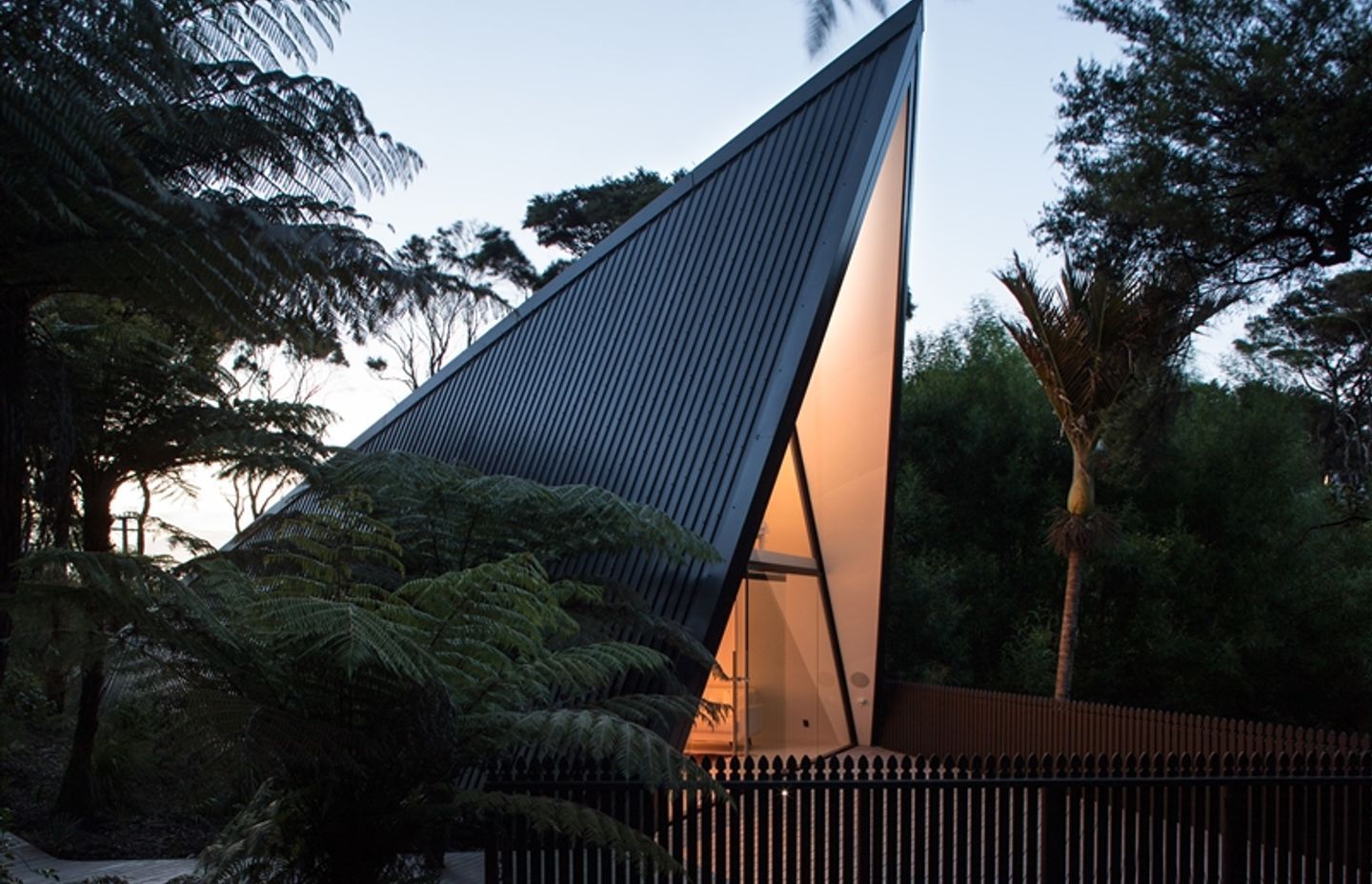
Sleeping below a tent on Waiheke Island, Chris envisioned a home with a similar triangular architectural form – simple, beautiful and playful. This idea sparked a project to build a collapsed tent house frame, and after two years of hard work, Tent House was completed.
We talked to Chris about his design inspiration, the materials he selected and the striking monochromatic colour scheme for this unique, creative form of architecture.
On shape and line
Since the inspiration was a triangular form, this posed several engineering and architectural issues, particularly on safety as the walls were not in conventional 90-degree angles.
Chris tried around 30 different options during the 2D-drawing stage to ensure the home would work structurally and functionally.
"It came down to which shape looks best and what angles worked best on the site to maximise the shape.
It was purely visual, followed by dissecting the design into cross-sections so the descending height walls would all fit in seamlessly and be safe for walking up to, despite the slope," said Chris.
On colour and light
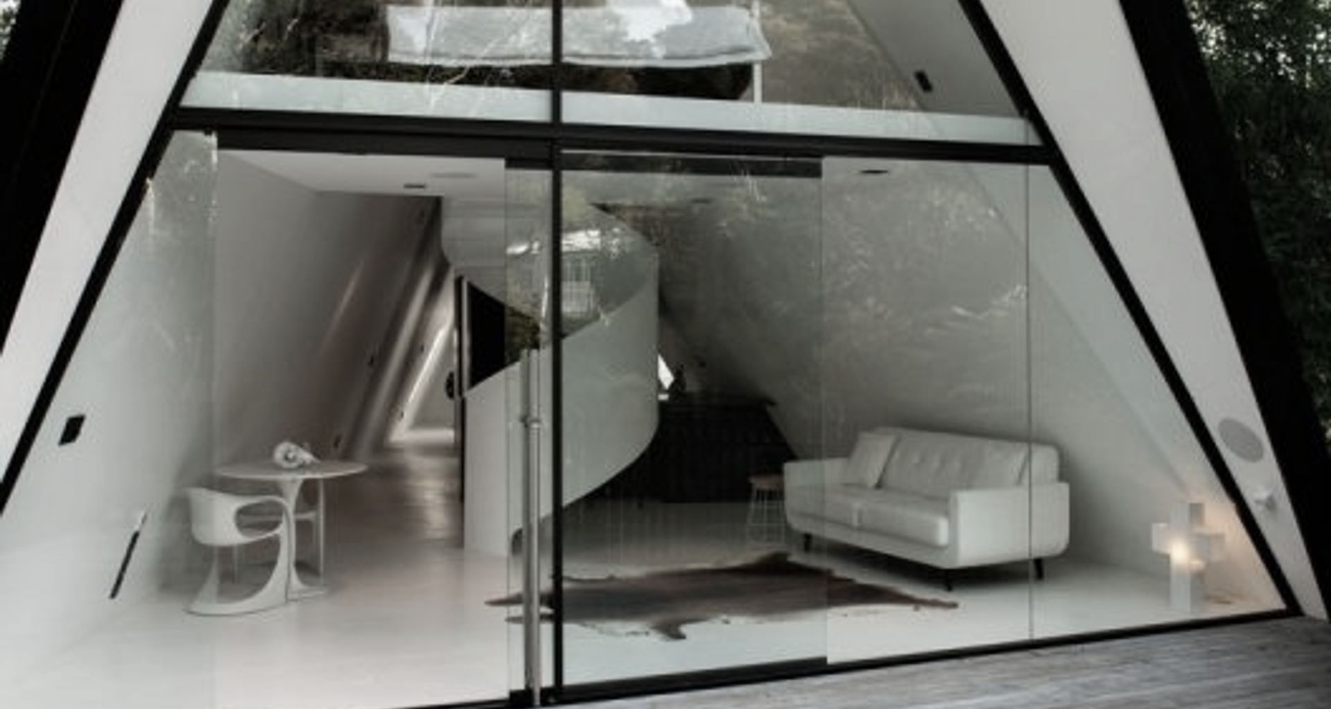
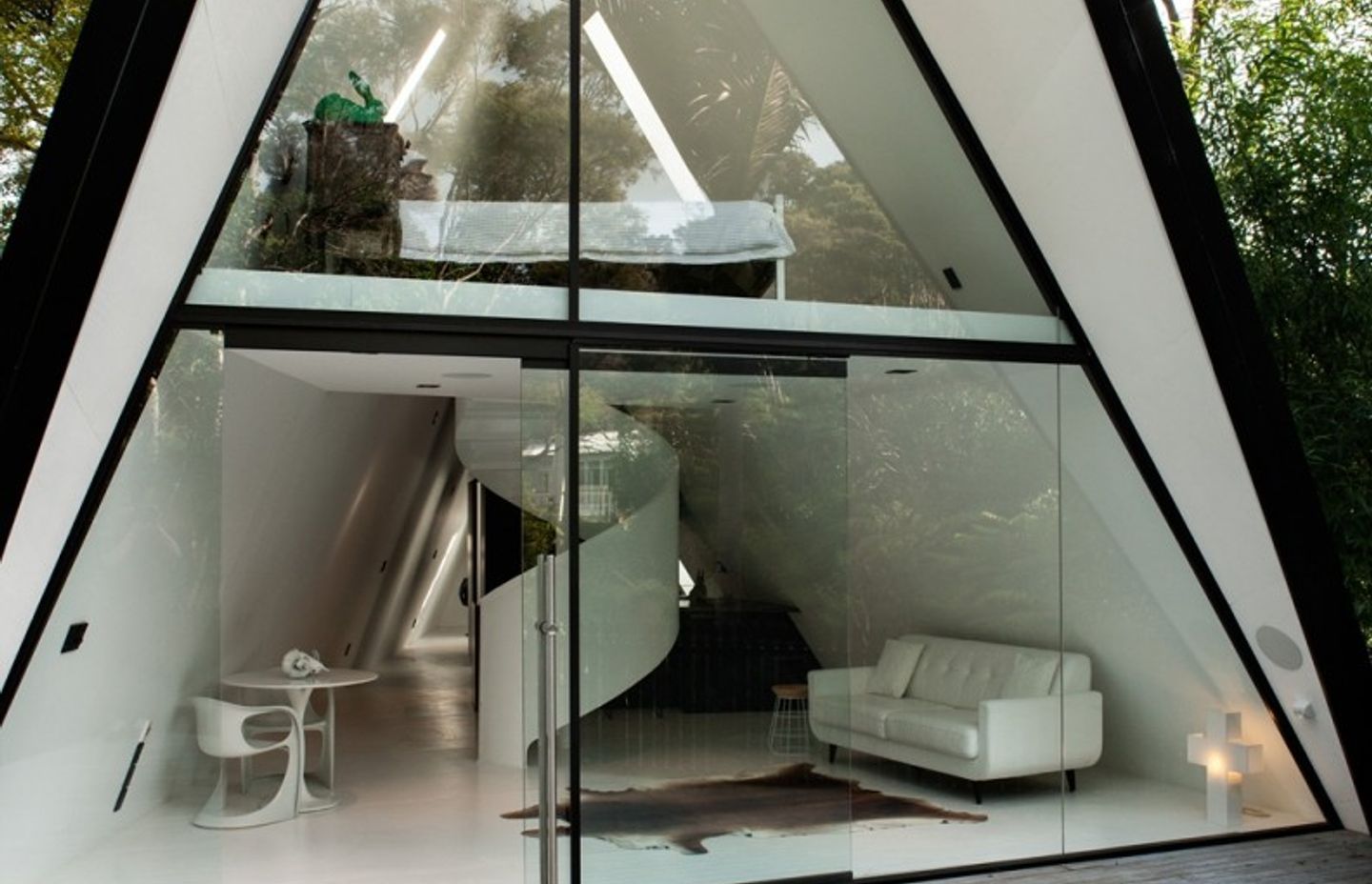
Chic and classy, the white colour scheme of Tent House is an instant eye-catcher.
"I felt drawn towards an all-white colour palette," said Chris. "I carefully selected a cool-white Resene paint."
However, Chris injected the colour black sparingly as an accent to enhance and accentuate the glowing white.
"I was also amazed by the North-facing light from the Cathedral glass windows and Adlux skylights," added Chris.
Indeed, images of Tent House showcase how light dances around the white surfaces for an immersive experience.
"It's almost a religious feel," said Chris. "Night-time is a favourite, as the LED lights at the base of the Colorsteel cladding cast a vivid, ethereal glow on the house."

On space
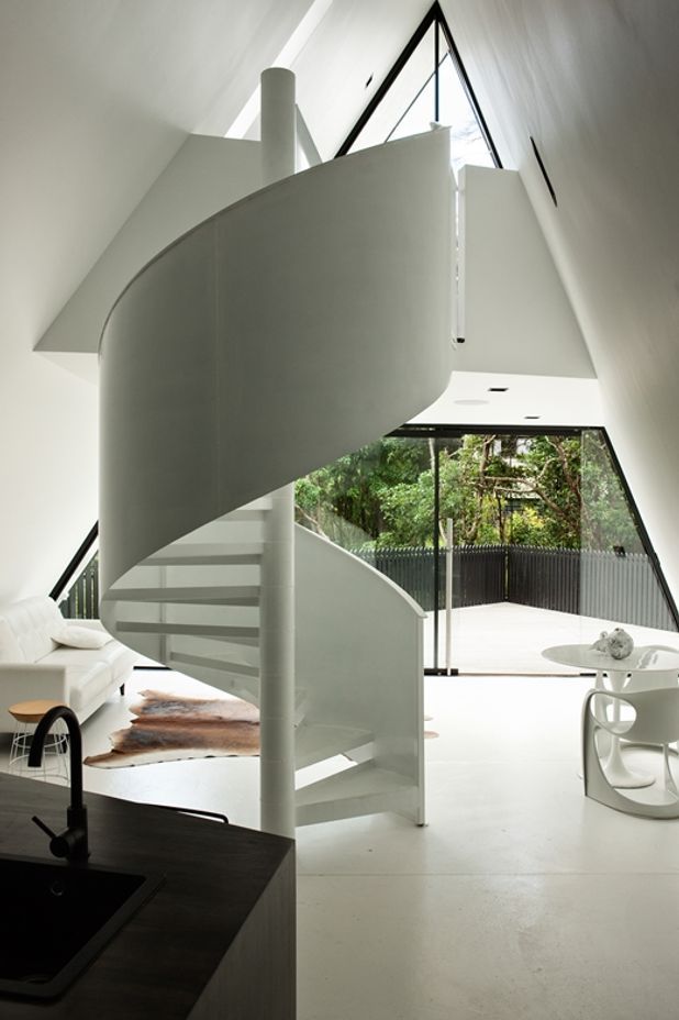
Spanning approximately 70 square metres on a larger site of 650 square metres, Tent House makes clever use of the smaller space and tricky triangular sloping walls by adding statement pieces, such as a spiral staircase.
It was a smarter alternative to a vertical ladder, while regular stairs would need a pitch that wouldn't work aesthetically with the home's triangular shape.
Originally, he planned to paint the staircase black, but that would have distracted from the white scheme.
"It's now a standout feature of the home, an artwork in its own right," says Chris.
On minimalist style
Chris intentionally paired back the home.
"There is no artworks on the walls, no door handles or locks or architraves on the floor. It's all about the shadows, lines and shapes created by the Tent House structure. It's stripped back, yet comforting."
He also carefully curated the furniture choices, adding that he "adores" his Casala Casalino original dining chairs which are complementary to the staircase.

