studioplusthree: where contemporary minimalism meets local craft
Written by
25 November 2021
•
5 min read
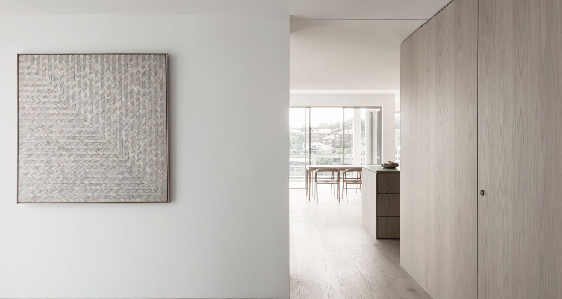
Subject: studioplusthree
Location: Sydney
Specialties: Residential and exhibition design
Design philosophy: Textured minimalism
Designing an exhibition for a gallery and designing a house might appear to have nothing in common, but you’d be surprised. “There's actually a surprising amount of overlap,” says Sydney architecture firm studioplusthree’s co-founder, Simon Rochowski. “In terms of the the way we think about the design, the way we can actually document and do the work, there are a lot of similarities.”
Since forming in 2015 with Julin Ang and Joseph Byrne, studioplusthree has quickly established itself as an architecture practice to watch, its clients attracted to the award-winning firm’s unique two-pronged offering – residential architecture and design for cultural institutions. While each has its distinctions, studioplusthree approaches both types of projects with a philosophy centred on quality, craft and sustainability.
Creating an atmosphere
“The way we think about our projects is that it's very much about the experience – how you experience the space when you first enter it in terms of light, materialities, tones and texture – and so when we're approaching all our projects that tends to be our starting point.”
Simon says the design process always begins by collating a number of reference images that create an atmosphere, and then trying to work out what the project “wants to be” or “wants to feel like”. With museum or gallery exhibition projects, the team can be more experimental, pulling inspiration from films, contemporary art and other galleries, whereas conceptualising residential projects revolves more around materials, textures and the opportunities offered by the physical space available.
“[Residential projects are] much more familiar territory, and people have a much more natural understanding of these spaces and places, whereas for the museums and galleries we get to create the kinds of spaces that perhaps people have never been in,” says Simon.
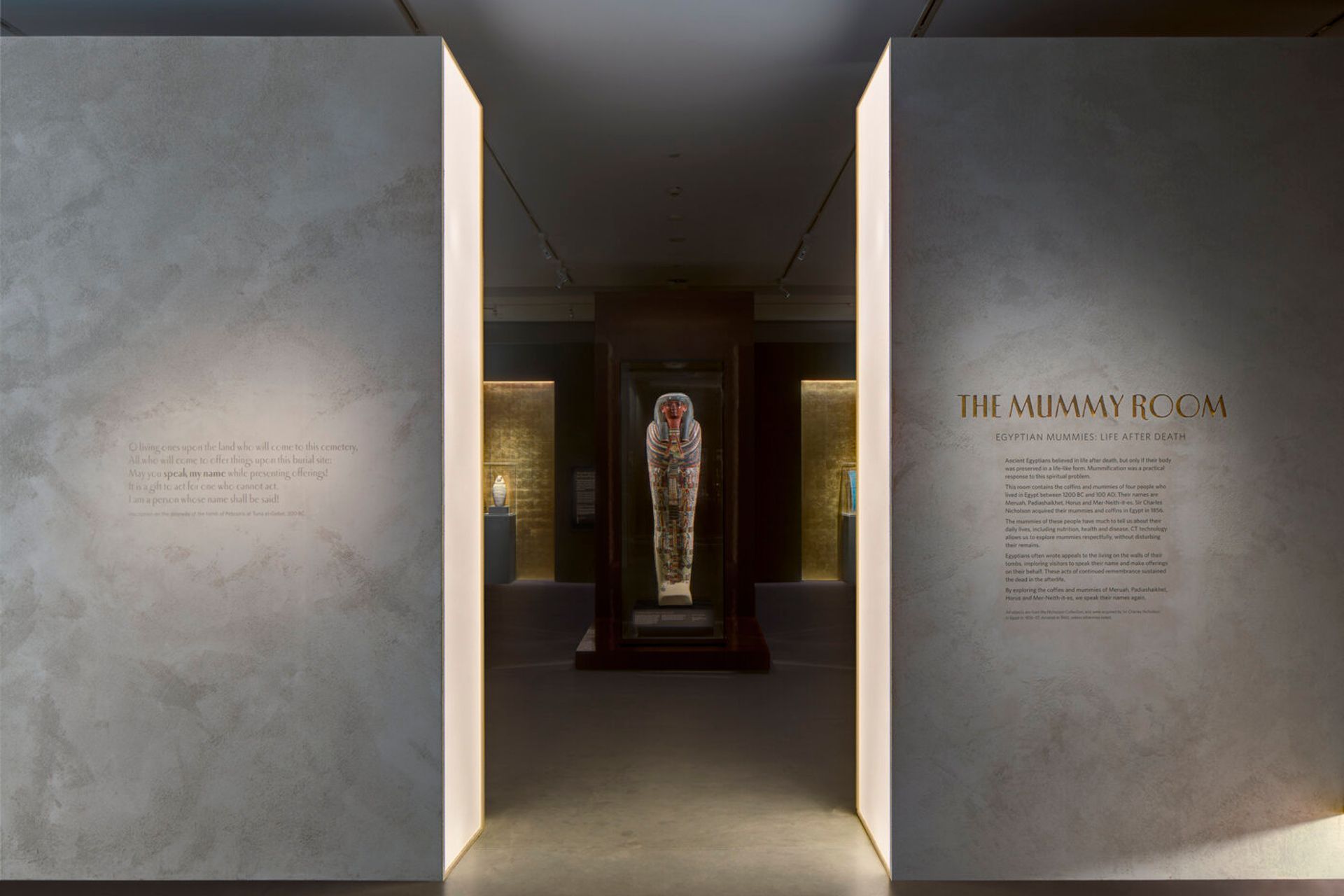
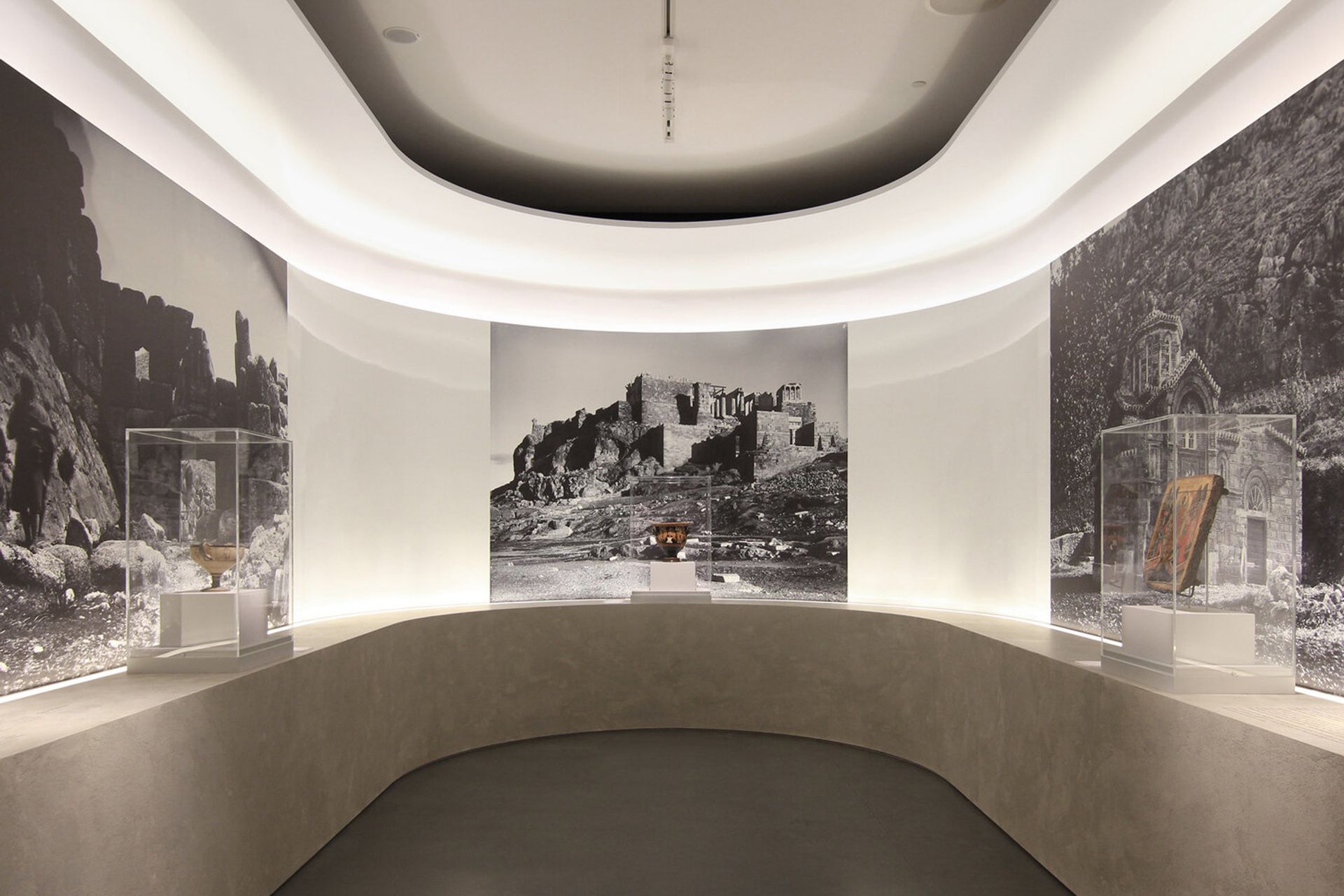
These spaces are those like the one studioplusthree created for the Nicholson Galleries at the University of Sydney’s new Chau Chak Wing Museum, where visitors found themselves in a space that evoked the pillared halls of ancient temple architecture. In this mystical environment, towering columns form an axis that draws visitors to a threshold made of light, symbolic of the transition to the afterlife.
It’s this creative approach to design and the use of space that has drawn a constant stream of customers to the studio over the last six years. “I think they they like that we have this maybe unconventional side, and that we actually borrow a lot of things from the two different project types. We might find a technique or a material or a certain way of lighting something from the museum world, which we can then actually bring into our houses and so there does actually tend to be a quite a bit of exchange between the two.”
The way we think about our projects is that it's very much about the experience – how you experience the space when you first enter it in terms of light, materialities, tones and texture...
Minimalist does not mean empty
Studioplusthree’s design philosophy is undoubtedly modern, and markedly minimalist – but probably not in the way you’re thinking. Rather, studioplusthree incorporates layers of contrasting materials, textures and tones that add warmth and a tactility to the space. “Textured minimalism is how some people have described our projects,“ says Simon. “We have a very kind of contemporary approach to our designs, but we're not tied to the kind of stock minimalism, which we see as a complete reduction of elements. We feel that there's great value and warmth in bringing these kinds of textures into the design.”
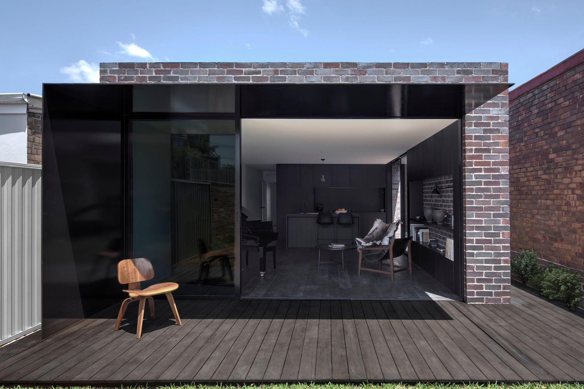
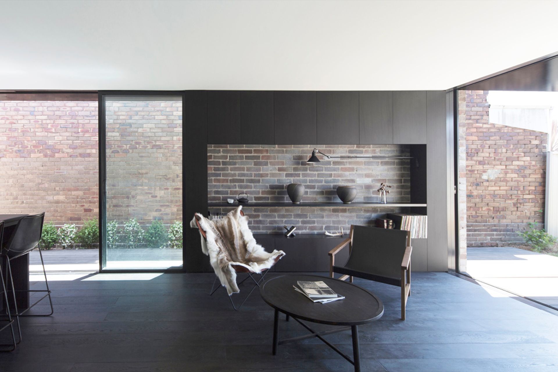
These textured elements might include materials like those seen in Llewelyn house, where recycled bricks have been strategically positioned alongside glossy, powder-coated black steel. “It’s this idea of something very slick contrasted again something that's very rough, building on this textured palette,” says Simon.
He adds their approach is a wholistic one, and that often these elements and materials serve a dual purpose – both functional and aesthetic – as is the case in Llewelyn House where the glossy black surface reflects the garden back into the interior space, bringing the outdoors in.
Tune in to find your style
For those on the hunt for an architect for their home, Simon says a good starting point is to note your reaction when you are in particular spaces, as you will have an intuitive sense of the types of environments that make you feel relaxed and at ease, which is how we all want to feel when we are at home.
He also suggests initiating a conversation with the architects you are considering, to find out how they like to work. “Some architects can be quite stylistically-driven or have a very strong approach,” he says. “Whilst we bring our own kind of design approach to it, we very much consider it a dialogue with the client and I think that process is really important both for the clients and for ourselves. We don't want to feel like so we're just implementing a preconceived idea.
“It’s a big process. Embarking on building a new home is often one of the biggest projects people will ever take on, so I think that research is really important and I think not feeling too pressured into it – and that's one of the big advantages of a site like ArchiPro – you can get a good overview in the one place.”
To learn more about studioplusthree, view their projects and more, visit their ArchiPro profile here.
Words by Madelin Tomelty