The big glow-up: an ingestible beauty company’s sublime new fit-out
Written by
13 August 2023
•
5 min read
When it comes to branding, it doesn’t get much more feminine and dynamic than ingestible beauty business Vida-Glow. The company, which started with marine collagen powder nine years ago, has since developed a plethora of other ingestible beauty products that improve hair, nails, energy and skin.
The products come in powder form and can be mixed into drinks or food, and the company’s focus has been on scientifically tested products with clinically proven benefits. Started at home by Anna Lahey, the company was one of the first to combine beauty and health supplements, and it grew at a rapid rate. So much so that in 2019 it engaged renowned Melbourne agency Studio Ongarato to lead it in a major rebrand, as well as upsizing from its warehouse-plus-office to a new high-rise office space in north Sydney for its 100 staff.
It was amidst this whirlwind of change when Arent&Pyke was engaged to design the fit-out of the new premises, which would provide a central hub for the business, and bring the workspace in line with the dynamic new brand identity.
“When we first met with the client, they were taking on half a floor of a 1000sqm floor plate, but when we looked at projections for the next 18 months, it was never going to accommodate the anticipated growth of the company,” says Arent & Pyke’s Sarah-Jane Pyke. “They ended up taking a whole floor of the building, which enabled us to deliver everything they needed, as well as have room for growth.”
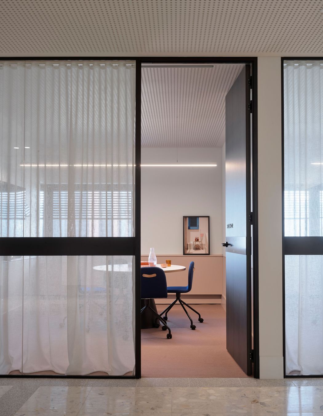
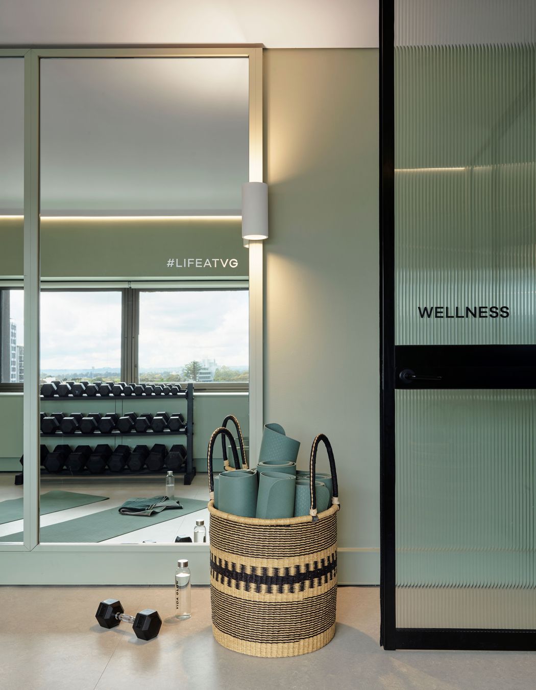
The client’s brief was expansive and exciting and included a small research and development lab, office space, meeting rooms, a wellness space where staff can practice yoga, do weights or hold meetings, a large working kitchen, a content studio, and a reception space to greet visitors.
Arent&Pyke are known for their warm and textural residential interiors, and it was precisely this feeling of domestic hospitality that Vida-Glow was after in the fit-out.
“The feel of the brand is about strong women and keeping people feeling strong and healthy, so there’s a feminine edge to it but there’s also another dynamic and energetic aspect, and that’s where we tried to bring in a llittle bit of sharpness - there's something that's quite gutsy about it,” says Sarah-Jane.
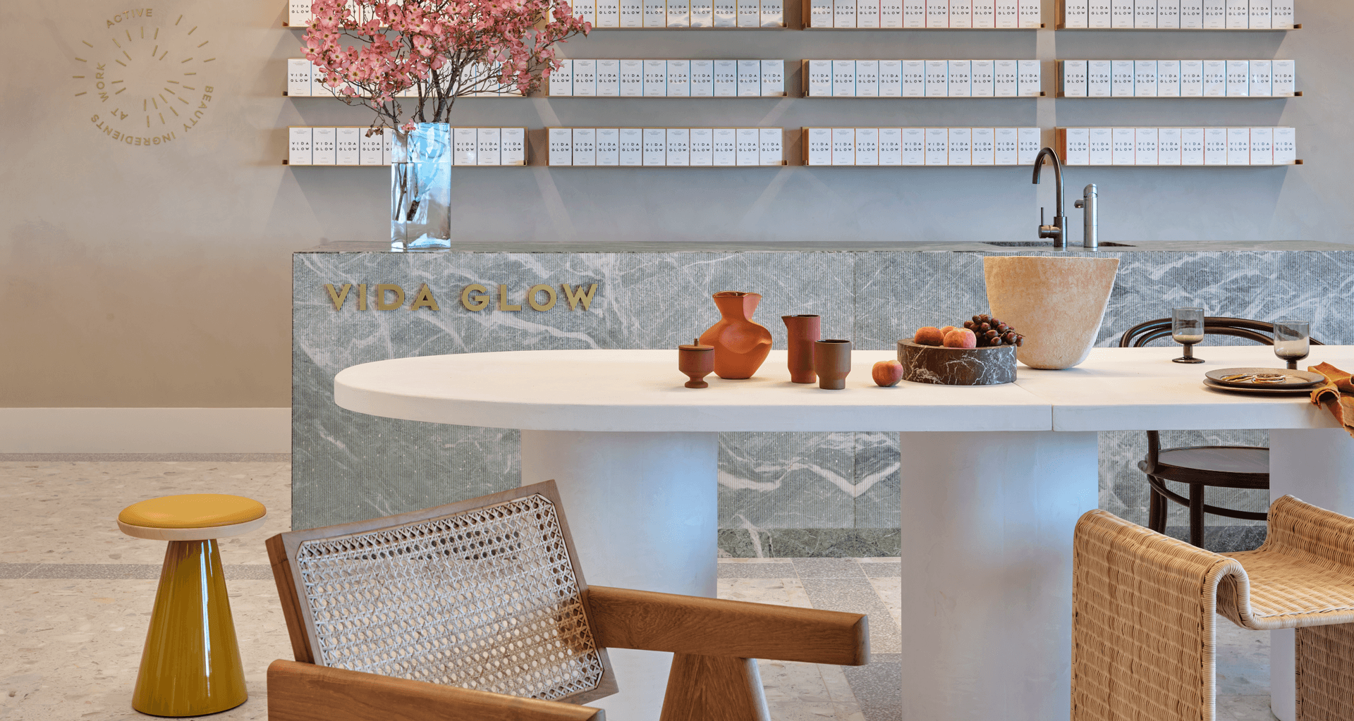
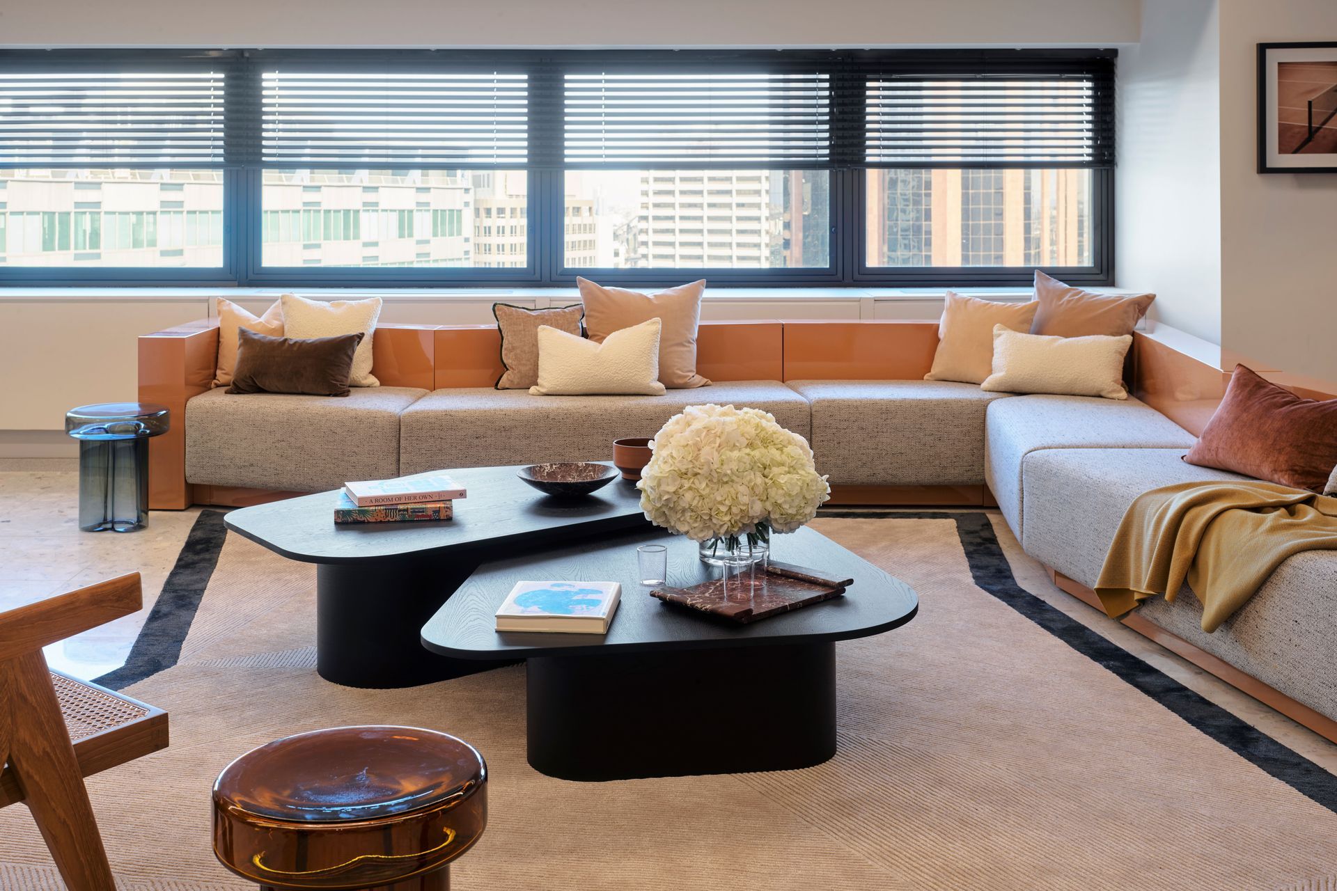
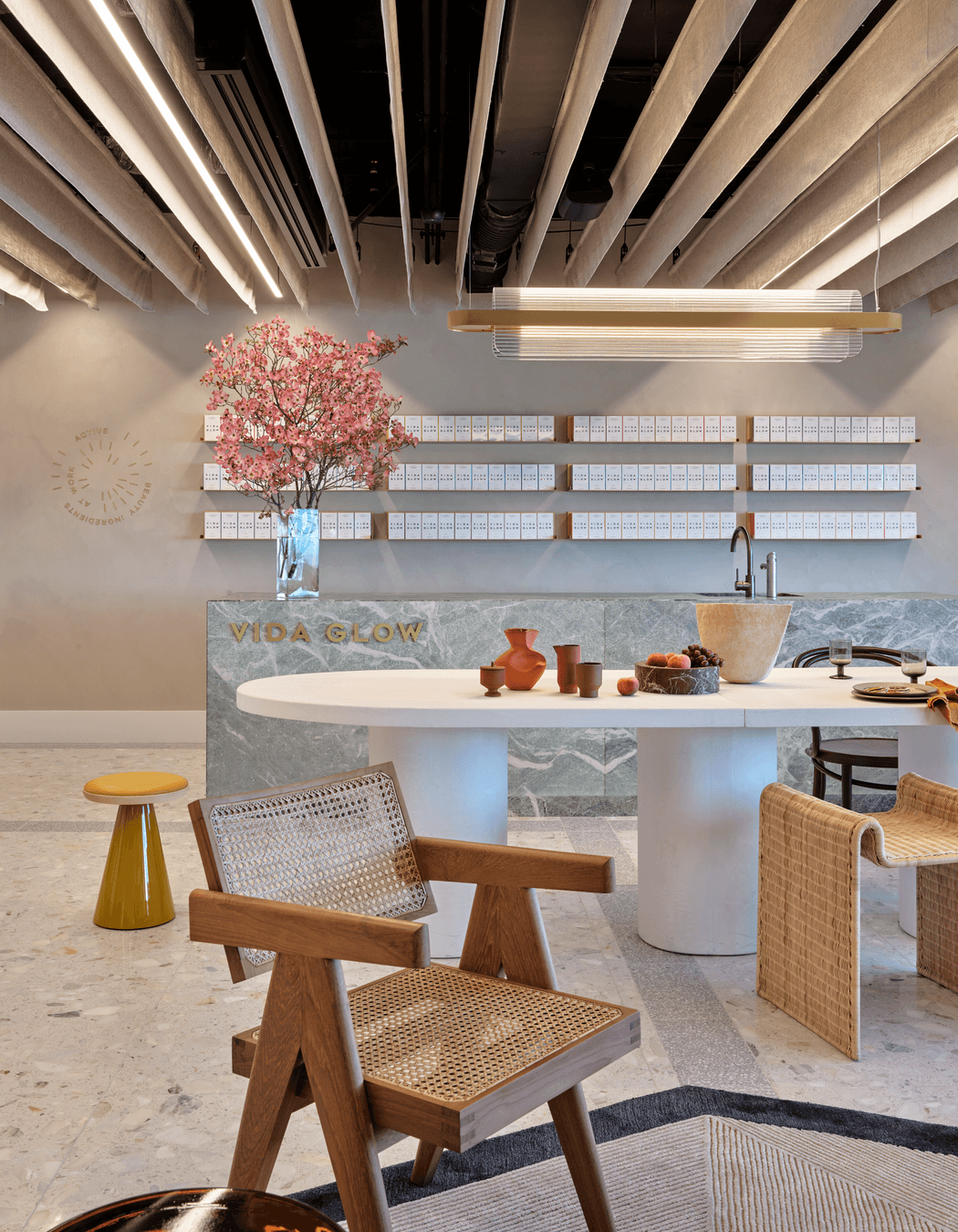
In the lobby space this is immediately apparent, with its big undulating peach sofa and terrazzo floors; it features a projector screen that is used for team meetings and a huge stone bar, where visitors are offered collagen drinks, immediately bringing people into the experience of the product and brand.
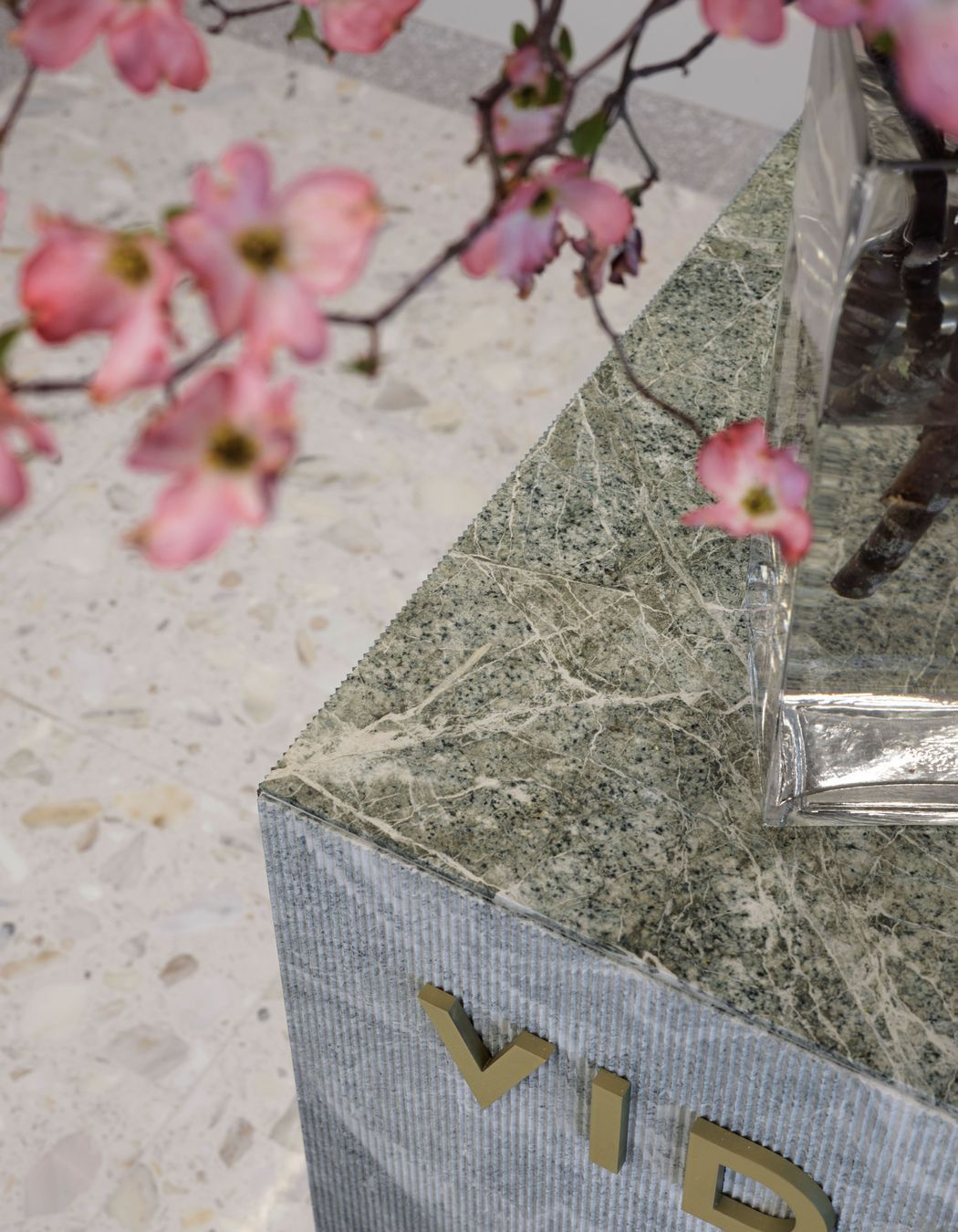
"I think the collagen bar is a really good example of the contrast between what visually is soft, and what physically is quite hard," sys Sarah-Jane. “We used this beautiful stone, which is called parsley green, and the top of the bar is honed whereas the front of the bar has got this really delicate ribbing on it, which softens the patterning of the stone, but it's actually quite sharp when you come up close to it.”
Moving into the office, timber flooring is used to soften the workspaces, and the furniture was specifically chosen for its domestic edge, creating a welcoming and intimate experience.
“As part of the brief there was a sense that people needed to feel really comfortable both when they come to work, and when they come to visit. So we thought a lot about how to achieve that, which was often simply introducing domestic scale."
Arent&Pyke worked with Art Bank to select a whole series of artworks to introduce that very personal and domestic feel, choosing particular works that bring intimacy into spaces which could otherwise feel clinical.
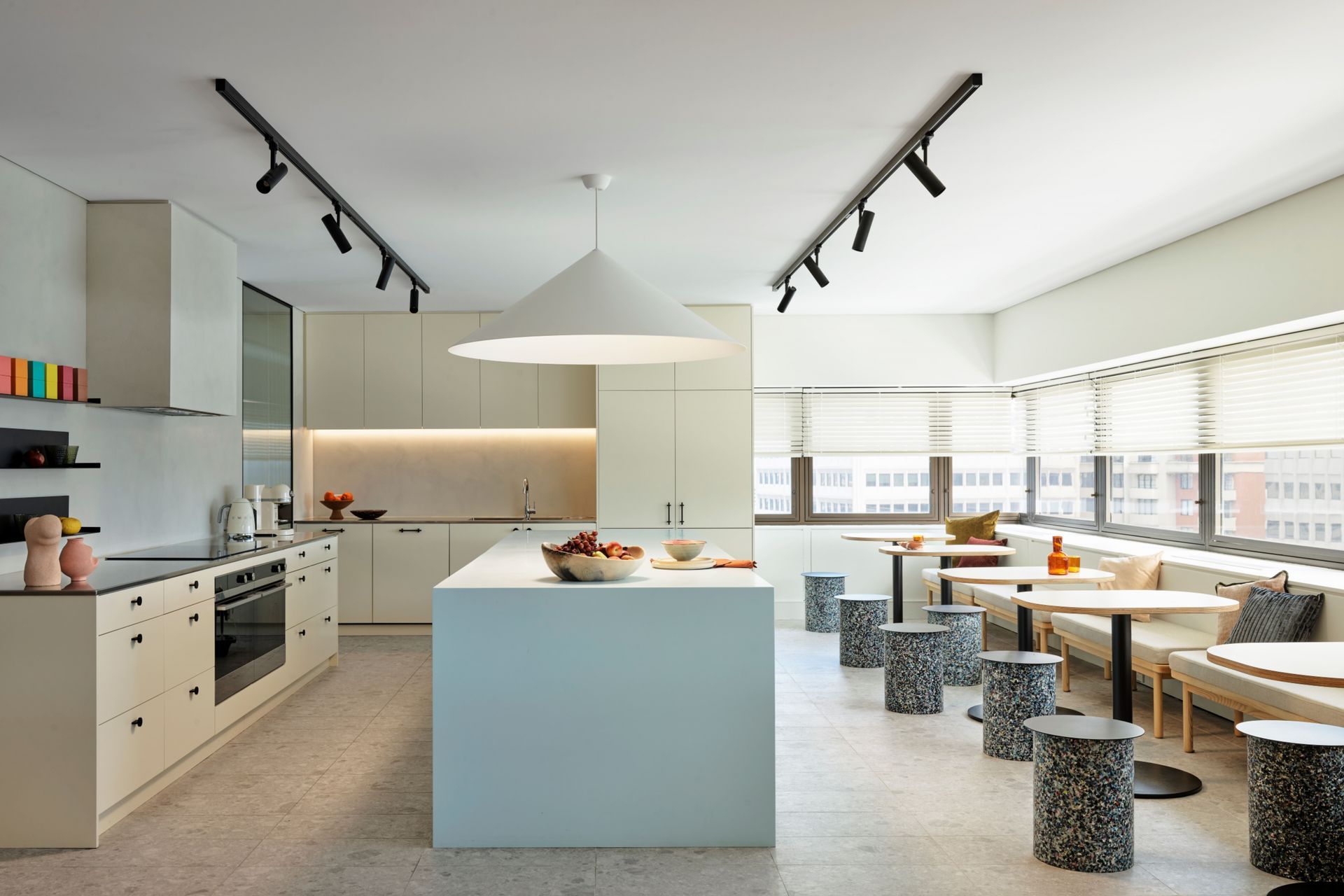
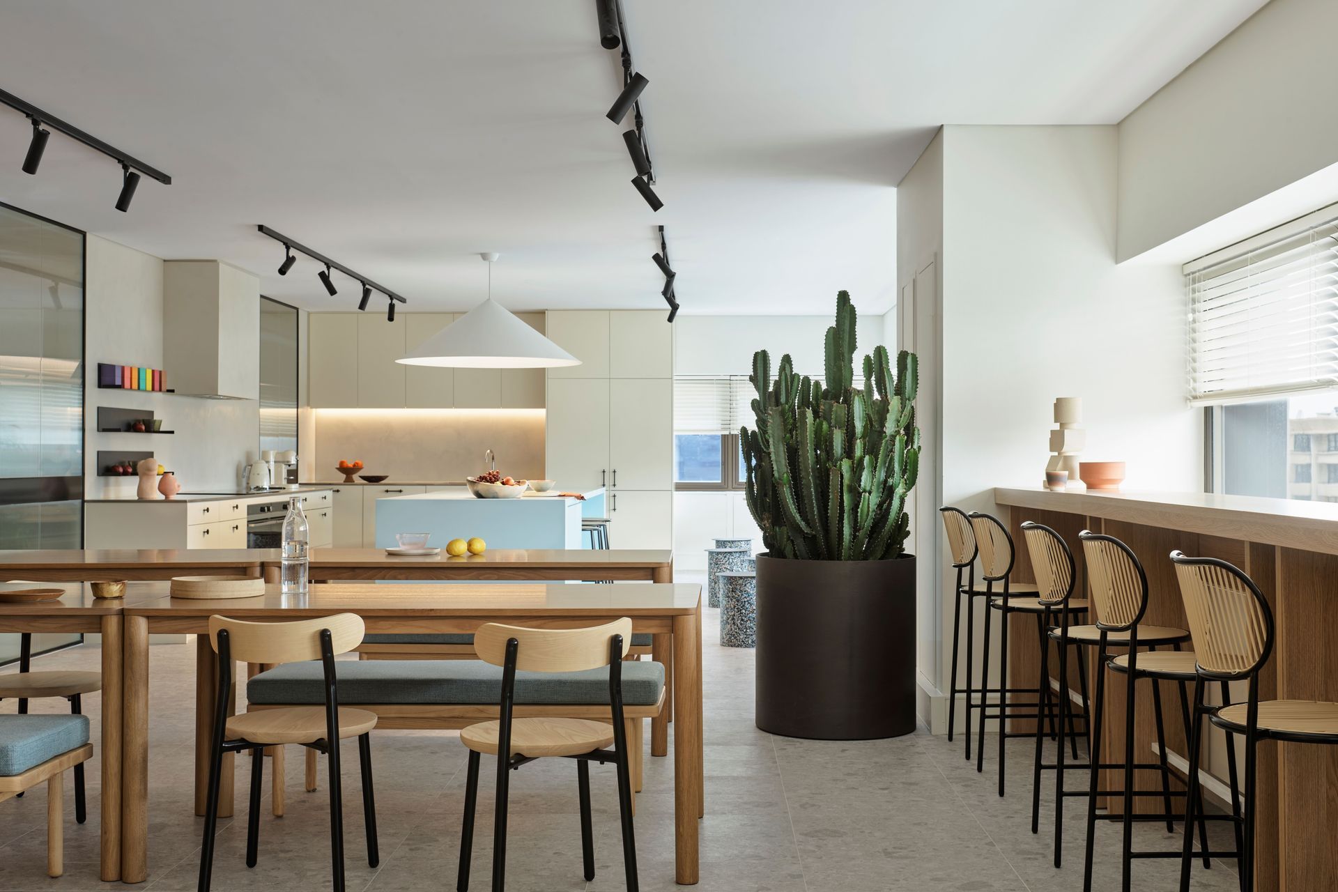
The large, beautiful working kitchen was another way of creating a feeling of ‘home’ at work,and for Sarah-Jane it’s a standout feature of the design.
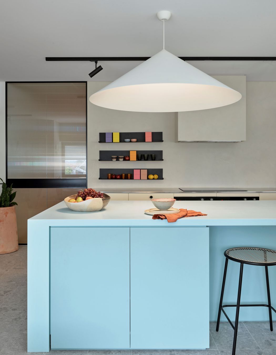
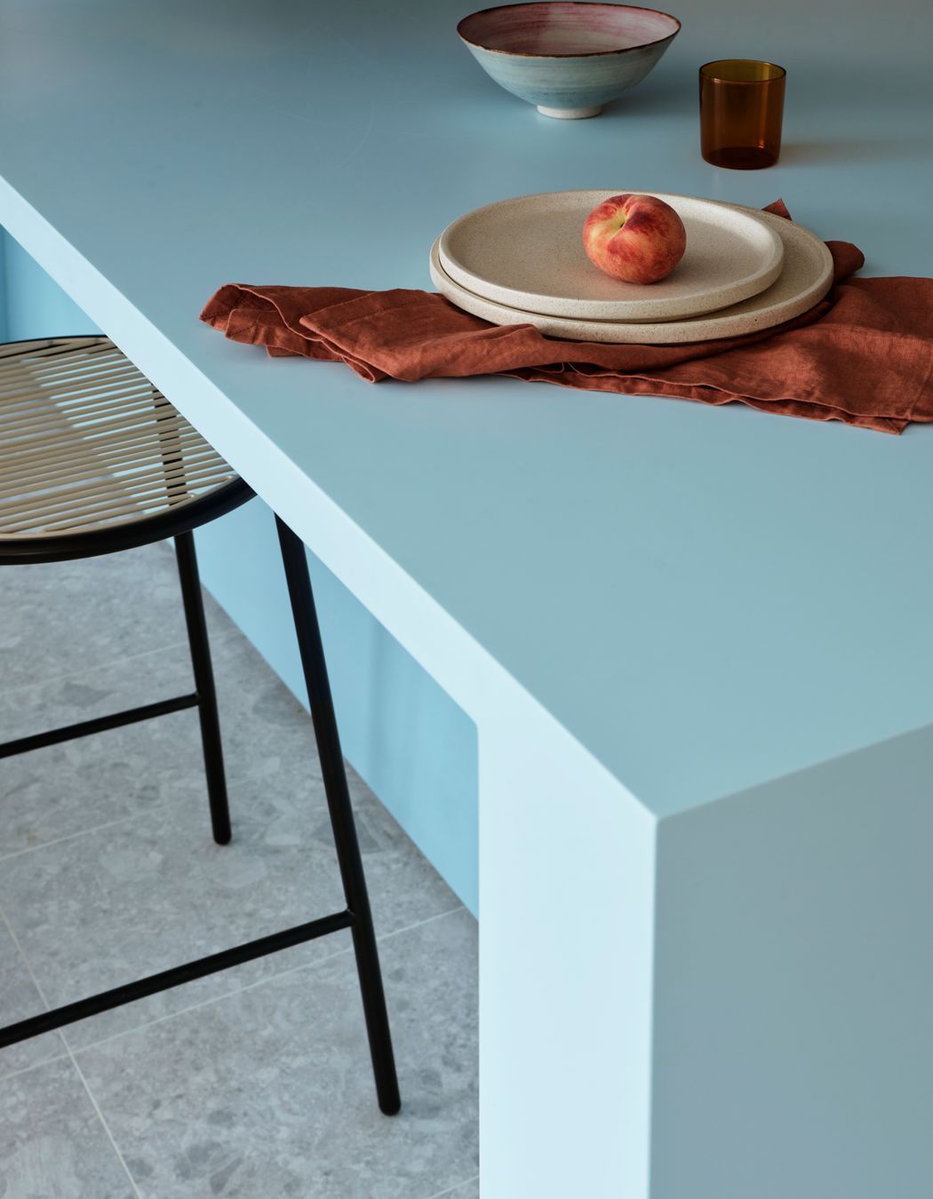
“Being a wellness brand, they already had staff who love to cook and were bringing food in, so we created a big working kitchen that can seat up to 100 staff with full cooking facilities, with an enormous island bench in a soft blue marblo.”
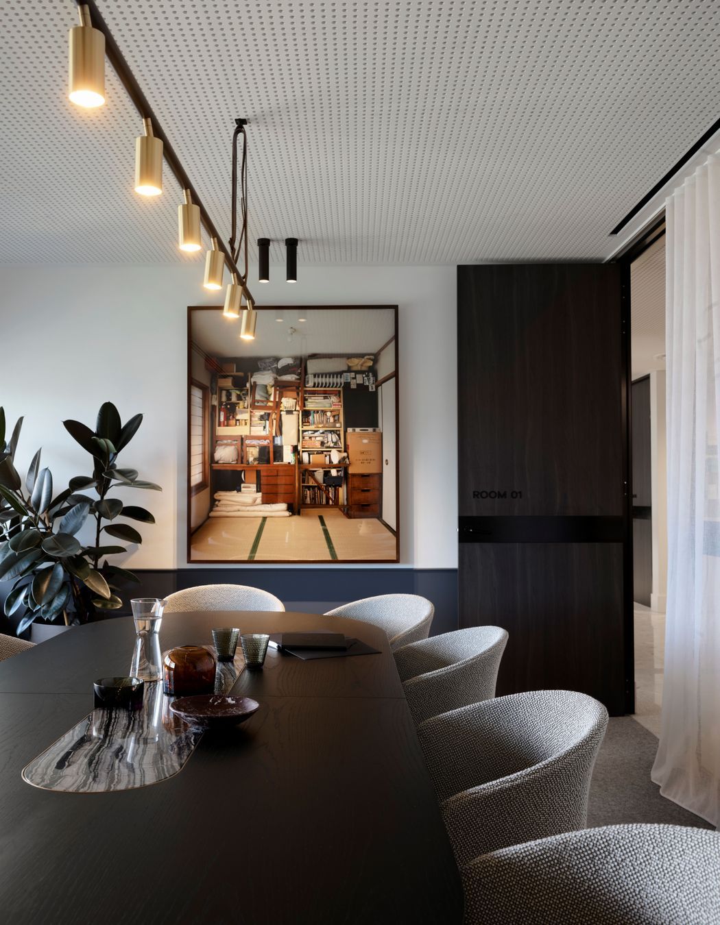
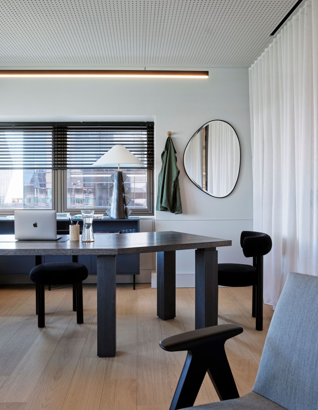
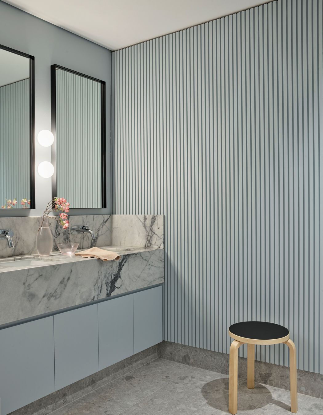
The brand colours had a huge influence on the colour of this bench as well as all other aspects of the colour and material palette.
“The rebrand had brought through this beautiful range of colours, and we knew that range would expand in the future, so we were working with colours that we called the ‘best friends’ to the brand colours and used them throughout the space, because the visual identity of the brand is really important to them in terms of how the space was going to represent them.”
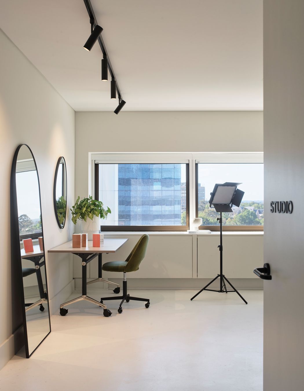
This was particularly important because part of the brief was that founder Anna Fahey would use the office space as a back-drop for the many videos she shares on social media.
The bespoke content studio was designed to assist with a soundproof production location for these films, and Sarah-Jane was thrilled that they could include such a unique and practical space.
She says that since the project was completed, she’s had great feedback from Anna, but the proof has been seeing the quality of the films on the company’s social media feeds.
“As a key part of the brief, Anna was going to be on camera day in and day out in this space, and she needed it to look good and to represent the brand every time you see her,” shares Sarah-Jane. “I feel like when I see it, I can see how beautifully it represents the brand and how it speaks to everything they're talking about. It's a huge success story."
Discover more stunning projects from Arent&Pyke
