This bright, relaxed, open-plan cafe prioritises natural, quality materials
Written by
19 March 2024
•
4 min read
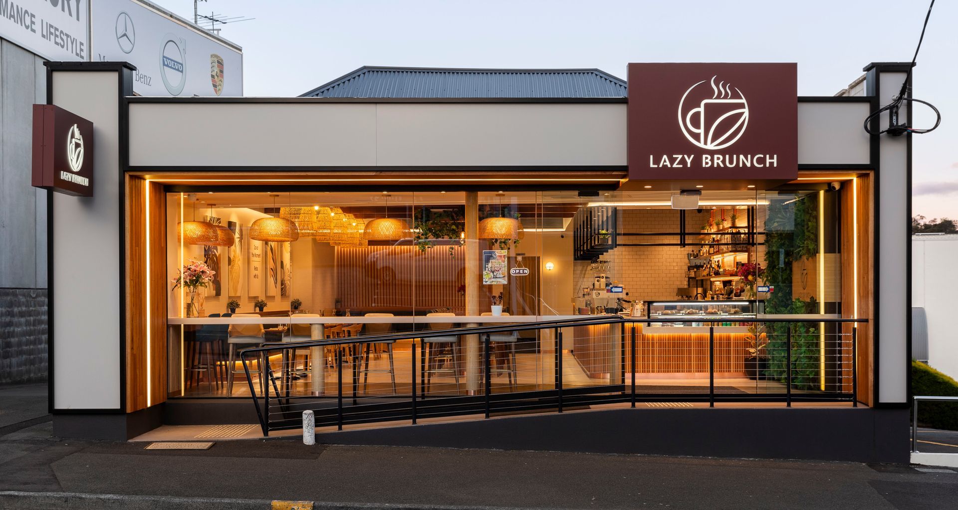
Taking up residence in an underutilised building on Argyle Street, North Hobart, Asian-fusion cafe, Lazy Brunch, had a simple brief for the space.
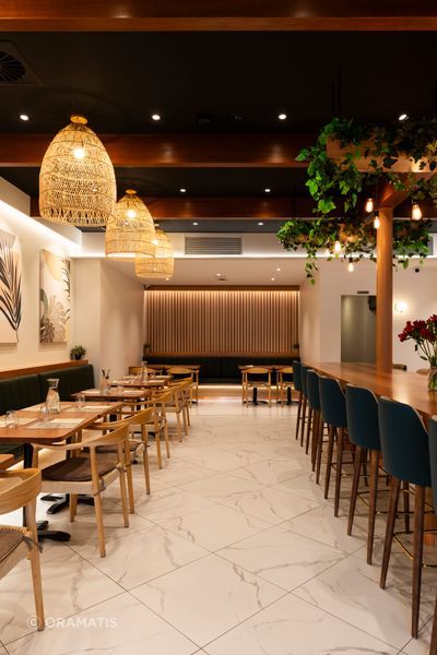
“Prioritising the incorporation of natural, quality materials and finishes, with a focus on light and airy interior design, the client wanted the dining space and experience to be flexible — allowing for a morning cafe and takeaway-style operation with the option to provide a more formal lunch and dining experience later in the day,” says Alexander Hill, principal at Oramatis design studio.
Tasked with the brief, Oramatis drew up initial sketch designs that were presented alongside rudimentary plans and 3D-rendered images to give the client a clear idea of the studio’s vision.
“We like to provide 3D renders for our commercial projects as they help the client to understand materials, colours, and volumes,” Hill explains.
In this case, the 3D renders were particularly helpful, as the building’s floor plan required a complete redesign; previously operating as a TAB betting agency, the layout wasn’t conducive to the needs of an open-plan cafe with a commercial kitchen and bathrooms.
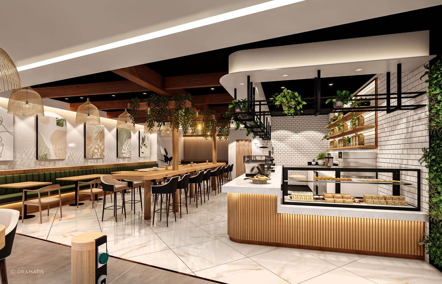
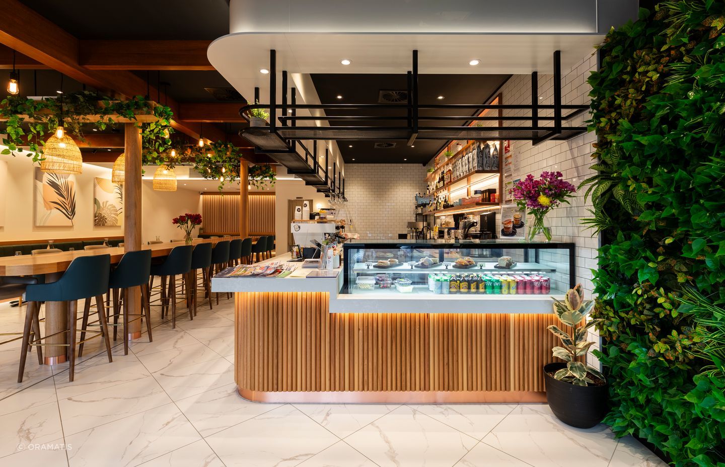
Alongside the open, airy feel, there was also a need for more connection between the main cafe dining area and the public space.
“This was achieved by fully glazing the front facade and incorporating a bar along this glazing so that customers sitting there would help activate the venue,” Hill says.
By allowing passers-by the opportunity to see patrons enjoying their meals and the cafe’s relaxed, modern atmosphere, the business is more likely to draw in new customers.
“We also worked with the client to develop a material board based on several commercial fit-out precedents. The core materials included extensive use of Tasmanian Oak as well as Bronze, Copper, YDL Stone and subway tiles. We wanted to achieve a contemporary look with raw yet elegant materials.”
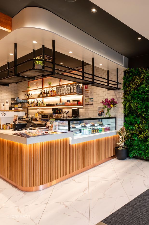
Lighting was another important design consideration, with the Trend Miniled XDC chosen as task lighting for the cafe service bar area.
“These lights have a high Colouring Rendering Index (CRI) of 90+ which is important for the accurate colour appearance of foods, materials and people. Havit strip lighting was also incorporated into joinery and wall uplighting to help create ambience. All lighting was made dimmable for nighttime operation,” Hill explains.
When designing a commercial space, workflow is key. Sticking to the budget for this project meant the design team needed to figure out how to establish an effective floor plan within the building’s existing external walls. To achieve this, public spaces were located at the front of the building with a direct connection to the street for convenient access, while bathrooms, cool rooms, and the commercial kitchen were located to the rear.
“Some parts of the building were stepped down, but we kept the public spaces and toilets on the same level to ensure disabled access. In the open-plan dining area, we chose a mixture of seating that included dining bench seats, bars and stools, and freestanding tables and chairs to give patrons options.”
Because much of the building’s structure wasn’t exposed until construction began, the team were unaware of structural issues with the existing floor framing footings and roof — much of which needed to be reinforced or replaced entirely.
“This problem-solving was the most complex part of the design process,” Hill says. “During construction, we discovered ceiling beams that protruded into the restaurant dining space and could not be removed. We decided to wrap these beams in Tasmanian Oak and paint the ceiling black to provide contrast and create a feature.”
Sourced locally, this Tasmanian Oak was one of a few feature materials chosen to enhance the interior and promote a warm, comfortable, clean, and smart atmosphere. Alongside the ceiling beams, it was also used for dowels and tabletops. Bronze was chosen for the cafe servery bar kickers, with Natural White Dulux on the walls and white subway tiles behind the bar. A synthetic ‘green wall’ was also installed near the entrance for a low-maintenance approach to biophilia.
“Our favourite part of the design is coming up with the initial concept for the client. We do our 3D renders and update these throughout the design process to ensure that the renders match the construction documentation. Our clients always appreciate this,” Hill says.
Lazy Brunch was extremely satisfied with the design, and, after multiple iterations and scrutiny over every element, the end result was exactly what they wanted.
Learn more about Oramatis.