High drama in a minimalist kitchen
Written by
30 June 2022
•
4 min read
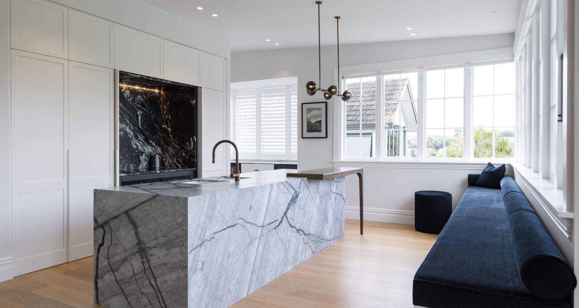
The kitchen in this family home renovation is classic contemporary with a kick, says Sticks + Stones Design interior designer Katie Scott.
“The idea was to keep it nice and light, but they wanted a little bit of drama, and a little bit of mood.”
It’s in keeping with the era of the house, a transitional villa, she says. “It has beautiful features. It has an archway and panelling down the hallway so we took from that. The aim was to create something that felt like it belonged. But modern, with all the new appliances and things we expect from kitchens now.”
The kitchen was part of the renovation of the whole house, says Katie. “Because I was involved from the beginning, I had a lot of input so I could really tailor-make that kitchen.”
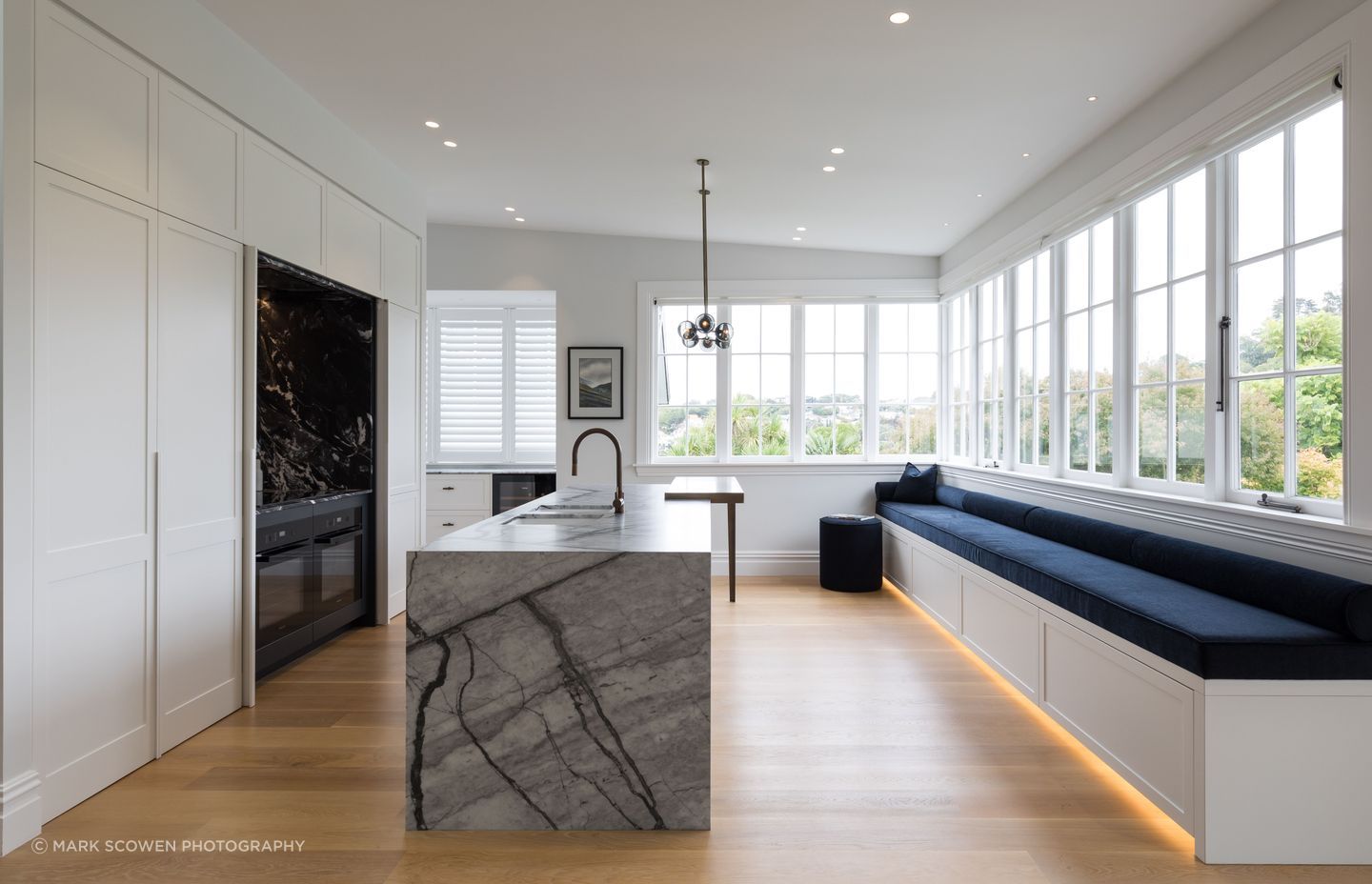
The main feature is the large island. “It’s very simplistic, like a big block of marble that’s been planted there. The bar leaner breaks it up a little, and adds classic style with the tapered leg.”
There’s a surprise behind the cabinetry. “The hob area shuts off behind pocket doors. When it's open, it's quite a dramatic contrast being a dark marble with dark cabinetry. That is the opposite to the very light kitchen so it's a bit of a showpiece. When you're not using the kitchen, it's just a white panel feature wall. You can have a drink and relax and not really see the kitchen.”
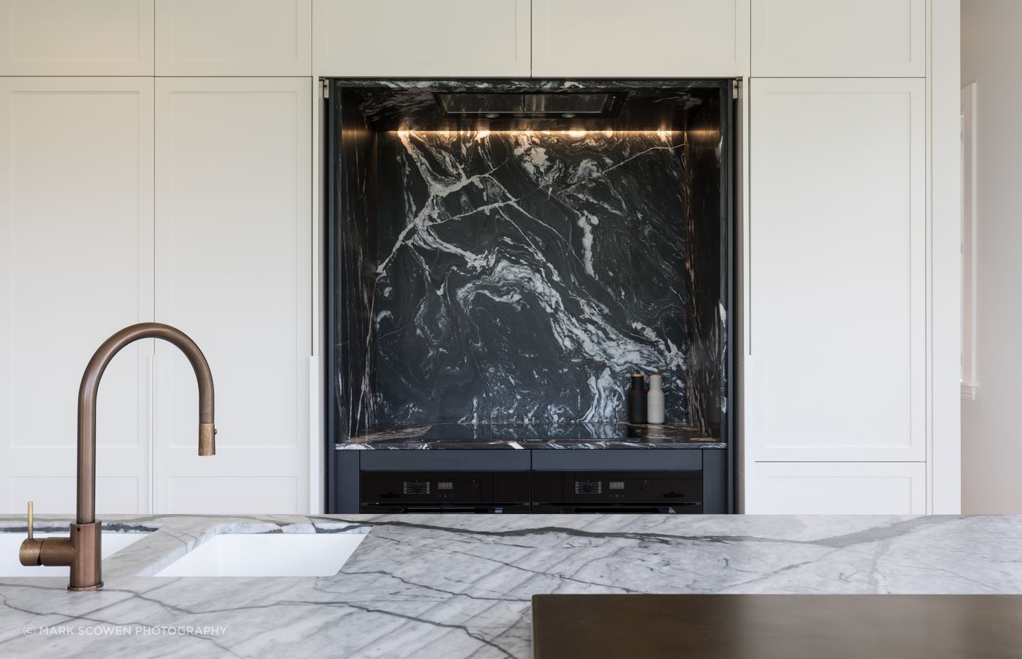
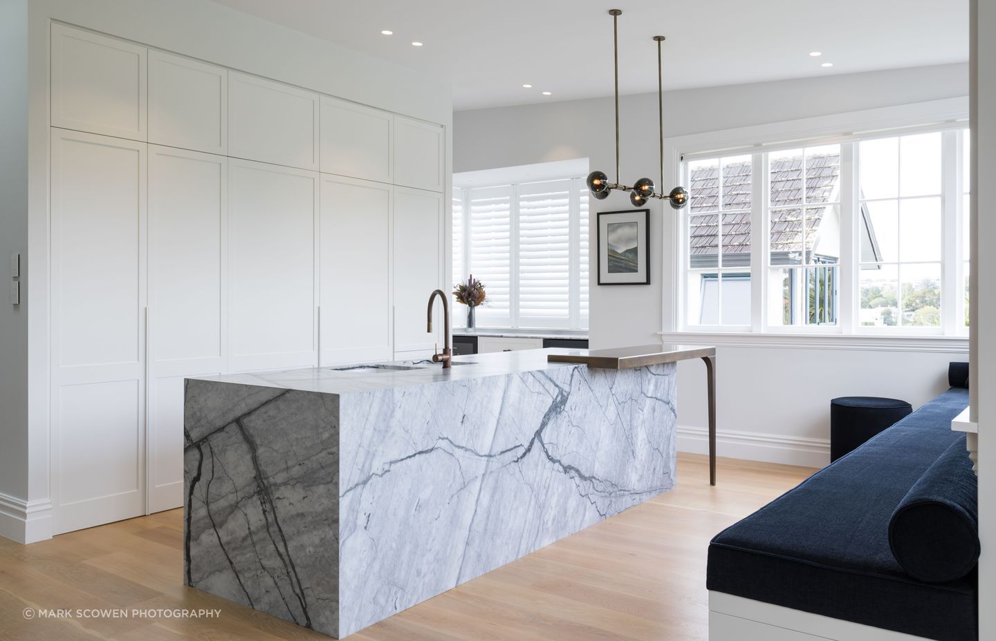
The choice of marble was key to the design. “We were on the hunt for two marbles: both dramatic but that work together. The client really liked those dark, moody greys so we were looking for something cool with more blue tones, as opposed to warmth. I went with the client to a few stone suppliers: it's actually one of my favourite parts of the job. I do it with most clients if they want natural stone. It’s like choosing a piece of art.”
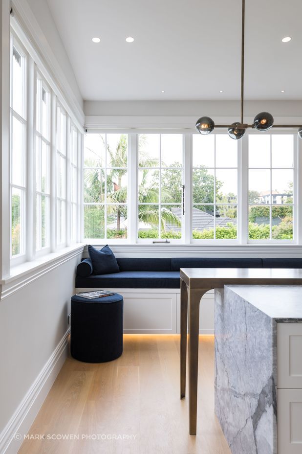
The bench seating is just as dramatic as the marble. “The space was quite long and narrow, so there’s a lot of room to sit and have a glass of wine and it’s a lovely spot to sit and read the newspaper in the morning with your coffee. It’s part of that social environment. They’re a young family and very social people. They like to have a lot of people over.”
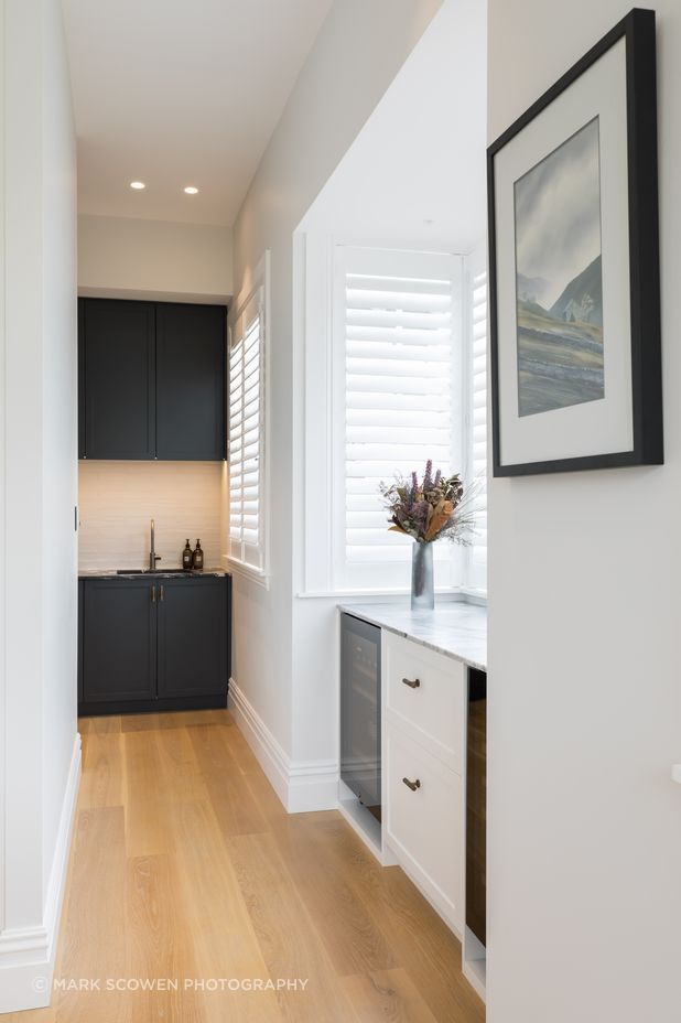
And a big part of family life – and a social life – is dealing with the mess. Tucked behind the kitchen is a scullery.
“If you hate doing the dishes straight after or you're not the cleanest cook, then a scullery or butler's pantry is a good space to have. Some people are very tidy, however, and like to keep it all open and they'd rather have a larger kitchen space. Everybody’s different, some people love it.”
Katie knows very well how this family likes to live in the house. She had worked with them in a previous home, so she was familiar with their style. “Plus they knew what they liked and what they didn't like, and were very decisive.”
However she is very adept at connecting with brand new clients, even those unfamiliar with interior design.” If they really have no idea what they like, they might like clothes or a particular shoe or an artist. Just an idea of aesthetic. Sometimes you can tell a lot from a very small object, so a little bit of information can actually tell quite a big story. And then it's a matter of working through that to create a concept that they can connect with. Communication is definitely key. It’s about having that trust.”
