Turn the Page
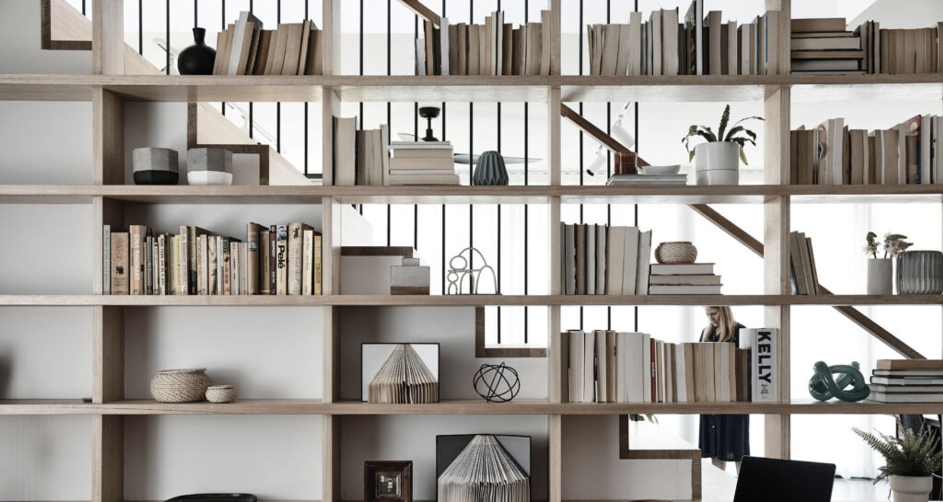
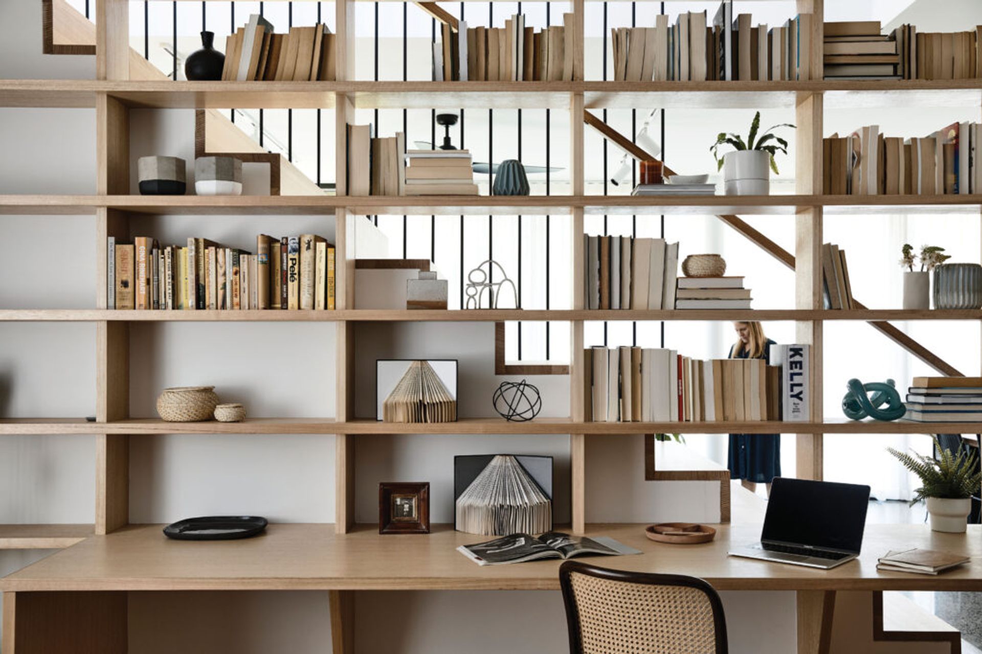
When a bookcase is the hero of a house, it’s a safe bet the owners love words. But this bookcase is more than a careful curation of paperbacks. It’s the central axis around which an entire house interlocks and overlaps, and the key to the way this project achieves more with less.
The owners, publishers Maria Hendriks and Praveen Naidoo, engaged director Ben Callery, of Ben Callery Architects, to restore the front four rooms of their house in Northcote and add a new extension with a backyard for their family of four. They wanted somewhere they could comfortably work or study but still feel connected to the rest of the house and their children.
They were also open to Callery and his team challenging the conventional must-haves for a four-person suburban family brief – a butler’s pantry, ensuite, large laundry and garage – because they couldn’t ‘go up and out’ but rather, ‘go up and back in’.
The main issue was their unusually small, yet double-fronted block. Measuring 395-square-metres, subdivided and shallow from the rear, the site called for a very clever approach with space.
“For starters, there’s no garage,” Callery laughs. Or separate ensuite, for that matter. Two of the existing front rooms remain as bedrooms, while the third is a compact laundry doubling as a hallway to the main bathroom. With a discrete entrance to the main bedroom, the bathroom also moonlights as the ensuite. “It’s quite a challenging thing for some people, but they’ve saved a lot of space,” he says.
The fourth room performs three different functions – the central study, second living area and library – where the family studies, works and keeps their devices.
It features the semi-transparent bookcase, which peeks through to the adjacent extension. The family can perch by the full-width desk and look into the new living area, connecting with the house on their own terms while feeling semi-secluded to work productively.
“The books are the centre of the house,” Callery says. “And where the clients’ literary passion is celebrated in daily family life.”
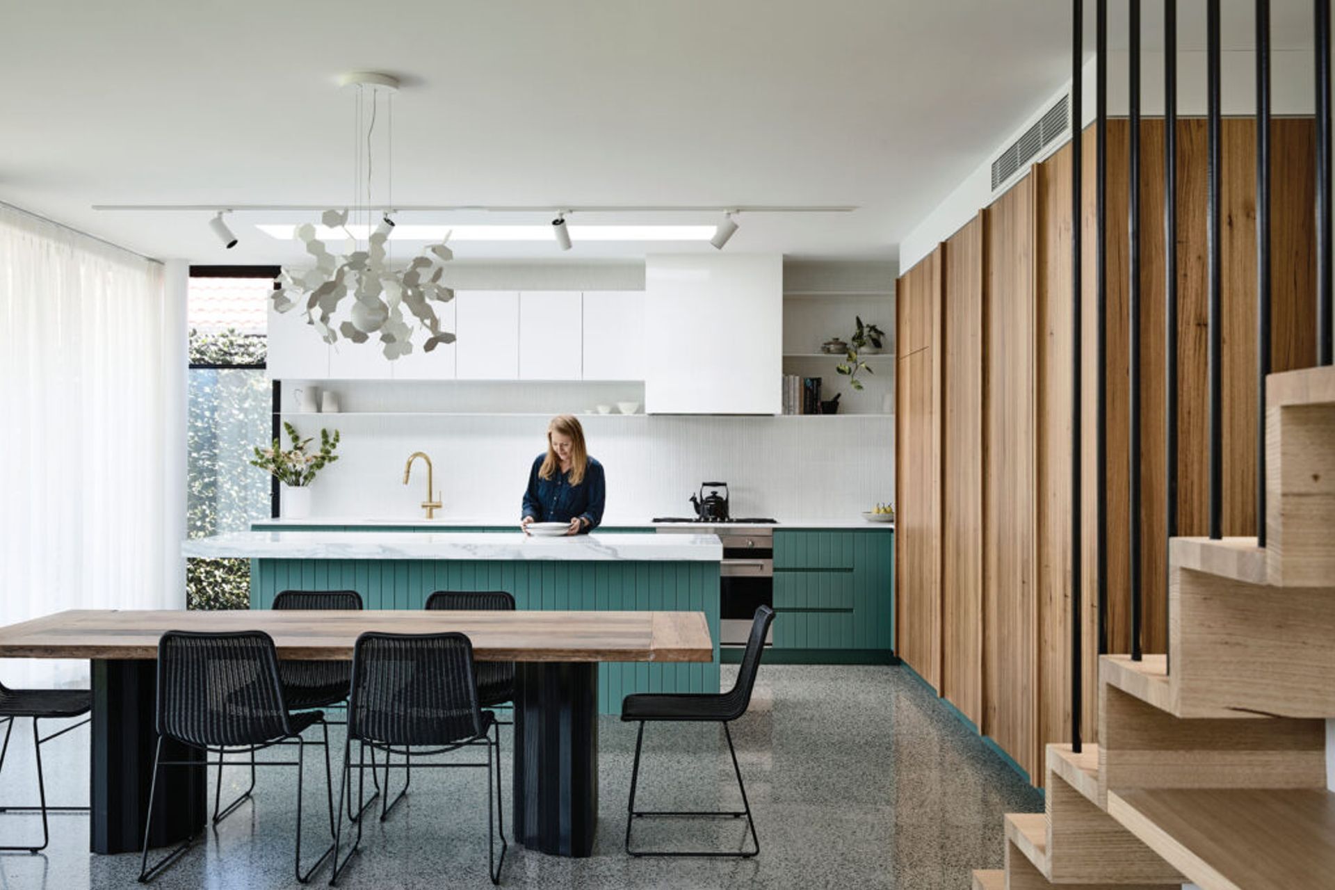
The rest of the ground floor extension is open and spacious, comprising the new kitchen, dining and living areas. They flow outside to encourage play and interaction, overlapping and borrowing light from each other to maximise every inch.
For example, concrete floors flow seamlessly from the living space right through into the backyard, which integrates beautifully with the outdoor dining area.
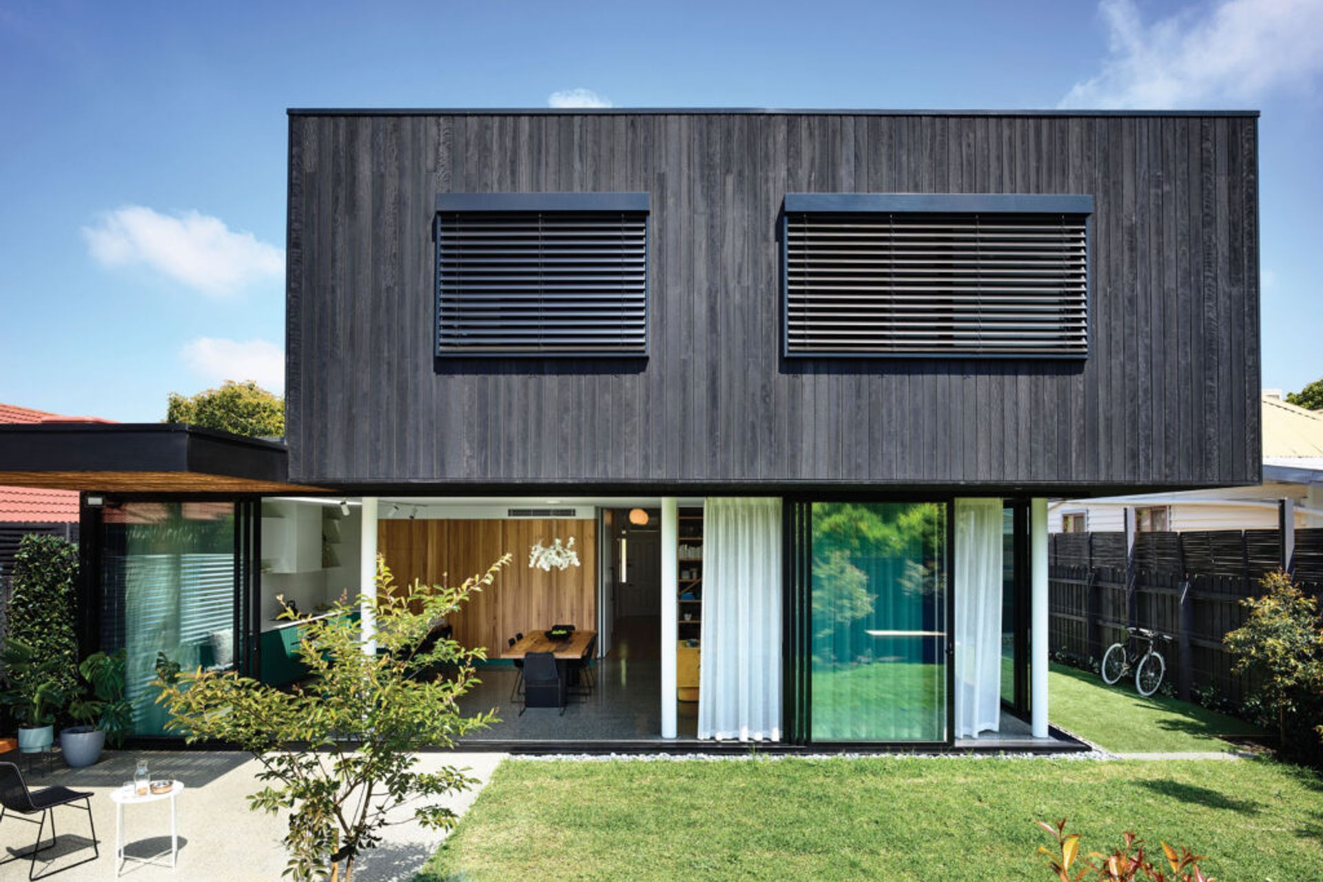
Furthermore, two sides of the house disappear via floor-toceiling glass doors, opening the indoors entirely to the outdoors, and doubling the sense of space from the shortened block.
Even the landscaping is highly detailed with banquette seating around the perimeter maximising space, providing plenty of space for the kids to play.
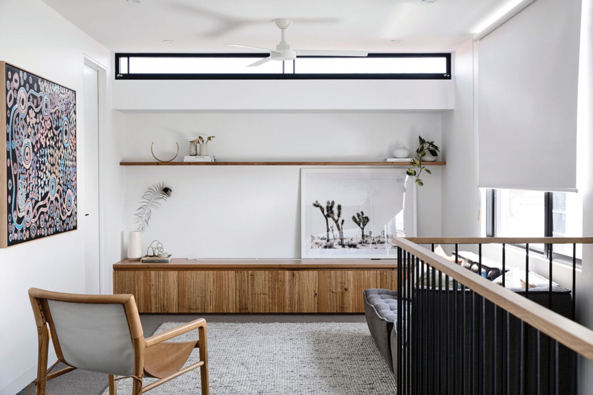
Upstairs, the cantilevered extension is solid and opaque by contrast. It floats over the rooms below and features a rumpus, two bedrooms for the children and a bathroom.
Again, the bookcase helps to mark the transition into the home’s family zone. The rising treads integrate with the upper shelves at the top of the bookcase, which are filled with an array of colourful children’s books.
“The stair void also draws a dramatic and functional shaft of northern sunlight deep into the ground floor rooms for passive solar gain,” Callery says.
Here, the house can be opened and closed, with operable external blinds on all windows for cross-flow ventilation and minimised energy use. The rumpus could become an extra study area as the children grow older, surrounded by leafy views over chimneys, established trees and rooftops that bring the outdoors in.
In a delightful twist on tradition, this house delivers more but doesn’t consume any extra than it needs. And it’s a case study of sustainable living that perfectly reflects its owners today and tomorrow.
