TWIN PALETTES - by HOME MAGAZINE

Interior Designer Luciana Borges’ clients had opposing ideas: one wanted light tones and neutrals, the other wanted dark, moody spaces, so the sensible compromise was to meet in the middle and deliver both.
So began the development of a palette that weaved light and dark together offering a journey of juxtaposition.
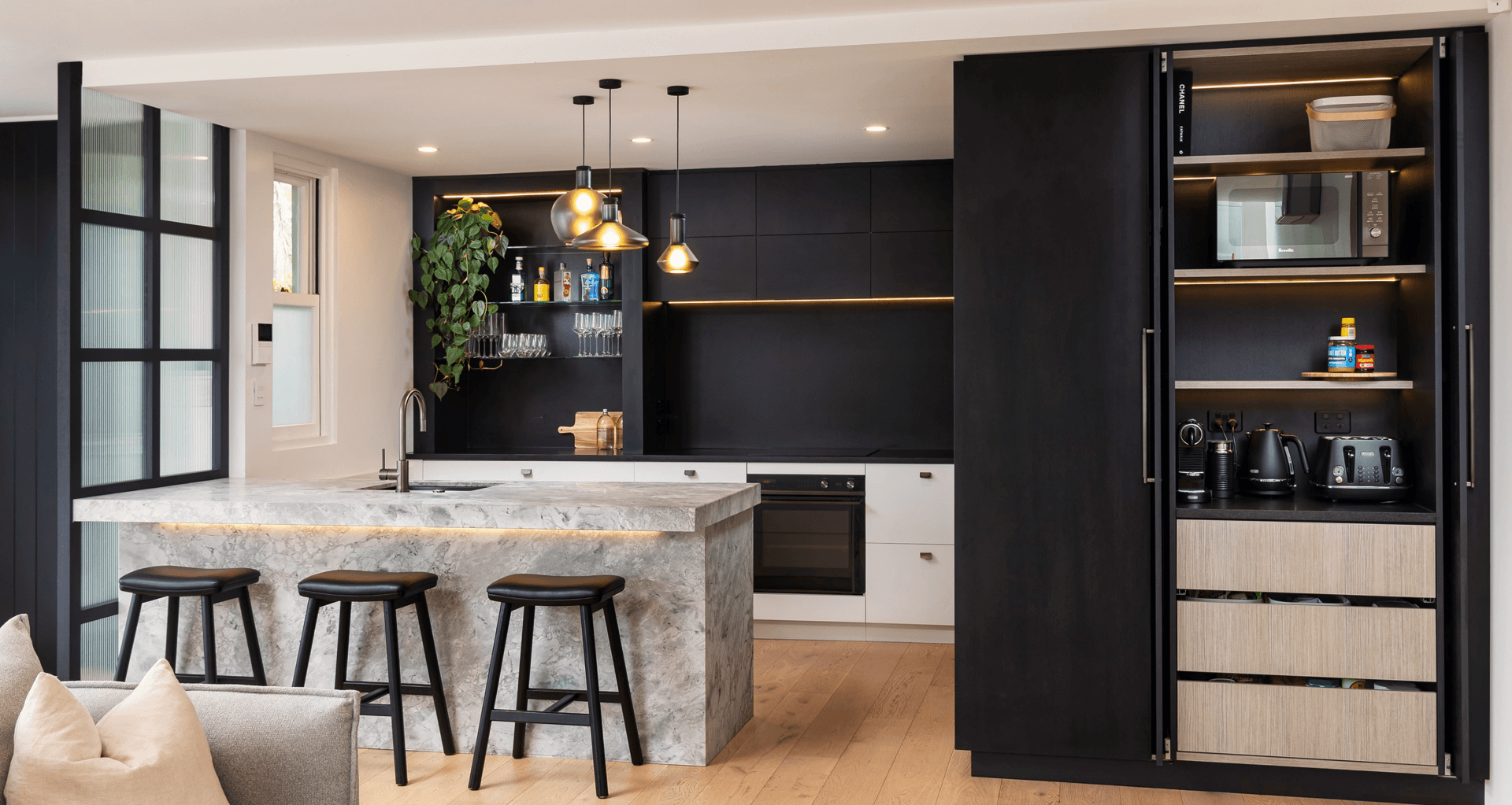
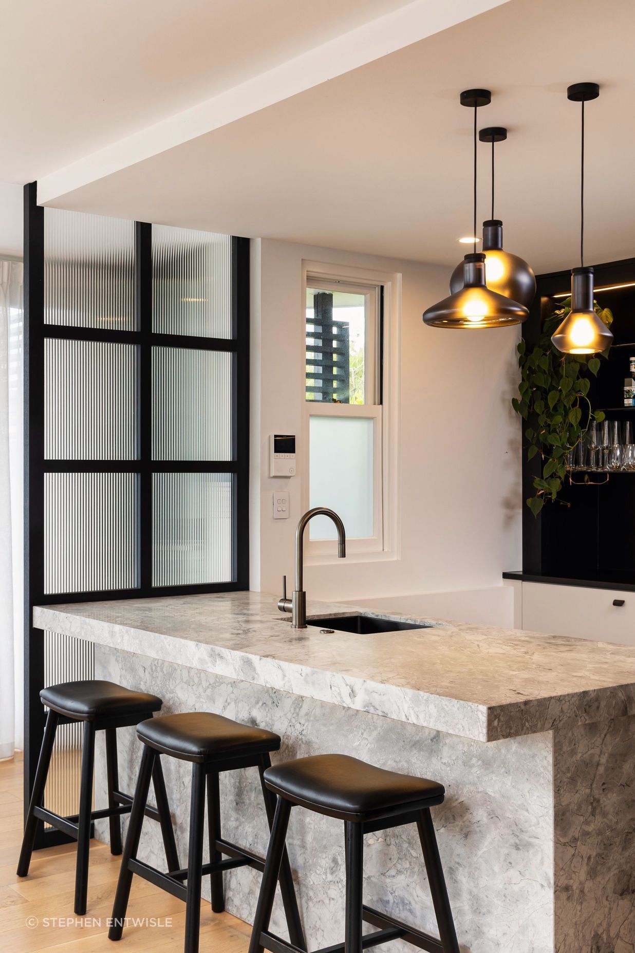
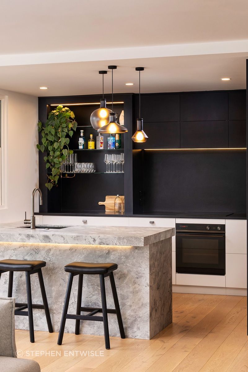
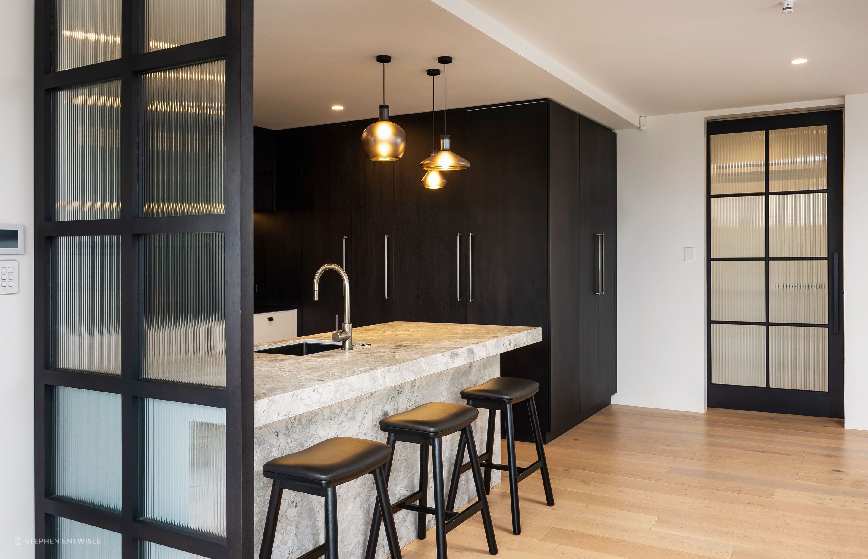
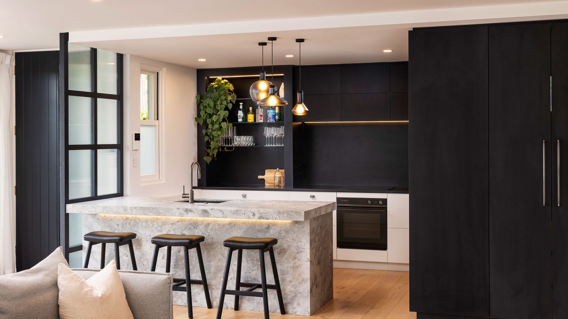
The Kitchen is where it begins, with what was a small space extended to incorporate the island and more room for entertaining. A Super White granite was chosen for the island, which sets the tones for the lighter hues; against it, above-bench Dark stained American oak cabinetry divided by the rear bench top, in black leather finish granite, gives way to bellow-bench cabinetry with a double pot lacquer finish in Quarter Surrender by Resene: together, they introduce the dramatic chiaroscuro of the story that runs through this home.
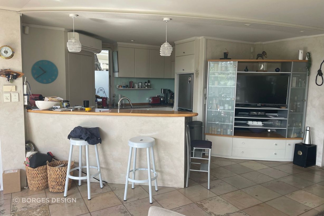
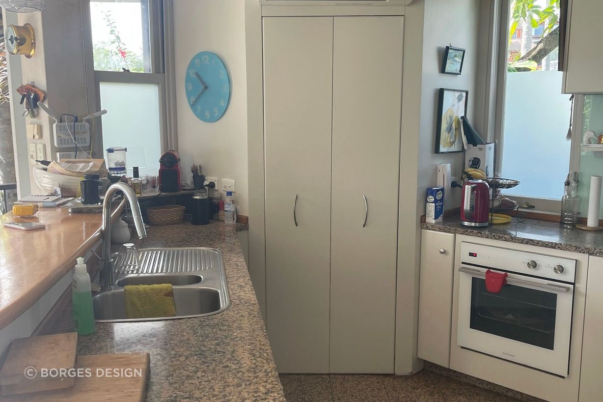
Take a look at the before the renovation pictures bellow.
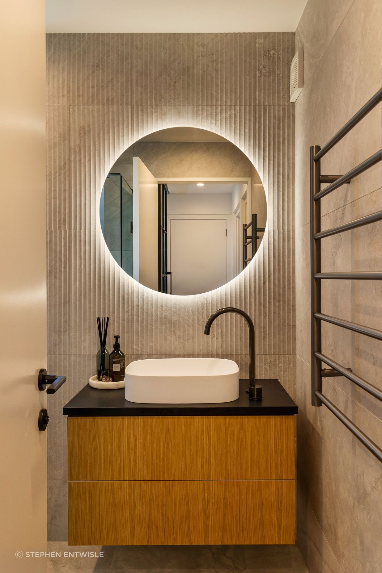
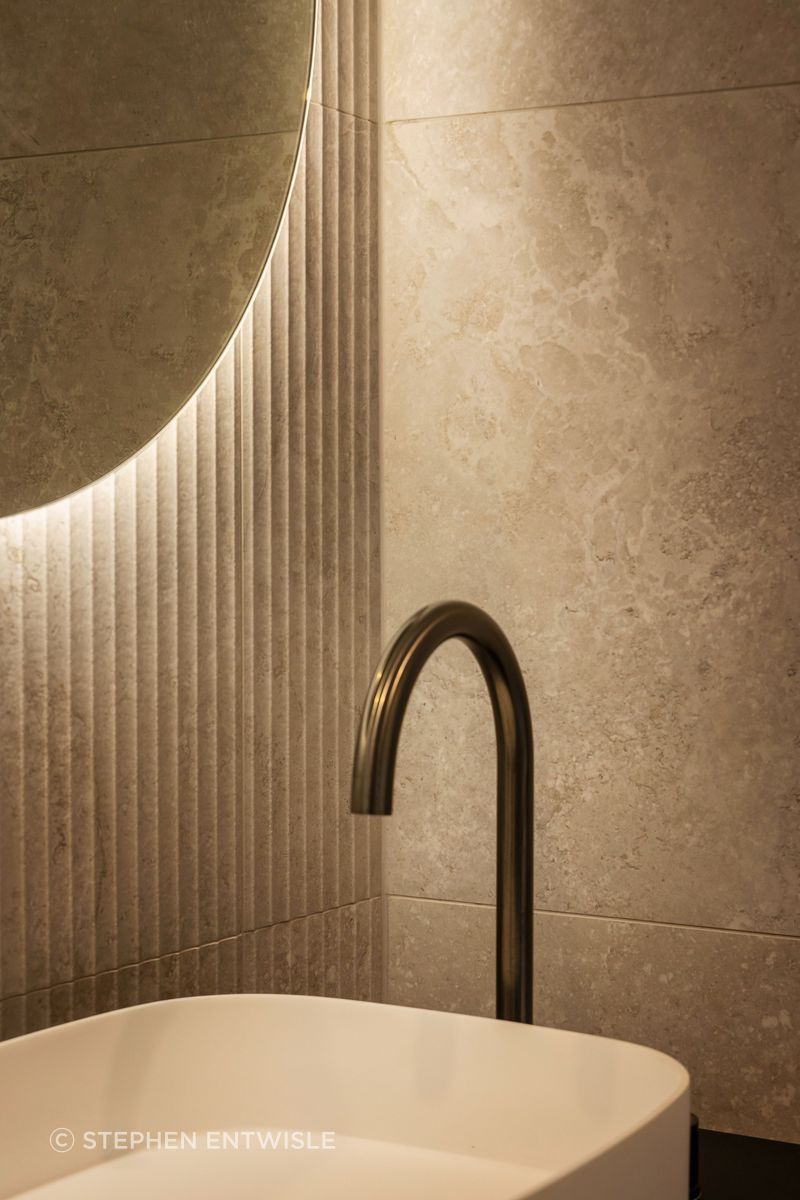
Downstairs, the guest bathroom embraces the light with subtle silver undertones in large format tiles that wrap floor and walls. Fluted tiles in the same colorway echo the ribbed glass of a Crittall door that separates the Kitchen from the entrance gallery.
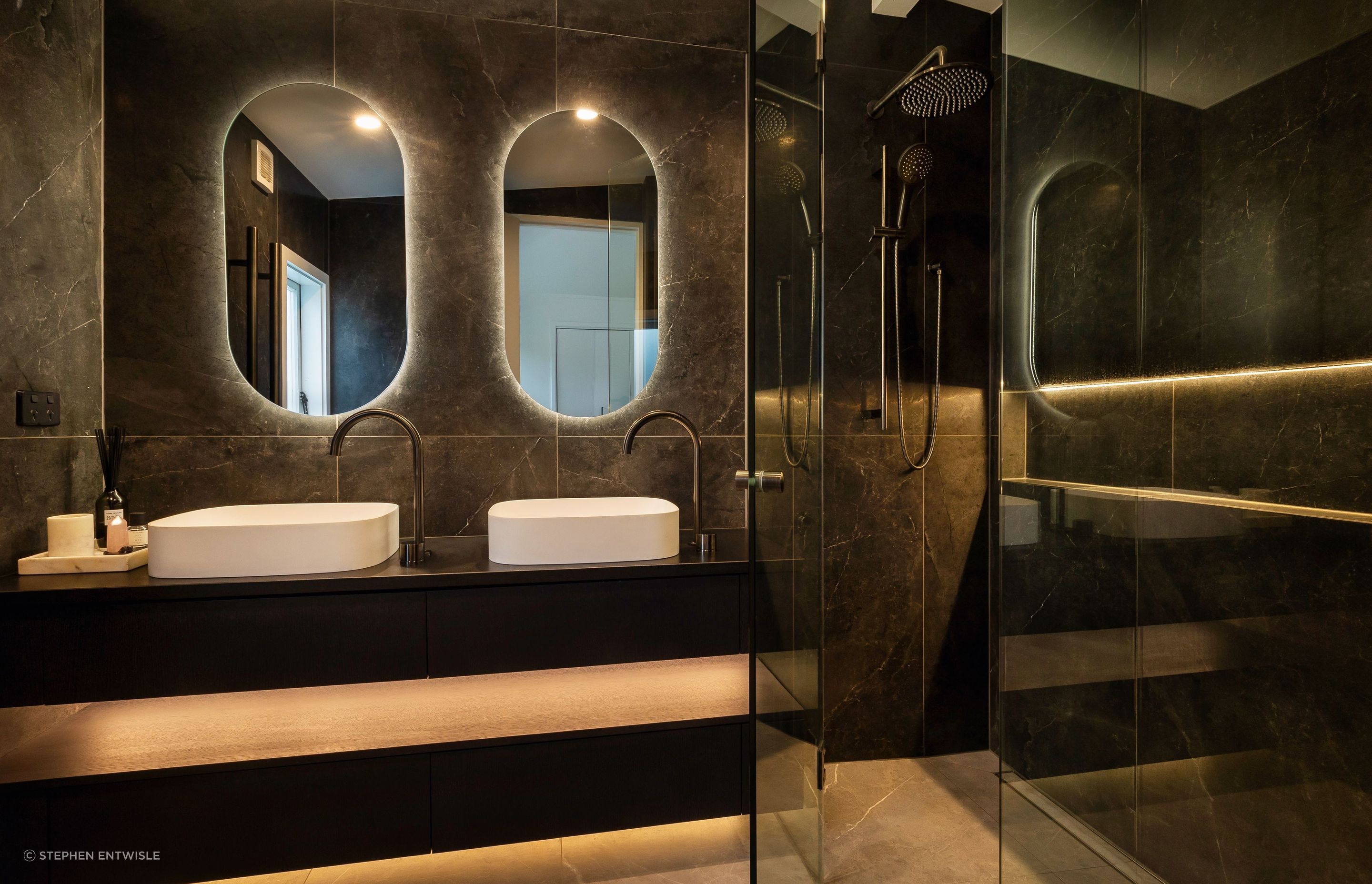
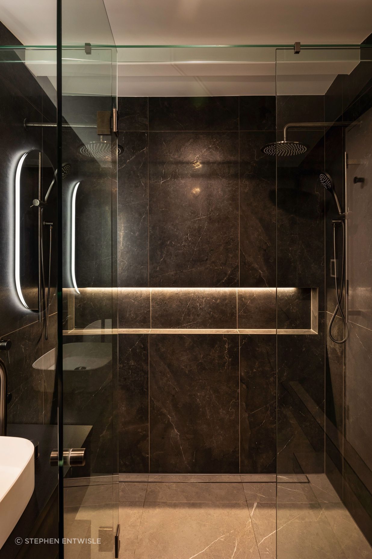
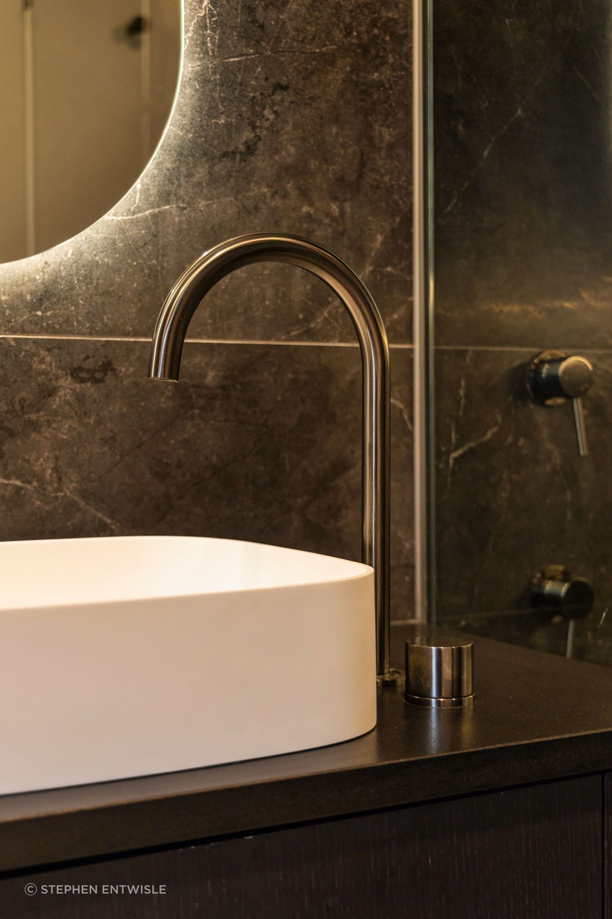
Upstairs the en-suite delves into opposing tones with deep charcoal tiles on the walls and light grey tiles on the floor creating an immersive moody retreat.
“We set out to create something modern and deliver two different design languages in one connected journey. I think we achieved that in here.”
Thank HOME for featuring our Westmere Renovation Project