Colour explained: how to create striking interior schemes
Written by
22 June 2020
•
4 min read
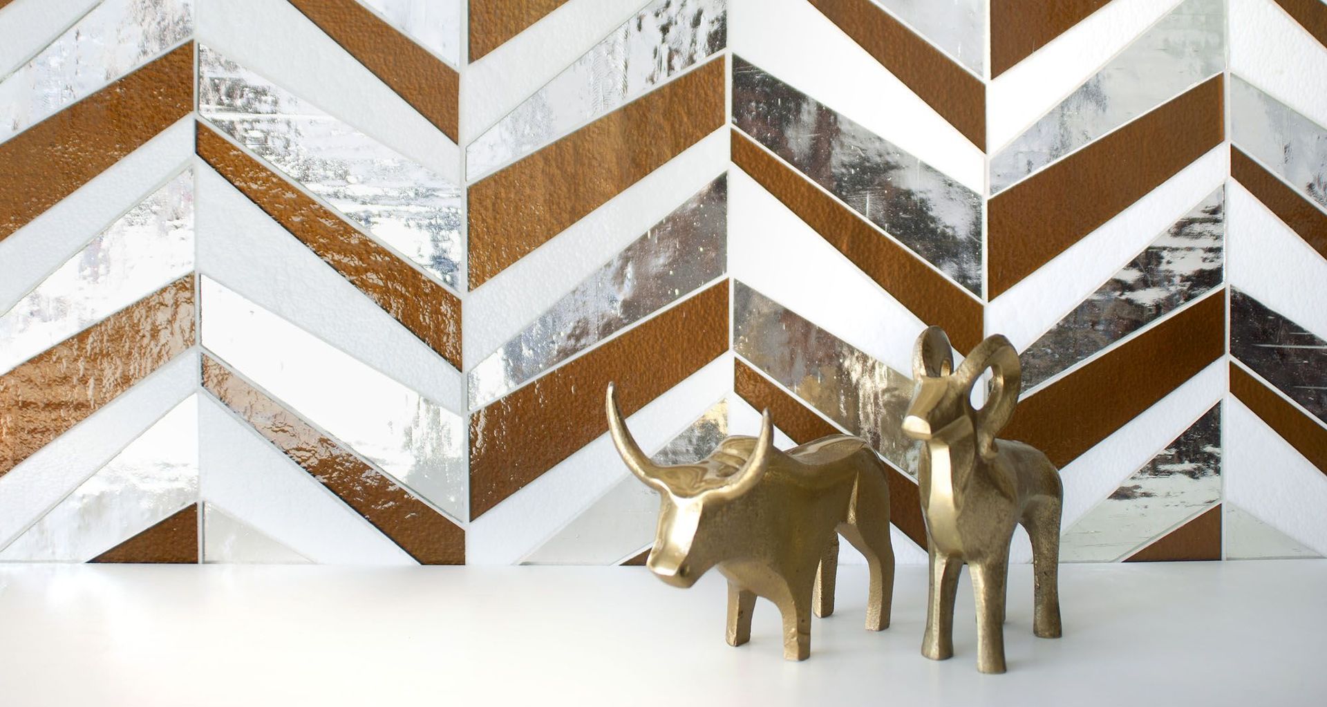
Creating the perfect colour scheme for your interior design isn't a science, it's an art. So while there are no unbreakable rules—if you like the way something looks, then it's a good colour scheme—there are some principles and guidelines you can follow to make finding that perfect colour scheme a little easier.
Some basic colour terminology
It's helpful to first understand some of the basic terms and principles behind colour.
It all begins with the primary colours, of which there are three; red, yellow, and blue. These are the three base colours that can't be made by combining any other two colours, and as such are the foundation of all the other colours.
Secondary colours are those which can be made from mixing two of the primary colours together. The three secondary colours are orange (a mix of red and yellow), purple (blue and red), and green (yellow and blue).
Then there are tertiary colours. These are made up of combinations of both primary and secondary colours.
Primary, secondary, and tertiary colours can be laid out in the form of a colour wheel of 12 distinct colours. Starting from red and moving clockwise on the wheel below, you can see the pattern: primary colour, tertiary colour, secondary colour, tertiary colour and then on to the next primary colour, with the three colours between red and yellow being combinations of the two in different concentrations.

Why are these concepts important? Because when viewed in the context of a colour wheel, they can make it easier to find colours that work together well. As will be explained, the combination of a colour wheel and certain design principles can act as a map of sorts for finding visually appealing colour schemes that work.
Beyond the colour wheel
Neutral tones, such as black, white, or a combination of the two in the form of grey, can be used to create new forms of regular colours.
While the terms are sometimes used in different ways, in general darkening a colour by adding black is known as shading, lightening a colour by adding white is tinting, and adding both with grey is known as creating a different tone.
What are the basic types of colour schemes?
There are a number of strategies and principles that can help you to find a visually appealing combination of colours.
Complementary colours
The first and most basic is using complementary colours. Complementary colours form pairs and are found on the opposite sides of the colour wheel. The nice thing about complementary colours is that they create contrast between each other, but in a way that's appealing and not garish.
With two complementary colours, you can fill in the rest of the space with more neutral tones like whites or beiges to provide the space and room for those colours to shine.
Analogous colour schemes
Another method for finding a colour scheme is to choose analogous colours, which are found side by side on the colour wheel. Analogous colours provide less contrast than complementary colours from the opposite side of the wheel, and therefore can create a more understated palette.

Monochromatic colour schemes
The other common way of choosing a colour scheme is by picking one main colour and using only variations - different tones and tints - of that colour in the scheme. This is known as a monochromatic colour scheme, and it can create bold and powerful spaces when done well.

How much of each colour should you use?
Once you've decided on the colours you want to use, the 60-30-10 rule can be a useful way to think about how much of each of them should be used within the room.
The idea is that 60 per cent of the room should be the first colour (or variations of it), 30 per cent of the room should be your second colour, and only 10 per cent should be the third colour. These percentages apply to everything in the room, from the walls and the floor, to the furniture and decor.
Bright colours can be particularly effective as accents, but should generally only make up 10 per cent of the entire scheme. Rather than painting a wall in a powerful, bright tone, for example, a few smaller splashes among neutrals, blacks and whites will really make the colour stand out, despite not using all that much of it.

Are you ready to start planning a colour scheme for your interior? Get in touch with one of our professional interior designers or interior decorators for expert advice.
<sup>Top banner image credit: </sup><sup>Kohler</sup>