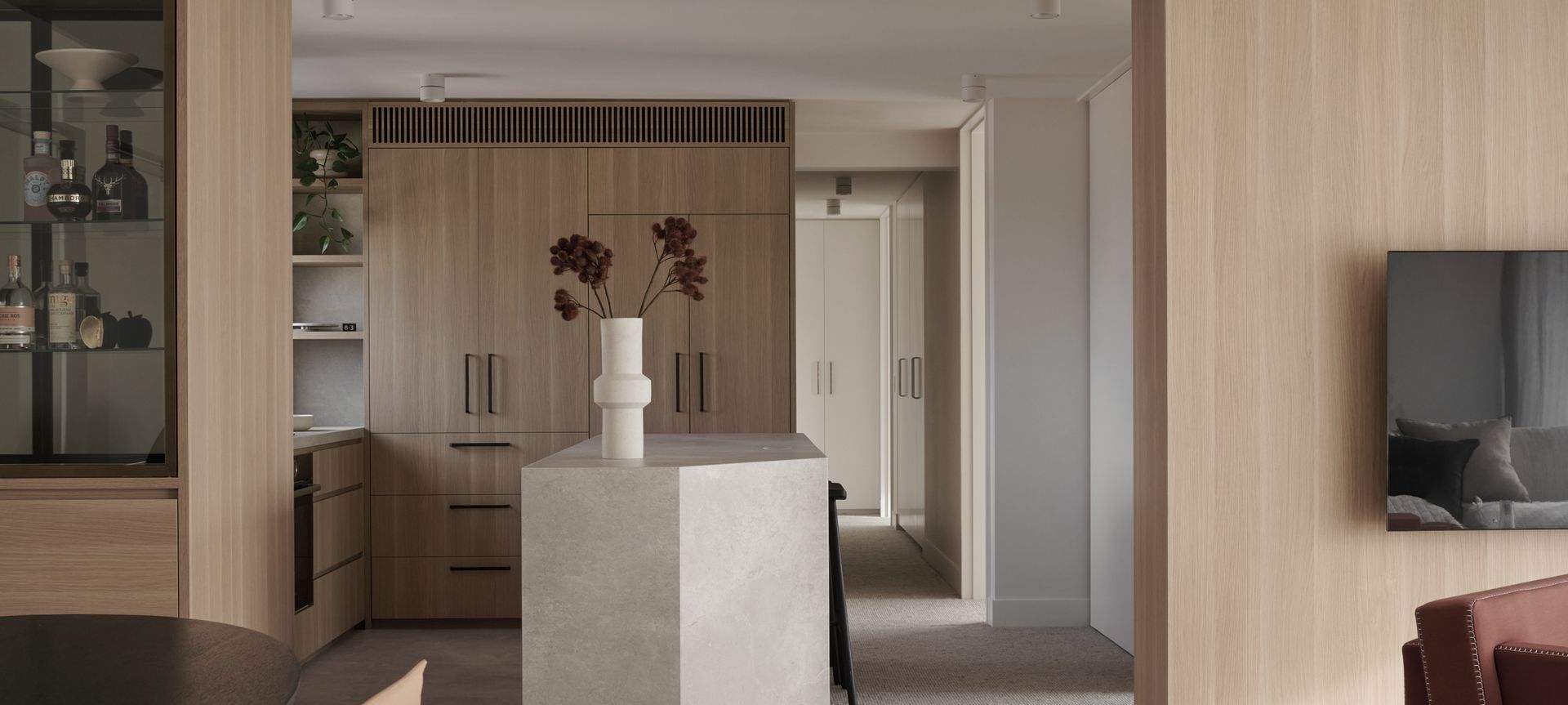
This humble abode is tucked away in Melbourne’s oldest apartment block, designed by Australian architect Robin Boyd in 1962. The owners of the property wanted to refurbish the apartment with all the comforts of contemporary living and engaged architectural design firm S&K Group to manage the project in 2021. The design approach was led by director and architect, Paul Kegen.
“Being one of the larger apartments in the complex, the new design needed to open up the kitchen and living spaces, provide an ensuite to the master bedroom and a study suitable for two people,” says Paul. “The overall brief for the materiality was neutral, warm and pared back in order to embrace the incredible uninterrupted views of the city, right over the Royal Botanical Gardens.”
Reconfiguration
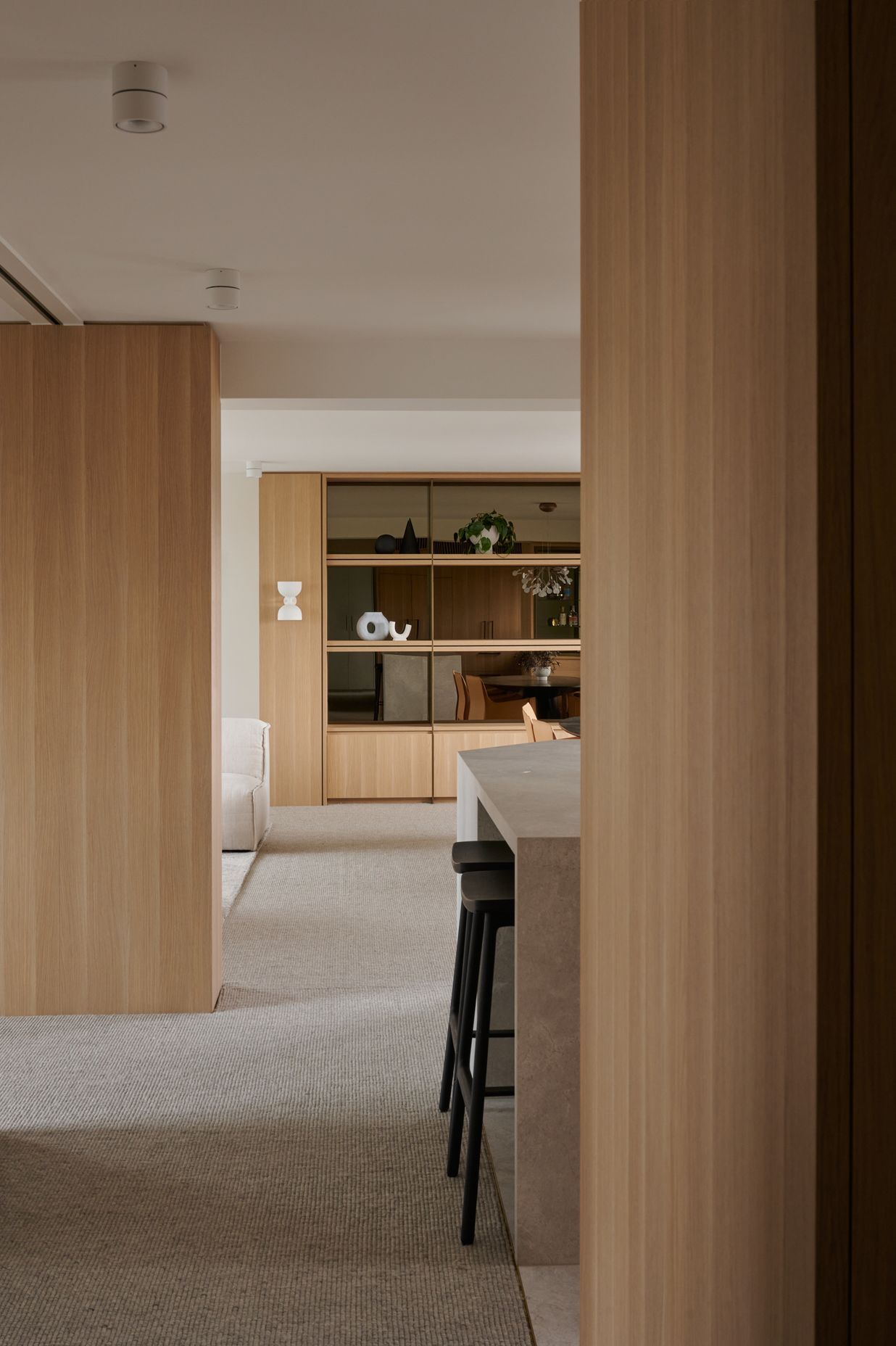
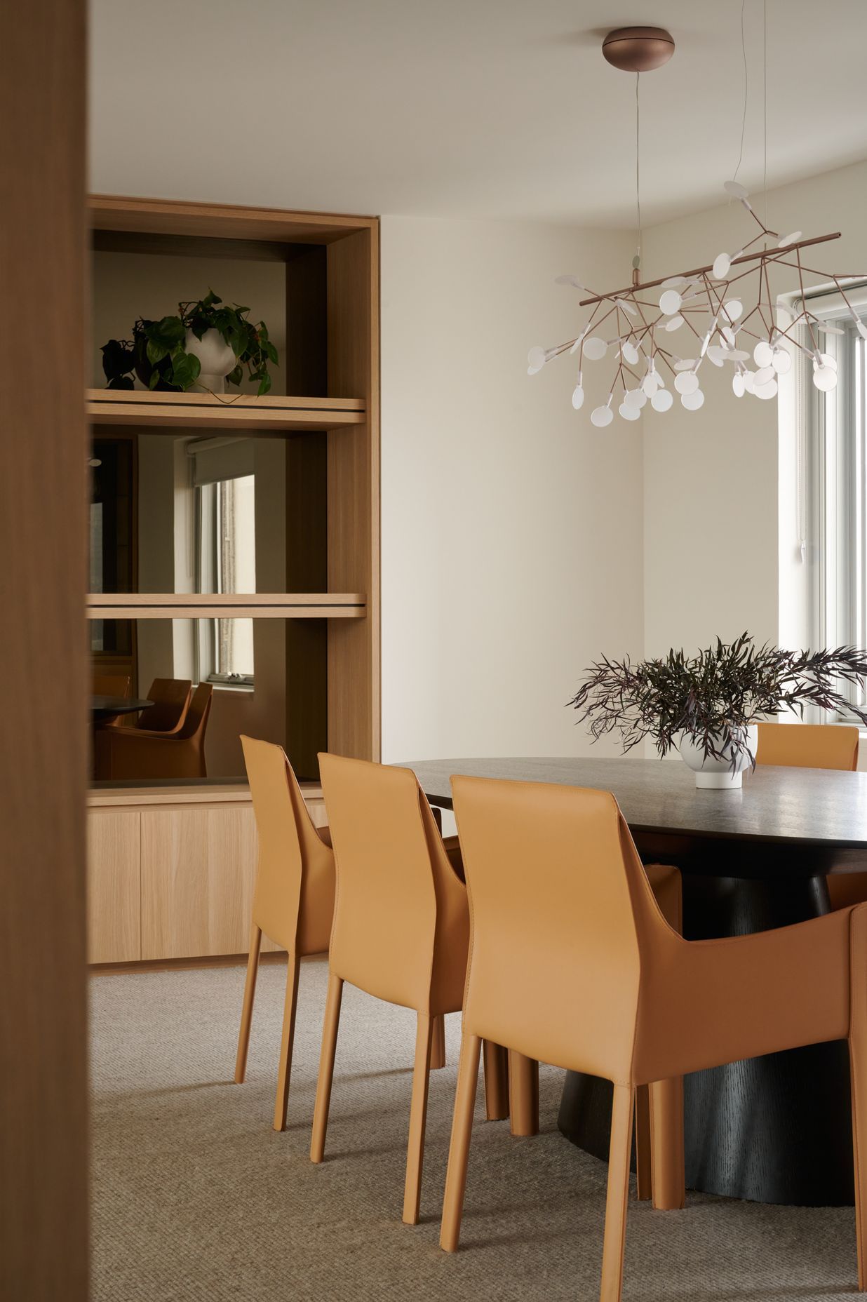
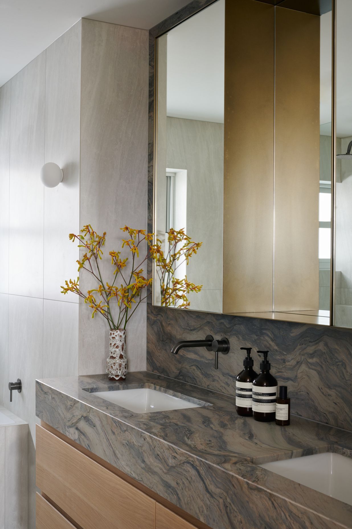
While fulfilling the brief didn’t require severe structural changes, existing spaces were reconfigured to accommodate the desired spatial planning. The kitchen, dining and living rooms were opened up to create an open-plan layout. The original dining area was converted into a study space that could comfortably fit two people working from home, and the main bathroom was closed off and connected to the master bedroom to create an ensuite. The original laundry, powder room and shower room were merged in order to construct a functional main bathroom.
“It was important to connect the apartment to the northern aspect it shared with the Botanic Gardens and the sweeping view of the city skyline,” says Paul. “So was increasing functionality throughout the apartment, so we paid particular attention to areas such as storage, multi-use spaces and connected family living.”
Read now: A 1940s brick cottage imbued with masculine elegance and contemporary sensibility
Project hurdles
S&K Group began working on the project during the pandemic, and the ongoing lockdowns and restrictions in Melbourne soon affected the availability of many of the materials specified for the project, forcing the team to endure long wait times and delays in orders, but the biggest challenge was replacing the original floor. “The ceiling height and flooring substructure was historically very low and also proved a challenge in order to comply with the strict apartment acoustic regulations,” adds Paul. “Removal of the original flooring, leveling and preparation for modern day standards was one of the biggest challenges.” The project took 18 months to reach completion in 2022.
Design language
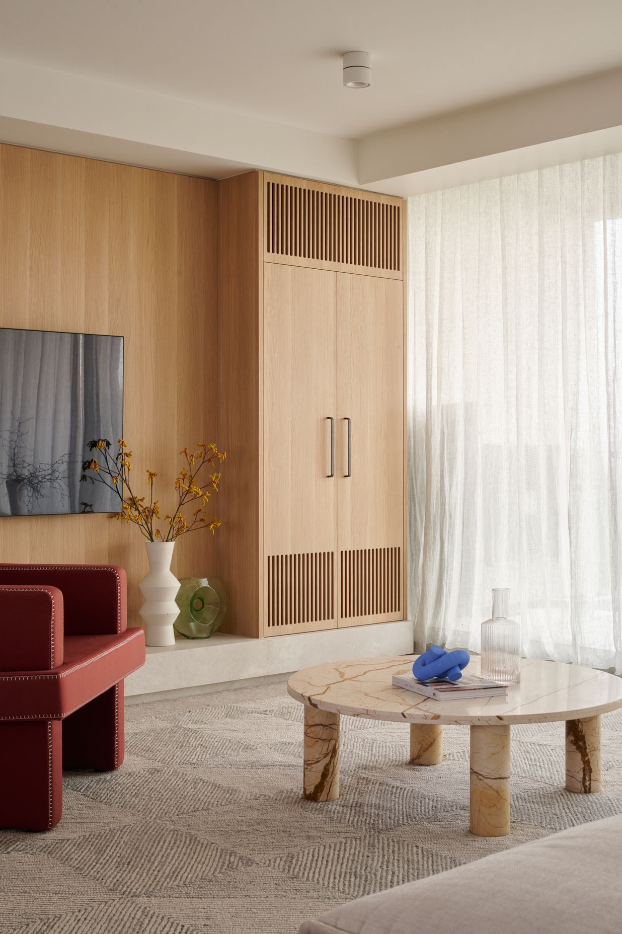
A classic neutral colour palette was chosen to ensure timeless appeal and longevity of design. “Neutrality and warmth were design components employed to ensure the surrounding views were framed and maintained,” says Paul.
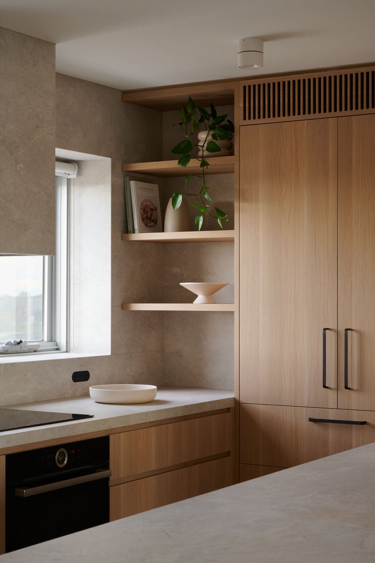
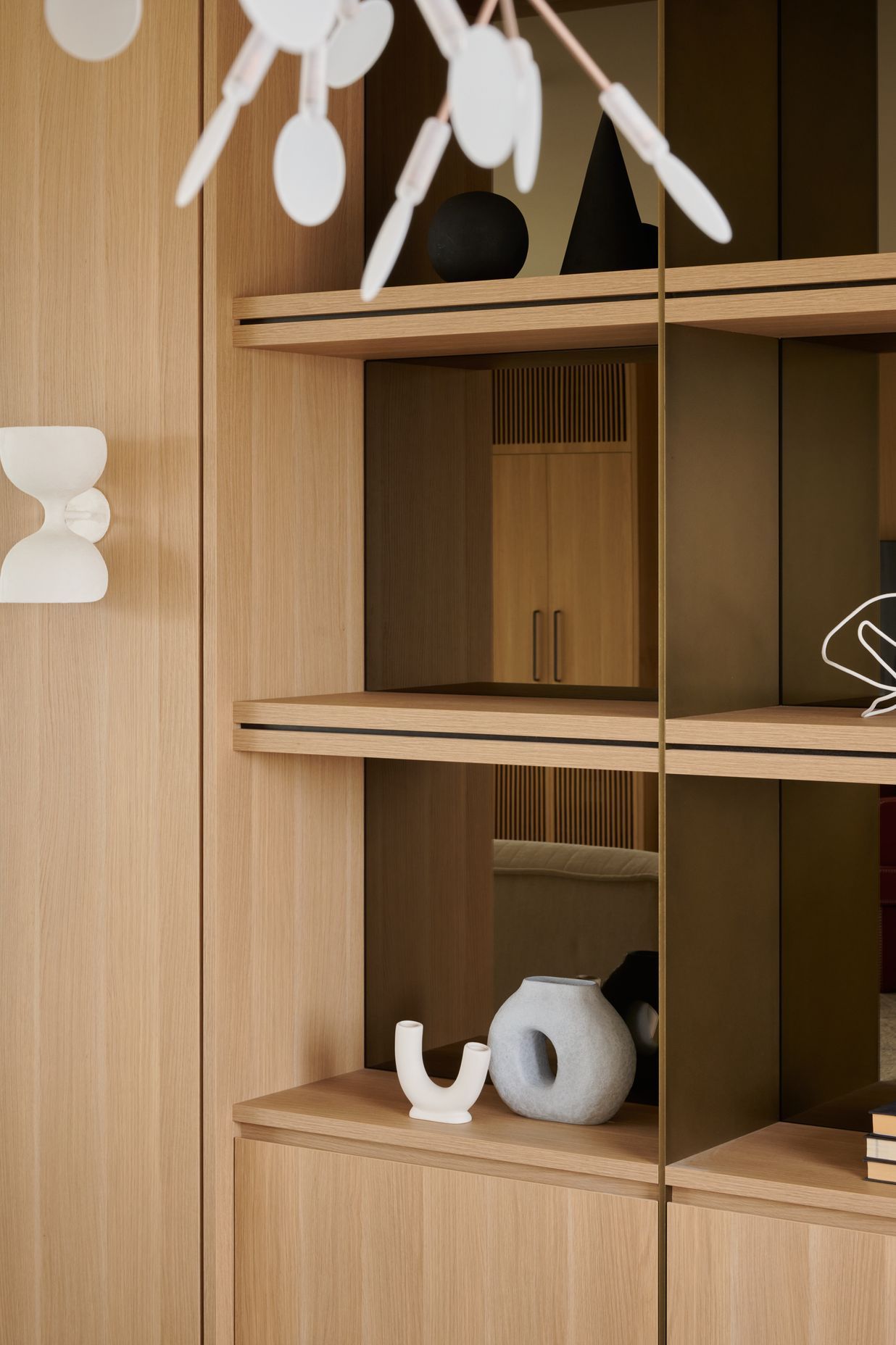
The materials palette features a selection of timber veneer, porcelain, natural stone, leather and bronze to create a pared-back aesthetic that invites natural light into the home while directing the gaze towards the wonderful view of the city and gardens. “Mirrors appear in the living room display joinery to add depth, while timber veneer can be found throughout the apartment to create continuity, warmth and acknowledge the apartment’s original timber joinery,” says Paul. “We also chose to wrap some features, such as the rangehood, in stone to match the splashback and blend into the space rather than draw your eye to it.”
Final outcome
While S&K Group opted to follow a contemporary design path, certain elements of mid-century design – and the building itself – influenced the creative interpretation of the brief.
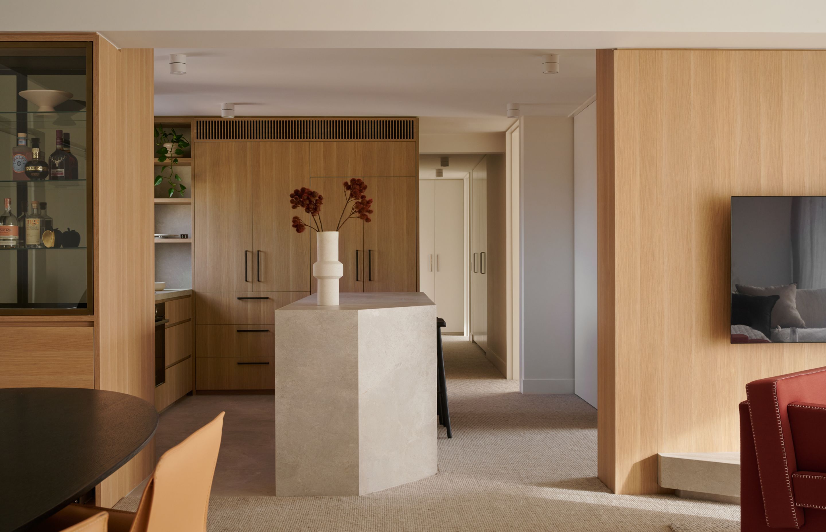
“This project was an exercise in providing modern living in an historic shell,” says Paul. “Some of these elements remained throughout the process and can be seen in the final design, such as the monolithic form of the kitchen island, clean lines and timber veneer throughout the apartment.”
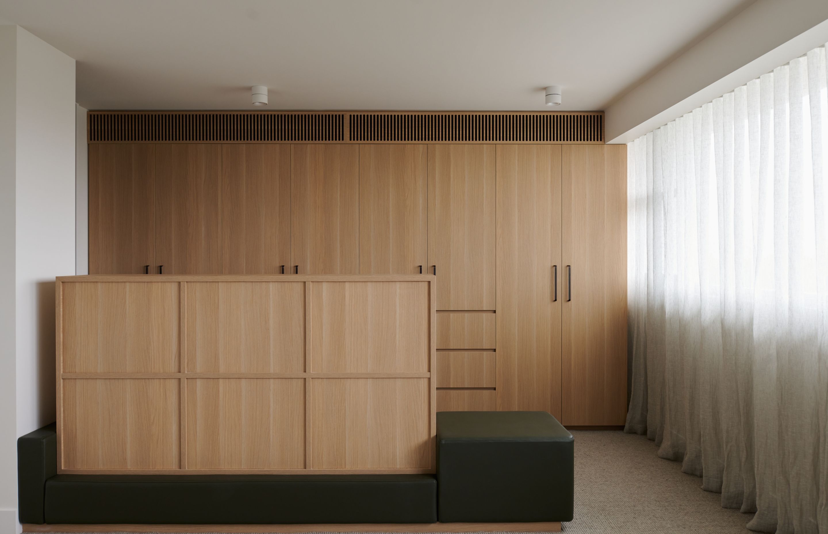
However, Paul’s favourite feature of the home is the the dividing low-height joinery in the master bedroom. “The bedroom was proportionally too large for a bed and a robe, so this unit was designed to provide excess drawer storage and a seat at the end of the bed for putting on shoes. In some ways it acts as a walk-in robe, without being a closed space,” says Paul.
See more beautiful projects by S&K Group on ArchiPro.
