About
Butcher & Farmer Design.
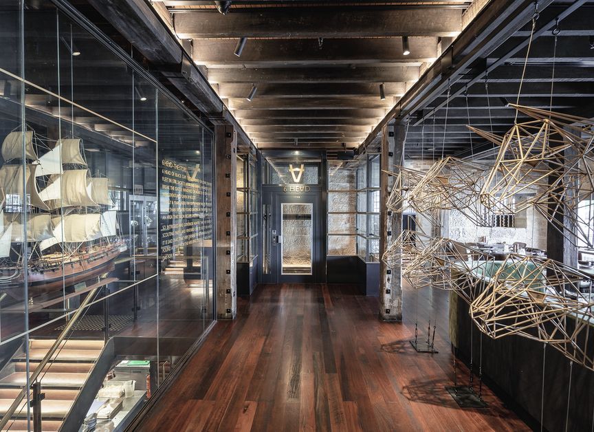
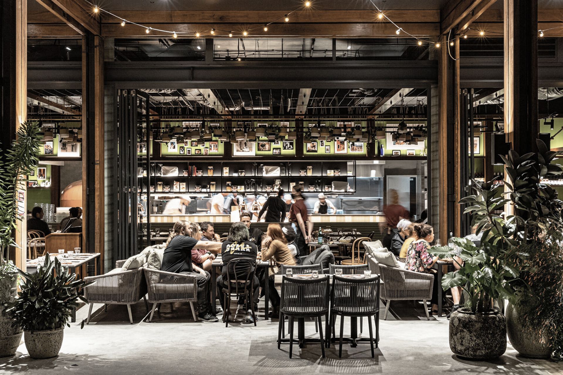
ArchiPro Project Summary - Butcher and The Farmer: A contemporary marketplace-inspired restaurant design that fosters community interaction through thoughtful spatial planning and a blend of eclectic materials, completed in January 2019 for Seagrass Boutique Hospitality Group.
- Title:
- Butcher and The Farmer, Interior Design
- Interior Designer:
- COOOP
- Category:
- Commercial/
- Hospitality
- Completed:
- 2019
- Client:
- Seagrass Boutique Hospitality Group
- Photographers:
- Seagrass Boutique Hospitality Group
Project Gallery
Views and Engagement
Professionals used

COOOP. Our studio specializes in design for behaviour.
We have done so for almost 30 years and in this time we have learned a tremendous amount about how people behave naturally and instinctively within these social environments. We have learned the hard way that in order to design successful venues, we needed to place predictive human behaviour at the heart of what we do. We capture succinctly how most people behave most of the time in order to design spaces for the most joy and ultimately the most success. This assists us in capturing the spirit of place.
Founded
2016
Established presence in the industry.
Projects Listed
61
A portfolio of work to explore.
COOOP.
Profile
Projects
Contact
Project Portfolio
Other People also viewed
Why ArchiPro?
No more endless searching -
Everything you need, all in one place.Real projects, real experts -
Work with vetted architects, designers, and suppliers.Designed for New Zealand -
Projects, products, and professionals that meet local standards.From inspiration to reality -
Find your style and connect with the experts behind it.Start your Project
Start you project with a free account to unlock features designed to help you simplify your building project.
Learn MoreBecome a Pro
Showcase your business on ArchiPro and join industry leading brands showcasing their products and expertise.
Learn More