Caroma on Collins banner

What is the point of a physical showroom in the age of internet shopping? What is the value of an “Australian brand” when we live in a global society with global supply chains? How as consumers, do we choose wisely when there are so many products on offer?

These are some of the questions we attempted to answer through our investigation of the showroom experience in Caroma on Collins.

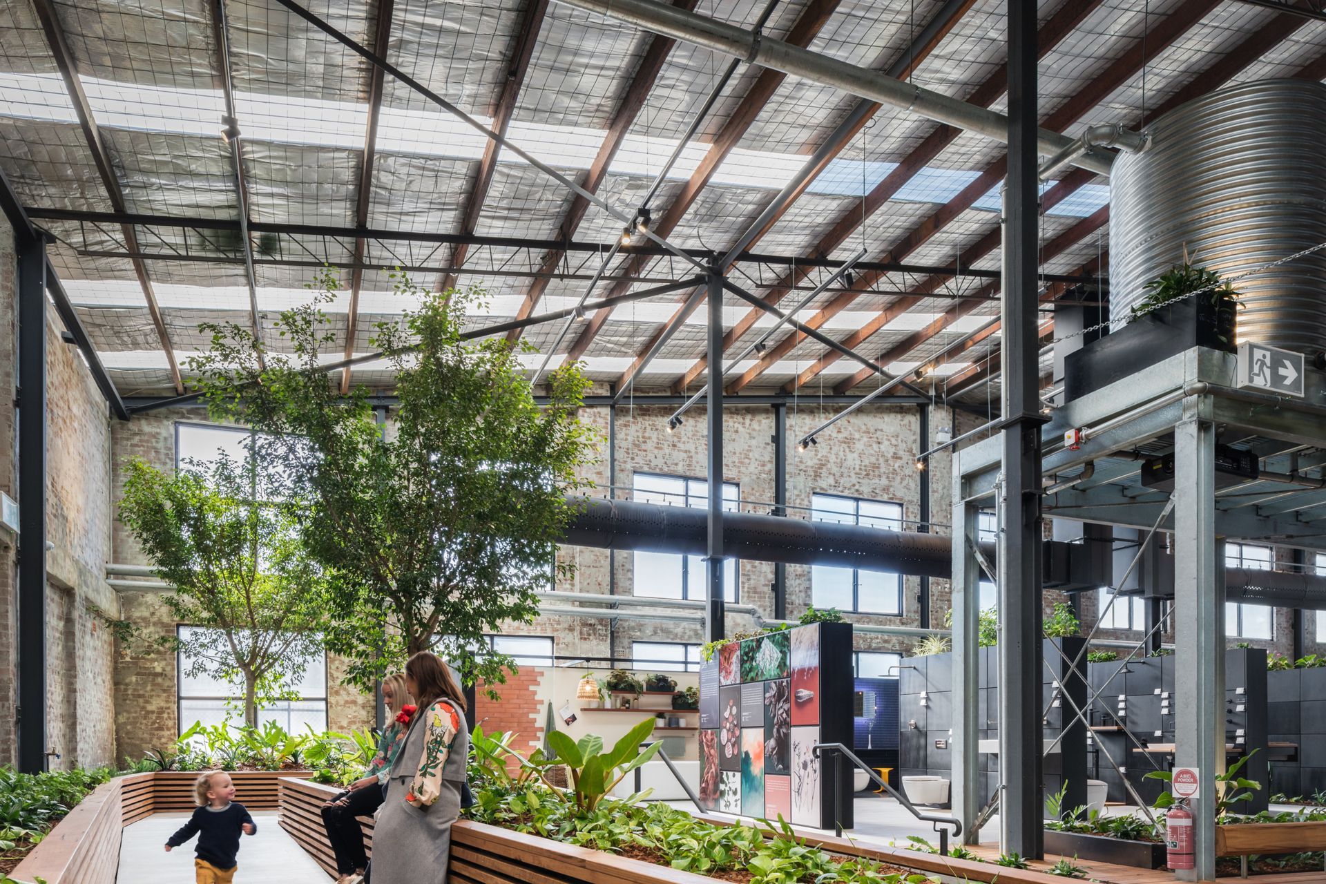
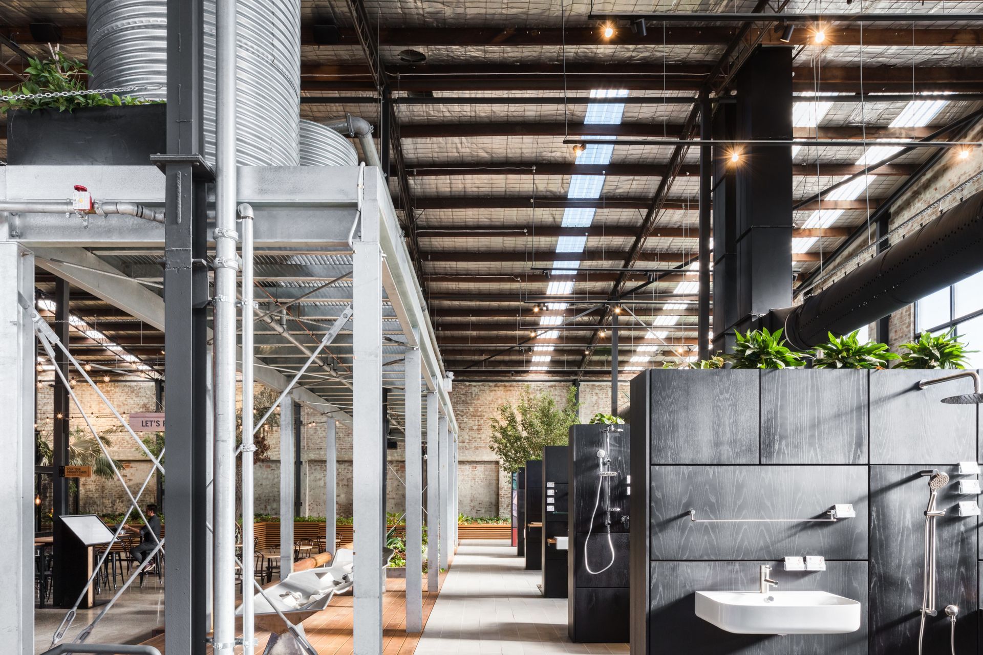
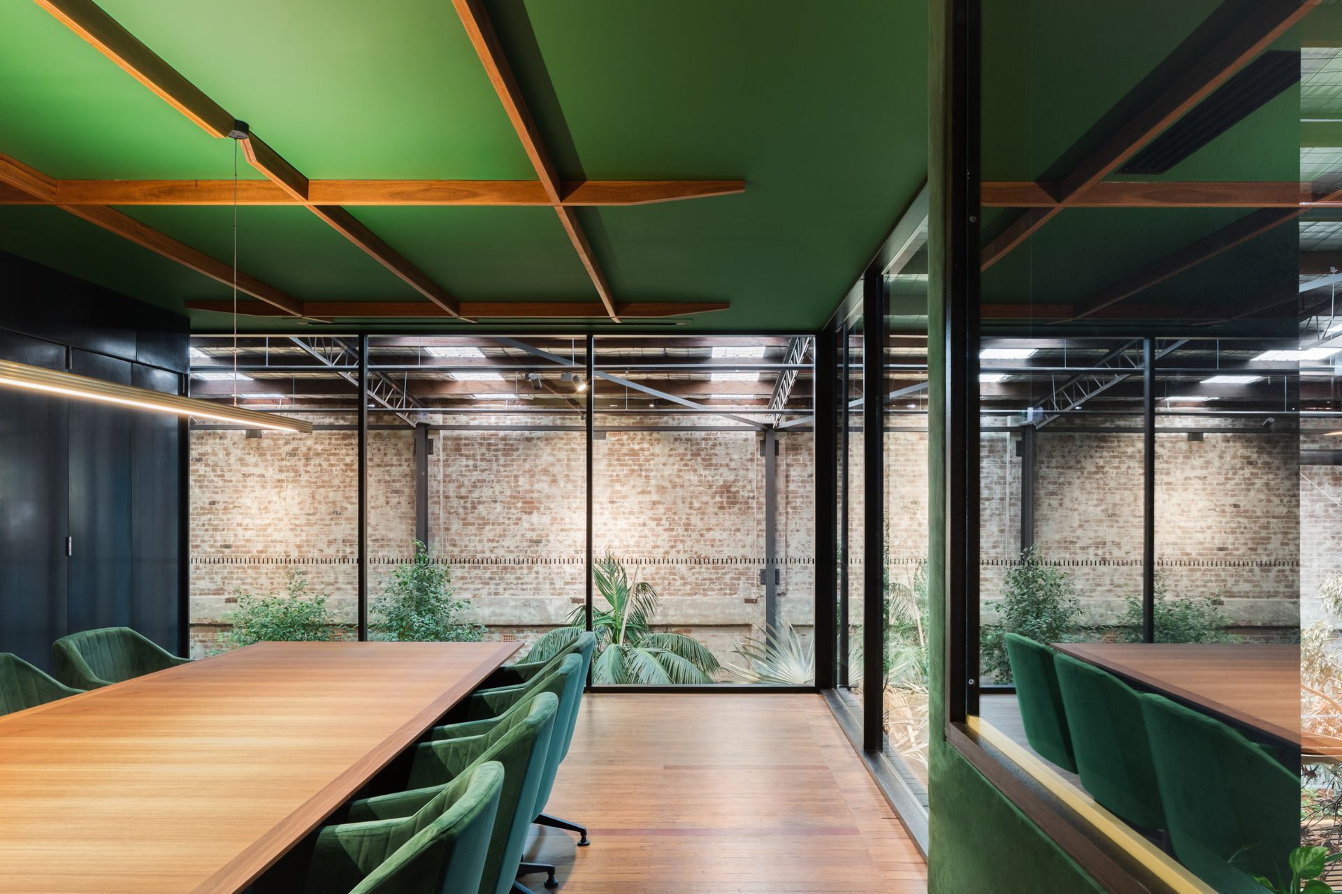
The project embodies a familiar Australian brand and seeks to communicate its values through volume, symbol, and material rather than signage, marketing strategy, and slideshow images. The project uses physical space to provide what the internet cannot; a customer experience that is unique in both emotion and pace, and that communicates as much to the body as it does to the intellect. Instead of pushing products onto customers in a traditional showroom manner, Caroma on Collins offers a space in which to breathe, sit, slow down, explore and experience.

The brief was simple, make physical the values and history of Caroma.

Contained within that simple brief was a much deeper conversation around Australian culture, innovation, and sustainability. All too often brands wish to turn away from their past and become “aspirational”, although this is not Caroma. Caroma is the plastic taps at your Nana’s house that are still kind of hip, the cistern that is still working after 30 years, and the bath you sit in with your first child.

This type of history deserves more than plasterboard walls with square set ceilings, it deserved an honest narrative that is rich with texture and symbolism.

Firstly, there is the agenda of our studio – this includes producing spaces that reach occupants on an emotional, almost instinctual level rather than solely a cerebral or visual one. We don’t want people to simply see our spaces but to feel them.

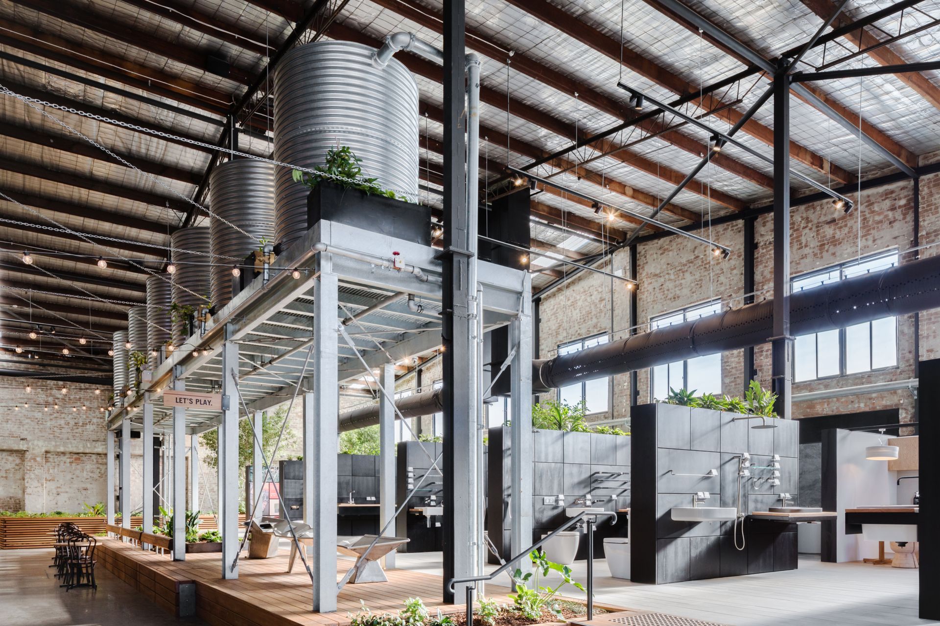
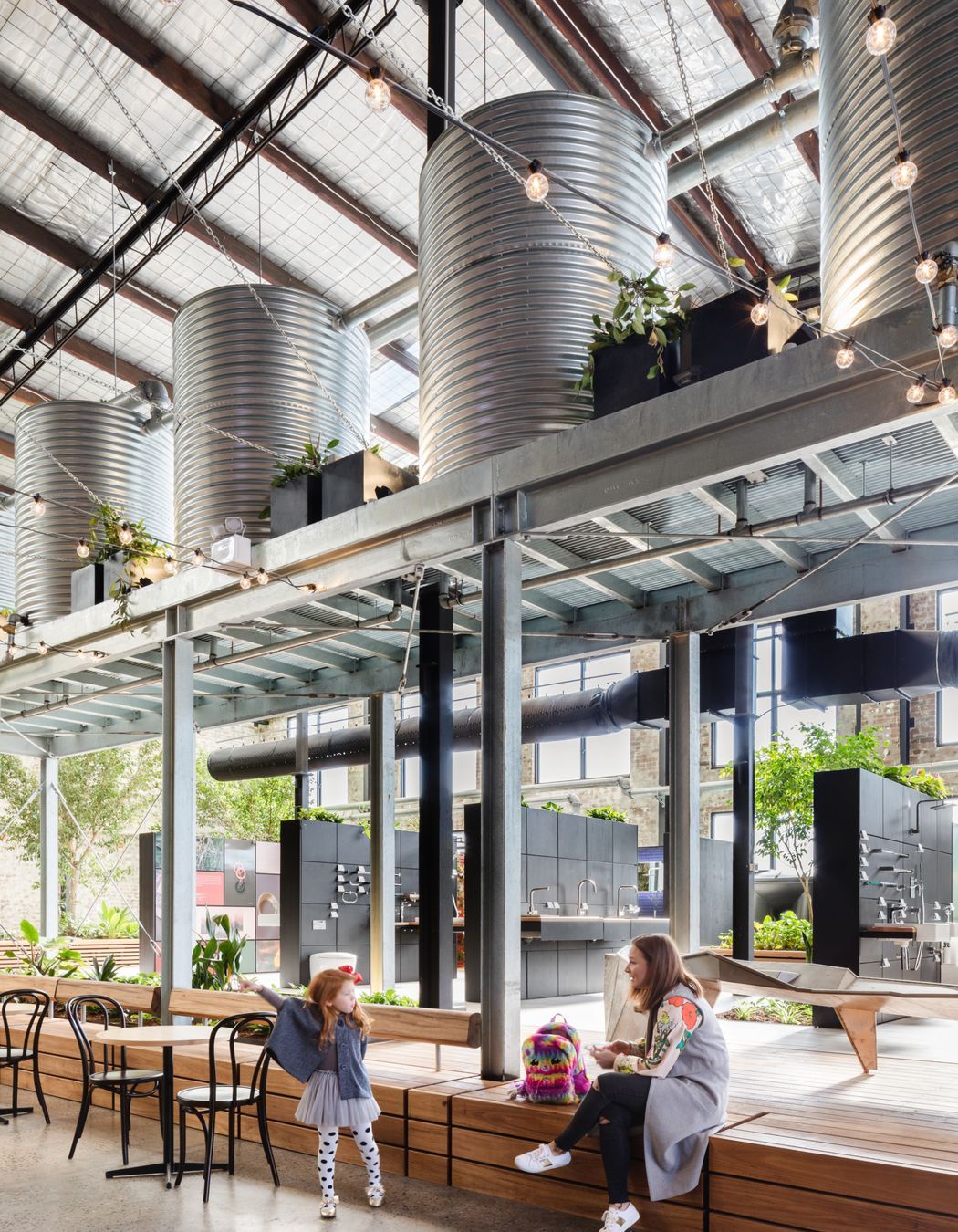
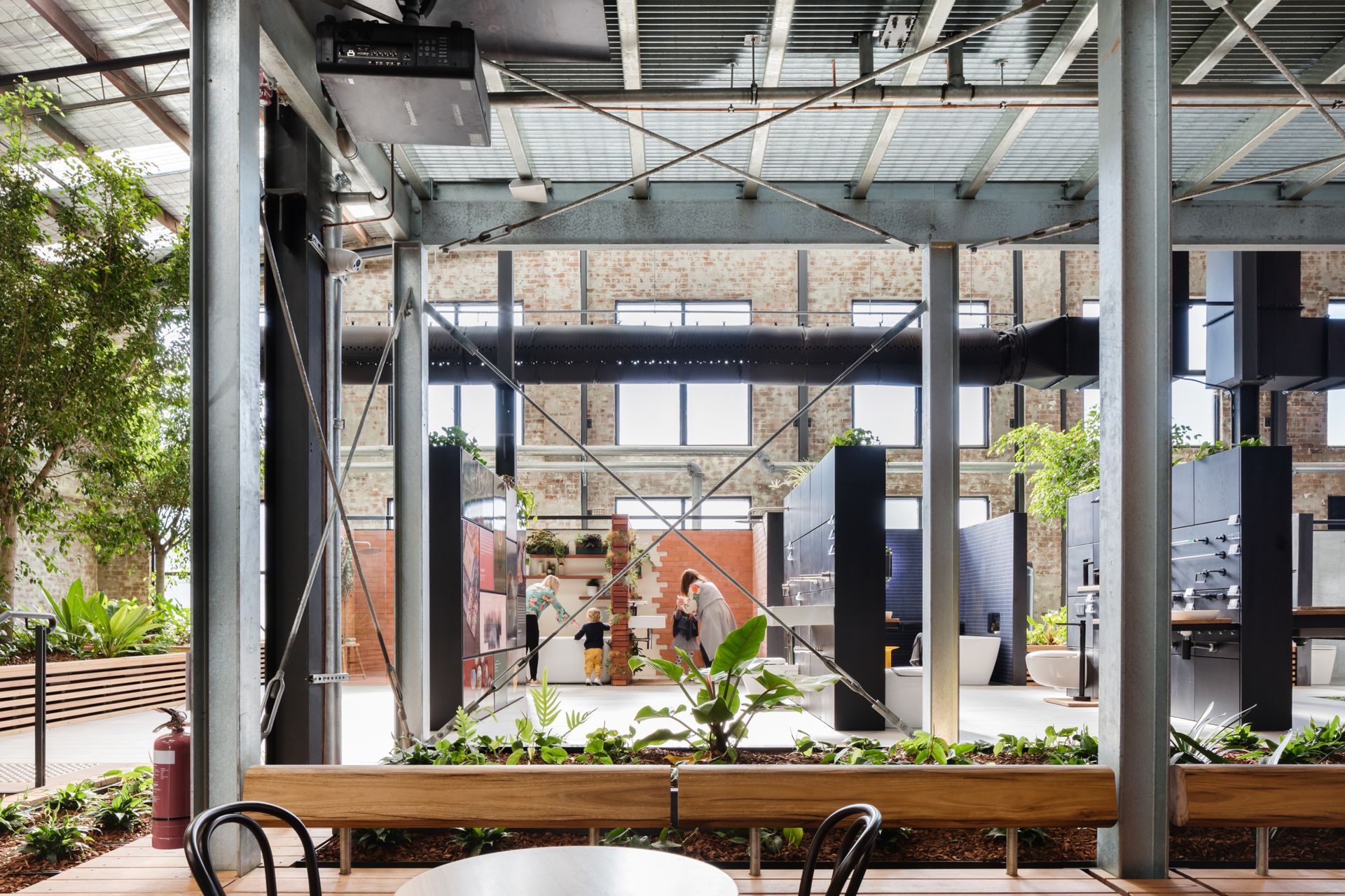
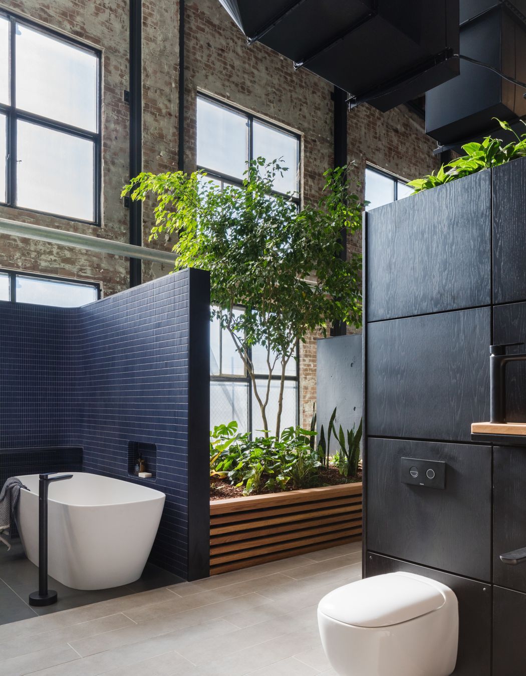
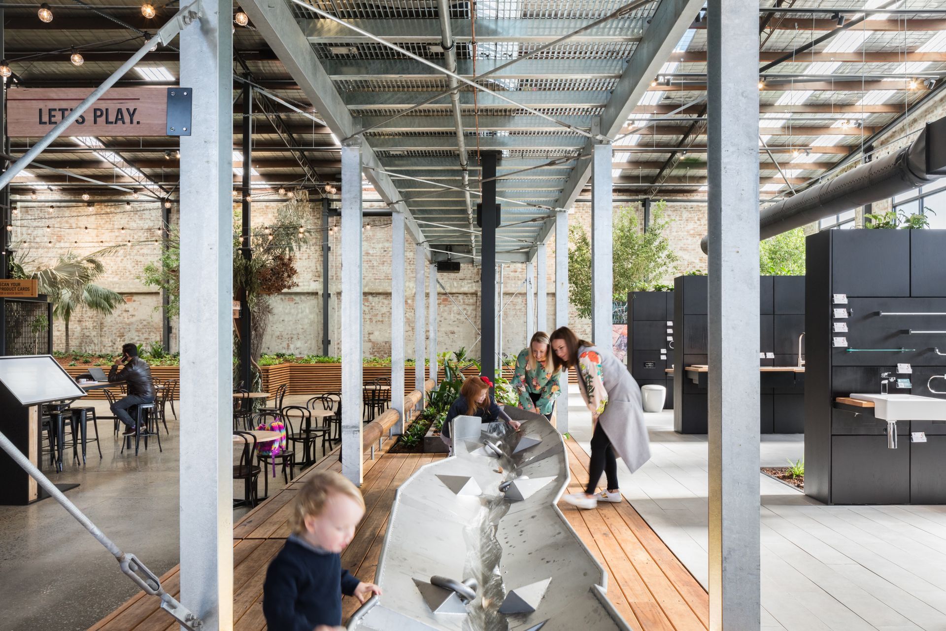
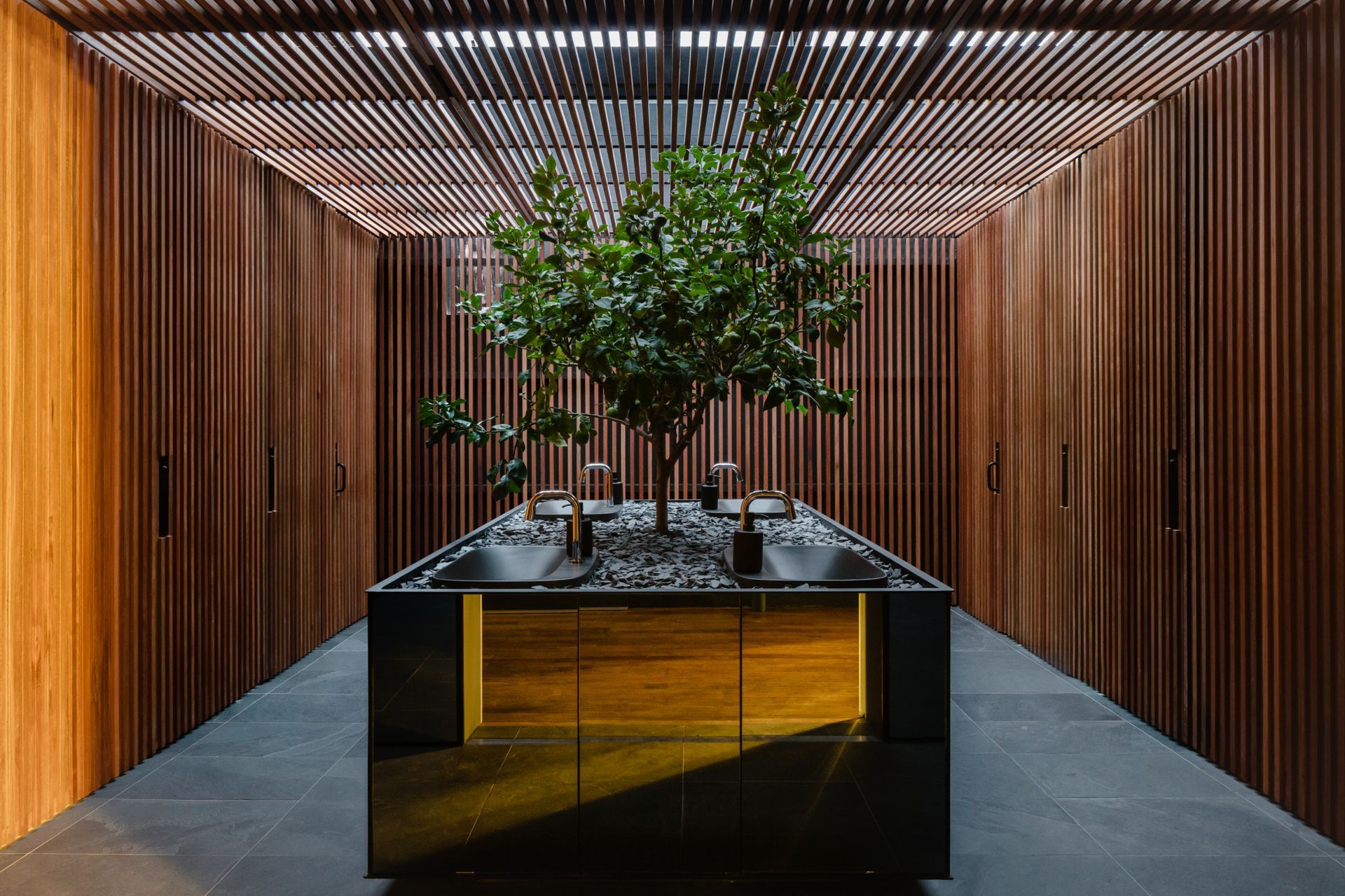
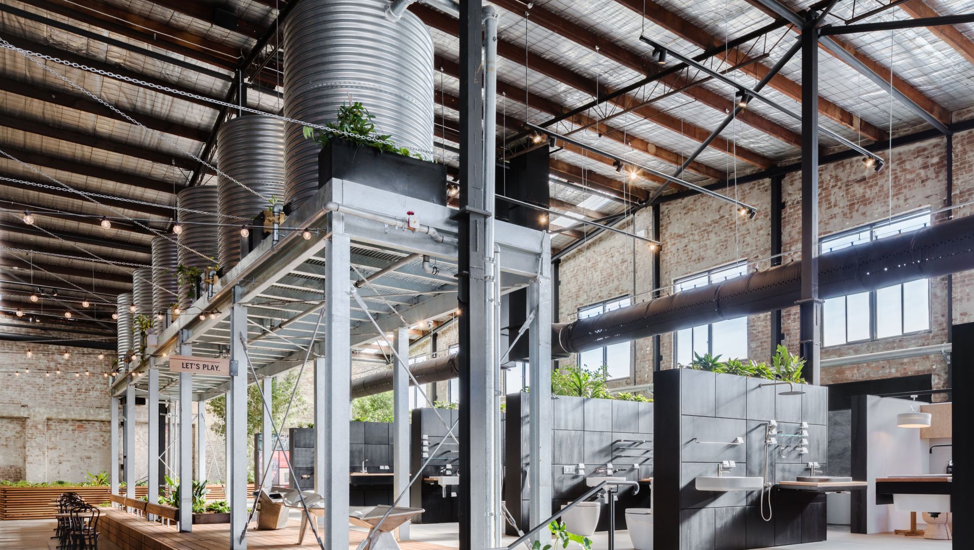
Secondly, we wished to communicate Caroma’s values through symbol and material rather than a superficial marketing strategy. For instance, the galvanised water tanks are a nod to the Australian pioneer, the recluse farmer who valued water above all else and who had to innovate and adapt to survive. Then there is the lemon tree that sits in the bathroom, speaking of a time when one was conveniently planted near the back door acting as a make-shift second bathroom.

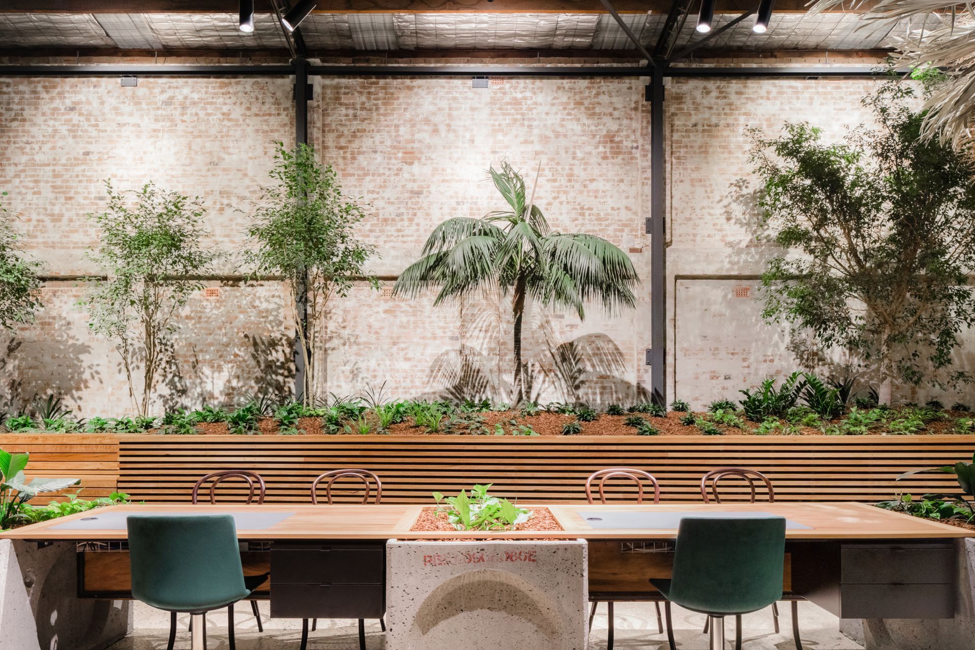
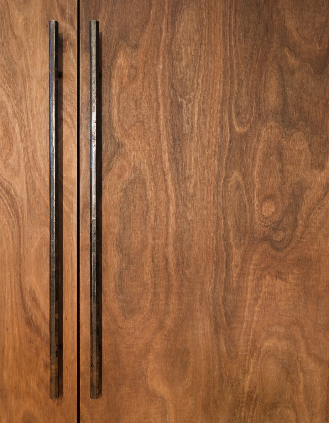
Material selection was also important, with the use of mild steel and spotted gum, materials which age gracefully, developing character over time.

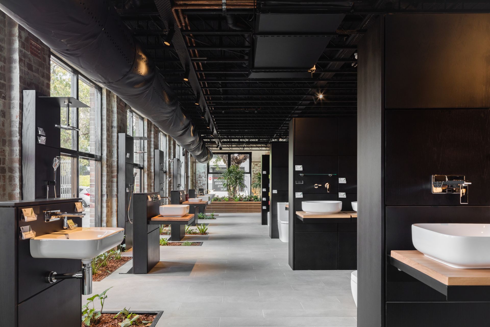
Lastly, it was important that the space felt open and welcoming without feeling vacuous or intimidating. We were conscious of the “paradox of choice” where too many options create choice anxiety, so products are clearly displayed in limited numbers. Functional “product pods” have been designed by local creatives to illustrate the diverse ways product can be used. A child water play area by the Agency of Sculpture and level access to all areas and displays ensures equal access and activity for all users. The outcome is a new community space located in the heart of Sydney’s showroom district.

The first major design challenge was to create a space that reflected on Caroma’s past while invigorating the present and setting a firm direction for the future; while the second major design challenge lay in finding the best approach for articulating this narrative into a spatial experience that the body would instinctively recognise.

In our current world of Instagram posts and Pinterest boards, it is easy to find a thousand great ideas or discover the in-vogue material with matching colour scheme, but nothing lifted from these digital pages would be meaningful.

Instead, Caroma required something different, something special, a physical manifestation of its Australian-ness built from the memories of those who grew up with their products. The process of achieving this involved investigating the feelings Caroma would trigger in our clients, their staff members and within ourselves. Caroma has been present in daily Australian life for so long that everyone had an anecdote to tell. From here those stories were told through architecture, without the need for an explanation. This process told us that the space required a slow, casual and approachable pace where experience and exploration trumped the sale, turning the typical showroom experience into a stroll through the bush.

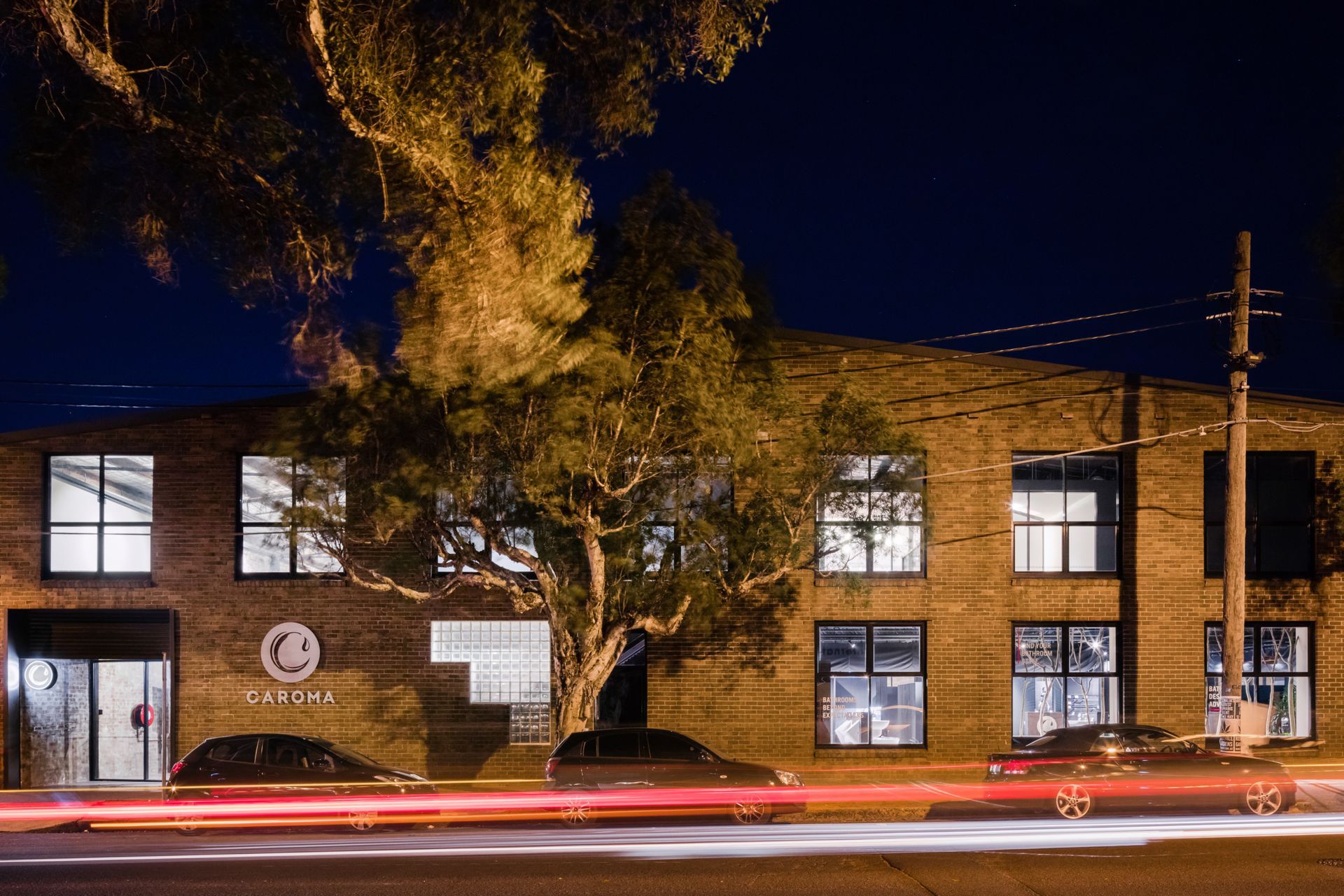
The project viewed sustainability as inherent to an appropriate, resolved design. This included a clear commitment to reduce resource consumption, reduce pollution, and create a comfortable and healthy environment built responsibly. The adaptive reuse of an existing warehouse meant that significant material use, energy use, and waste creation were avoided from the outset. The project focused on evidence-based decision making, undertaking a pre-construction assessment of thermal conditions to inform the design and servicing decisions.

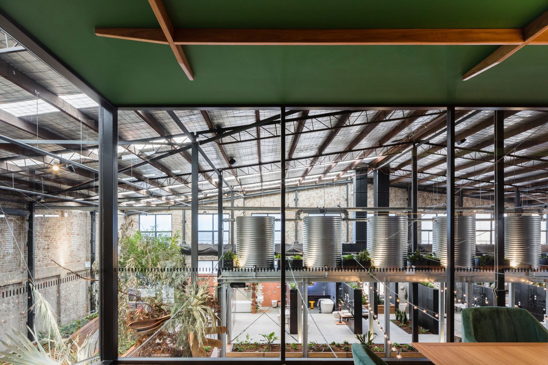
Caroma’s focus as a company on making it intuitive for customers to use less water was embodied in the design’s reference to natural hydrological cycles. The project includes 40,000 litres of rainwater storage, collected in tanks and reused for irrigation.

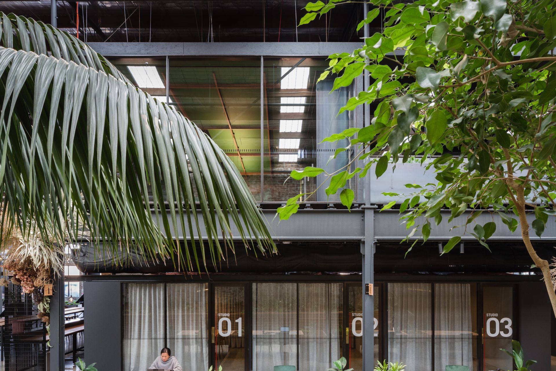
The design of the interior landscape supports a number of sustainable aspects. The evapotranspiration of the plants provides natural cooling, filters pollutants from the air and creates a connection to nature that supports the well-being of both staff and visitors. This landscape was specified through detailed daylight and temperature analysis.

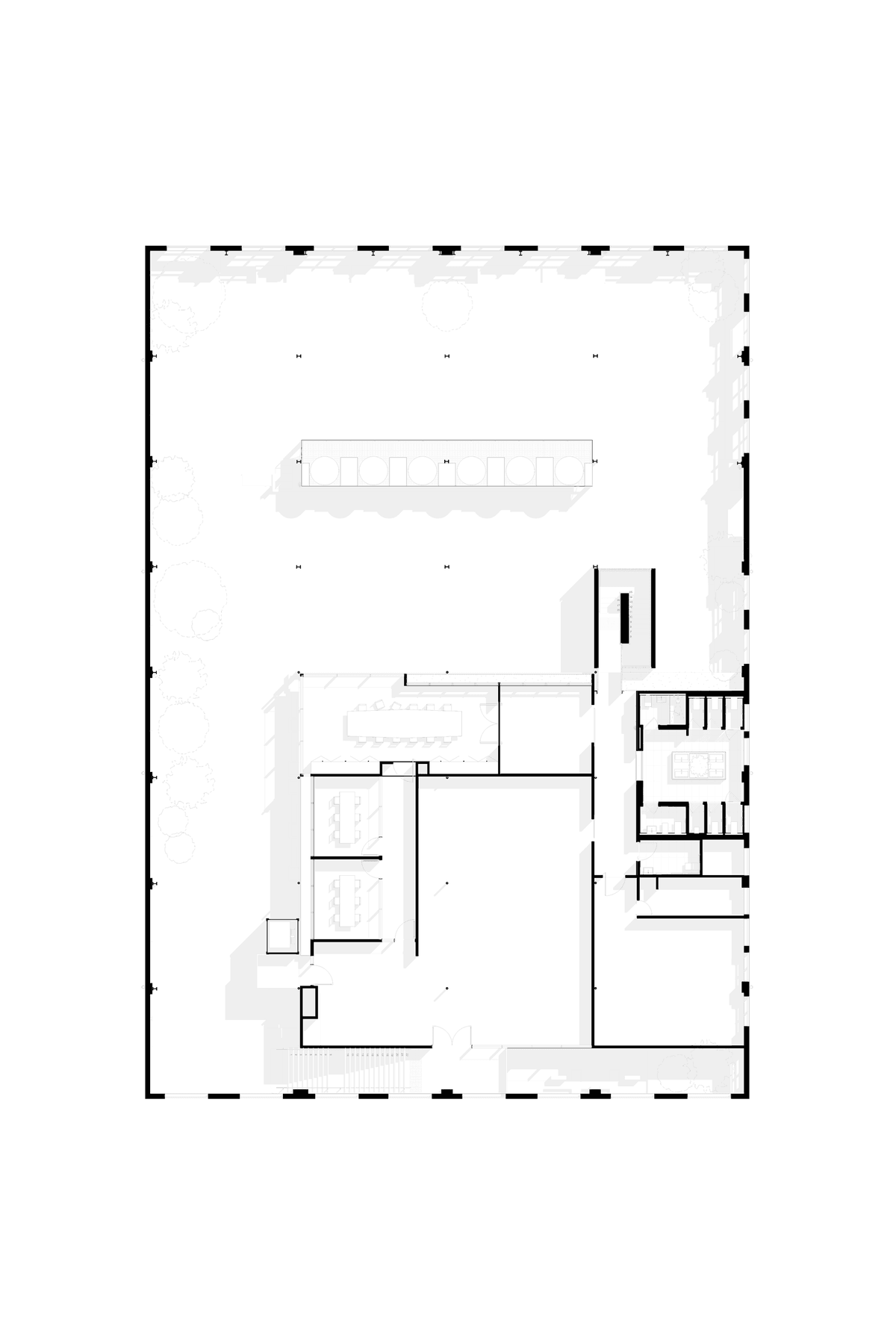
The need for active heating and cooling is minimised through the creation of an ‘indoor/outdoor’ atmosphere for most spaces. Supported by the landscape, the majority of areas act as semi-conditioned spaces, maintaining the comfort of occupants within a broader thermal comfort band. This allowed a highly efficient indirect evaporative cooling system to be specified, dramatically reducing operational energy use. Smaller, fully conditioned spaces are contained within the office and conference room, offering a higher level of thermal control if required.

Location
: Sydney, NSW

Builder: CJ Duncan

Completed: 2018

Photography: Katherine Lu

Awards: Gold - 2018 Sydney Design Awards Architecture - Commercial - Constructed. Winner - 2018 Architeam Awards - Commercial

Professionals used in
Caroma on Collins

About the
Professional

Archier creates engaging architectural spaces and bespoke products, with an emphasis on honest, responsive design and efficient construction.

ARCHIER is an architectural practice with studios in Hobart and Melbourne. We work across residential and commercial sectors and have a particular interest in the relationship between architecture and landscape. We are a privately owned company and have four principals. One of our four directors is also Landscape Architect and this gives us a unique skill-set to work seamlessly across the two domains of Architecture and Landscape.

We work across a range of scales; for a range of clients. Our work encompasses residential, commercial and government architecture; public and private landscape projects; as well as the design and manufacture of furniture and lighting products

Our innovative designs are focused on material honesty, thermal performance and constructability, as we strive for affordable and responsive architecture that contributes to the public domain.

We are interested in projects that span architecture, urban design and landscape and embrace the mantra that design is delivery. Our practice utilises BIM extensively to automate and streamline our design work-flow and we are increasingly leveraging BIM to not only aid and support the delivery and construction of our work; we are also using it directly with Off Site Manufacturers to automate the production of timber based floor, wall and roof elements directly from the coordinated design model.

Our directors have over 25 years of combined industry experience and were drawn together to create an inclusive practice that is truly outcome orientated. We have won awards across a range of disciplines connected to the built environment that recognise our design excellence and innovation, along with our commitment to sustainable buildings and the environment.

As a practice, we have worked on large scale commercial projects with a construction value in excess of $100M through Joint Venture arrangements with Hayball Architects and we have lead multidisciplinary teams for complex commercial projects over $5M in value.

We relish the opportunity to work collaboratively with clients and large project teams to incorporate specialist knowledge and expertise into our work. We are data driven and focused on quality project outcomes. We have proven project experience leading complex projects in sensitive environments and have been recognised for our contextual approach to design.

We have also been awarded for our approach to sustainability and always seek not only to optimise the thermal performance of our buildings, but also to consider the life cycle cost of our material choices.