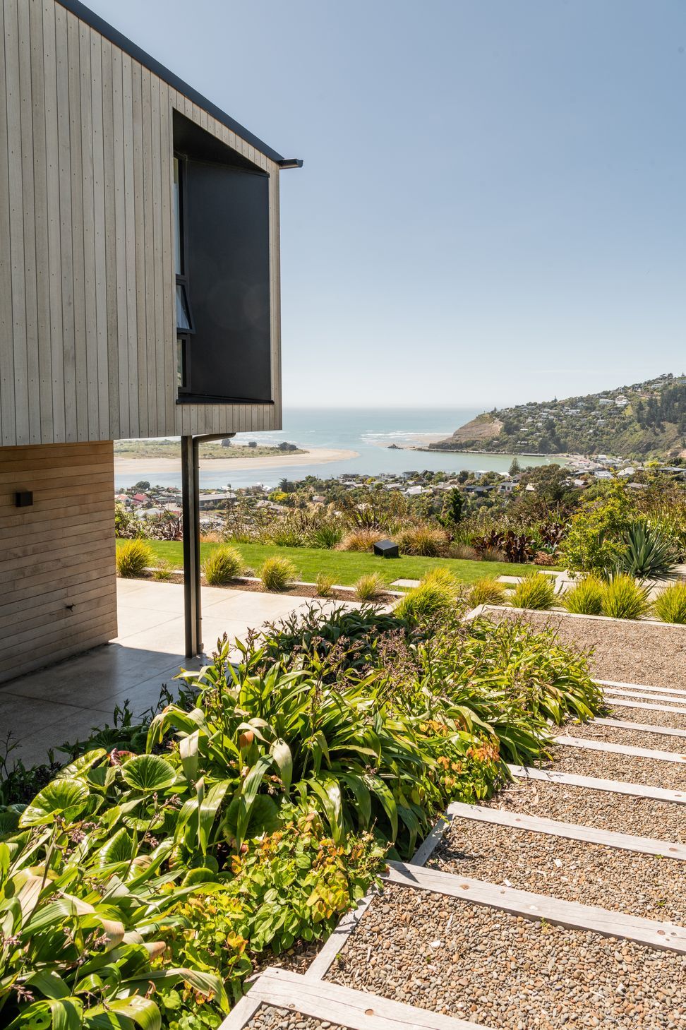
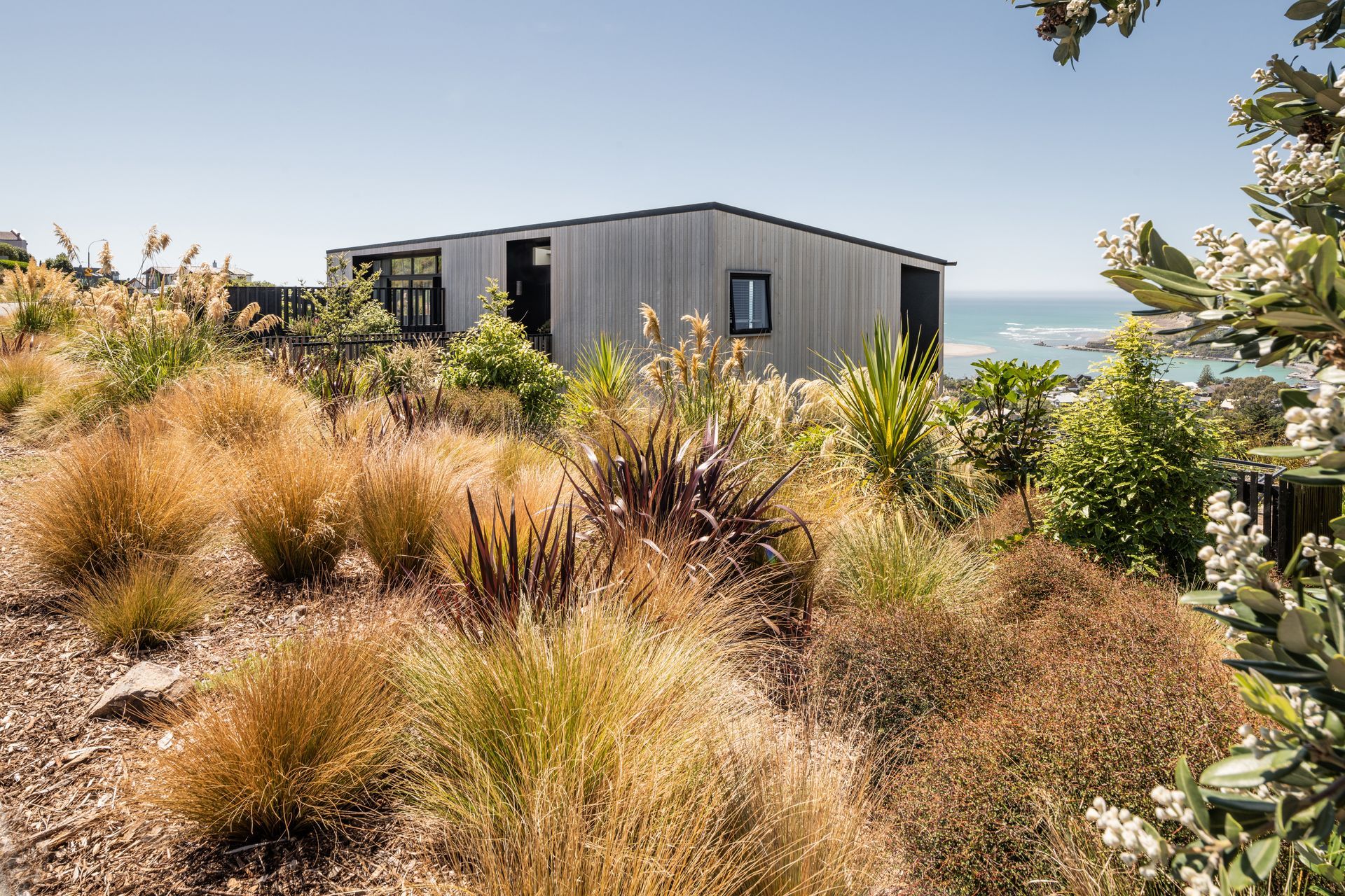
On a steep site in above Monck's Bay in Christchurch, a cedar-clad home makes a clever statement with sheltered outdoor spaces that capture the jaw-dropping view.
The houses high on the hillside above Monck’s Bay feature a common dichotomy found in homes with sea views in Christchurch; as spectacular as the views are, the bitter easterly wind makes a direct connection to the outdoors unfavourable.
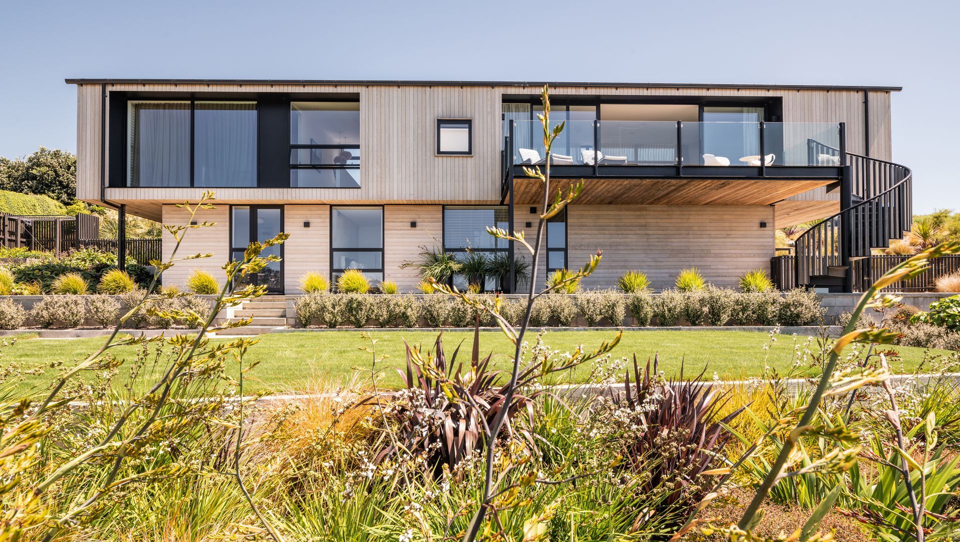
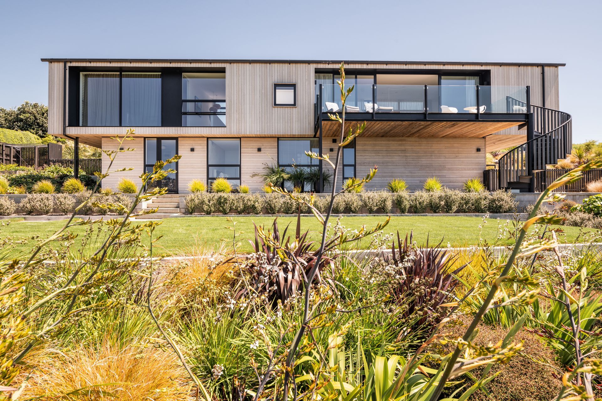
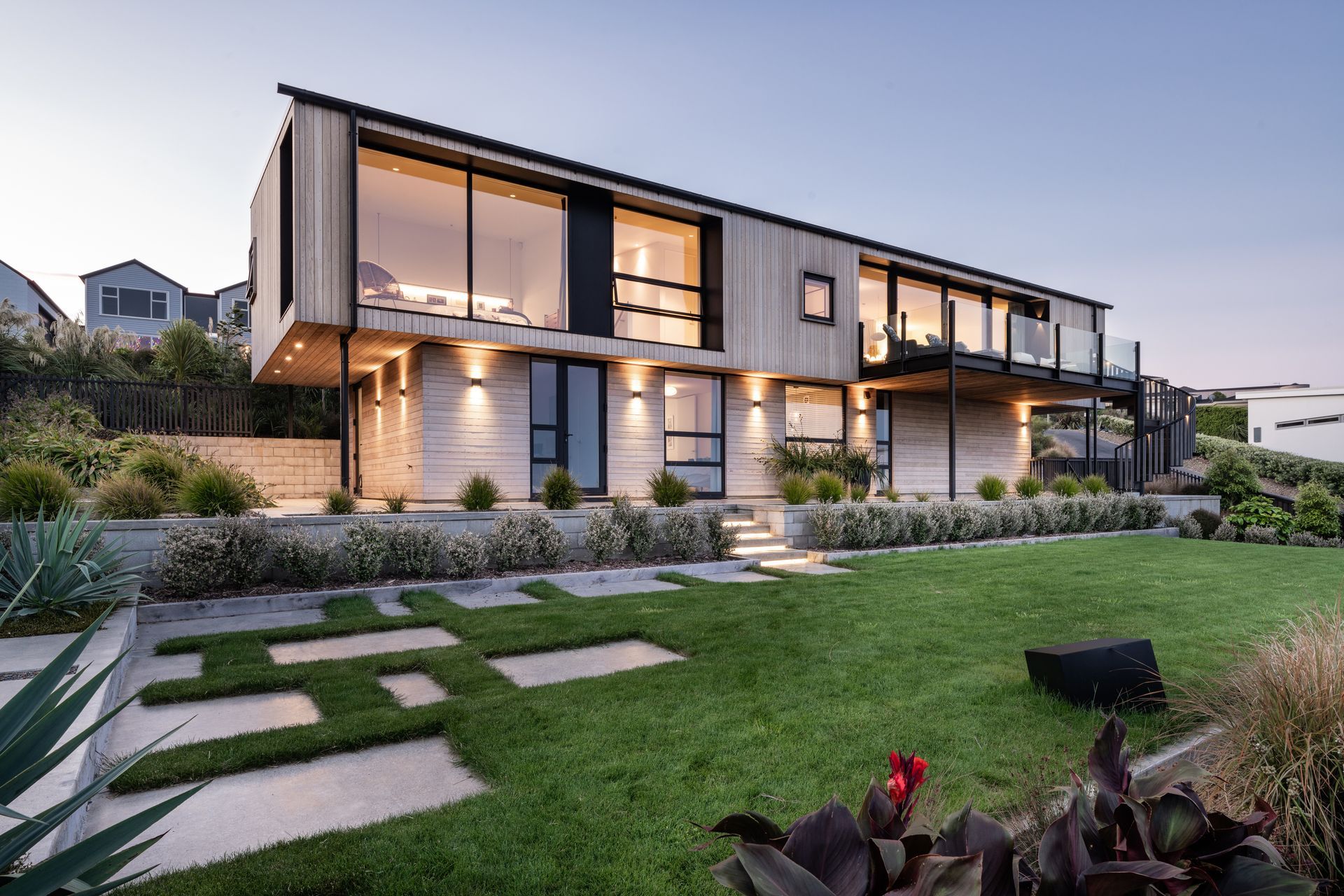
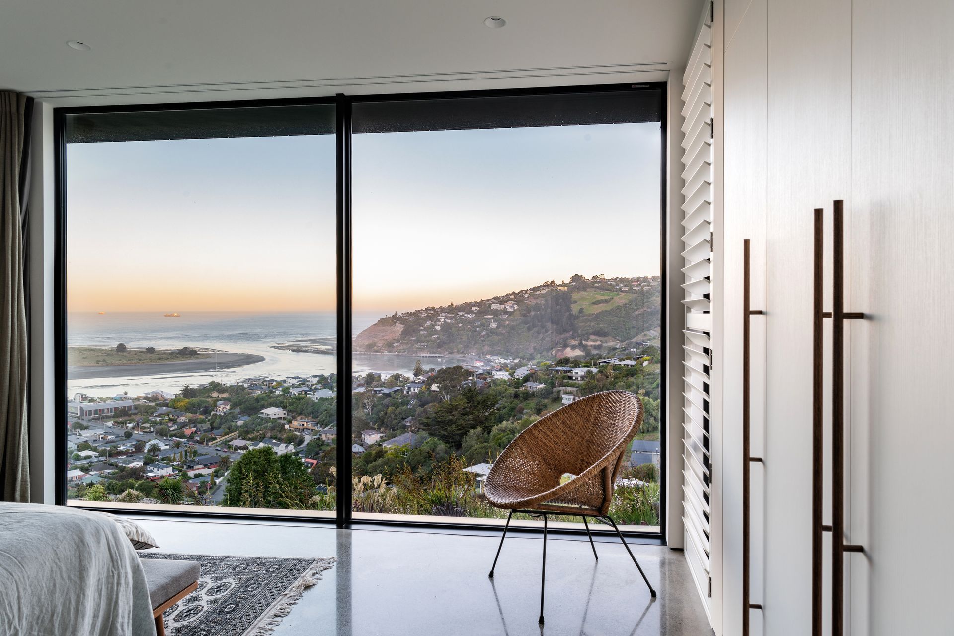
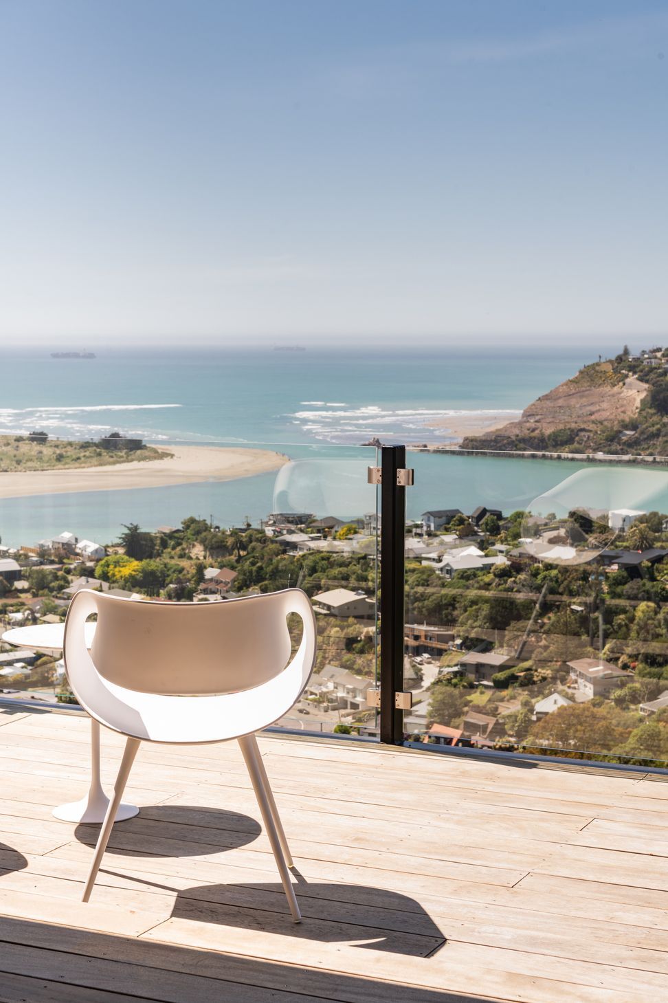
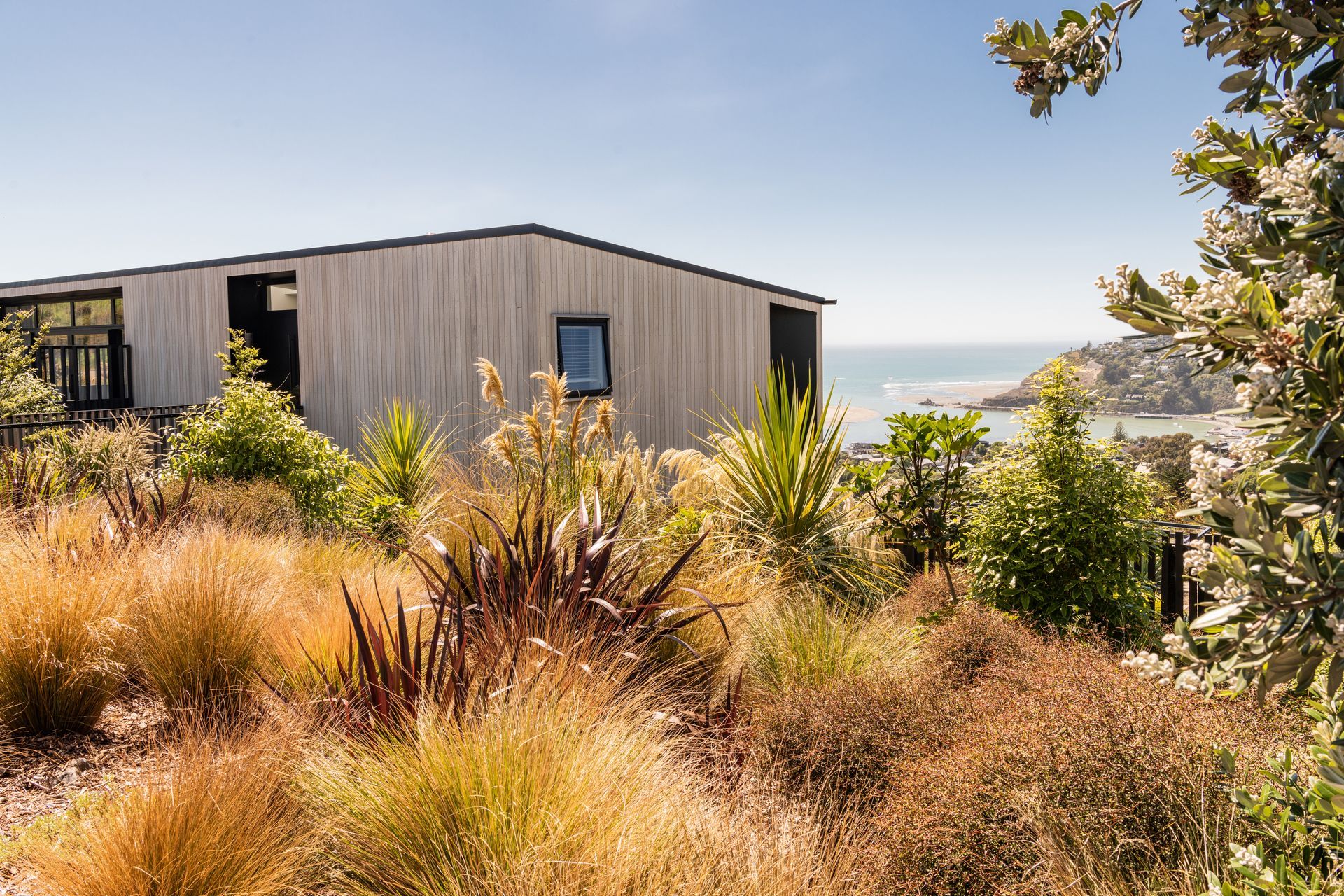
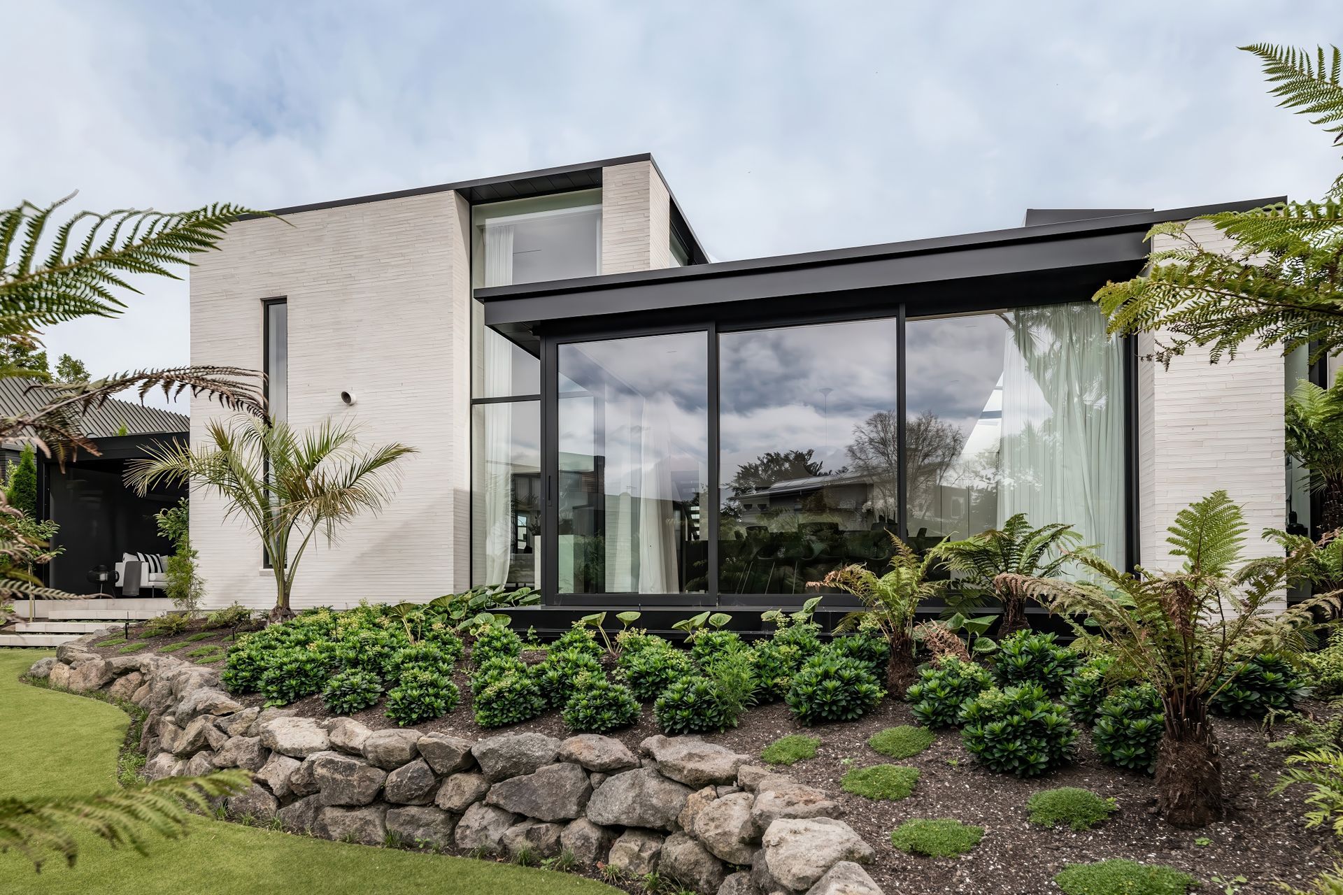
But in this Monck’s Bay home with transcendent views out to Shag Rock and the south shore, Common Architecture was able to create a design with little compromise.
Common’s Tobin Smith explains: “One of the key drivers of the design was obviously maximising the view out over the water, but then there’s the prevailing easterly wind, which just barrels through there. So, we’ve created a deck that extends out from the living rooms to the east, but that's only a ‘sometimes’ space. The more usable space is actually out to the west, out on the road side.”
The clever aspect of this spatial separation is that the view can be seen right through the home, so the occupants can enjoy the warmth of the sunny, sheltered courtyard, while still enjoying a direct connection to the sea.
This dual approach to the design means the narrow floor plan of the upper level also allows for passive ventilation.
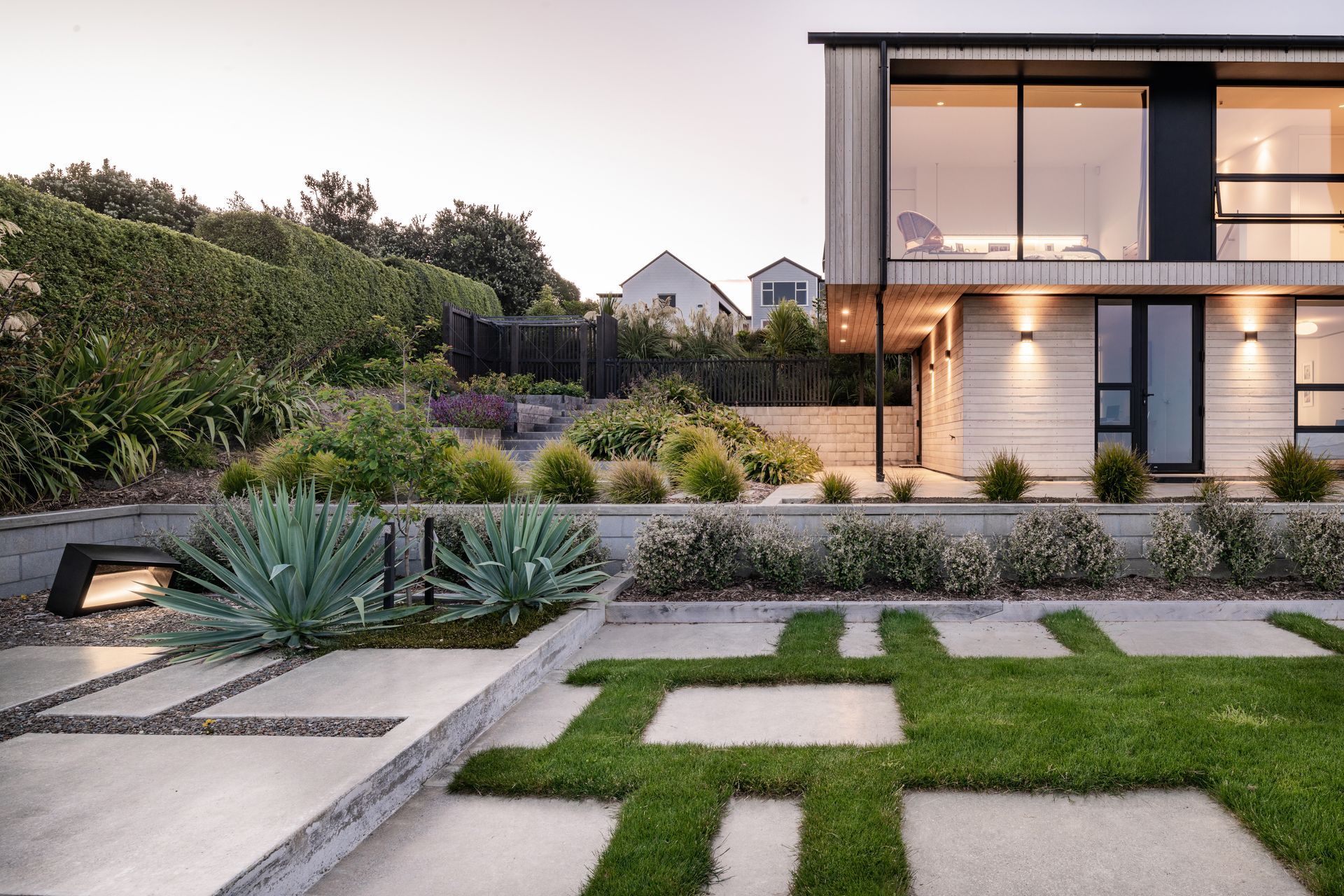
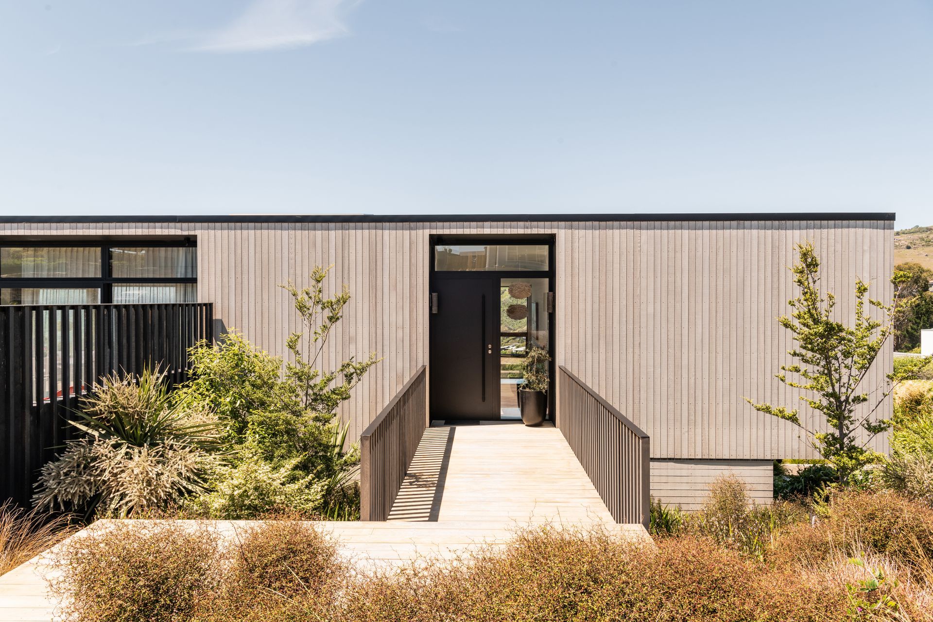
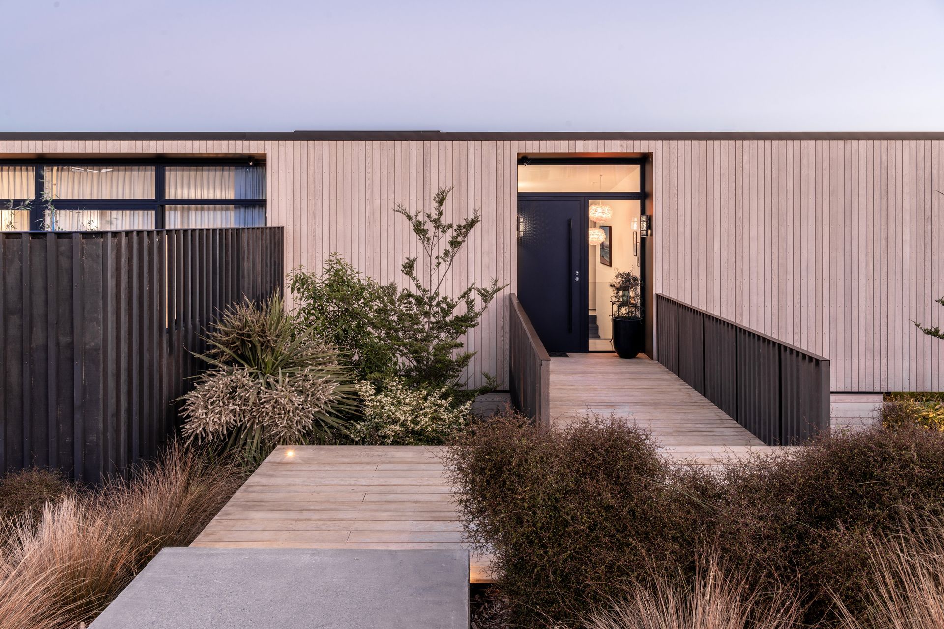
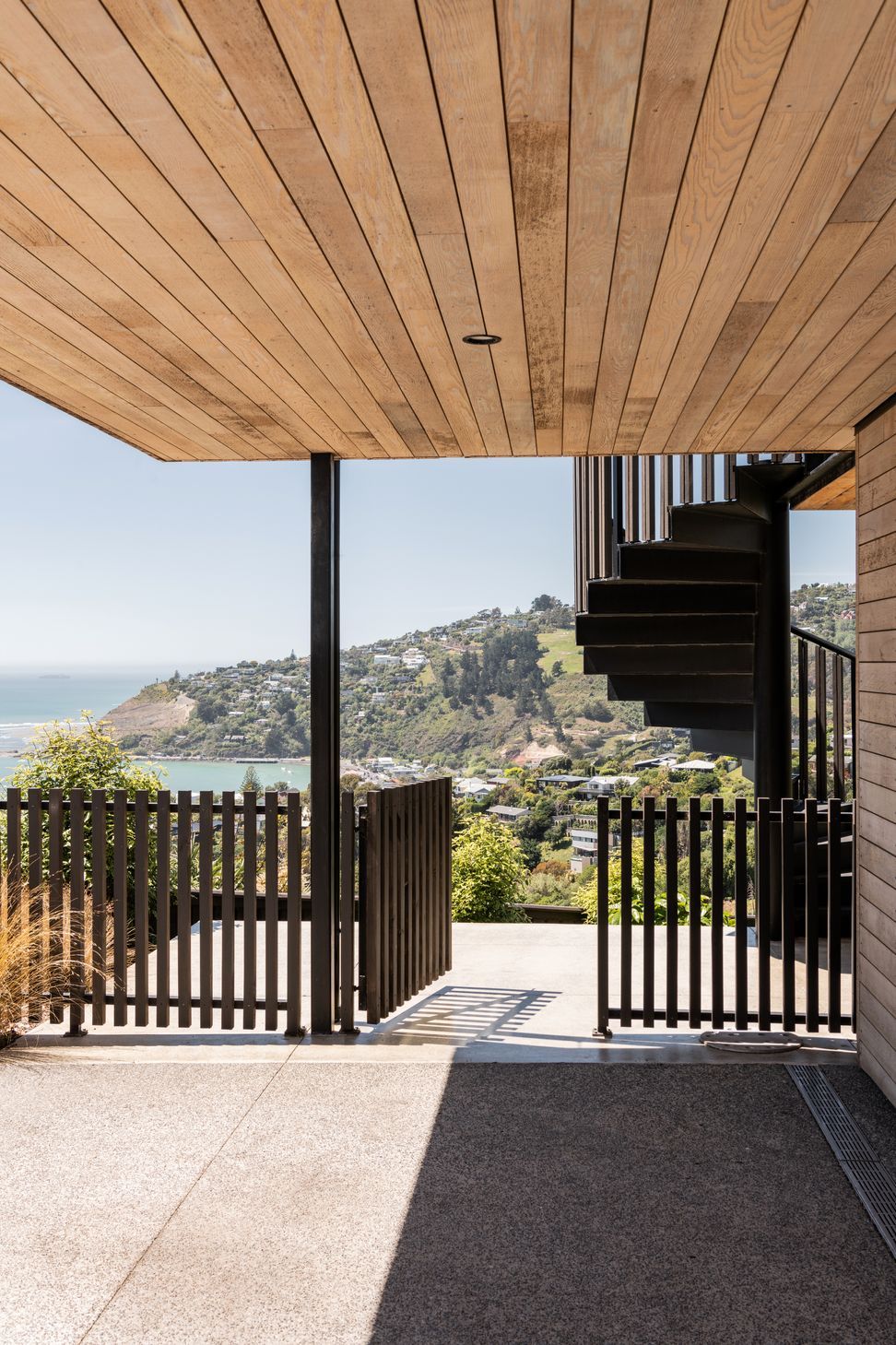
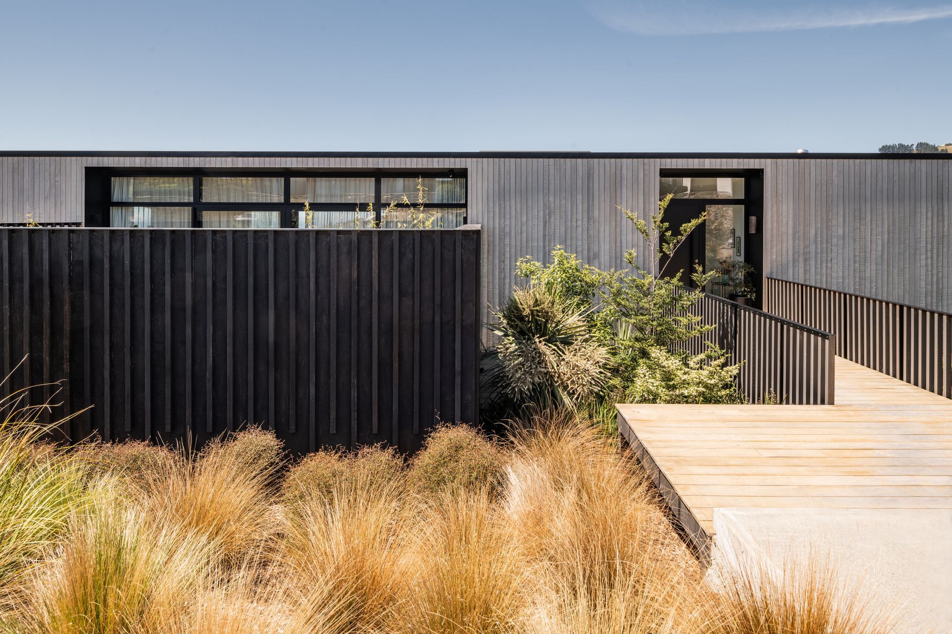
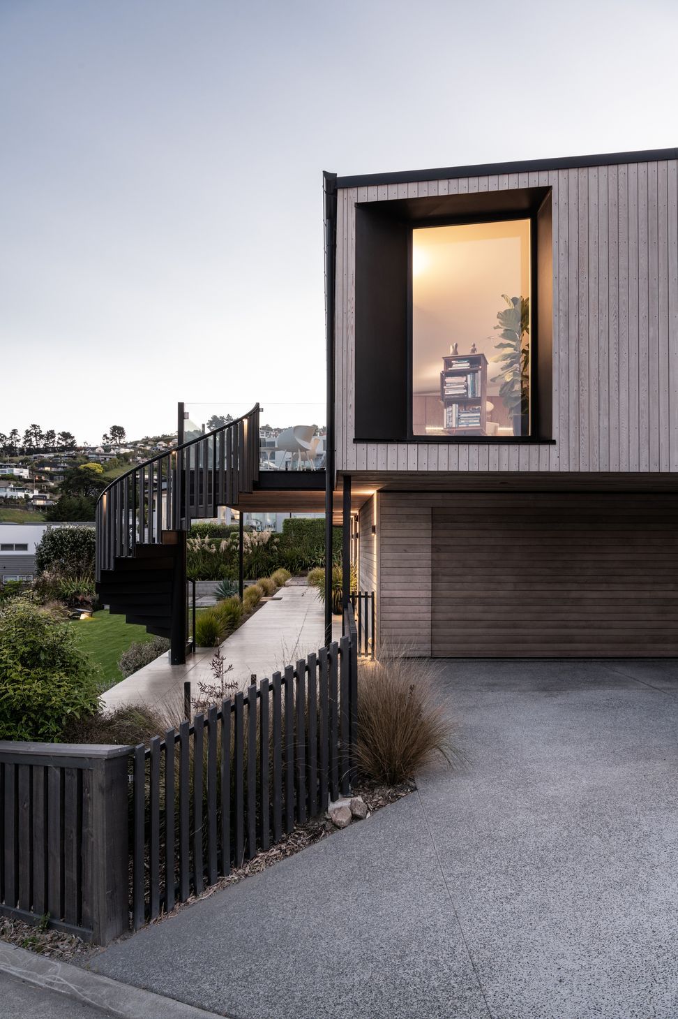
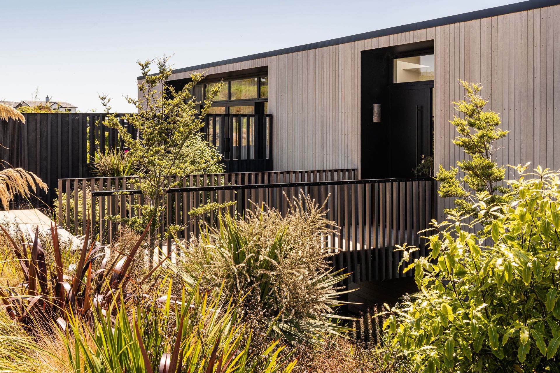
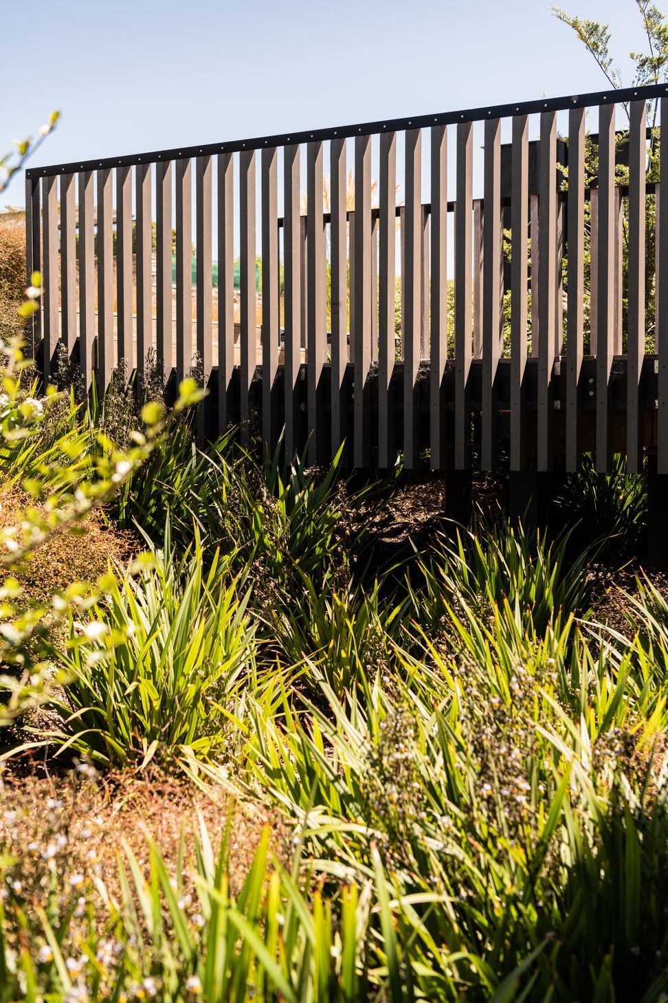
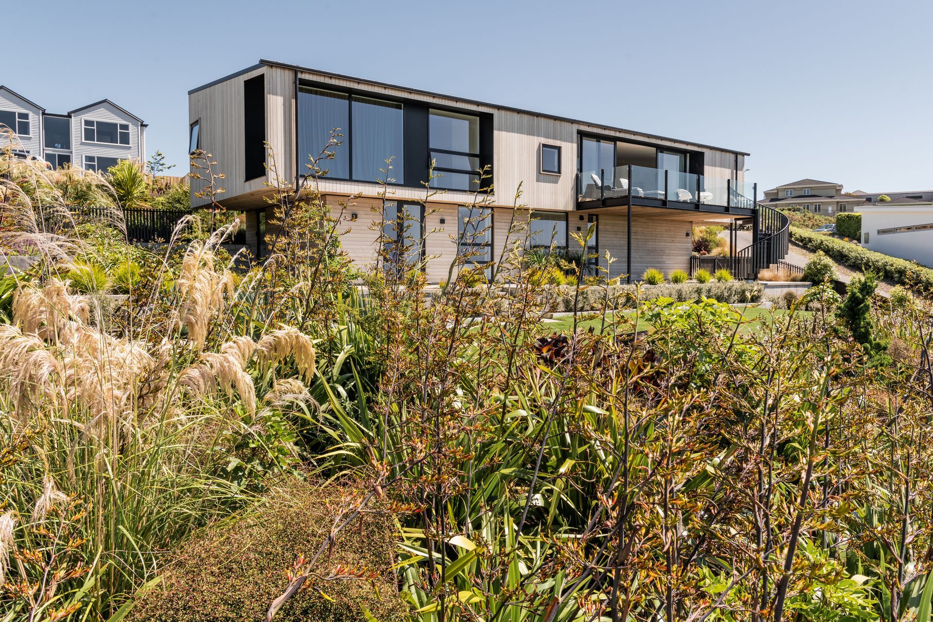
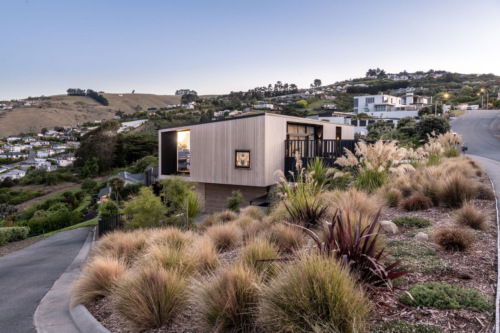
The pedestrian access to the upper floor is from the road, across an elevated bridge that extends over a wide council reserve that was not allowed to be built on.
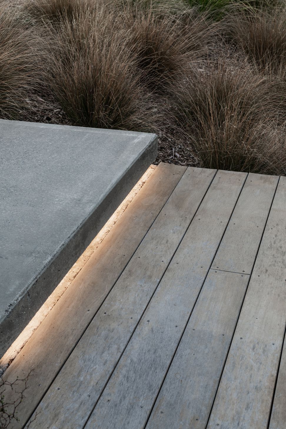
The landscaping of the reserve was enhanced with new native plantings, and it means the home is expressed as a single level from the street.
“I think that it’s really lovely that it reads as a single storey house from the street, and I think that bridge is a really beautiful feature, with the landscaping to the entry. It’s absolutely glorious.”
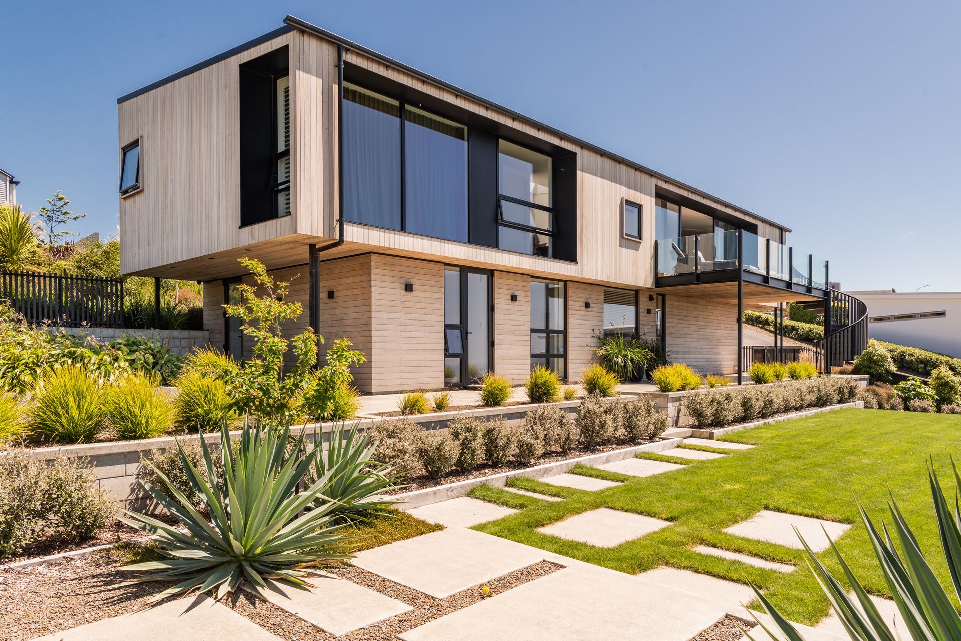
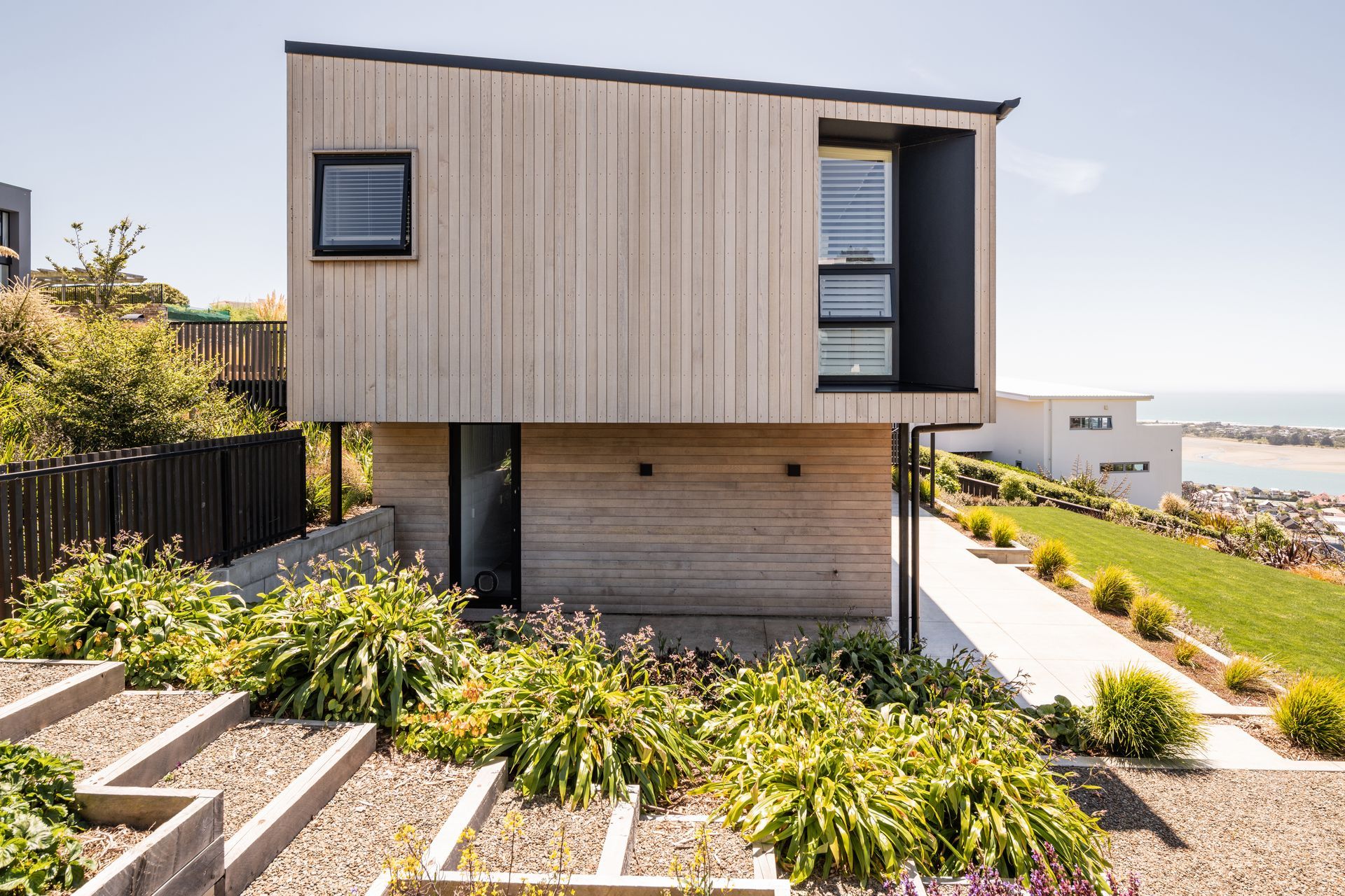
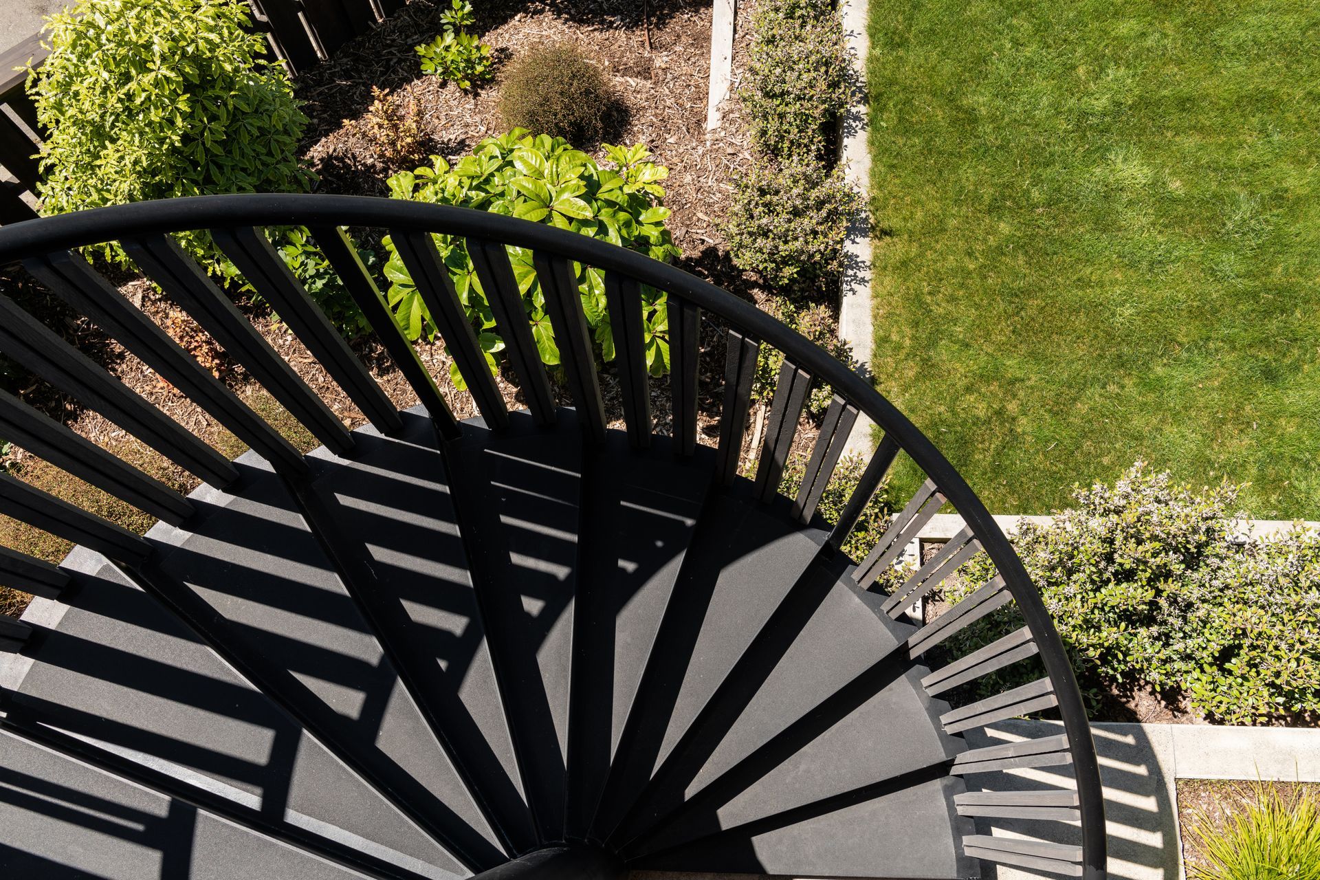
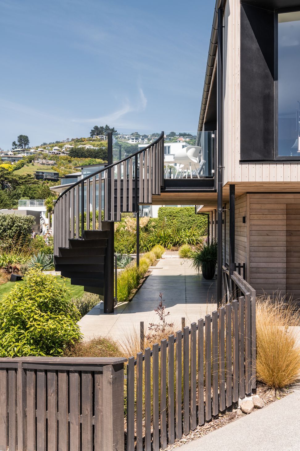
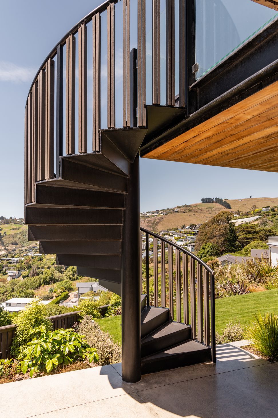
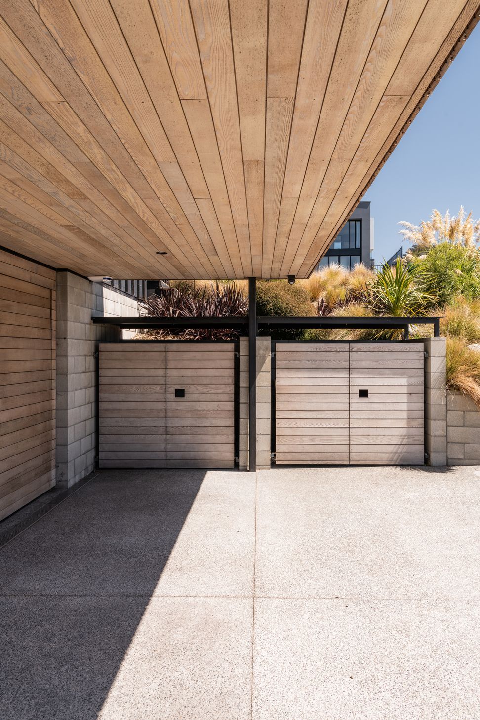
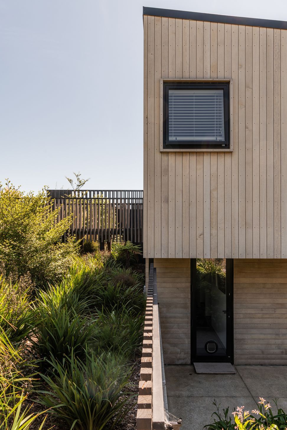
From the road, the site drops off quite steeply. A right-of-way to one side of the property has meant vehicle and pedestrian access were able to be separated, and that the garage has been able to be tucked under the house as opposed to occupying the primary view from the street.
The slope of the section dictated the layout of the house. “The house is effectively a vertical stack,” says Tobin. “Vehicle movement comes into the lower level, while pedestrian access comes straight into the upper level, which is the primary space for the key occupants.”
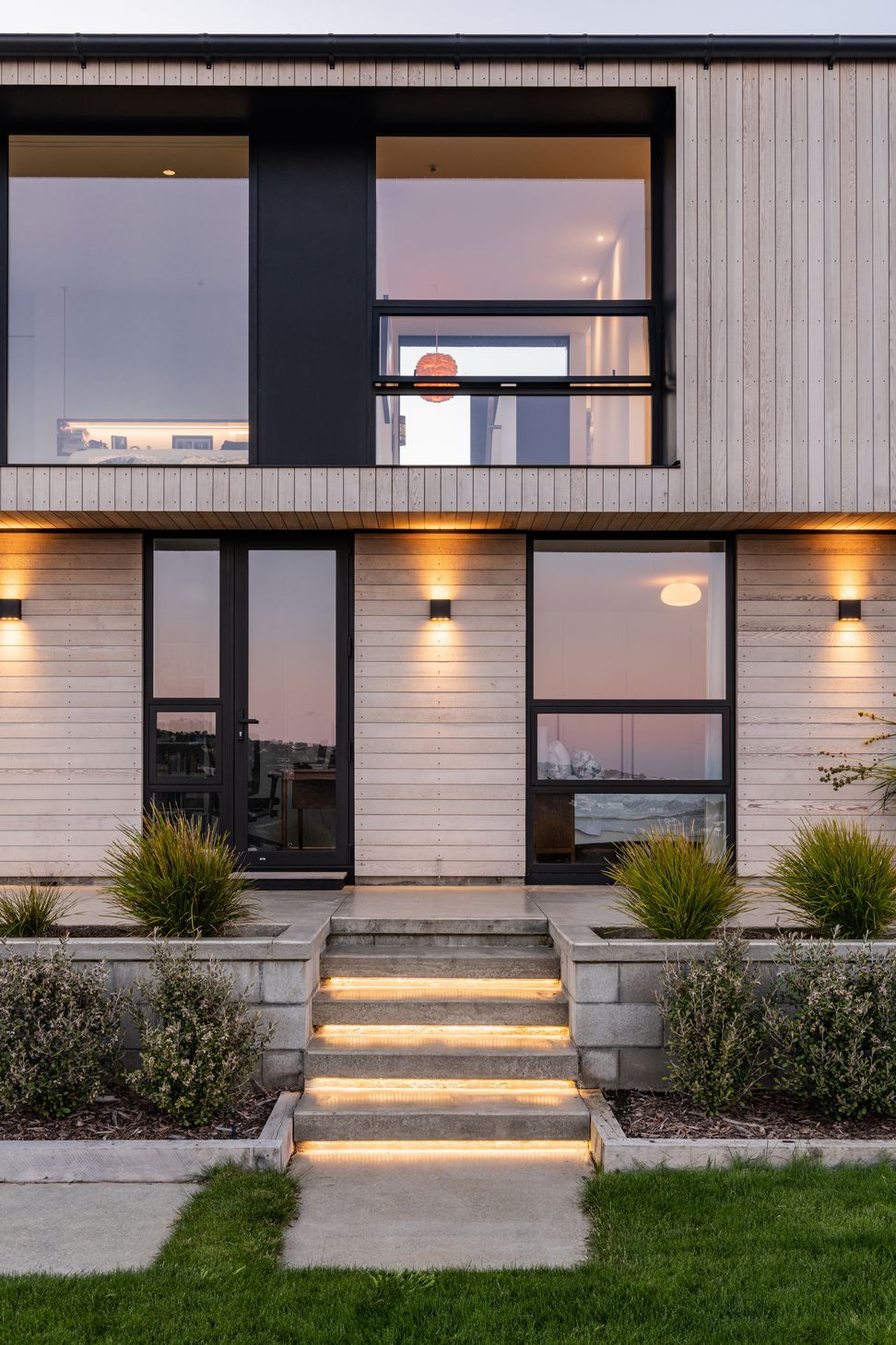
The entry on the upper separates the two functions of the space: living and master suite. Importantly, there is also an office upstairs. “The clients do a bit of work and study from home, so there’s an additional space set up and designed for them to use as a home office. This project began before the lockdown period, and with hindsight we’ve all adopted this idea of having a well appointed space to work from home because of what we’ve experienced over the last three years.”
Down on the lower level are two guest bedrooms, a bathroom, laundry and garage.
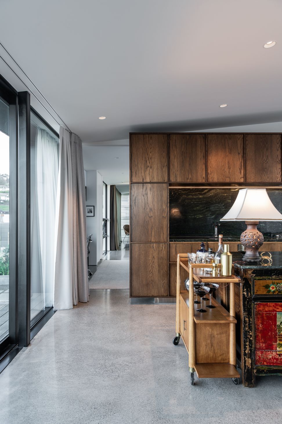
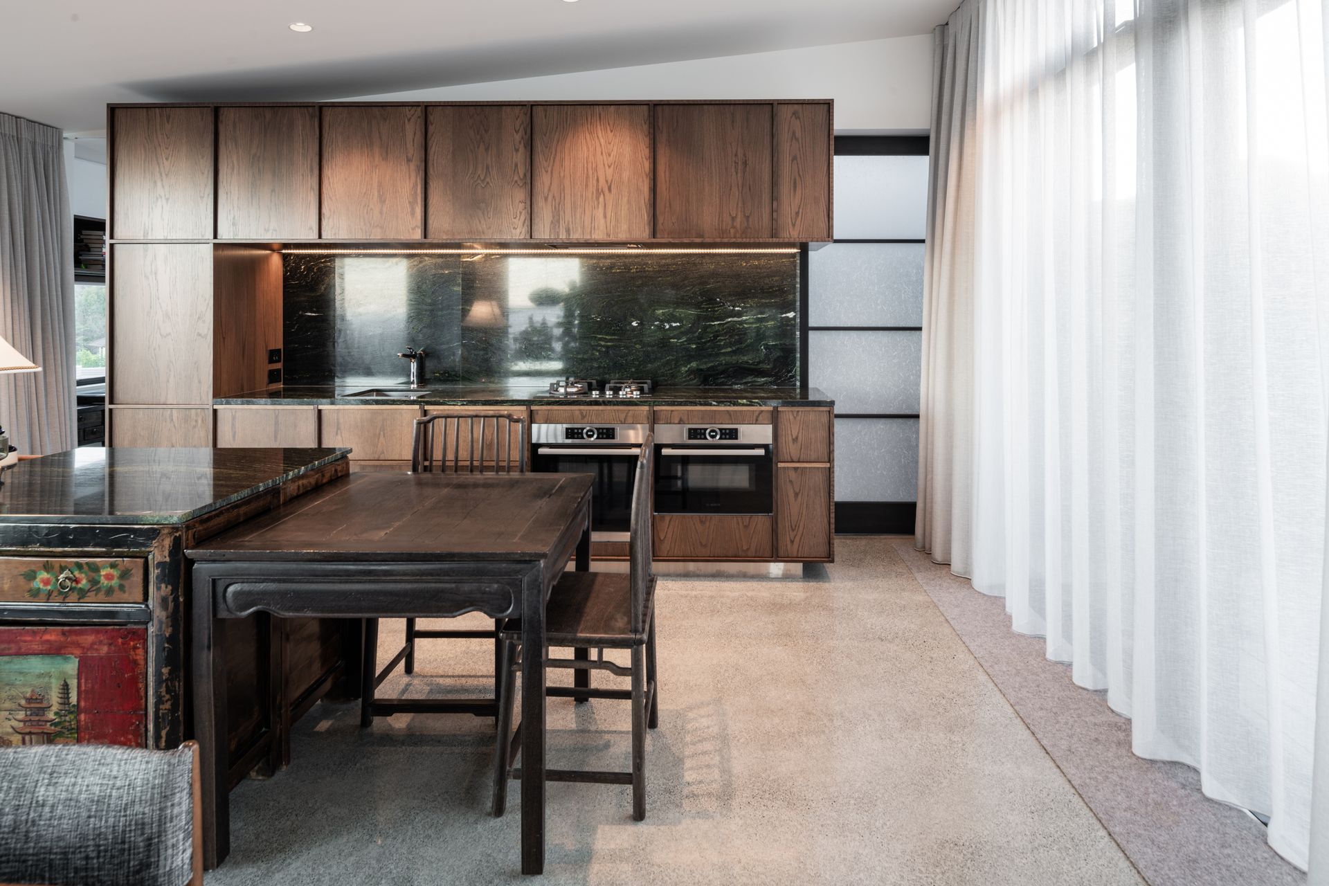
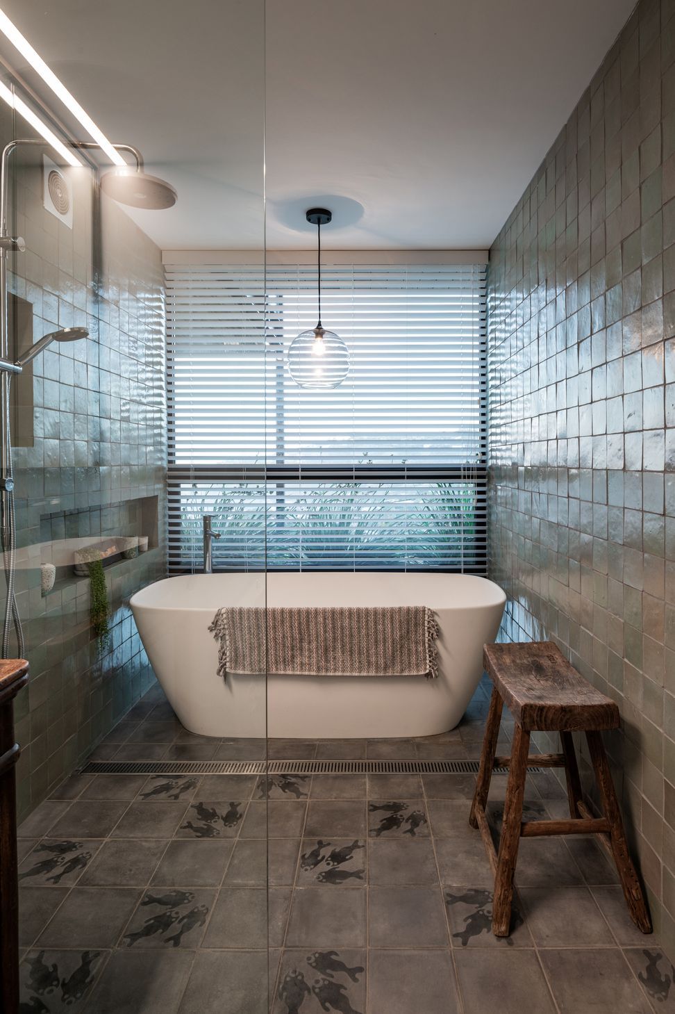
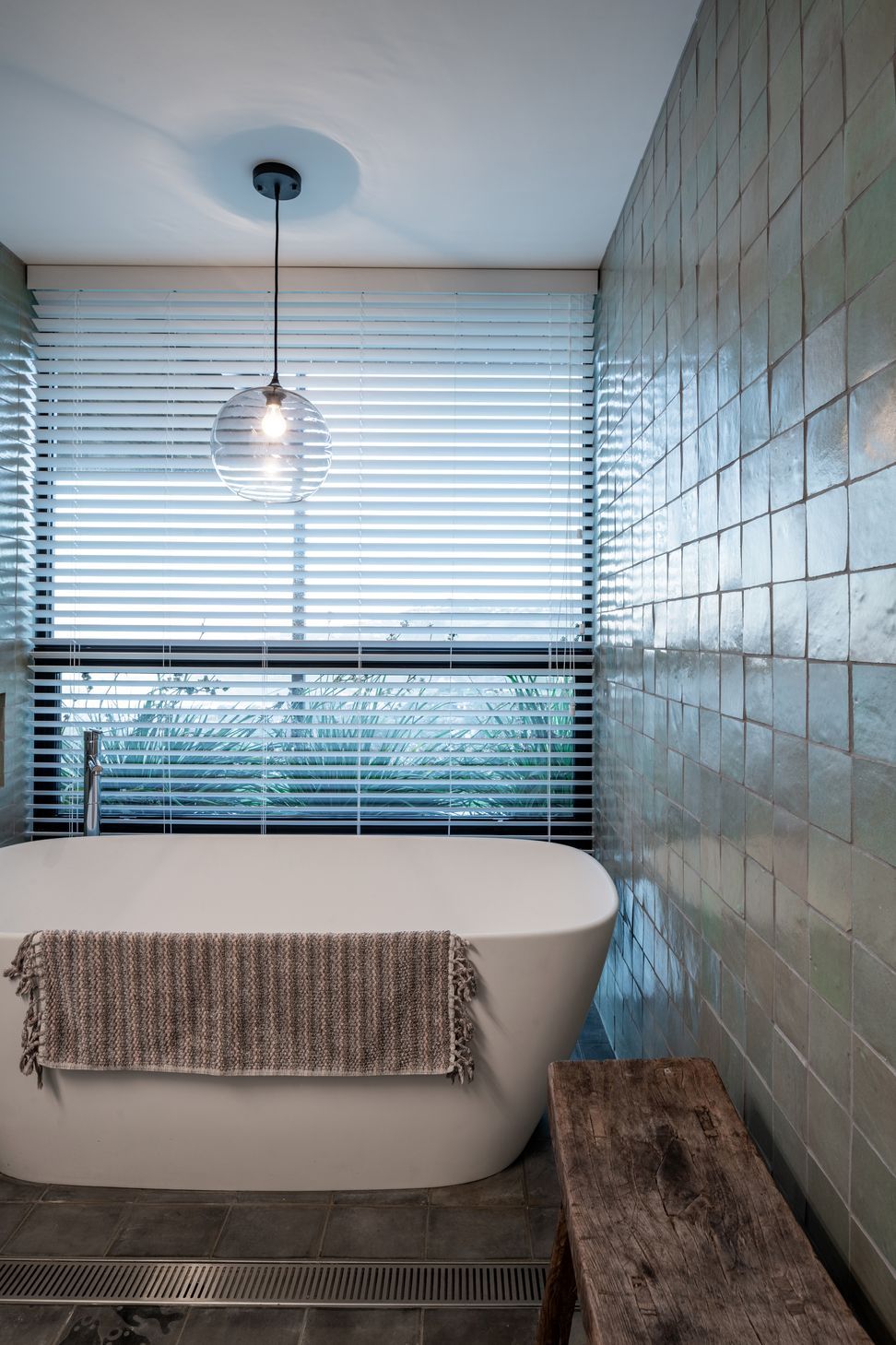
The clients’ brief for the interior was a Scandinavian flavour, relatively simple, and light in its tones. Over years of travel, they had collected pieces that they wanted to introduce into the house, such as a Mongolian chest, which was used as the kitchen island unit, and Japanese shoji screens.
Tobin says this worked perfectly with Common Architecture’s ethos: “We take on the principle, with a lot of our work, that if we create an interior space that effectively becomes a gallery, then someone can put in whatever pieces they wish. In this instance, because the client had some quite colourful pieces, that was critical. Keeping the interior palette really simple means those pieces sit there quite nicely.”
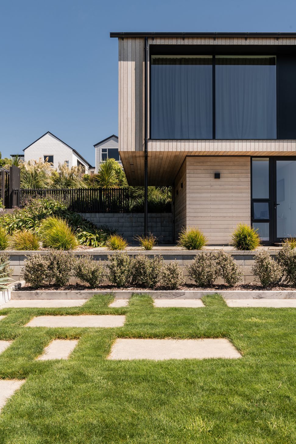
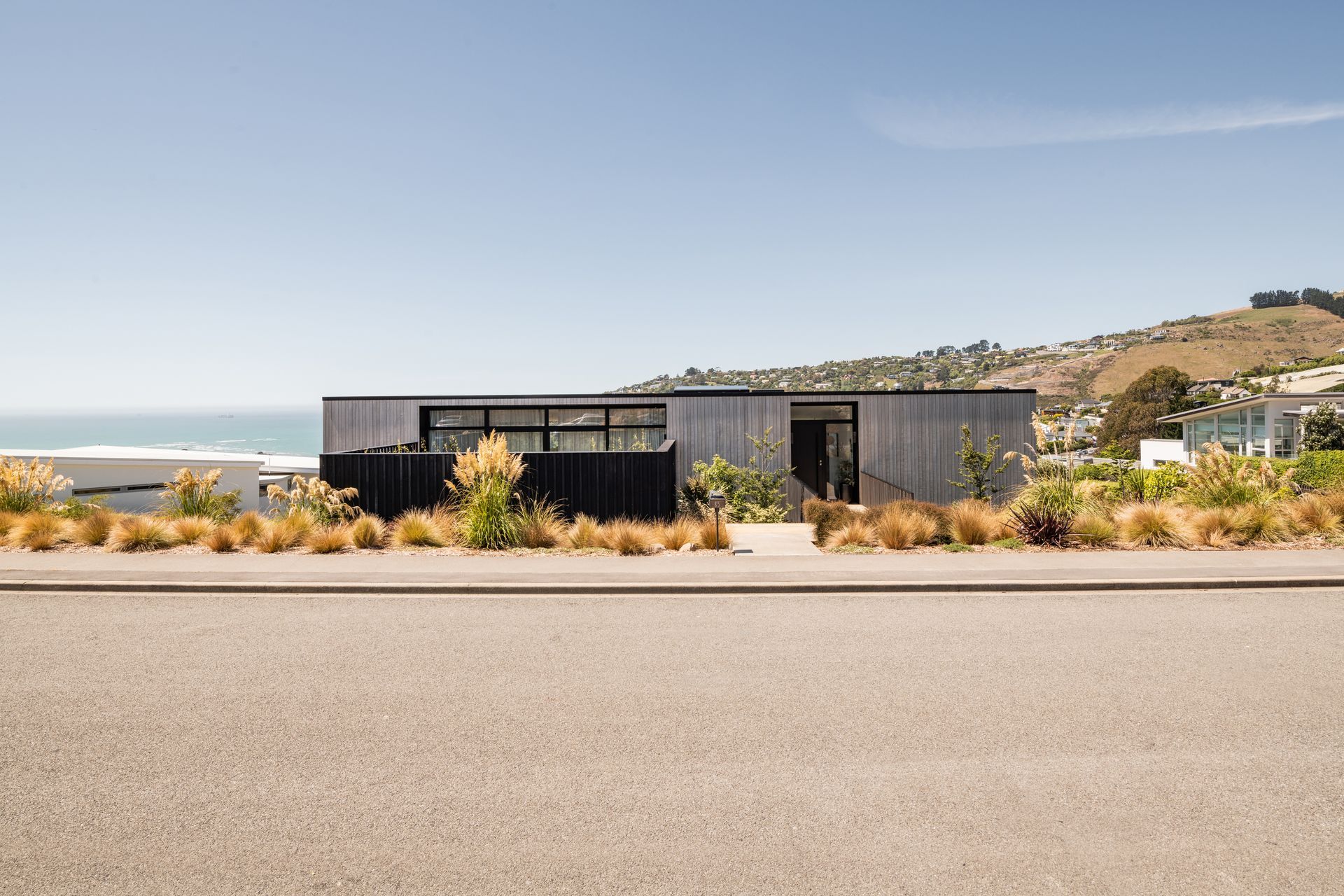
The interior features a polished concrete floor slab and the colour palette is white on white, while the exterior materiality is lightly stained cedar. The cladding was pre-seasoned with a Dryden’s wood oil to prompt the naturally occurring silvering that is typical of timber as it ages.
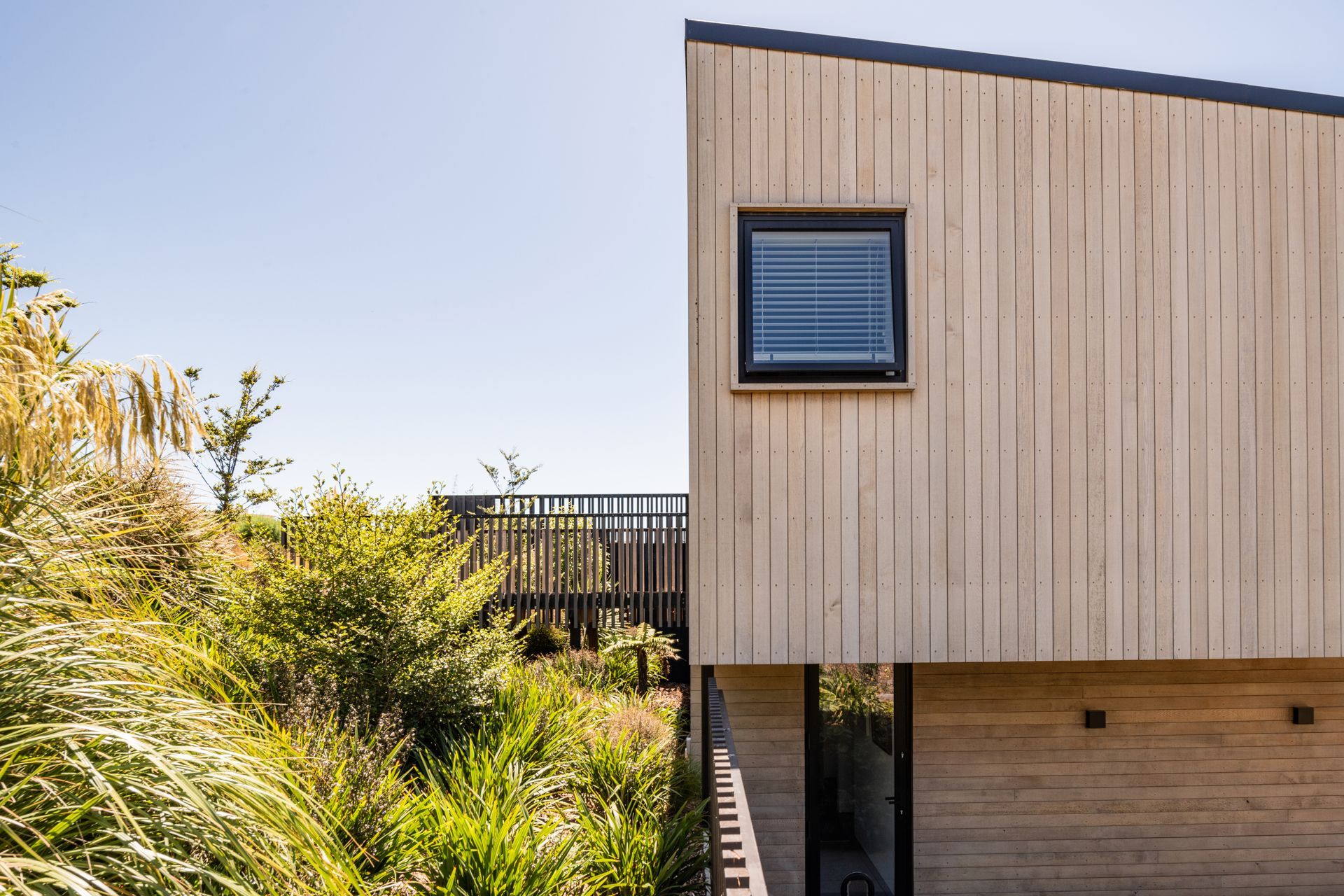
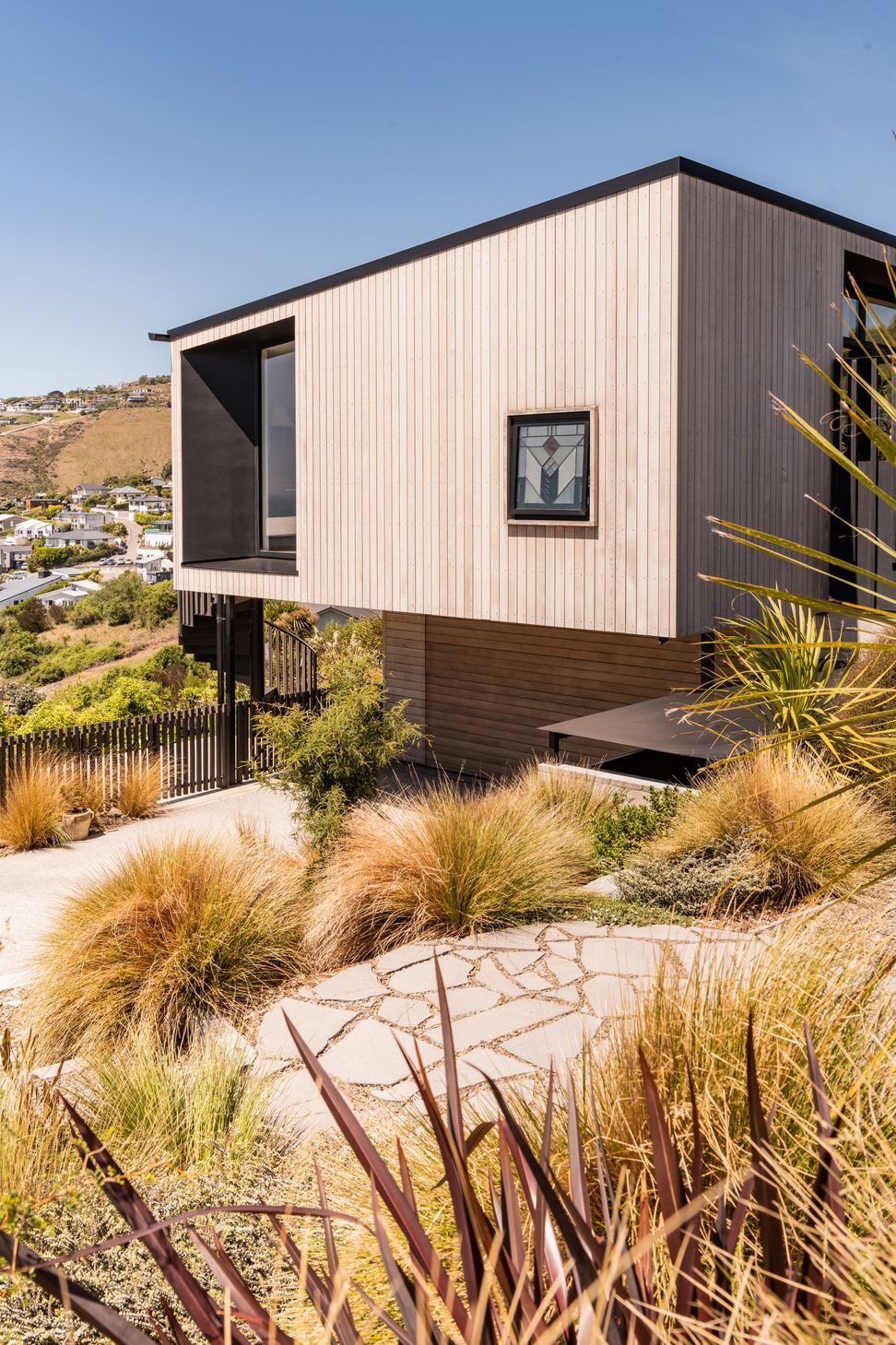
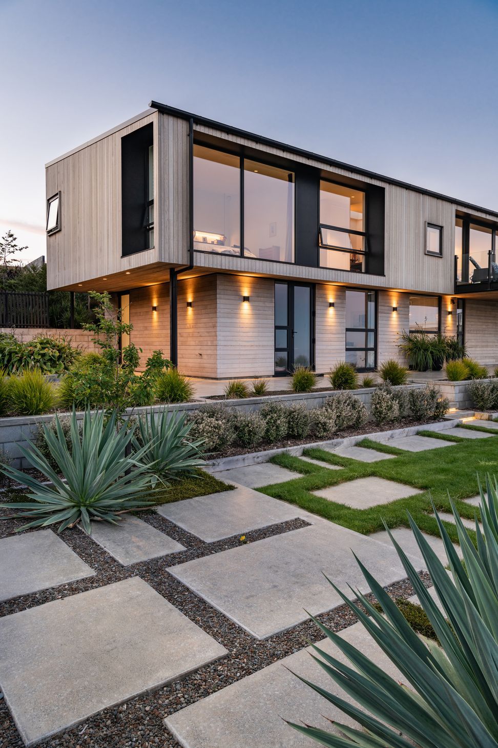
The cedar has been thoughtfully used to accentuate the form of the building.
“It has quite large cantilevers or overhangs on either end, to really emphasise that primary building form,” says Tobin. “The timber on the upper level runs vertically, and then to offer a disconnect without adding another material for material’s sake, the boarding on the lower level runs horizontally.”
Interestingly this juxtaposition of form and lines represents how the home can be best understood, in terms of an east-west duality.
Tobin says the home contains many surprises considering the challenges of the site, and his favourite aspect of the design is that it addresses that duality in such a generous way.
Words by ArchiPro Editorial