About
Hunters’ Roots.
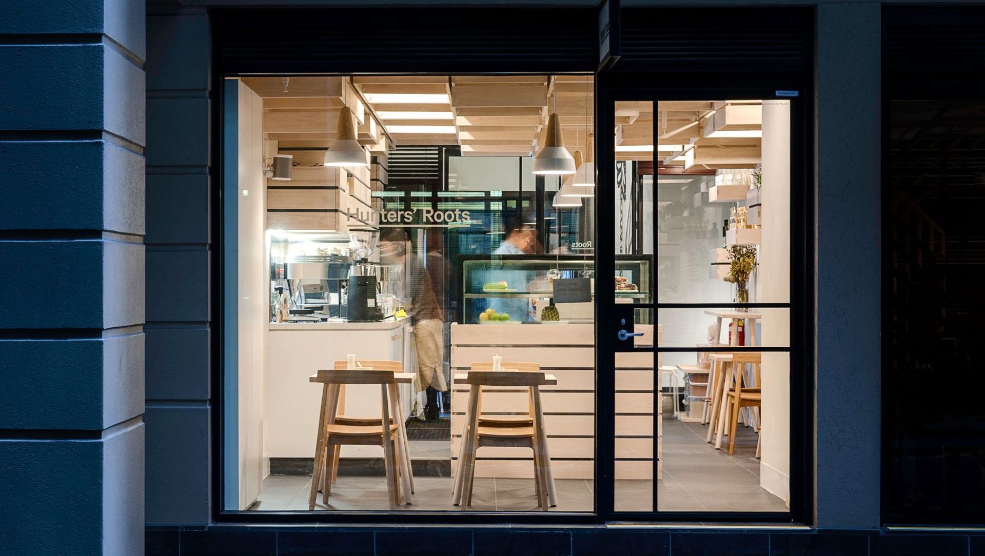
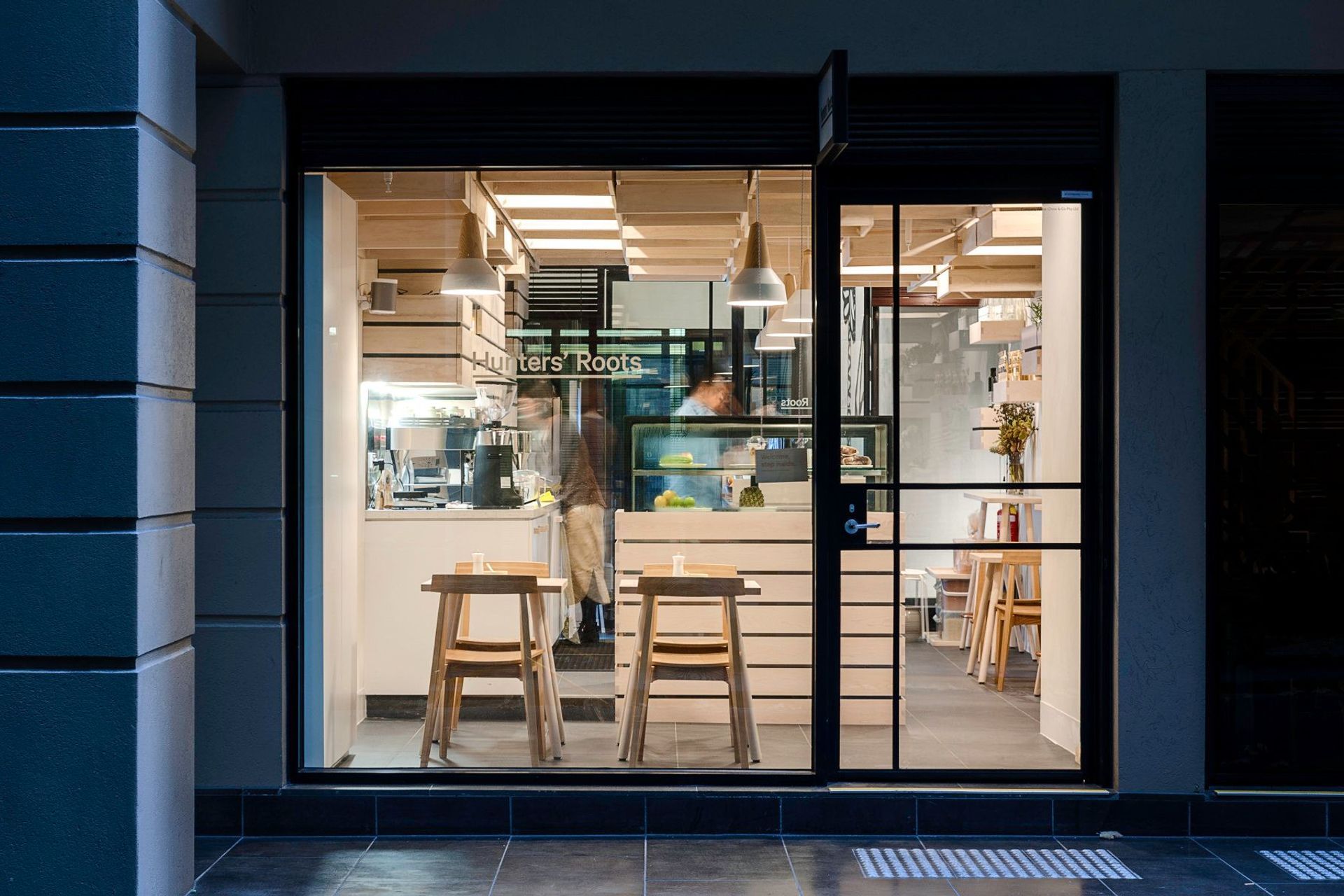
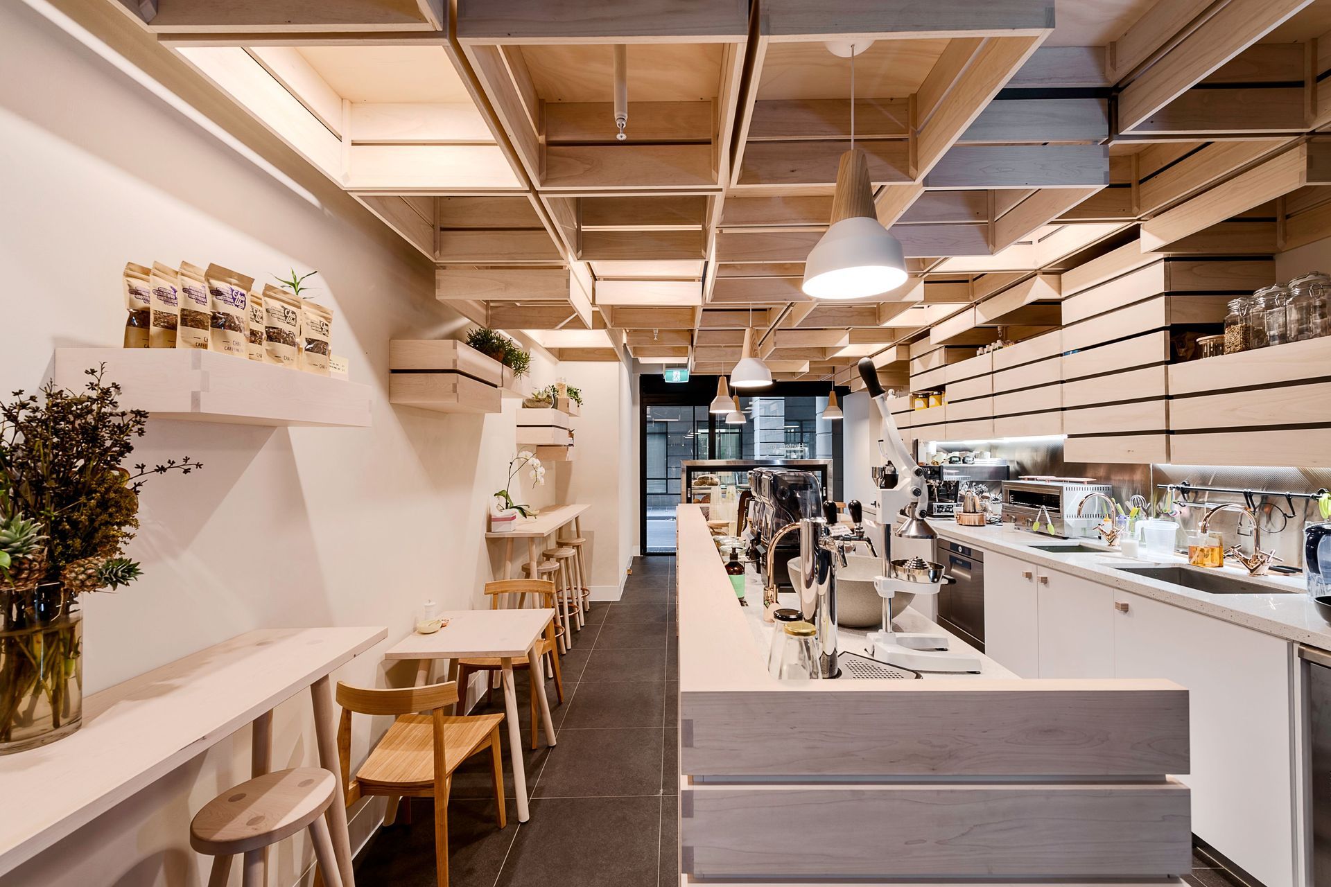
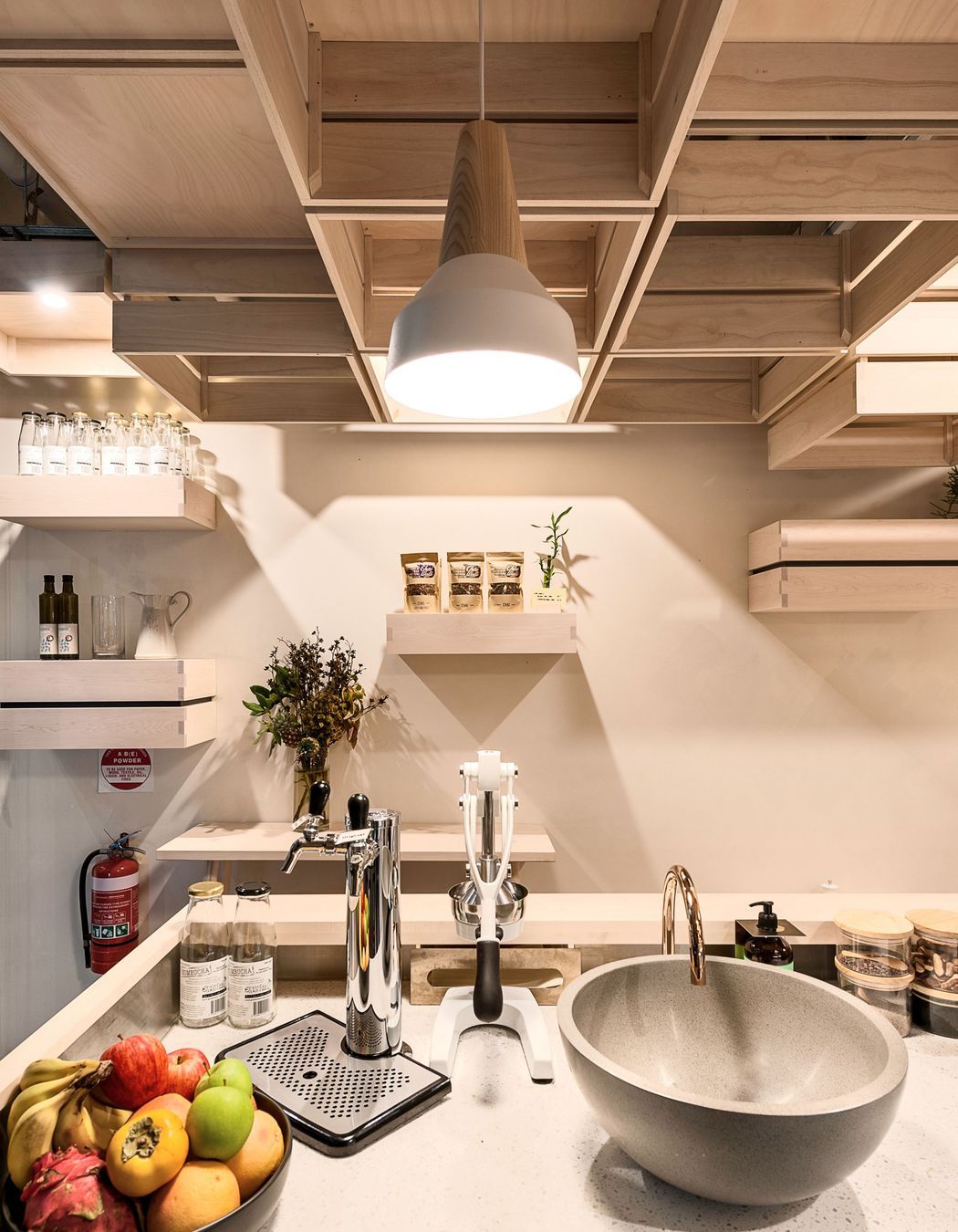
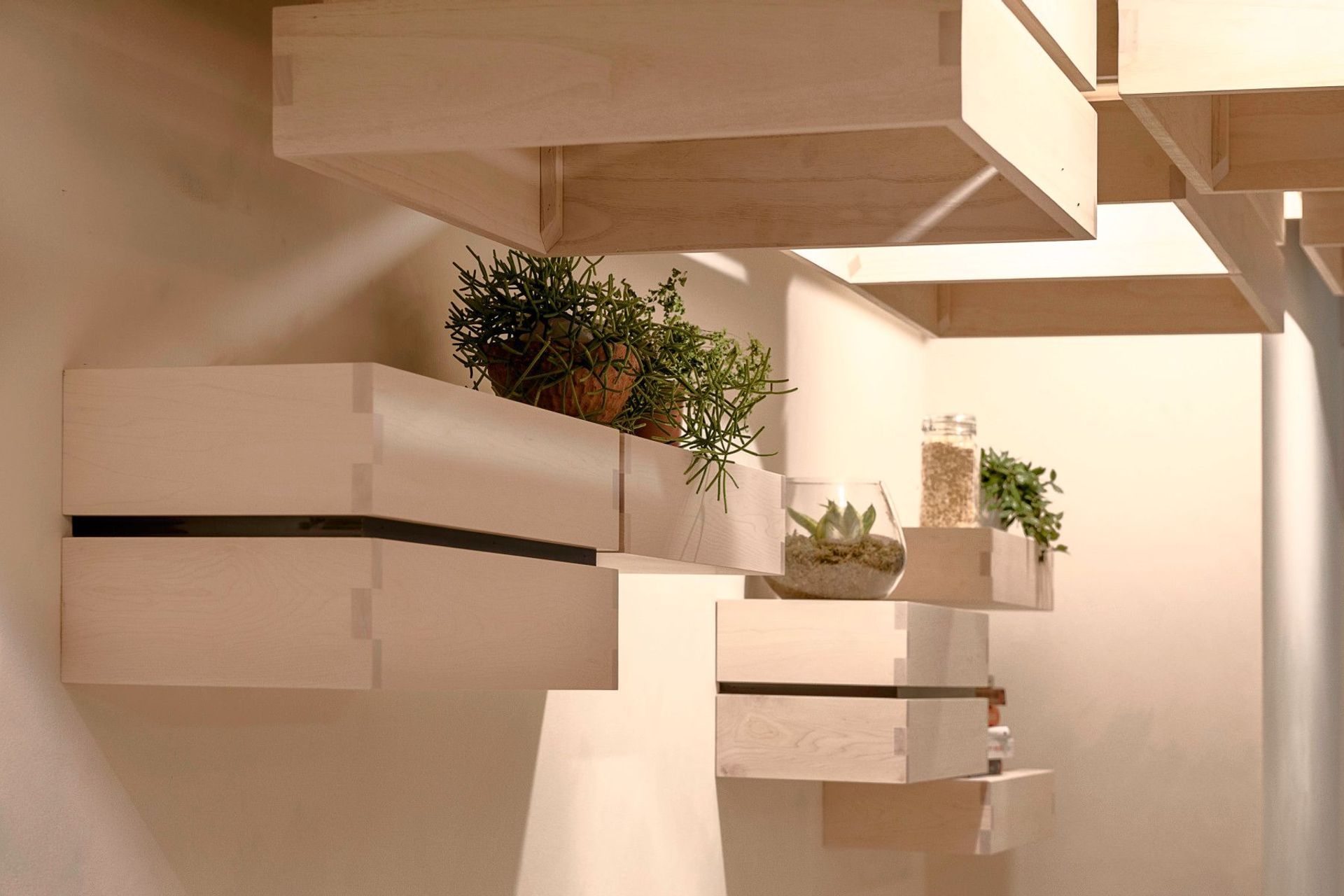
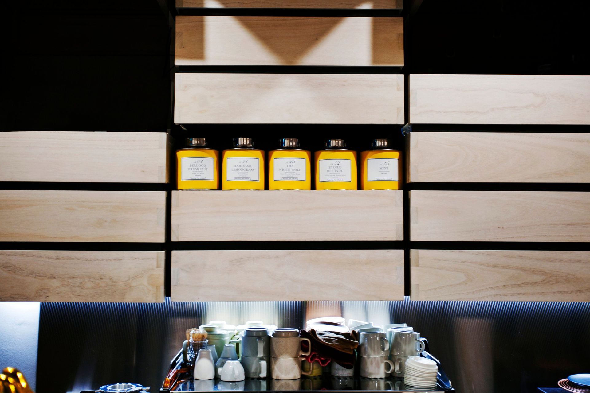
ArchiPro Project Summary - A café design inspired by vegetable crates, featuring extensive timber elements that create a warm, sculptural environment while maximizing limited floor space for food preparation and seating.
- Title:
- Hunters’ Roots
- Architect:
- Kitayama K Architects
- Category:
- Commercial/
- Hospitality
Project Gallery
Views and Engagement
Professionals used

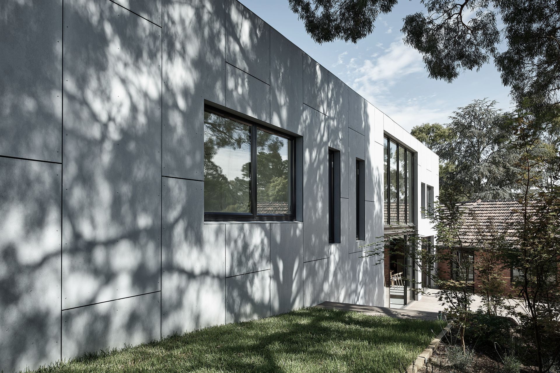
Kitayama K Architects. kitayama k architect is a Melbourne-based architecture and interior design firm, led by Japanese architect Kei Kitayama.
Our focus is to create memorable architecture by responding to the client brief and existing site context.
Year Joined
2023
Established presence on ArchiPro.
Projects Listed
2
A portfolio of work to explore.
Kitayama K Architects.
Profile
Projects
Contact
Project Portfolio
Other People also viewed
Why ArchiPro?
No more endless searching -
Everything you need, all in one place.Real projects, real experts -
Work with vetted architects, designers, and suppliers.Designed for New Zealand -
Projects, products, and professionals that meet local standards.From inspiration to reality -
Find your style and connect with the experts behind it.Start your Project
Start you project with a free account to unlock features designed to help you simplify your building project.
Learn MoreBecome a Pro
Showcase your business on ArchiPro and join industry leading brands showcasing their products and expertise.
Learn More