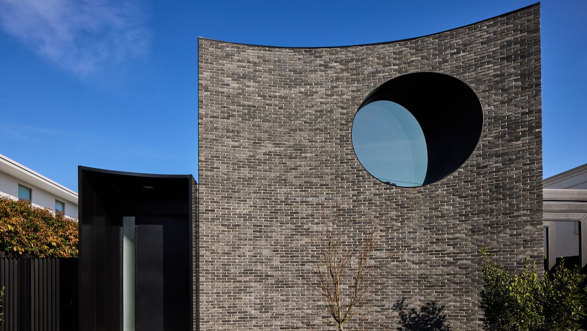
Petersen D96 bricks’ sweeping curved form delivers engaging street theatre in Brighton
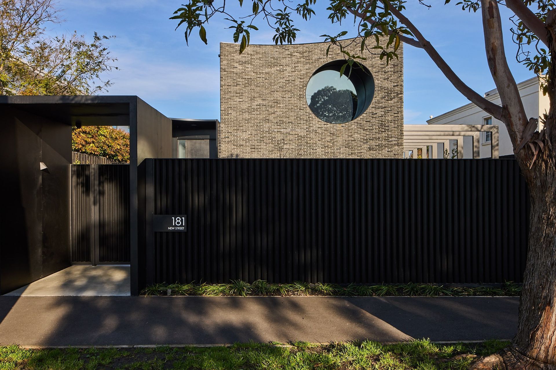
At its most simplistic, Luna House is black, made of bricks and steel, with a sweeping curved façade and one round window. But, of course, it’s abundantly more. It tells a story using materials, light and spaces to create a language so the home owners, and anyone passing by, can easily read it.
The brainchild of Billy Kavellaris, owner at Kavellaris Urban Design (KUD), Luna House tells a story about the people who live in it: Robert (also the builder), Zoe and their two young sons. For Billy, this project was personal, and a privilege, because he’s been friends with Robert for 30 years. So, Billy intimately knows the family, the site and its context so well, and has delivered a home that fits them like a glove, showing his true understanding of who they are.
Luna House also reflects Billy’s passion for art and architecture, showcasing how they’re intimately intertwined: “There’s a real level of sophistication in achieving architecture as an art form and not just a utilitarian shelter we need. The reason we aspire to create architecture that is art masquerading as shelter is to create engaging spaces,” Billy says.
So, Luna House showcases Billy the storyteller using his passion for art and architecture to tell a story through a building:
“The decisions you’re making for design outcomes aren’t prefaced on does it work – they’re imperatives that happen regardless. Rather than does it fit in with the design narrative, the environment, the brief, it’s ‘does it tell a story of the people inhabiting a space?’ And that’s the critical thing this house does – it tells a story about Robert and his family who live in it.”
The Luna House story is playful, layered, engaging and captivating.
From the street, Luna House delivers urban theatre in the otherwise conservative surrounds of Brighton. Creating an impact, and engaging those who live there as much as those who pass by.
This begins with the palette. Dramatically monochromatic, its series of predominantly blacks and greys are evocatively broken with pops of deep colour, externally through green landscaping and internally via rich materials like marble, French Oak timber and blue Japanese tiles.
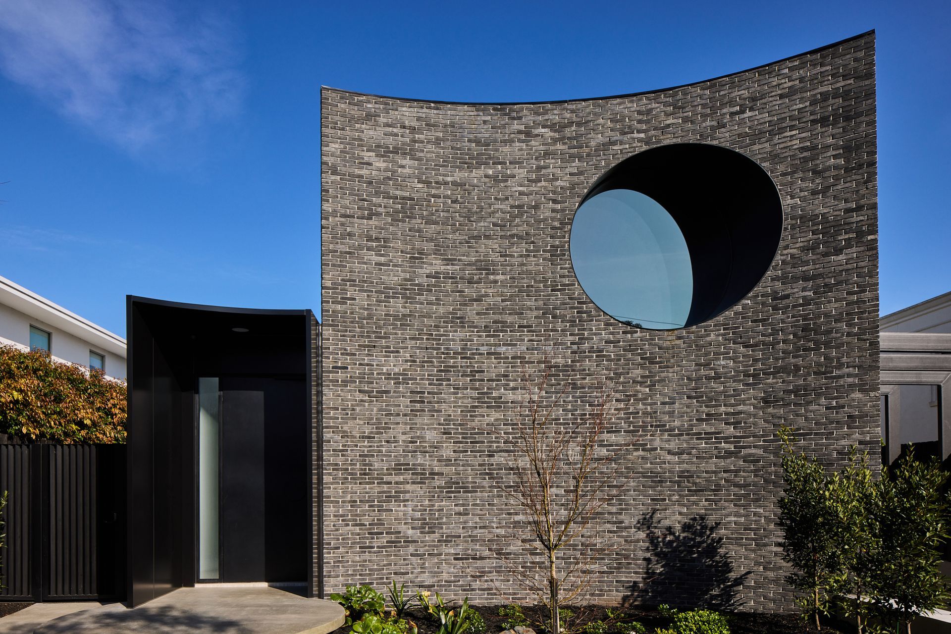
Petersen K96 bricks are the hero of the palette, turning the design process on its head. Instead of creating a design outcome, then applying the materials to fit, Billy used Petersen D96 bricks to drive the design outcome, and to show how a small matrix of little things can make a big impact.
“It’s such a beautiful product, we love it. It’s a genuine handmade brick with texture, character and irregularity, and that was really important for the material selection,” Billy recalls.
With a focus on handmade craftsmanship selecting skilled bricklayers was critical: “We’re not just using a bricklayer to lay bricks, we’re using a master craftsman to get the desired outcome. There’s no point having beautiful bricks if they can’t execute the design ideas.”
And it’s what KUD does with the bricks, alongside Brooker Bricklaying, that sets this home apart. “We wanted to use it to show that a geometric box can create amazing fluid curves,” Billy explains.
Building focus and tension between rectangular and curved forms.
The monumental, sweeping double height curved façade of Petersen D96 bricks is punctuated with one large glazed portal, all derived from geometric blocks. Quite the paradox, building focus and tension between strict rectangular and circular forms, delivering equilibrium and harmony.
But the real magic of Luna House is the way the bricks combine with black steel and concrete to create a simple and elegant, yet beautifully layered façade.
From across the street you see a sleek black steel fence grounding the building, with a portico at the gate. But you don’t see what happens inside, where the building meets the ground, all you see is the fence and a sweeping curve with a big oculus. Once inside, you see the next layer – round floating concrete discs that you ascend to enter the house. You see how the building meets the ground and interacts with the brick façade, and it’s then you see the different resolution of the bricks. From afar, you see the sweeping curve, and up close you see the bricks’ kinks, imperfections and character.
And while the facade looks effortless, it’s complex and intricate, giving a nod to Billy’s passion and skill for architecture, clearly evident in his work:
“There’s a rigour about every detail and how everything’s put together. The brickwork feels like it looks amazing. But to design and model it in our computers to make sure the bricks fit in how they meet the corners and the circle, all of those details are so important, and so difficult that you need to rigorously go through and make sure you understand the tolerances and where you cut bricks and where you don’t. People don’t see that, all they see is the outcome, and that’s a really rewarding outcome for us,” Billy reflects.
Landscaping is also a central focus; there are multiple nooks and crannies where landscape complements the architecture and engages with the spaces and the palette, inside and out.
Continuing the seamless repetition of the circular form inside.
Inside, the external design language continues with seamless repetition of the circular form. From the floating discs at the entrance, you walk through the corridor and a spiral stair connects the three levels. A round multipurpose room at the centre of the home is created by half circle glazed atriums containing a Japanese-inspired garden. This sits outside the glazing line and is connected to the house with one door. There’s also a circular end to the island bench in the kitchen, a welcome space for friends or family to gather, eat and chat.
“There are a lot of curved elements in this house so you have this really nice juxtaposition between some really organic curved and linear forms and some very geometric spaces. That tension between those two things creates interesting moments,” Billy comments.
The home’s interior is fully flexible, light-filled and an entertainer’s dream. There are five bedrooms, five bathrooms and various living spaces – a traditional living/lounge connected to the kitchen/dining room, a more formal room at the front, and the multipurpose circular room. Many people can be in difference spaces, simultaneously, each space creating something unique.
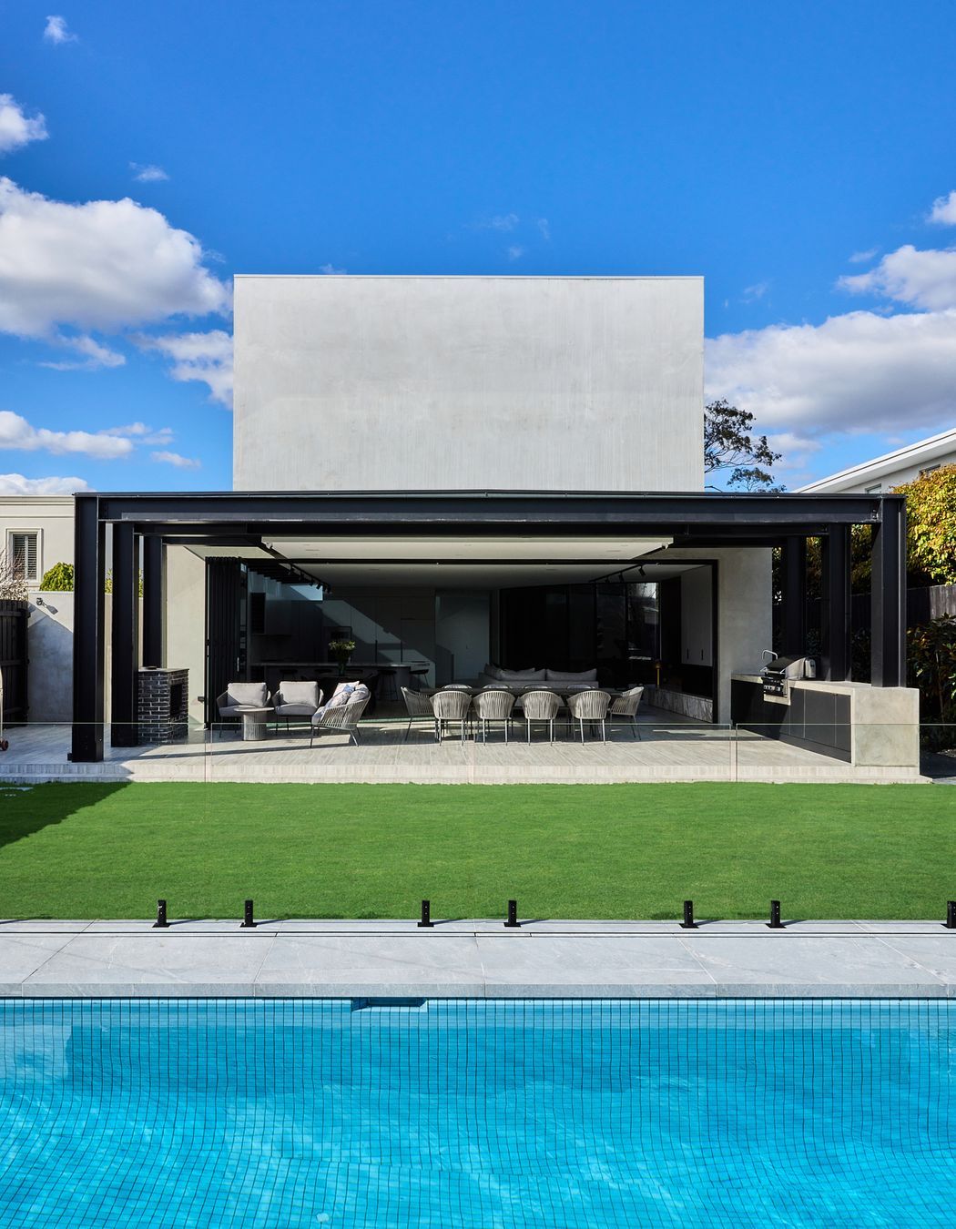
A private retreat on the top storey includes four bedrooms and an open study acting as a hot desking area, catering for work-from-home and school study needs. The basement contains a four car garage, gym, theatre room, wine cellar and storage. And the rear garden has an alfresco area with BBQ/kitchen, fireplace (of Petersen bricks), a woodfired pizza oven and a pool.
Strategically-placed glass attracts an abundance of light throughout the day ensuring a continued outside connection to internal spaces, while also controlling the flow to other areas where intimacy, mood or practicality dictates. While a linear skylight runs from the dining room to the kitchen and into the butler’s pantry bringing light into functional areas, oculus skylights over the formal dining room and spiral stairs frames and filters light throughout these spaces. Conversely, on the west-facing rear of the house, there are no windows, shielding the home from the hot afternoon sun. Instead, a long, monumental plinth on steel portal frames covers the alfresco area, providing summer shade to the bifold doors.
Luna House is proof that telling a layered, genuine story and continually pushing the envelope pays dividends. Rob and his family absolutely love everything about it: its playfulness, its engagement at the street level and, mostly, that it’s entirely left field of what you’d imagine a house to look like. For Billy, the joy was in watching the building materialise and reach the final outcome (which is magnificent), and ultimately see his friends using the home in the way it was intended. That is the true measure of success.
