About
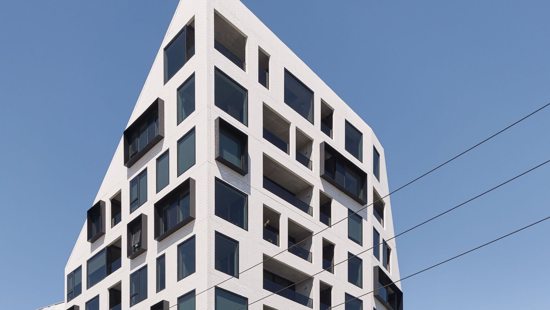
Peel by Milieu.
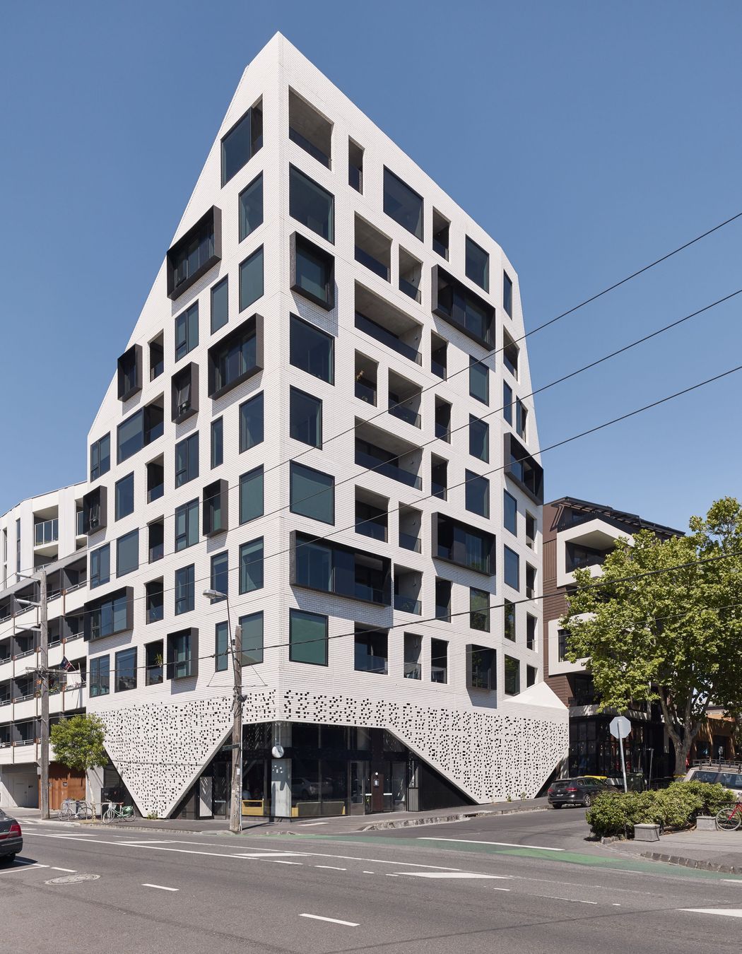
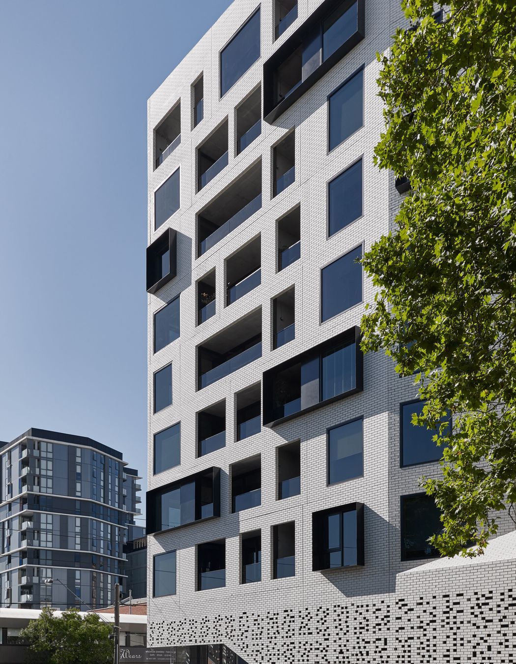
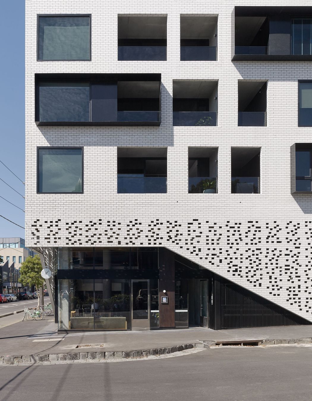
ArchiPro Project Summary - Peel by Milieu is a modern residential development in Collingwood, completed in 2018, featuring 37 elegantly designed apartments that harmonize with the urban landscape, showcasing a distinctive brick façade and innovative architectural details by DKO Architects.
- Title:
- Peel by Milieu
- Manufacturers and Supplier:
- Robertson's Building Products
- Category:
- Residential/
- New Builds
- Completed:
- 2018
- Building style:
- Modern
- Client:
- DKO Architects
- Photographers:
- Dan Hocking
Project Gallery
Views and Engagement
Products used
Professionals used

Robertson's Building Products. A building products innovator, Robertson's Building Products provides innovative, customised wall and floor solutions to help architects, designers, builders and homeowners transform their visions into practical, high quality, award-winning designs, and leading edge projects in their field.
What sets us apart is the unique nature, breadth and quality of the products we supply, their flexibility to adapt to your project’s requirements, and the personalised service and proven expertise we bring to develop the best solution for you.
Our unique clay, glass and stone bricks and brick facing tiles and brick slips will enrich and invigorate your projects with their unconventional and contrasting textures, and their countless special colours and sizes, helping you to achieve state of the art designs. Using our products, your project won’t look like anything else on the street, but will become the leader others seek to follow.
And, our product range keeps growing. We’re continuously developing existing products and sourcing new bricks and thin brick tiles, both locally and internationally.
Just think of Robertson's Building Products as your partner in design: our approach is collaborative, considered and open, driven by a love of good design. We listen carefully, understand your needs and use our proven industry expertise to make it easy for you to find the best solution.
Year Joined
2023
Established presence on ArchiPro.
Projects Listed
95
A portfolio of work to explore.
Responds within
2d
Typically replies within the stated time.
Robertson's Building Products.
Profile
Projects
Contact
Project Portfolio
Other People also viewed
Why ArchiPro?
No more endless searching -
Everything you need, all in one place.Real projects, real experts -
Work with vetted architects, designers, and suppliers.Designed for New Zealand -
Projects, products, and professionals that meet local standards.From inspiration to reality -
Find your style and connect with the experts behind it.Start your Project
Start you project with a free account to unlock features designed to help you simplify your building project.
Learn MoreBecome a Pro
Showcase your business on ArchiPro and join industry leading brands showcasing their products and expertise.
Learn More