On a tranquil riverside site near Hamilton sits the diminutive but highly functional River Retreat. Designed by architect Daniel Smith of Edwards White Architects as his own home, this is an exercise in minimalism that works. Amelia Melbourne-Hayward of ArchiPro talked to Smith about some of the design ideas behind the award-winning house.
Where is River Retreat located and why did you choose this site?
My partner and I had been living in Auckland for six and a half years and were ready for our next stage of life. Situated around 20 minutes north of Hamilton, it’s a skinny, long site with beautiful north-facing river views. I convinced my wife to come and look at it and we ended up buying the property in 2014.
While we were completing the subdivision consent, we lived in an old house on the site that we renovated and currently rent out. We used those funds to build River Retreat – it’s always been the dream to build our own house!
The site is only 13 metres wide, so we were working within quite restrictive parameters. Although the scale of the building had to be within all height boundaries and set back from the river, we pushed it as far forward as we possibly could, so it sits only 28 metres off the river edge – it feels very close to the water.
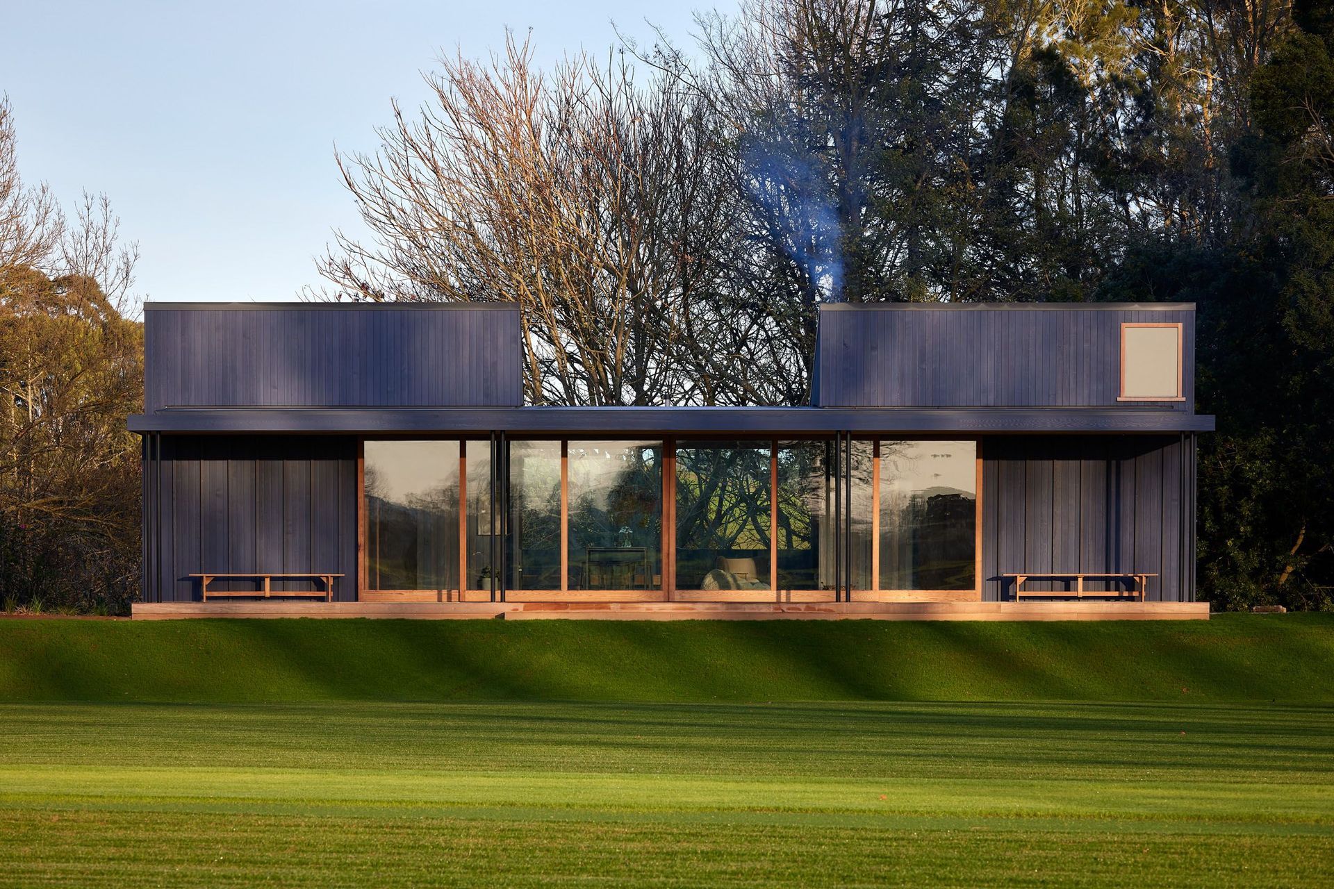
What were the main design ideas behind the house?
Originally, we designed a 30m² studio but quickly realised that we needed more of a family home, so it was an exercise in reduction and deciding what is essential to create a small family home that works well.
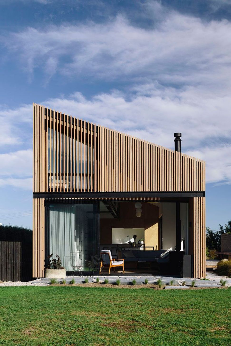
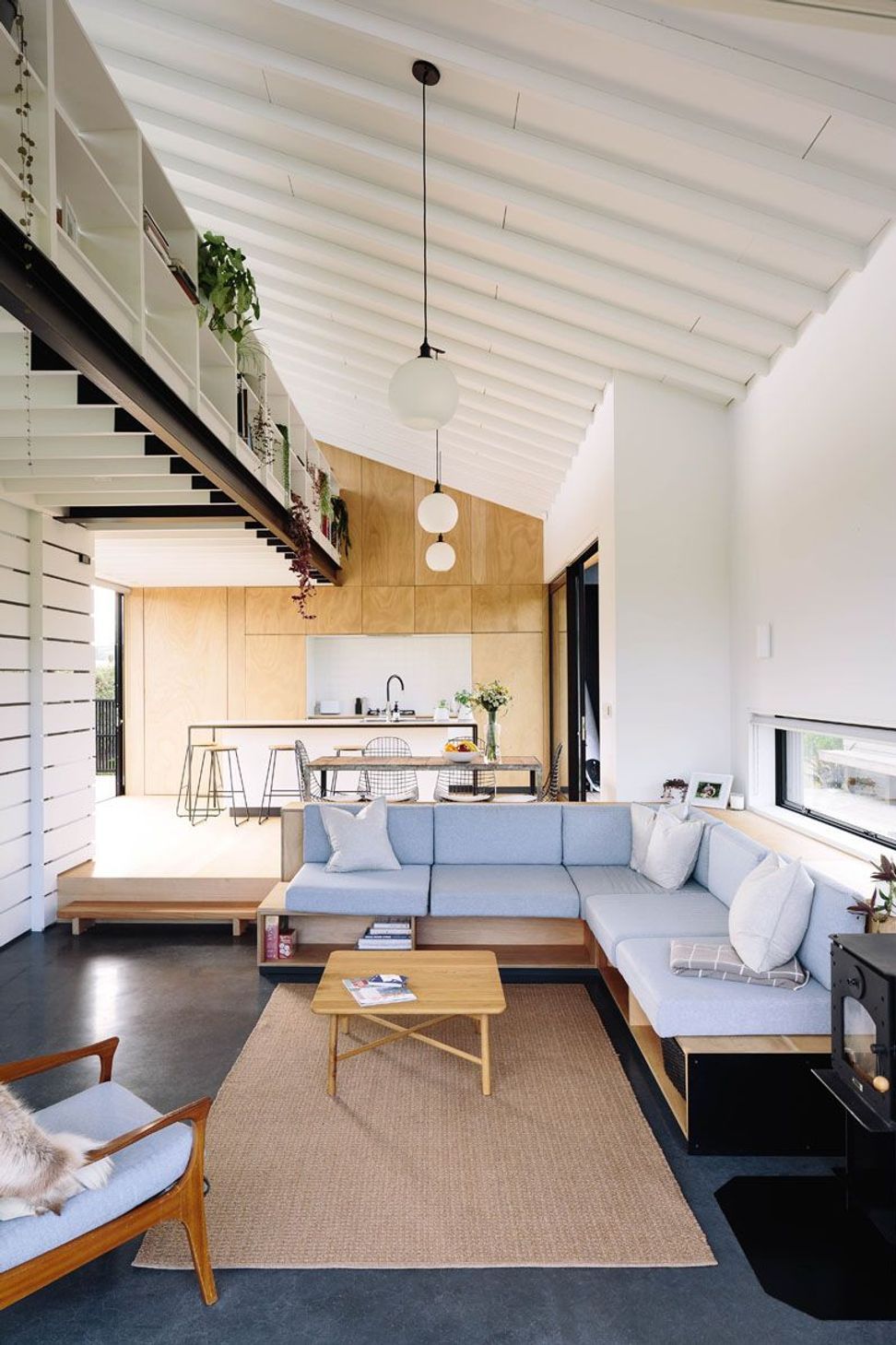
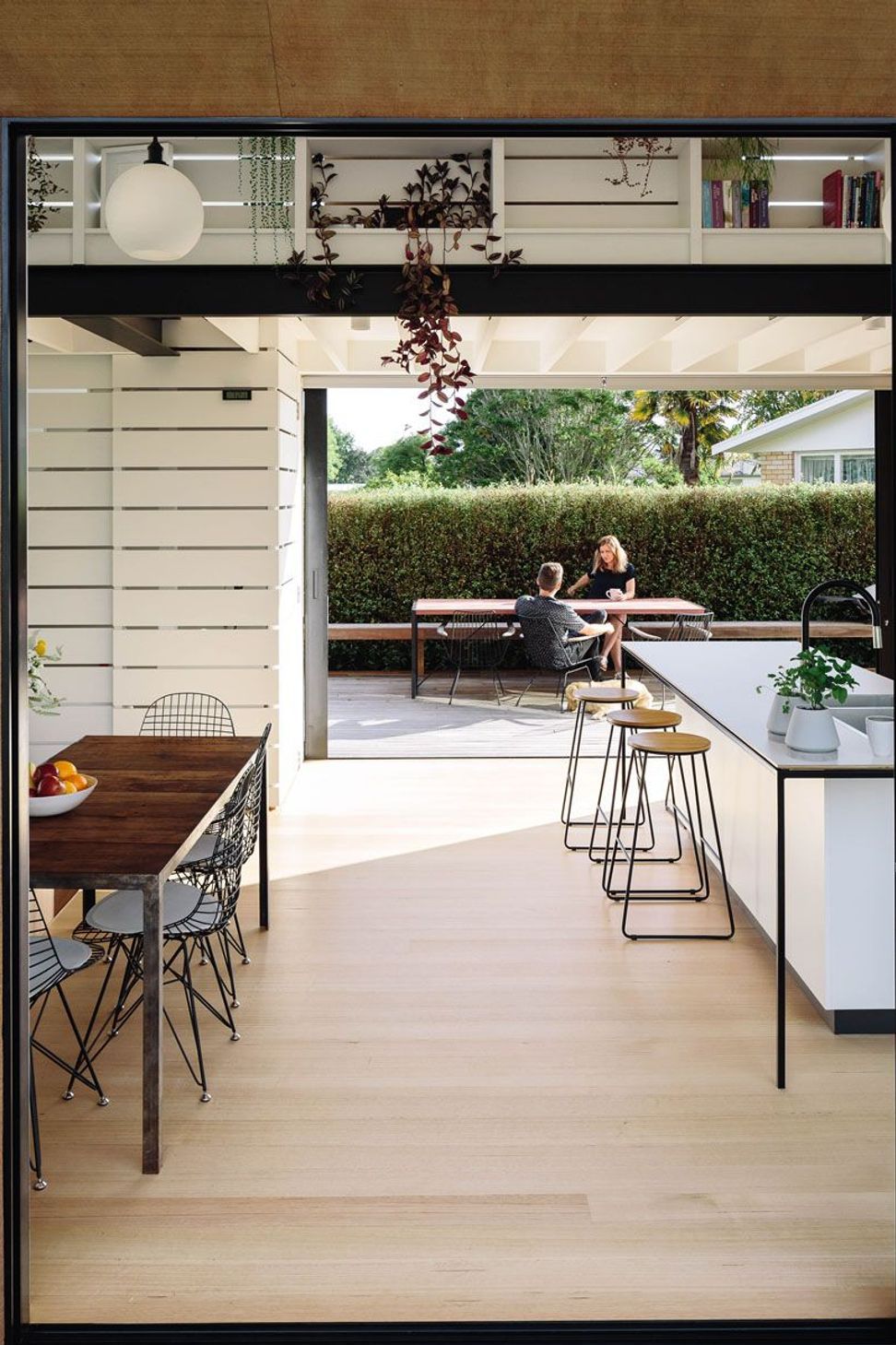
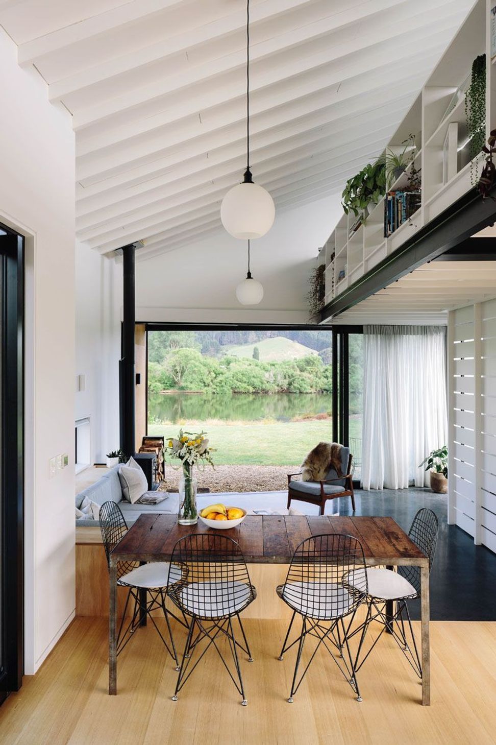
The design draws off the classic New Zealand bach typology, with natural materials, casual, open plan living and blurred spaces. We wanted it to be light and to open out to the view – to be a place of relaxation.
You’ve managed to fit three bedrooms into a small space without it seeming too tight. How did you achieve this?
Our brief was to have a minimum of two bedrooms and a bathroom. We ended up putting a mezzanine above the living area, which was to gain more room but also to create separate zones for living. During construction, we realised that we could fit another small bedroom in the roof attic space. There is also a day bed and an office space upstairs.
Downstairs, you step into the living area from the kitchen, so it feels like you’re stepping into another distinct area – essential for creating the illusion of spaciousness in a small home.
The open shelving that runs along the mezzanine makes the house feel homely and, at the same time, prevents clutter in the small living area – it’s a perfect spot for photos, books and plants.
Why have you chosen these materials for the interior?
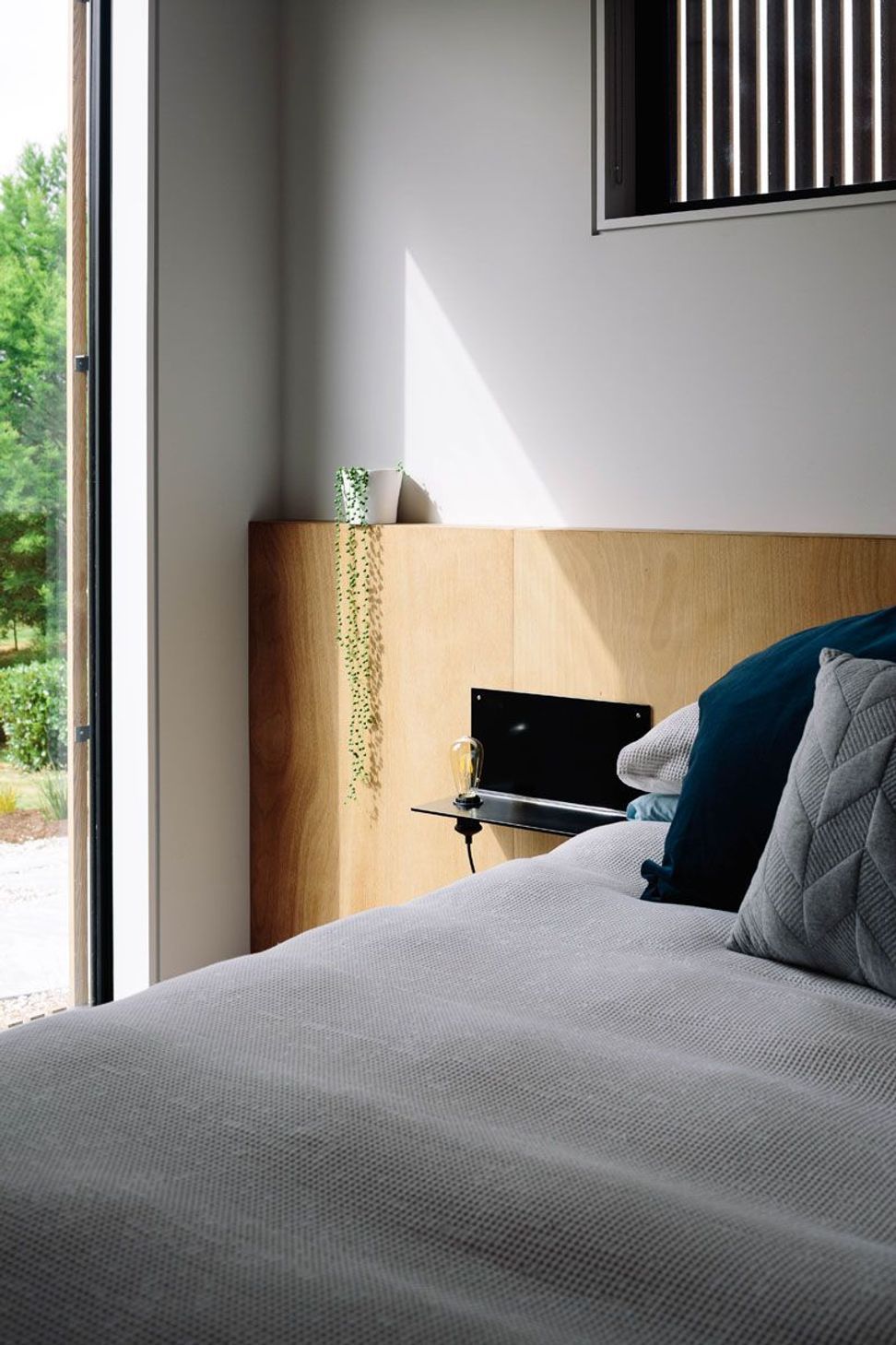
Inside, we wanted a modern-day home that still retained the bach feel, so we instigated three rules with the interior materials. Anything generic and cost efficient, such as pine or GIB, was painted white. Anything in steel/aluminium was powdercoated black, and any natural material – such as the ply, the Tasmanian Oak flooring and the built-in cabinetry – was exposed to impart a light, natural aesthetic.
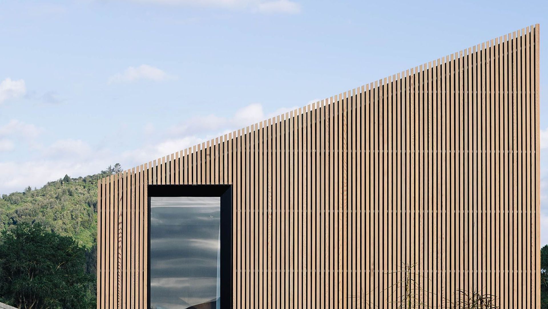
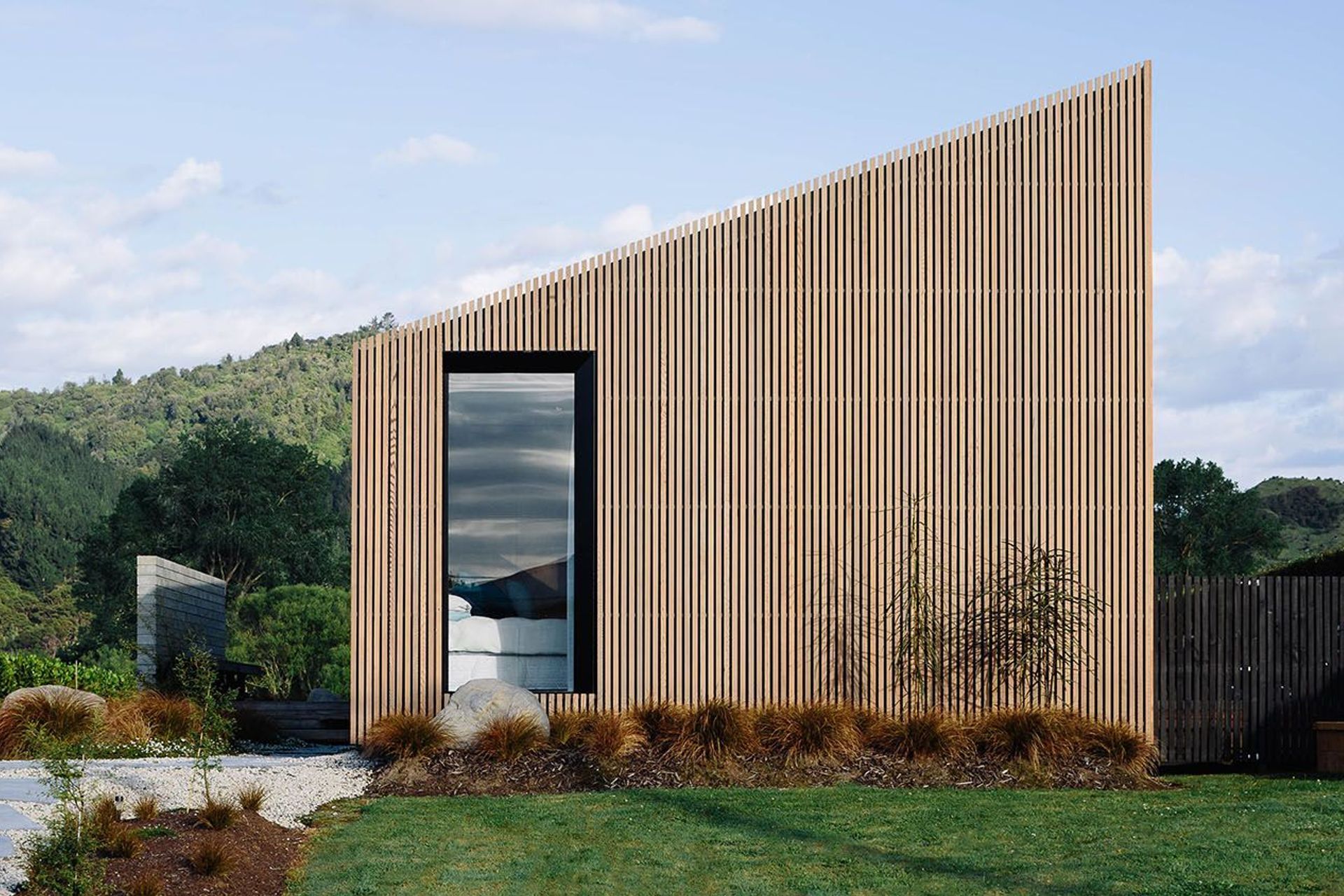
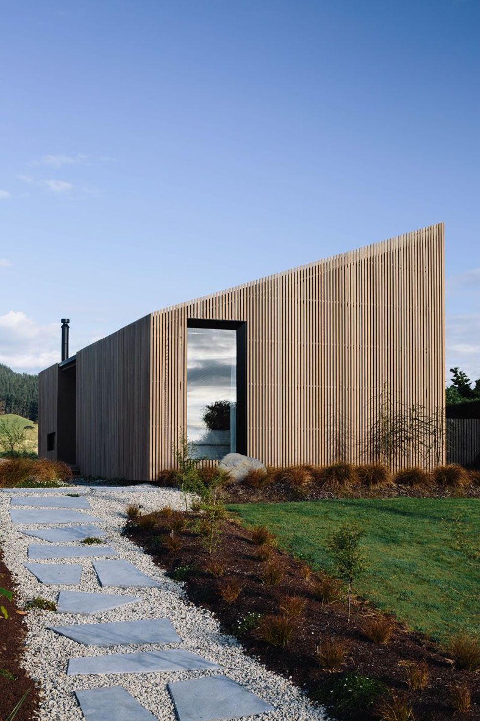
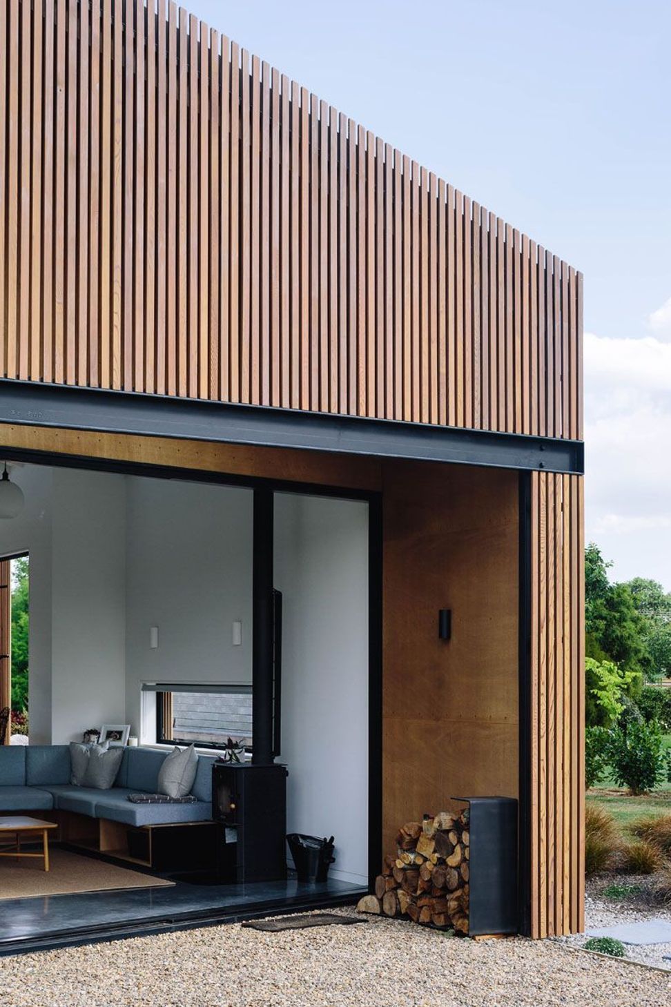
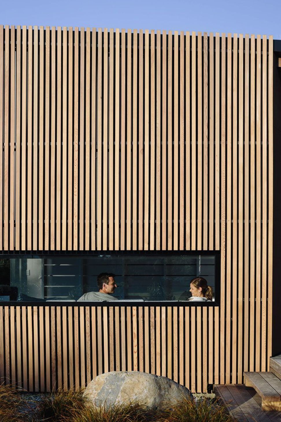
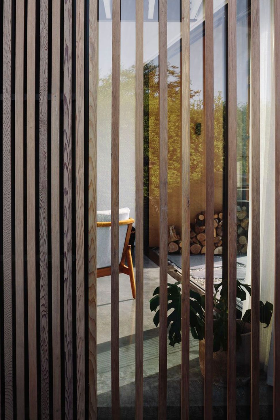
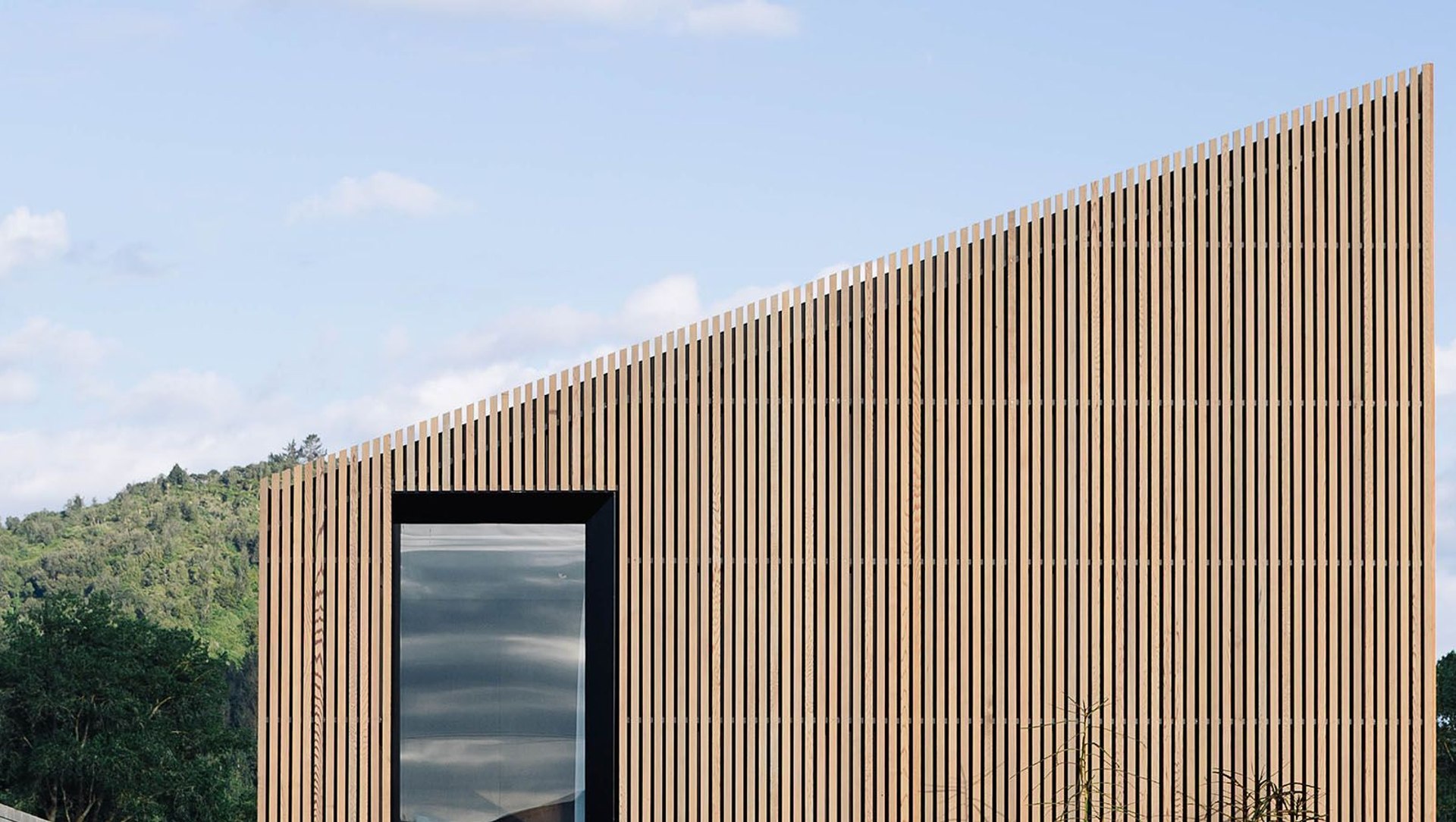
The cedar rainscreen cladding and the form of the home is quite unusual and very striking. How did you reach these design decisions?
With the exterior, we wanted it to feel like a clean, crisp form in the landscape that used materials that weren’t too expensive but remained very much in context to the site. On approach, we wanted the house to feel like it’s meant to be there.
The rainscreen is a cedar-clad form that covers the flashing details very well. It’s almost like the ring of a tree with the ‘bark’ being the battens and the smoother surface underneath the plywood. We clad the entire house firstly in bullet-proof Diamond Colorsteel, as it is weathertight, with the cedar rainscreen added last.
Tell me about the outdoor living spaces.
We created deck spaces on both the eastern side for the morning sun, and the western side enjoys the evening sun. Rather than a covered outdoor space, which the budget didn’t quite cover, we have kitchen/dining doors that open right up and create the sensation of being in an outdoor room.
The two decks mean that you can move to either side of the house depending on the climate or the day, or you can relax out the front on the grassy area.
Edwards White Architects was also behind the landscaping – what are the main elements?
All the planting is native. We wanted to feel like it came up out of the ground – it’s a very natural look that came together in about six weeks, with a bit of trial and error! The pavers are poured in-situ concrete with black oxide, with recycled crushed concrete between them.
What’s your favourite spot in the house?
The kitchen is the hub of the home, it is simple and functional but elegant. The whole back wall is made of ply with white-surfaced recessed elements – essentially a wall of cabinetry. The island feels like a piece of furniture with its customised steel frame and a high-pressure laminate Formica top.
As we don’t have a defined dining room, the kitchen space is again a response to what we could reduce in the house to make it functional but still highly liveable. It’s a peaceful getaway, and now that we have a 1-year-old baby, it works very well as a small, comfortable family home.
Written by ArchiPro editor Amelia Melbourne-Hayward.
Photography by Simon Wilson
This idyllic riverside property will be on the market in April 2025!