


Weeroona House – a Queen Anne villa in Melbourne’s Hawthorn with a noteworthy, copper-clad extension by Neil Architecture – demonstrates a cultivated response to the coalescence of heritage and contemporary architecture. Complementing its Federation bones, the house features spirited touches by Simone Haag – a confident use of colour and an exciting material selection throughout.
“We’re constantly evolving in the way we approach these types of buildings,” David Neil of Neil Architecture explains. “Increasingly, we’ve become a contextually driven office, so when we’re working on the back of these old houses, we try to make sure they relate to the front – either in terms of complementary materials or form – without being too starkly different.” Weeroona House’s extensive scope saw the architects remove a 1970s lean-to and design an expansive extension with an additional storey above and a garage below.
Structurally, the front of the home has been treated lightly. However, a bold approach to materiality and colour brings depth and intrigue to the overall design, and a selection of furniture, artwork and objects curated by Simone Haag conveys a distinct richness. As Simone says, “from the initial client meeting, I was inspired. Among many things, David has an exceptional eye for colour, and the tones that were already established for the project were so sophisticated, dark and moody that I knew the client had an appetite for greatness.”
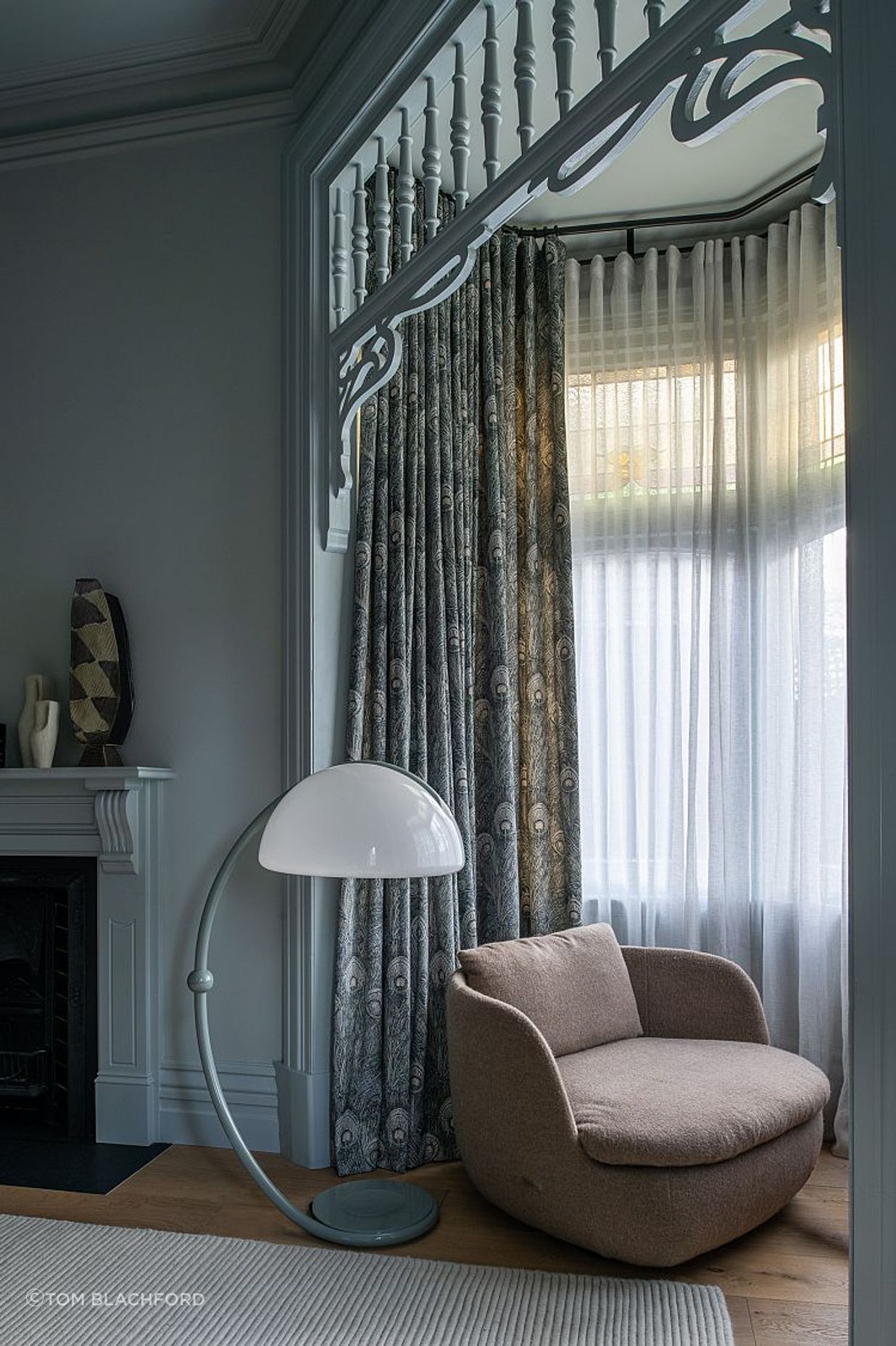
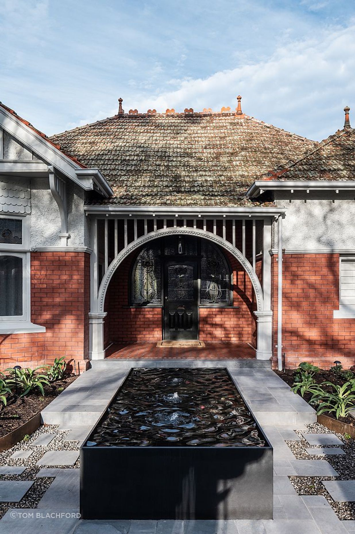
The Queen Anne villa has a marvellous street presence. Many of the neighbouring dwellings hail from the same era and express similarly complex elements and strongly articulated forms. Set back from the street with a low fence and a large front garden, there is ample aspect to appreciate the home. The original timber fretwork and gutters have been painted light grey and the original brickwork newly tuckpointed. As Matt Breen of Neil Architecture notes, “the existing part of the house was in need of a lot of repairs,” adding, “this all formed part of the restoration works such as new tessellated tiles, patched and repaired rough cast render and new stained-glass windows.”
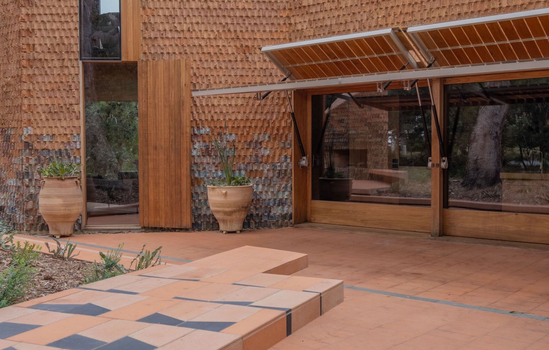
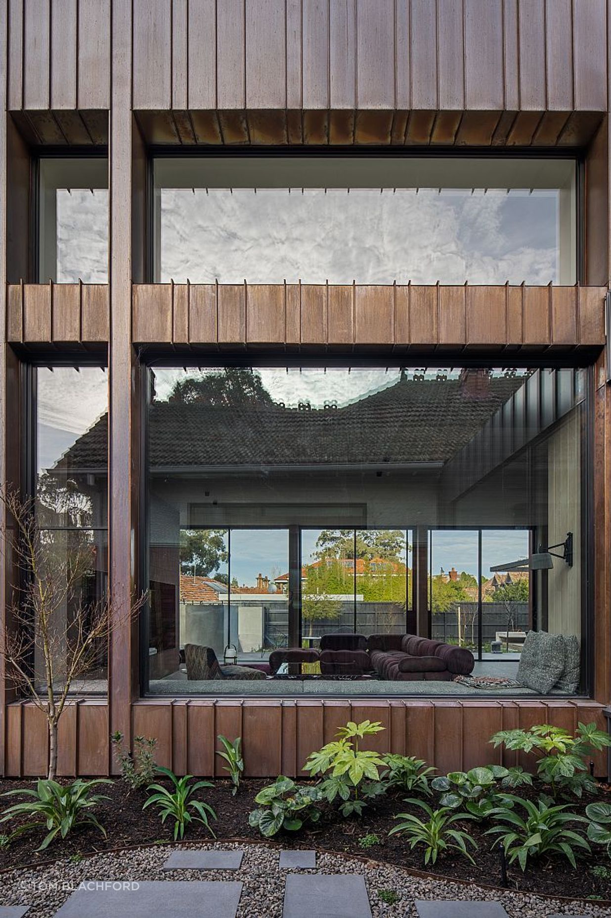
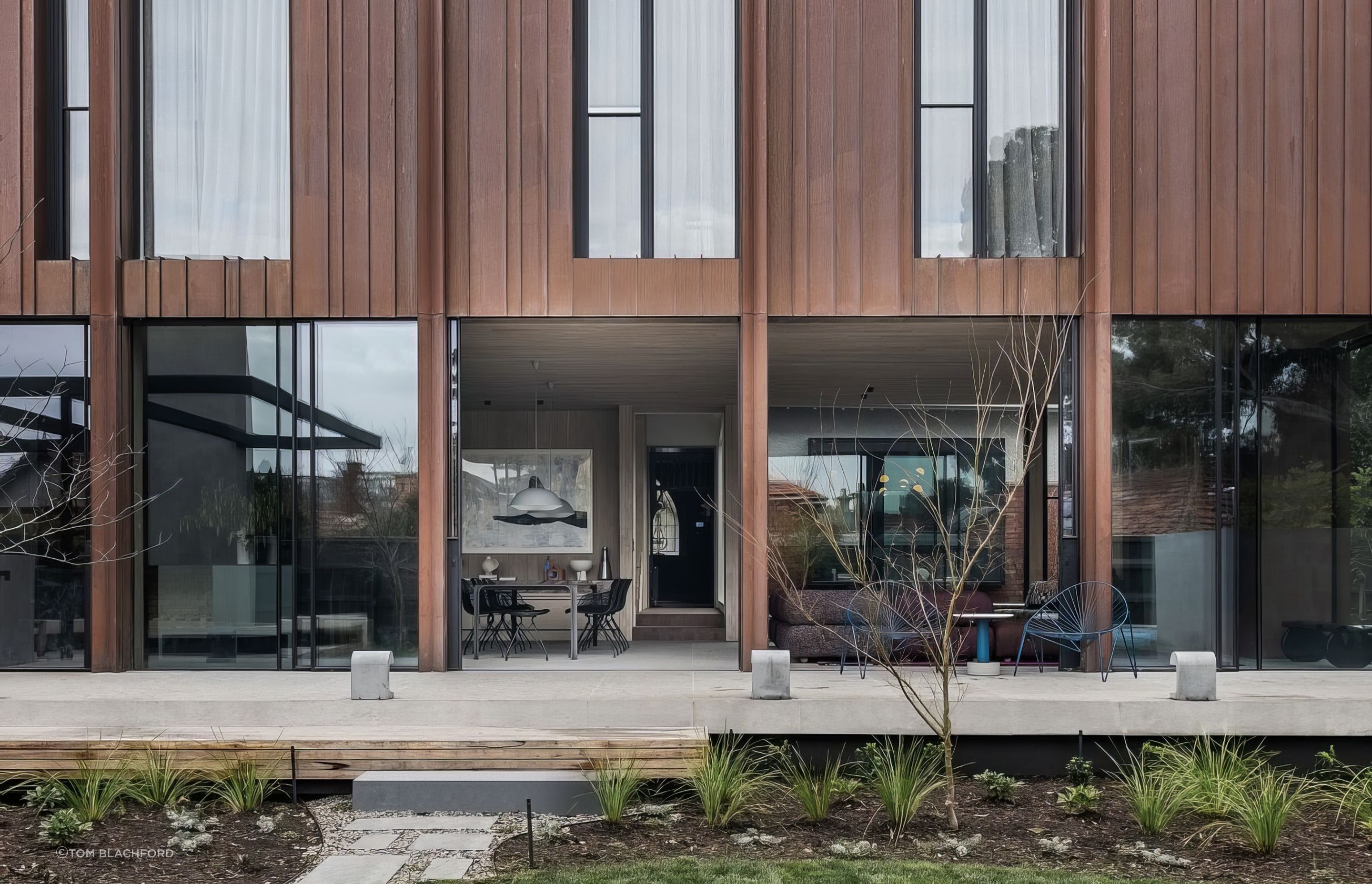
There is a neatness to the expression, and yet the moss-covered original roof tiles and landscaping by Eckersley Garden Architecture soften the effect, reminding passers-by of the home’s lived-in heritage. The extension is barely visible from the street, but it makes for a bold expression at the rear. “The copper cladding and its detailing are quite defining – it’s a very strong gesture,” David says. “Copper is a nice material to work with on a heritage project as it complements the red brick.” Matt echoes this, saying it “will patina beautifully with age – constantly changing and evolving with the building.”
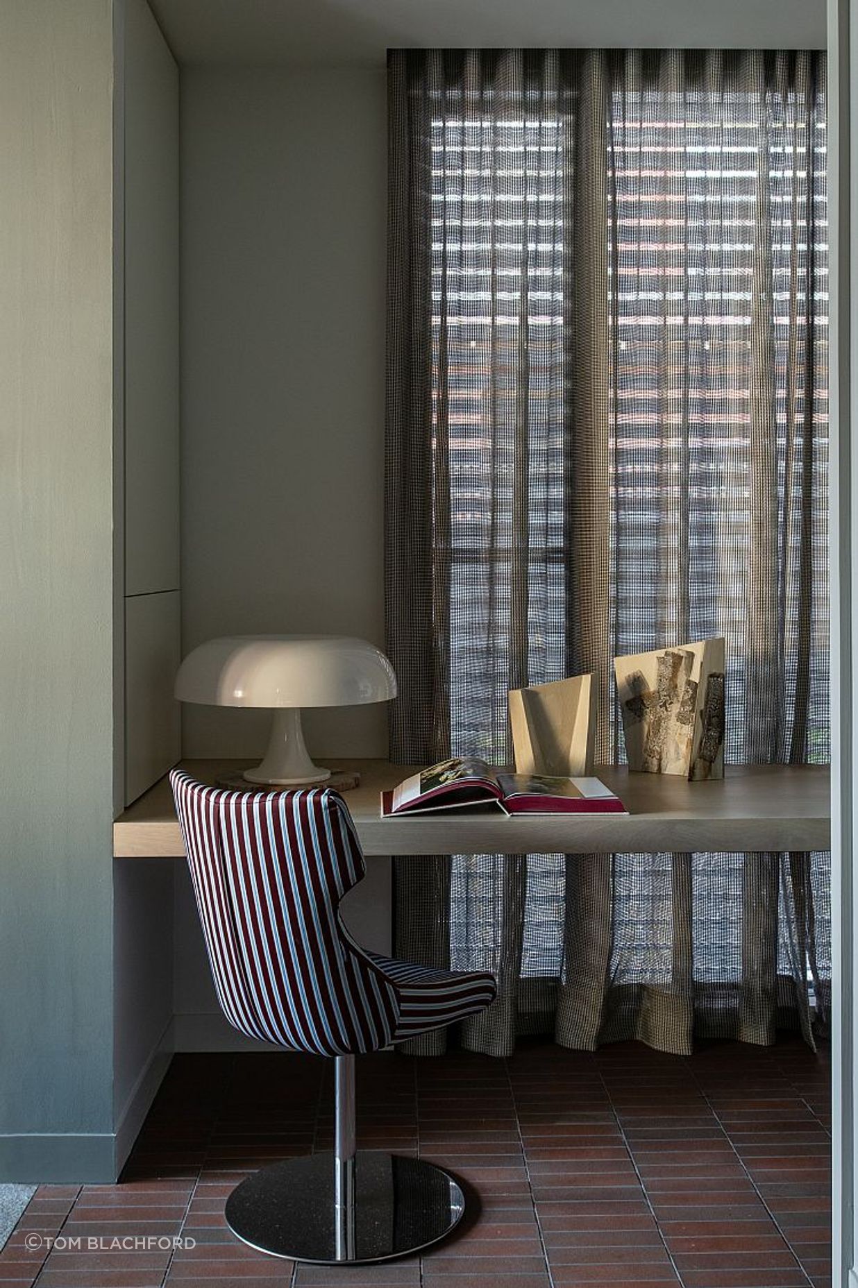
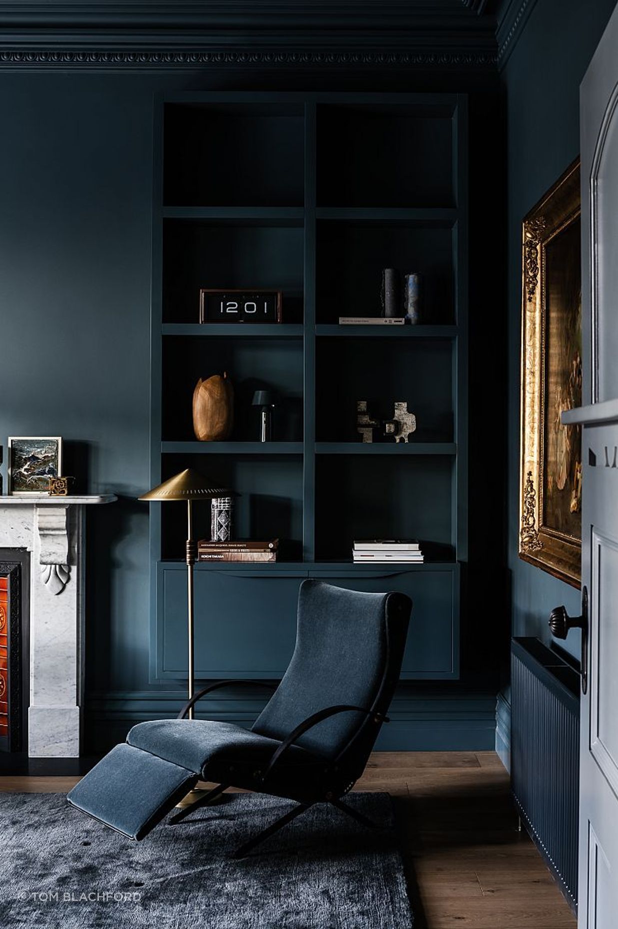
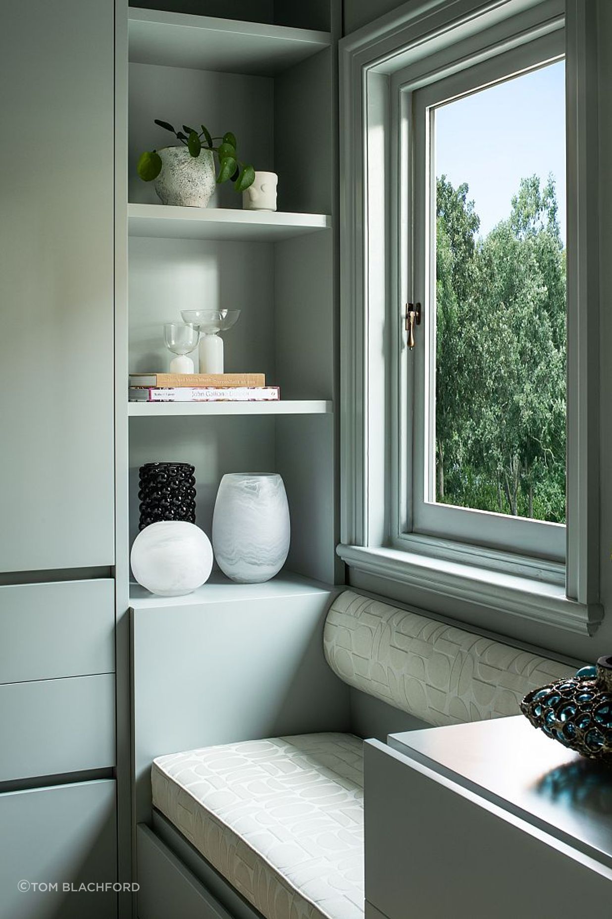
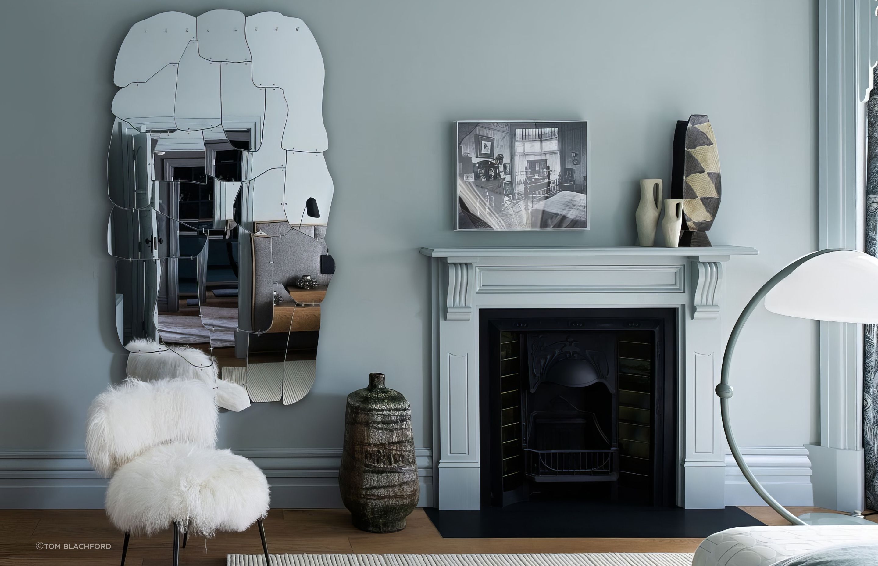
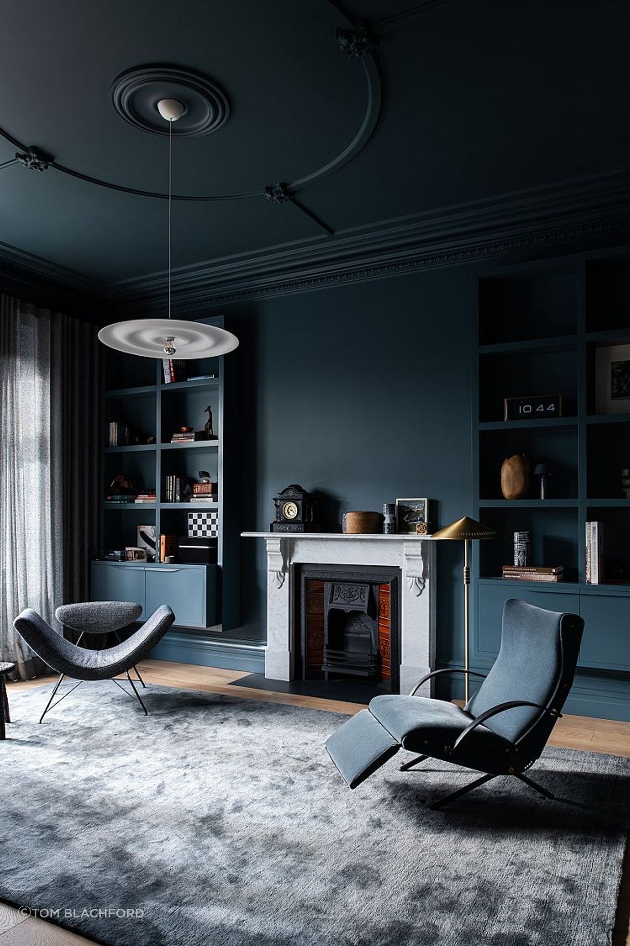
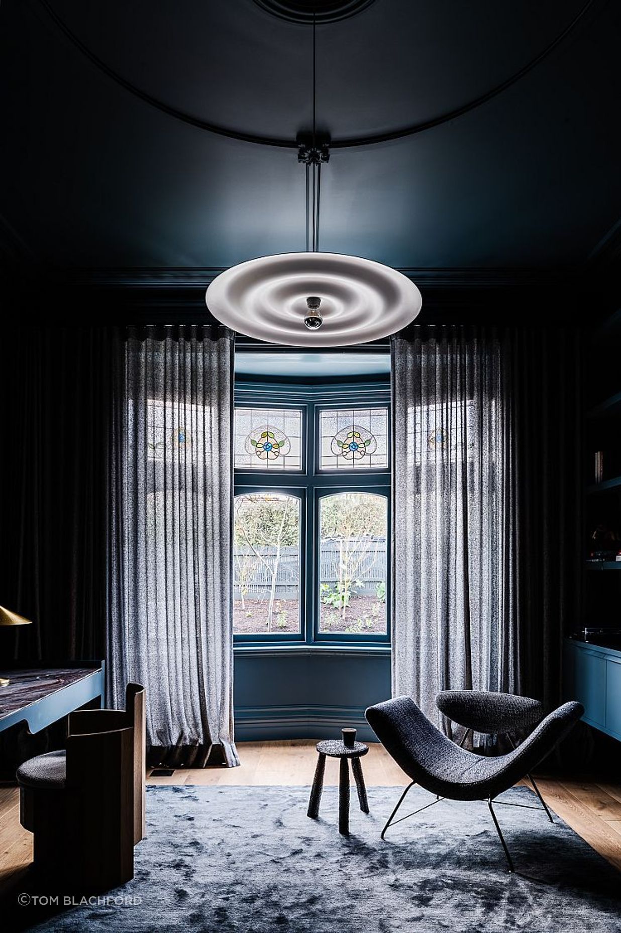
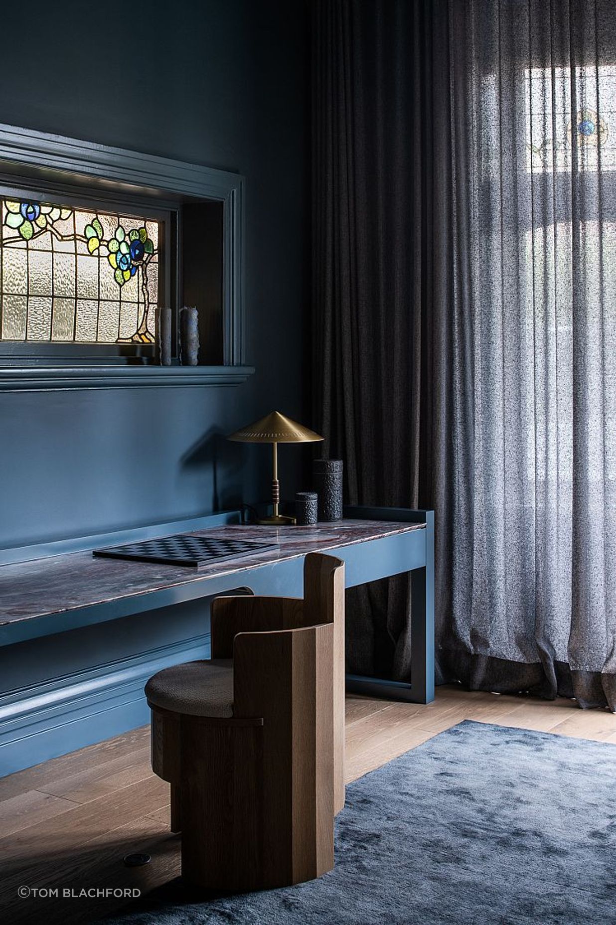
Inside, the front rooms proudly express their heritage with high ceilings and decorative cornicing. The surfaces are coated in shades of deep cyan, bringing cohesion and a touch of modernity to the otherwise ornate spaces. Of the study, Simone says “the idea for this room was that it would be completely tonal, and the variations would reveal themselves in form and texture but not in colour.” A vintage Tecno lounge chair in mohair velvet upholstery “perfectly matched the walls, which set in motion the search for a series of other pieces that also colour matched the walls,” she says.
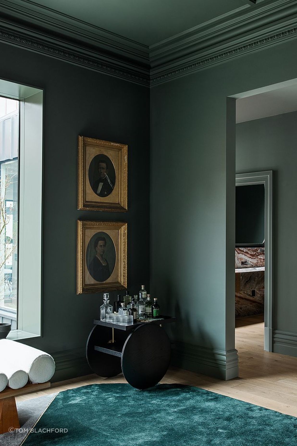
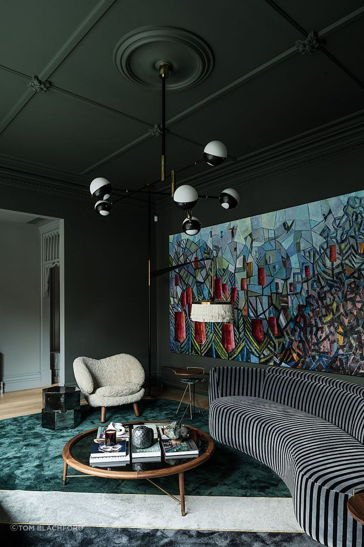
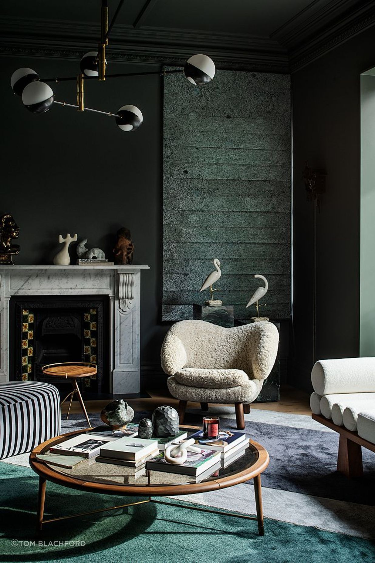
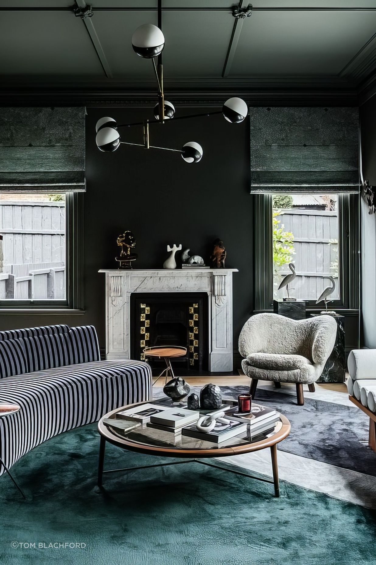
Coated in deep emerald and expertly dressed, the formal living room takes a similar approach. Simone recalls that the clients expressed a desire to be challenged through the furniture and art selections. “When someone says they’re eclectic, that’s very subjective, so figuring out where they sat was an interesting process.” As such, the space is amplified by an exceptional selection of vintage and contemporary pieces by Dimorestudio,Finn Juhl, Daniel Boddam and more, all sourced specifically for Weeroona House with the client’s open-ended brief in mind. A selection of keepsakes and sentimental objects pepper the interiors as well; as Simone says, these pieces “were small in scale but colossal in terms of importance [and] add a gravitas to the project.”
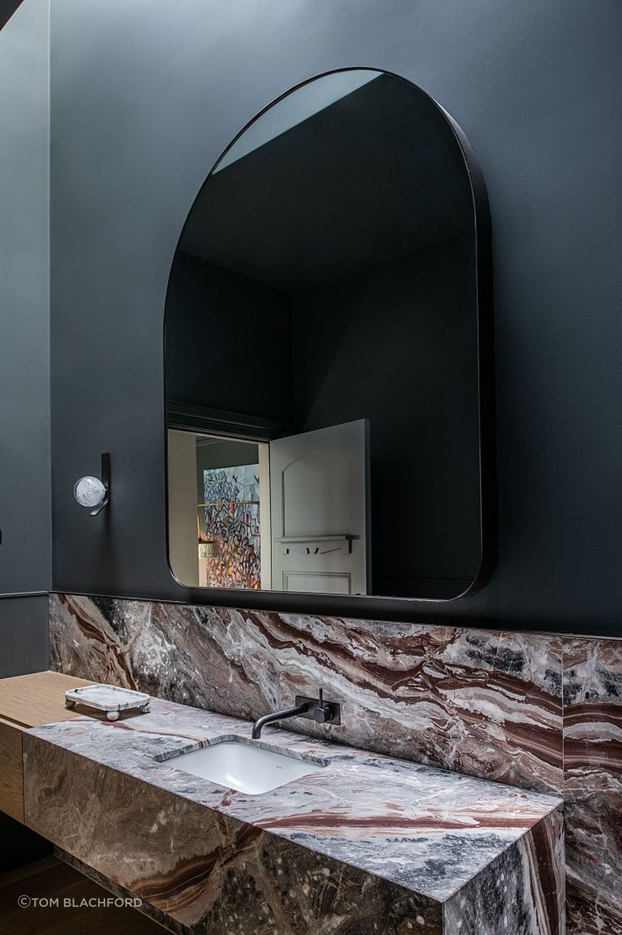
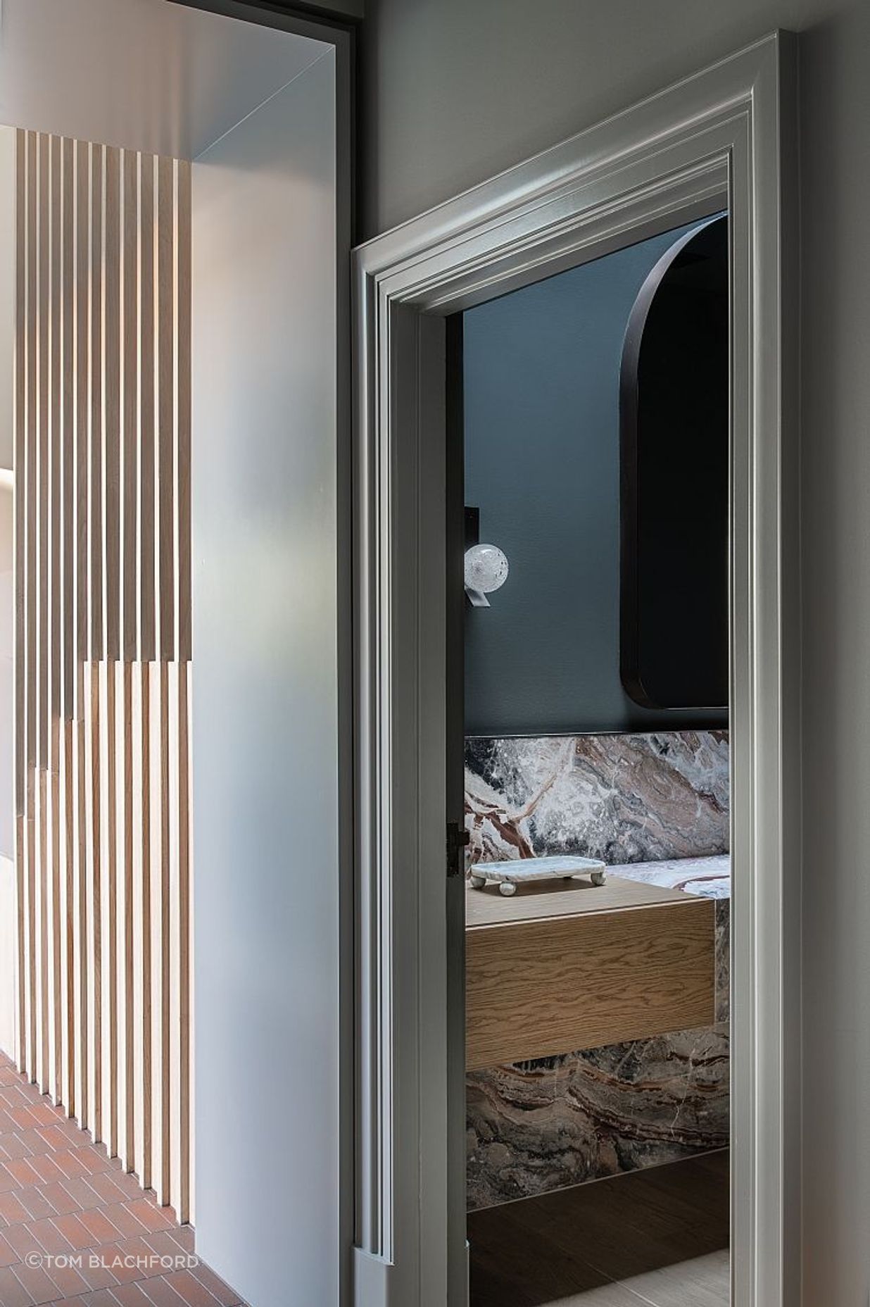
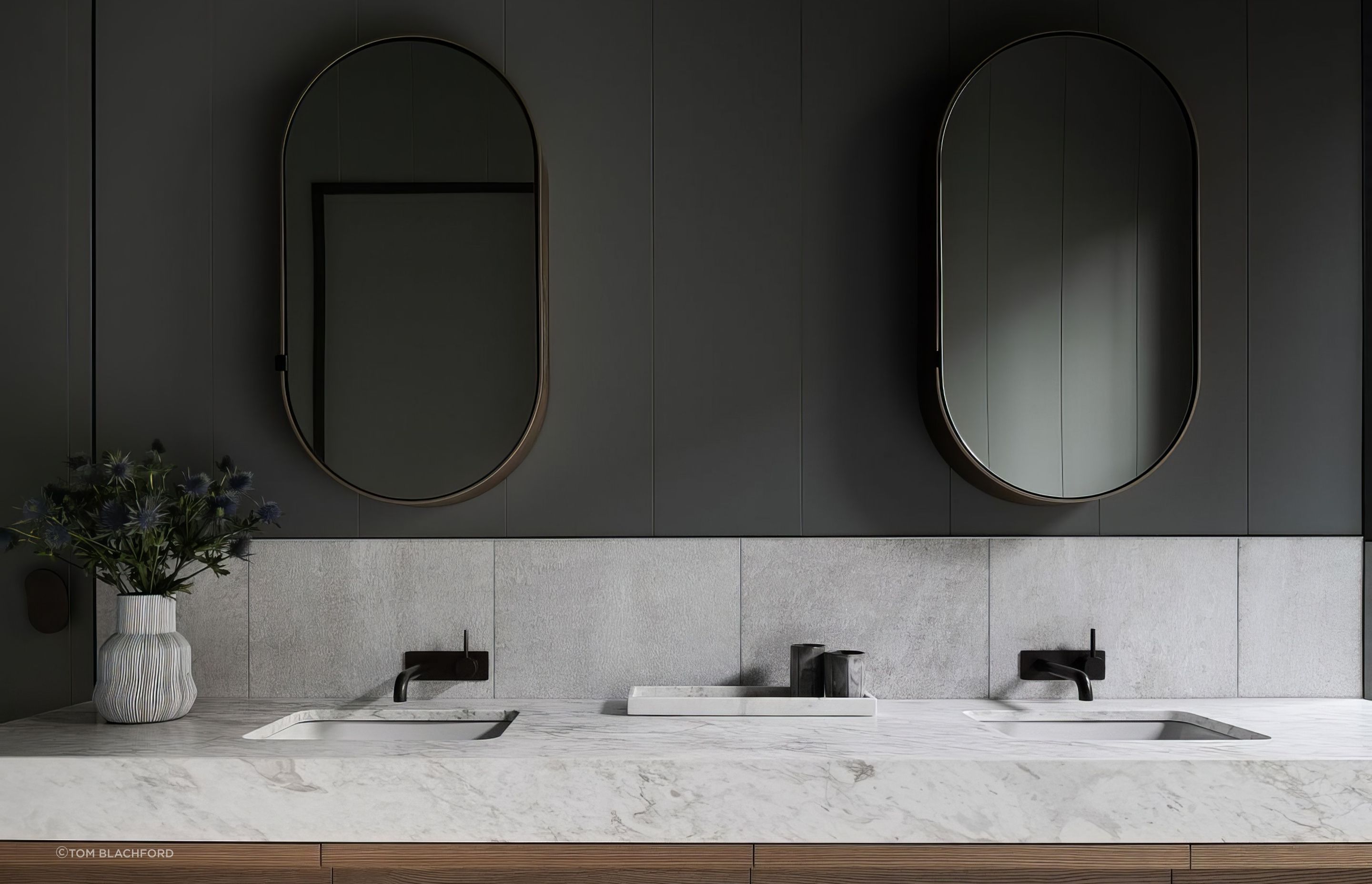
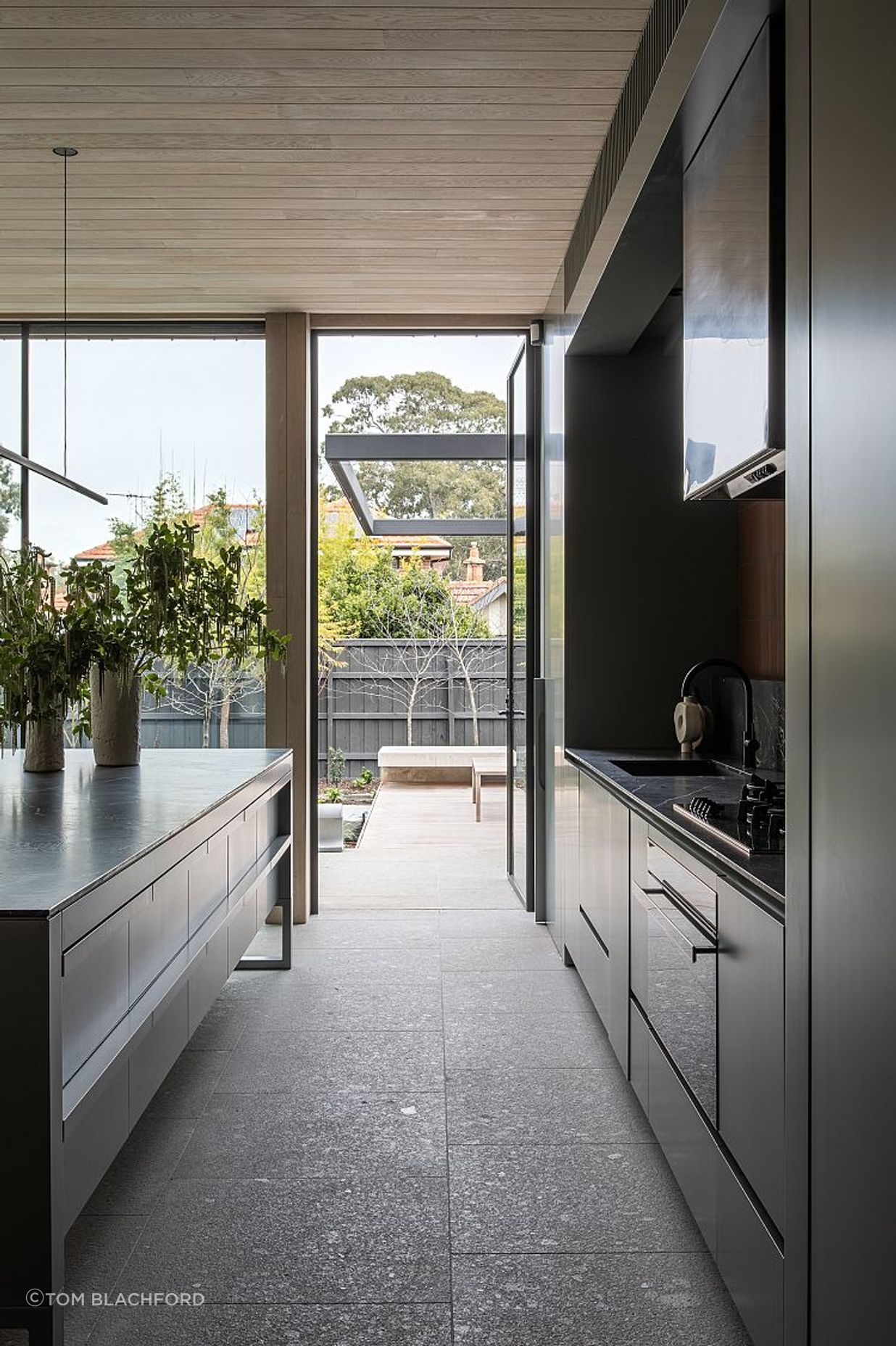
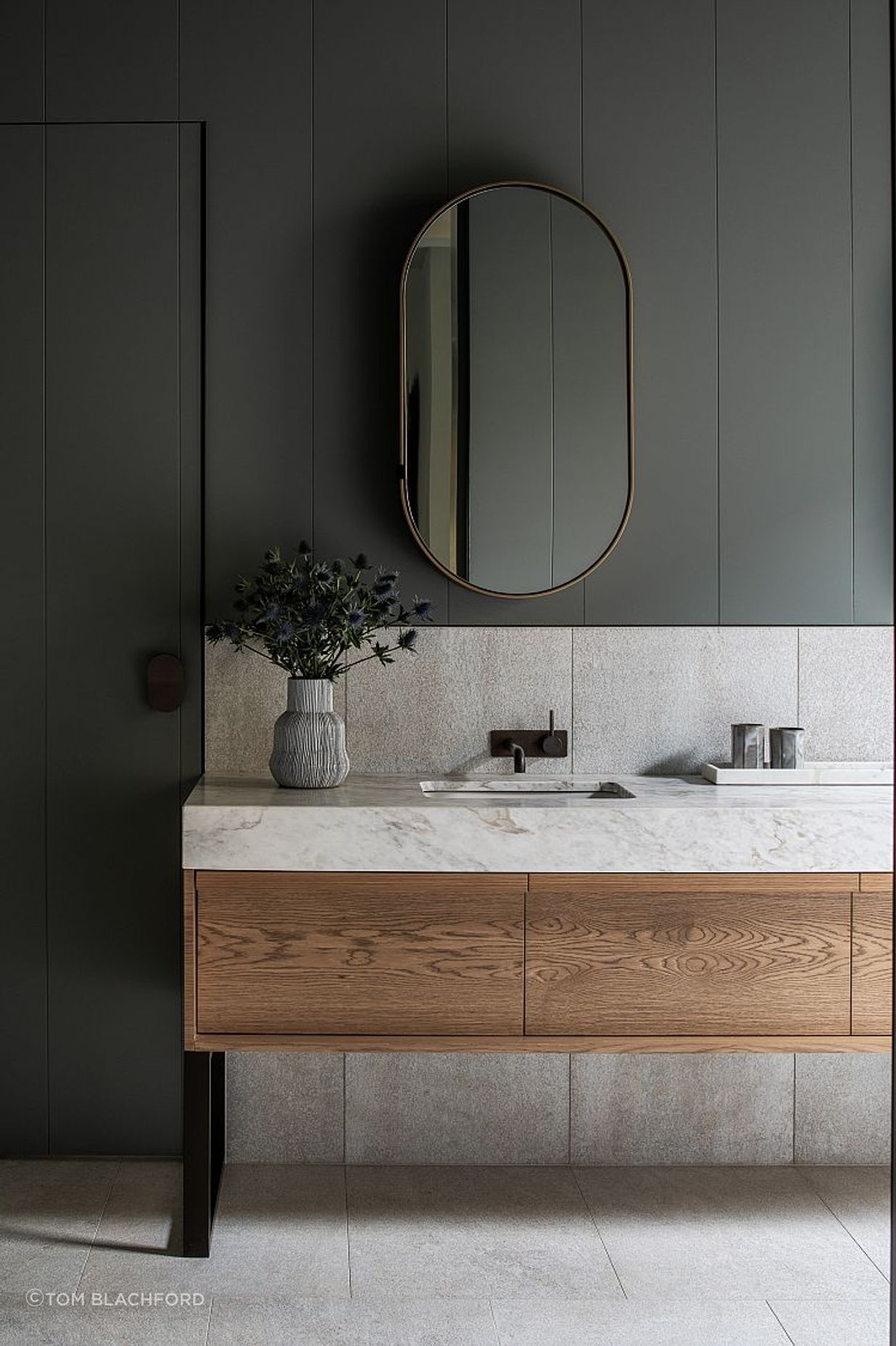
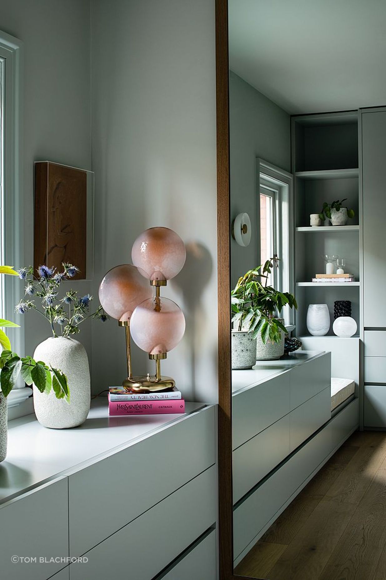
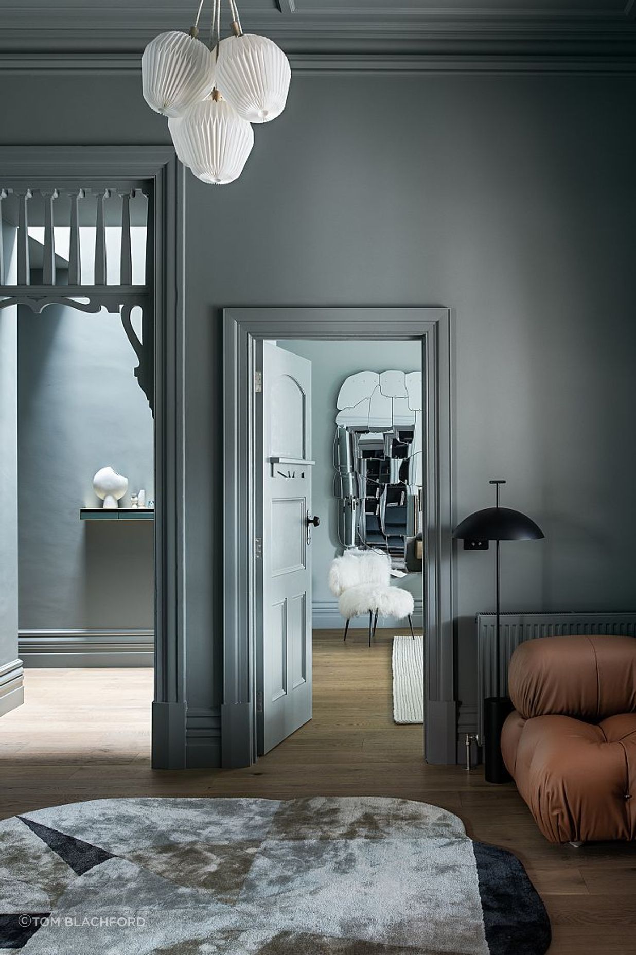
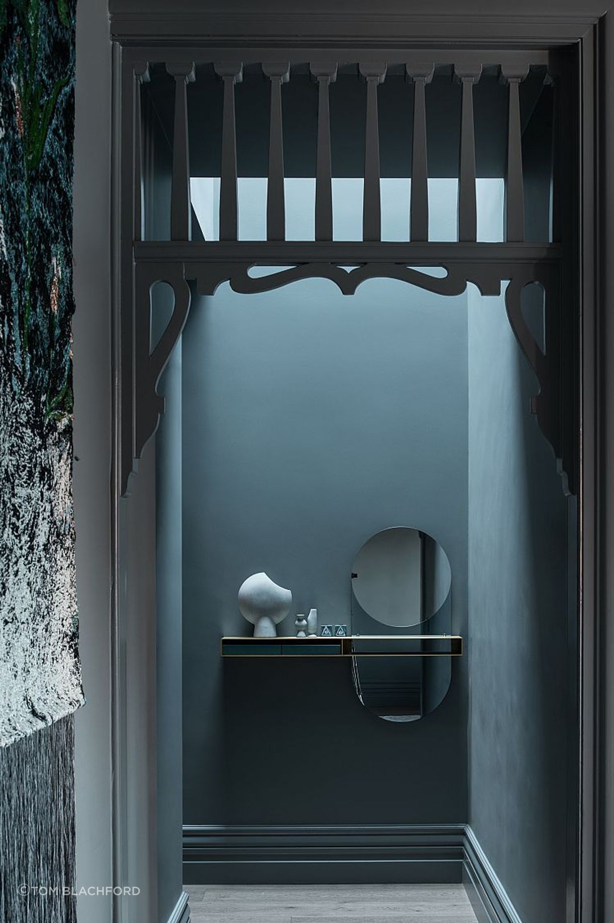
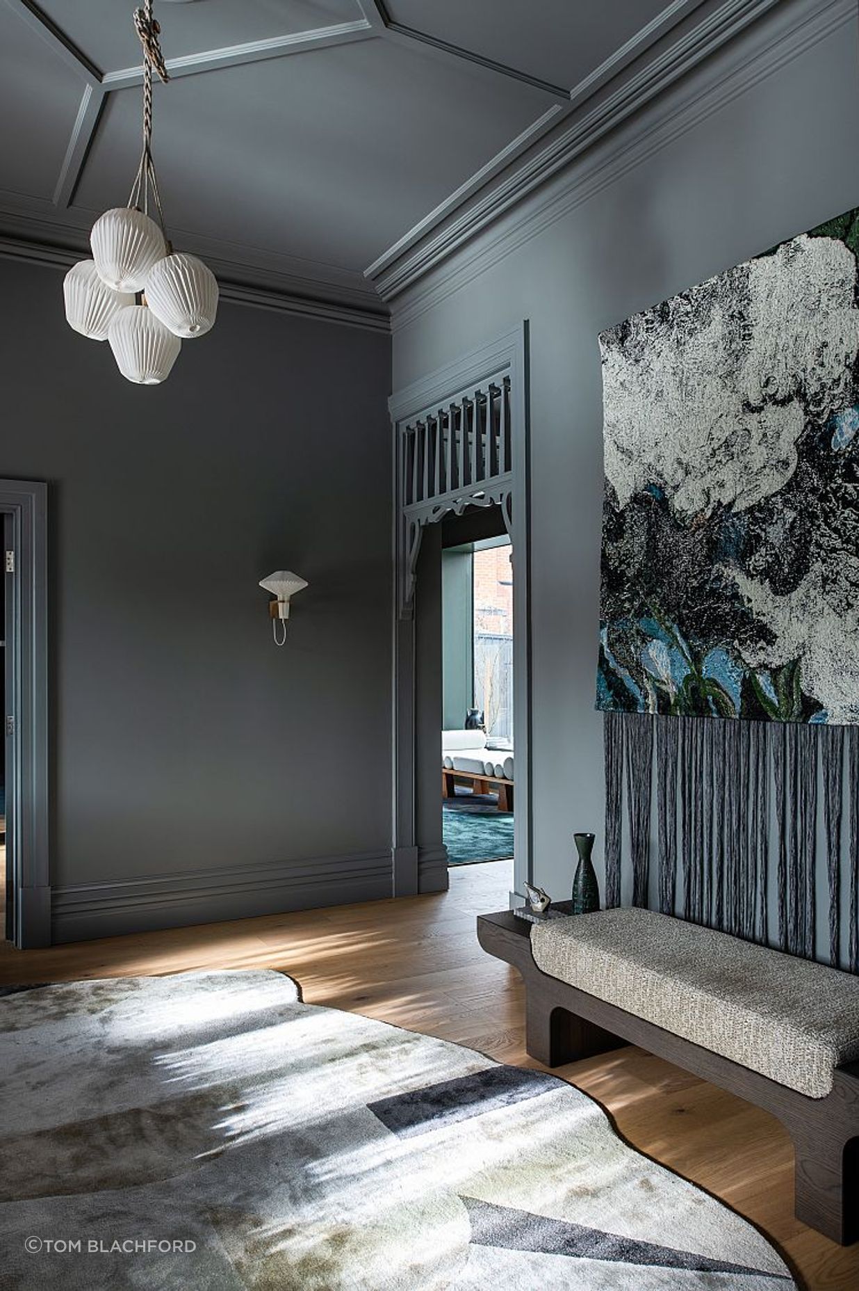
The original layout has remained largely intact. Interestingly, there are two corridors running from the entryway to the back of the house around a central pod, which houses the powder room. Painted in deep cyan and with richly veined Artedomus Opus Rosso stone benchtops, it is a delightfully unexpected hidden pocket of the house. The “service corridor” to the west leads to the cloak room, study nook and the back of the kitchen, whilst the main corridor unfurls to the left, providing glimpses to the rear. Artedomus INAX Fabe RE tiles stretch out underfoot, signalling the next iteration of materiality, as a large window offers views to a generous internal courtyard.
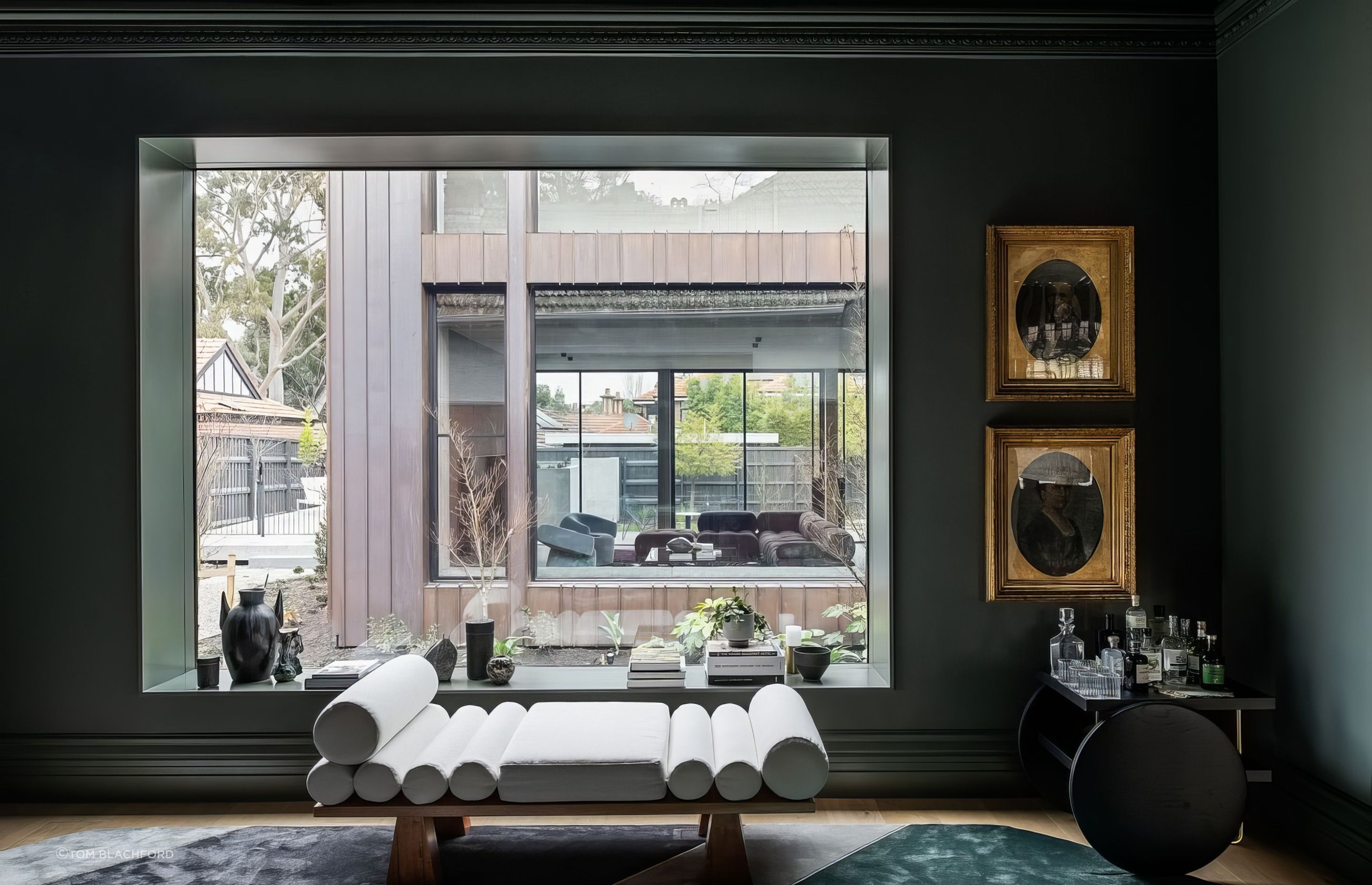
This courtyard is a brilliant move; it separates the old from the new and ushers an abundance of northern light into the back of the home. The two rooms that bookend the courtyard both feature epic picture windows, which mirror each other, creating a wonderful dialogue between the heritage and contemporary elements. “It’s a very natural instinct for me to bring a courtyard into a space like this, particularly if the house has a south-facing backyard,” David says. “Natural light was the main driver, but of course the bonus was the added window in the main living room that connects the two spaces and creates the garden outlook.”
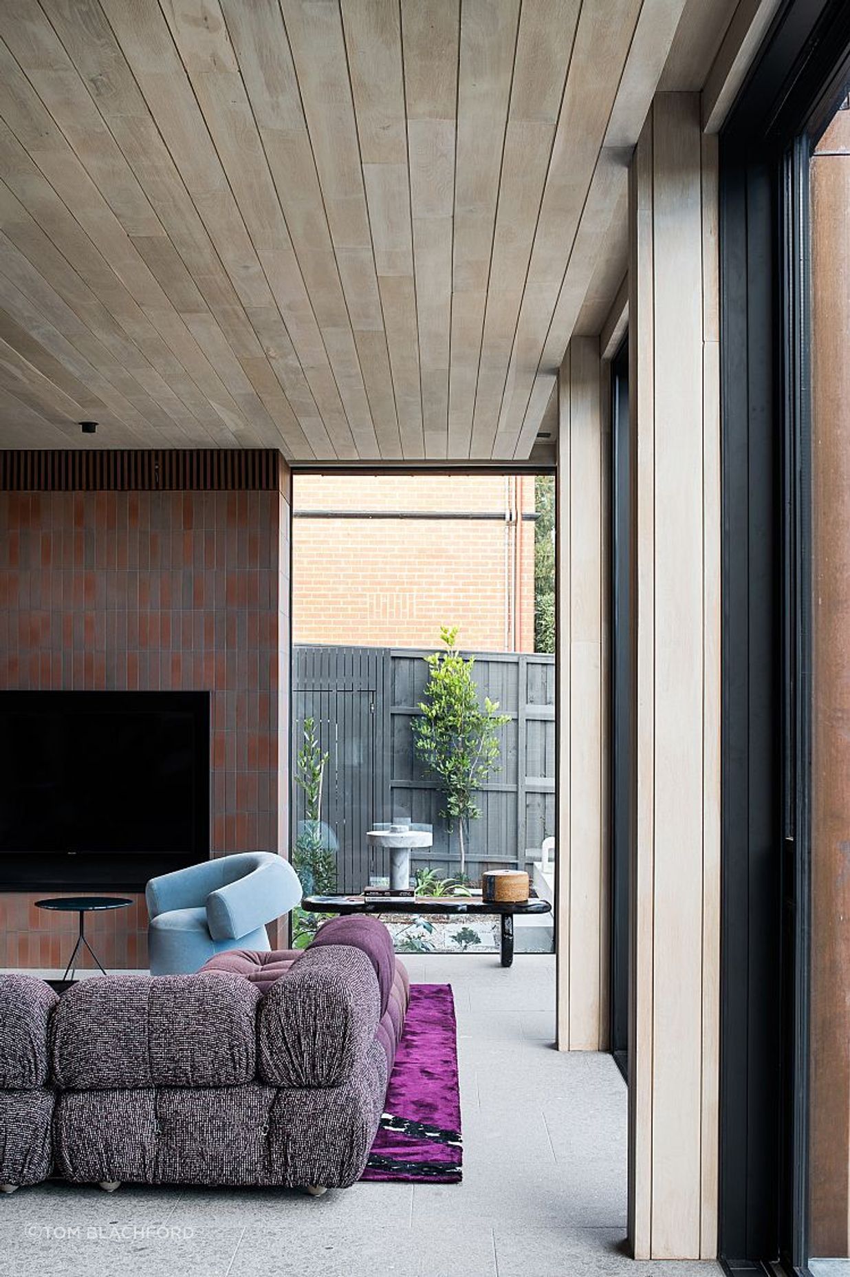
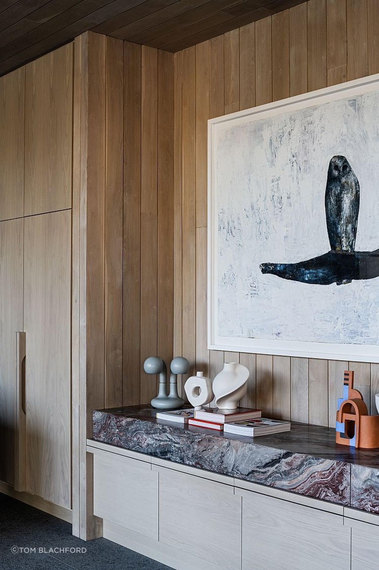
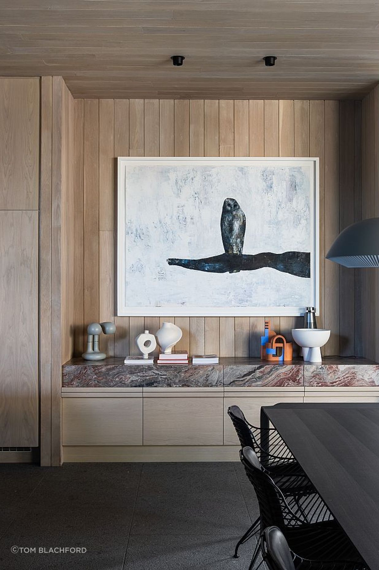
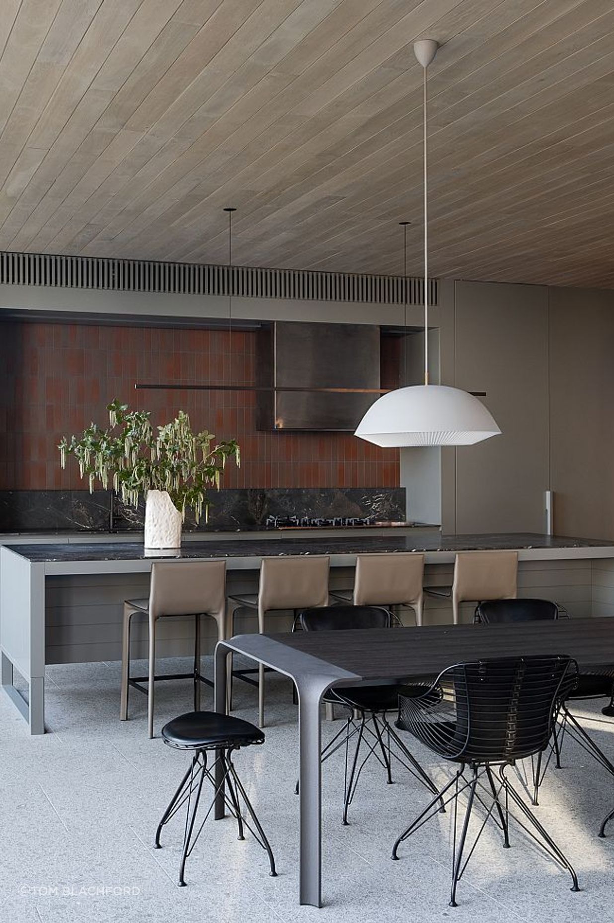
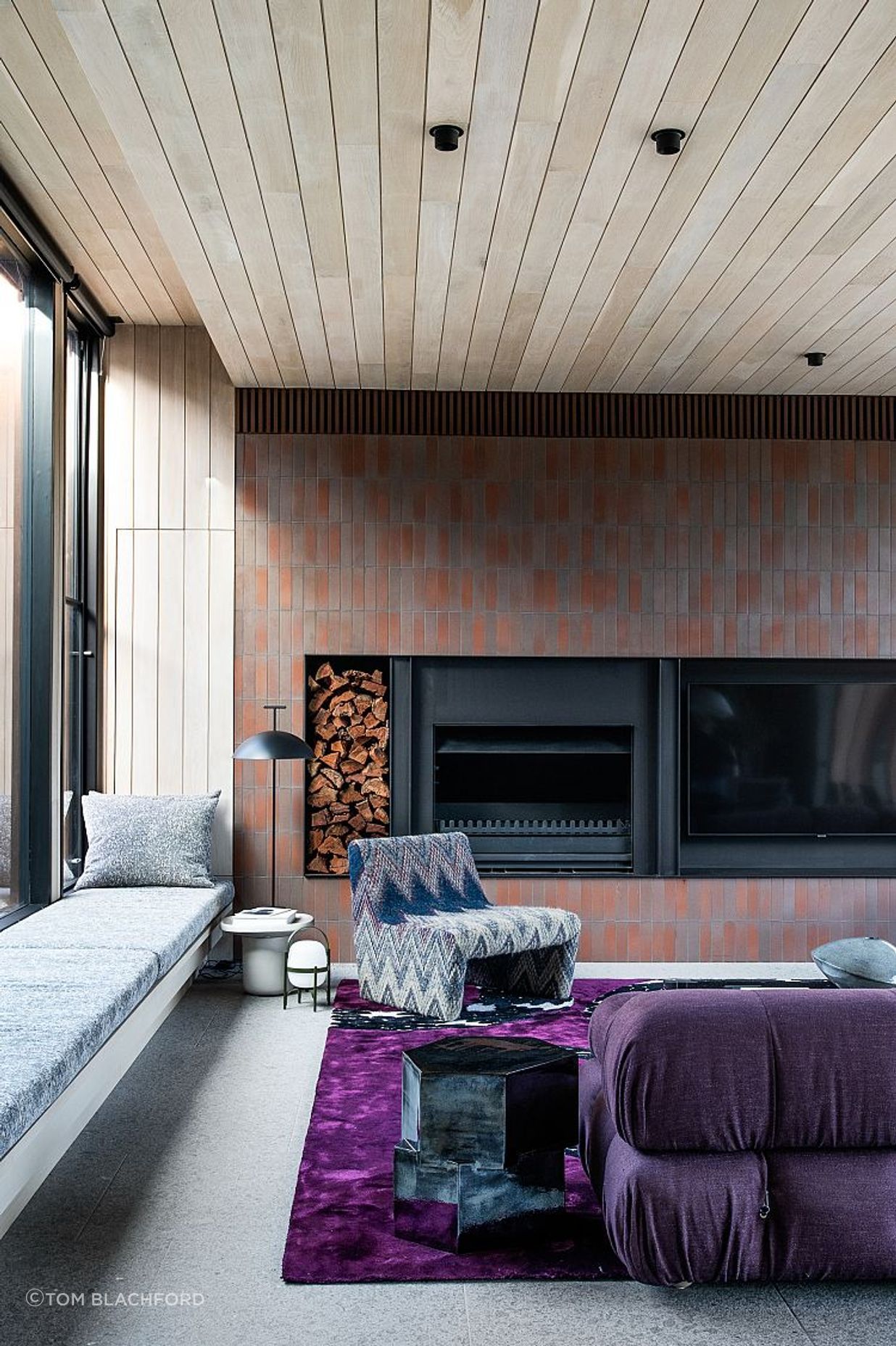
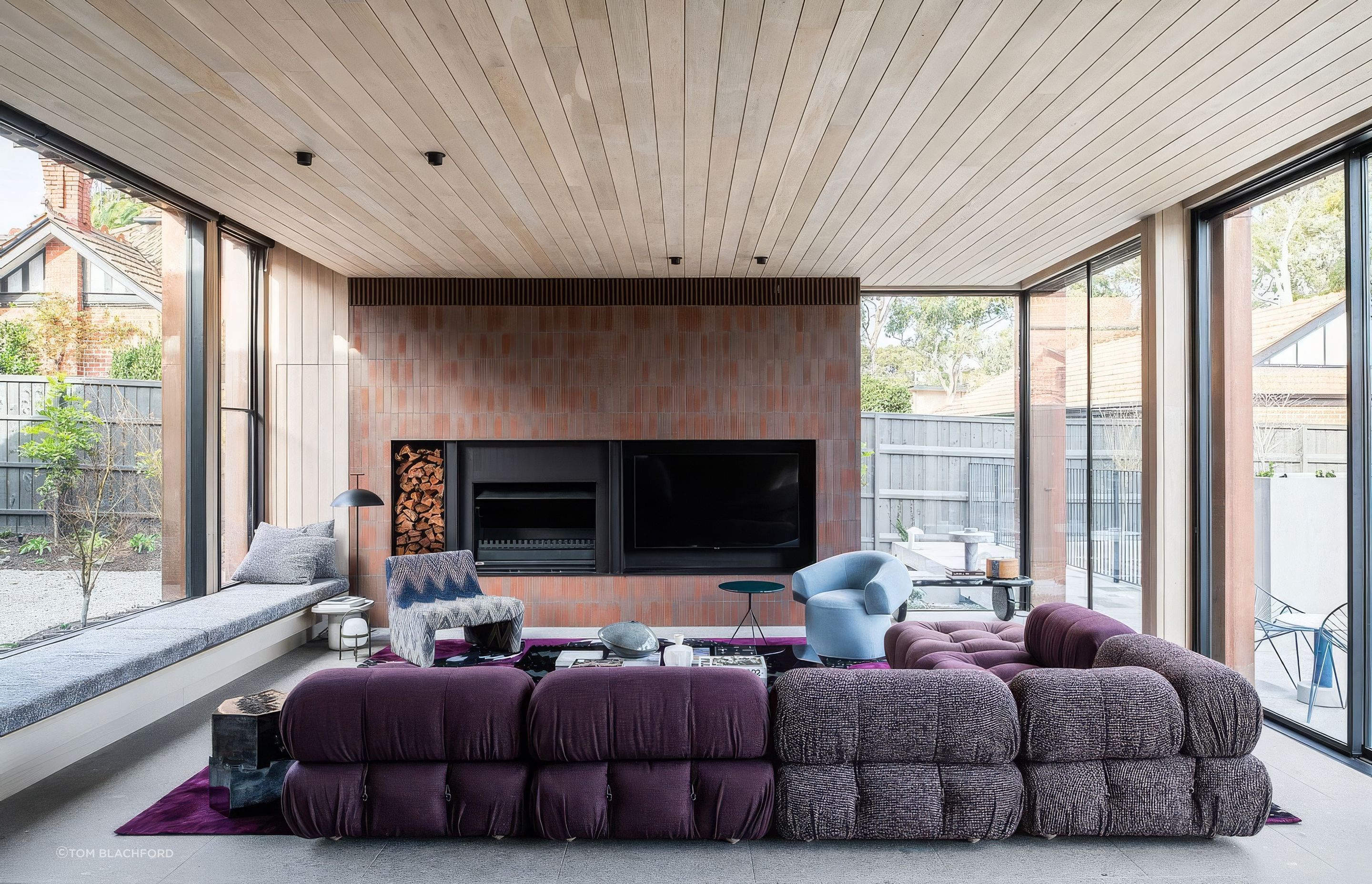
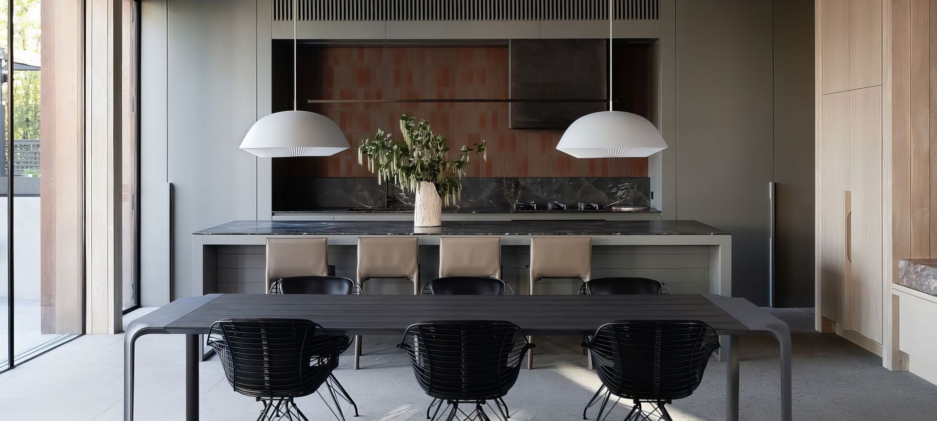
In the back room, two sets of custom steel-framed sliding doors frame views to the backyard, pool and the gum trees beyond, and natural light floods in from both sides. The scale is generous throughout; oversized furniture and zany features feel just right given the sense of space and light. Artedomus INAX tiles appear again on the wall behind the fireplace, in
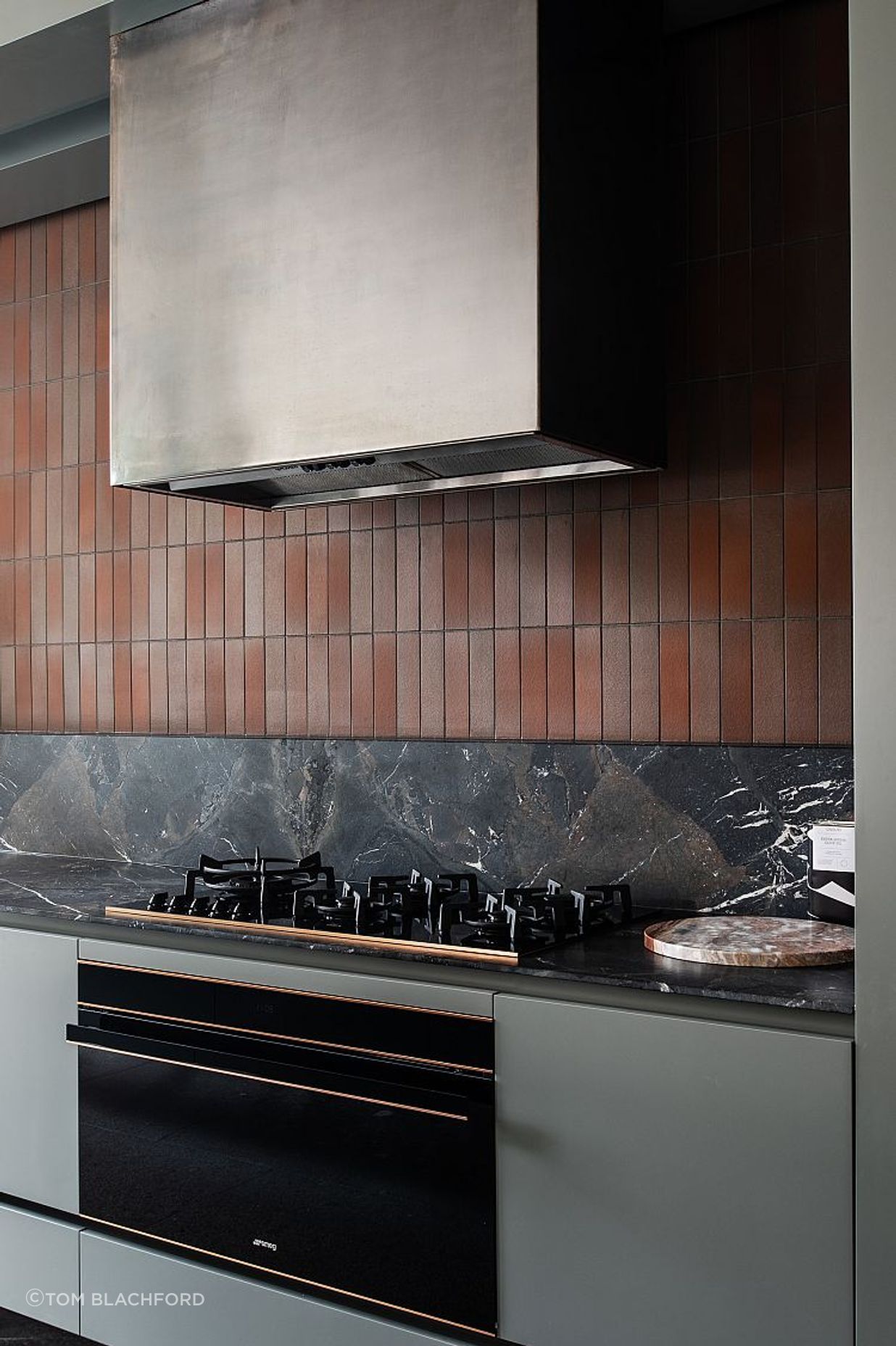
the kitchen and outside, too – the material’s multiple applications demonstrating its versatility and aesthetic value. The ceiling is clad entirely in American oak, as are some of the walls, and Opus Rosso sits atop custom timber joinery. The glorious red veining of this stone complements the magenta shades of the B&B Italia Camaleonda sofa, rust coloured INAX tiles and the patinating copper on the exterior. Finally, Artedomus Magnesia spans the kitchen benchtops, bringing another layer to the detailed palette and working in pleasing tandem with the other forward finishes.
As David points out, the imaginative – though dignified – approach to materiality and colour prevails as Weeroona House’s new-found, defining feature. “Everything has texture and warmth, be that through colour or materials. It makes for quite a rich interior without being too much to take in,” he says. As a culmination of curious arrangements and converging forms, this house is energetic and, in some spaces, loud. Yet, it is beautifully tempered, offset just so by the home’s classic bones and apertures to the leafy surrounds.
Words by Millie Thwaites
Architecture by Neil Architecture
Build by Tim Wilson Building
Styling, Furniture, Art and Object by Simone Haag
Landscape by Eckersley Garden Architecture
Engineering by Structplan
Stone and Tiles by Artedomus
No project details available for this project.
Request more information from this professional.
Artedomus is Australia’s leading supplier of unique, high quality stone, tiles, architectural surfaces, bathware and furniture for commercial and residential architectural projects.
Founded in 1985 as Domus Ceramics, the company was built to import exclusive Italian floor and wall finishes to Australia with a focus on sourcing unique products that have a simple and natural intrinsic beauty; shunning short-term fashion and trends. As a result with this philosophy and outstanding product offering; Domus soon became a source of reference and inspiration for leading architects and designers.
Experts in sourcing unique stones, tiles and architectural surfaces.
We have been searching for, and sourcing, unique stones, tiles, architectural surfaces and products from around the world and introducing them to Australia for over 35 years. Some of the most beautiful and widely recognised marbles, limestones and sandstones in the design market today including Isernia, Bedonia and Elba have been favoured by leading architects and designers for their depth of colour, unique markings and distinctive natural qualities, all originally identified by Artedomus. With passion and expert understanding, we appreciate the power a unique natural product has to transform any design project into a singular work of art.
Find us in Sydney, Melbourne, Brisbane and Perth.
With showrooms in Sydney, Melbourne, Brisbane and Perth, Artedomus continues to bring beautiful, unique interior and exterior finishes to the Australian market. We are also the exclusive supplier of the innovative INAX range of mosaics and architectural ceramics from Japan, the iconic Agape Italy bathware range, the Mangiarotti designed Agapecasa furniture range and Le Corbusier LCS Ceramics.
Our highly experienced team is here to make sure you find exactly what you’re looking for.
Our people are as important as our products, and just as unique. They are passionate about design and love nothing more than finding the right solution for your project. Please don’t hesitate to contact us with any questions you might have.
Start you project with a free account to unlock features designed to help you simplify your building project.
Learn MoreShowcase your business on ArchiPro and join industry leading brands showcasing their products and expertise.
Learn MoreManufacturers and Suppliers