A coastal retreat reimagining the traditional gabled form
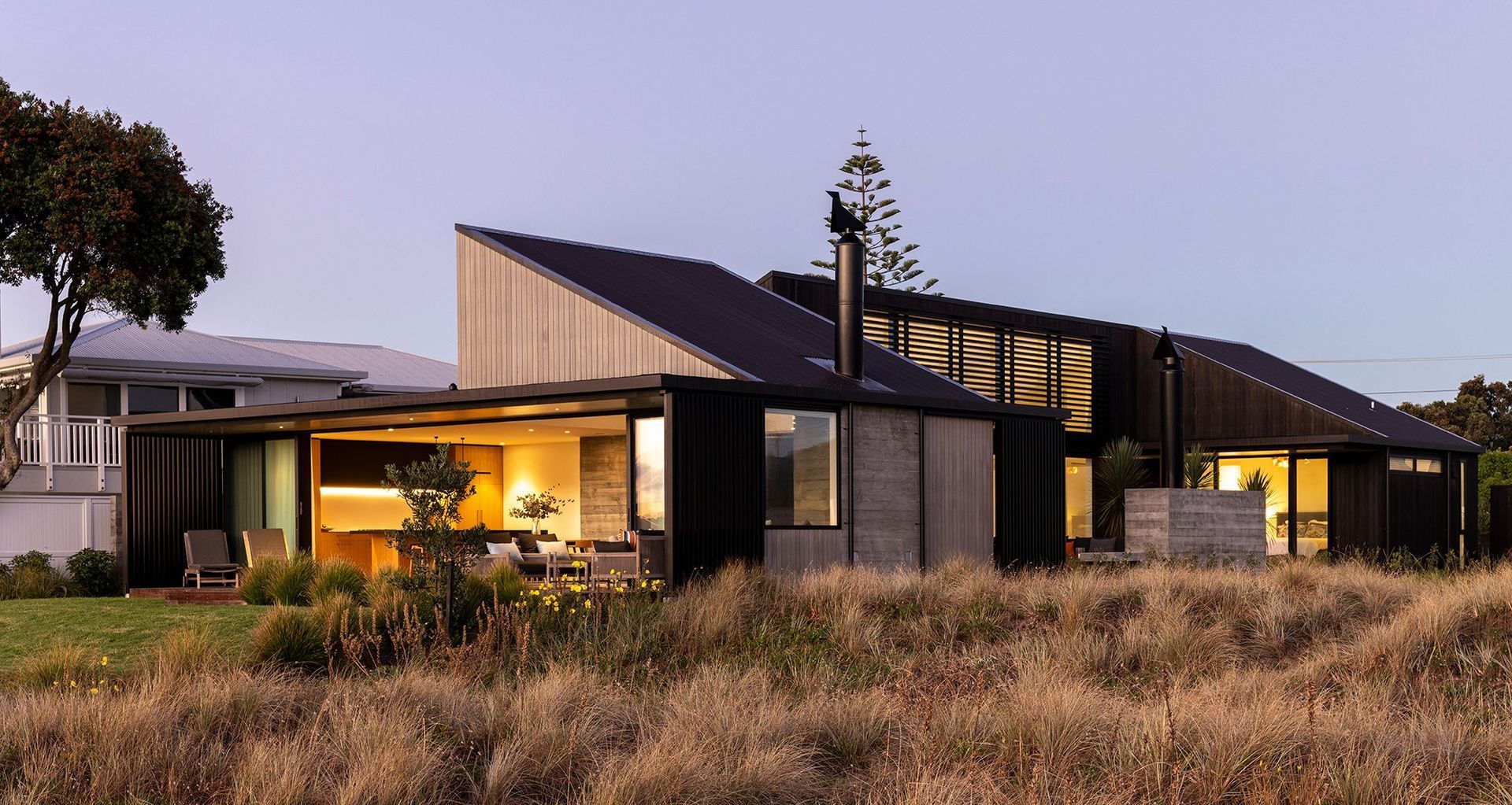
To the passerby, Whangamata Retreat is shrouded in secrecy. Its darkly clad street elevation has no windows, but its split gable form seems to magically change as you move around the residence.
Studio2 Architects was tasked with a simple brief: design a holiday home that integrated with its surroundings. "It needed to be sympathetic to its context, in that it was respectful of form, size, site and the local architectural fabric,” explains Ash Kumar of Studio2 Architects.
Following discussions with their clients, the architects were inspired to both include and subvert the traditional gabled forms that feature heavily in the area. It was hoped that the meeting of traditional and contemporary would curate a unique design language yet remain unobtrusive.
While the region's built environment informed the home's design, the natural environment informed its positioning. The site is flat and in close proximity to the beach. Looking east, expansive sea views stretch outwards, and from time to time, the coastal winds are keenly felt. The challenge was to capture this view while ensuring the residents' privacy and protection from the elements.
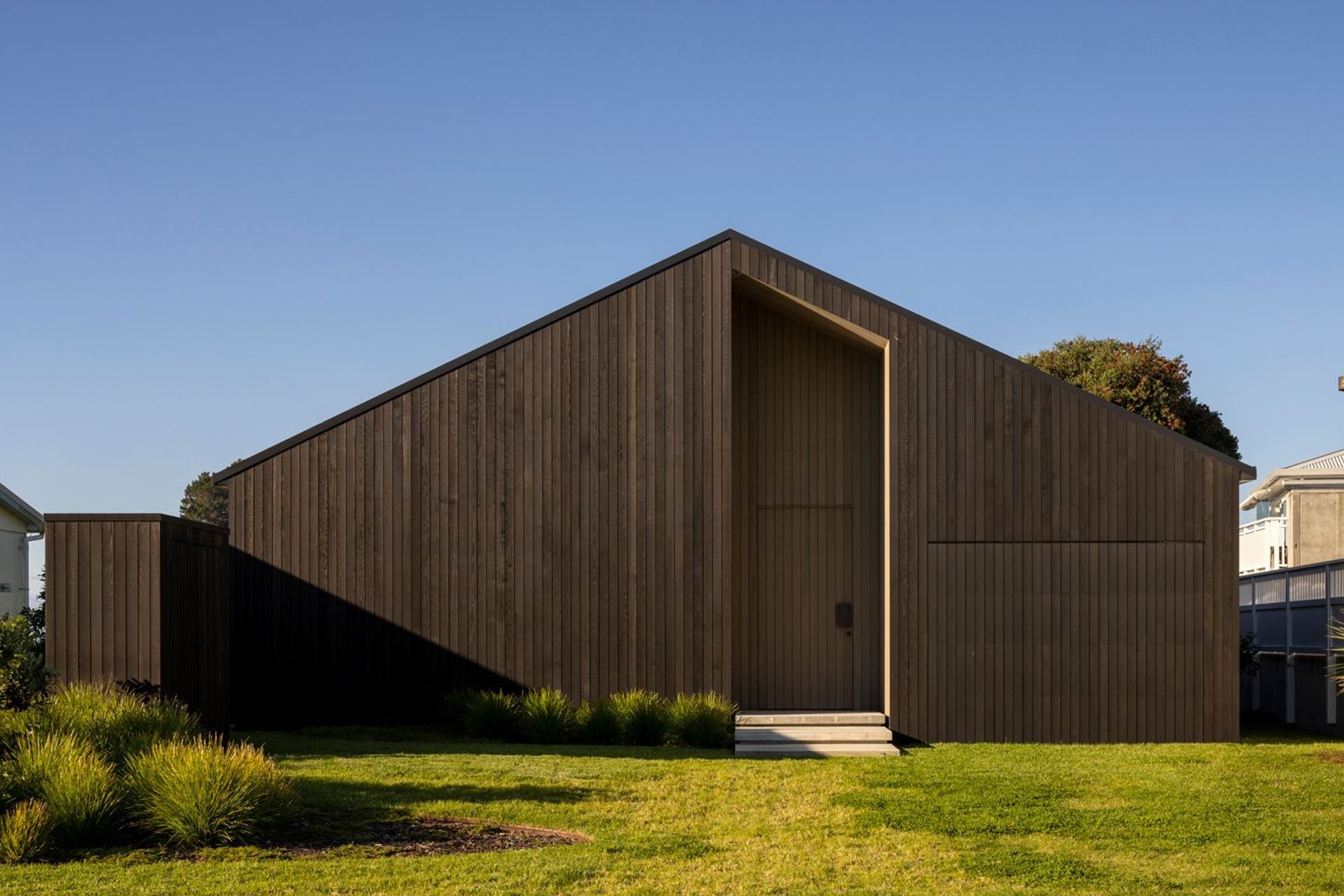
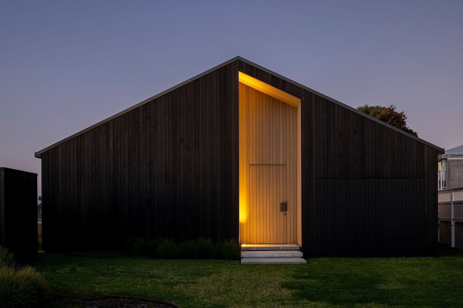
On arrival, a sense of immense privacy is immediate, as the large, deeply toned structure shrouds the interior. The gabled form has been cut away and manipulated, creating a shifting perspective of its form as you move around the home. Much like the sea nearby, the residence seems to be in a constant state of flux, but at the same time, the paradoxical structure evokes a sense of calming stability.
Following a U-shaped plan, the dwelling is comprised of three zones, which are connected by a central hallway. The layout perfectly summarises the concept of an ‘indoor-outdoor flow’ with spaces that foster a connection to nature. “One arrives at the house and progresses through to the view,” Ash adds.
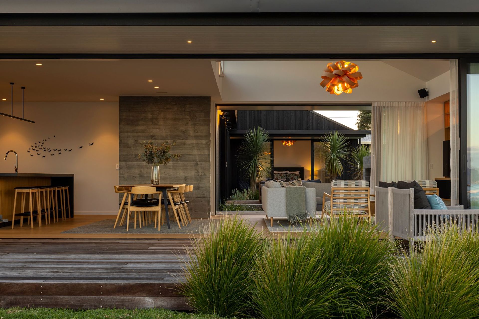
Inside, a double-height entry moves into a light-filled gallery space. The main bedroom area sits in the northwestern end, complete with a walk-in wardrobe and ensuite. To the south lie more bedrooms, bathrooms, and a garage. Facing the sea, the eastern end forms the main kitchen, dining and living space, where glass sliding doors open directly onto the beach. A north-facing courtyard has been placed in the centre of the U-shaped plan, overlooking the sandy shoreline.
The spatial organisation was determined based on the clients’ lifestyle, the pathway of the sun, and exposure to the elements. The private spaces are the first to be encountered before the house unfolds towards the sea, allowing the residents to enjoy a beachside evening before retreating inland for a night’s rest.
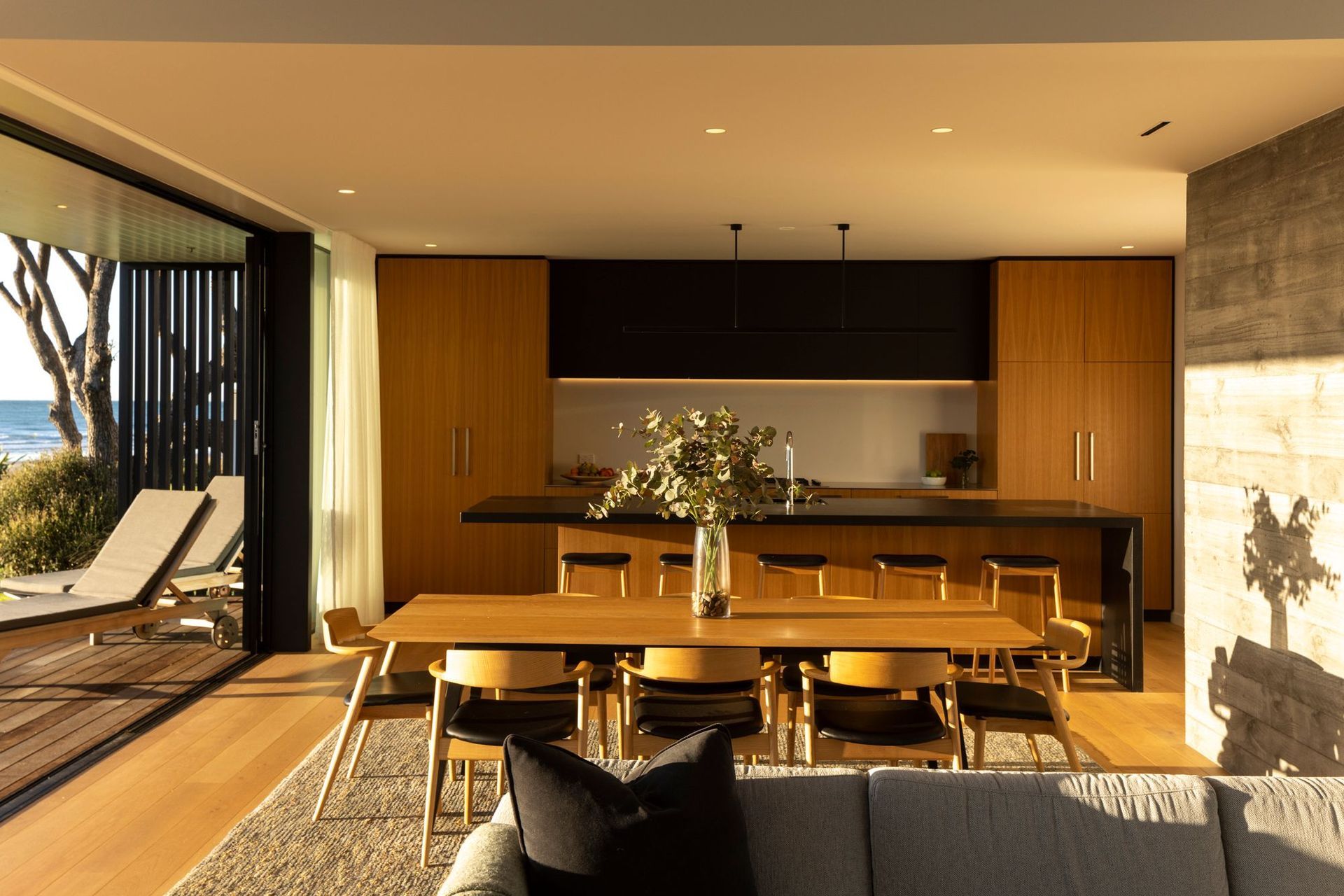
The morning light illuminates the kitchen, dining and living space, the north-facing courtyard enjoys all-day sun, and the northwestern main bedroom is lit in the afternoon. Tucked away to the south, the remaining bedrooms are cosy sanctuaries. By placing the courtyard in the centre of the U-shaped plan, residents enjoy all-day sun whilst still remaining protected from coastal winds.
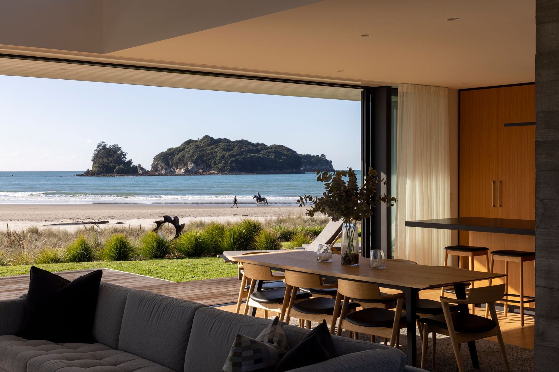
The material palette was heavily inspired by the environment, using limited, carefully chosen natural textures and colours. Darkly stained cedar shiplap weatherboards were used for the cladding, polished concrete comprises the floors, and a combination of tongue and groove boards and white-painted plasterboard form the ceilings. American oak veneer cabinetry warms the interior. The home is topped with a corrugated roof, finished in an authentically rustic New Zealand tone, Colorsteel’s ‘FlaxPod’.
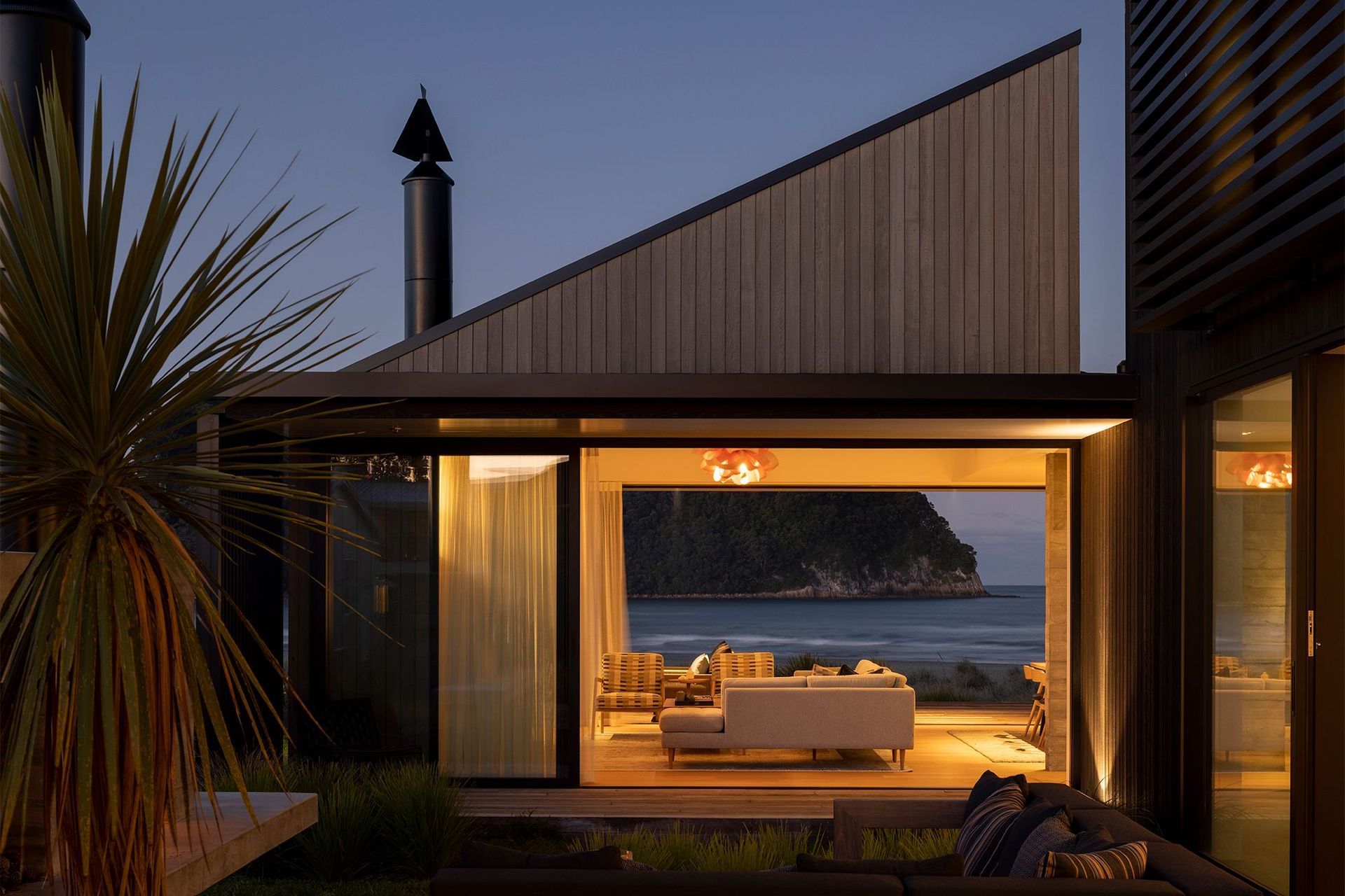
The U-shaped plan and use of natural materials were fundamental to this architectural style, but the building’s form is the highlight for Ash. “The house changes as you walk around it and through it,” Ash explains. “The main gabled form visually shifts at different elevational angles.”
