Bringing home to the office
Written by
16 June 2019
•
5 min read

Many companies are now bringing ‘the feeling of home’ into their offices. More intimate and friendly spaces are taking over from commercial interiors that have traditionally been quite sterile and generic.
“Commercial trends are being designed to link back to residential architecture,” suggests Thomas Seear-Budd from Studio Pacific Architecture. He is one of a team of architects and designers that worked on the interiors of our Project of the Month, 20 Customhouse Quay XXCQ, creating warmth and intimacy in its huge double-height lobby space and in Deloitte’s offices on the 12th floor.
“We tried to break down the spaces to create a more residential feel and to have more intricacy in the detailing. Commercial projects can often be whitewashed – with huge stone slabs through a big lobby, for example – where there is nothing of the intimate scale that humans enjoy and that you would find in a residential project.”
“But lobby interiors are really interesting because they almost operate like residential homes or retail-scale projects,” says Thomas. “Commercial projects tend to take a long time and we were lucky that our client for 20 Customhouse Quay gave us a lot of creative freedom to explore how we could reinterpret a 'typical' Wellington lobby."
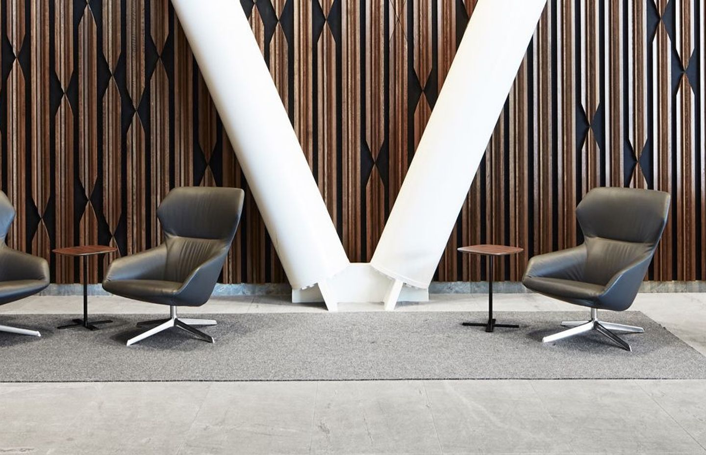
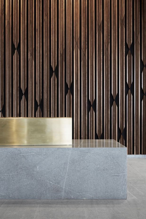
Studio Pacific’s interiors team was hugely influenced by the materials themselves, which were distilled down to a few key materials: oak panels on the walls, stone flooring that runs through to the exterior, black aluminium lifts and wall cladding, and a stone and brass reception desk designed by the architects, while brass detailing adds warmth and elegance to the space.
Sustainability is an increasingly important topic when choosing materials, with growing concerns about implications of using synthetics that can’t be recycled and plastics ending up in our oceans, along with other environmental factors, of course.
“Durability is a big concern too,” suggests Thomas. “But natural materials wear and weather in quite a beautiful manner and everyone has a connection to real timber and stone, as opposed to fake materials. My belief is that if it’s going to be artificial, then it should appear artificial and not imitate a natural material. Although, in saying that, in commercial projects, there is a pattern whereby faux materials are being used on external facades. At the same time, there’s a reverse trend for the interiors of buildings, where we’re trying to bring in more real materials.”
“Fundamentally, it’s about adding as much warmth as possible into both our homes and our offices. In the interior of Customhouse Quay, we utilised a lot of stone, which was offset by the warmth of the timber,” explains Thomas. “We looked at how we could manipulate those materials to achieve what we wanted on an intimate scale; hence, we sculptured the timber into the wall panels and, then, created the X cuts to provide variety. It is really important that the design draws from the materiality itself – that shouldn’t be an afterthought.”
Studio Pacific is applying the same approach to other projects in the office. For Thomas, it's a process of adding natural materials and warmth, as well as spending a lot of time refining the scheme and the detailing. I’ve noticed that the finer details often fall down in commercial projects but, a handrail doesn’t have to just be a stainless-steel tube. Even on these big jobs, there are opportunities to do things that are more interesting – to provide a little moment of joy for anyone who touches it.”
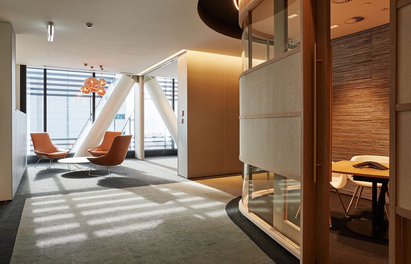
Thomas says the team approached the design by inserting surprises and moments of joy throughout the interior. “If you go up to level 12, which my colleagues designed, you enter a different world,” suggests Thomas. “It is like a jewellery box-like, dimly-lit space, in contrast to the light-filled cavernous lobby.”
Up here, Deloitte’s office space is residential in its detailing and choice of materials. In the centre of the space is an oak pod with rounded corners and curved glass, containing small meeting rooms. There are lovely moments throughout, such as the blue fabric seating booth, feature lampshades and chandeliers, and a café with a light box ceiling of treetops in the New Zealand bush. Around the perimeter, bigger meeting spaces sit away from the pod and enjoy great views of Wellington’s harbour and city.
If 20 Customhouse Quay sets a new standard for new commercial buildings in New Zealand, then homogenous workspaces may become a thing of the past. Considering that New Zealanders typically work between 35 to 40 hours per week, it is seen as increasingly important that work environments are relaxed and homely – and an increasing number of occupational psychologists, architects and designers agree.
According to The Future Organization, experts on the future of work and how the workplace is changing, "Employees tell us that the workplace community has influenced their decision to join an organisation, to stay with one and to commit themselves more to their work."
Research conducted by global architectural firm Gensler indicates that what employees want from their workspaces is actually pretty simple. They want individual spaces that have a functional layout, adjustability that allows them to adapt their workspace to their current needs, noise management, and access to the resources they need. After that, unsurprisingly, food-related requirements were a priority, such as an in-house or nearby café, while slides and ping pong tables were not regarded high on the list.
Given that most people spend the majority of their waking hours at work, spaces that allow people to feel connected, be productive and stay focused in turn helps business, because healthy, happy people do great work.
Words by Justine Harvey.
Photography by Thomas Seear-Budd.


