What does it take to create New Zealand’s most seismic-resistant tall building?
Good design and clever technologies make this landmark Wellington building a game-changer for new commercial buildings around New Zealand, and the design is inspirational for the home as well.
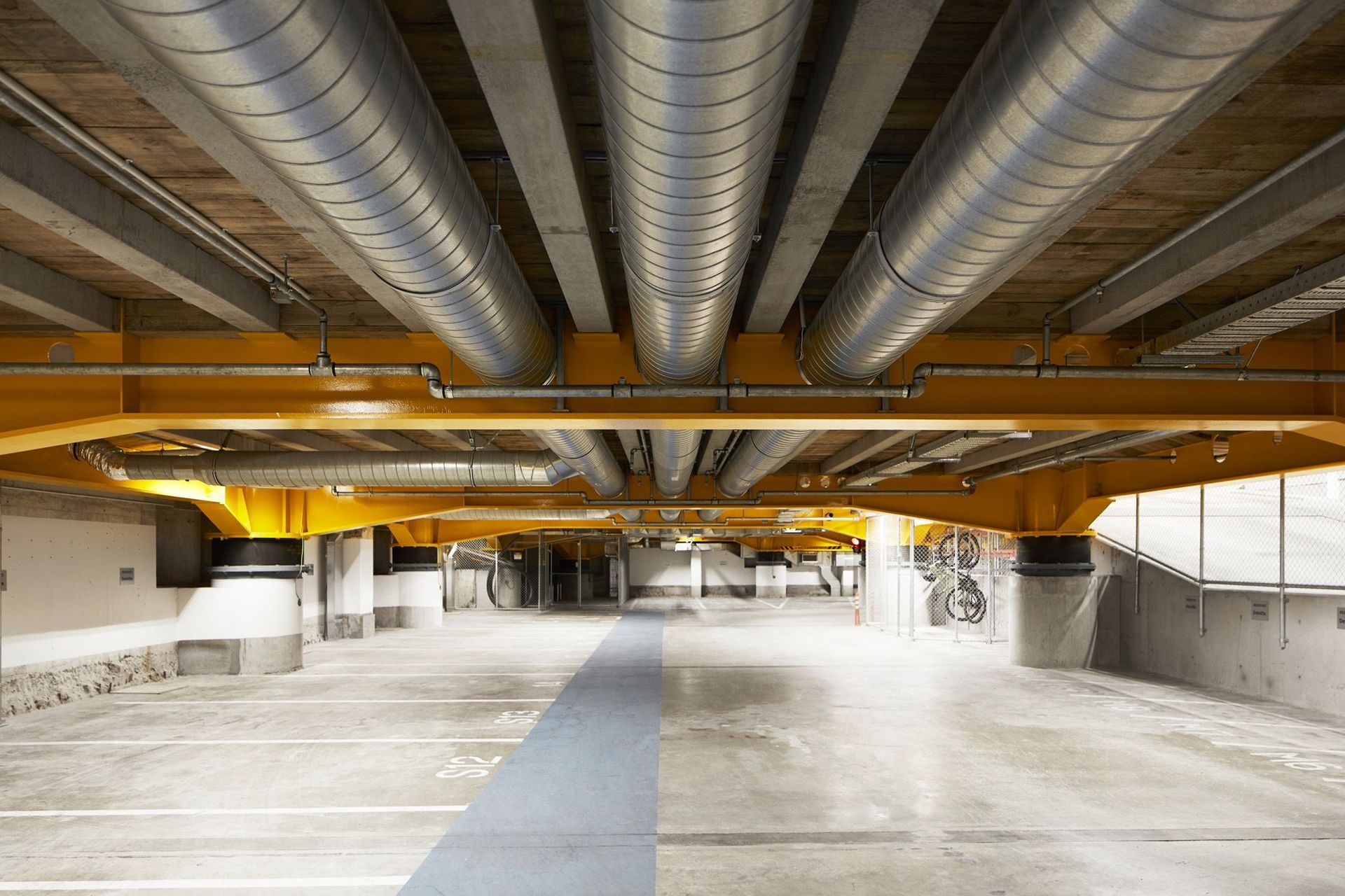
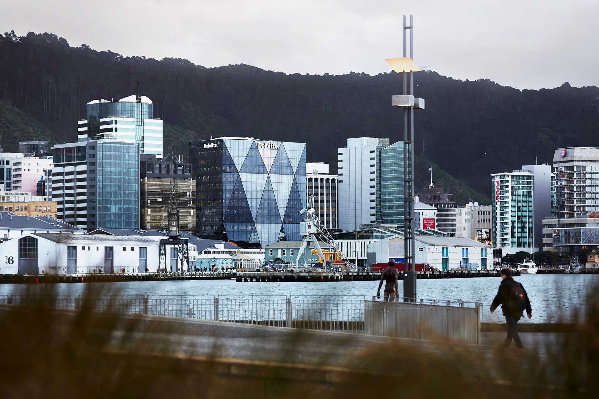
On a prime Wellington waterfront site, the 14-storeyed 20 Customhouse Quay (XXCQ) building is one of the safest structures to be standing in during an earthquake. It sits on 28 piles that can move more than half a metre in any direction during an earthquake without any serious damage.
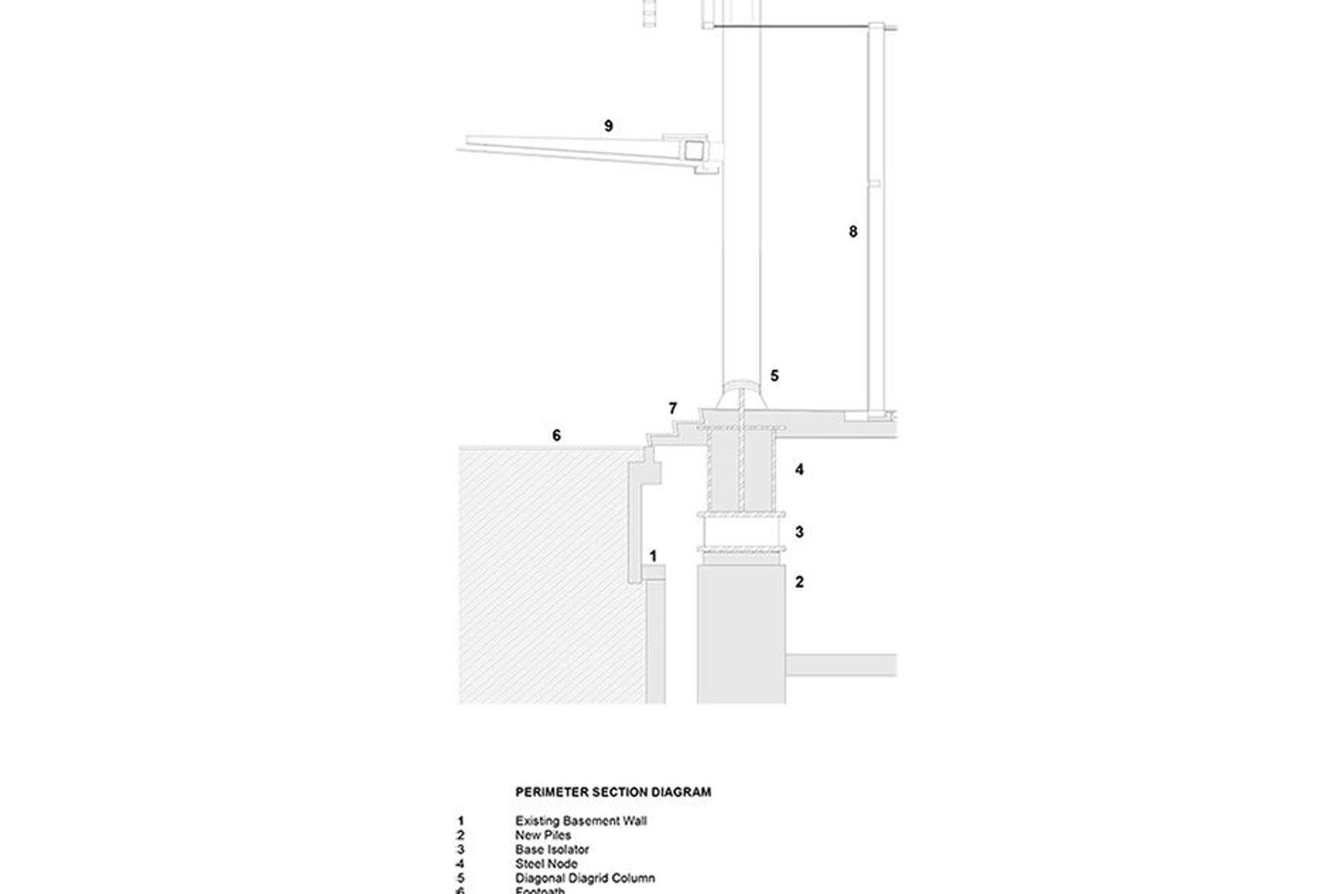
The technical term for the clever technology that protects XXCQ is ‘seismic base isolation’, which separates a building’s structure from the ground and, consequently, from the lateral forces of an earthquake. It was pioneered in the 1970s by Kiwi scientist and engineer Dr William (Bill) Robinson, who invented the element that makes the base isolation work, the ‘lead rubber bearing’.
The first structure in the world to use Bill’s invention was another Wellington landmark, the William Clayton Building (1982), which was recently upgraded by Studio Pacific Architecture, the designers of XXCQ. Since then, this technology has become the most popular way to protect structures during earthquakes, having been used in more than 8,000 buildings around the world.
In XXCQ’s basement, the base isolators hold the weight of the building and allow the foundations to move sideways. “They’re such a critical part of the seismic performance,” explains structural engineer Chris Speed of Dunning Thornton Consultants. “Each one was put into a large machine in Malaysia, where they were built, and pushed to their full design capacity of 615mm to prove that they would work in a final seismic event.”
The building’s structure is also kept separate from the adjacent buildings to prevent them from effectively banging into each other during a quake. XXCQ is estimated to work at 180 percent of the building code standards for seismic events, so it’s far in excess of what’s required. During a recent Wellington earthquake, the tenants on the upper floors of the building barely felt it.
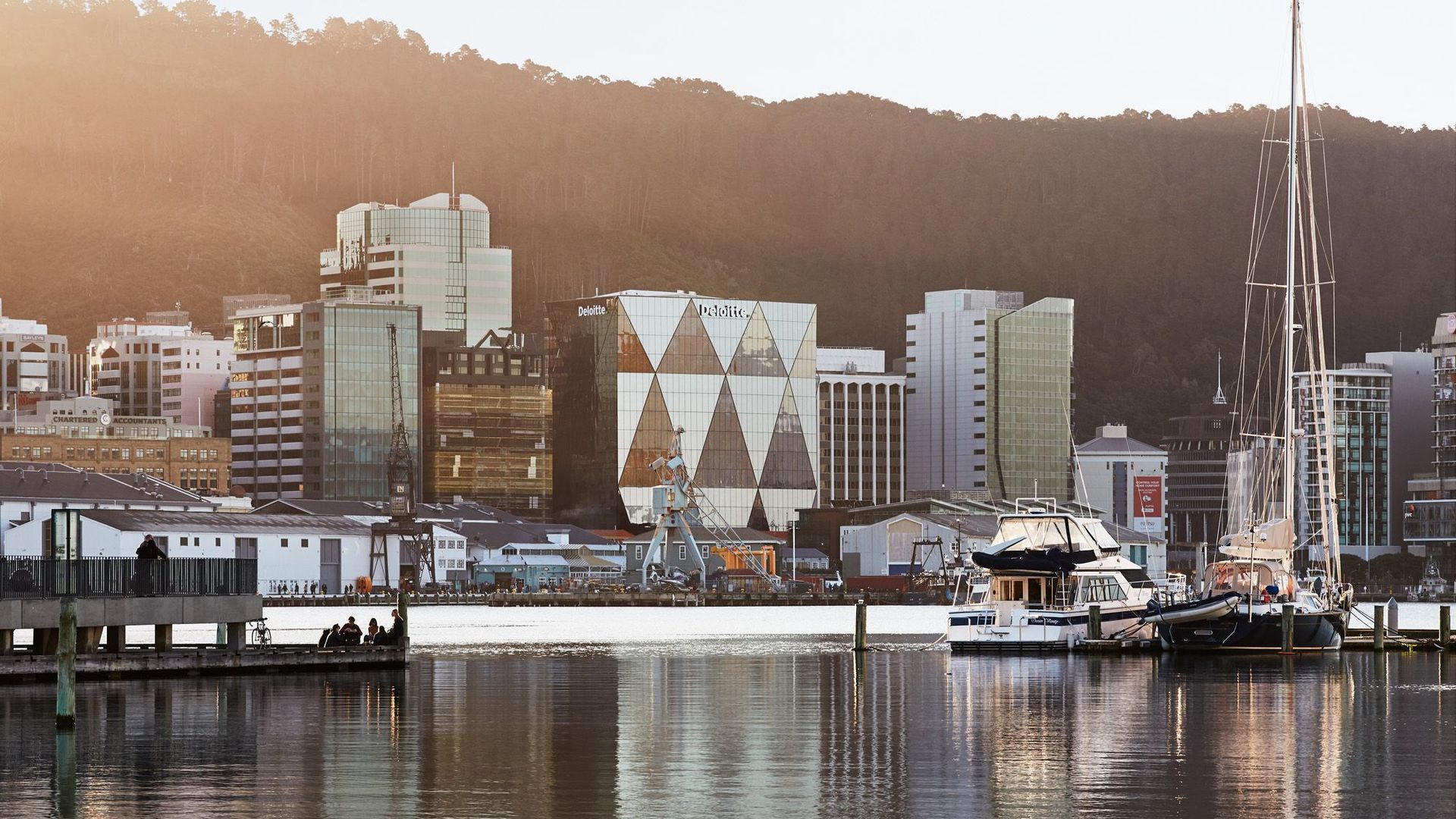
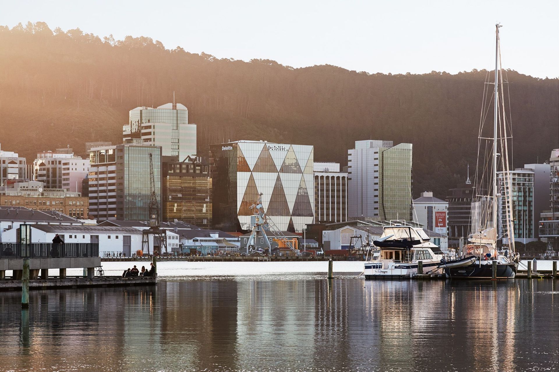
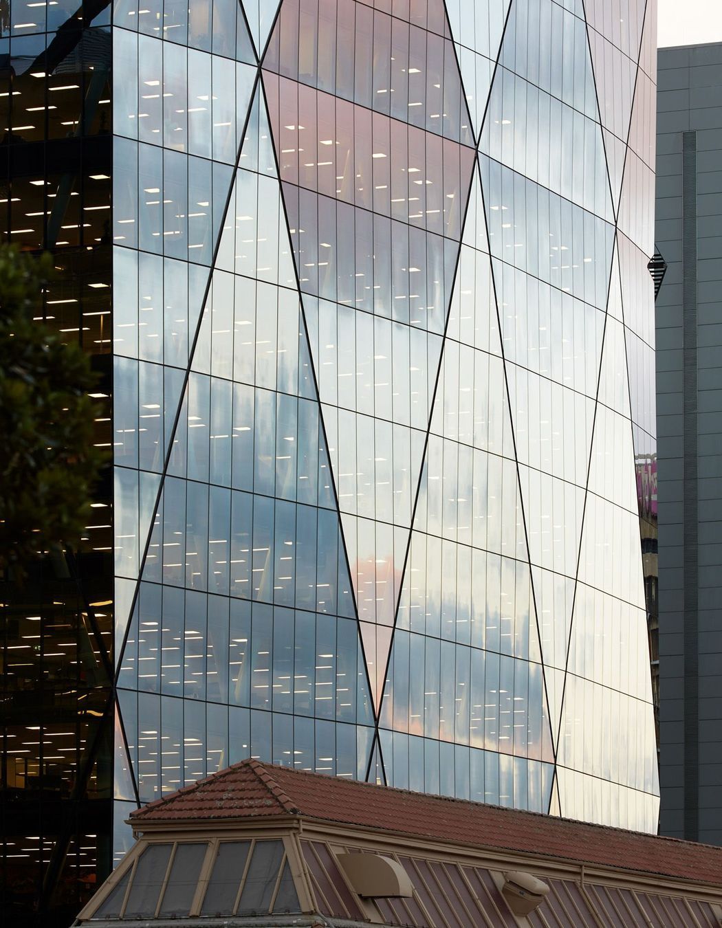
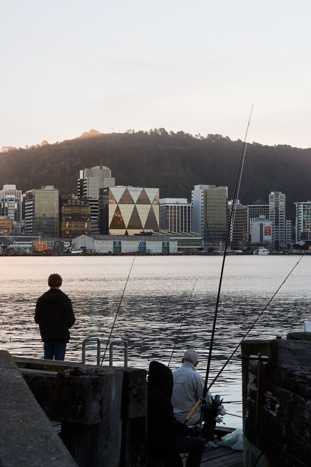
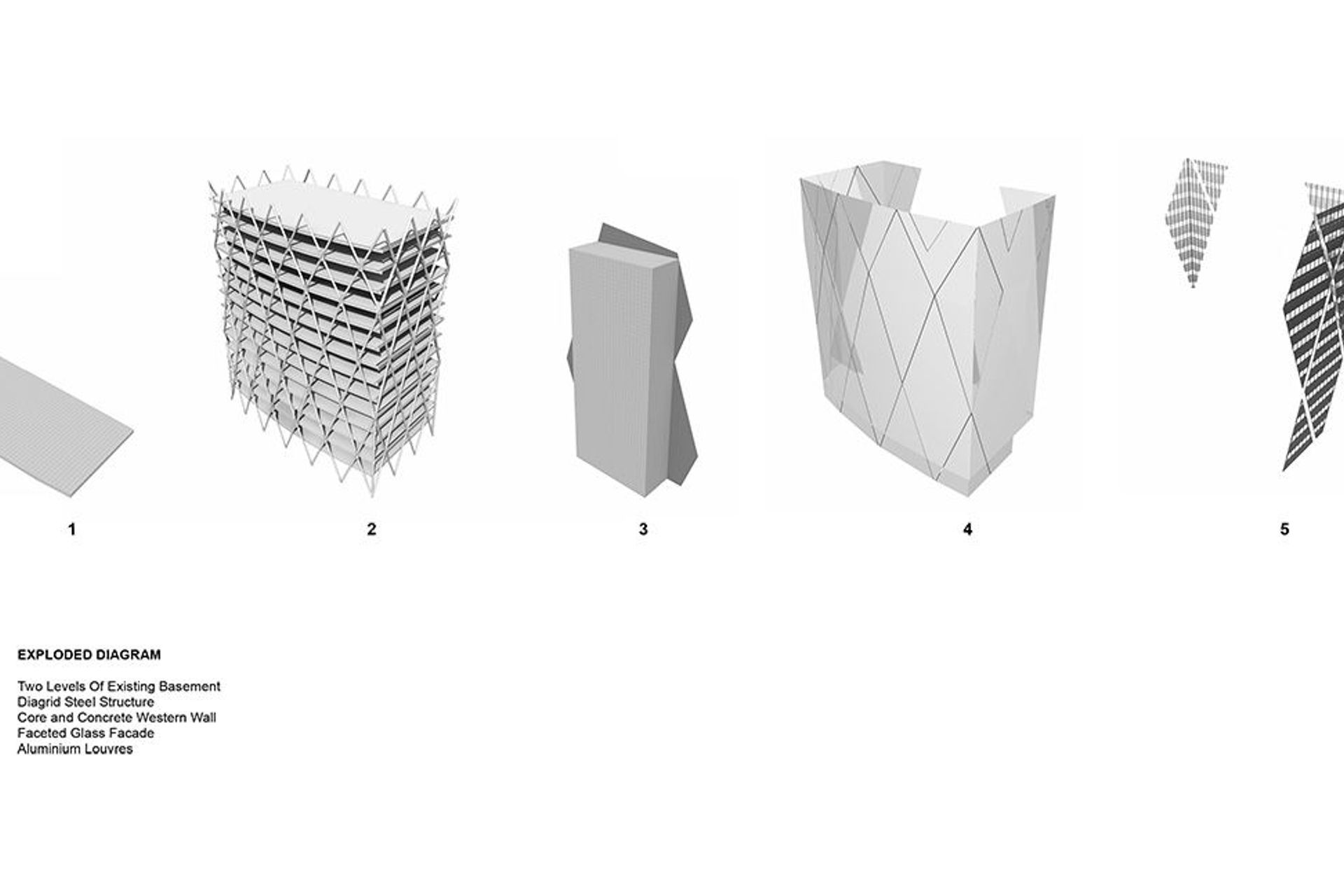
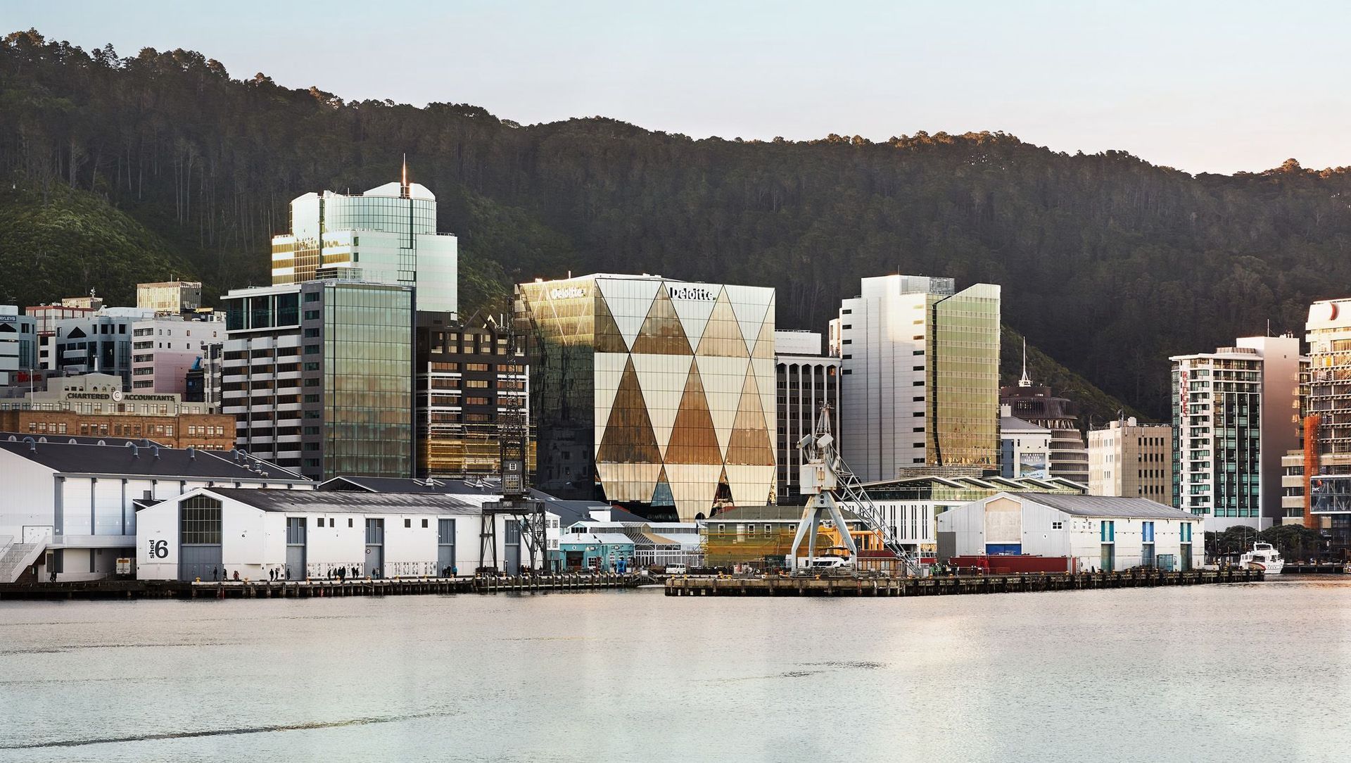
Another unique feature of the building is the curved, triangular-façeted glass façade, which is now a highlight of the Wellington cityscape. The best view can be seen from Oriental Parade, looking across the harbour, when the early-morning sunlight hits the glazing and the ever-changing clouds pass over and create moving shadows across the building.
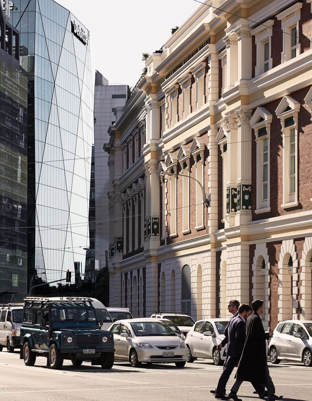
“The façeted curve is not only great in terms of the harbour view, but it creates vistas up and down the street,” explains Marc Woodbury, senior principal at Studio Pacific. “The natural amphitheatre of the harbour curves one way and the building curves against that, which opens up the corners of the building to allow views down the Quay to Westpac Stadium and into the city as well.”
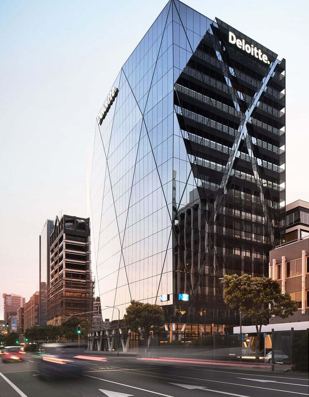
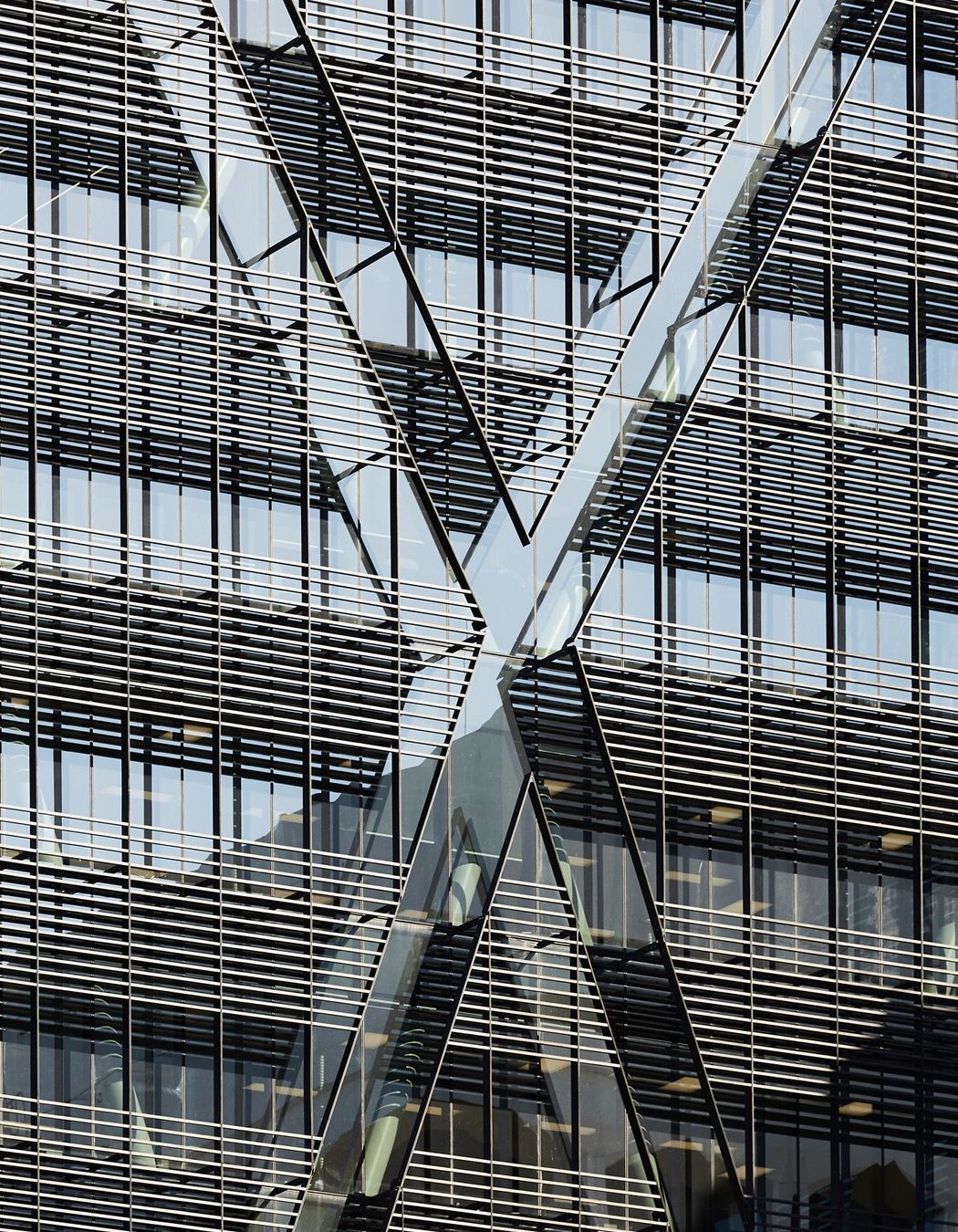
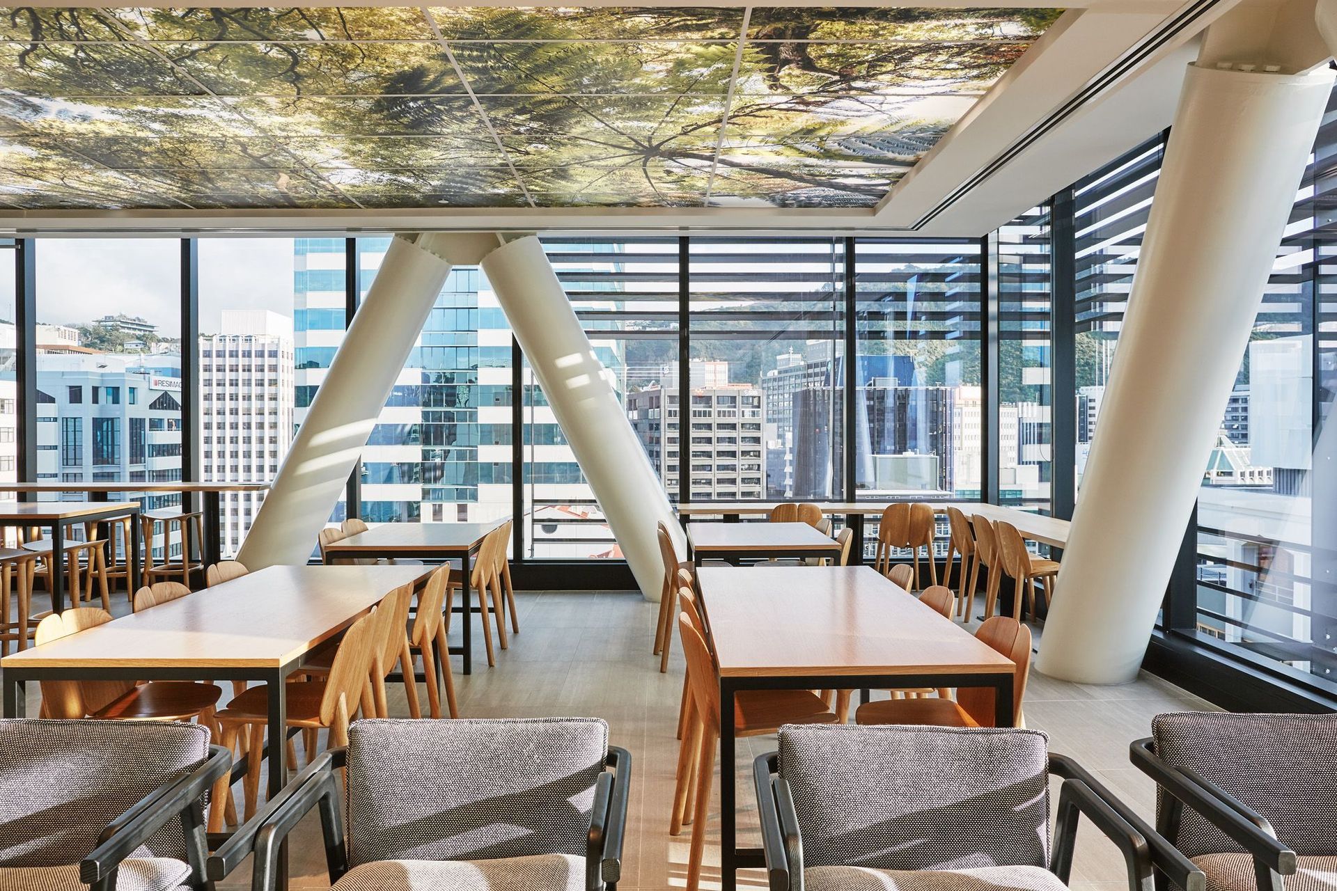
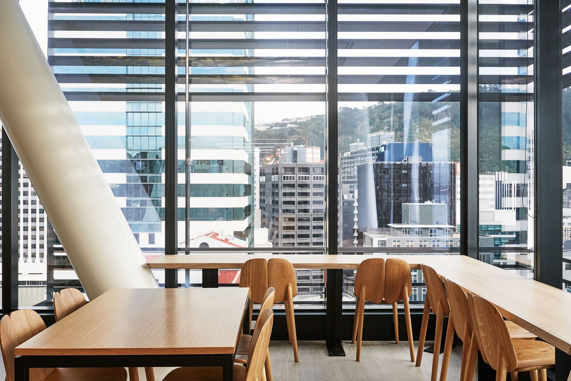
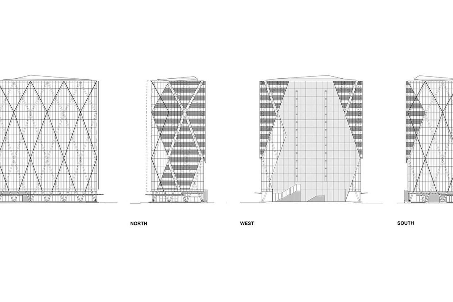
A framework of structural steel ‘crosses’ form the diagonal pattern on the façade, utilising another clever innovation called a diagrid structural system. It is similar to what was used on London’s landmark Gherkin building, by British architect Lord Norman Foster.
“The diagrid system is a very important part of the building – we like to think of it as the building’s DNA,” says Marc. It creates a very strong and lightweight structure and reduces the amount of steel required, so there is no need for perimeter columns and, usually, no structural core either. Most crucially, it is an ideal structure during an earthquake, since diagonal bracing is well known for resisting lateral structural movement.
High quality was also a key driver for the design and having high-end tenants planned for the building – like Deloitte (the principal tenant which has signage rights to the building), Kiwibank, Oracle, IAG and Craigs Investment Partners – certainly helped.
“The owners were very conscious of the long-term quality of the building,” says Marc. “They wanted seismic performance well above normal, high floor-to-floor and inter-floor heights, lots of natural light with good solar control and energy performance. It was quality at a real bare bones infrastructural level, rather than just the finishes. The point was that the building should stand the test of time.”
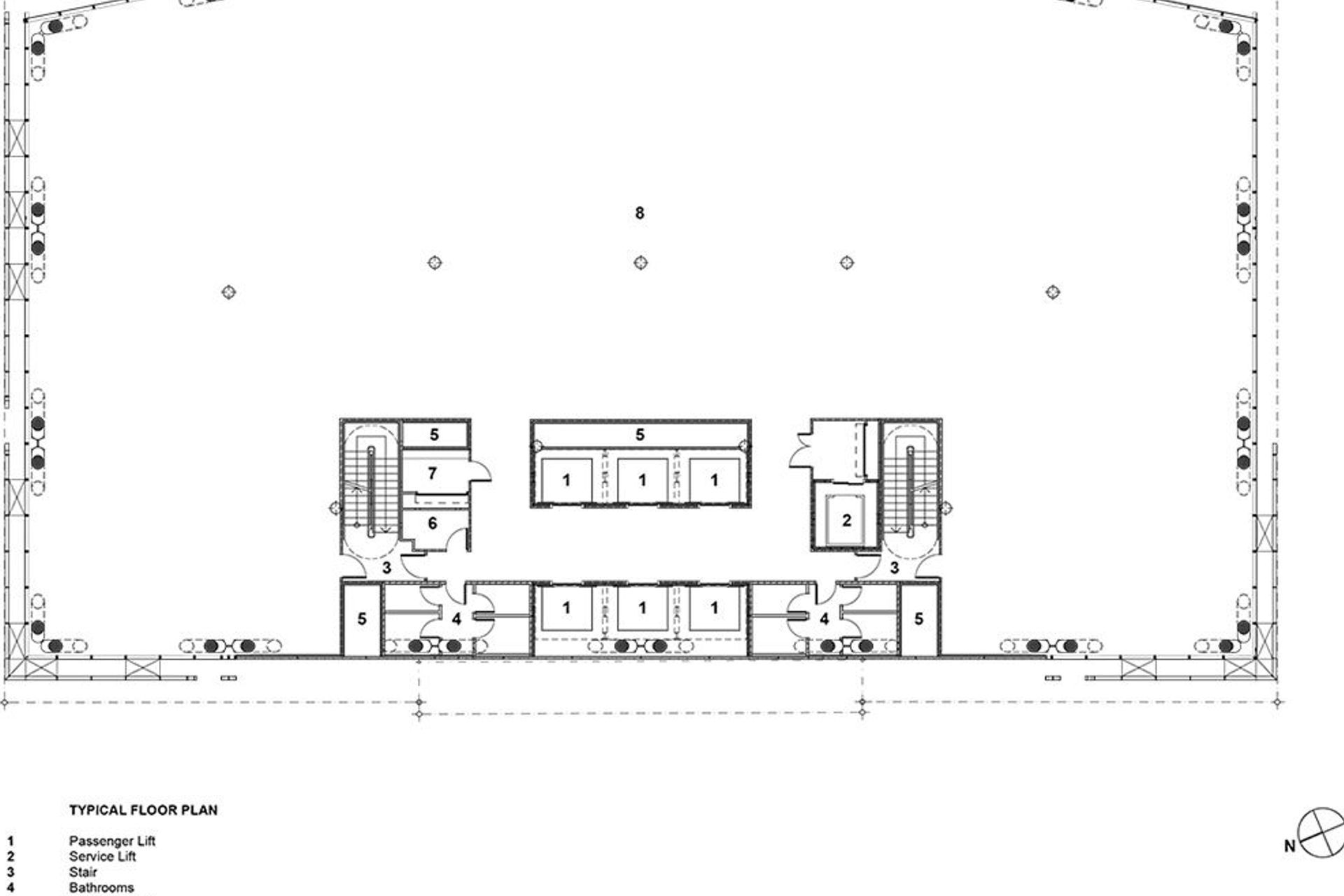
But high quality didn’t necessarily mean extravagance. XXCQ is also a very efficient and sustainable building. The architects carefully planned the building’s core to make sure it works as hard as it can, to free up extra floor plate. It has also received a 5 Green Star ‘excellence’ rating from the New Zealand Green Building Council, which looked at both the life cycle of the building and the sustainability
of the materials used.
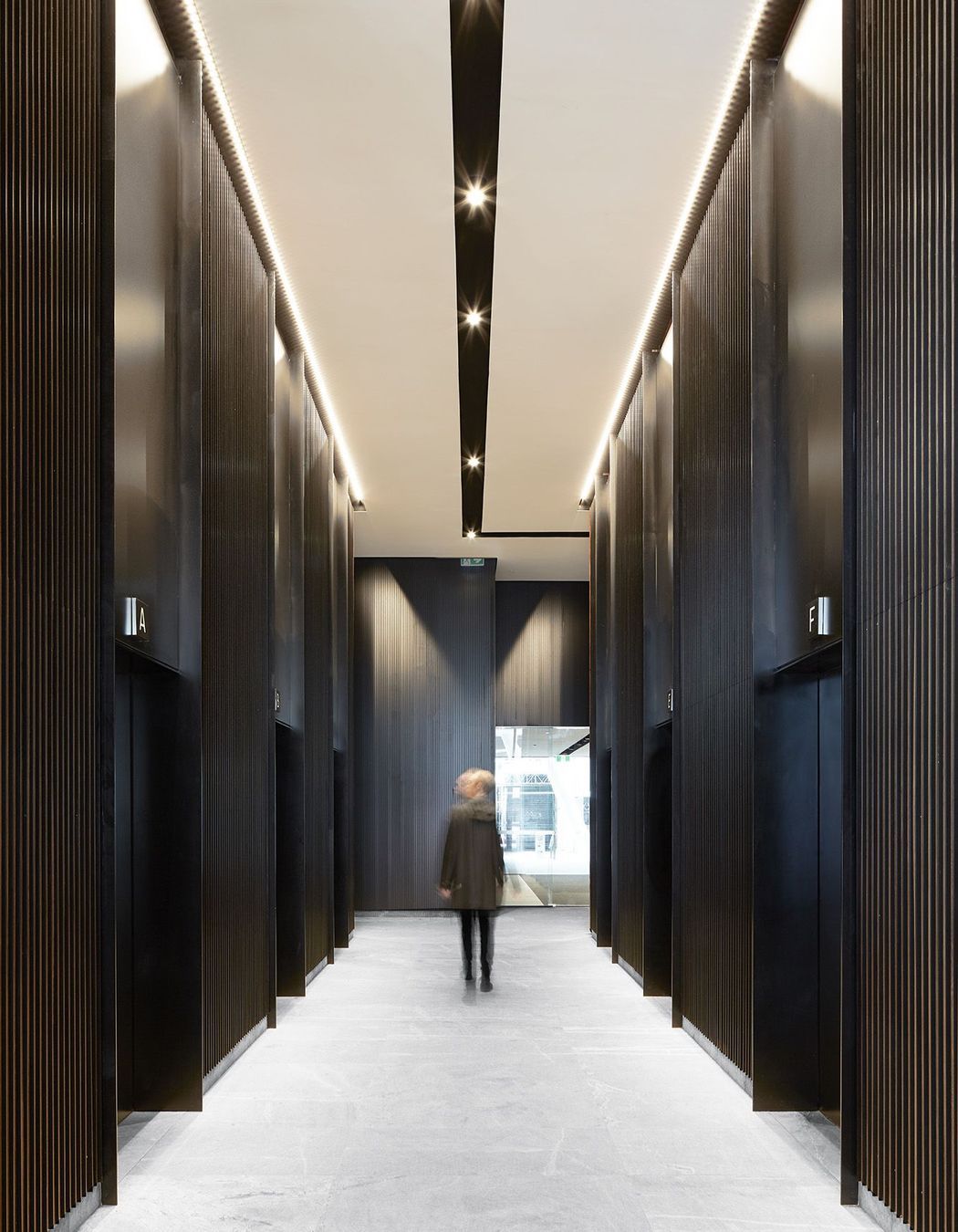
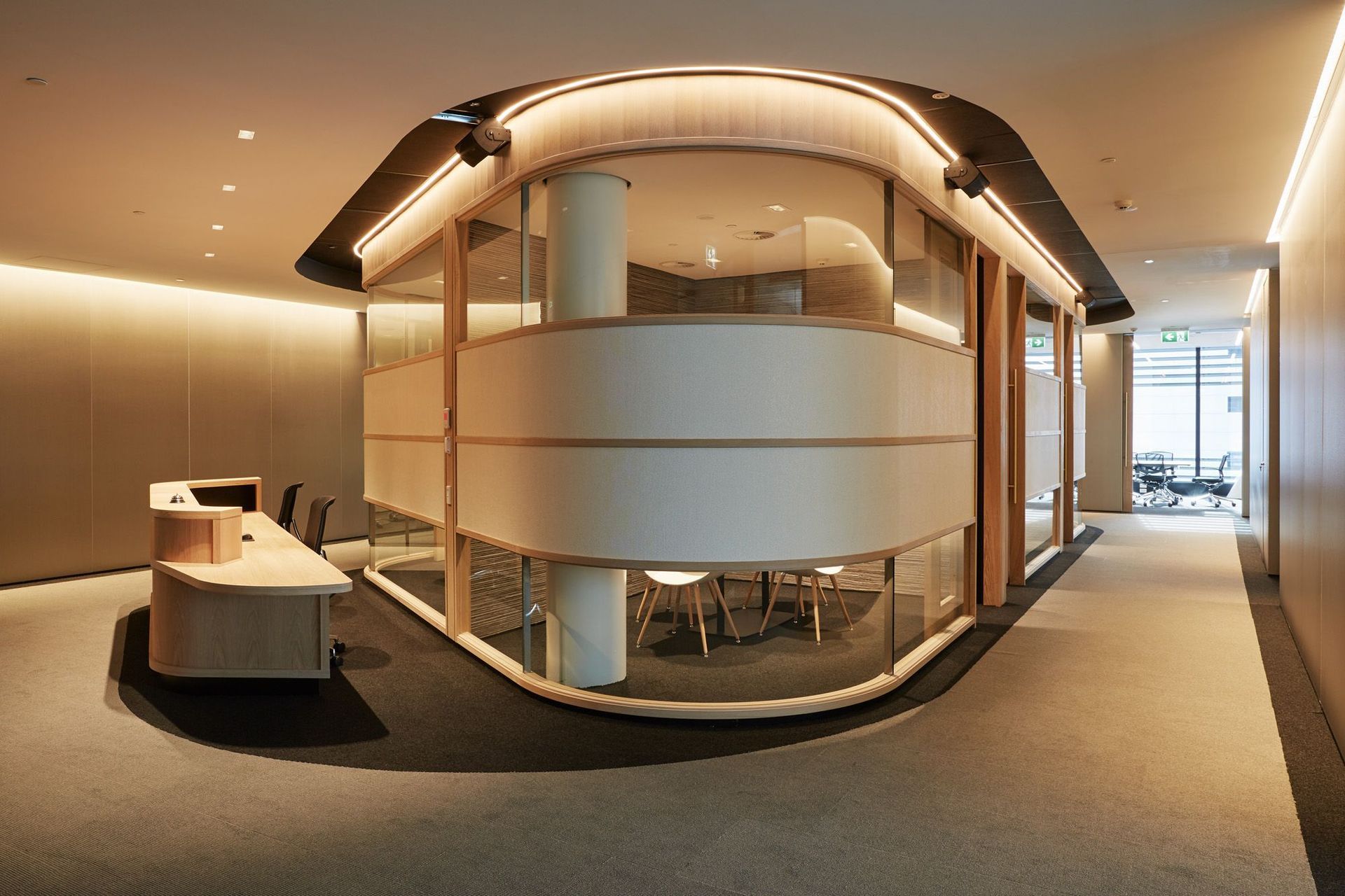
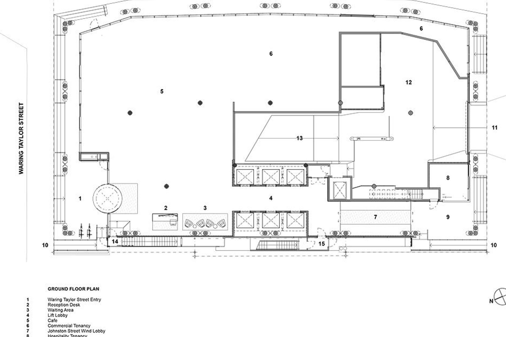
The client was passionate about having a ground-floor lobby experience that was different to the small and narrow spaces you might typically find in Wellington, suggests Thomas Seear-Budd, a designer at Studio Pacific Architecture. “It was about making sure that everything – from the overall project seen from across the harbour to the handrails, to the way people move through and inhabit the spaces – is really high quality and well executed.”
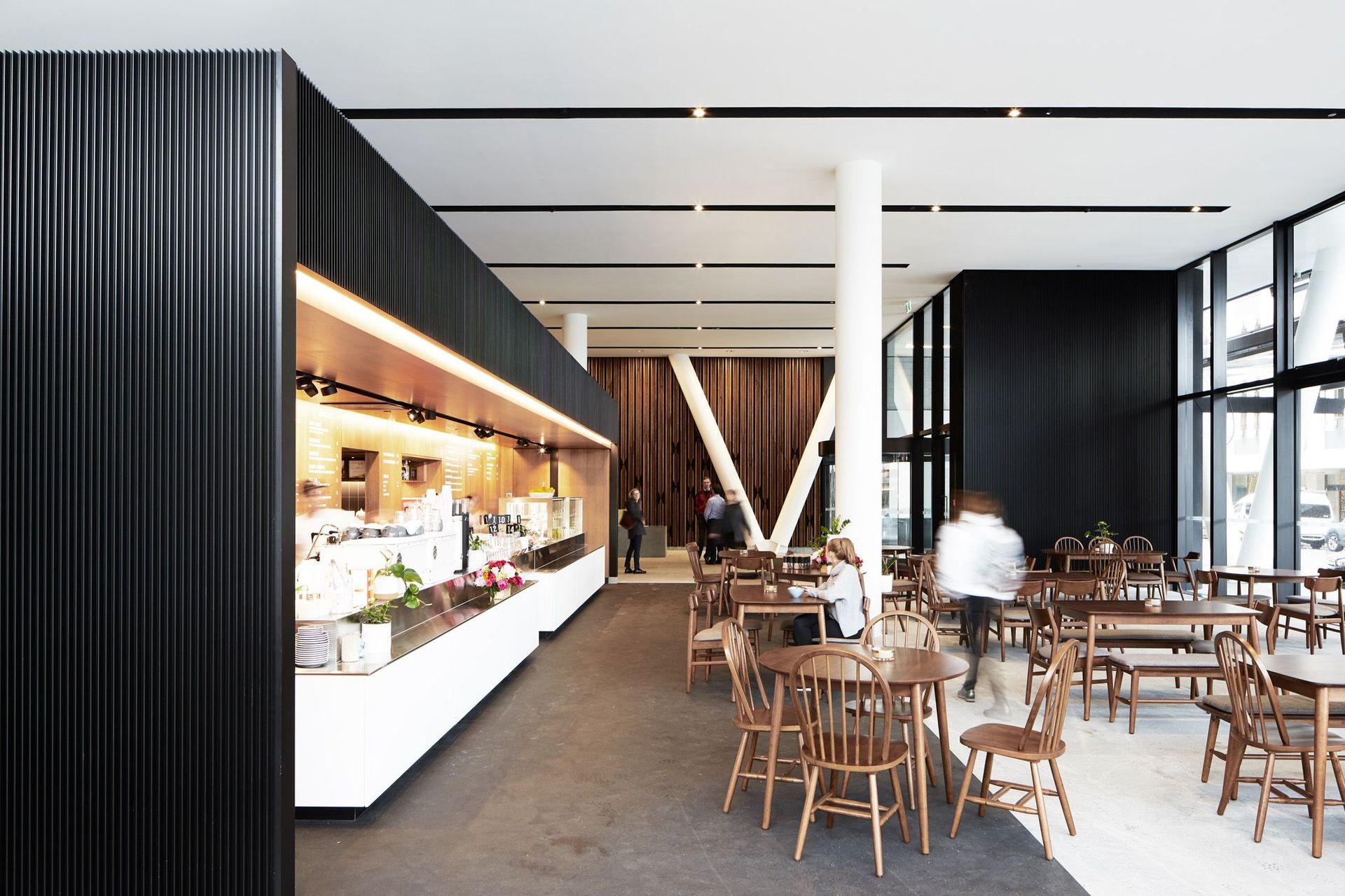
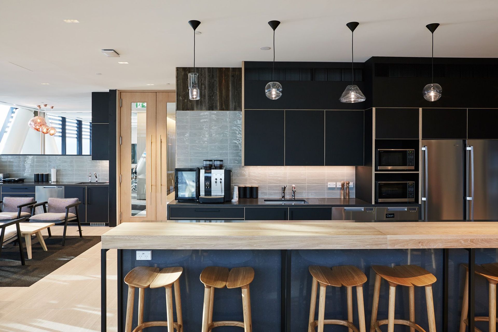
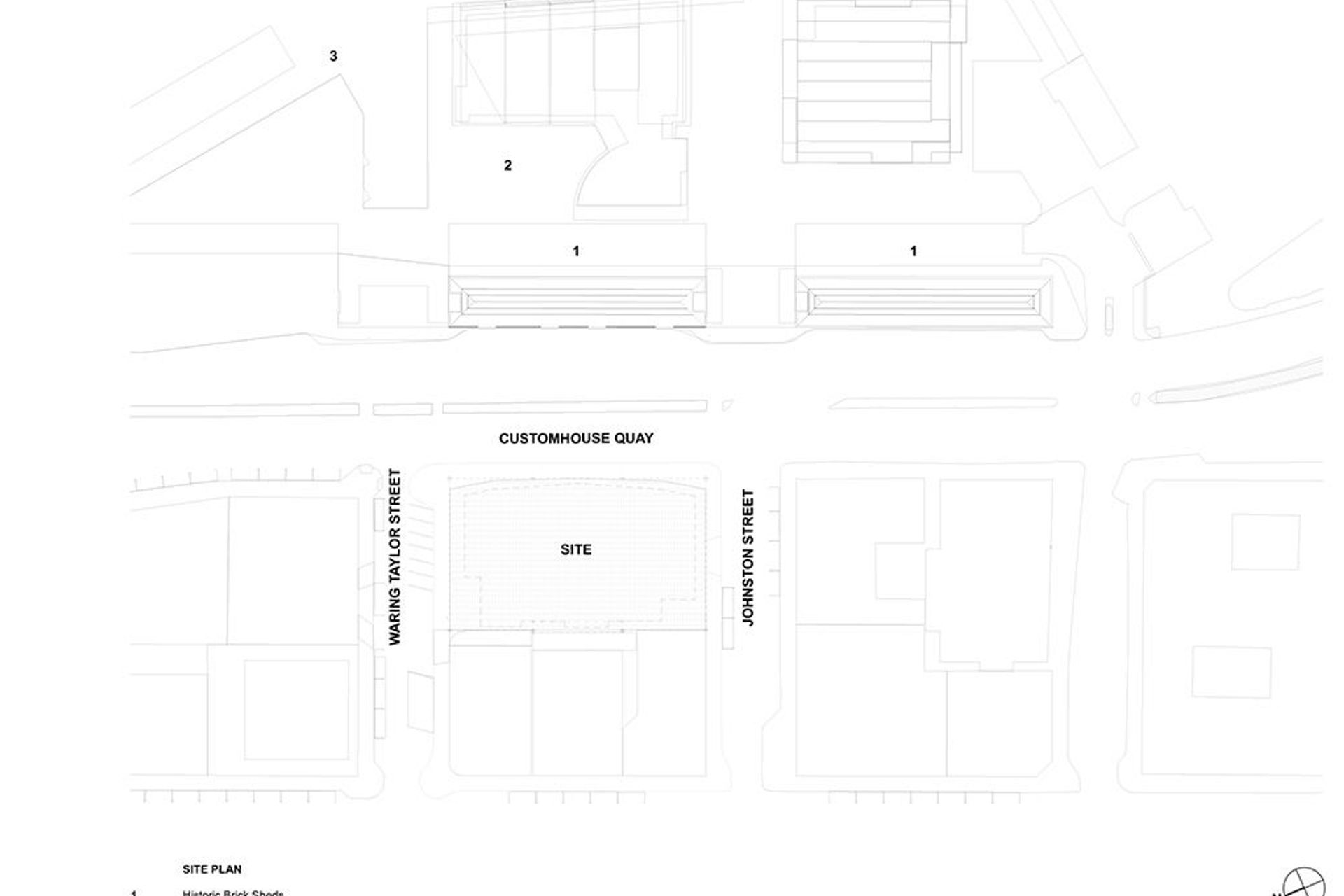
On the ground floor level – overlooking the heritage Shed 11 and 13 buildings – a bustling café serves delicious food and doubles as an informal meeting space for the staff in the building. Unlike most commercial buildings, the ground floor has been considered like a public space and is transparent from and into the street.
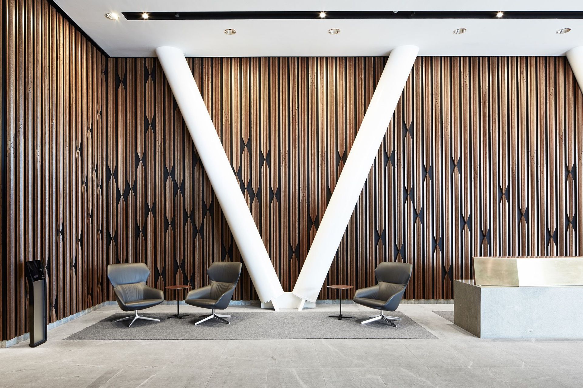
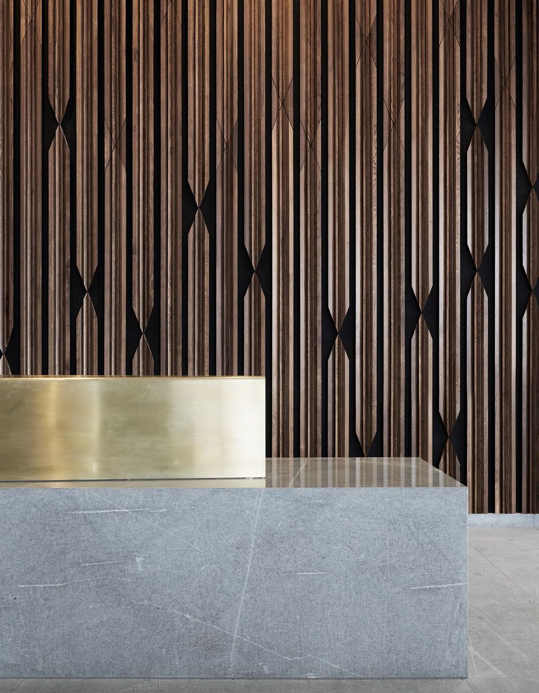
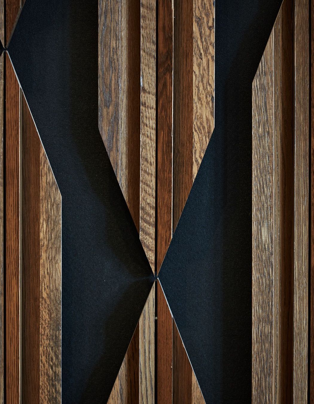
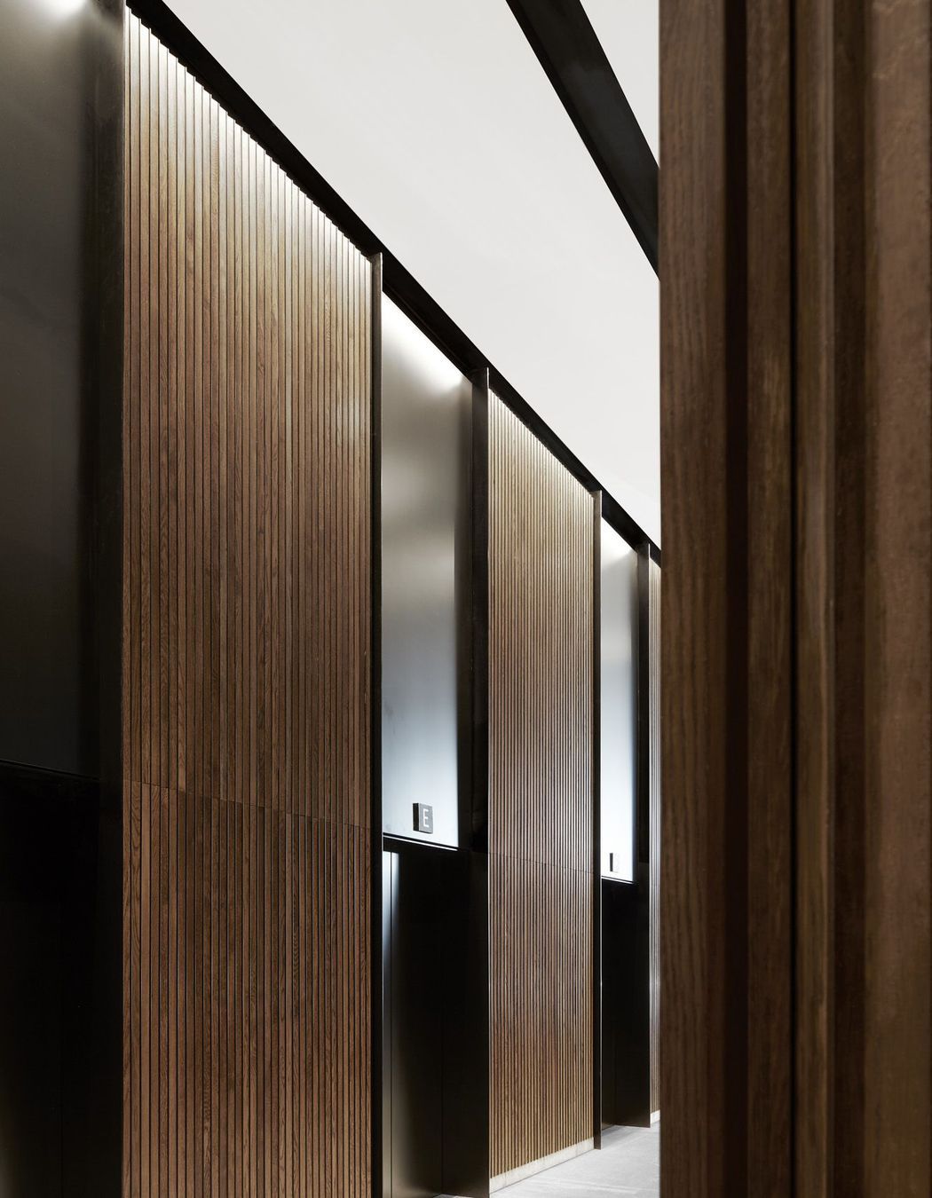
The main feature of the lobby is the stunning wall panelling, configured in an ‘XX’ pattern of vertical oak battens, in reference to the diagrid. “Butterflies, or open diagonal joints, provide a nice texture across the surface and, if you’re looking at the wider wall, they migrate along and settle down in the seating area,” explains Thomas. “It was about layering texture, pattern and form to create an interesting architectural experience from different angles.”
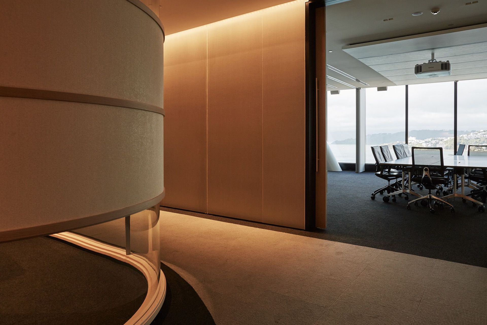
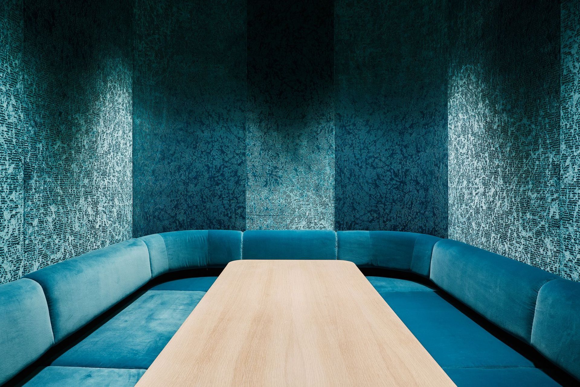
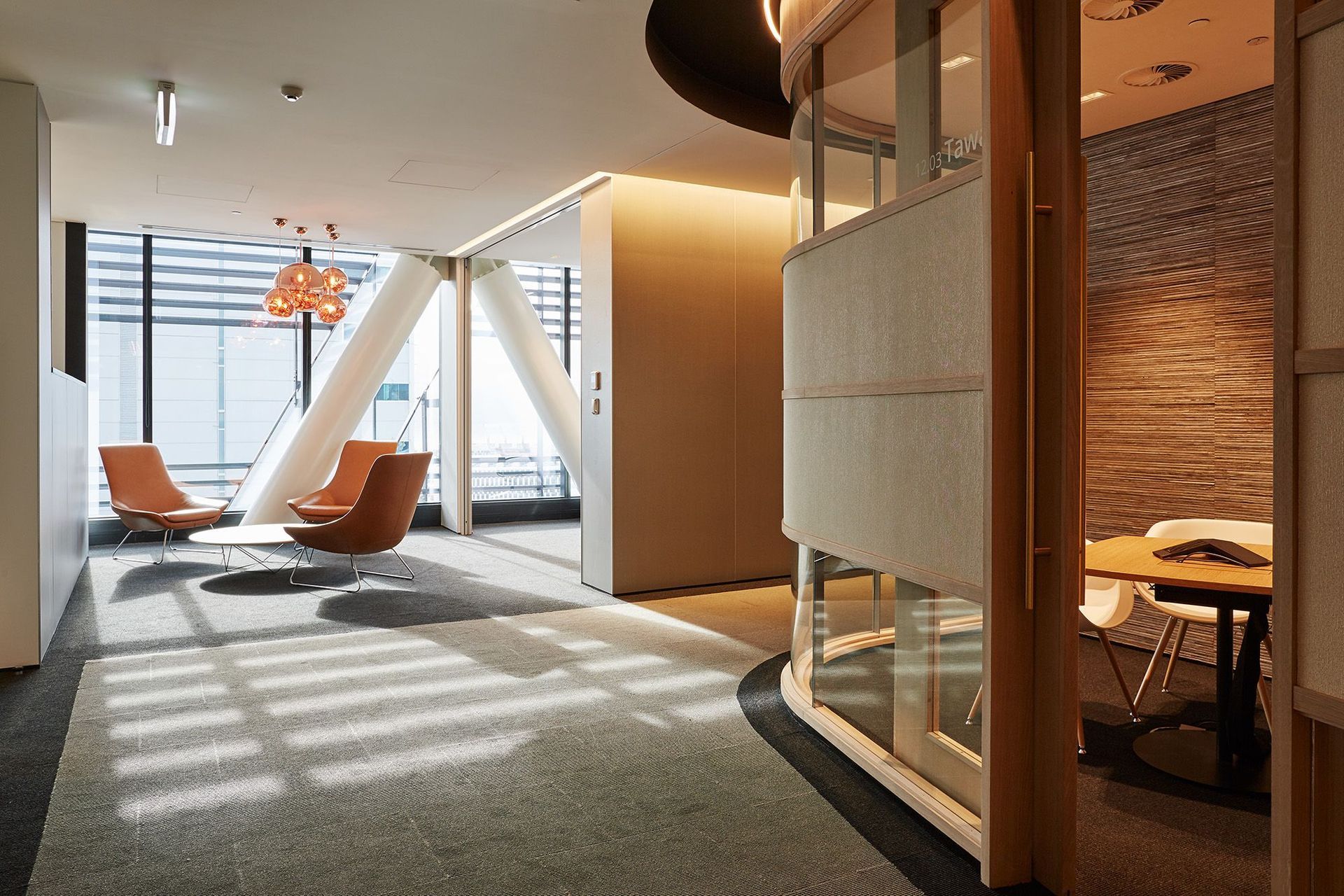
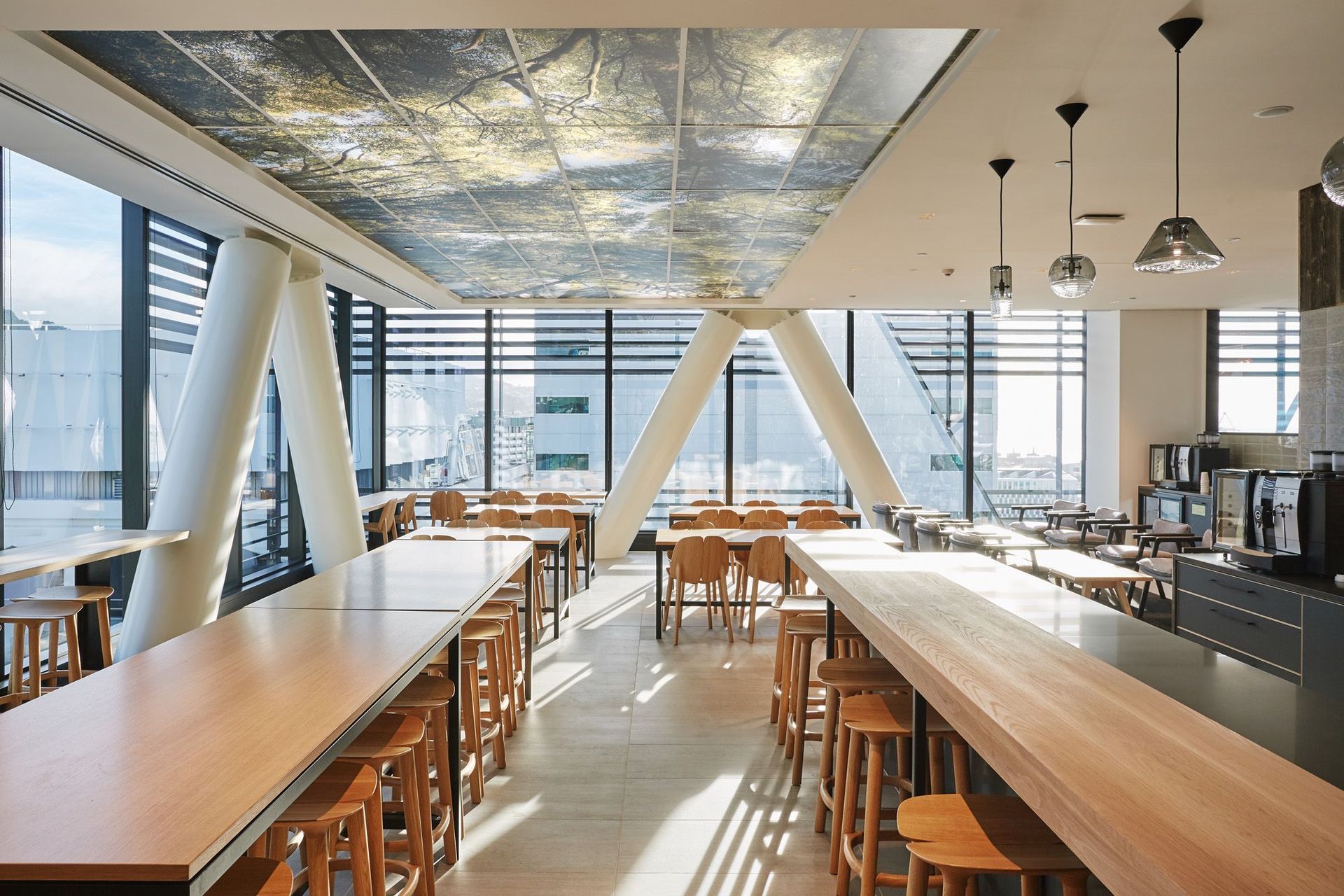
The design creates moments of discovery as you flow though the building, including Deloitte’s tenancy on level 12, where you enter a different world. “This is a jewellery box-like, dimly-lit space, in contrast to the light-filled cavernous lobby,” says Thomas. The style here is very residential for a corporate space – with its curvaceous corners, large pendant lights, plush seating and several ceilings that emanate light through printed forest canopies.
It’s not surprising that XXCQ has been very well received by the community, professionals and the general public. Passersby drop in off the street to check out the interior and chat with the concierge, and most people in Wellington are very familiar with its striking view from across the harbour. “For us, it’s a great outcome and a real nod to Studio Pacific’s strengths and what they’ve been able to deliver,” says Lincoln Fraser, development director of Newcrest Group, who commissioned the project with US venture capital partners Wilton Capital.
“What we’re seeing now, with this modern generation of office buildings, is an asset that’s calculated to achieve an outcome that preserves the structure during an earthquake and not just the minimum requirement of the building code,” Lincoln adds. “The learnings out of the Seddon (2013), Canterbury (2010/11) and Kaikoura (2016) earthquakes have taught us that building owners need to preserve the tenants’ fitouts and business continuity, as well as their own asset, because that’s what all parties are expecting – and, in this day and age, we should be able to achieve that.”
Text by Justine Harvey
Photography by Thomas Seear-Budd
