Colour, curves and a touch of ‘Miami cool’ bring personality to this Mosman home
Written by
13 September 2023
•
4 min read
There’s no shortage of personality in this home – from the vibrant magenta staircase handrail and pastel-coloured bathrooms, to the round stained glass windows and playful pendant lighting. It’s something designer Suzanne Gorman, director of Studio Gorman, credits to the clients for their trust in the design process.
A collaboration between Studio Gorman, David Campbell Building and architect Peter Tout, it was important for the three-storey Sydney residence to be brought up-to-date with new lighting, air-conditioning and improved plumbing.

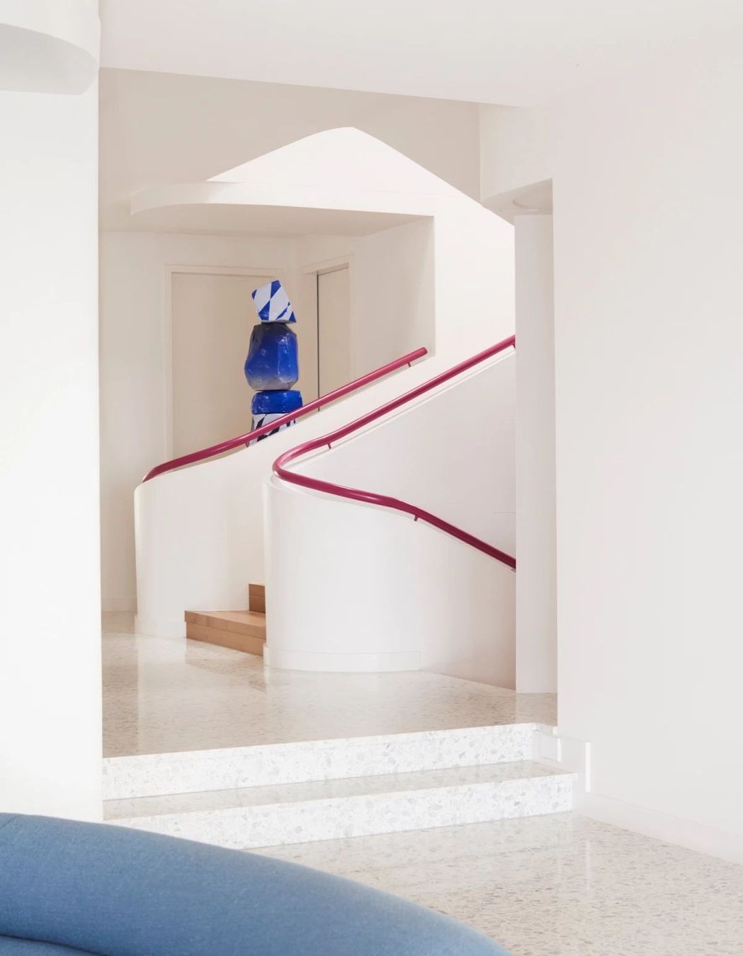
“We wanted to introduce all the services in a beautiful way,” explains Suzanne. “When you look at the house, you can see all the curved bulkheads – these were all designed to keep the height of the ceilings, while being able to install all of the plumbing and air-conditioning. That was an important element of the project: bringing the house up to speed for modern living from the 1980s, while keeping it looking beautiful.”
A balance of form and function, the curved bulkheads successfully conceal the dwelling’s services while influencing the playful mood of the entire home, with the curvaceous forms taking inspiration from Art Deco and the P&O style. “This house was built in the 1980s and you can see references to earlier influential styles that played a part in how houses of that era looked,” says Suzanne. “We then drew upon the styles of the 1980s and these earlier styles, too, when we were developing our design concepts.”
By minimising sharp corners throughout the home, this repetition of curved surfaces performs on a practical level for the homeowners – a busy family with four children.
“We also agreed that it had a very Miami feel to it,” says Suzanne.

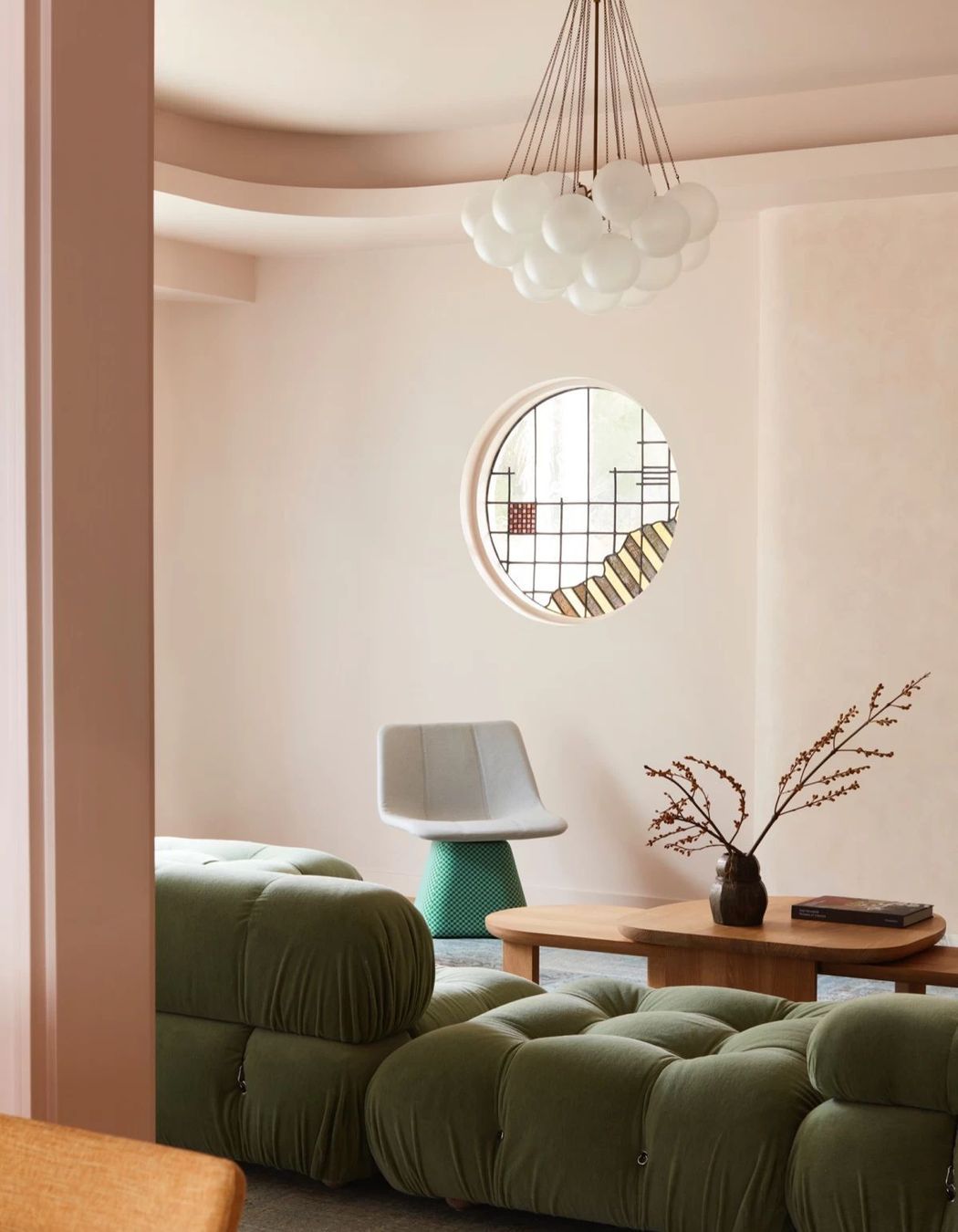
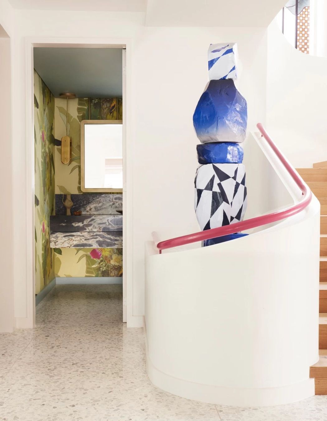

On entering Harbour House, you’re greeted by a large terrazzo-clad foyer. It’s here that the magenta stair rail can be seen wrapping the three-storey staircase. With a bold sculpture by artist Elliott Routledge, and a glimpse at the original 1980s round stained glass windows, this space certainly makes a strong first impression.
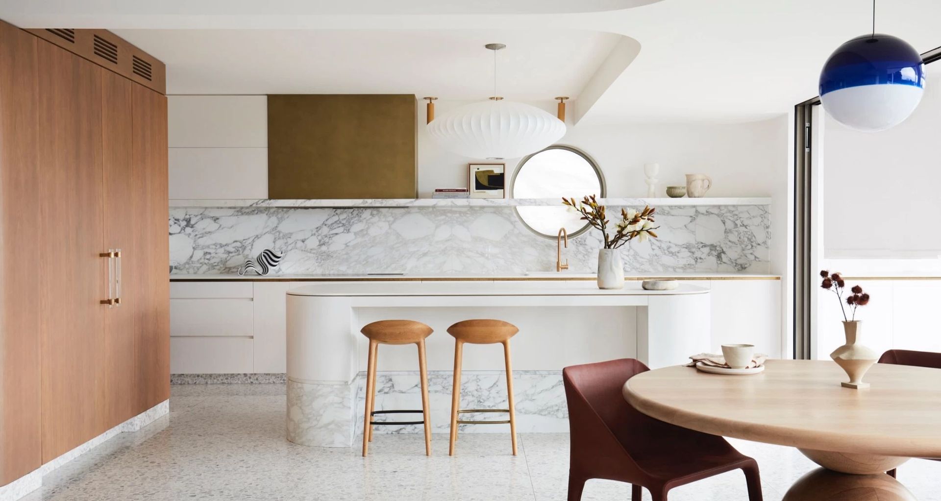
To the left, the formal lounge takes cues from the 1980s, with pastel pink coating the walls and ceiling, and a bulbous B&B Italia 'Camaleonda' sofa. The formal dining area also has a pastel pink palette, while the main kitchen/living space is open and airy with a playful curation of colour and curvaceous forms; the terrazzo flooring acts as a gorgeous canvas for the architecture and furniture to deliver a contemporary twist on 1980s style.
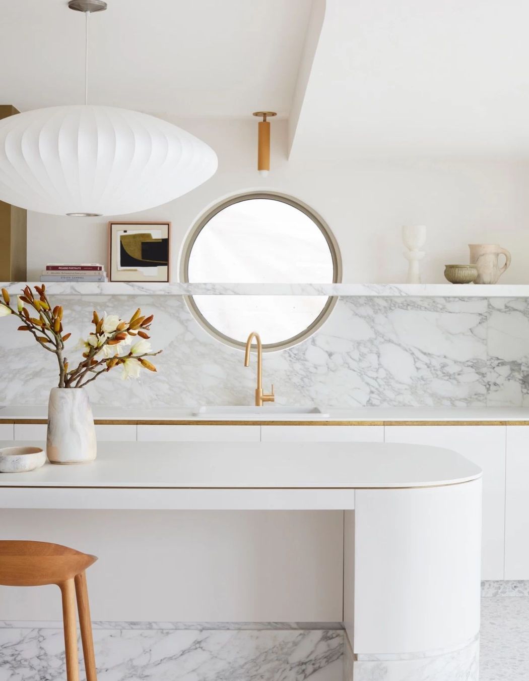
“In the kitchen, the window is new and not stained glass; but it's the same size as what you see in the living room and the stairwell,” says Suzanne.
Circle motives are repeated, from the curved ends of the kitchen island bench and pantry, to the round wooden dining table, formation of the powder blue Jardan sofa, and Puffy Lounge by Faye Toogood – a design described as a “purposeful and playful juxtaposition”.

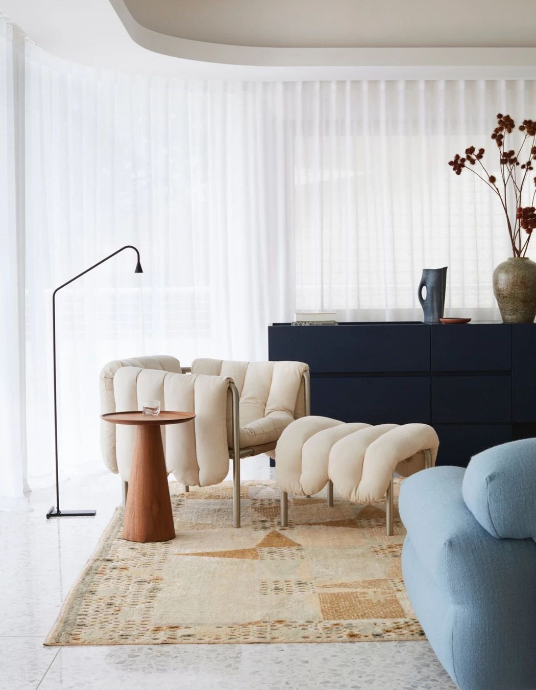
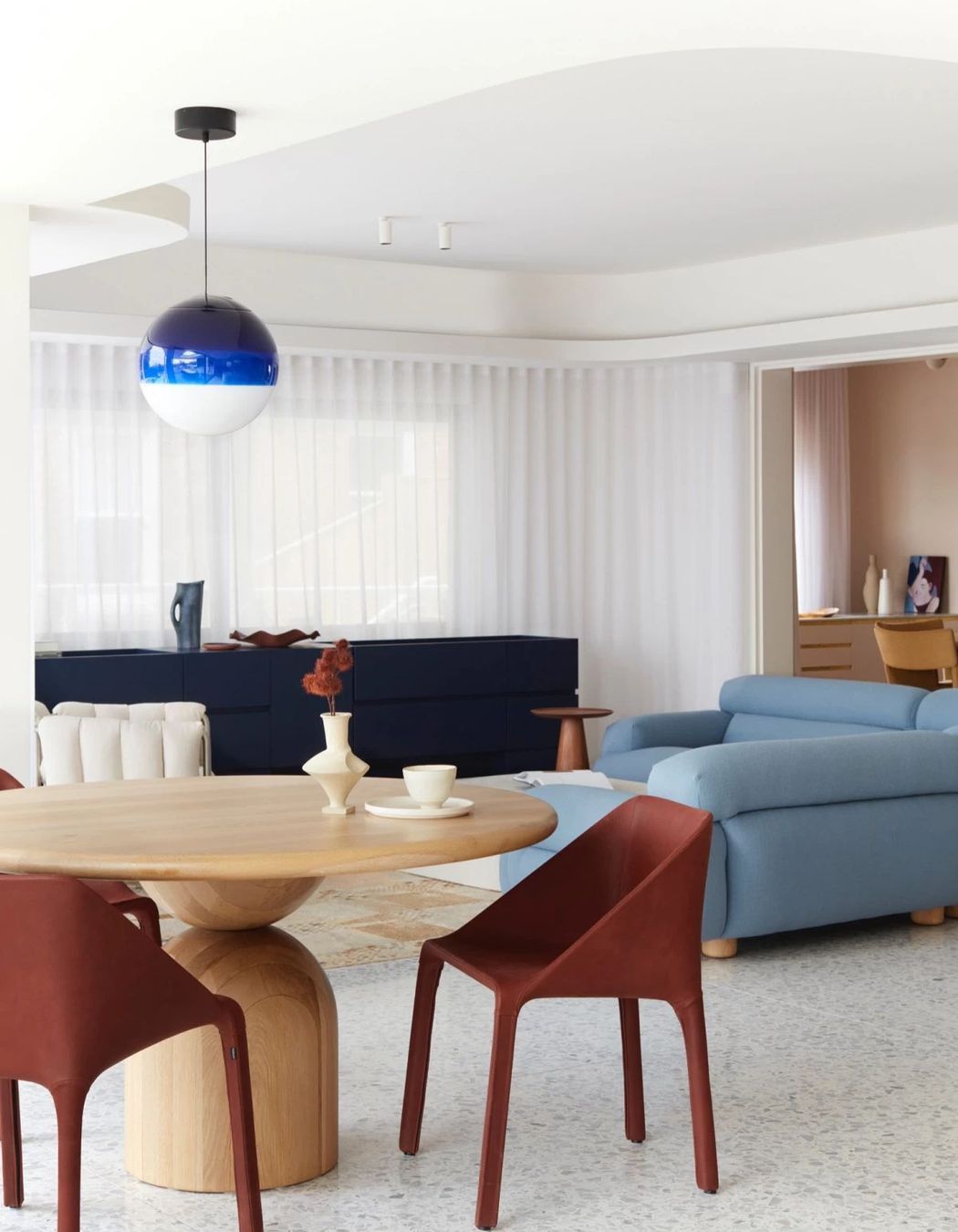
“At Studio Gorman, we are especially interested in the interaction of materials and colour, and creating a balance of colour and material throughout the whole house – we use the placement of colour to define the architecture.”
In Harbour House, Suzanne explains that we see this in the repeated use of pastel pink and blue, whether it’s in furniture or in the bathroom tiles or lighting. “The colour really only deepens in a few areas.”
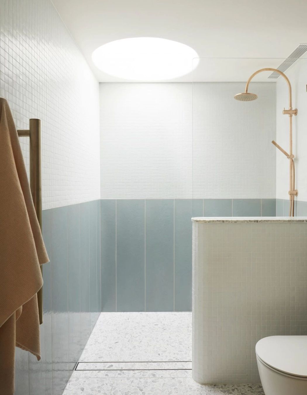
Upstairs, this dance of pastels continues in the twin side-by-side bathrooms designed for the four young children of the family.
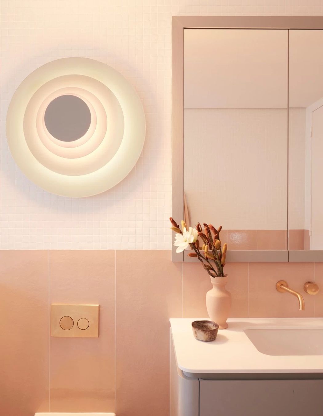
“We decided to give each bathroom its own personality, even though they’re very similar. One is pastel blue and one is pastel pink – the bathroom with the pastel pink wall tiles has a pastel blue vanity, and the one with the blue wall tiles has the pastel pink vanity.”
In both bathrooms, the same oversized wall light brings a playful focal point, and brass tapware adds a level of sophistication. “I like bathrooms to be harmonious with each other, but definitely slightly different,” says Suzanne.

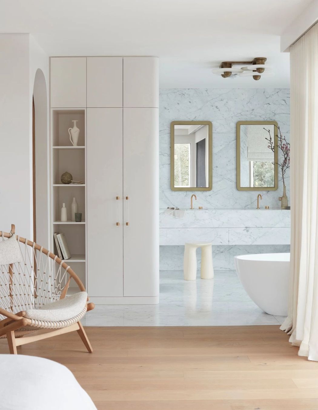
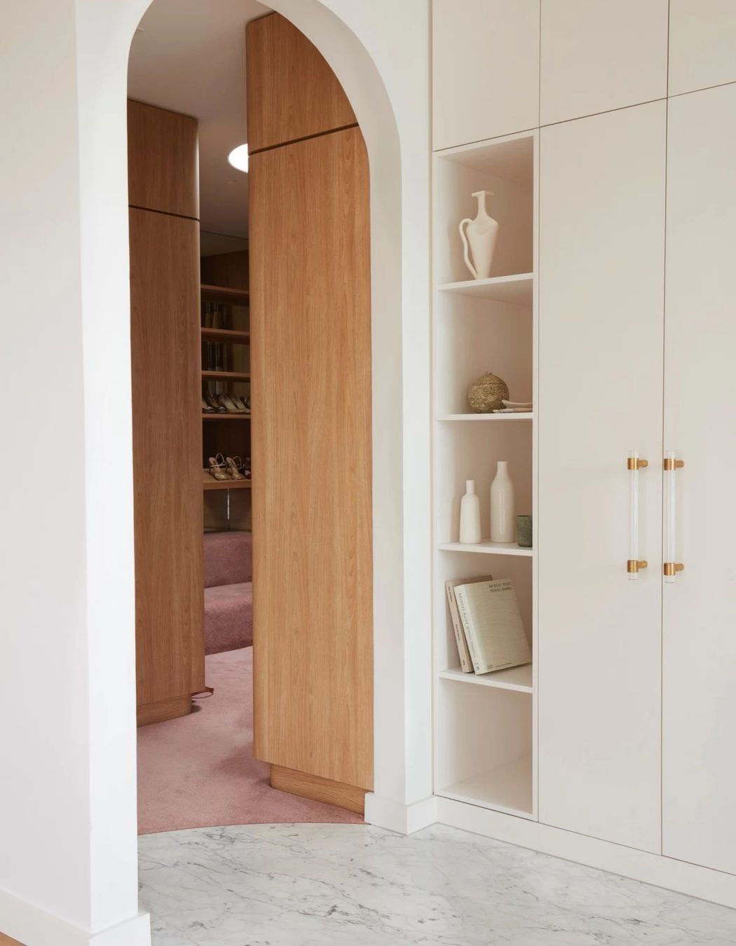
Also found on the third floor, the main bedroom suite is an open-plan haven with a light and calming palette, natural textures and organic forms. Of course, there is a hint of 1980s fun with pink carpet in the walk-in-wardrobe.
Playful, immersed in colour and reminiscent of the flamboyant 1980s, this home is a masterclass in crafting sophisticated spaces that pay homage to past design eras while honouring the personality of those living in it today.
Explore more projects by Studio Gorman on ArchiPro.
