Simone van der Plas on how to best work with an interior designer
Written by
25 September 2022
•
8 min read
ArchiPro: How do you know if a designer is the right fit?
Simone: First of all, the client has to connect with the designer and they’ve got to like that person. They need to ensure the designer listens to their ideas and contributes towards providing solutions. A designer’s job isn’t only about putting pretty colours on walls or sourcing soft furnishings, it's also about solving spatial problems. Certainly, addressing spatial challenges is the first priority, then the use of materials and finishes in the decoration and soft furnishings come as second priority.
AP: What do you specialise in?
S: My skills and work ranges from doing architectural design concepts for extensions, new houses through to all aspects of interior design, including sourcing and supplying furnishings. I do a little commercial/retail work from time to time and am currently working on an orthodontist office.
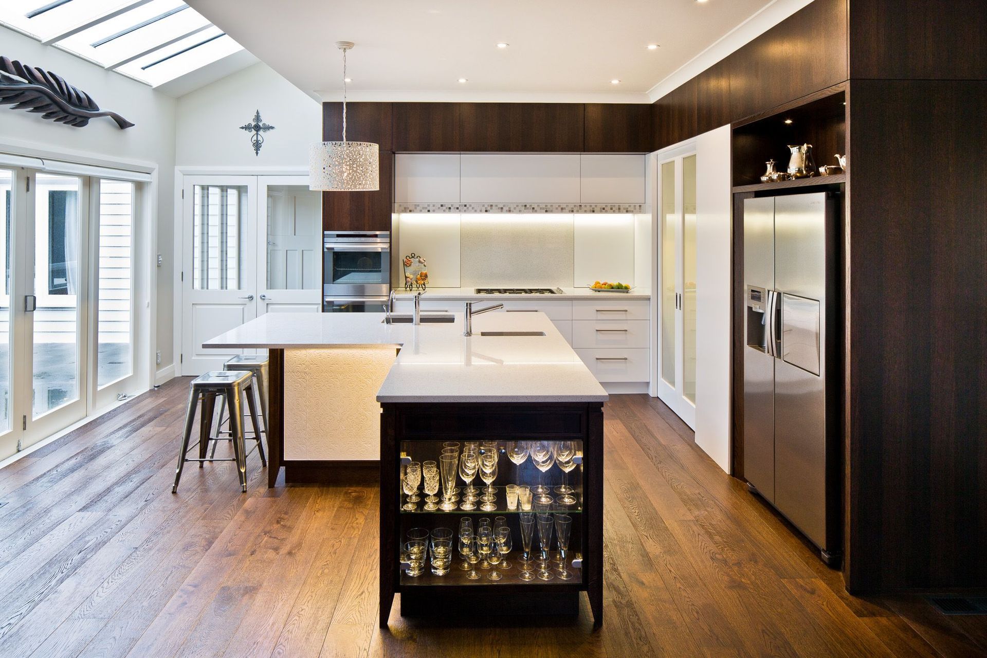
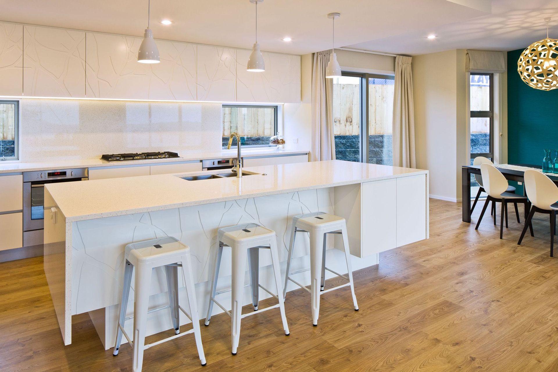
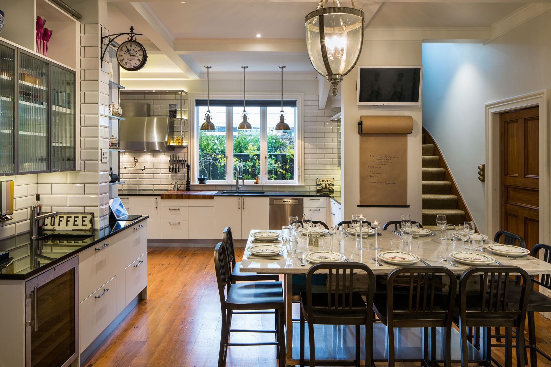
I am also doing a lot of whole house renovation work including new kitchens and bathrooms, specifying exterior materials and colours, too. My specialty skill is kitchens – I am NKBA trained and have won awards for my kitchens. I very much enjoy creating functional, but stylish spaces.
I started off life as an exhibition designer, so I’ve got a good understanding of graphics and construction because we had to build what we designed. I got very good at being creative in how to use and manage space. A lot of my kitchen designs have some interesting features. I’m doing one at the moment with a slide away espresso machine that they didn’t want taking up bench space. We’ve looked at how we can slide that away out of view, and still have the practicalities of not having power cords everywhere and dust and crumb traps.
As I have dressage horses and grew up rurally, I’ve been engaged lately to design stables and barn complexes plus a modern country house.
AP: How do you guide a client through the process?
S: I sit down initially and explain to them how I work. I have a logical step-by-step system: receiving the brief and then delivering a fees estimate and a scope of work as I understand it. If the client is happy with the fees estimate, then I talk them through the project plan in more detail depending on the complexities and scope of work.
I have a spreadsheet where I identify an approximation of time taken for each task, and I include that in my fees estimate. Let’s say, for instance, there’s 100 hours allocated to a project. The clock ticks backwards from that and the client is billed for the actual time used. I’ve found that this approach has been the most efficient and fairest to both parties. Communication is absolutely key.
These are all important factors in providing the right solution for enhancing how they live in the space.
AP: What information should a client provide for a brief?
S: It’s not just about what they like. It’s really helpful to any designer or architect that’s engaging with a new client if that client provides a brief where they’ve created a lookbook and a list of likes, dislikes, and what’s currently working for them and what isn’t. The lookbook might only have half a dozen images or 60 images – the point being that a good designer can see really quickly what the commonalities are in the images and the language the client is using.
They also need to share what their dislikes are, how the spaces are working or not working for them, and whether they’ve got a family or extended family and friends over all of the time. These are all important factors in providing the right solution for enhancing how they live in the space. The more information the better.
AP: What’s your top tip for someone who has not worked with a designer before?
S: My top tip would be to provide as detailed a brief as possible. Also, meet with two or three designers first. Don’t just look at their websites, but go and ask them questions and talk to some of the designer’s clients. Have a chat with those people and ask what that person was like to work with – particularly if the client is coming in cold and hasn't been referred to by a friend.
Then they need to know that the person they’re dealing with is suitably qualified and can listen to and interpret them. Clear communication is absolutely critical.
Another is to not be frightened to say that they maybe don’t like the choices that have been presented by the designer – it helps the designer to work more efficiently if a client is clear about their likes/dislikes.
Prioritise where your money goes to where you’re going to get the most value.
AP: What do you recommend clients splurge on versus save?
S: I recommend that a client breaks their project into a list of priorities. What are the immediate problems that need solutions? Then prioritise again after that. What needs to be addressed immediately? What can be left to be addressed in, say, a year’s time? In particular, prioritise where your money is invested to where you are going to get the most value and improvement to how your space works.
For example, in a kitchen I recommend to clients that they put their money into buying quality appliances that suit their current and future needs. They should also get the best quality benchtop they can afford because the benchtop surface takes a lot of wear and tear, plus it is usually a contributing factor towards being a strong focal point in a kitchen. Money can be saved by using a low pressure laminate on the cabinetry instead.
AP: What are you loving in interiors at the moment?
S: Looking at the Dulux Colour Forecast for 2023, we’re going to see some warm colour palettes and earthy tones come through. It’s very reflective of where the world is heading at the moment – coming out of the tail end of a pandemic, people are working from home more and are wanting their homes to wrap around them so that they feel secure.
There’s also a nice palette of colours coming through that’s quite fresh and reflects oceanic colours – blues and greens and tinted whites. I always enjoy seeing new colour combinations coming through, firstly in apparel wear and then into interiors. I particularly like colours that have longevity.
AP: What are some ways you like to bring colour into a space?
S: I love using different textures and I think it’s really cool to use wallpapers. When you paint colours on walls, it’s a flat surface. So, it’s nice to bring in a pop of texture through graphic imagery on a wall in selected areas of a space.
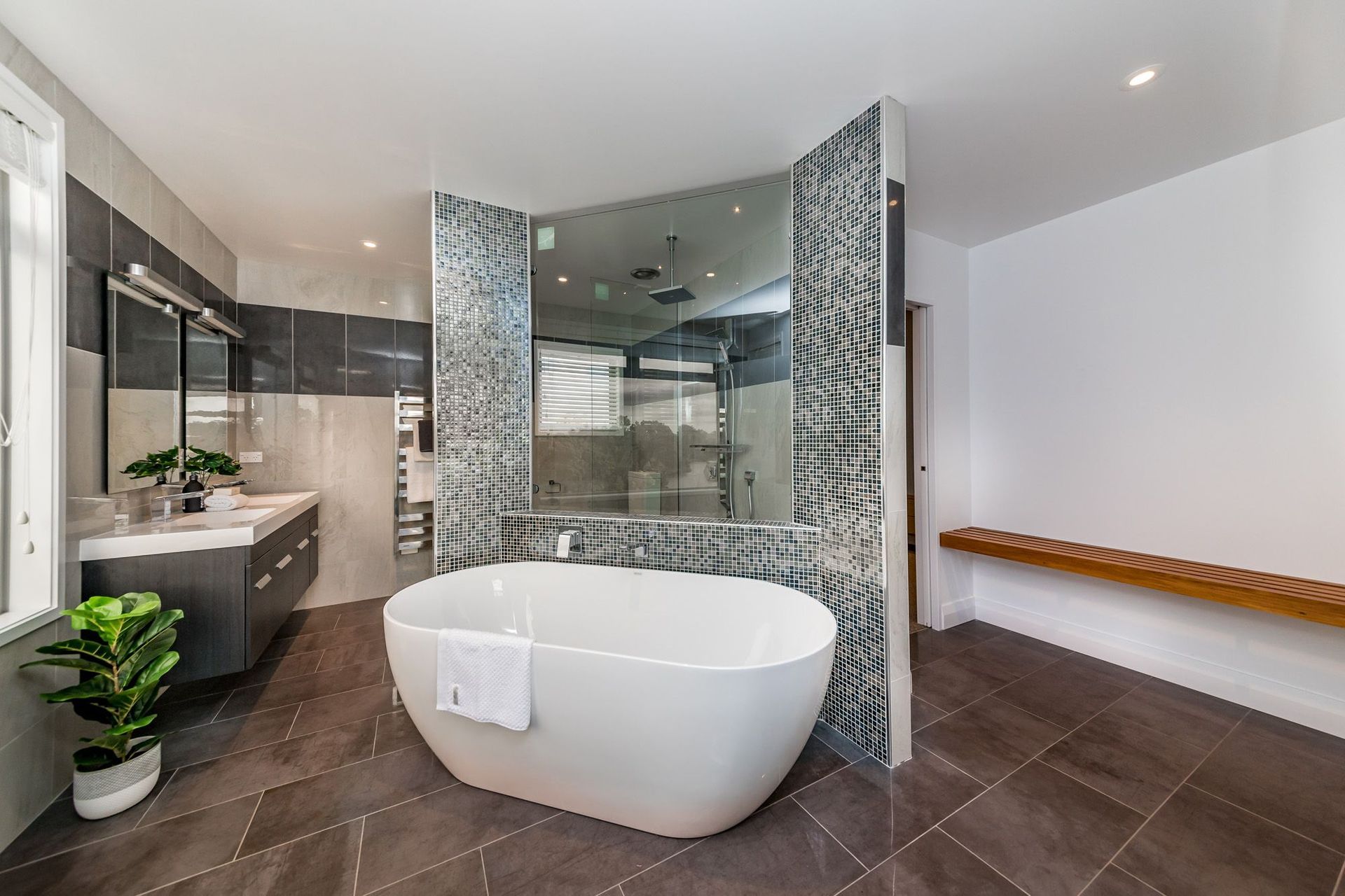
You can also bring in colour, for example, with coloured marble effect tiles, bathroom vanities, fixtures, and coloured glass in light fittings.
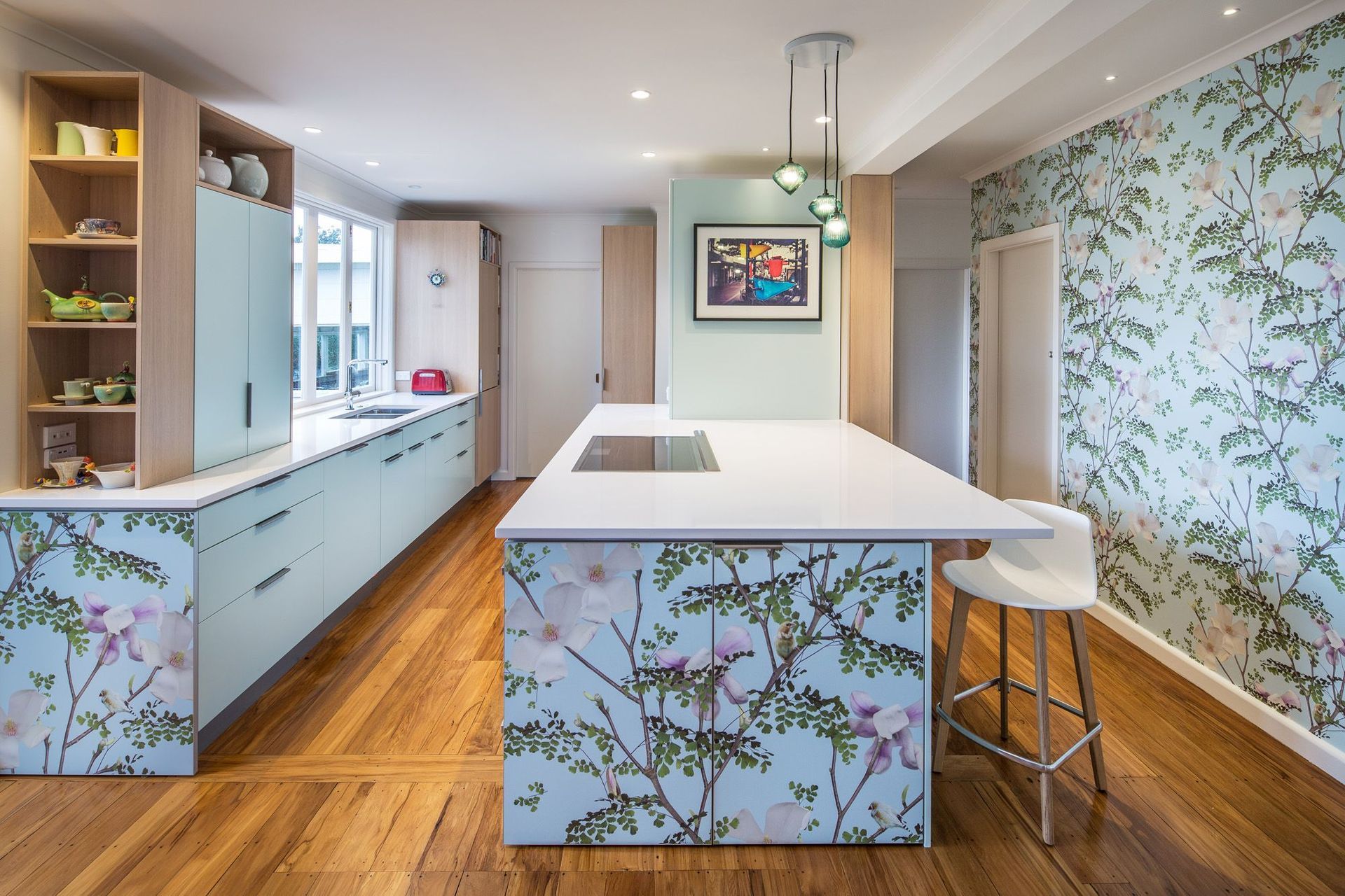
For the Cherry Blossom Kitchen project, I have used an image from the client’s holiday of a cherry blossom tree on their splashback and also on the full-height sliding pantry doors. It was a great, fun way to create something a little different that was reflective of the client. The Magnolia Kitchen design was built around the client’s love of a magnolia wall mural, where I engaged the magnolia wall mural graphic designer in the UK to create a wallpaper. I then enlarged parts of the image and had them printed onto the cabinetry. This project had its challenges but it was a finalist in the SBID International Design Awards and also won the Resene Best Use of Colour award.
AP: How do you present your design concept and ideas with clients?
S: At the concept stage, I use Archicad to do all my floorplans and elevations and I hand-render conceptual ideas in 3D, plus I do some CAD modelling so the client can envisage their space. I often make digital sample boards with some text explaining what the particular images used is pertaining to. Then, once we’ve decided on the general look, we visit merchants, design libraries and source the sampling to create an interiors story for the look of the home.
Never look at your sampling individually – it's really important to have all of the samples together to look at the whole story. That’s how you start understanding flow. A lot of people need to remember that when you open a door and you’re in one room, you can see right through the adjacent spaces, so overlapping colour and texture is important. You want a story to unfold throughout that space.
Explore Simone van der Plas’ work on ArchiPro.