"Strong but elegant": Brunswick Lean-To by Blair Smith Architecture
Written by
04 February 2022
•
5 min read
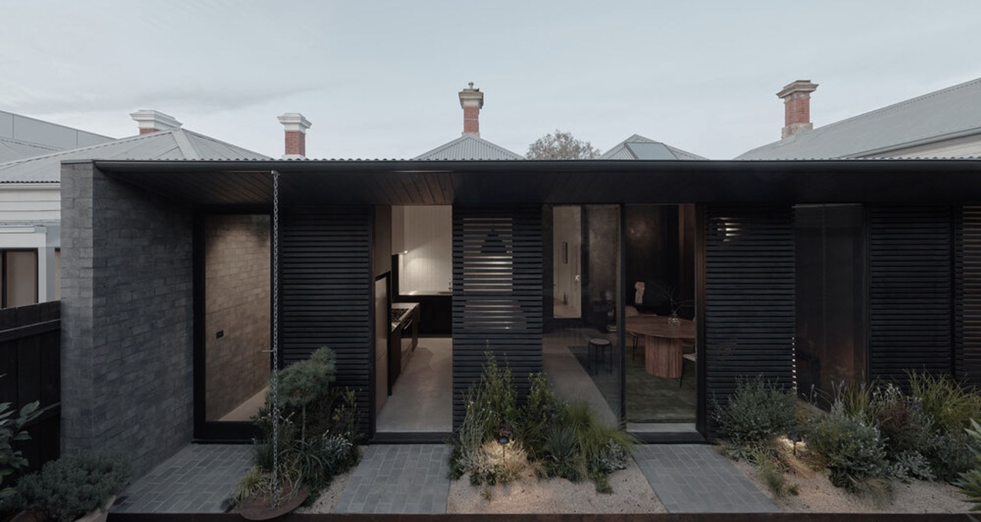
There’s no denying the allure of the humble cottage. Stereotypical or not, heritage cottages stir up visions of petite weatherboard structures and fairytale-like country gardens bursting with blooms and the occasional roaming chicken. But as anyone who has ever purchased one will tell you, stepping inside a traditional cottage can often leave much to be desired.
In Melbourne’s edgy inner-city suburb of Brunswick, an old and dilapidated lean-to structure off the back of a small, 73-metre-squared original cottage was far from fulfilling the domestic needs of its new owners. “[The owners] were compelled to renovate because the original lean-to structure was so cold that they often found themselves wearing puffer jackets indoors in order to prepare meals!” architect Blair Smith of Blair Smith Architecture explains. In summer, meanwhile, they had the the opposite problem: the heat was unbearable.
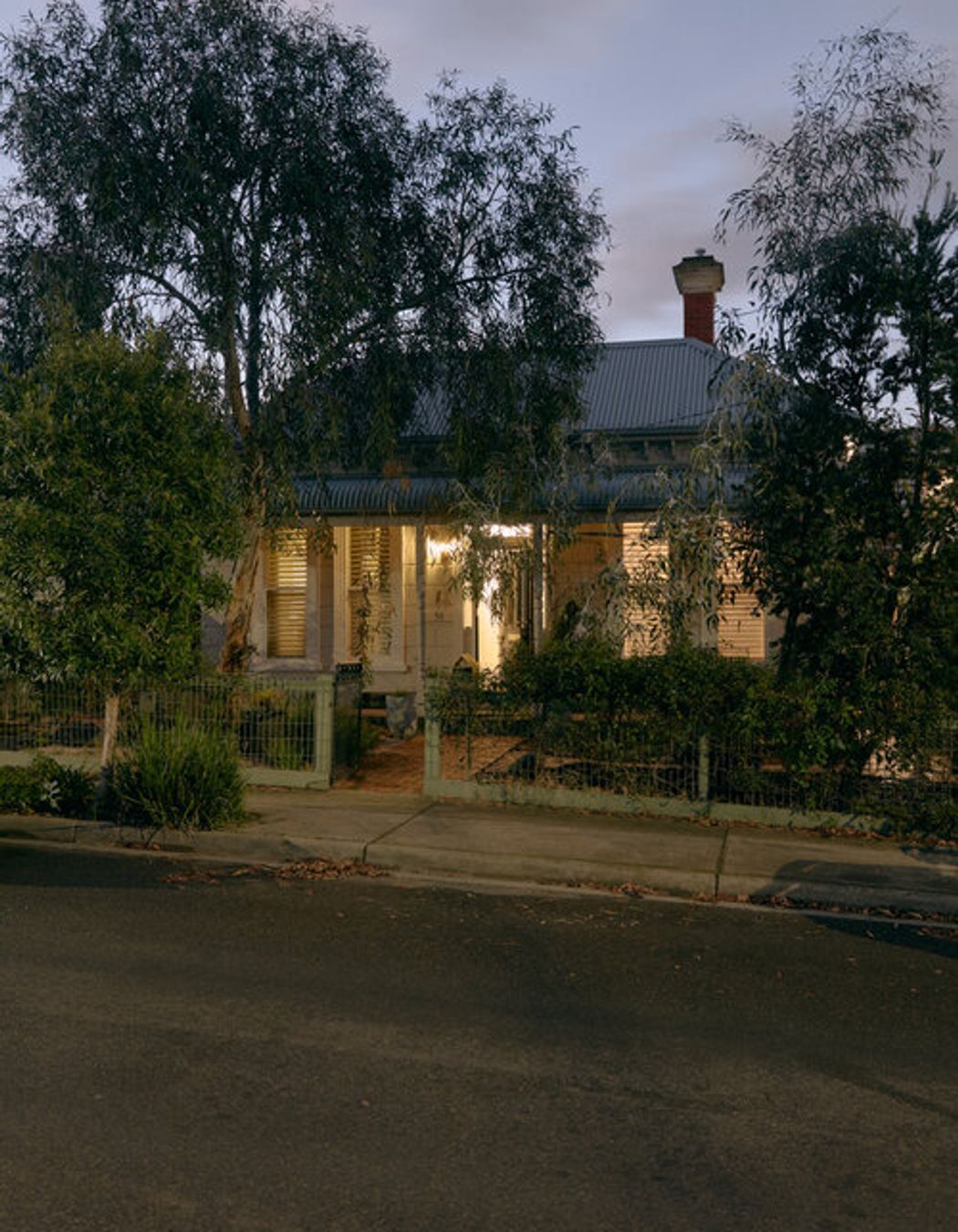
The owners also had a modest budget for Blair to work with, but what they lacked in unlimited resources, they made up for with a huge enthusiasm for the project and a hunger for collaboration. Active participants in the design process, the trio came to a mutual understanding that the project would enrich the clients’ day-to-day lives with minimal architectural intervention.
“Our initial discussions where focused on creating a low-impact building, both in terms of its carbon footprint as well as retaining an established garden,” says Blair. This meant the new structure had to be small – no bigger than 51 square metres and only slightly bigger than the original lean-to.
Blair’s solution was to reject the usual architectural approach of positioning wet areas in close proximity to the bedrooms, which would have required a dramatic reconfiguration of the cottage. Instead, he set out to replace the run-down lean-to with a reorganised, modern-day version replete with new bathroom, laundry and kitchen – each of which maintains its connection to the much-loved edible garden.
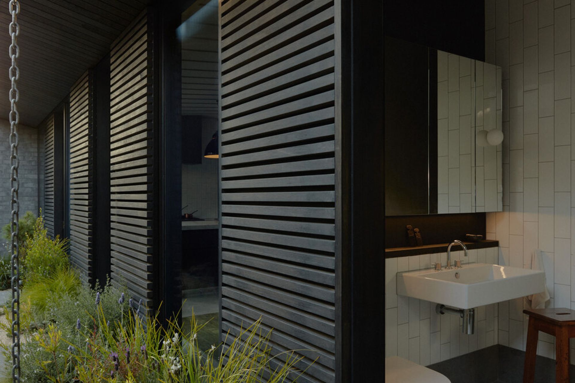
“The bathroom can be opened up at both ends so that the internal spaces and the garden feel interconnected. On a practical level, this allows someone at an outdoor gathering in the yard to step directly into the bathroom without trudging through the whole house! One can also have a shower with an outlook to the garden if they are so inclined,” suggests Blair.
“Strong but elegant” became the project's mantra as Blair worked through the design process with the clients over an 18-month period, and then embarked on a mere five-month construction window. “Even though we often used this catch phrase in jest I’d like to think that anyone who visits the building would testify that it rings true,” he says.
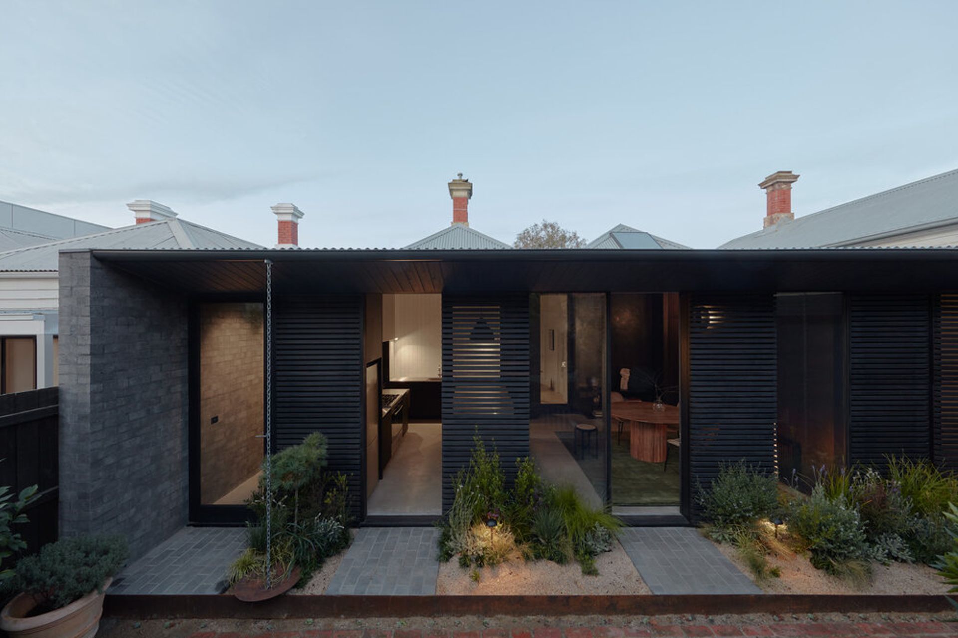
The elegance of the house goes without saying, while the project’s strength lies in its moody palette and striking, highly functional elements such as the extension’s three black sliding timber screens. Positioned on a single track, these ingenious screens work to control heat and glare, provide privacy from a neighbouring three-storey building and can be opened up fully without blocking the garden views and natural light.
“In the new lean-to, materials of high thermal mass receive plenty of winter sun, the eave shades the glazing in summer – and there’s ample opportunities for cross flow ventilation and purging,” says Blair.
An unsurprising request from an owner who was clearly attracted to the idylls of cottage life, was that the house should feel tranquil. “One key request was to create a sense of retreat and calm in the house – a home that would offset the 'urban intensity' of inner city life.”
Blair met this need for quietude and harmony by purposefully choosing each material with this idea in mind. To start with, you won’t find any ceiling downlights anywhere in the extension. “In fact, the only objects that touch the ceiling are a pendant rose for the island bench, a stainless steel rangehood and an exhaust fan for each wet area,” he notes. “All lighting is via wall sconces and lamps. Not every client would be brave enough to do this, but they embraced the design challenge and the idea of low-level ambient lighting in the evening.”
The affordable gloss tiles chosen are positioned to reflect the garden greenery, and the grey battened ceiling offers a sense of depth and shadow to what would otherwise be a conventional plasterboard surface.
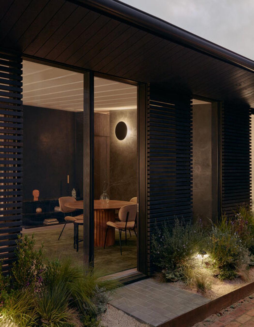
We could have achieved a larger building, but a richness in material and detail would have been diluted over a greater area and the result would have been much more conventional.
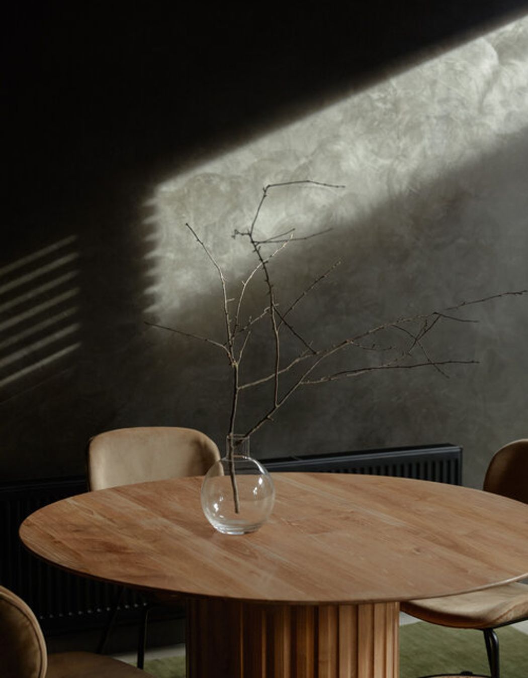
Other eye-catching but serene details include the painted dining area wall, which showcases a textural finish with a beautiful lustre that changes over the course of the day with the natural light. It’s a small detail that has big impact – much like the project itself. After all, much of Brunswick Lean-to’s allure comes from its restraint.
The “modesty” of the house, as Blair puts it, is his favourite thing about the project and reflects his practice’s ongoing commitment to small footprint residential architecture, and sensitive or sustainably-minded design.
“By keeping the building small we were able to concentrate the budget over less area,” he explains. “We could have achieved a larger building, but a richness in material and detail would have been diluted over a greater area and the result would have been much more conventional.
“The owners here have created a bespoke, small-footprint addition within their means and undoubtedly added value to the property without overextending themselves. There should be more residential projects with that sentiment!”