The reimagining of a 1970s Gold Coast cottage
Written by
21 April 2024
•
5 min read
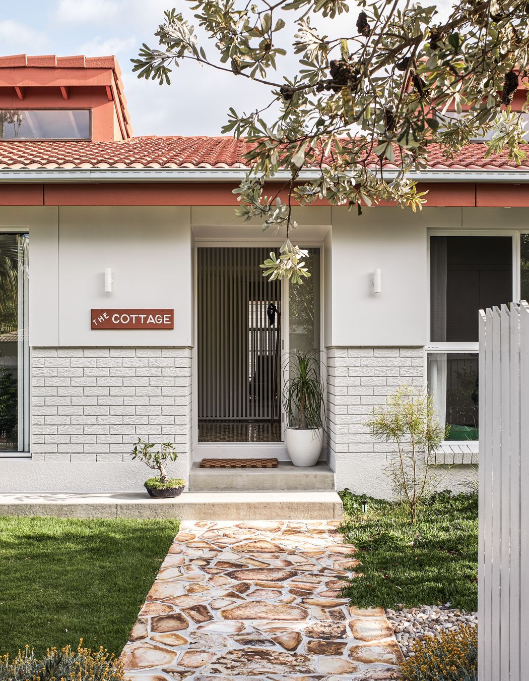
When an enquiry came in about renovating a cottage in Burleigh Heads, architect Justin Humphrey, who lives on the same street as the house, had his fingers crossed that it was a 1970s house he found particularly interesting due to its unusually striking red roofline.
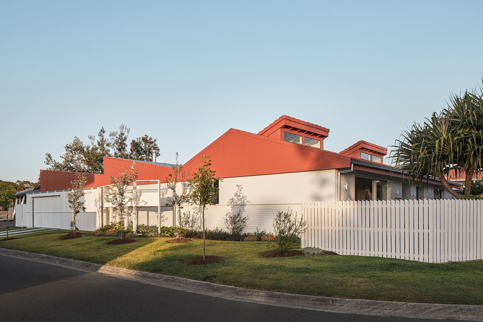
The area is suburban, close to the beach and features predominantly low-rise houses built in the 1970s and 1980s. But the cottage Justin had his eye on was different to others, with a long street front elevation without any windows on one side, and a collection of single-pitched roofs that had been added over the years.
“There was some interesting form in the roof already, but other than that it was very much fitting in with the original streetscape, which is predominantly brick and tile,” shares Justin.
Once it was confirmed, Justin had the opportunity to view the interior, which featured the mid-century elements he’d hoped for.
“There were some really lovely bones inside and some of the original part of the house has high clerestory windows at the top, facing the south, giving a nice, soft light,” says Justin. “There was some exposed roof structure inside that was painted brown, as well as original brickwork and 1970s tiles.”
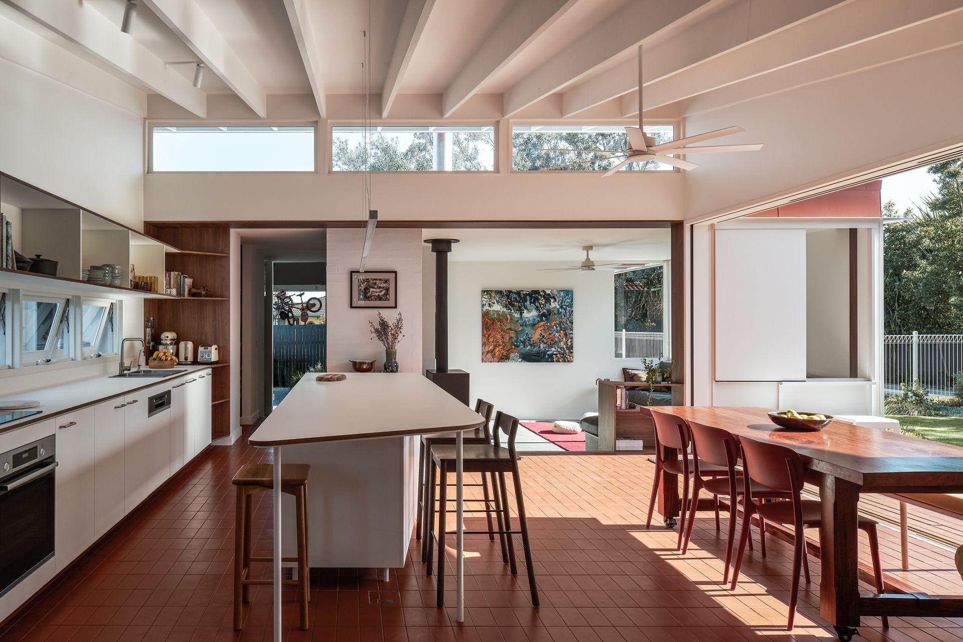
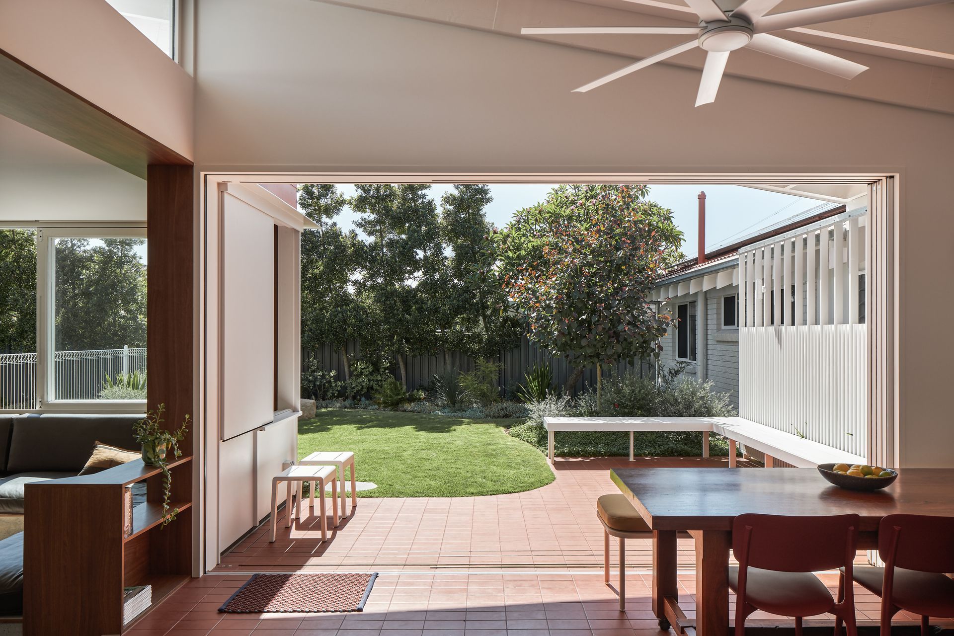
Taking the original features as inspiration for the renovation, attention was paid to the reconfiguration of the existing spaces. The clients, who were a young family with two children, needed more space, but were a close-knit unit who didn’t want everyone pushed into separate areas of the house.
“They were very aware that they liked to live in close proximity to each other, and their daily patterns of living involved lots of overlap and that was something they didn't want to lose.”
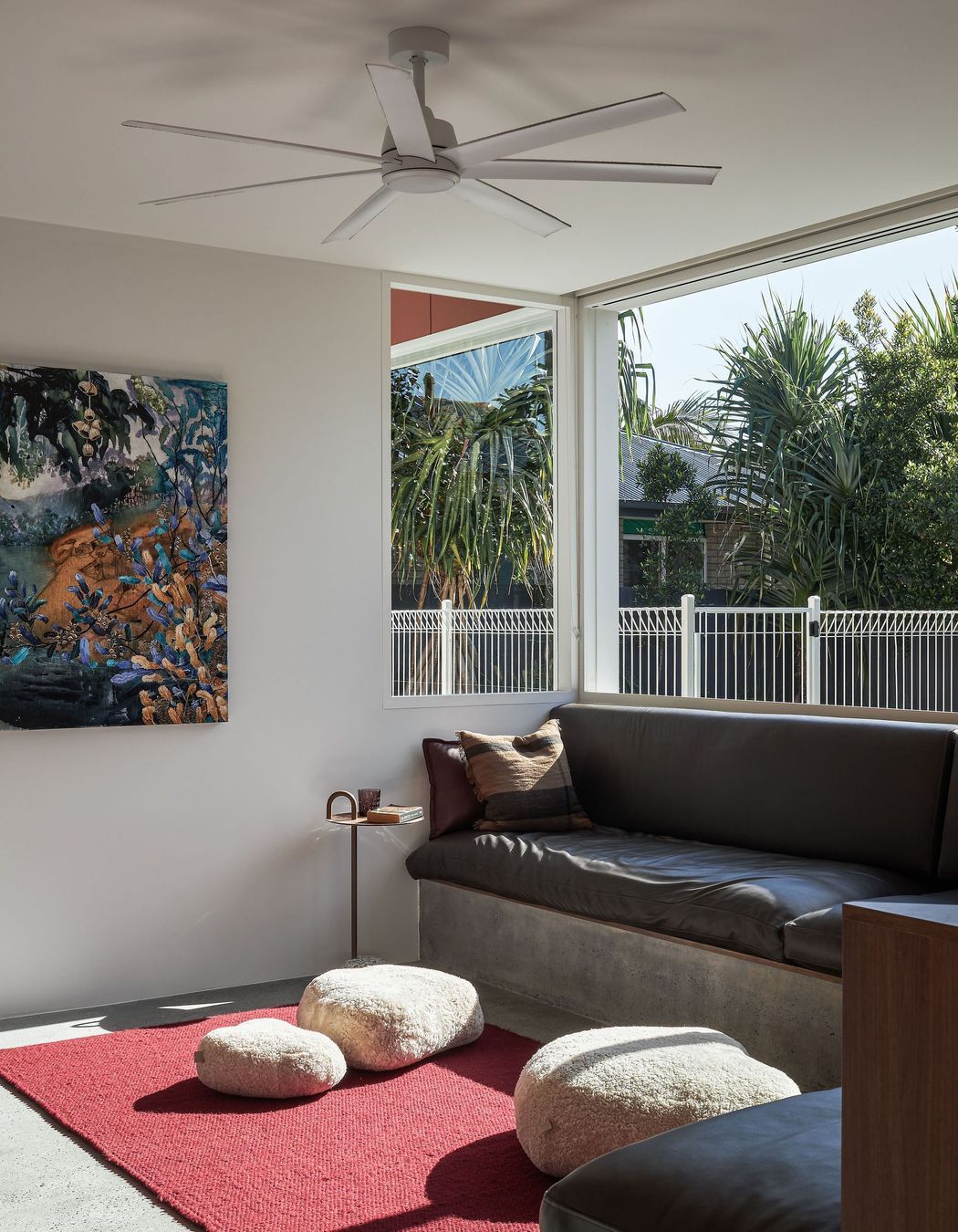
As such, the new layout supports those patterns of living, but still allows people to find their own space within the house if they need to. At one end of the existing house, the two children’s bedrooms and guest bedroom were largely left intact, while a family bathroom was reconfigured; the master bedroom was moved into the existing kitchen, and the sunken lounge replaced the existing garage. A new access was established that gives the family a private entry, which leads them through the mudroom and laundry, past a new powder room to the main living spaces.
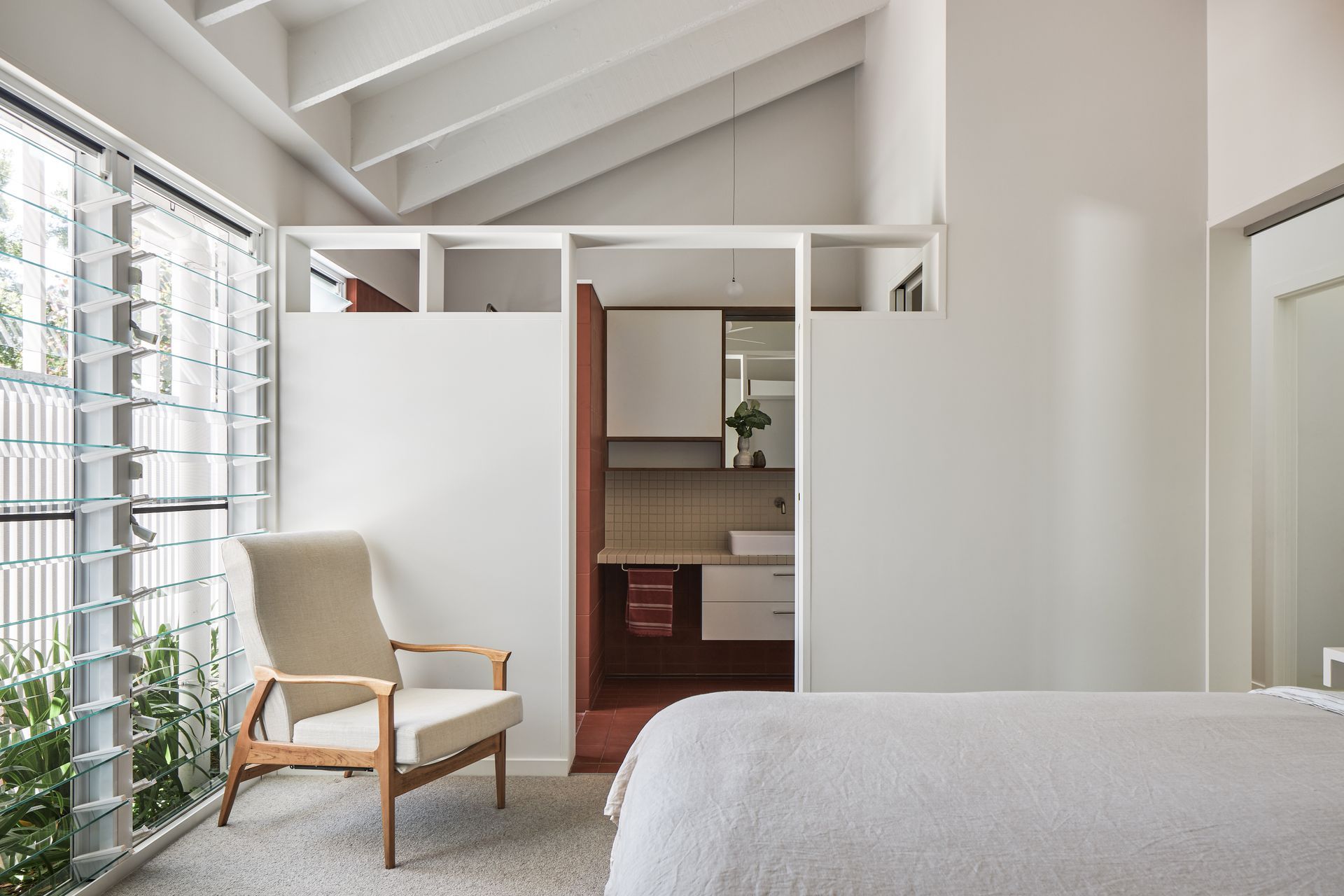
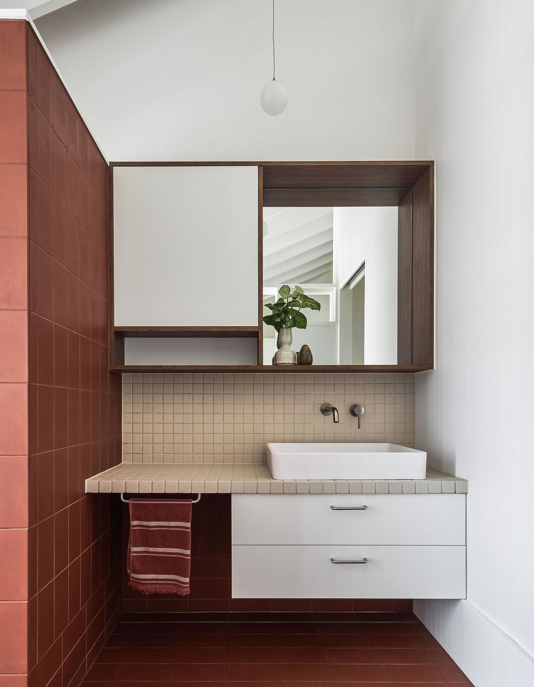
Connection with the outdoor spaces was also foundational to the brief.
“There used to be this huge pool in the backyard which was really dominant - as soon as you stepped out of the kitchen it was about a metre before you hit a pool fence - so the house felt very closed off on both that side and the street-facing (western) side.”
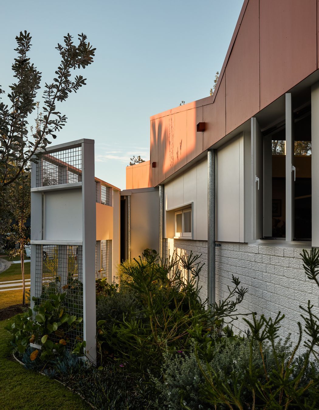
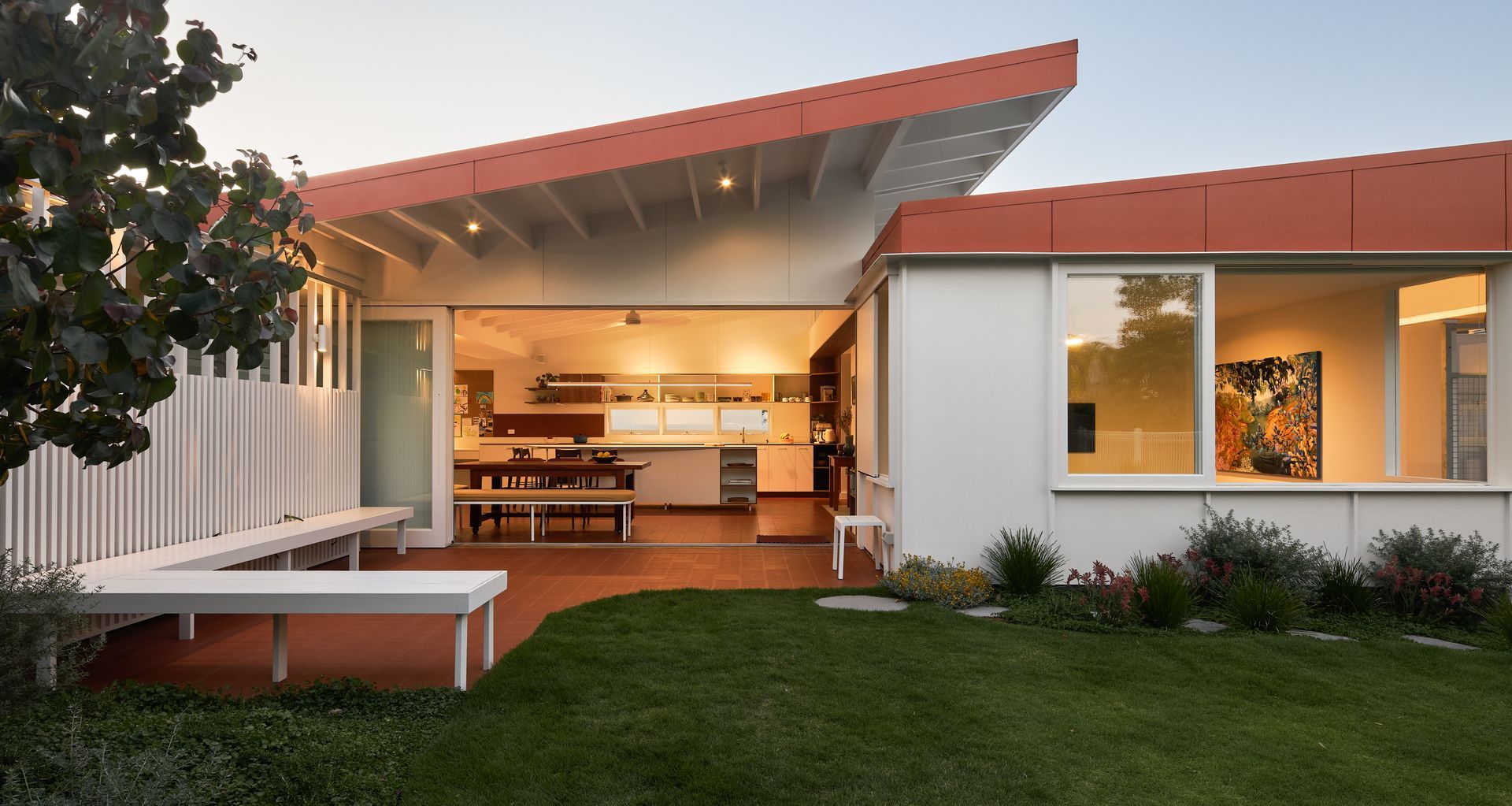
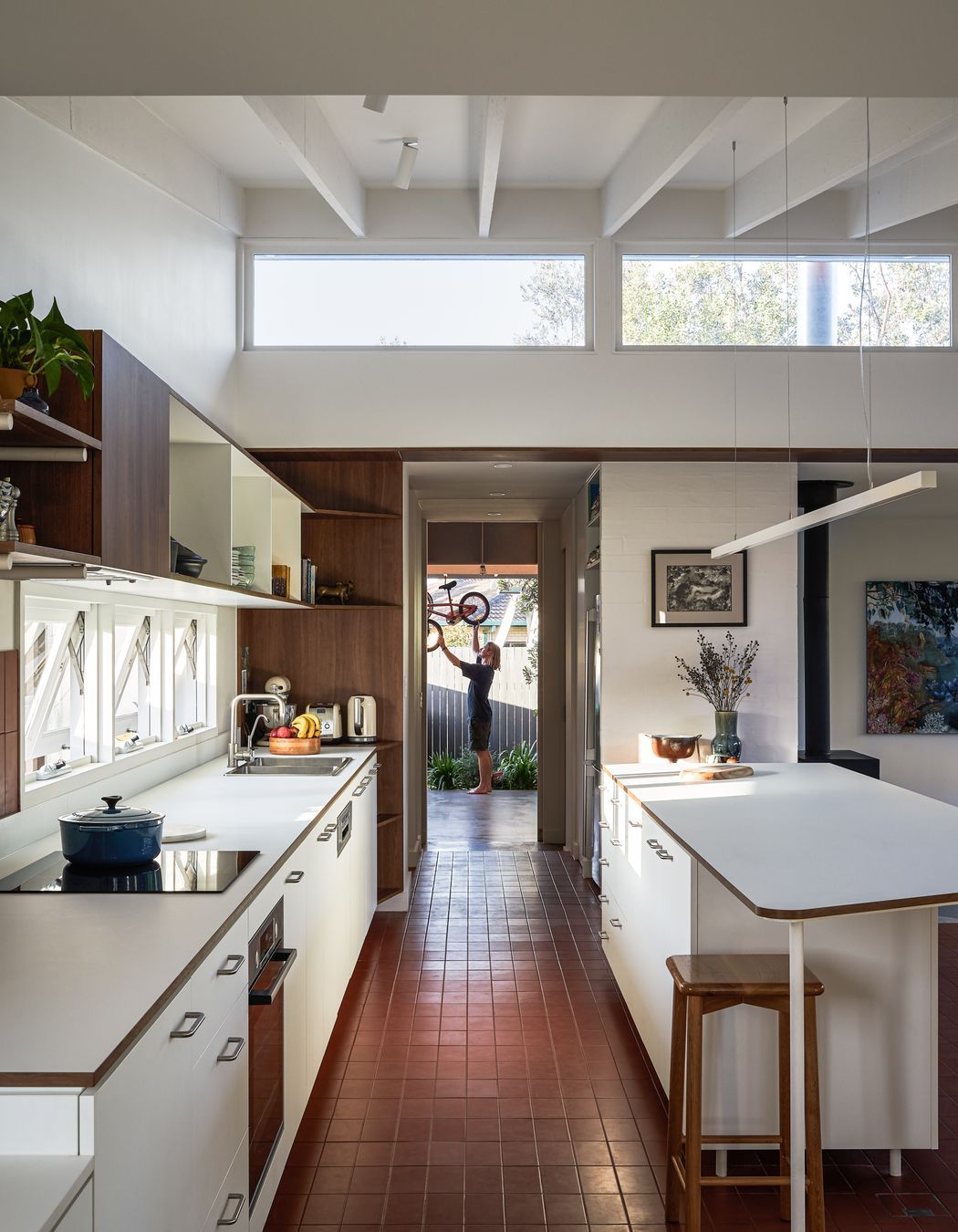
To reverse this disconnection, the pool was removed and on the eastern (backyard) side, the house is now connected to the yard from the living spaces, making it easy for the parents to watch their children play, while on the western side, the kitchen windows now face out to the street, and multiple windows perforate the once monolithic elevation.
Externally, the home has been reunified through a cohesive material and colour palette that draws inspiration from the original red roof and the 1970s materiality, including the terracotta-coloured sandstone around the pool, and the patterned ceramic tiles inside.
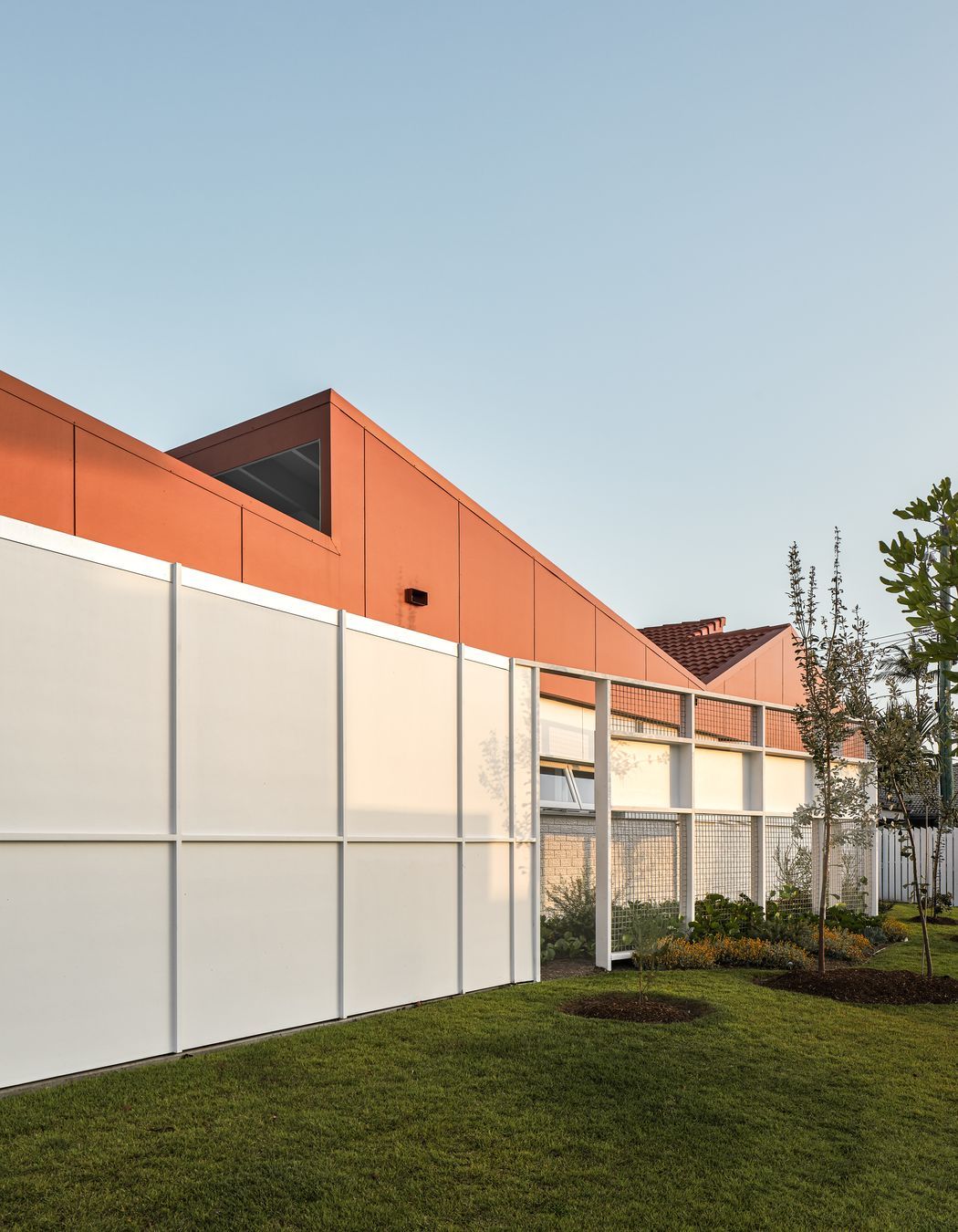
“It was important to create something visually strong on the western elevation, which would then allow us to carry those ideas around the corner and integrate old with new,” shares Justin. “We basically scored a line underneath the existing dynamic form of the roof lines, filling in those shapes almost graphically on the western elevation with a bold terracotta colour in place of the original red of the roof.”
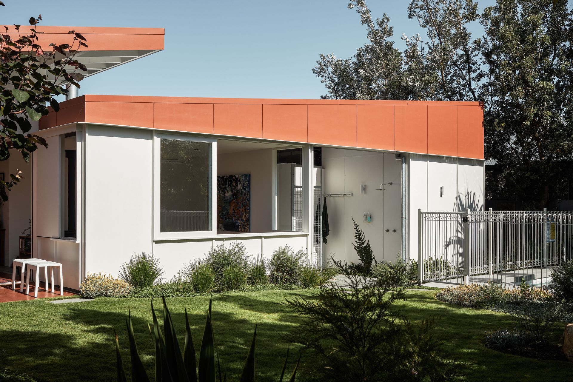
Juxtaposed against the graphic terracotta strokes of the roofline, a strong horizontal material palette adds a gentle geometry to the walls of the exterior.
Inside, the same muted yet warm mid-century palette is reflected. “We were able to keep a lot of the qualities of the old house and just make it a little bit lighter internally by painting it out in a soft white, making the most of some of the beautiful qualities of the architecture that was there from the original house.”
Great care was taken to remove by hand the original patterned ceramic floor tiles so that they could be reinstated, and these are now juxtaposed nicely against the terracotta tile flooring in the new part of the house.
This attention to detail, as well as a reasonably restrictive budget, meant that each decision was carefully considered, resulting in a home that feels warm and inviting, and supports the family’s social temperament.
“The house is constantly open and the clients are happy to share that part of themselves and their lifestyle with the neighborhood. There's always an invitation to stop by for a beer and knock on the door or pull up to the kitchen window and have a chat.”
This increased engagement both with the street and with their own backyard is key to the success of the renovation, says Justin.
“Their engagement with the street, the surrounding neighbours and their kids is one of the key things that has made the project so successful, and we were happy to restore what would be one of the most characteristic houses in the area and give it a new life.”
Explore more projects by Justin Humphrey Architects
