About
Air New Zealand.
ArchiPro Project Summary - Comprehensive rebranding of Air New Zealand across 70 international ports, ensuring brand integrity and compliance through strategic collaboration and local expertise, resulting in a refreshed suite of branded environments for travelers.
- Title:
- Air New Zealand
- Professional Servic:
- Diadem
- Category:
- Community/
- Transportation
Project Gallery

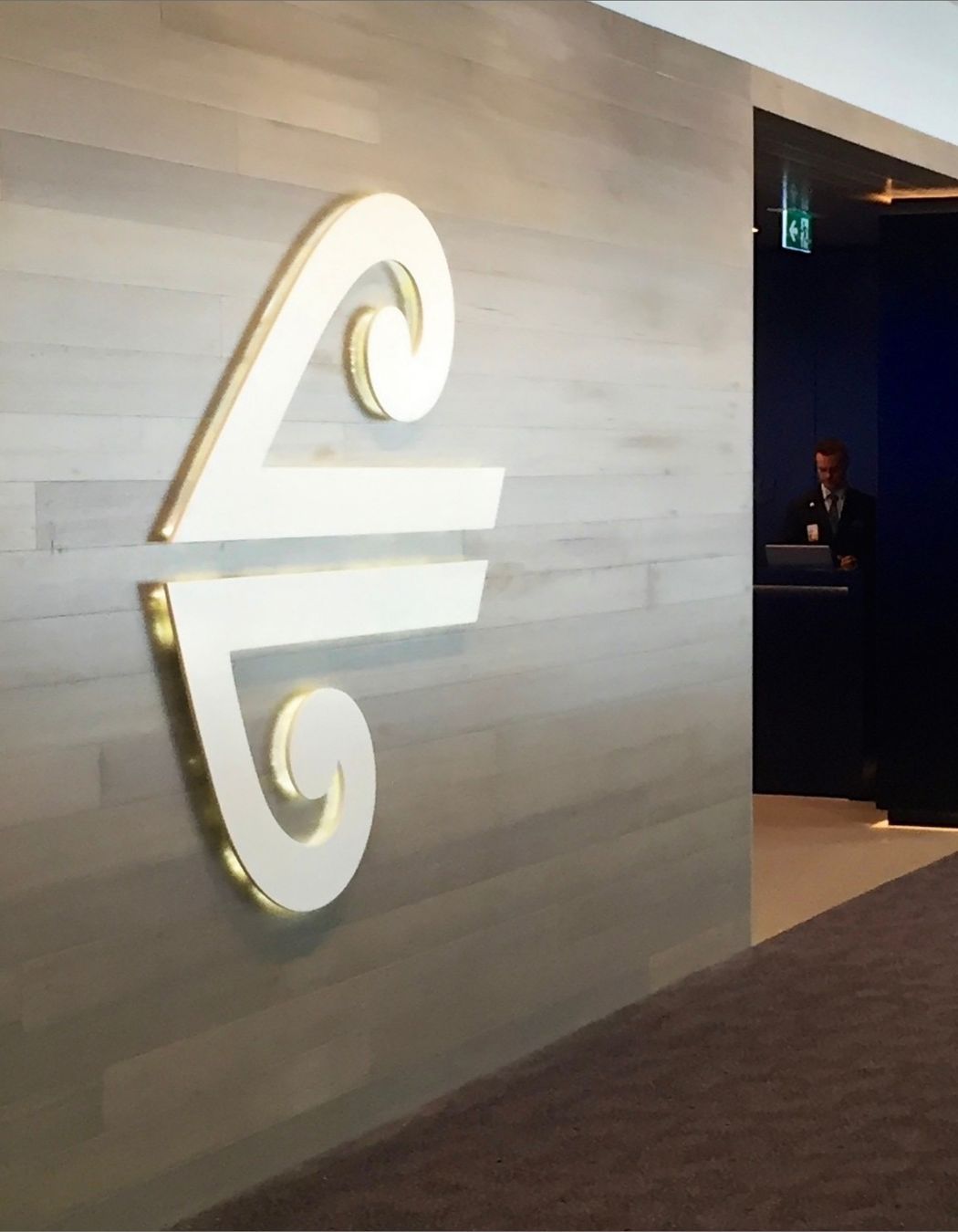


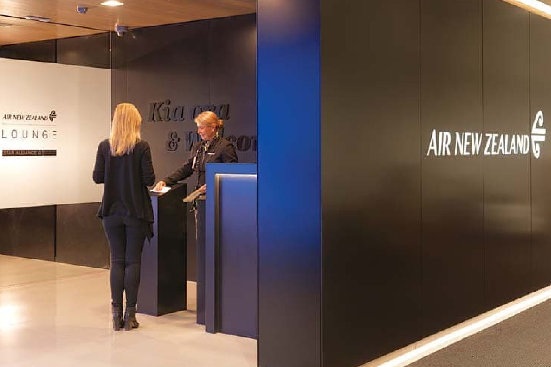
Views and Engagement
Professionals used

Diadem. Diadem is an integrated practice which shapes brands for the built environment.
Over the last two decades, we have helped people communicate, navigate and engage with branded spaces around the world.Founded in 2000, we’ve grown from a single consultancy to a practice with six offices, and a team known for industry-leading expertise. Over that time, it’s been our privilege to deliver strategic signage and wayfinding for clients in a wide range of industries.Today, our briefs continue to be interesting, challenging and diverse. Our solutions continue to earn acclaim and deliver meaningful value.As new markets and new service offerings emerge, we’re building on our experience as an advisor on place branding, sustainable design and digital solutions. We will continue to embrace new methods and changing technology to make a positive impact – for our clients, for their communities and for the environment.
Year Joined
2023
Established presence on ArchiPro.
Projects Listed
18
A portfolio of work to explore.

Diadem.
Profile
Projects
Contact
Project Portfolio
Other People also viewed
Why ArchiPro?
No more endless searching -
Everything you need, all in one place.Real projects, real experts -
Work with vetted architects, designers, and suppliers.Designed for New Zealand -
Projects, products, and professionals that meet local standards.From inspiration to reality -
Find your style and connect with the experts behind it.Start your Project
Start you project with a free account to unlock features designed to help you simplify your building project.
Learn MoreBecome a Pro
Showcase your business on ArchiPro and join industry leading brands showcasing their products and expertise.
Learn More