banner

The work undertaken on Brandon House in central Wellington was not just a quick refresh, says Marc Woodbury of Studio Pacific Architecture.

“Commercial property owner RJH bought the building on a corner site, and came to us looking for a full refurbishment,” he says. “And when I say full refurbishment, it was to effectively strip it back to the concrete frame. Everything came out.”

RJH knew the building had seismic issues, he says, and some work had already taken place before the purchase. “There had been a couple of schemes done before RJH bought it, to look at strengthening, and one of those solutions required a lot of work and we needed to take the facade off to do it.”

That also meant Studio Pacific Architecture knew exactly what they were dealing with in the eight-storey 1960s structure.

“We had the entire interior of the building point cloud scanned so we had accurate data of the existing building,” says Marc. “And one of the reasons we did that was because we noticed it wasn’t all the same all the way up. The first three floors had a different beam column situation, which had penetrations through the beams. The next few floors had a different configuration, and the eighth floor was slightly different again. It was critical to know, because the 1960s building wasn’t particularly heavily serviced in terms of mechanical, lighting or sprinklers and we were putting in a whole lot more to bring it up to modern standard. That required some very careful coordination and the point cloud really paid off. When we knew where penetrations in beams were, we could think about different strategies.”

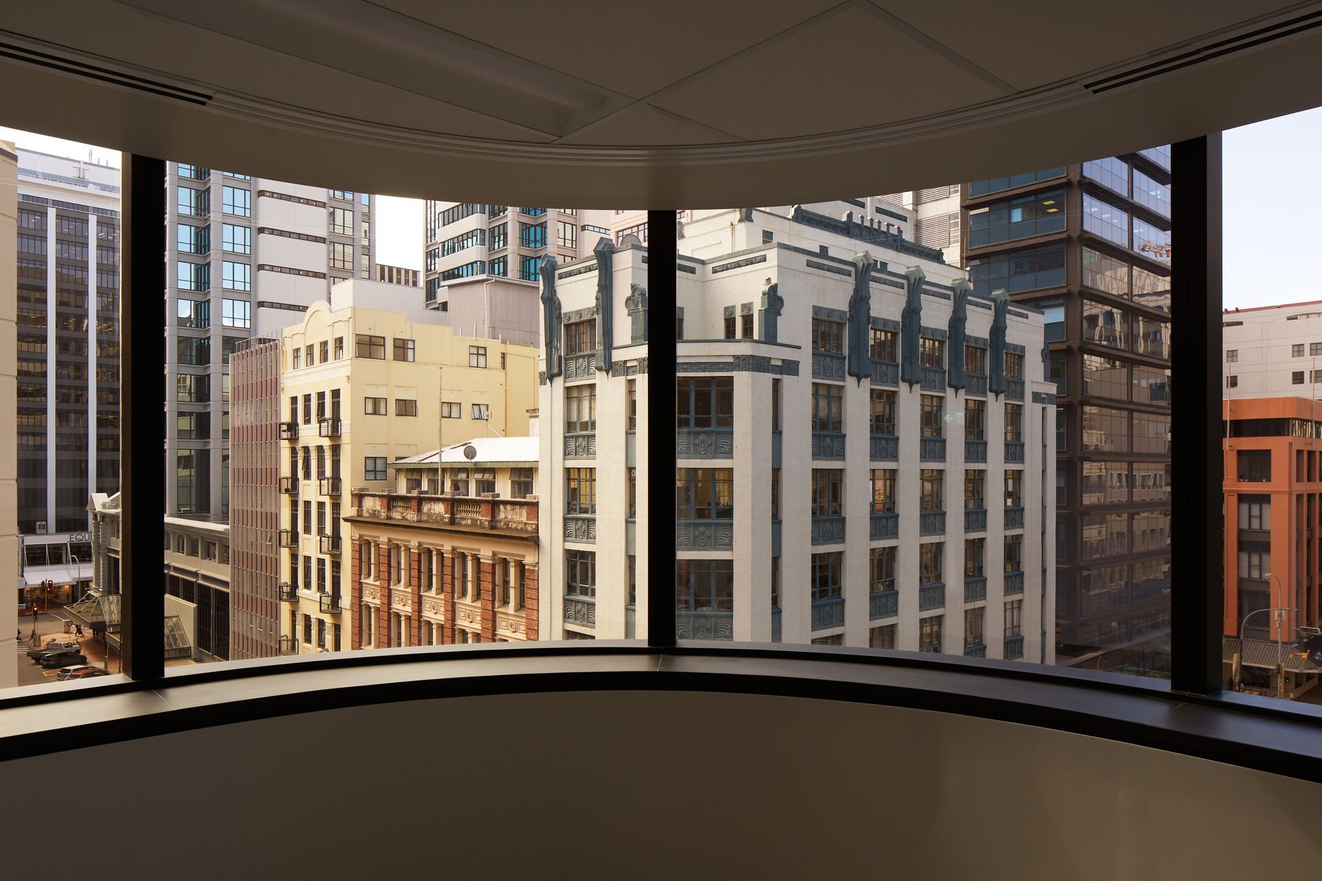
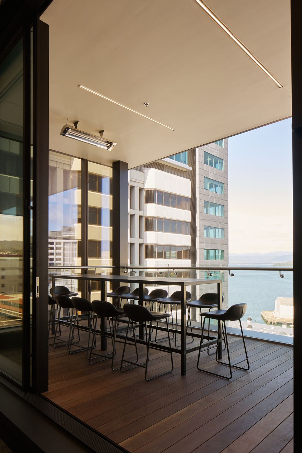
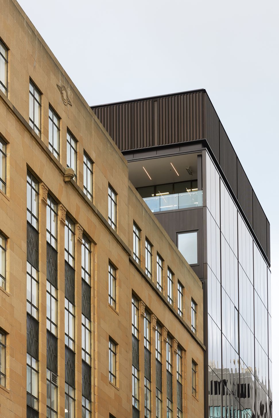
Next, RJH wanted to add some height. “Once you get above the building in front, you have some pretty spectacular views of the inner harbour. The building in front is a category listed heritage building so the likelihood of it getting higher itself is very unlikely and it was actually refurbished several years before. So it was a pretty safe bet to add two occupied floors and a mechanical plant floor.”

Bearing in mind the earthquake strengthening, there was an issue.

“The existing structure couldn’t take much more weight, and the structural engineers were looking to keep it within certain parameters. So we used a Potius building system that uses mass timber, and laminated veneer lumber,” says Marc.

The new top floor features an open deck with views of the water. The original idea was to glaze the wall facing the harbour, says Marc, but to avoid fire rating issues on the boundary wall, openable doors were instead set further back and an open deck was created.

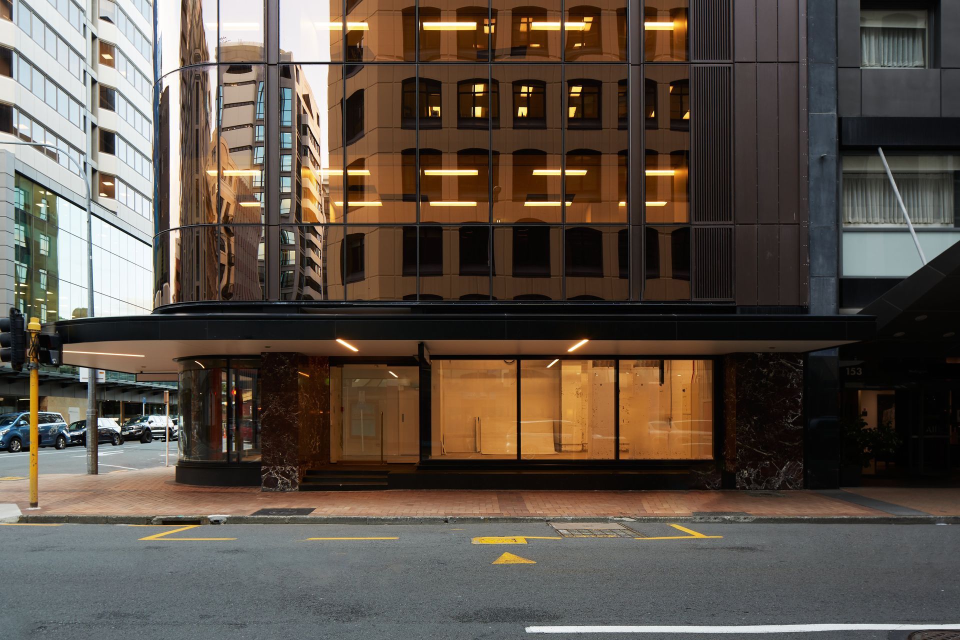
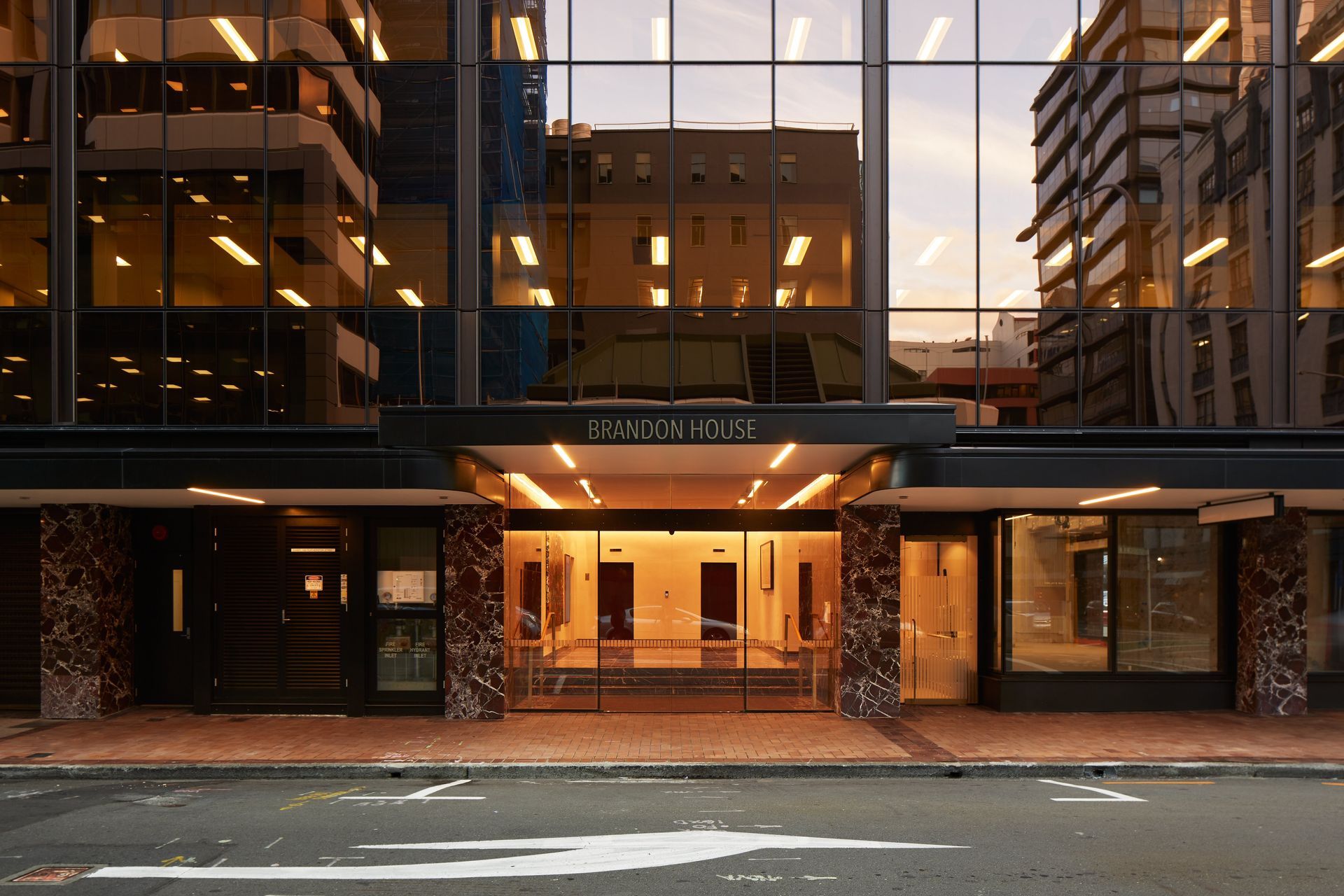
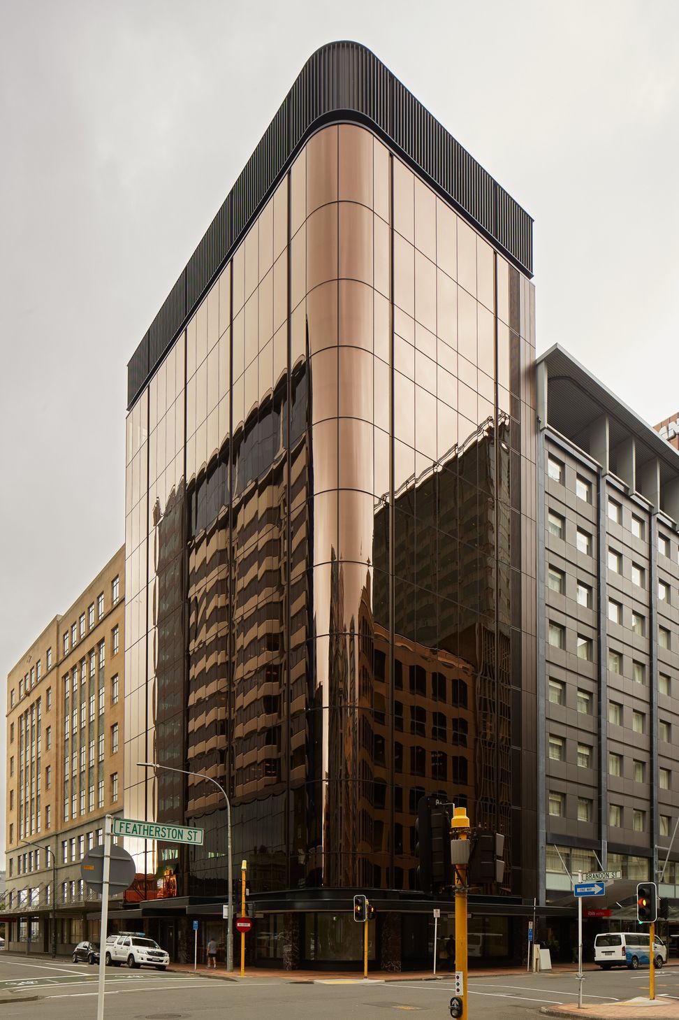
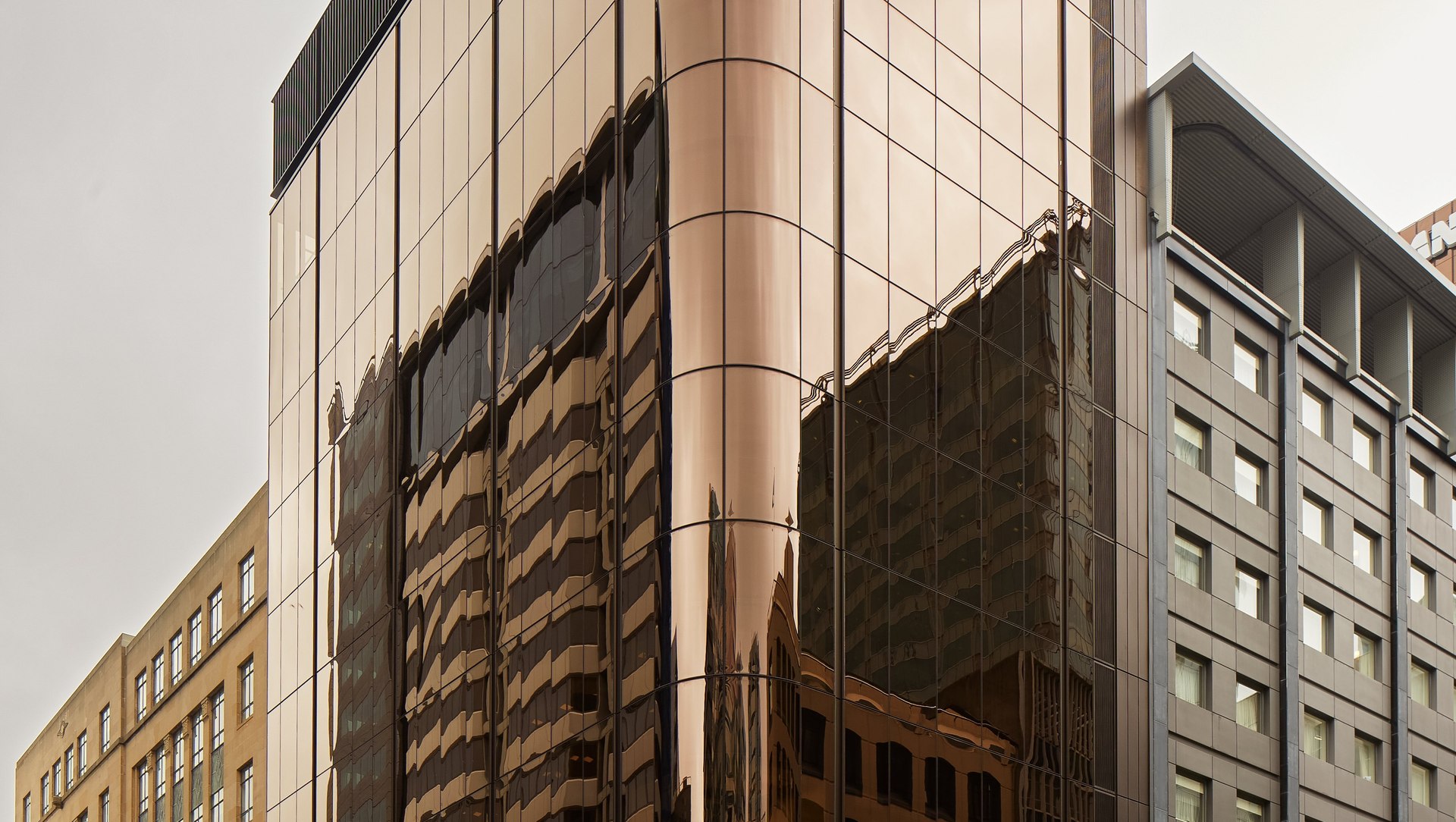
The addition of the top floors gave the building new elegant proportions, says Marc, which meant the design could be kept simple. “We didn't need to try too hard in articulating the facade of the building. There's a black negative in the facade, which aligns with the column grid inside and accentuates that verticality.”

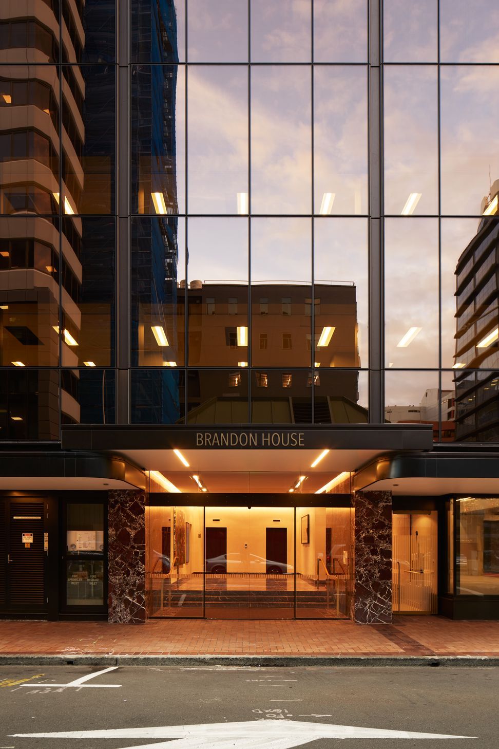
That facade is a curtain wall of bronze glass.

“I like to say it’s a modern twist on the 1980s bronze glass. It’s a bit darker, a bit deeper, and much more modern. The building has a curved corner on the street side so getting a bronze-tinted, double-glazed curved glass unit is pretty rare. There are only a couple of places in the world that manufacture that.”

There was a lot behind the choice of glass, says Marc. “One of the key criteria is its thermal performance. There are no external louvres or shading, that was a client preference, and office buildings tend to overheat. So the technical specifications needed to consider solar gain. That was the most fundamental thing, and then it was about the tint. We didn’t want it to be a standard blue or green glazed building, we wanted to change it up a bit.”

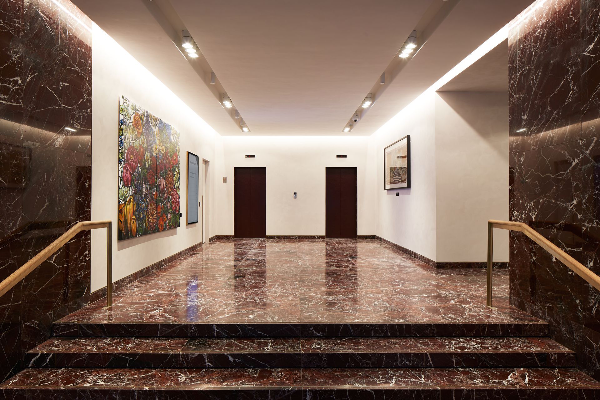
The design palette is deliberately pared back. Marc says RJH likes a relatively traditional look and feel in its buildings so the materials include timber, black joinery and brass, and a striking red stone.

“The client loves burgundy, so a lot of RJH buildings have burgundy in the lobbies,” says Marc. “So we thought we’d do it in stone. It’s a feature, it’s a little bit out there, and it suited the client. The palette of materials in the lobby is there to make that stone sing. The walls are a white Marmorino plaster finish with texture and a little sparkle. It was about trying to keep it as timeless as we could without complicating things.”

But Studio Pacific Architecture took the opportunity to push that traditional design.

“We had a pretty clear brief from the client: they know what they’re doing. As you’re presented with any project inevitably they have some sort of constraint, whether it’s preferences, budgets or time. Usually it’s a number of those things. I always think it’s those constraints that will get you the most creative output: dealing with them and coming up with something interesting. It’s always a challenge, but it’s a fun challenge.”

Words: Cassie Doherty

Photography credit: Thomas Seear-Budd

Studio Pacific Architecture
View locations (2)
Get in touch
Visit Website
 The ground floor of the building includes infrastructure for retail or hospitality. “There is a small area for retail on the corner, which is one structural bay and the curve, and then that continues on. All of the Featherston Street frontage is retail.”
The ground floor of the building includes infrastructure for retail or hospitality. “There is a small area for retail on the corner, which is one structural bay and the curve, and then that continues on. All of the Featherston Street frontage is retail.”
This building was within the model of commercial property owner RJH’s portfolio, says Marc. “But it was probably one of their most significant upgrades. There was an addition of end-of-trip facilities, so there are showers and bike parking, the kinds of things you now get in an office building."
“The client wanted to move the lifts to be more central in the building. We were redoing the core anyway in terms of bathrooms and so on, so we did. And that was because RJH likes to split the floors among potentially a number of different tenants so lifts placed centrally usually makes good sense as it reduces the amount of internal corridor.”
 “RJH always has artwork in the lobby of its buildings, and music playing.” The stone is rosso levante marble.
“RJH always has artwork in the lobby of its buildings, and music playing.” The stone is rosso levante marble.
The curved corner of the building is just as eye-catching inside as it is on the exterior. Tenants will do their own individual fitouts, says Marc.
“On the new timber top floors, we used some technologies that aren’t usually employed. The floors were raised with batten and cradle system – a plywood or particleboard flooring on battens which sit on rubber pads. That’s about acoustically isolating everything because timber doesn’t have the same mass as concrete. And it meant there was a bit of a cavity to run cabling as well.”
Finer detailing accentuates the building’s proportions. “There’s a 'cap' at the top of the building that’s a series of vertical fins. It was something our client quite liked and is very traditional on an office building,” says Marc.
This building was within the model of commercial property owner RJH’s portfolio, says Marc. “But it was probably one of their most significant upgrades. There was an addition of end-of-trip facilities, so there are showers and bike parking, the kinds of things you now get in an office building."
The 1960s building in Wellington has been extensively refurbished. “It was called The Leaders Building,” says Marc Woodbury of Studio Pacific Architecture. “I think it was originally built for an insurance company.” Now owned by RJH, its new name, Brandon House, refers to its location on the corner of Featherston and Brandon Streets.

Professionals used in
Brandon House

About the
Professional

Studio Pacific was established in Wellington in 1992 by the three directors: Nicholas Barratt-Boyes, Stephen McDougall and Evzen Novak.

Prior to establishing the studio, all three directors studied and/or worked together in New Zealand before working for a period in Europe: Evzen studied in Berlin and worked in Switzerland and London, while Nick and Stephen were based in London and worked on projects throughout the U.K. and Europe.

The collective international experience gained by the directors in Europe set the platform and influenced the direction of the practice. From early design competitions and small residential commissions, Studio Pacific has evolved into an award-winning substantial and creative practice with diverse projects throughout New Zealand. Particular recognition has been given to the studio for working with the arts, urban regeneration, housing, masterplanning and contemporary workspace planning.

Studio Pacific undertakes a large range of projects, from small individual furniture items to large projects involving entire new towns. Our small-scale work includes new houses, additions and alterations, and retail work. Our larger schemes include large multi-unit residential and commercial buildings as well as masterplans and landscaping.

We enjoy having a mix of project sizes and types in the studio – each project has different challenges, and offers varied opportunities for us to express our creativity in response.