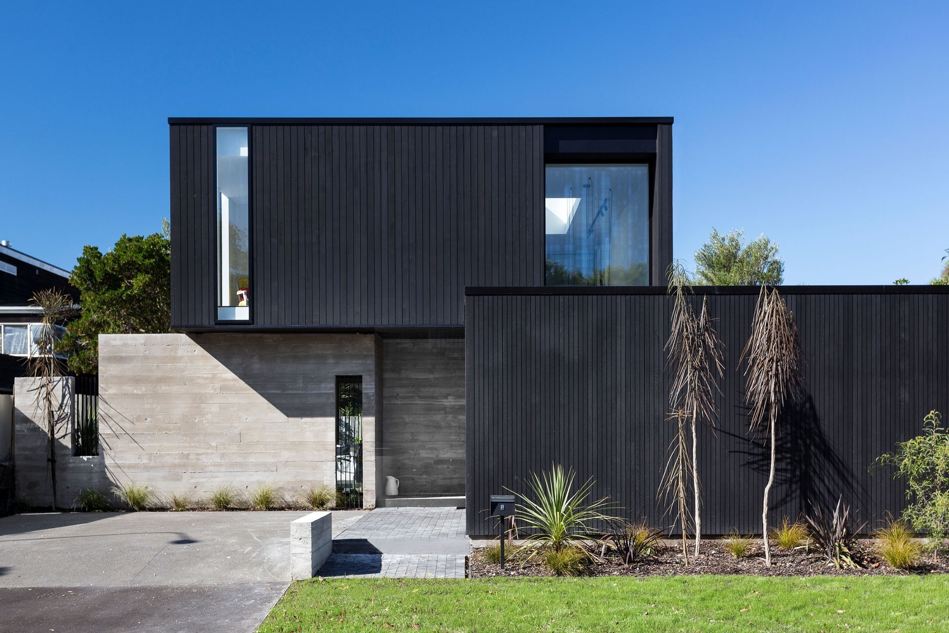
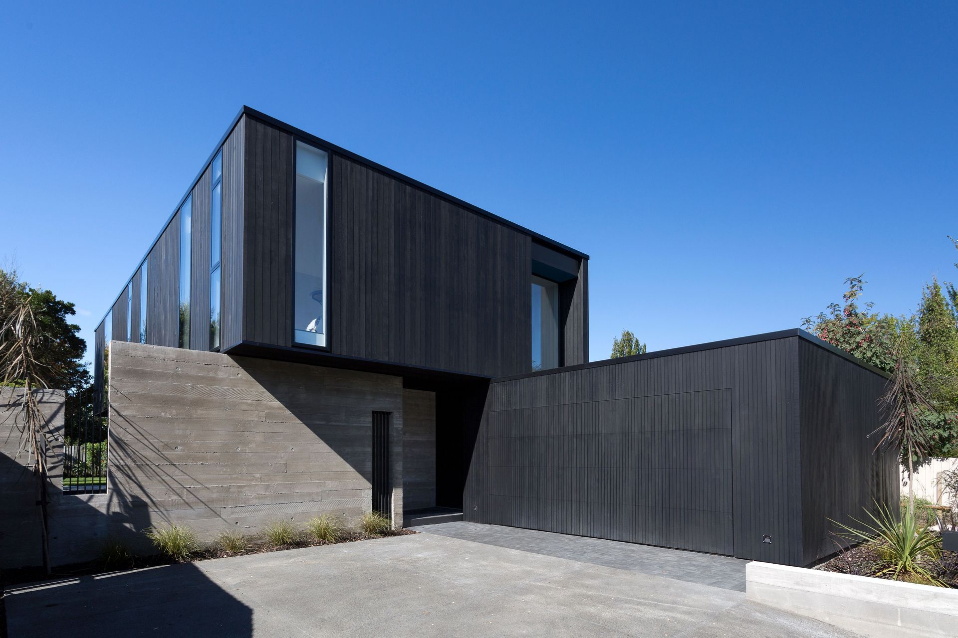
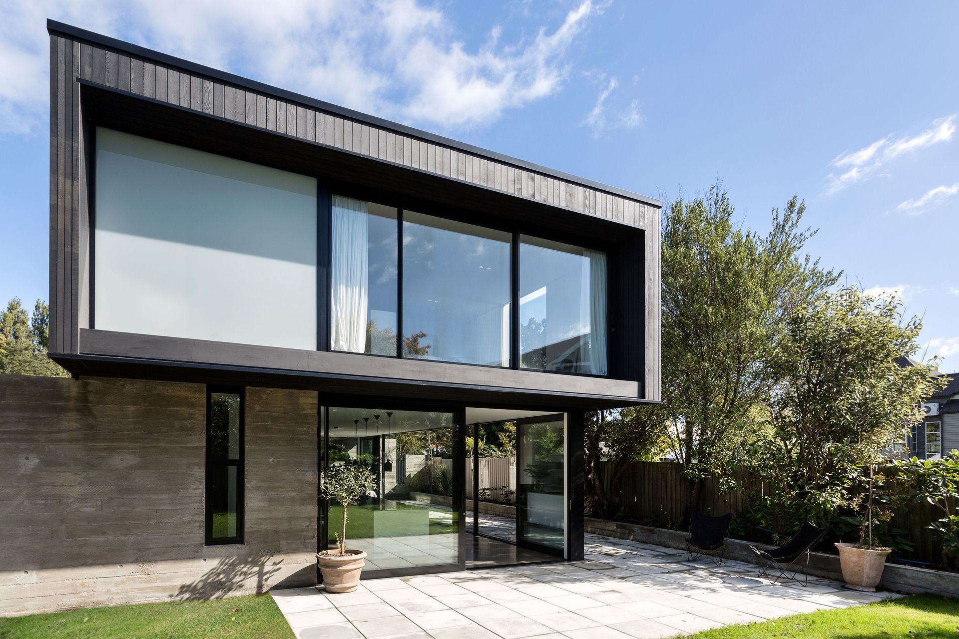
Churchill’s distinctive form creates privacy within its central Christchurch city setting, while at the same time making a connection with the nearby Ōtakaro river. Its black cedar-clad box lightly rests over two in-situ concrete walls, with a living space in between seamlessly opening up to a courtyard.
Near where Churchill Street meets the northern bank of the Ōtakaro or Avon River, CoLab Architecture has designed a home that is connected to its riverside location. “The site is in the north-east corner of the city, which was once a special archaeological area – a landing and trading settlement of local iwi Ngāi Tahu,” explains Tobin Smith from CoLab Architecture, which designed the home.
Despite its central city location, Churchill maintains its privacy while staying connected to the surrounding natural environment. “The Avon River is certainly the hero in this home, and you can see it at the end of the street when you stand out the front of the house, as well as from upstairs.”
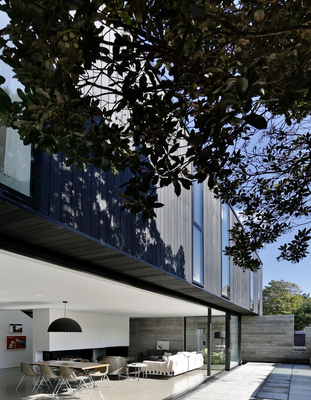
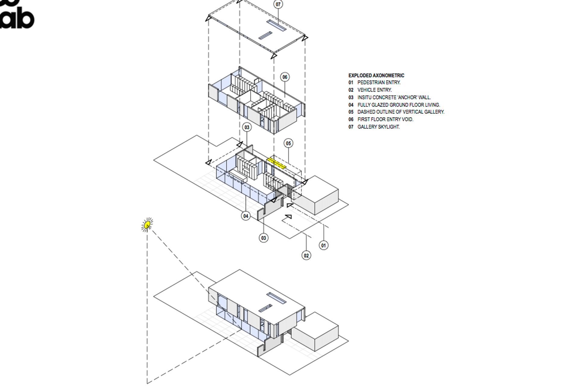
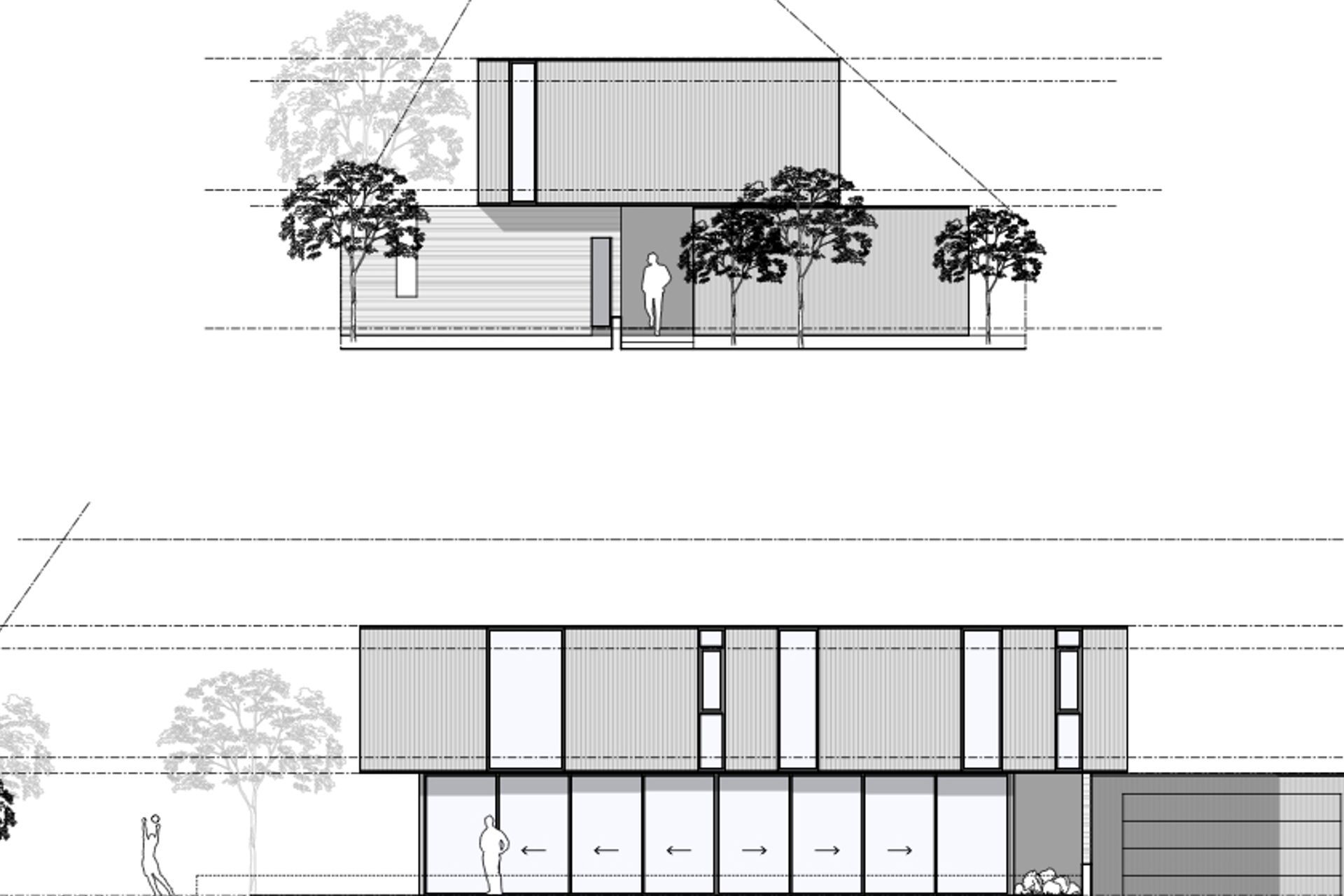
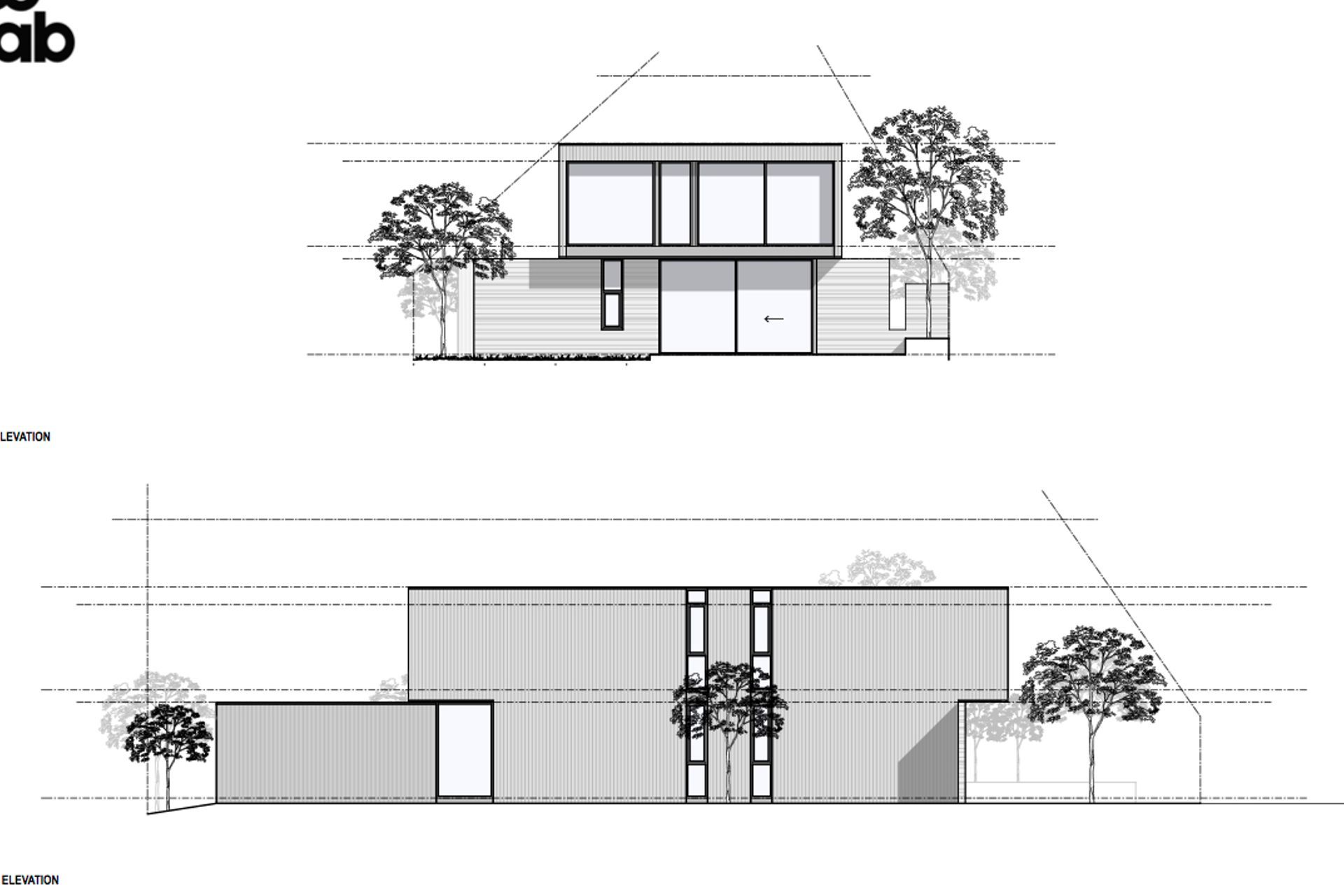
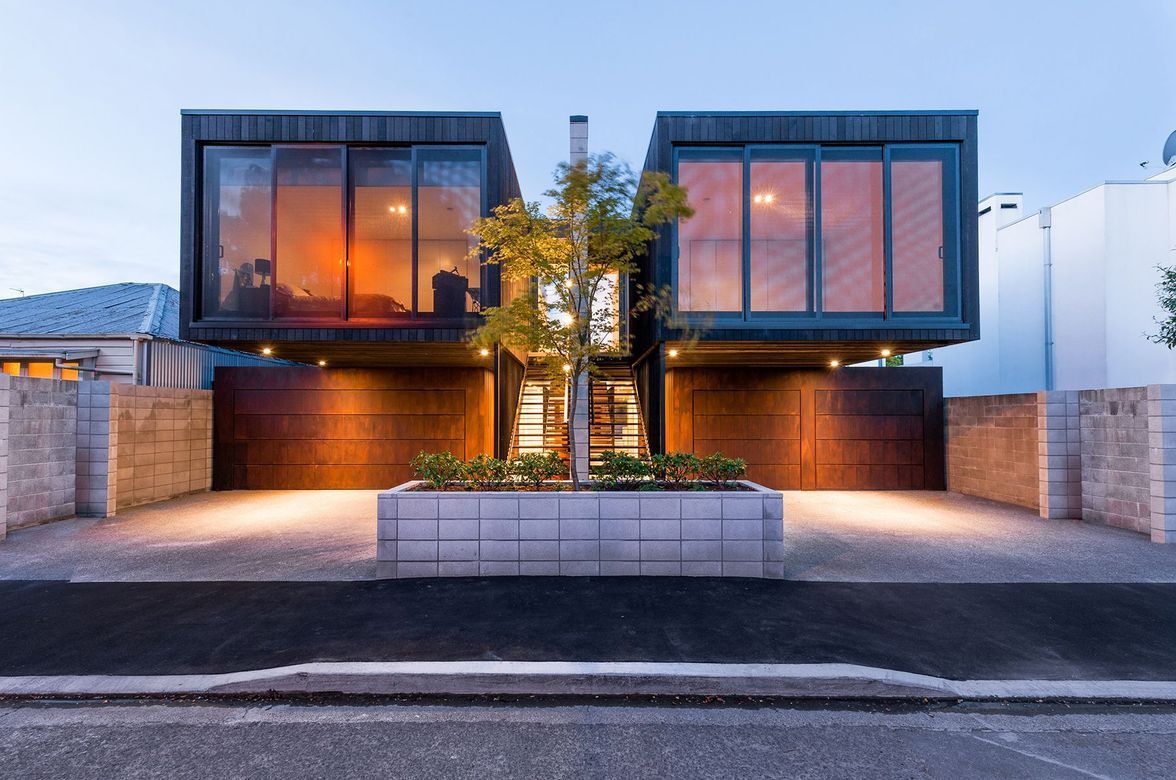
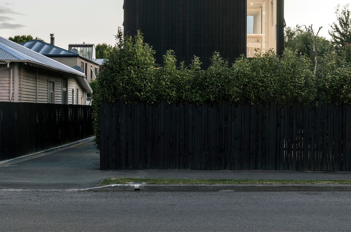
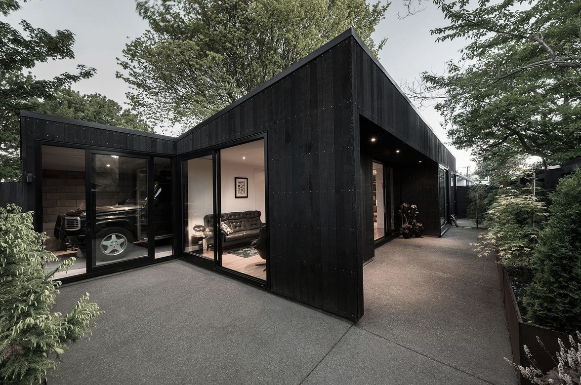
Churchill’s bold forms are what gives this 248m² home a solid connection to its place. A black cedar-clad box sits on two in-situ concrete walls that anchor the house to the ground like a pair of bookends. In between, full-height glazed doors open the ground-floor living spaces up to a courtyard, creating a spine along the length of the building. The upper box cantilevers out to create a sheltered and clear front entry into the home.
“The key was to create a little bit of space between the boxes, without the two forms appearing to crash together,” says Tobin. “What looks effortless actually involved a lot of effort and careful planning.”
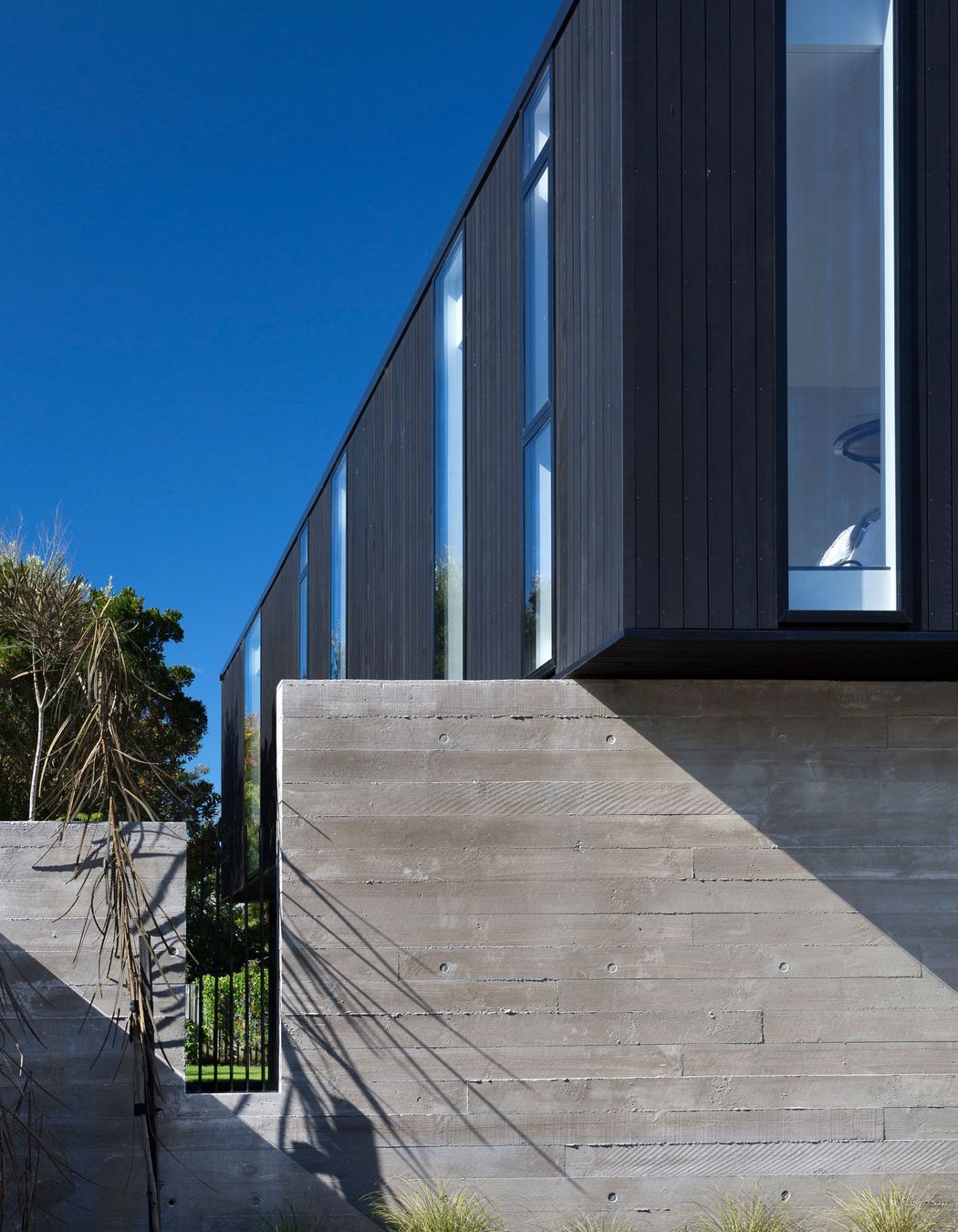
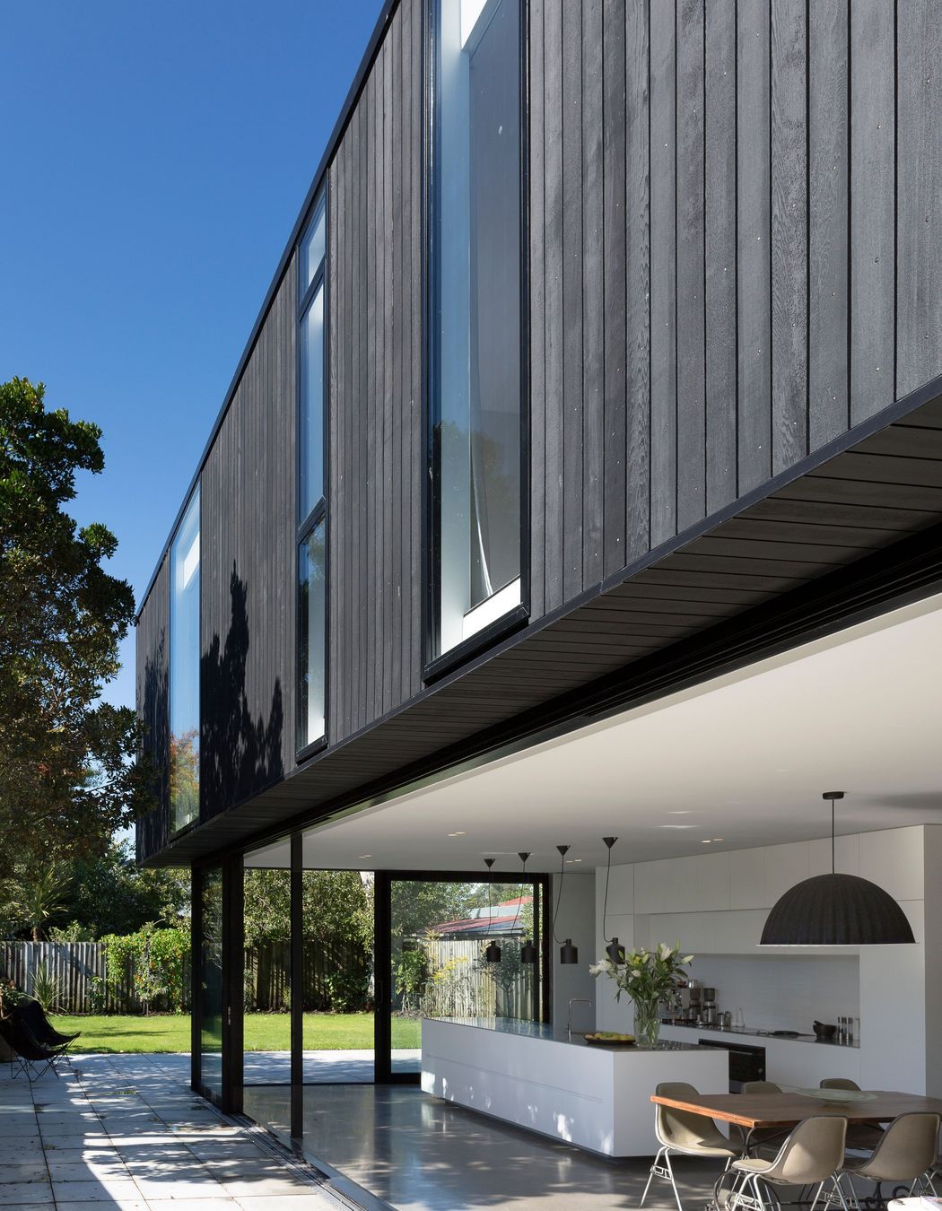
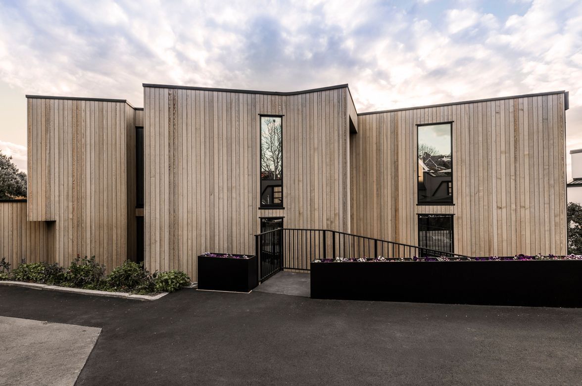
The upper floor features panels of cedar and glass, with floor-to-ceiling vertical windows designed to frame the neighbouring treetops. “These penetrations virtually hit the edges of the floor and roof,” explains Tobin. “ The flashing of the windows runs right past the structure, hiding the structural build-up of the floor, walls and ceiling."
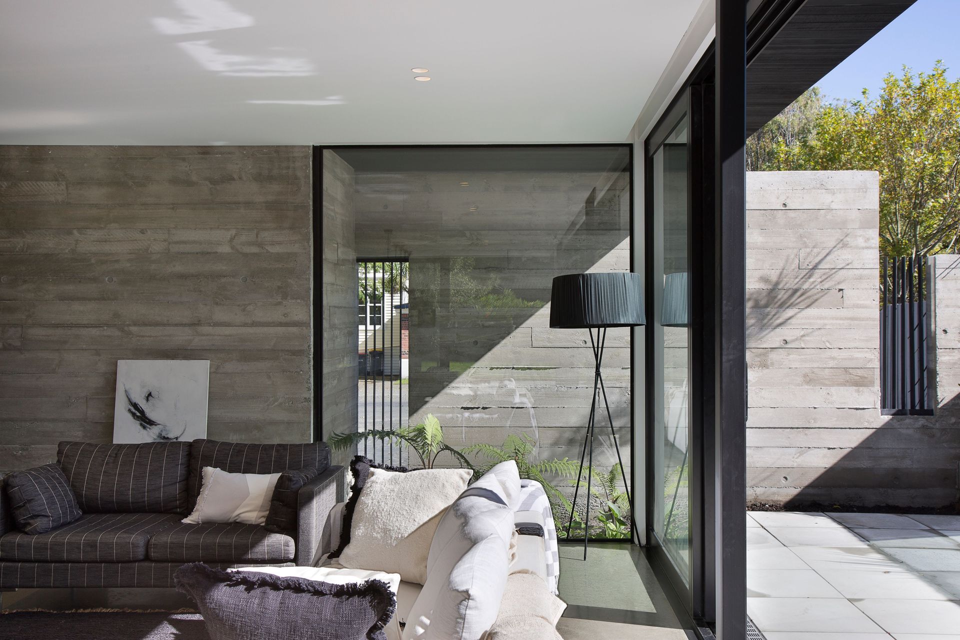
The verticality of the cedar and glass is contrasted by the horizontality of the concrete walls. “The concrete walls are strongly anchored to the site,” says Tobin. “They also form part of the structure of the house and they provide a boundary fence as well as a screening device from the street.”
Rectangular cut-outs in the concrete walls emulate the vertical penetrations in the upper box, balancing the overall geometry of the house while framing dedicated views internally and externally. “The cut-outs give dimensionality to the frontage,” Tobin suggests. “They create intersections with the house that are intriguing and help to control the street view. Street fronts are often treated poorly with fencing as an afterthought, creating a bland street, but we think it’s important to improve the street elevation.”
The discreet garage is a black cedar-clad box that juts out from the front of the house, providing fencing as well as a backdrop for planting. “We wanted to give the landscaping and greenery back to the street and, with the garage door down, it feels seamless – like part of the house.”
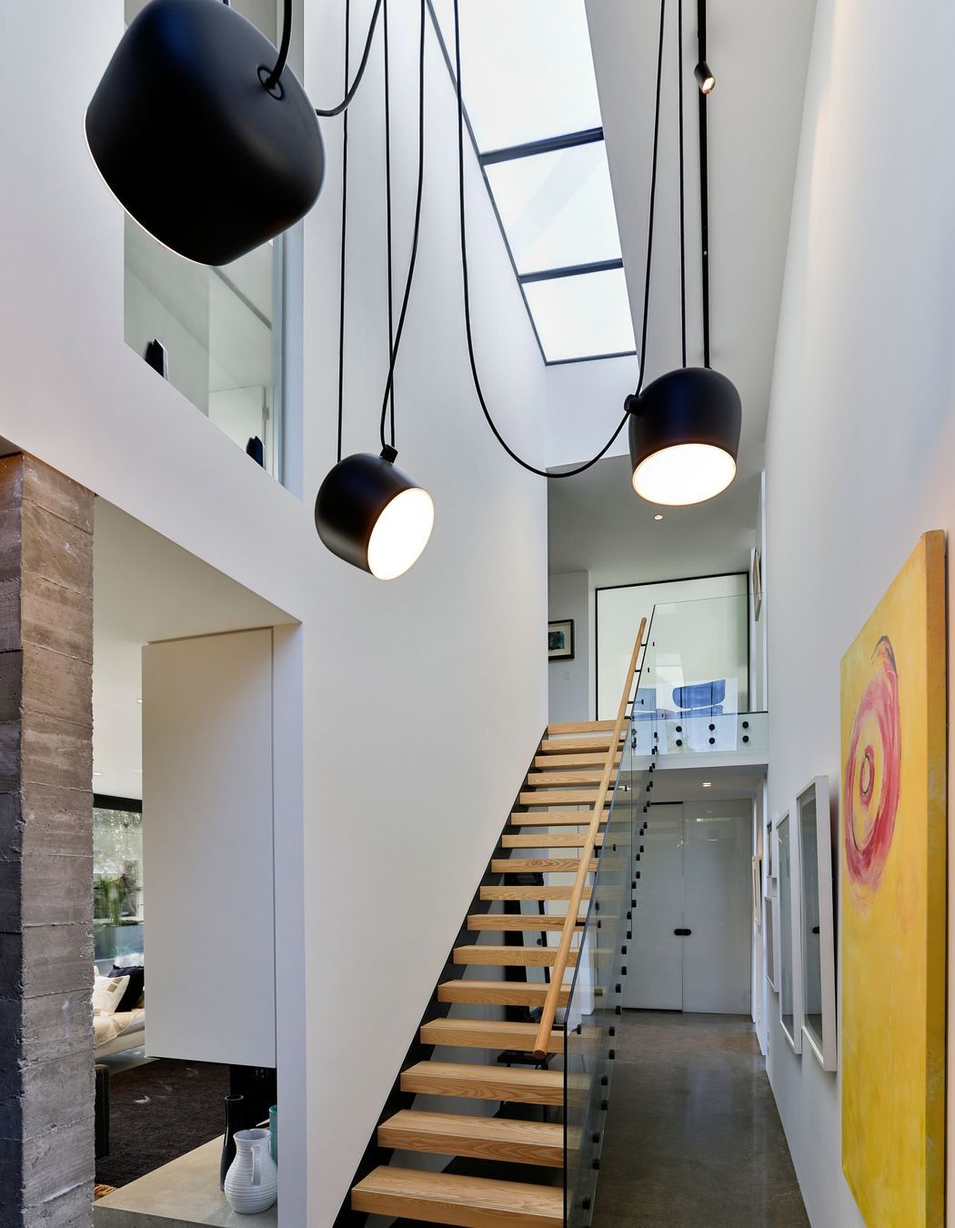
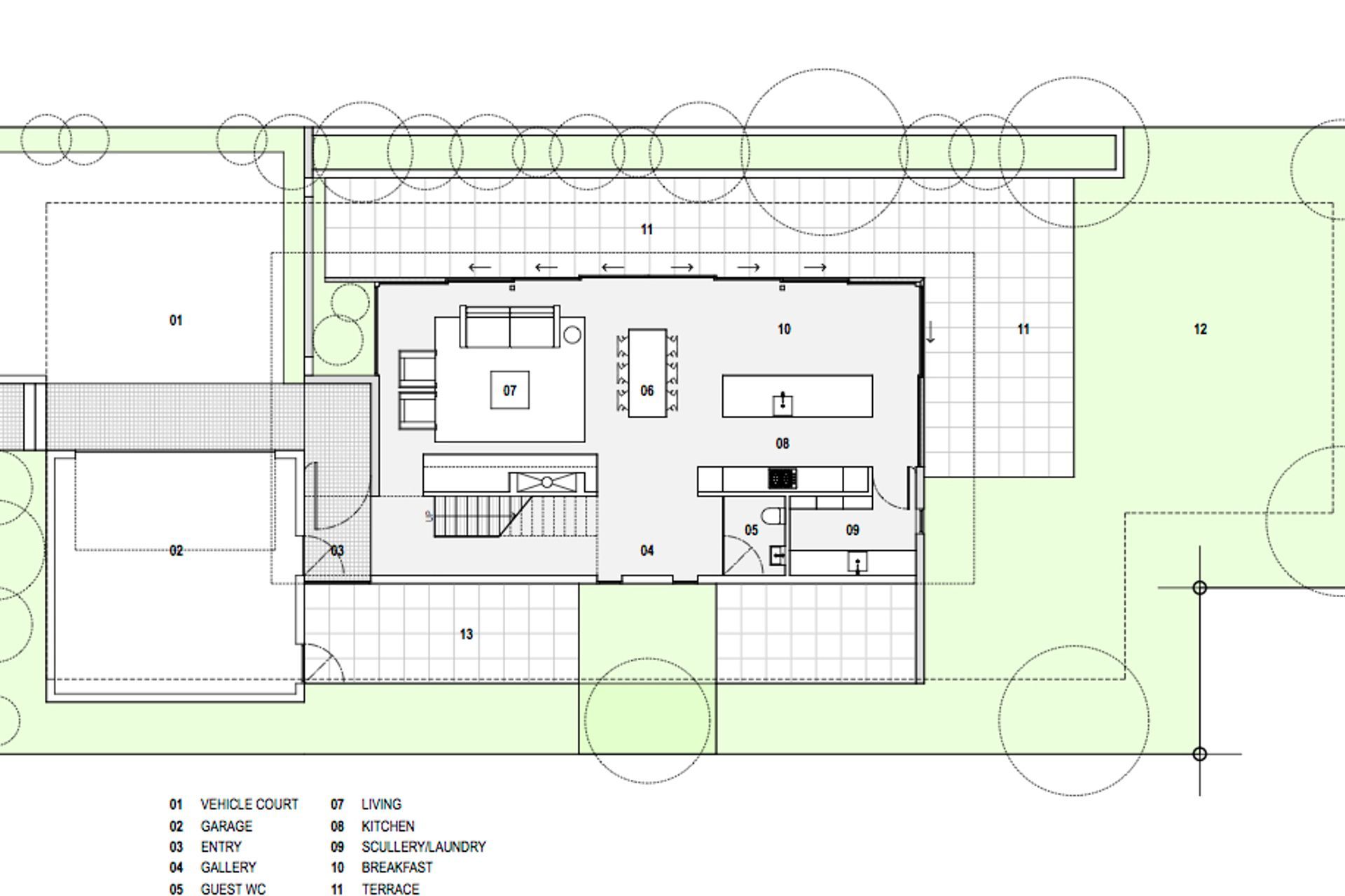
Upon entering the house, cobbles on the pathway carry through into cobbled insets on the floor of a double-height entrance foyer. Here, large white walls provide the ideal gallery space for art, with a skylight drawing indirect sunlight along the length of the space and over a blackened steel staircase. “The owners’ daughter is a fine artist and they have a collection of her artworks they wanted to display, so we needed to create a light space with some large white walls for displaying these,” explains Tobin.
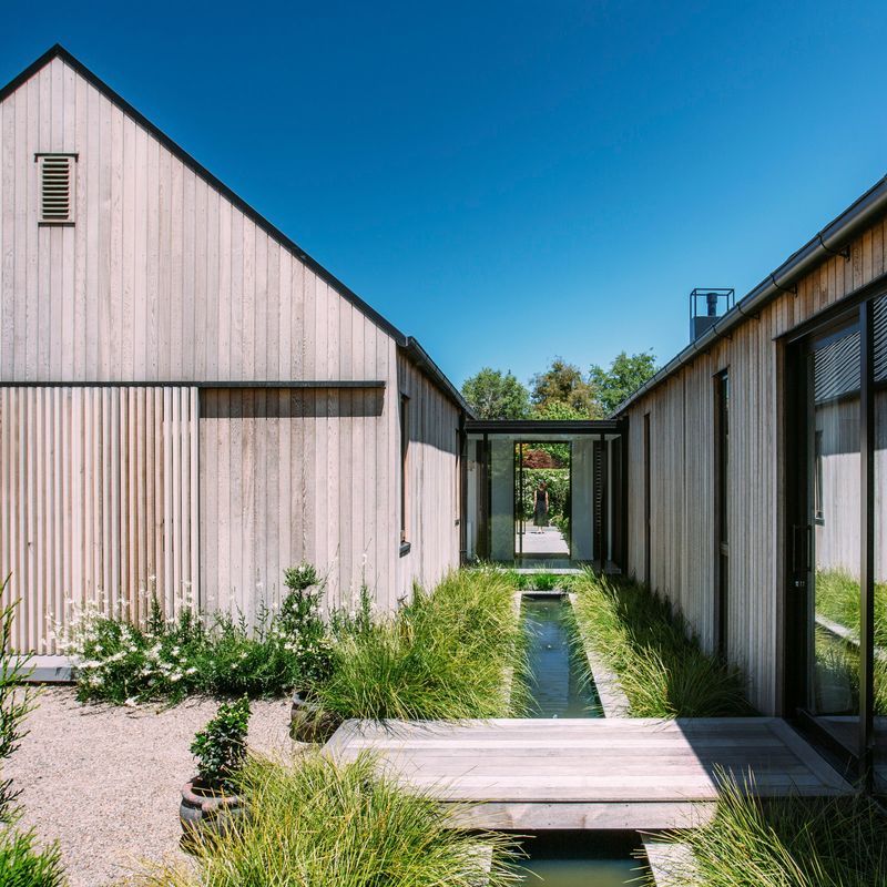
On the ground floor, the open-plan kitchen, dining and living area has a light aesthetic with glazed doors that slide back to open into the courtyard, without the need to cross a threshold. “This elevation is about four metres from the boundary with a level courtyard and ground floor, so there are no steps or thresholds, which makes a very usable and convertible space,” says Tobin. At the rear end, where the kitchen sits, a large viewing window and sliding door overlooks the back garden.
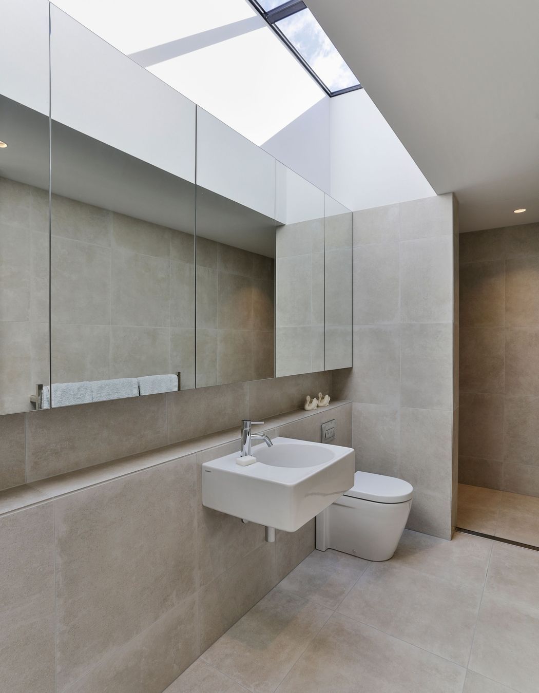
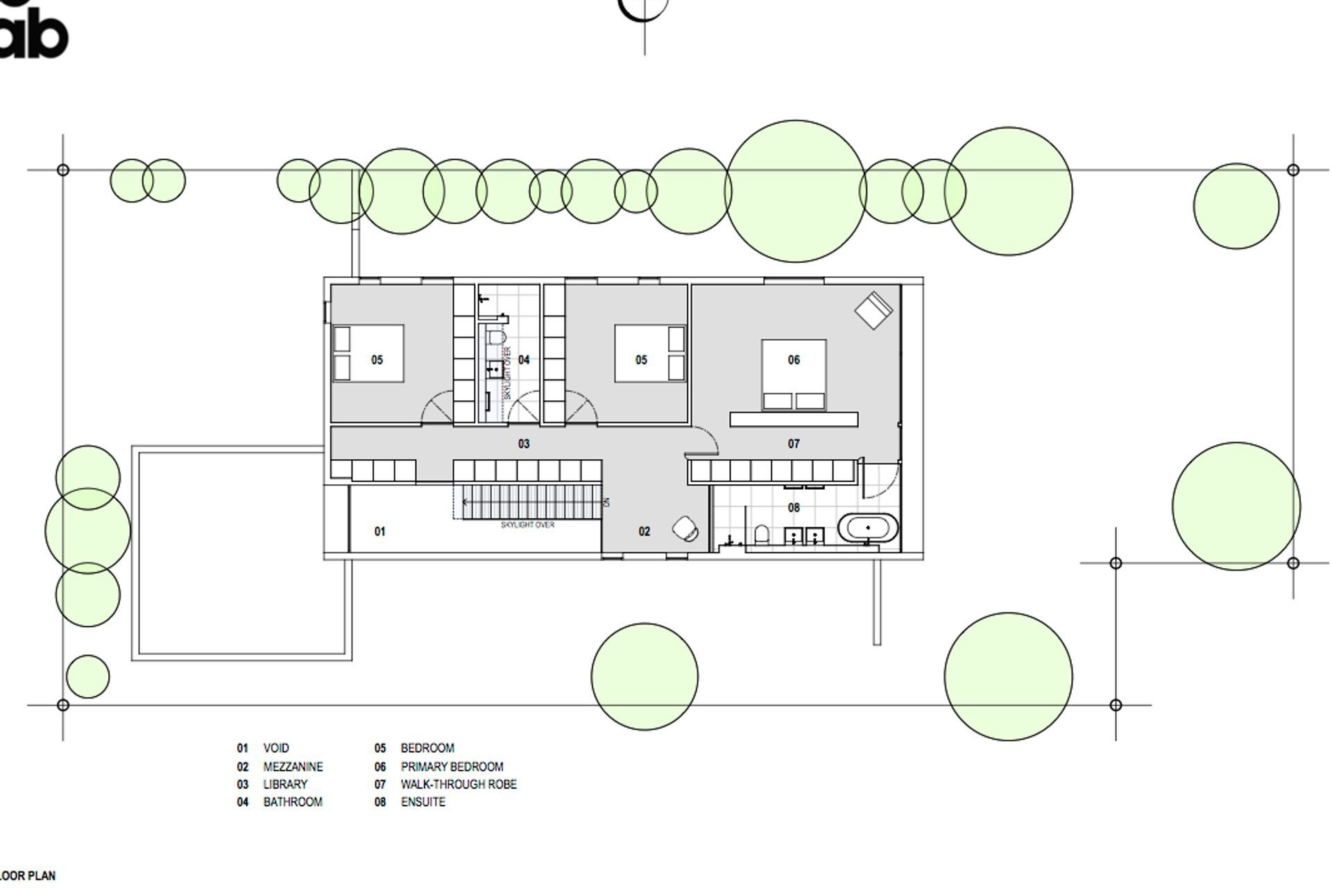
Upstairs, large viewing windows and skylights throughout create light and airy spaces for the three bedrooms. The master suite is a sanctuary for the client; when they lay in bed, they look directly out over the treetops through glazing that extends beyond the edges of the flooring and the ceiling.
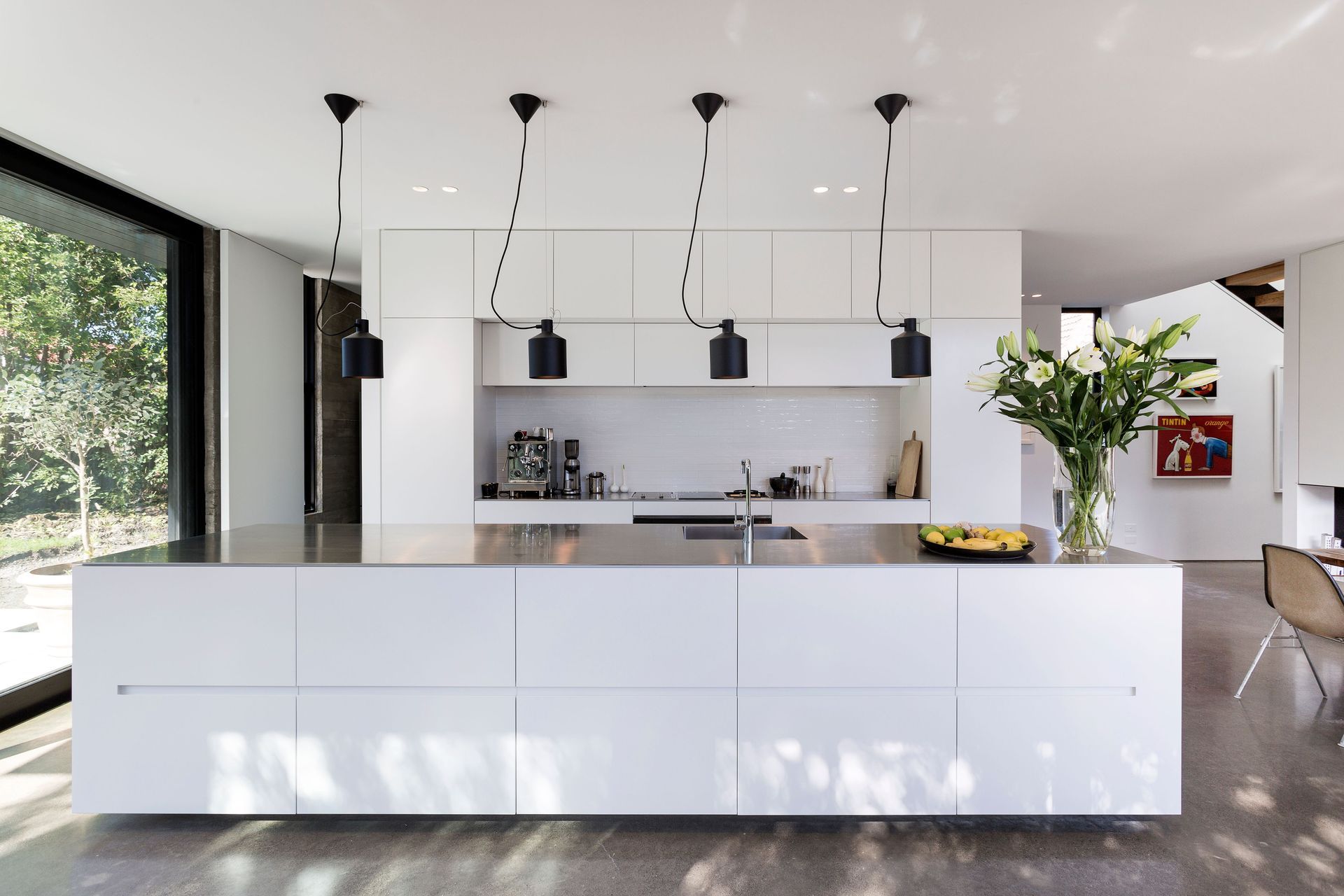
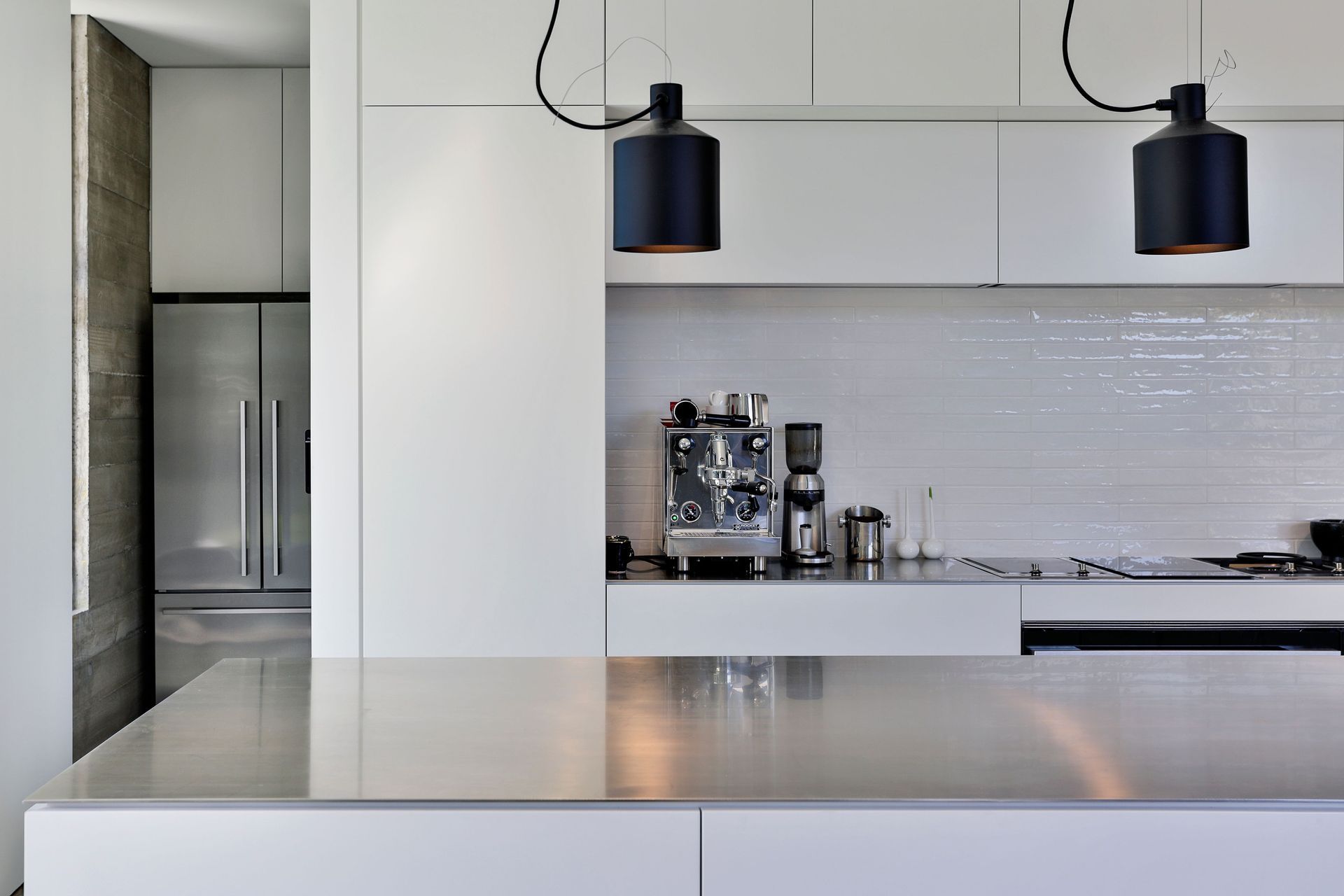
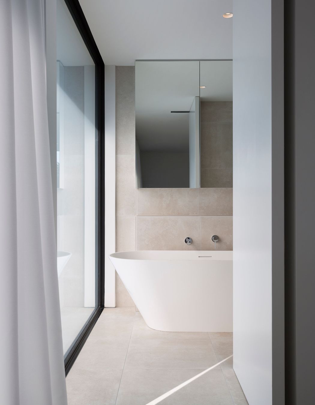
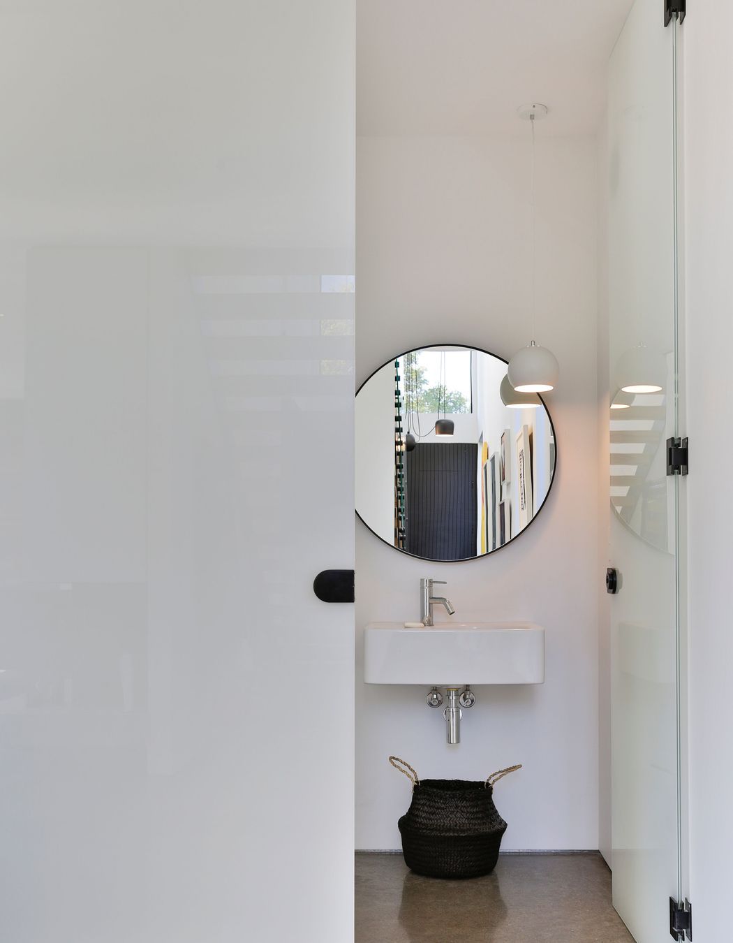
Downstairs, the scullery, laundry and toilet are hidden behind an all-white kitchen with stainless steel benchtops and black lights and fixtures. The monochromatic interior colour scheme has been selected by the owners to provide the perfect gallery-like backdrop for art.
Increasingly, Churchill will reflect the riverside setting with its honest natural materials that will patina with age and over the seasons. “We wanted the house to feel honest and livable – not too complicated – so we used three different concrete surface finishes,” says Tobin.
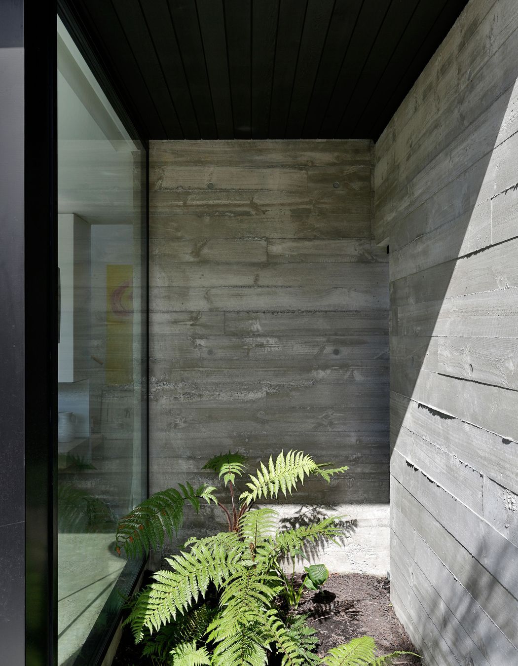
The concrete flooring has a light and subtle grind that avoids being too terrazzo-like; the exposed concrete walls were poured in situ and have the rough-sawn texture of the pine timbers used in the shuttering, with edges oozing out; while the concrete fire hearth and paving are smooth. “You either love or hate the honest nature of concrete for its unpredictability, but it provides a good contrast to the uniformity of the glass and cedar,” Tobin says.
“There is no skirting or trims around the edges of the concrete either, so the detailing had to be bang on,” he says. “On the walls, the concrete is exposed on both sides, providing an interesting texture that also forms part of the internal nature of the house, with shadows created during the day as the sun moves around the house.”
Located in a seismic zone, this central Christchurch home has been designed to withstand any future earthquakes by exceeding the new earthquake requirements. “Two posts in the outer corners of the house contain the structure and services, concealed within aluminium facings, while the roof has a diaphragm structure that becomes stiff during a seismic event. If a shake occurs, the whole building works as one complete box,” explains Tobin.
“The excavation also had to comply with earthquake requirements, so we dug nearly one metre of soil out from under the house and half-filled the raft with geofabric, whiel the footings under the concrete extend out with deep roots.
“Fortunately, the house is just far enough from the river that we didn’t have to worry about potential flooding,” he adds. “The site is naturally elevated at approximately one-and-a-half metres above the high tide river level, so flood management levels were okay; whereas, where it crosses the Avonside area, it can become really gnarly when the river level rises.”
Tobin used to work for well-known Christchurch architect Thom Craig, who has influenced his stripped-back contemporary style of architecture. “Churchill is like an ‘unassembled’ contemporary house,” says Tobin. “It’s a relatively small and uncomplicated townhouse that’s drawn from Christchurch’s modernist tradition, which is all about having a simplistic aesthetic and honest materials and construction.”
Perhaps, the beauty of this simple home is that it is clever without being ostentatious. It has a light and elegant structure – with the hovering upper level but it remains strongly rooted in the ground and its riverside surroundings.
Writing by Justine Harvey.
Photography by Jamie Cobel.
