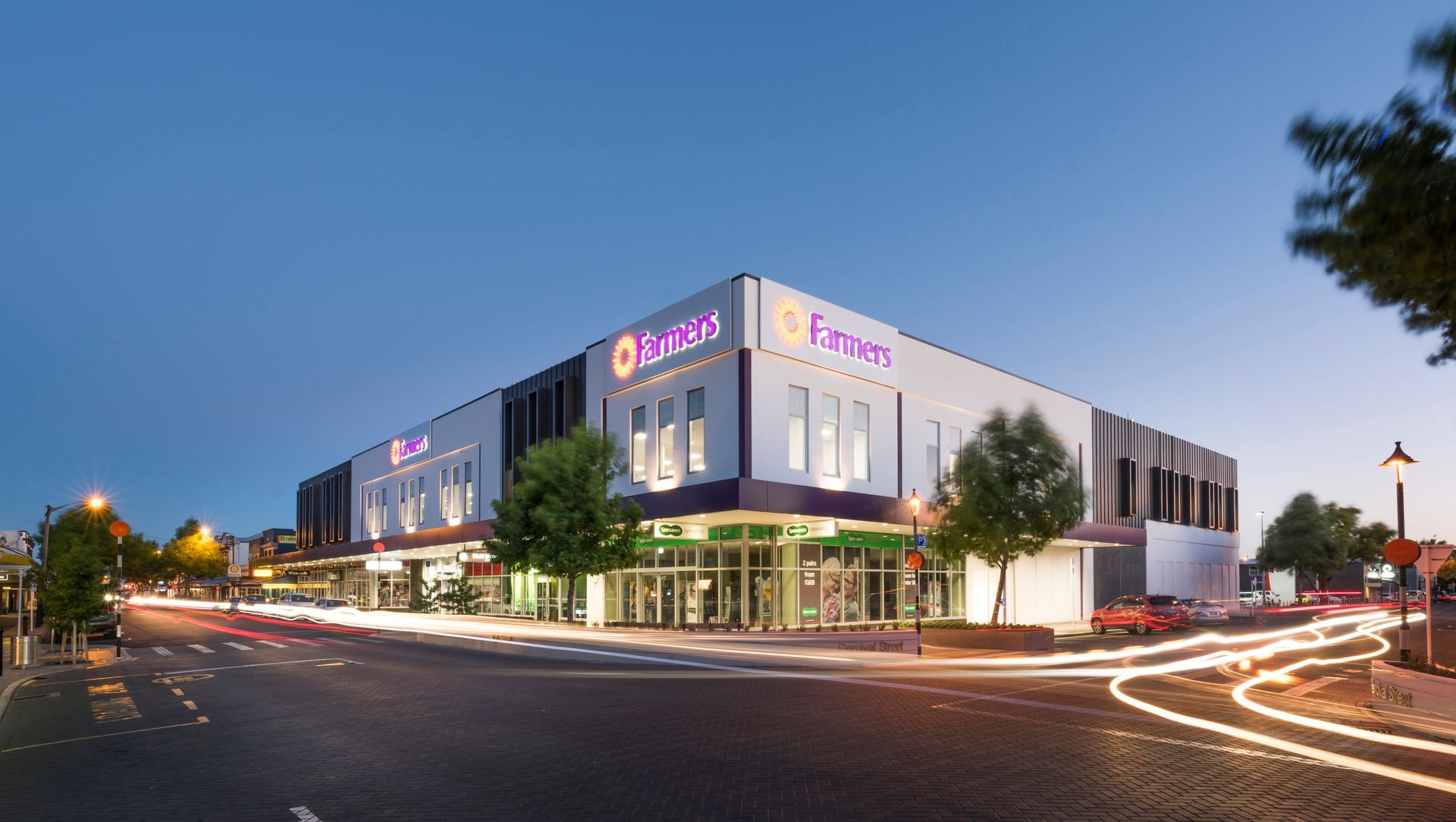
Farmers Rangiora banner

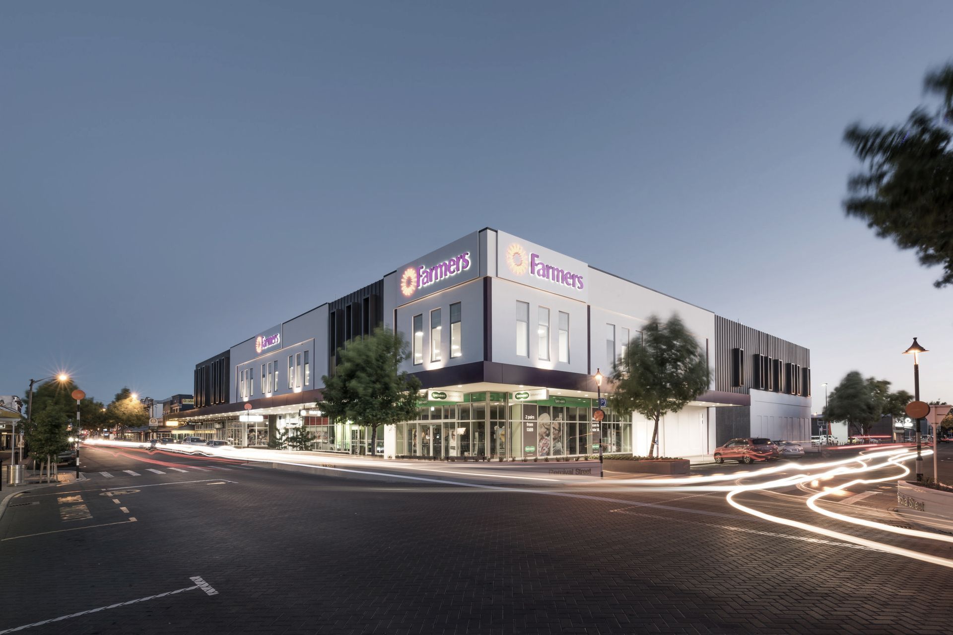
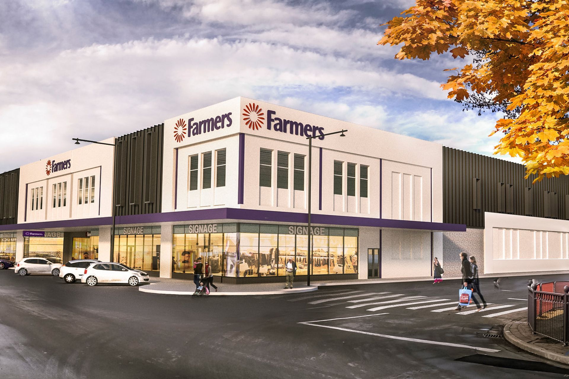
An innovative building design for a landmark retail brand – in a landmark location – has added a sense of vibrancy to the Rangiora town centre. The new building, which has farmers trading company as its major tenant, respects the past and reflects the town’s vision for a thriving CBD.

Located a 20-minute drive from central Christchurch, Rangiora has experienced rapid growth in recent years which is predicted to continue.

Farmers Trading Company, or Farmers, has been a long-standing key retailer in the town with its store being located in the heart of the CBD. It is bordered by three streets including the main shopping thoroughfare, High Street.

Originally a single storey building, which had been extended over time, it was demolished in 2014 after sustaining earthquake damage. The Christchurch design team has realised a vision to rejuvenate and revive this landmark retail location.

The result is a two-storey, approx 6,770m² Gross Floor Area (GFA) building which incorporates Farmers as the major tenant, along withspeciality retail in one portion of the ground-level (facing High Street). An 817m² commercial office tenancy is located in the upper level on the north side of the building and accessed through a separate entrance. This tenancy will be occupied by the local Council.

DESIGN

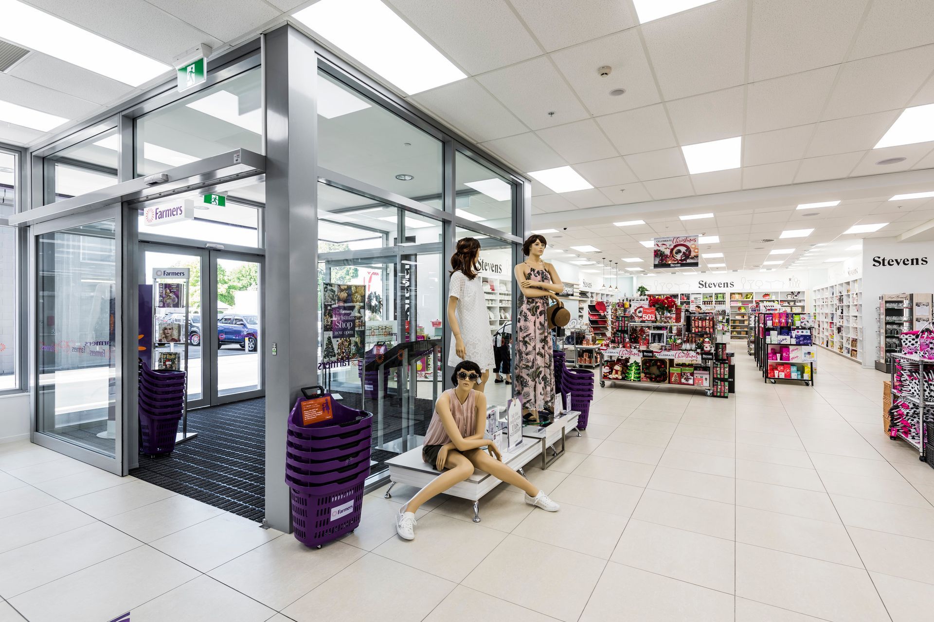
The main Farmers entrance is located in the centre of its High Street location. This benefits the internal store planning, as well as providing a strong visual signal to pedestrians.

The entrance creates an immediate impression and echoes the façade of the historic post office, located on the opposite street corner.

It is just one example of the clever design used in this project to maintain the local streetscape character.

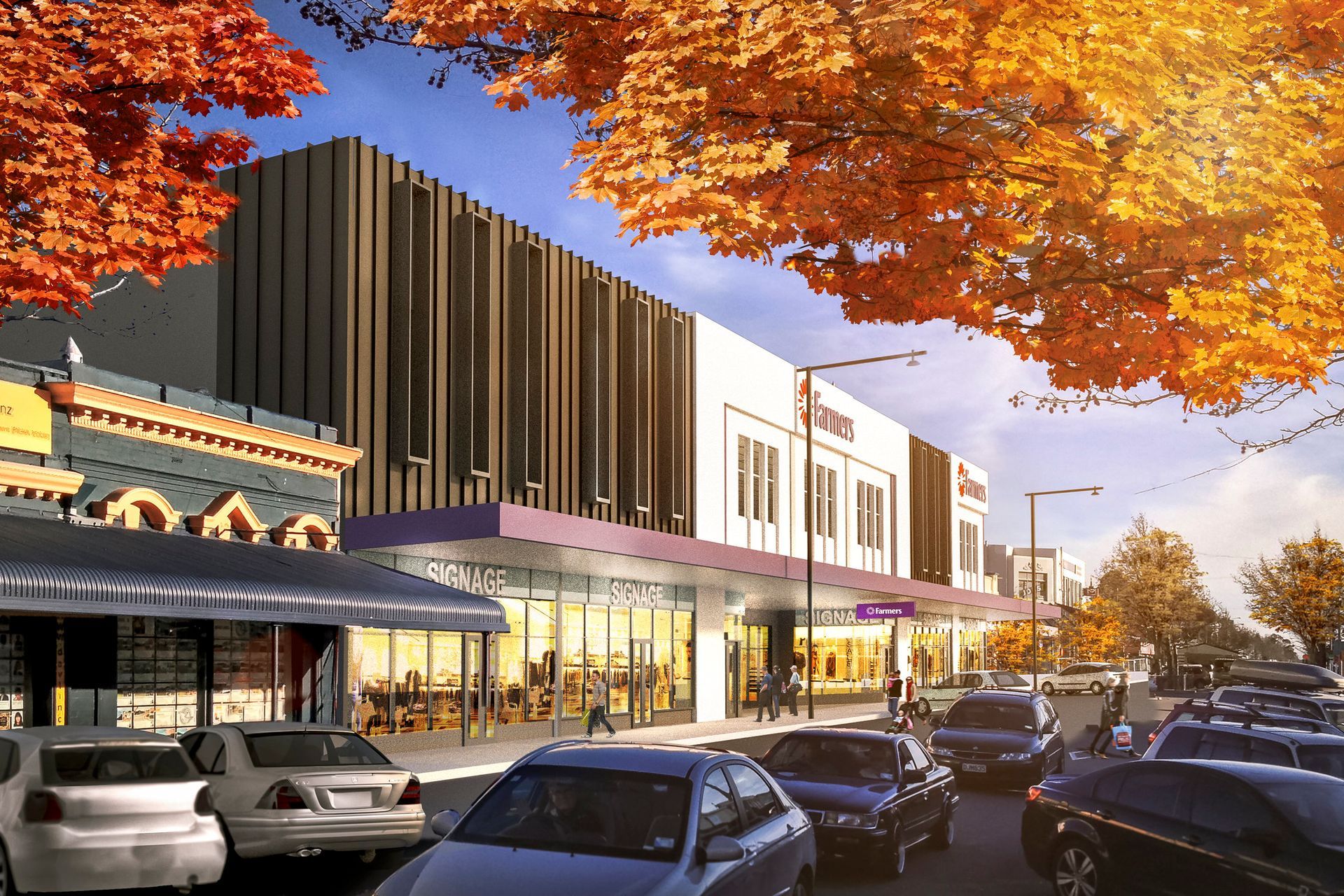
The façade design is equally sympathetic to the surrounding buildings, as well as reflecting the local Council’s design guidelines. The Farmers building’s elevations have been cleverly ‘broken-down’ into smaller elements which help to visually reduce its apparent bulk and scale.

A second entrance captures those entering from the neighbouring car park to the south of the building.

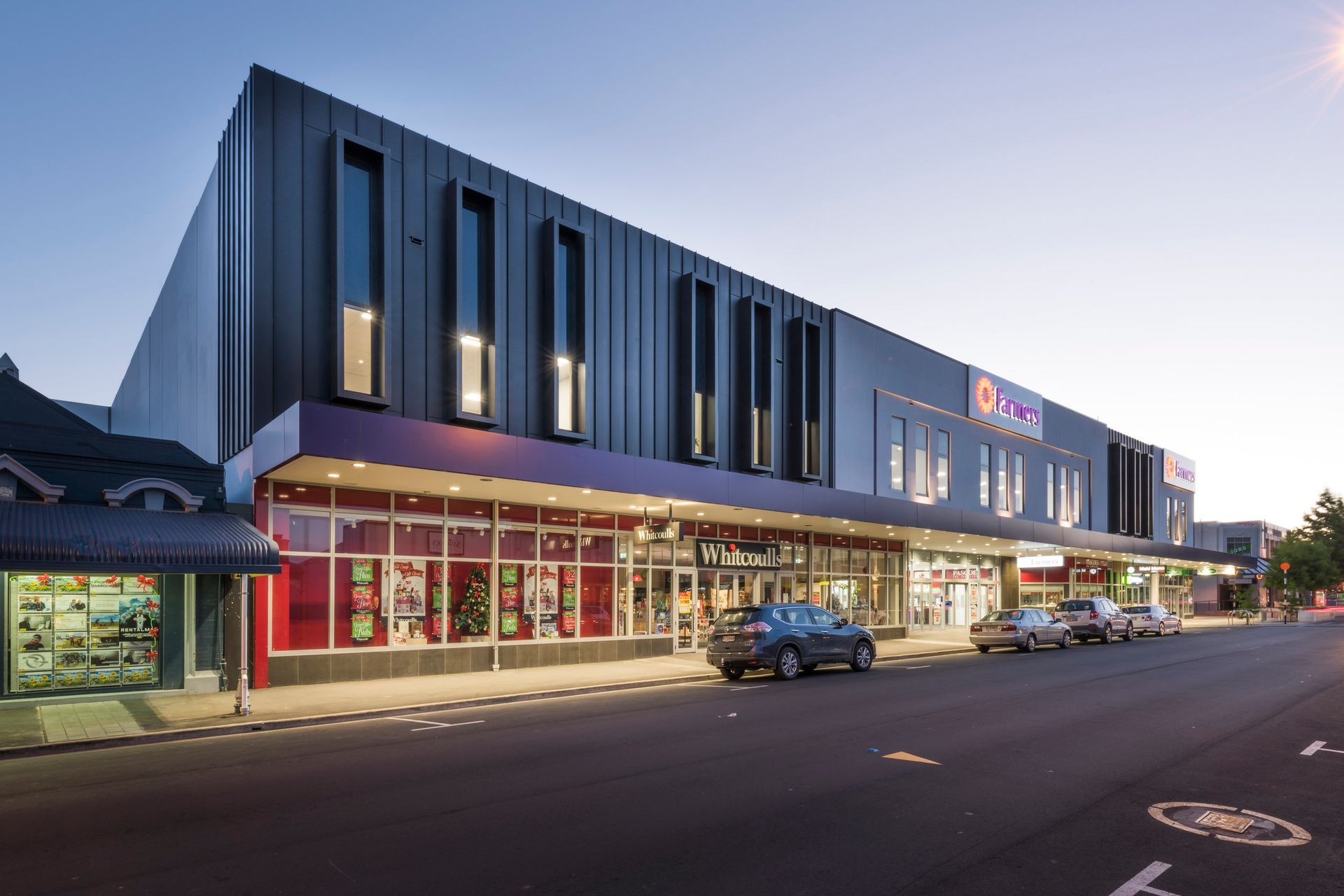
At ground level, the glazing design ‘activates’ the street presence for the specialty retail stores. Their entries are all designed to flow from High Street.

MATERIALS

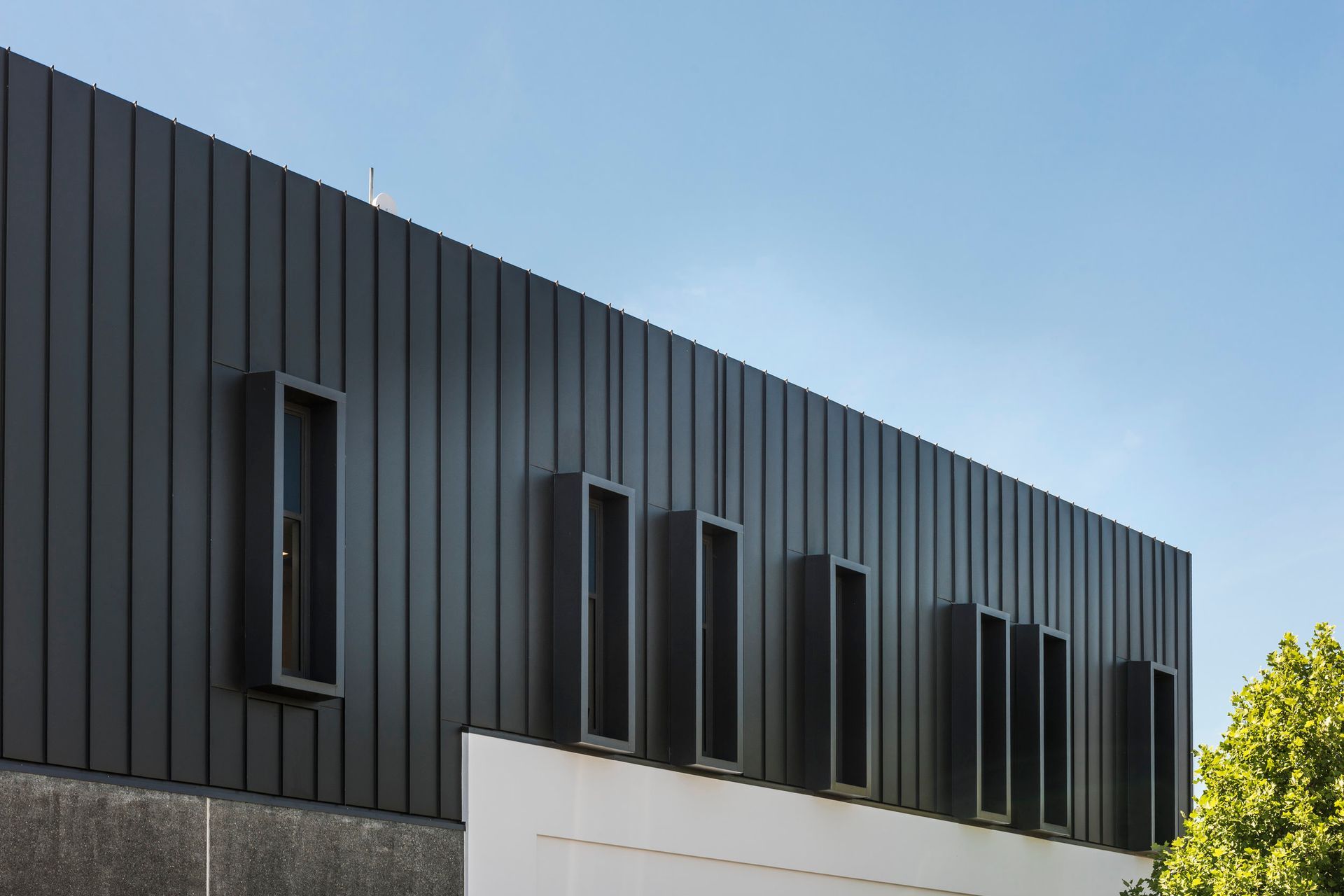
The palette was carefully selected to reflect materials commonly used in the local Canterbury region. These include the use of rendered elements and honed concrete panels to create a layering and depth to the façade. Standing-seam metal cladding in a dark grey colour add texture.

Vertical windows are framed by standing-seam cladding to provide visual repetition, helping to break down and soften the building.

OTHER CONSIDERATIONS

On the ground level, an external all-weather wrap-around verandah/canopy again echoes the design of neighbouring buildings, as well as providing the practical benefit of cover and shade for pedestrians.

This verandah also allows for night-time lighting over the surrounding footpaths, a principle in Crime Prevention Through Environmental Design (CPTED).

Up above, the building’s key elements are highlighted through lighting design – emphasising its presence as a landmark in the town centre.

A four degree fall in the roof design, and continuous parapets along all four elevations, allow guttering to be hidden from view.

A 326m² service yard is located in the east of the site. 

Products used in
Farmers Rangiora

About the
Professional

We believe good design enriches the human experience and positively contributes to our collective future.

Placemaking is at the heart of our practice. Our designs forge community connections, tell cultural stories, and are boldly resilient. We create spaces to be enjoyed across generations - and for generations to come.

With cross-sector expertise and empathy for all stakeholders, we design solutions that are high-performing and commercially viable.