About
Fisher & Paykel Sydney HQ.
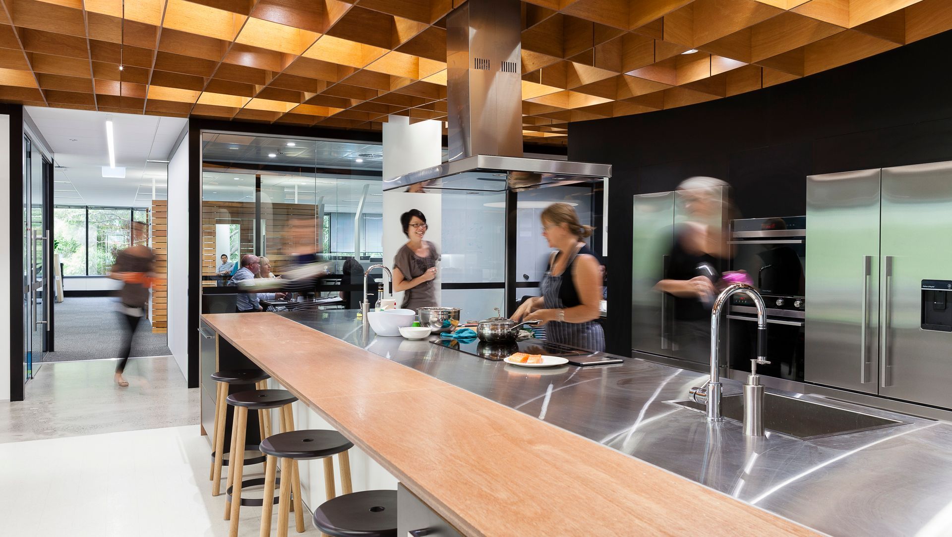
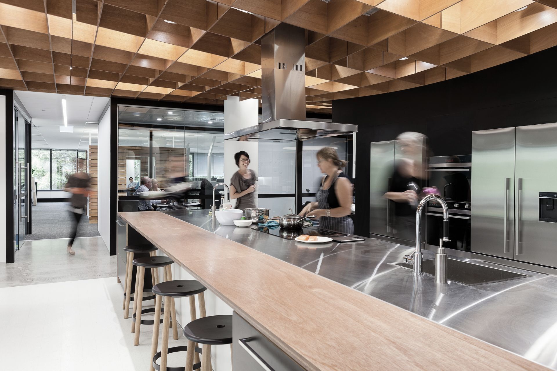
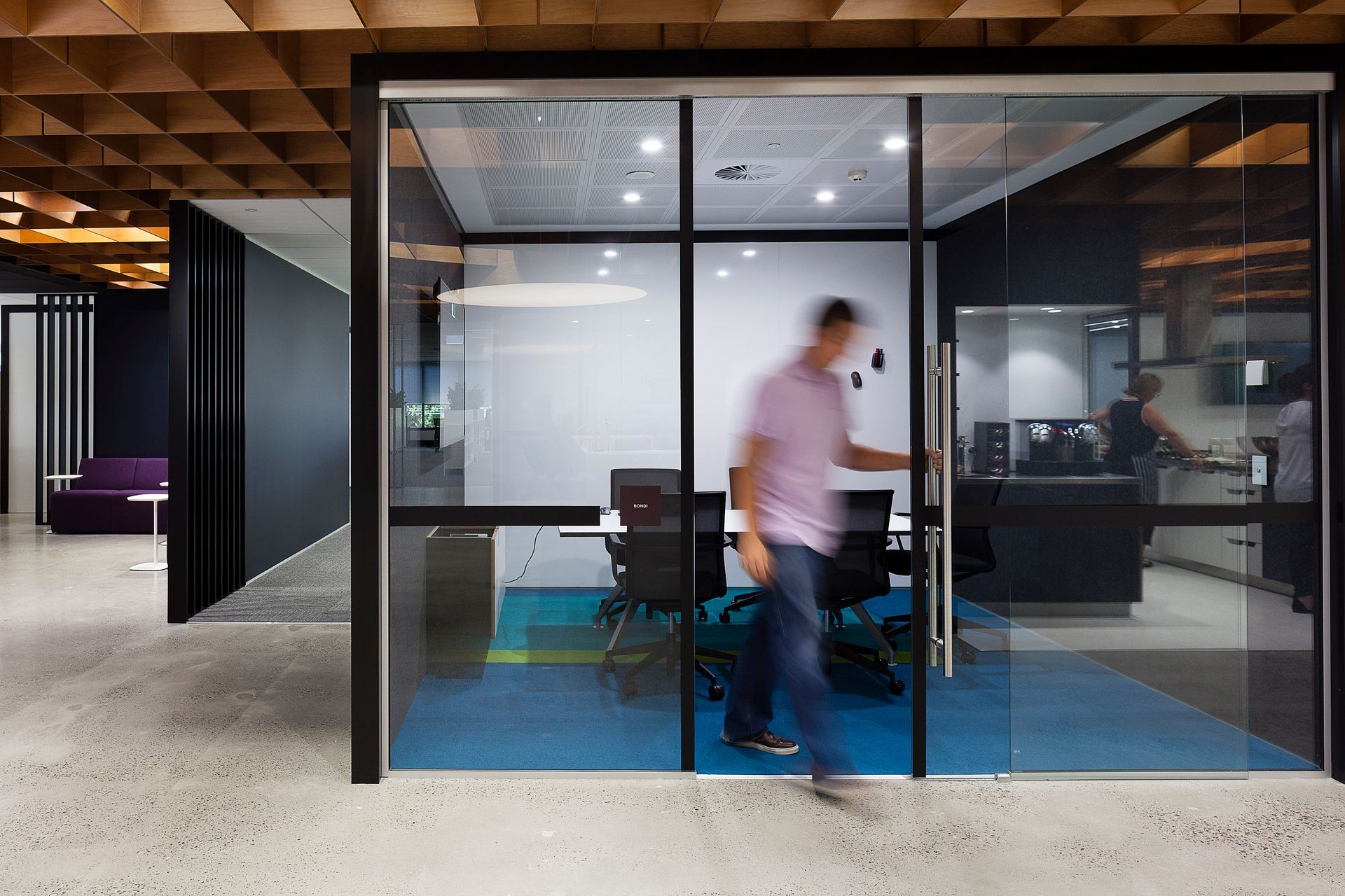
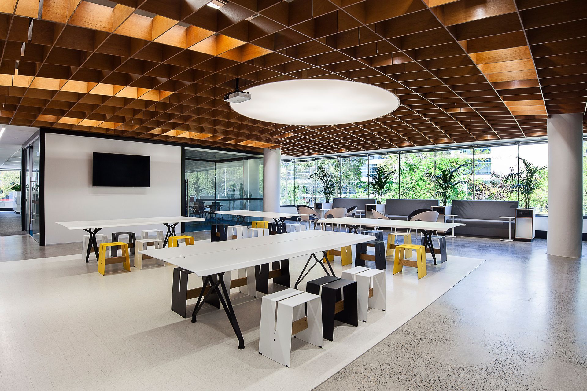
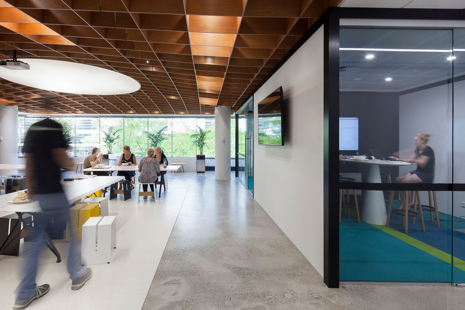
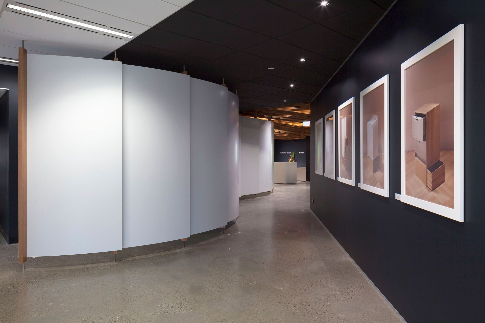
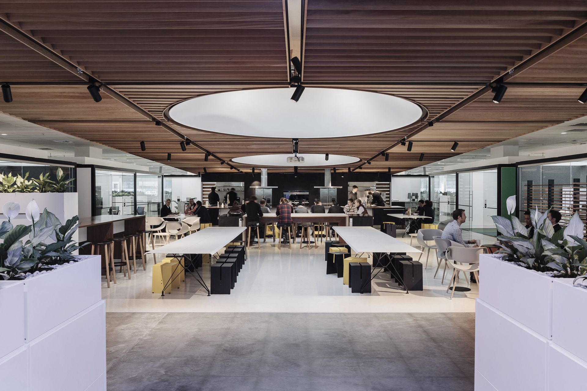
ArchiPro Project Summary - Fisher & Paykel's Sydney HQ features a dynamic workspace with a central Social Kitchen, flexible meeting pods, and a striking 3D plywood ceiling, designed to foster collaboration and reflect the brand's commitment to innovative living.
- Title:
- Fisher & Paykel Sydney HQ
- Architect:
- CUSTANCE
- Category:
- Commercial/
- Office
Project Gallery
Views and Engagement

CUSTANCE. Over 30 years Custance has become a respected and multi-award winning practice. Using our collective knowledge, experience and empathy, we have created spaces that transform people’s lives and better equip them to accommodate change.The tools we traditionally use are strategic planning, architecture, interior design and industrial design, however we have learned to wield them in different ways. We have developed these tools to allow people and organisations to experience space that is fully human and fully alive; space to live well, to create, to innovate and to grow – to enable face to face contact in a way that digital space does not.Clients return to us in both New Zealand and for 14 years now, Australia, where we’ve built a multi-disciplinary, trans-Tasman practice that focuses on people and their well being, not just the places we build for them. We believe in human touch and those two words hold the secret of our longevity.Before we begin any commission, whether a home , a corporate interior, a new building, an urban master plan or a strategic vision, we begin by discovering answers to fundamental human questions. Who? What? Why? For us these come before the traditional ‘where’, ‘when’ and ‘how’ of the brief and build specifications. They help us see beyond immediate needs. They help us understand people and design spaces that have enduring value.
Year Joined
2015
Established presence on ArchiPro.
Projects Listed
13
A portfolio of work to explore.
CUSTANCE.
Profile
Projects
Contact
Other People also viewed
Why ArchiPro?
No more endless searching -
Everything you need, all in one place.Real projects, real experts -
Work with vetted architects, designers, and suppliers.Designed for New Zealand -
Projects, products, and professionals that meet local standards.From inspiration to reality -
Find your style and connect with the experts behind it.Start your Project
Start you project with a free account to unlock features designed to help you simplify your building project.
Learn MoreBecome a Pro
Showcase your business on ArchiPro and join industry leading brands showcasing their products and expertise.
Learn More