A hidden oasis in the heart of Auckland, this 1960s brick-and tile has been transformed into a modern four-bedroomed family home with an ocean view of the Waitemata Harbour and a borrowed vista of the neighbour’s tennis court.
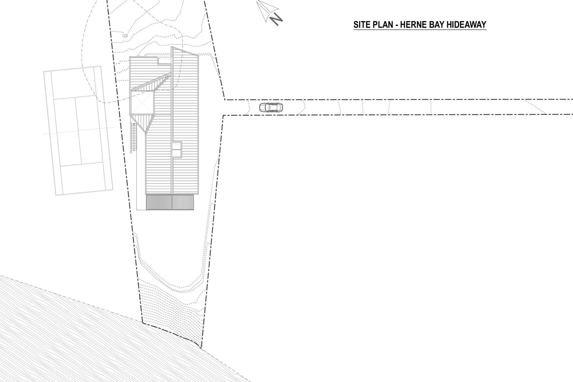
Despite been located close to the city, this 1,290m² site in Herne Bay is accessed via a 75m-long driveway with no through traffic, making it an incredibly quiet home – the perfect city retreat – for a young couple and their three young daughters.
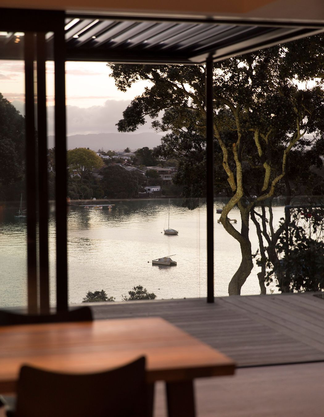
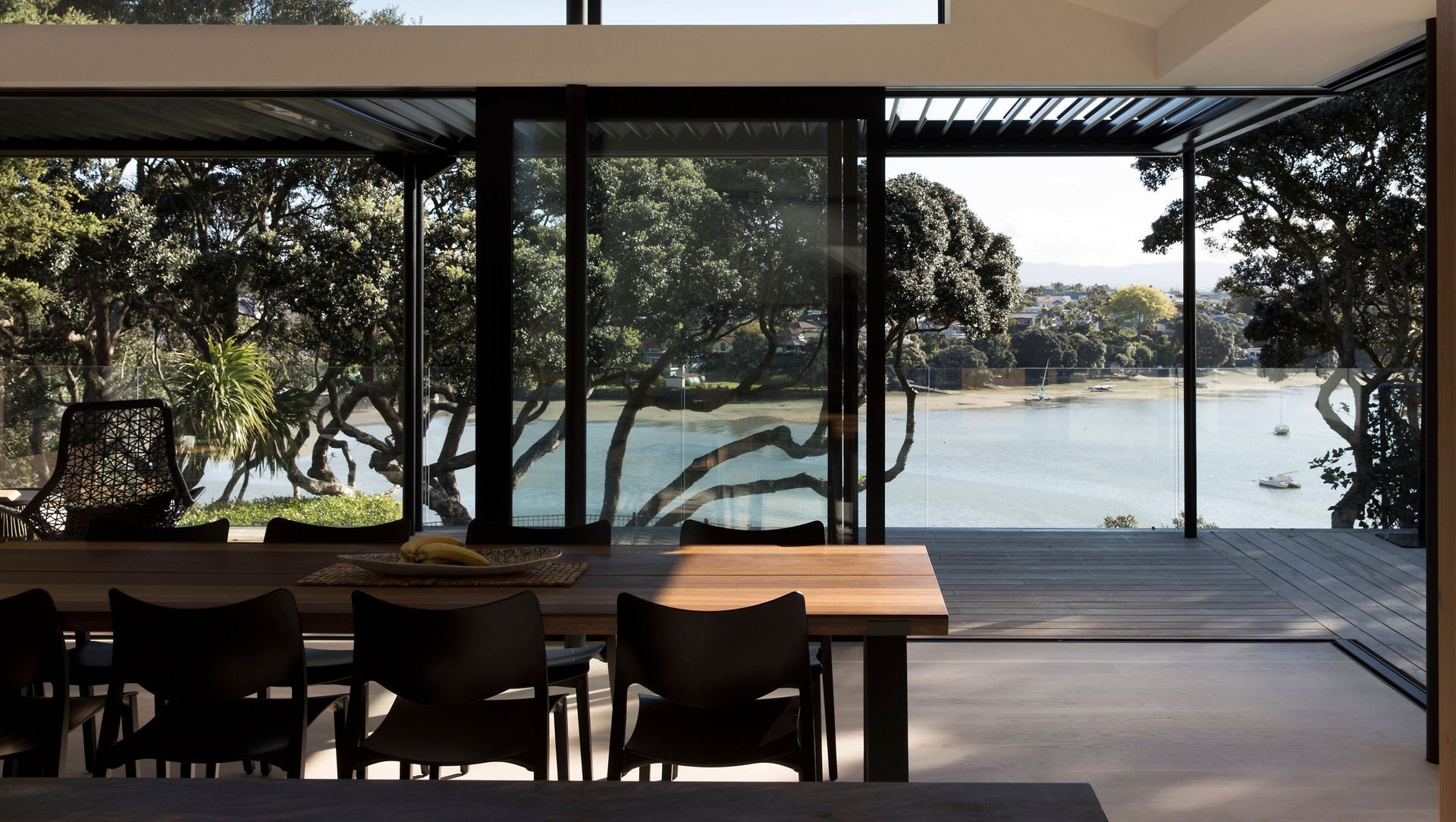
“Coming down the drive, it’s like you are sloughing off the city,” suggests architect Mike Hartley of Lloyd Hartley Architects. “The nature of this site – with its vista to Cox’s Bay, the ebb and flow of the water and established pohutukawa trees – makes it a classic North Island coastal environment. You feel as if you are at a bach somewhere up north overlooking the beach.”
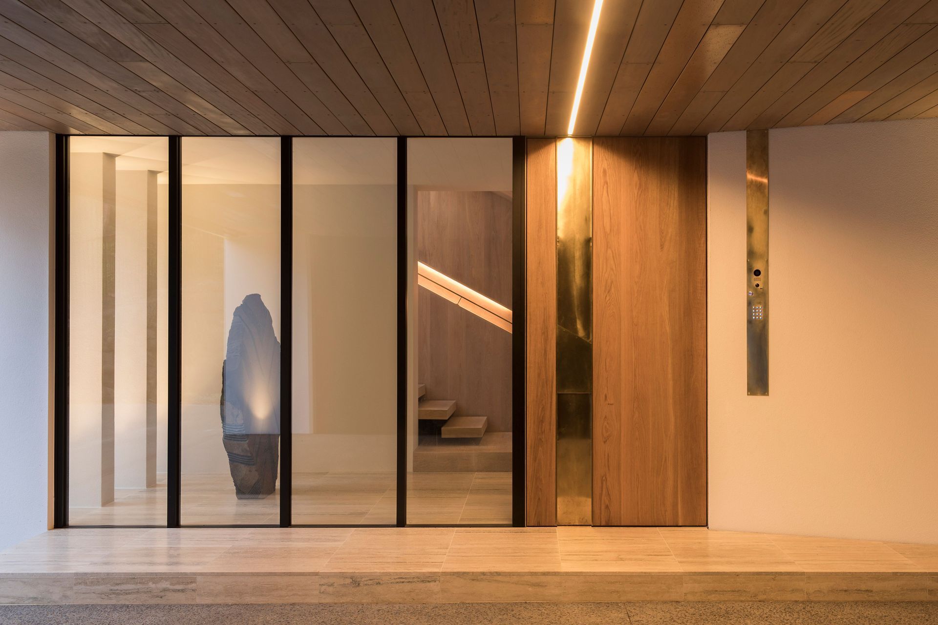
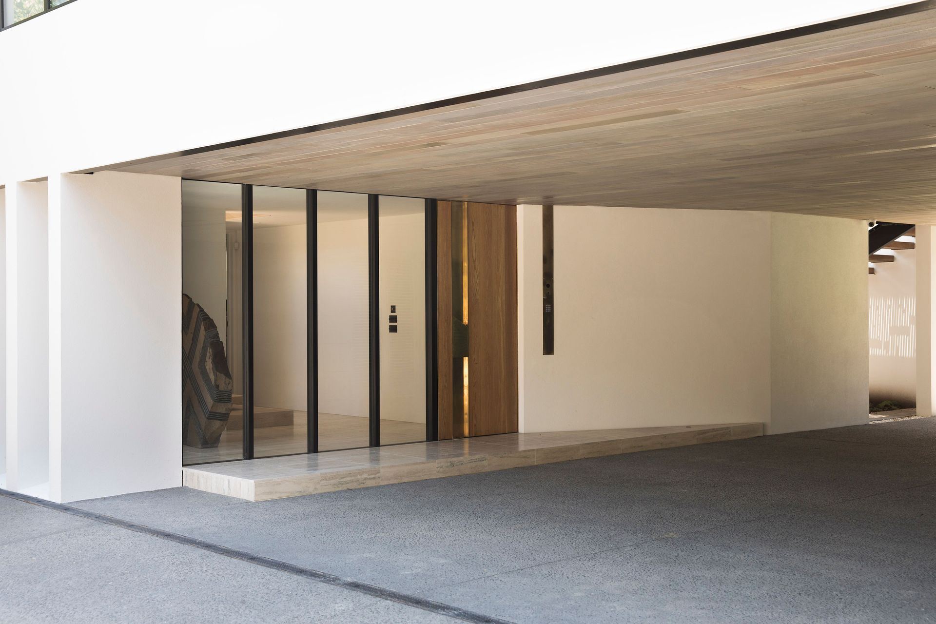
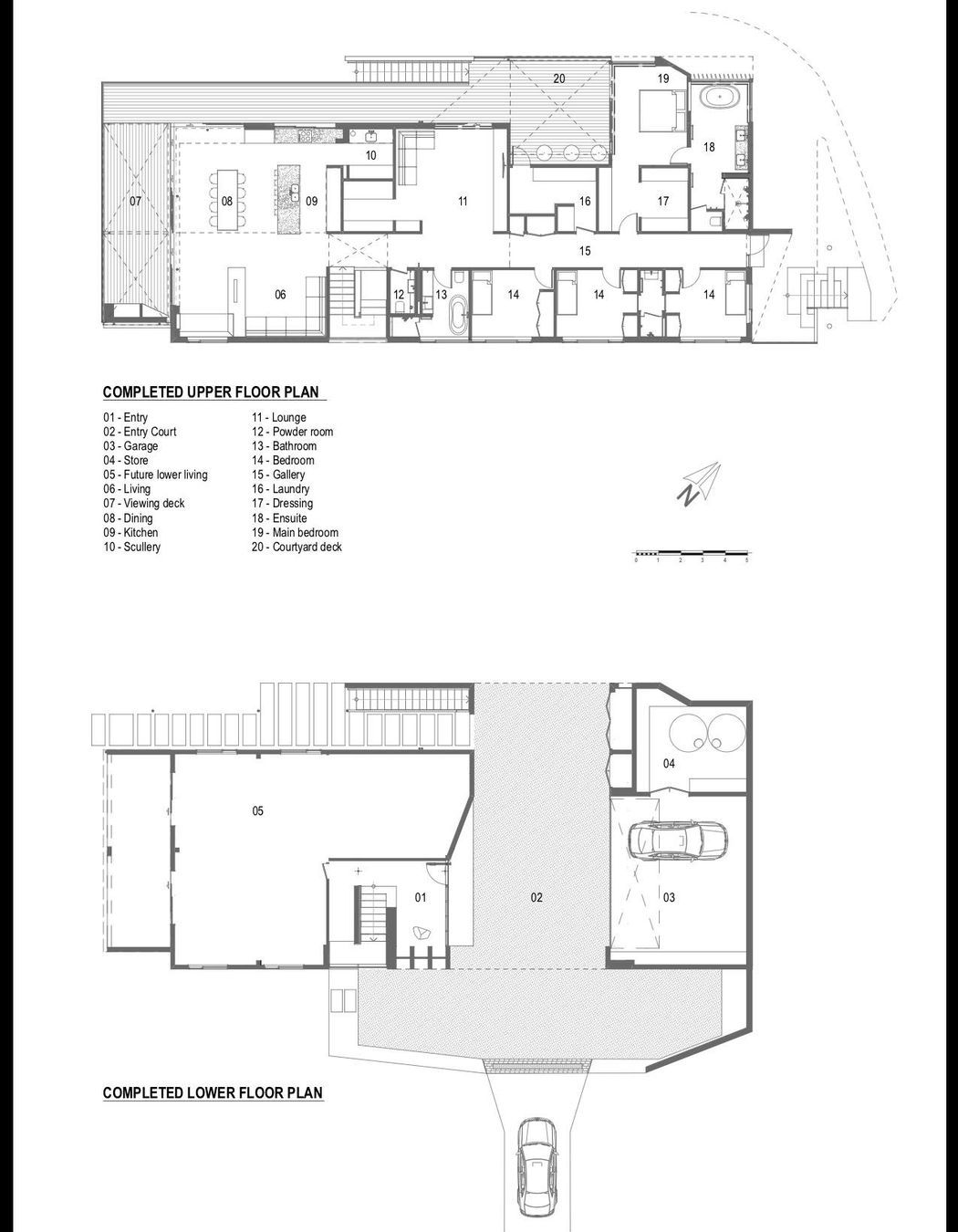
“Because Auckland has temperamental weather – it can be raining one minute and sunny the next –a lot of houses have beautiful front doors but the homeowners enter through the garage to stay dry,” says Mike. “We seem to prioritise cars so much these days that we also put carpets in our garages like they’re another living room. But, here, we wanted to create a nice covered entrance courtyard between the garage and the lower-ground floor of the house, which works well in this climate and the homeowners can now enjoy entering their home via the front door, and guests can drive in and stop right outside the entrance.”
Before Lloyd Hartley’s refurbishment, the first thing you could see as you drove down the long driveway to the house was a set of galvanised garage doors. “One of our key design moves was to create a new focal point by framing a view of the neighbour’s tennis court, which runs perpendicular to the driveway, through the covered entrance courtyard,” explains Mike.
The first floor of the house now forms a new bridging space that contains the laundry and a decked courtyard, and a master suite sits above the garage. Fortunately, their friendly neighbours were agreeable to the owners borrowing a view of their property, commenting that they thought it was very smart to borrow their tennis court.
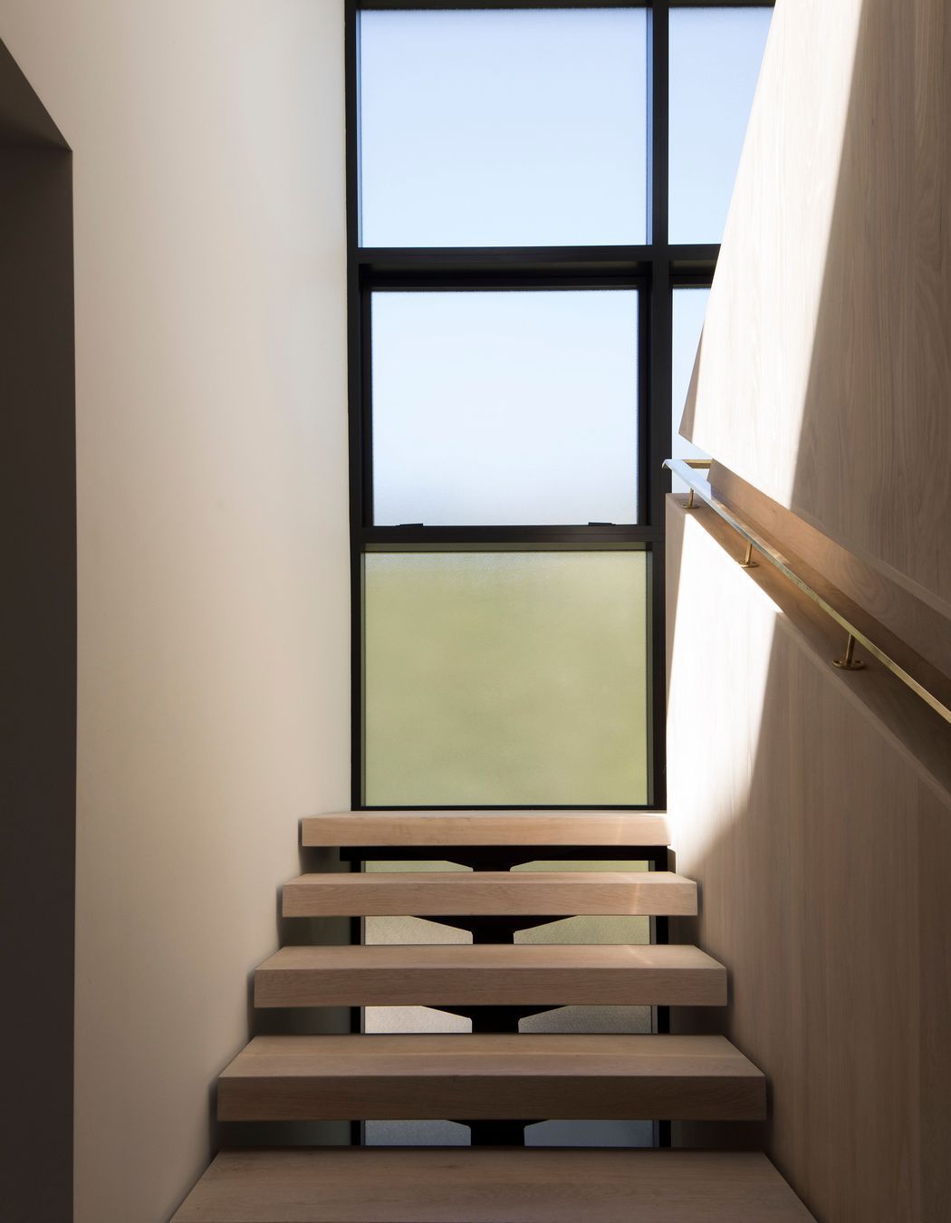
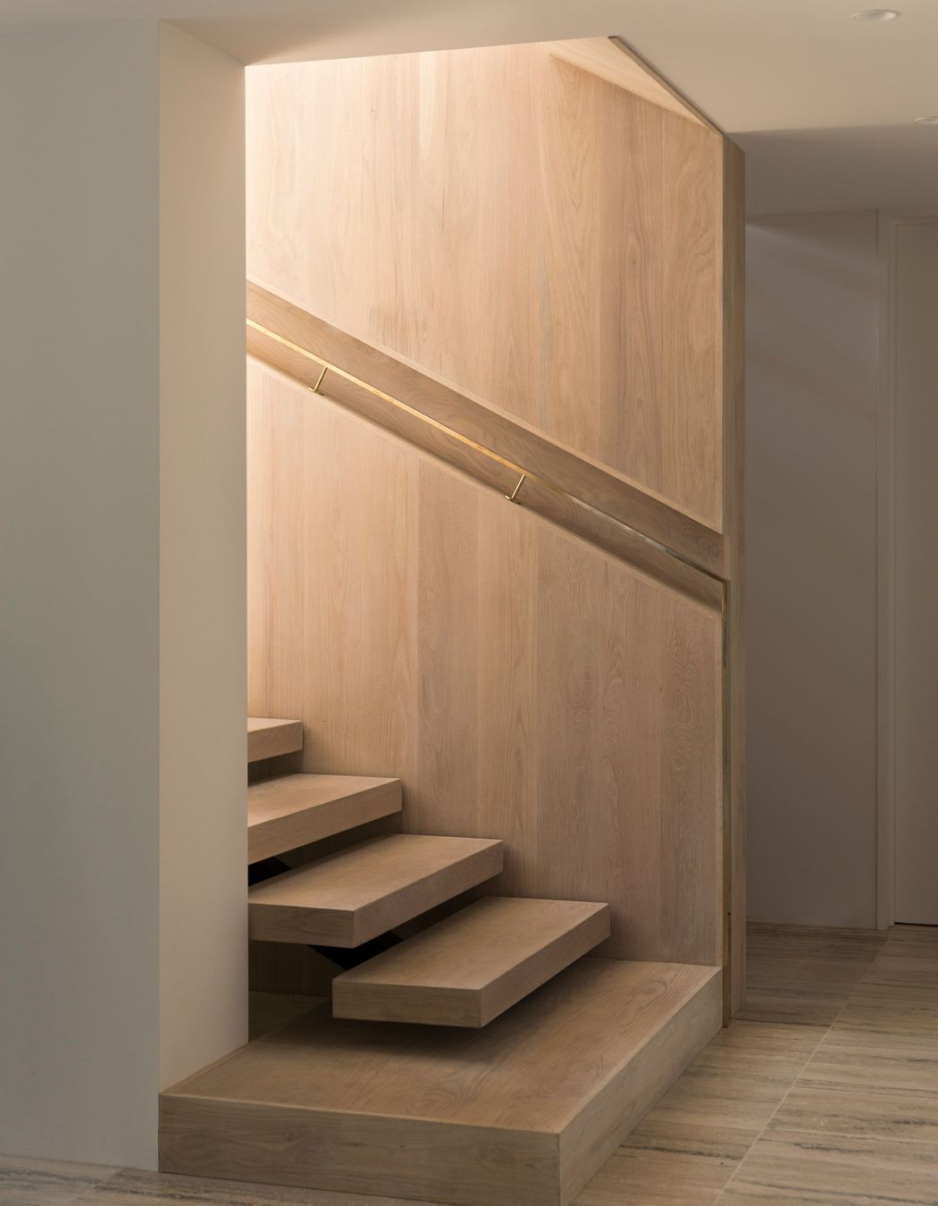
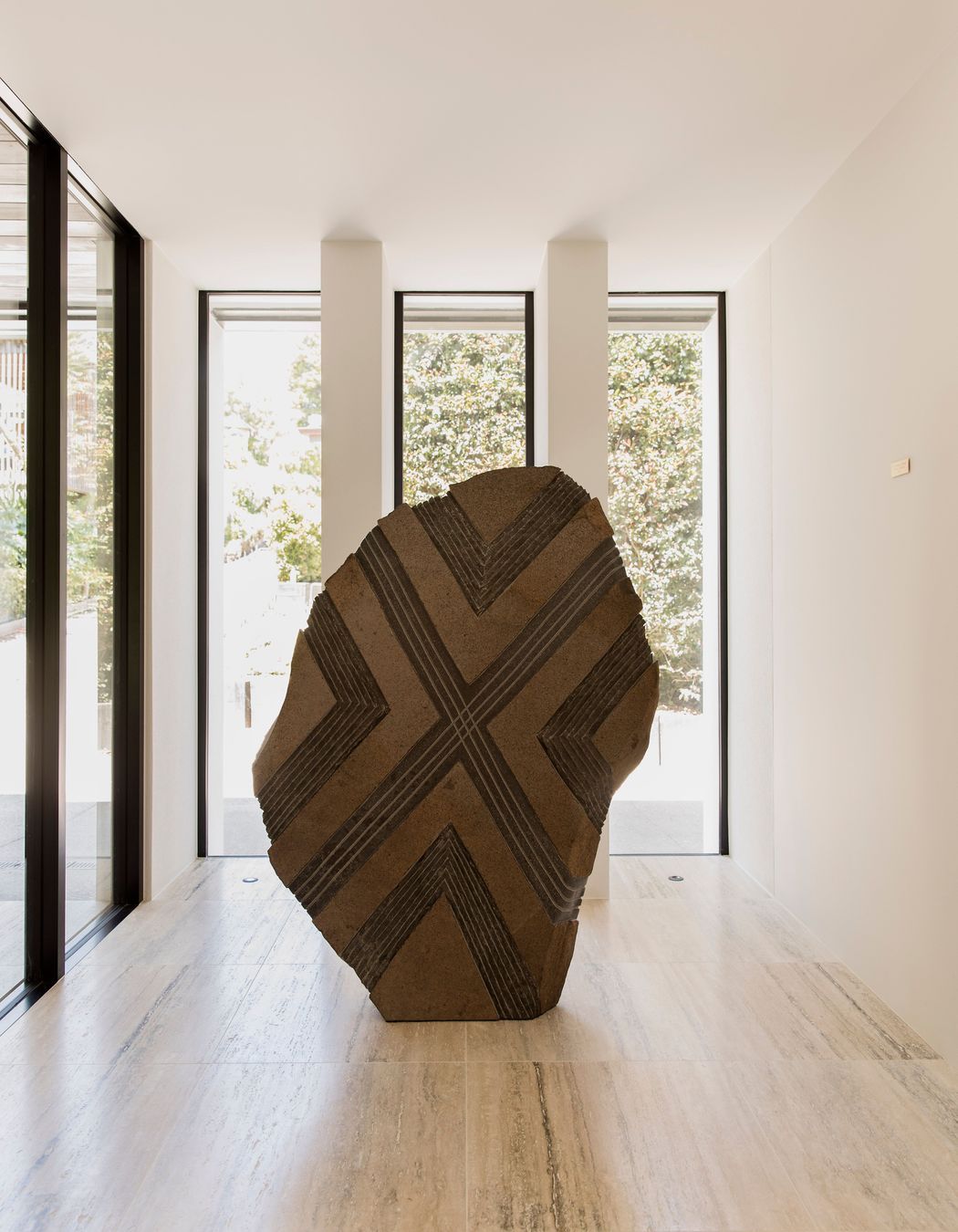
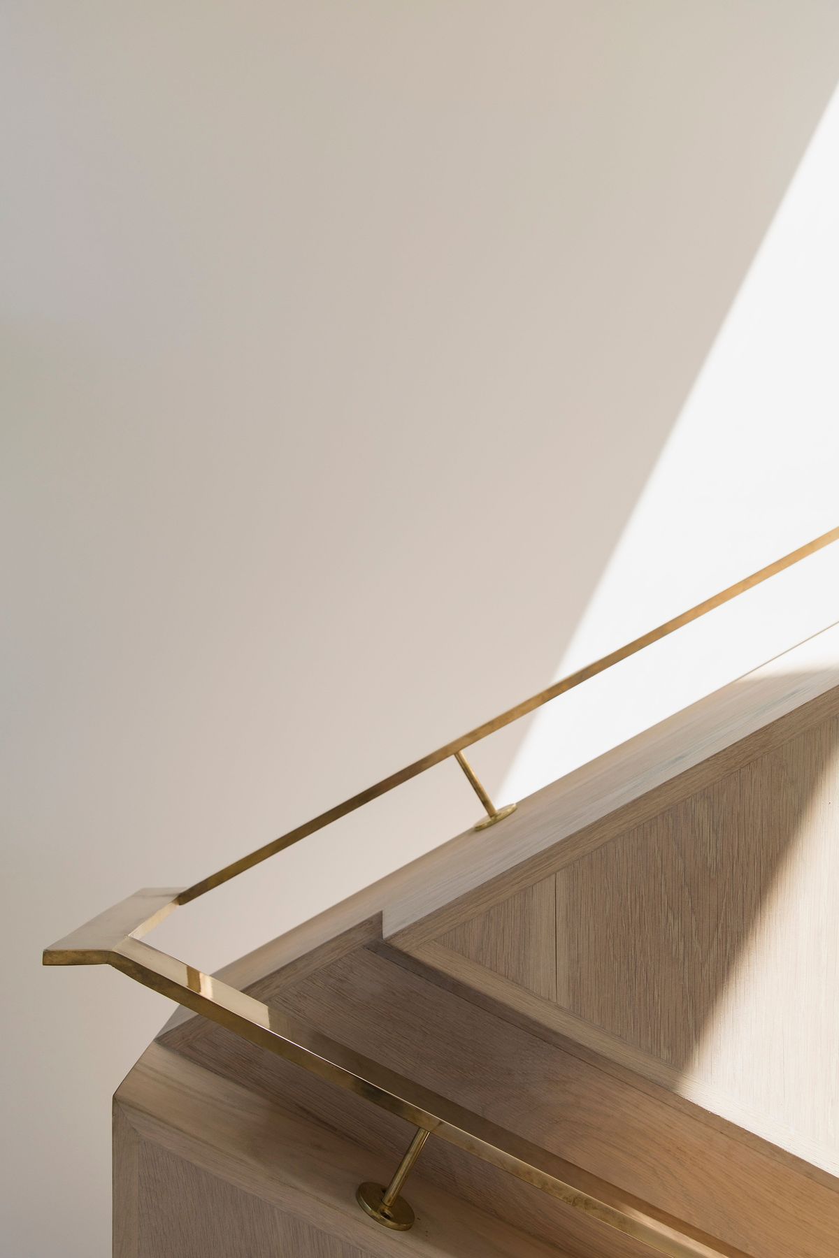
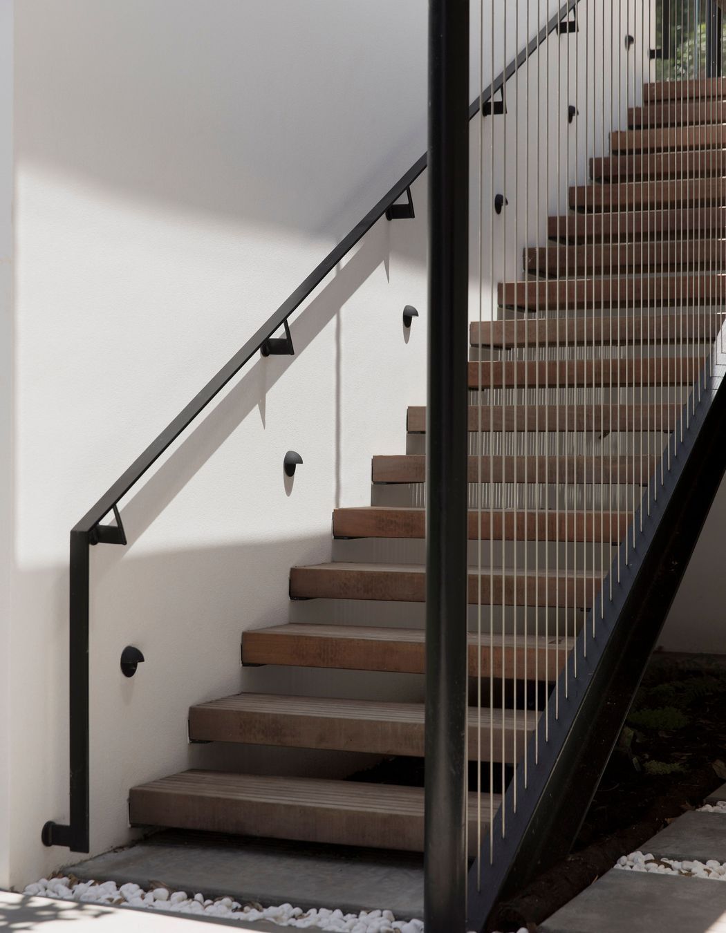
Inside the large gallery-like entrance space, with its silver travertine floor, a large sculpture takes centre stage, along with a bold staircase with concrete treads that appear to float. “We reused a big proportion of the existing staircase, which had a curve through the middle, cleaned it up and, through a sculptural movement, it winds its way up to the living area and enjoys views to the south-east,” says Mike.
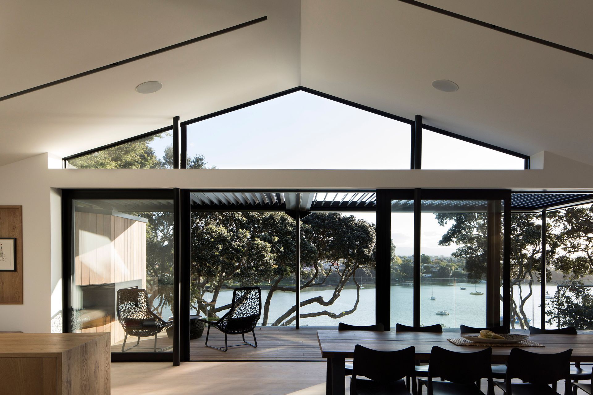
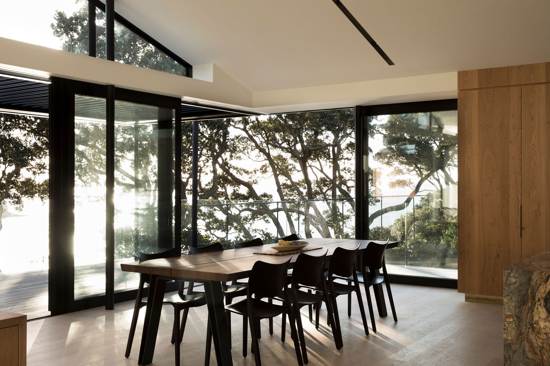
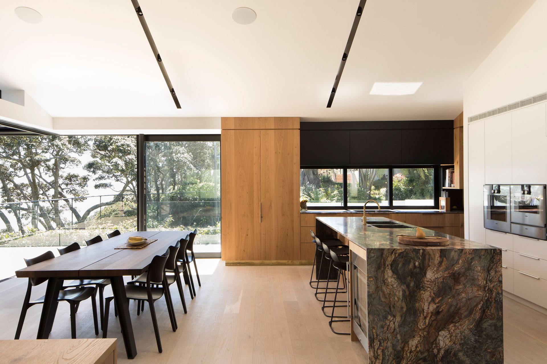
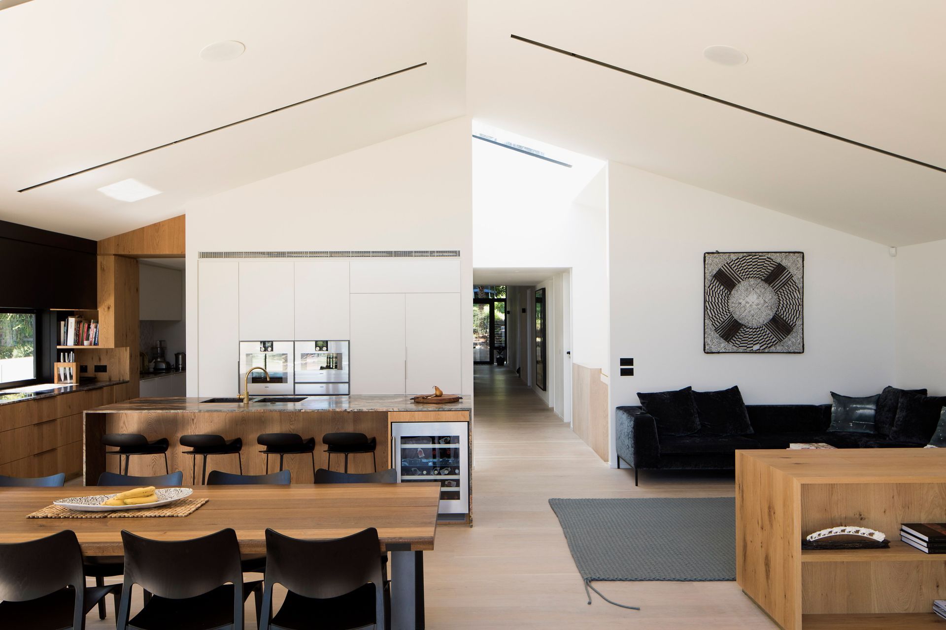
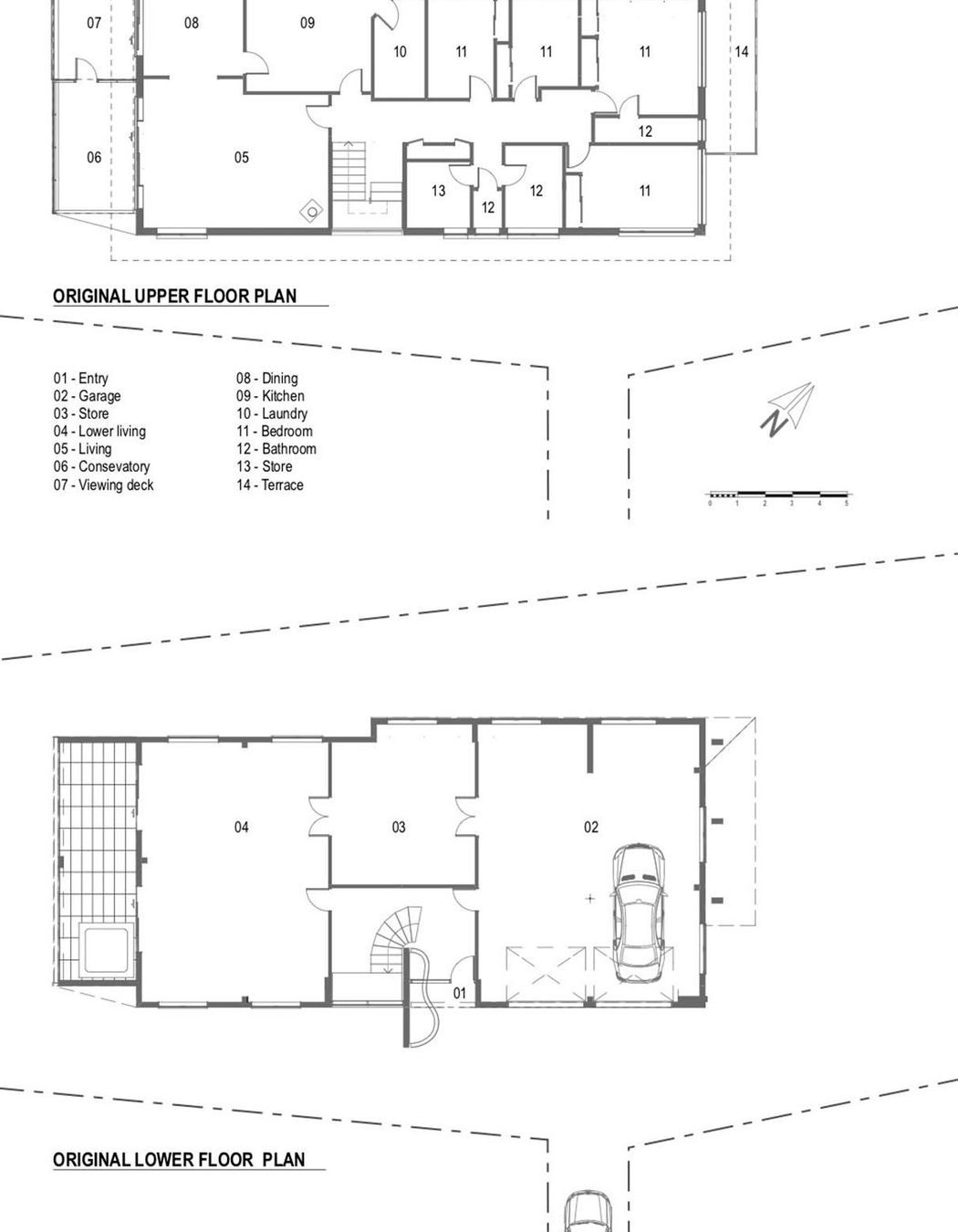
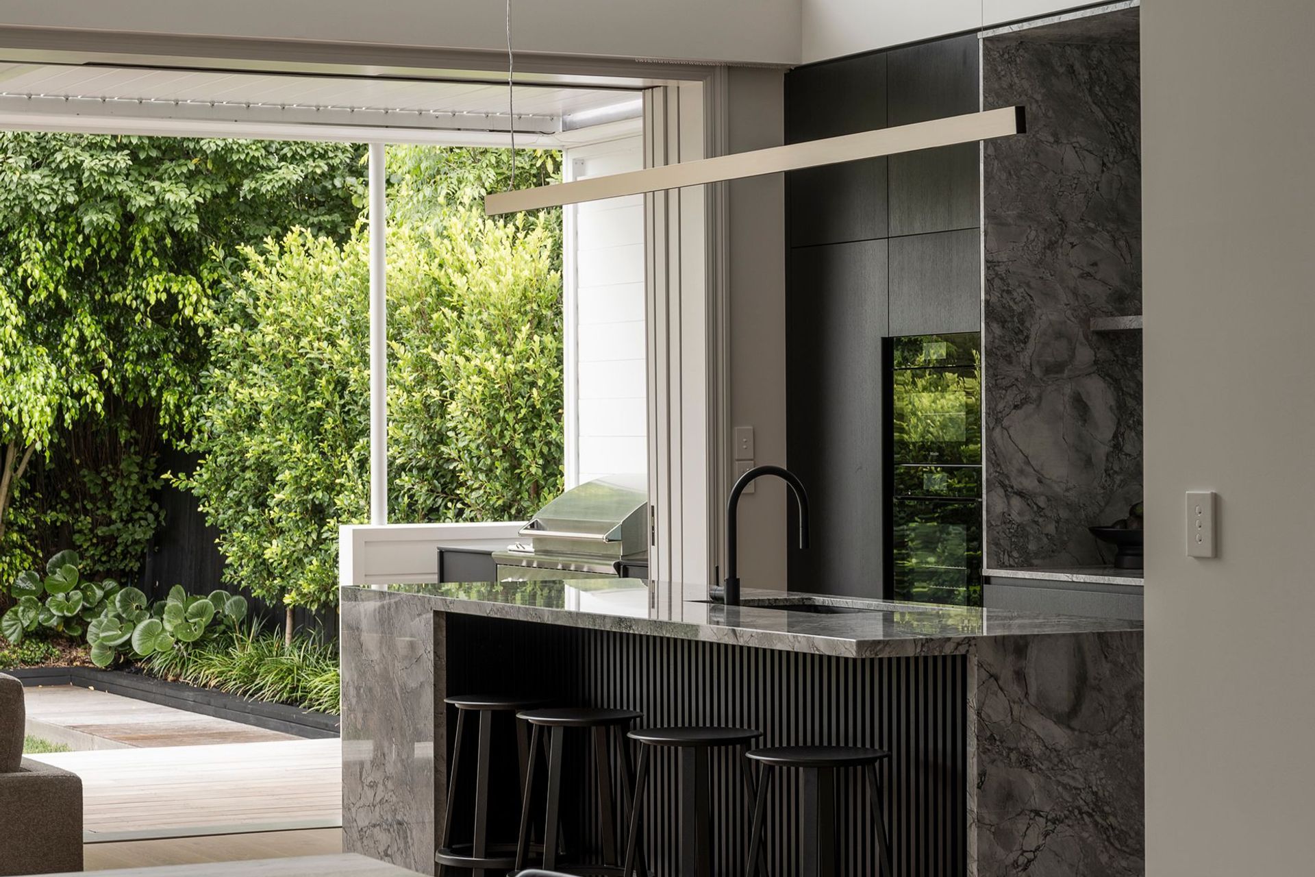
On the first-floor level, the open-plan kitchen, living and dining area still has a similar arrangement to the 1960s brick-and tile-home. “An issue with the original house was that it only had 2.4m-high ceilings, which made it feel as if it had a low cap over it and restricted the view of the water, so we opened it up to add volume and to improve the view. This, in turn, creates a lovely triangle of light in the interior as the sun rises up early in the morning.”
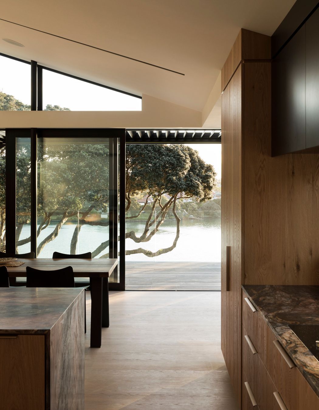
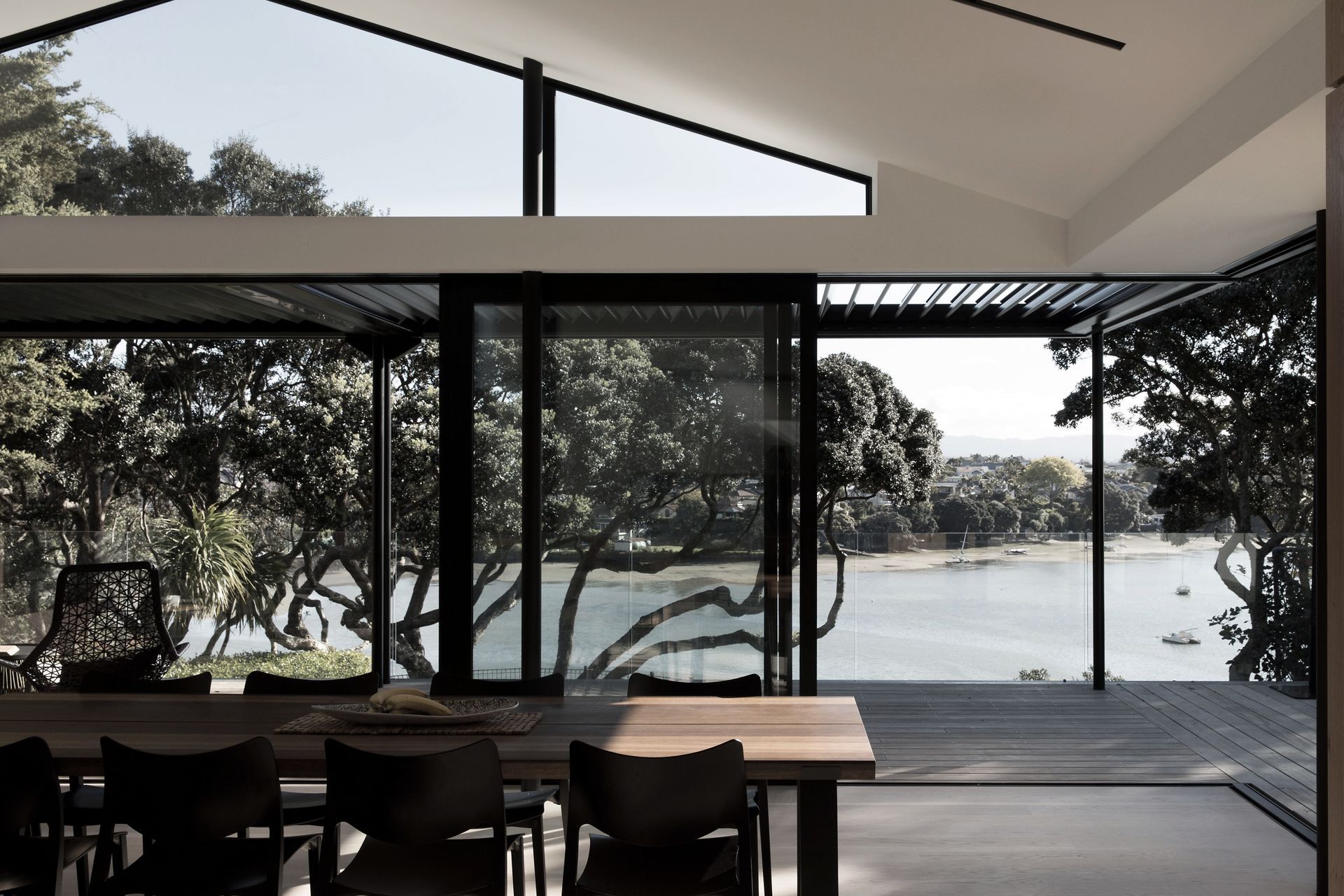
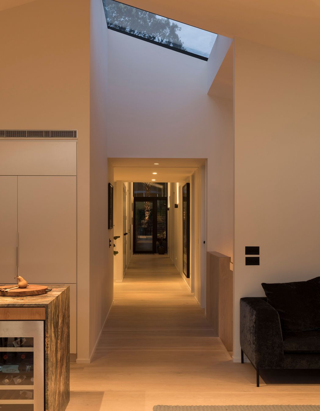
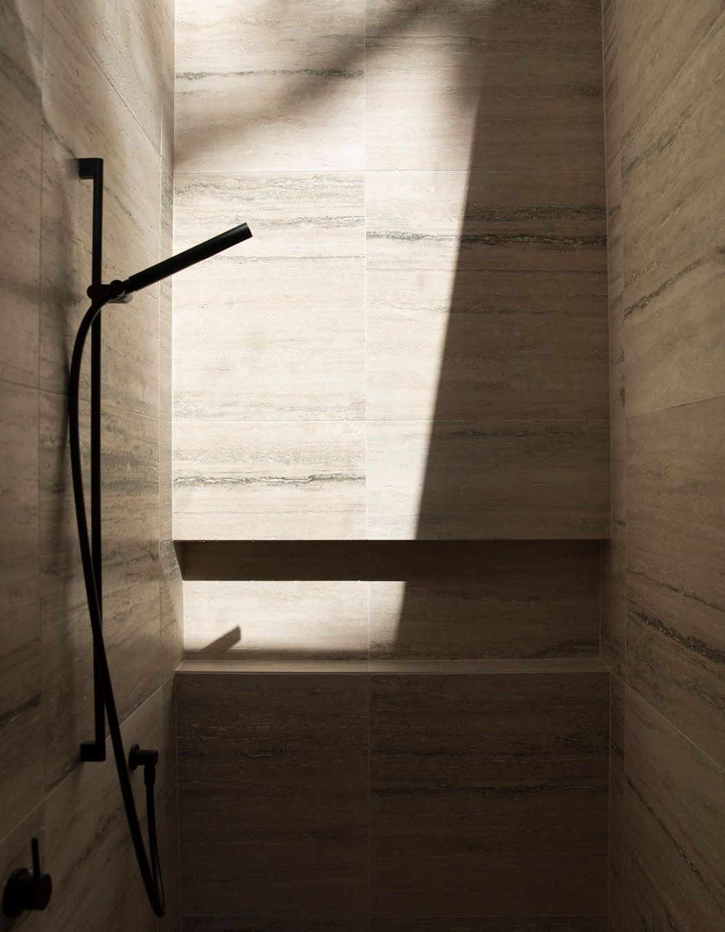
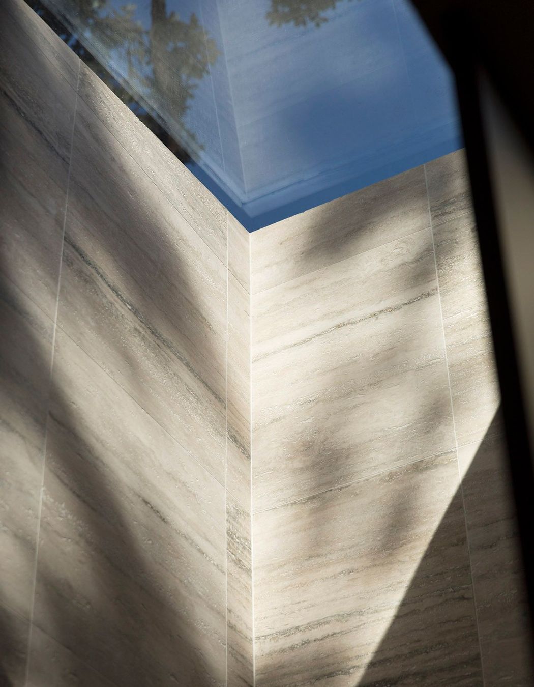
Working with the views through clever placement of windows and skylights throughout the home, Lloyd Hartley has not only captured the ocean, the pohutukawas, moving clouds and other features of the sky but, also, the sunlight as it rises from the east and sets to the west and creates shadow plays around the interior spaces.
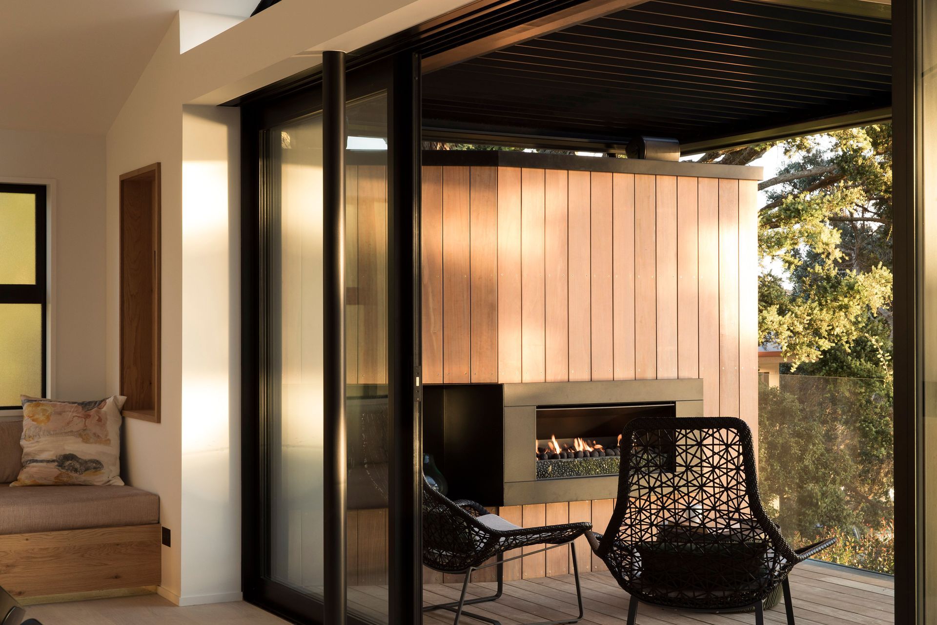
Forming a central axis on the first floor, a gallery-like hallway leads from the rear lawn, garden and kids’ trampoline space, past the bedrooms and laundry off either side, to the staircase and the main living areas, and out to decked terraces facing west and south-west.
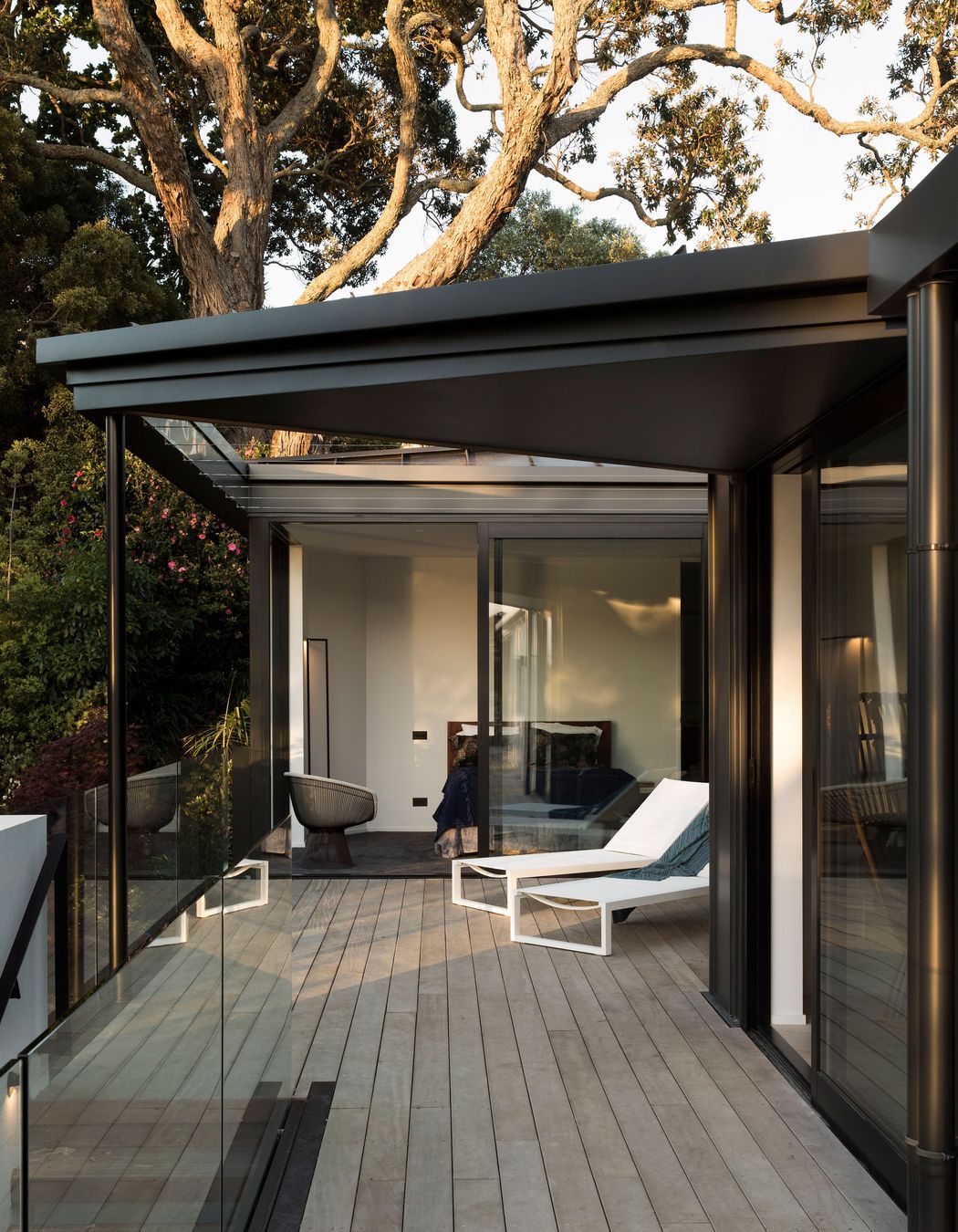
Above the garage, a master bedroom suite opens onto a courtyard deck with an ocean view and foliage growing up around it, which operates like the owners’ own private beach where they can laze in the sun and read a book. Alongside is a lounge/children’s playroom, making it easy to keep an eye on the young ones. Off the courtyard deck is a set of stairs that lead down to an existing swimming pool.
The concrete block portion on the ground floor of the original structure has been retained, as it was still a solid foundation, with a new build above and a new roof. The architects also wanted to retain much of the original brick veneer, however the ties to the timber structure were no longer holding the brick in place, so the cladding also needed to be replaced. “We decided to use the StoPoren panel façade system as it’s great at dealing with our coastal environment,” says Mike. “For continuity, we also applied the Sto plaster over the concrete block on the existing lower part of the house.”
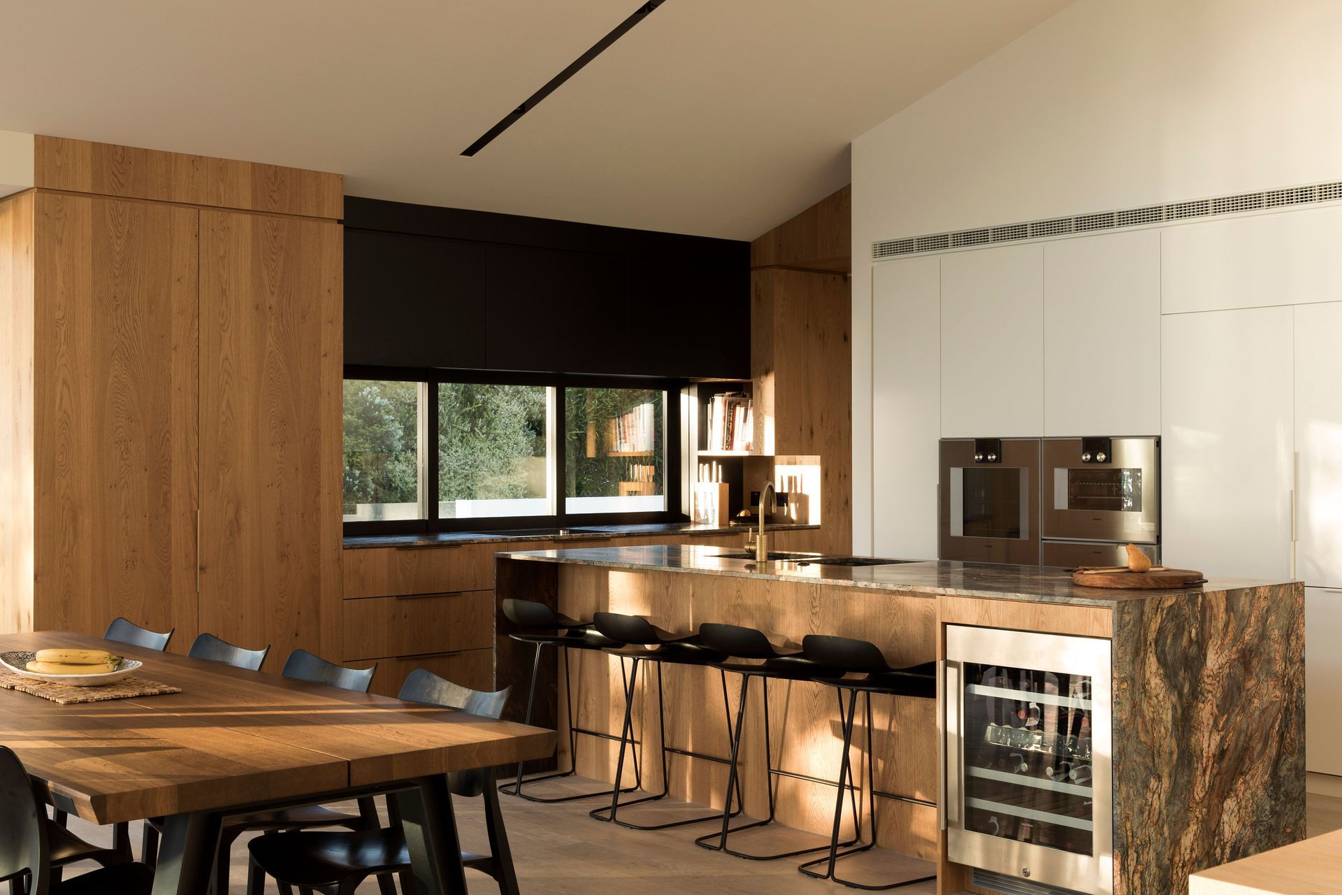
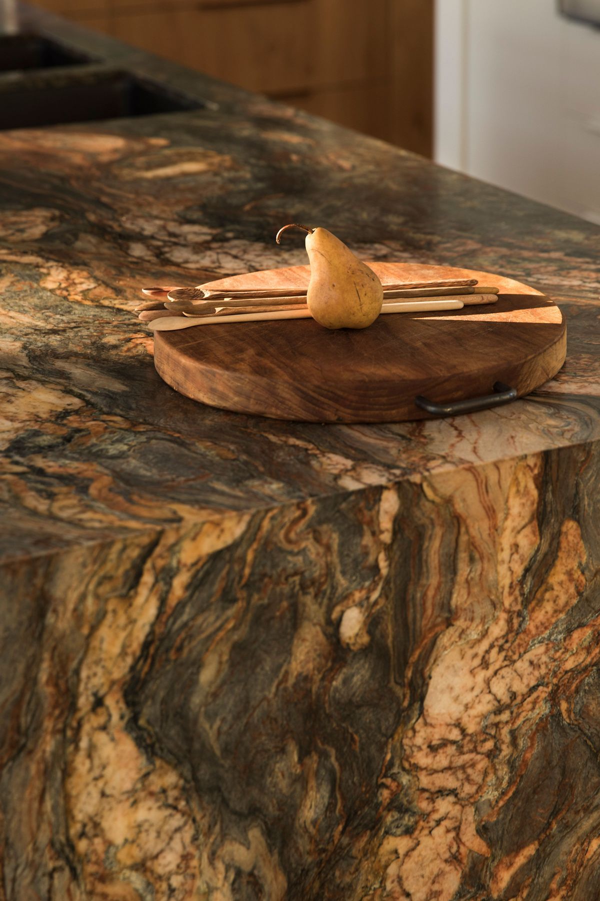
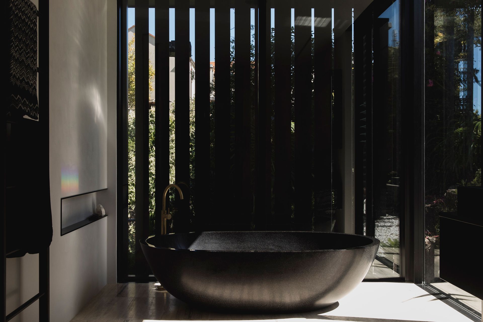
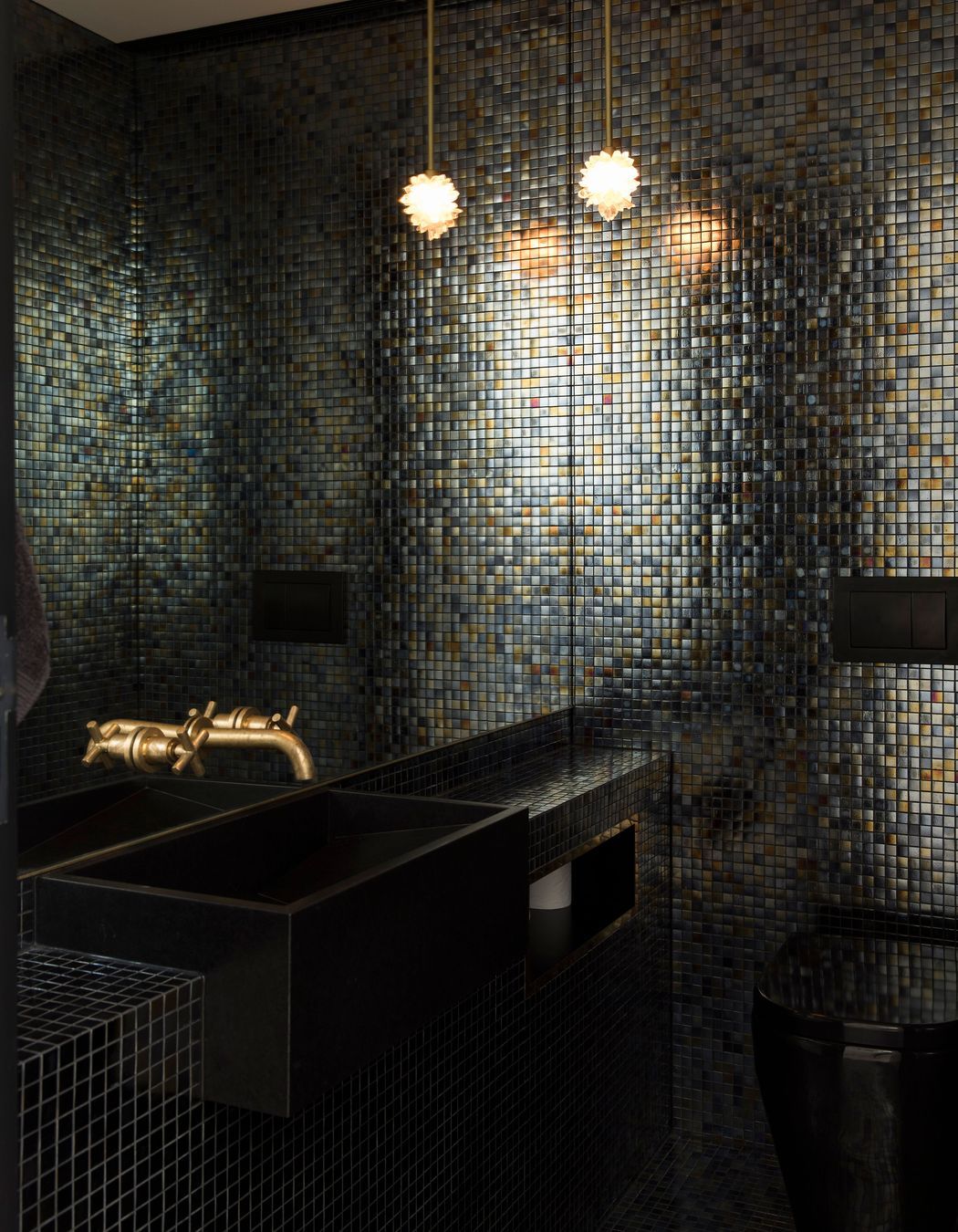
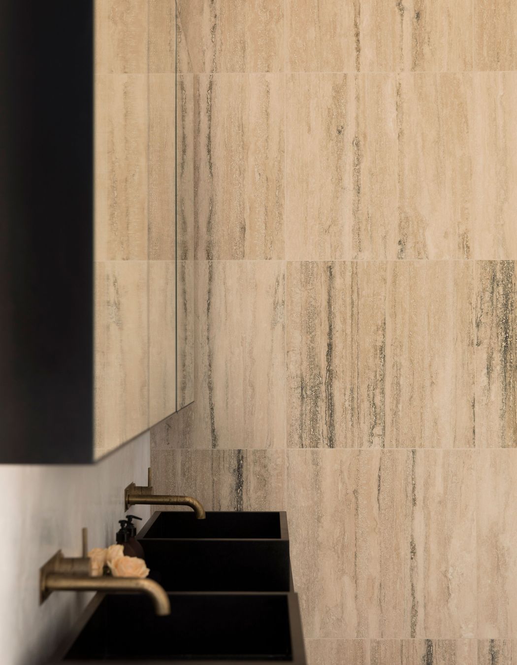
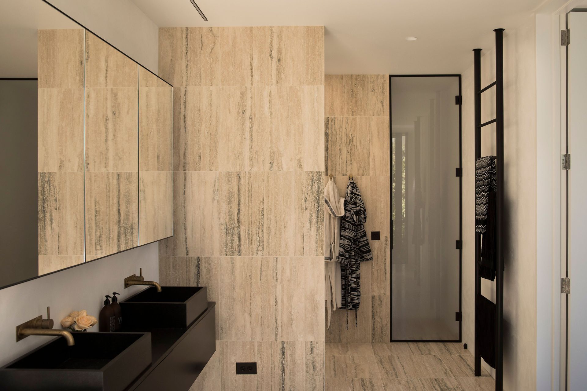
Throughout the interior, the material palette is rich in natural materials like timber, stone and brass. “We wanted shiny brass moments to come through in the design, especially in the areas that you touch – such as the door handles and light switches – as they gain a patina from repeated use over time,” explains Mike. “We were inspired by the work of Italian architect Carlo Scarpa and the overarching idea of timelessness, and quality of space, materiality and light. We used this approach in the way we went about our decision making throughout the process.”
A small-but-clever architectural detail is a long, vertical brass strip beside the entrance that conceals a security keypad in behind. “It was an element that was going to be ugly as there’s not a lot of choice on the market, so we developed a concept that creates a really lovely object. It shows how design, construction, collaboration and coordination can come together in one little piece and inform the overall house design,” suggests Mike.
Herne Bay Hideaway is a particularly special project for Mike and his business partner, architect Ben Lloyd, as it was the first project they designed together after they formed their practice. They have since designed a number of stunning projects but this one was a ‘slow incubation’, because the homeowners had a daughter amidst the design process.
Time and timelessness are prevalent themes throughout this home, which shows through in the quality and cohesion of the end result. “We like to be able to provide the client with enough materials, and the right information and tools, for them to make the best decisions for their project. After all, it’s not our house, we’re not living there, so it’s important that our clients actually become part of the whole idea of the project – then, they know how to inhabit the site.”
Words by Justine Harvey.
Photography by David Straight.
