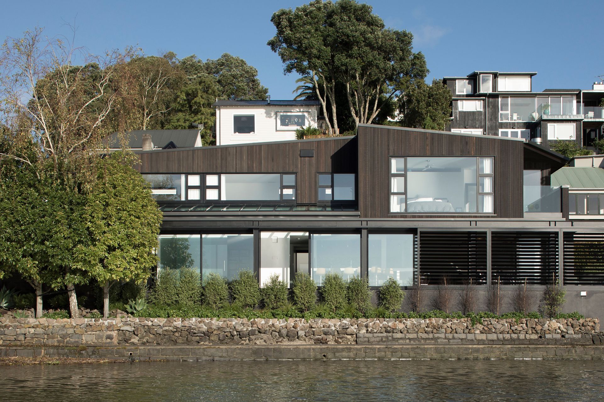
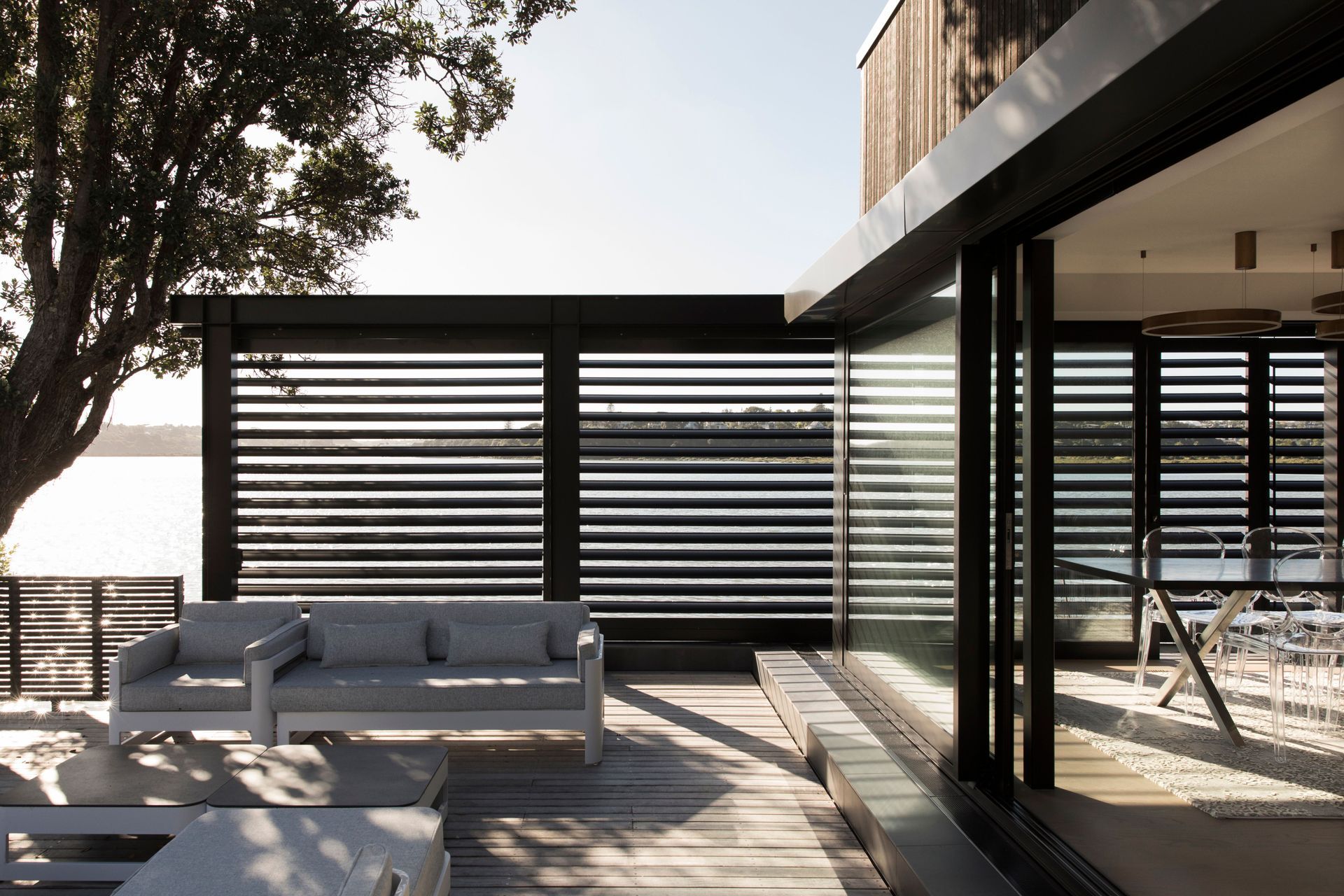
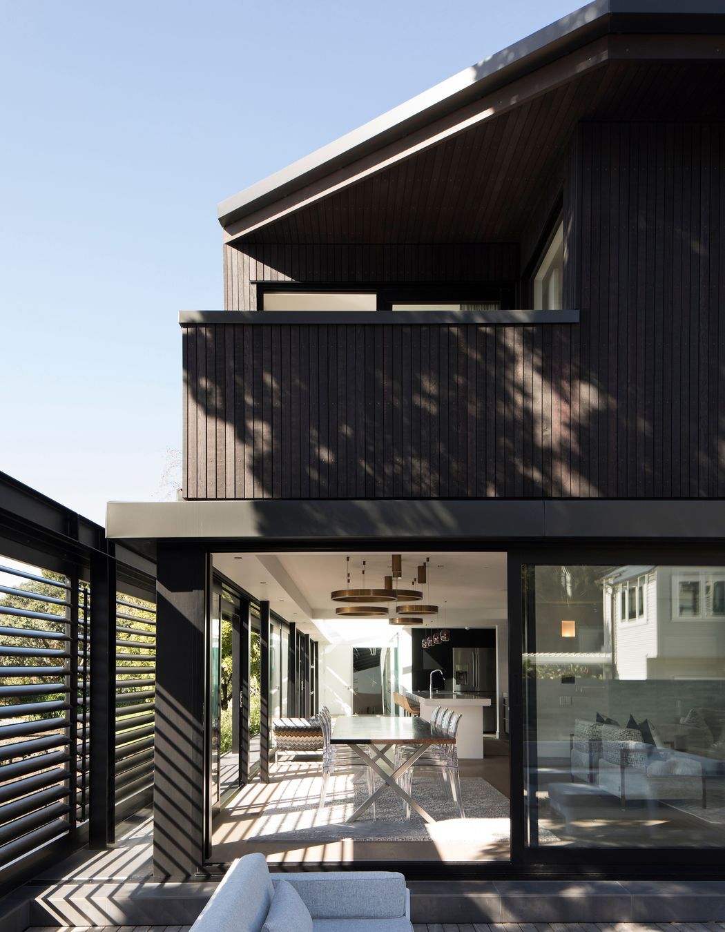
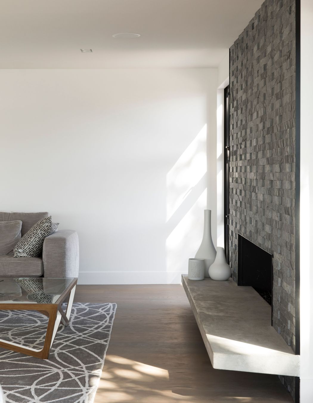
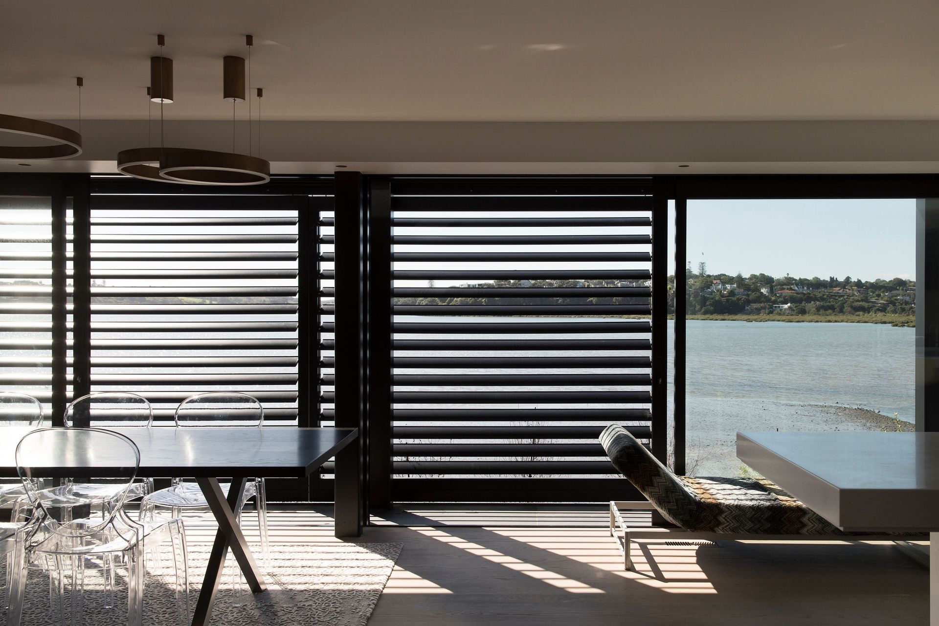
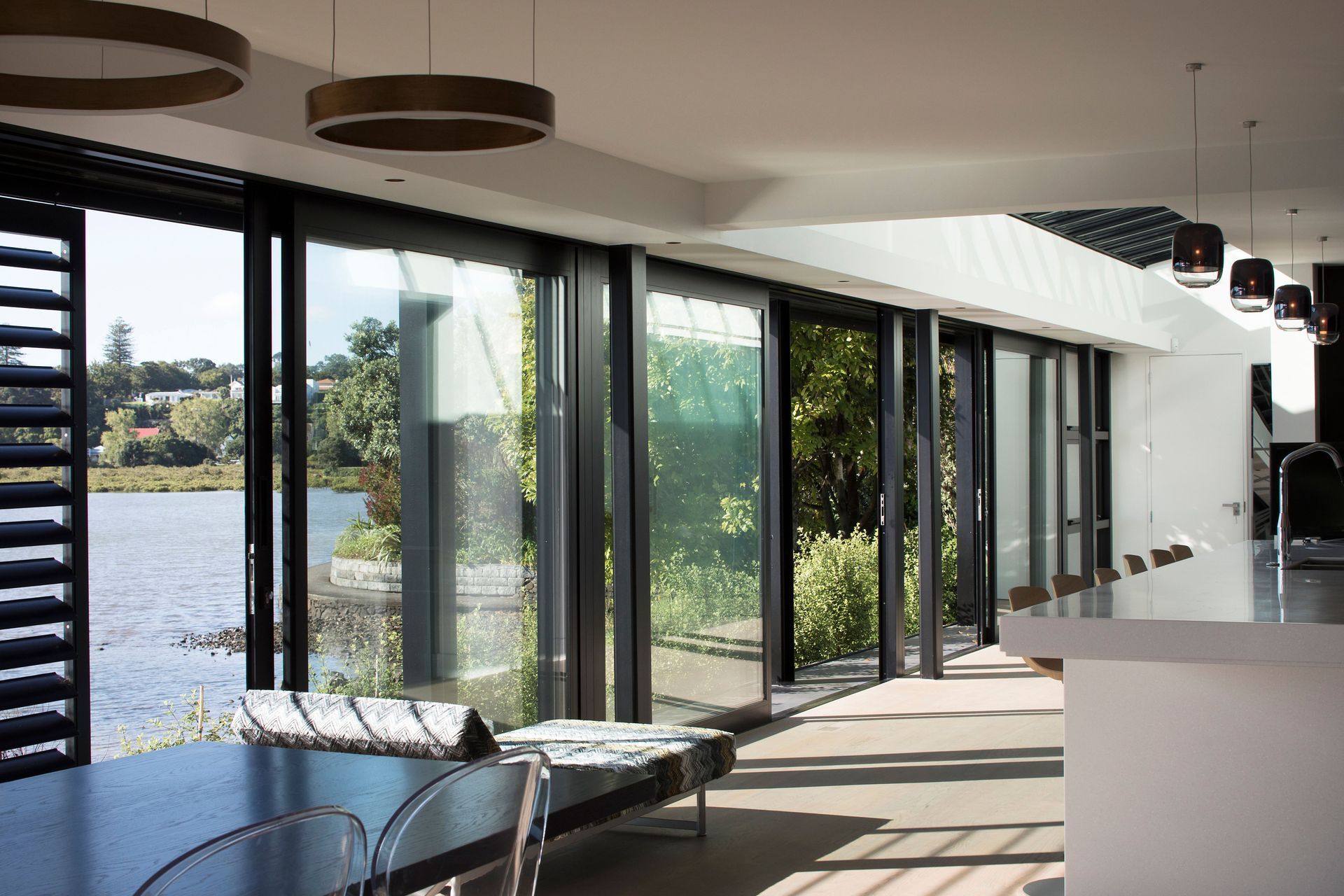
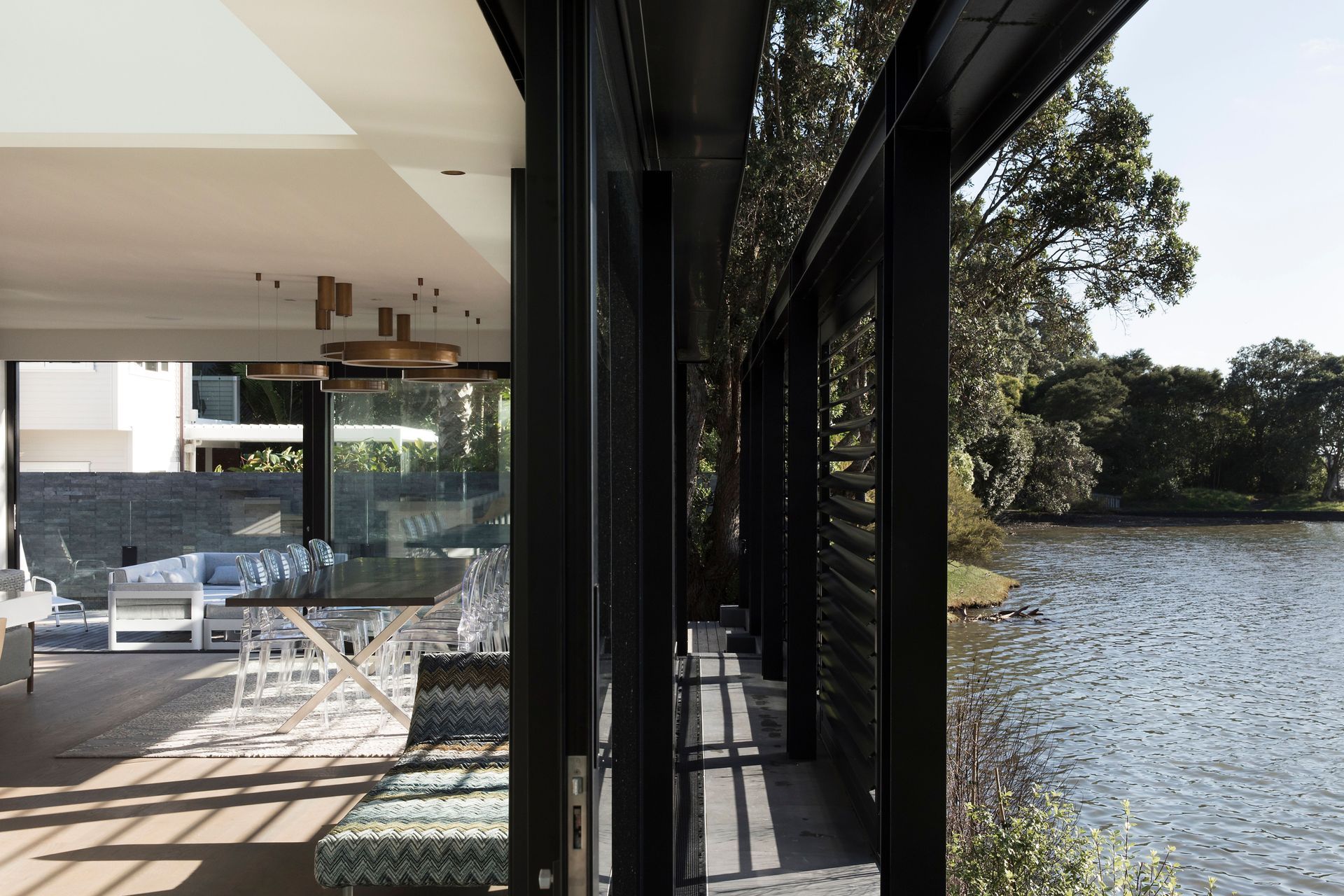
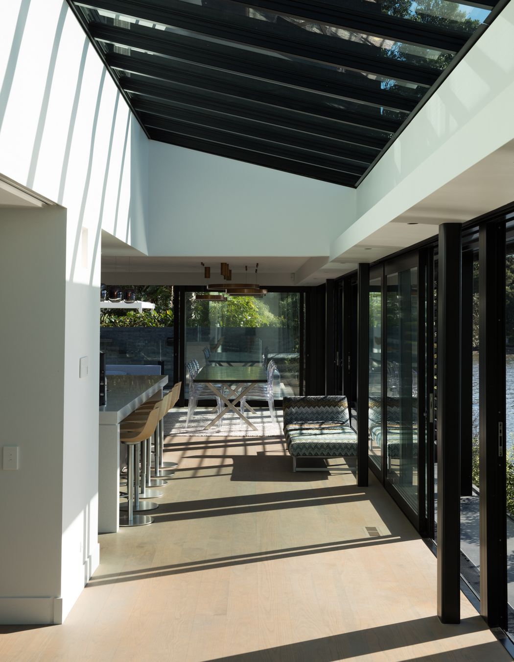
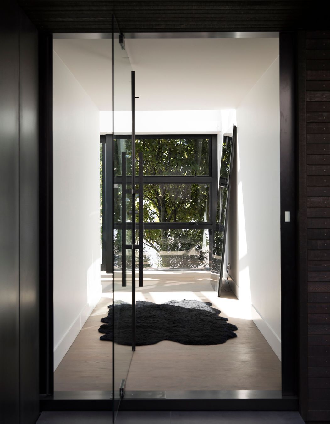
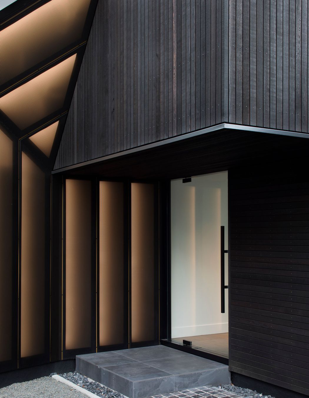
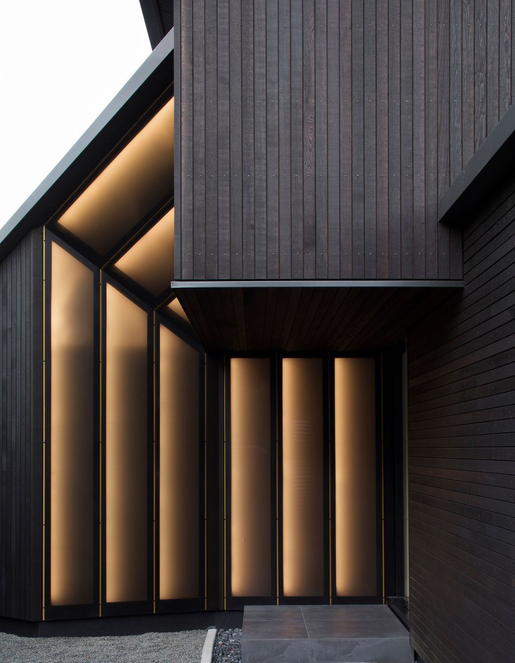
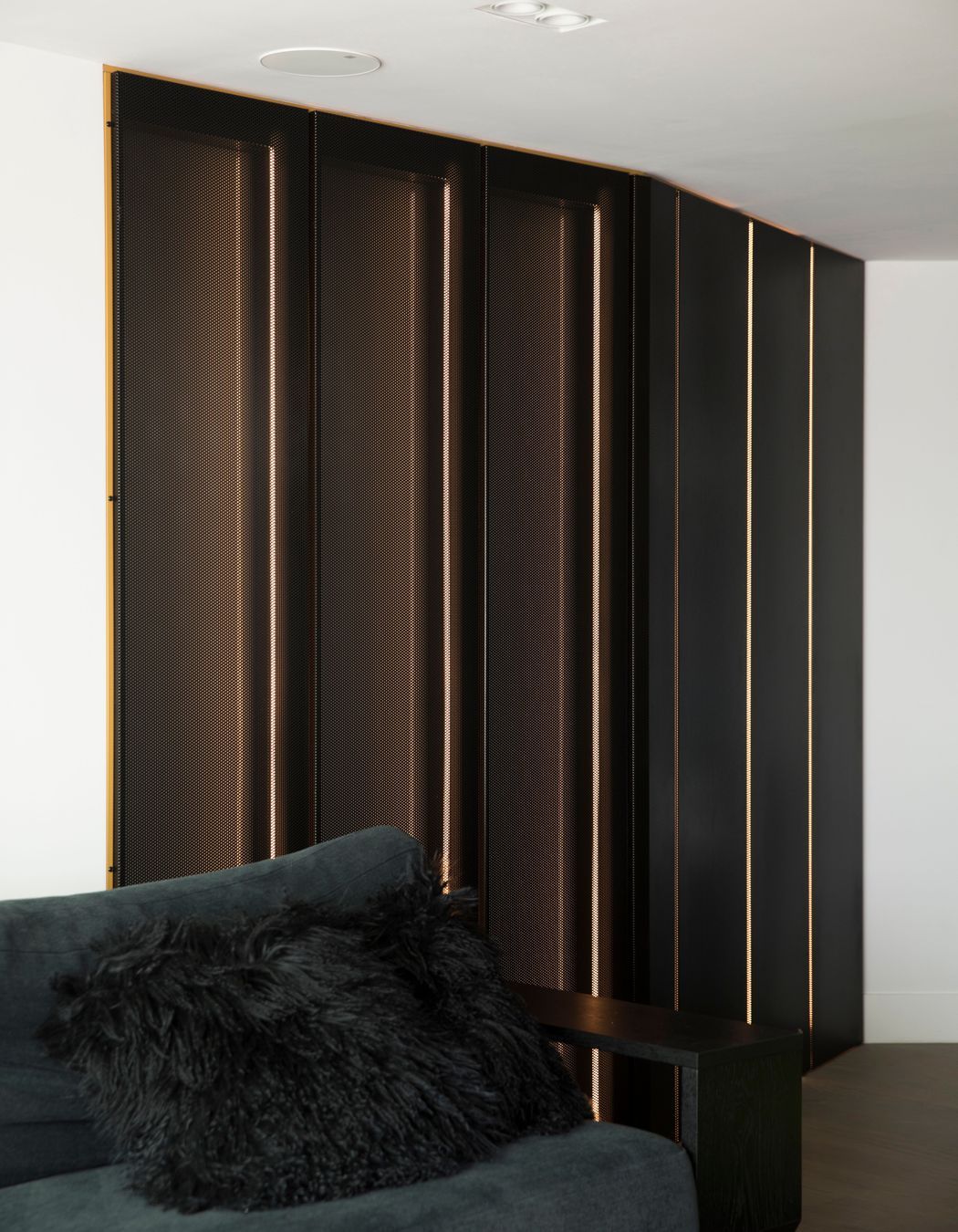
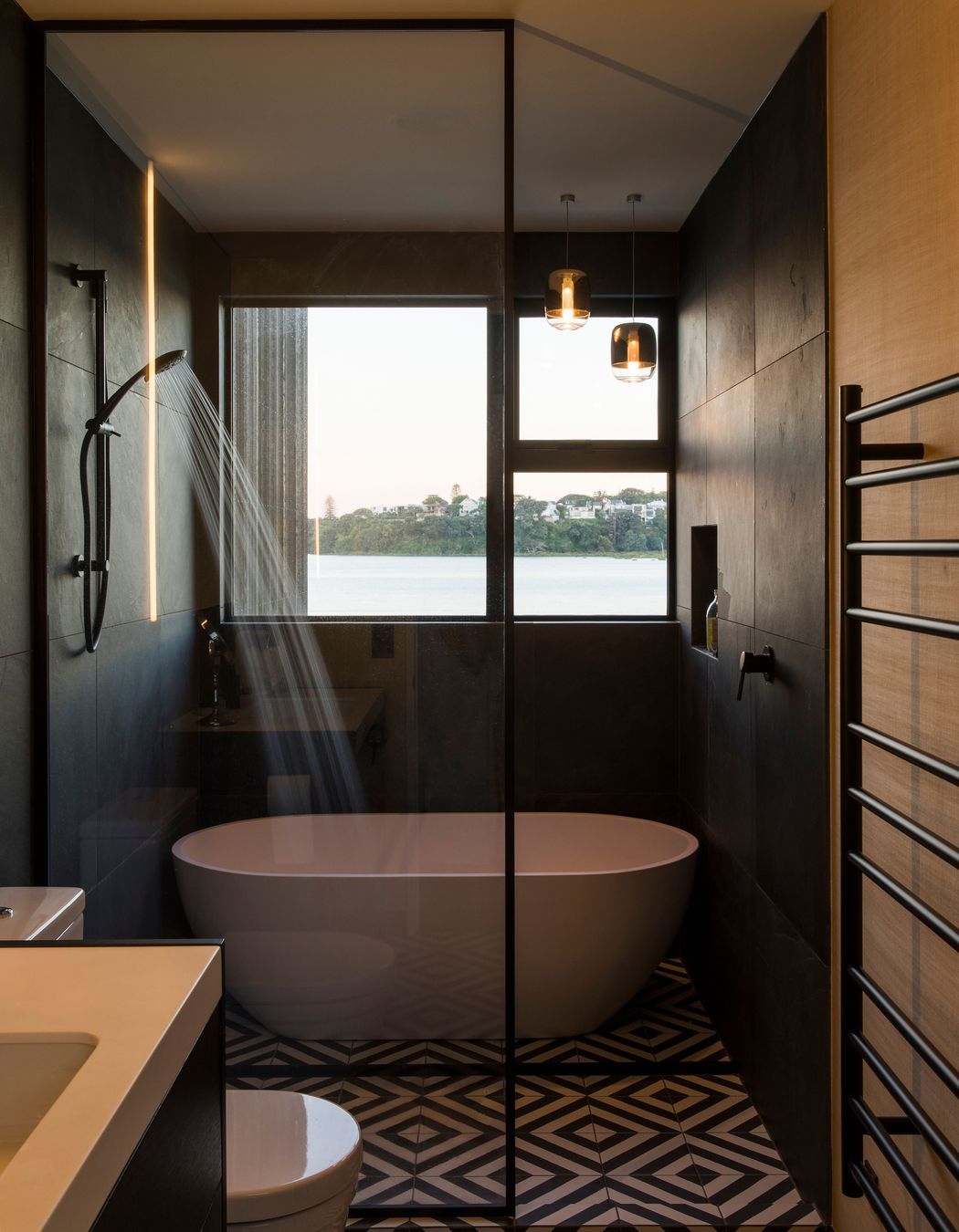
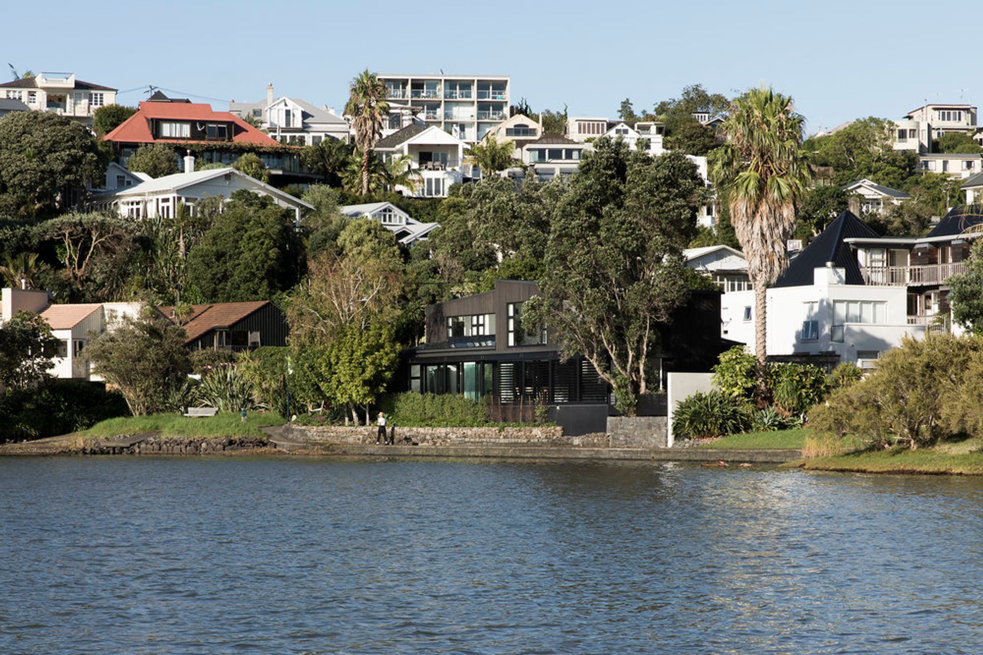
When architects Mike Hartley and Ben Lloyd of Lloyd Hartley Architects were invited to replace the cladding on a leading fashion designer's home in Parnell, they quickly realised that they would need to go beyond a simple 're-clad' and create some brand new elements. The completed waterfront home in Hobson Bay reflects the cut and details of a perfectly tailored suit.
Lloyd Hartley Architects may be a relatively new Auckland-based practice but Mike and Ben come with serious pedigree, having spent 10 years at Daniel Marshall Architects and six years at Julian Guthrie Architects, respectively.
“We feel that it’s important to not only fix the re-cladding problem but to think beyond it as well. We know people who have re-clad their homes, spent a lot of money and the work is all hidden,” remarks Mike. “They move back in and say, ‘Ahh, nothing’s changed!’ And what’s exciting about that? Our approach is to fix the problem and provide additional amenity to make it a better building to live in.”
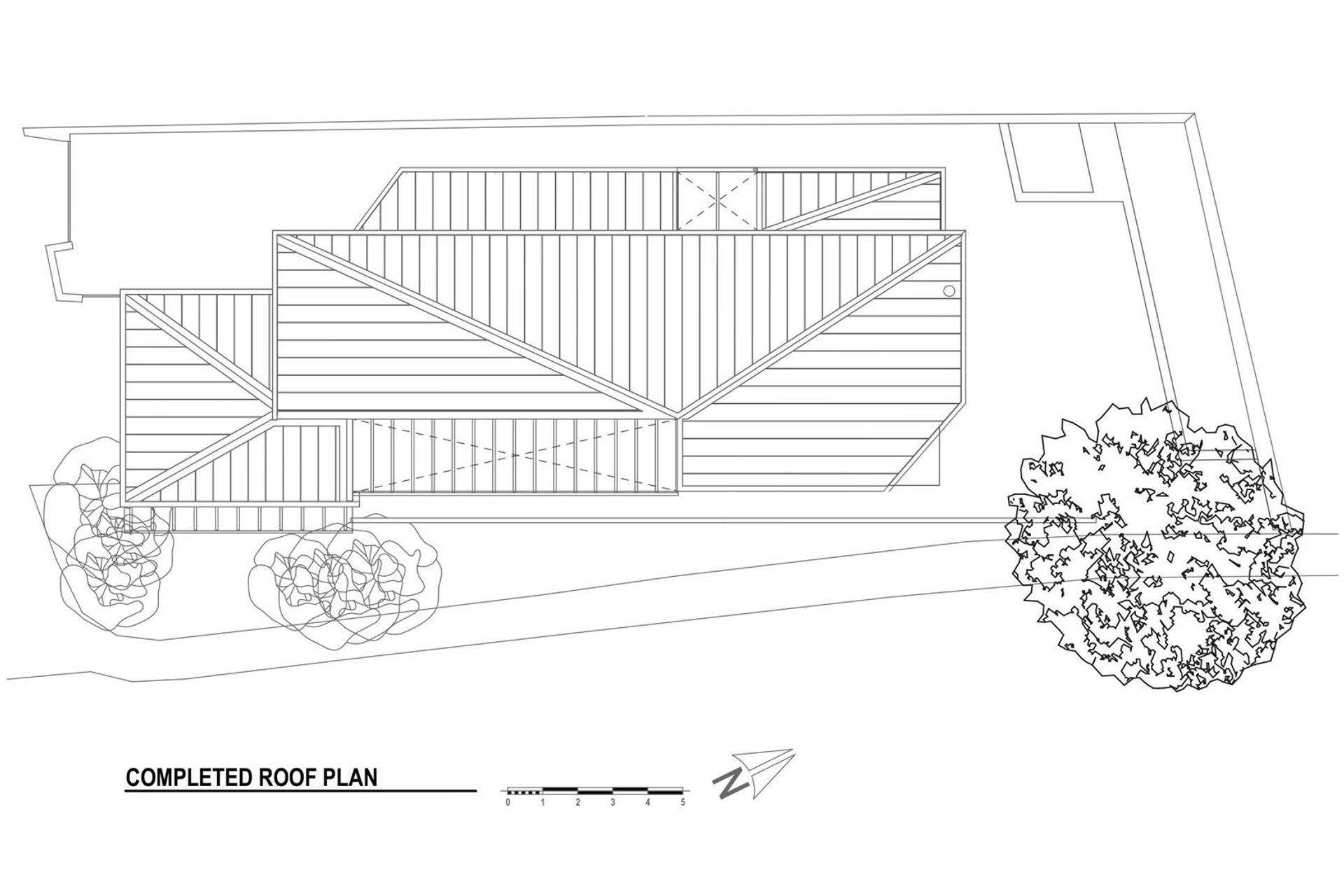
At this Hobson Bay home, as well as the issues with the performance of the existing claddings, there were multiple roof forms and a series of internal gutters that weren’t effectively keeping the house watertight. “We like to get water to the outside of a building as quickly and efficiently as possible – it’s a tried-and-tested approach that works quite well,” says Mike, dryly.
The architects and homeowners decided to change the roof forms, to add extra living space and to give the main entry more prominence from the street – to make the house more inviting to guests and from the streetscape.
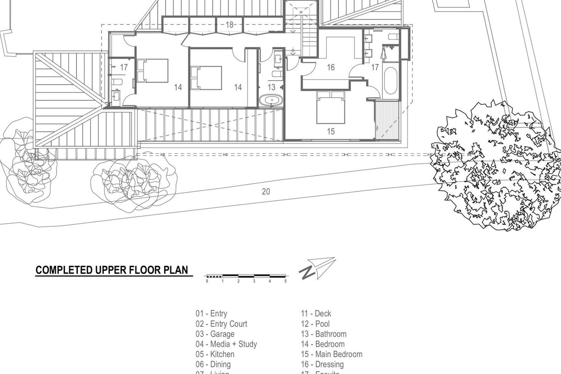
“We created additional space along the western side of the house by draping a new waterproof skin over it, which meant we could tailor the form better,” explains Mike. “Part of our development of the project was to try and intellectualise the question, ‘what is a reclad?’ Working with the fashion designer gave us the opportunity to find some resonance by thinking about the roofing and cladding as tailoring.”
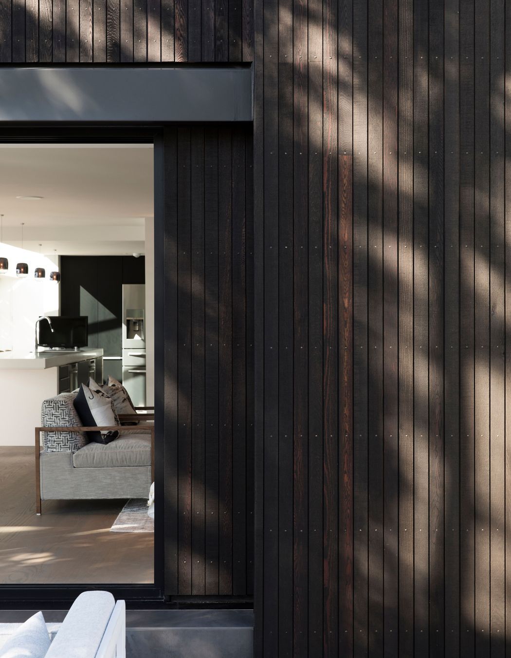
The owners were keen on black-stained cedar cladding, since cedar is the ‘go to’ timber in a coastal environment due to its strength and durability, however Mike had concerns about its use in this context. “I’m always a bit nervous about dark cedar because it needs a good maintenance program and black attracts more heat than lighter shades and, of course, heat and timber don’t love each other,” says Mike.
“So, we combined a technical approach with an aesthetic idea that the cladding is like a pinstriped suit made in a woven suited material. We chose the finest and best-looking narrow board we could find – from timber merchants Rosenfeld Kidson. Creating additional joints dealt with the expansion and contraction issues you can have with using timber cladding, and the fine grain provides the appearance of a pinstripe material.”
The re-cladding of the house also provided a great opportunity to properly insulate the home, led by Keith Trask from Serene Projects, and the electricians ended up practically rewiring the whole house.
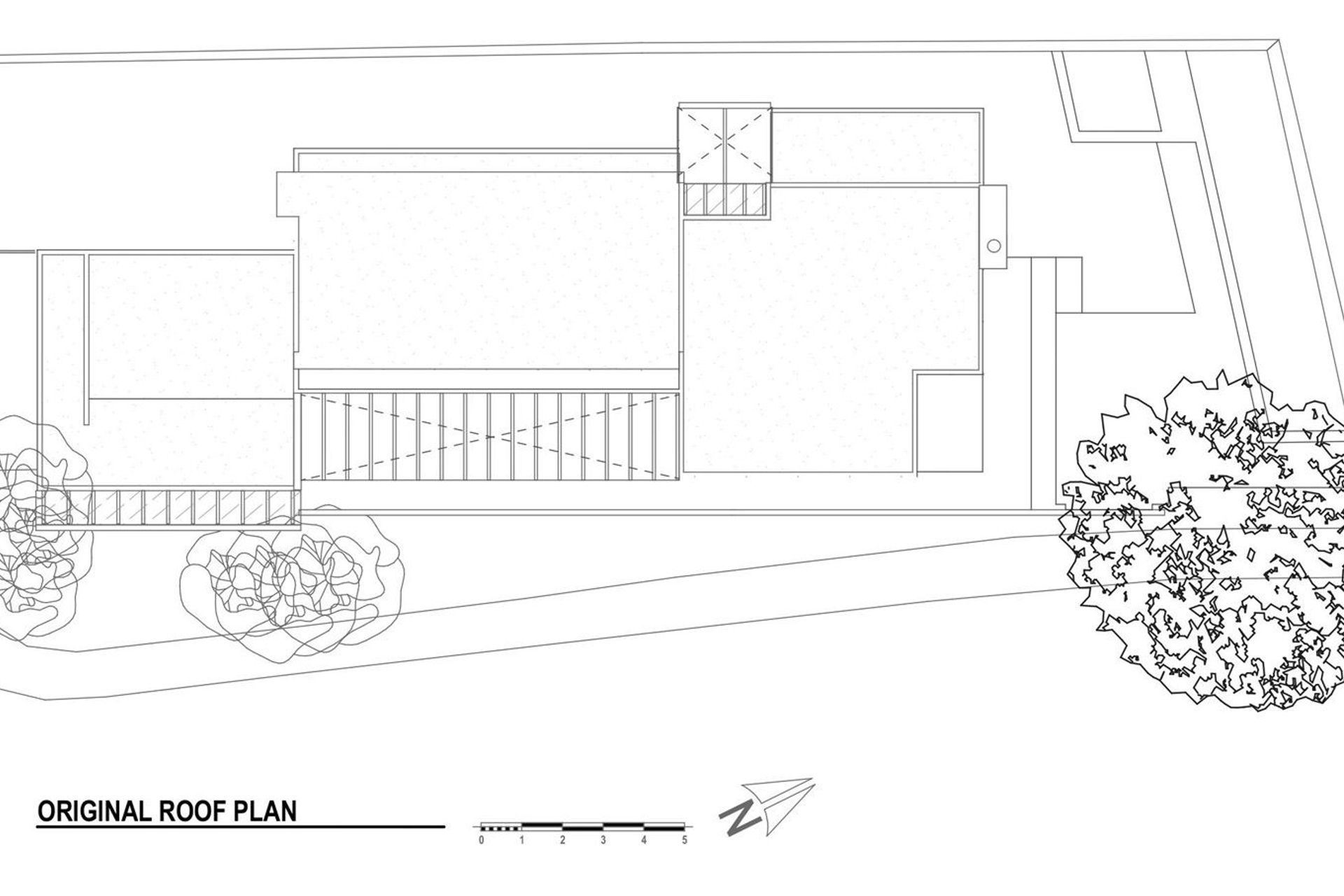
Given the previous issues in the house, it was crucial to create “the most waterproof roof out there?” suggests Mike. “We chose MDS Roofing with a Euroroof Snap Lock profile, which is a really fantastic roofing product because it acts like a skin. It uses a secret clip-fixing, which means there is no penetration – no rivets or screws – going through the actual roof so water can’t get through. It seems such a shame to install a waterproof skin and, then, you drill a load of holes through it!”
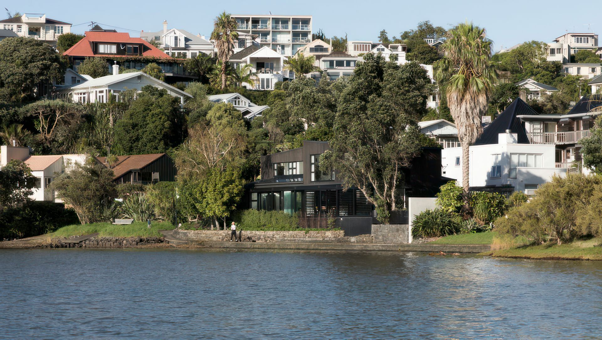
The roof became the ‘fifth’ elevation of the house and was an important design consideration because the site is positioned at the bottom of a ridge that leads down to Hobson Bay, and there are a number of houses looking down at the roof from above. The result is a tailored roof of crafted folded seams.
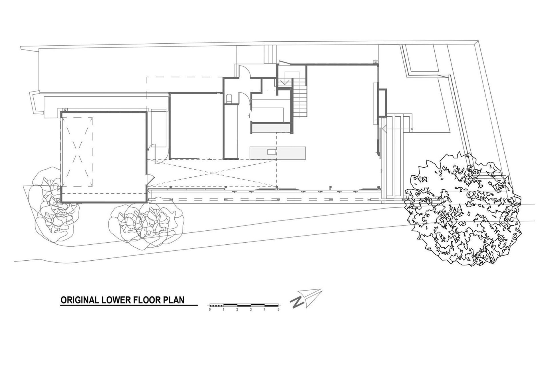
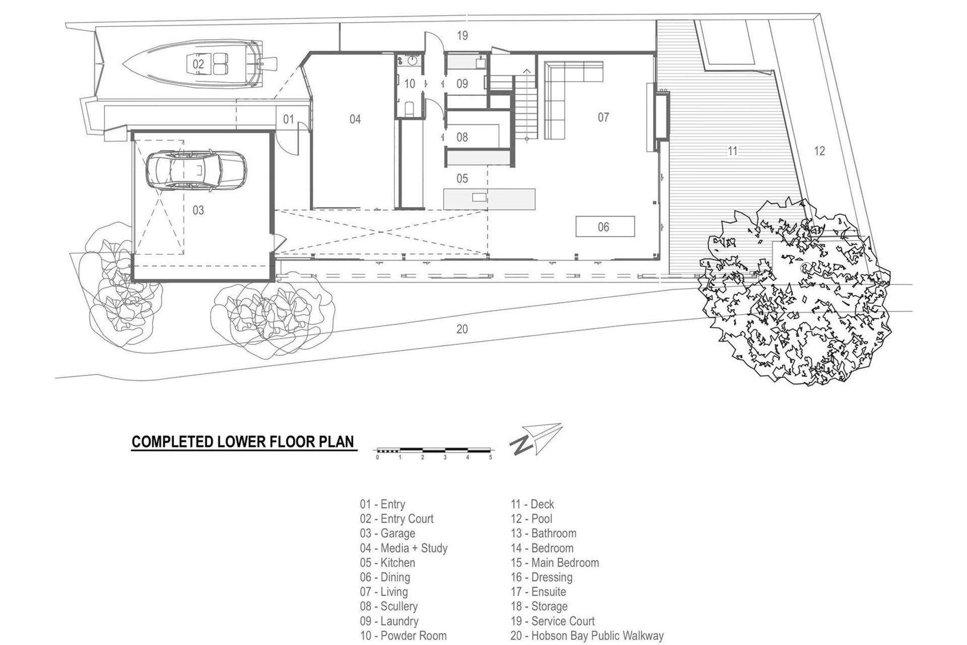
The architects added significant extra areas to the house, extending the lower-level media and study areas, along with an improved laundry and scullery. “Fashion and clothes are synonymous with this project and, with clothes, comes laundry,” says Mike. “But the original house had a townhouse-style laundry, set-up with just a sink and washing machine and nowhere to lay things out or to do ironing, so we added a decent-sized laundry with linen cupboards and so on.”
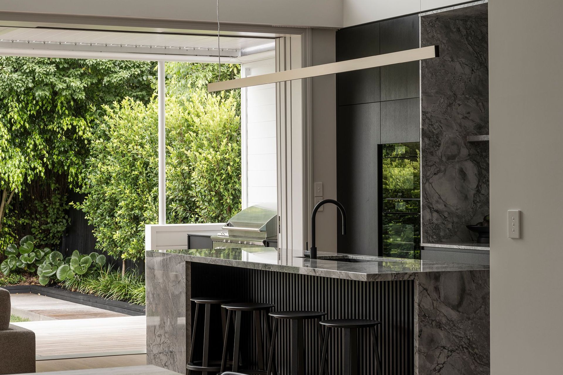
An additional area was created for people coming to stay and a new scullery to hide the detritus of cooking up a storm while hosting events. An existing Poggenpohl kitchen was reconditioned by the kitchen manufacturers and the client to tie in with the overall makeover.
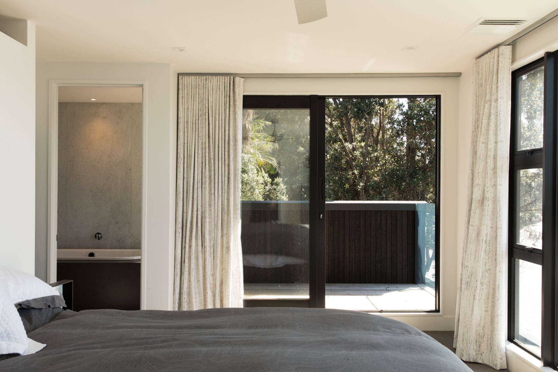
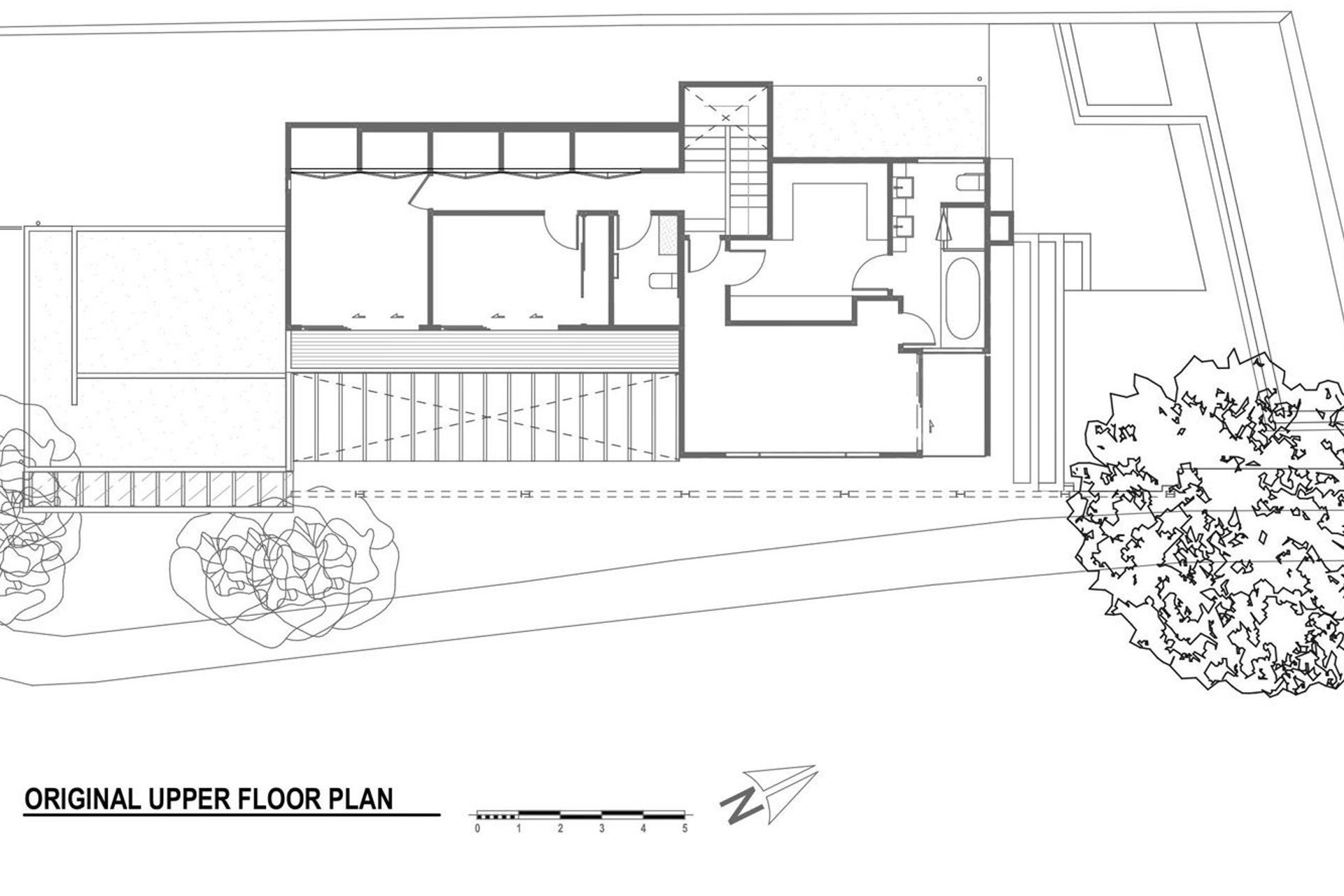
Upstairs, the bedrooms were pushed out into an existing 900mm-wide deck that was essentially unusable, and an en suite was added to the guest bedroom.
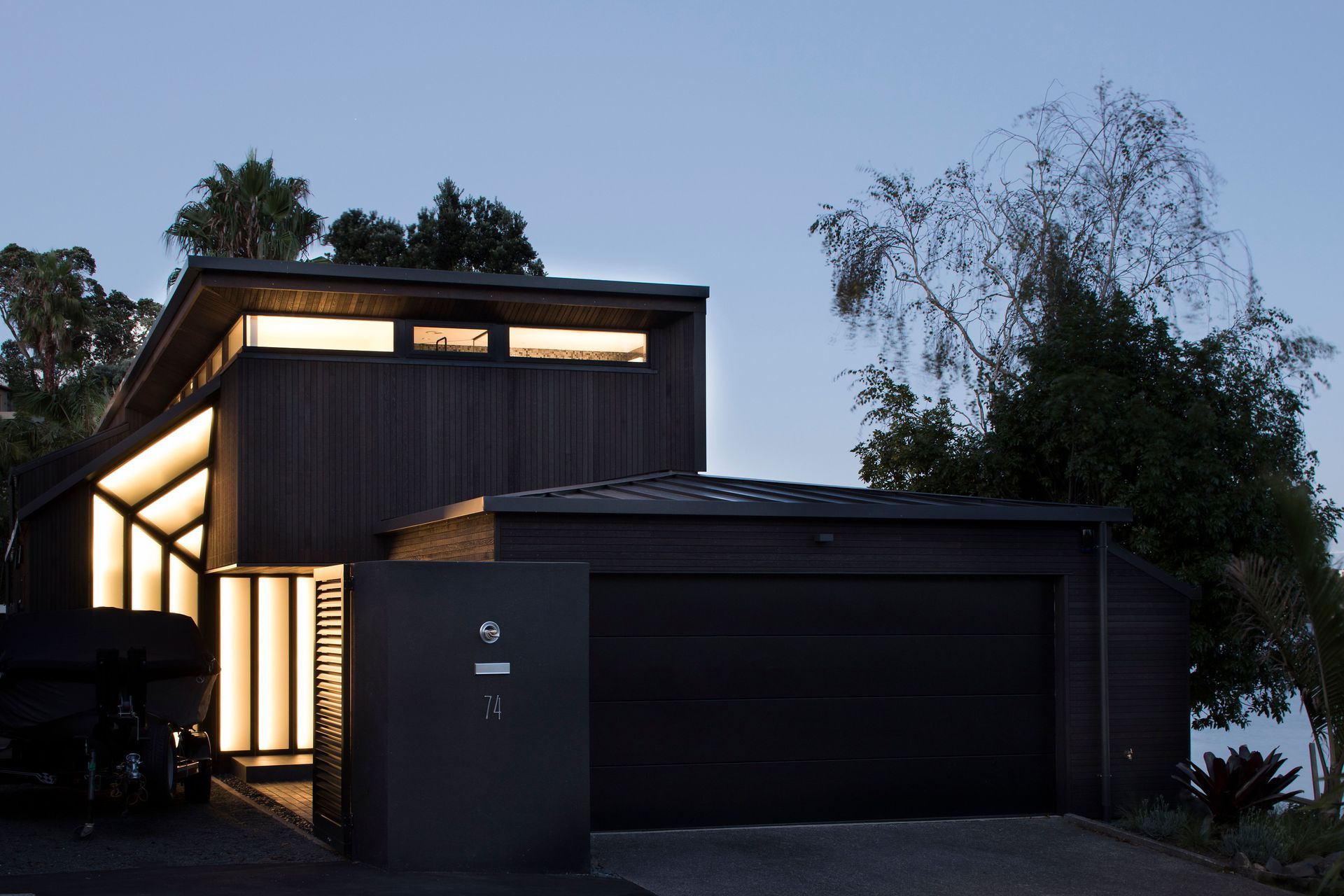
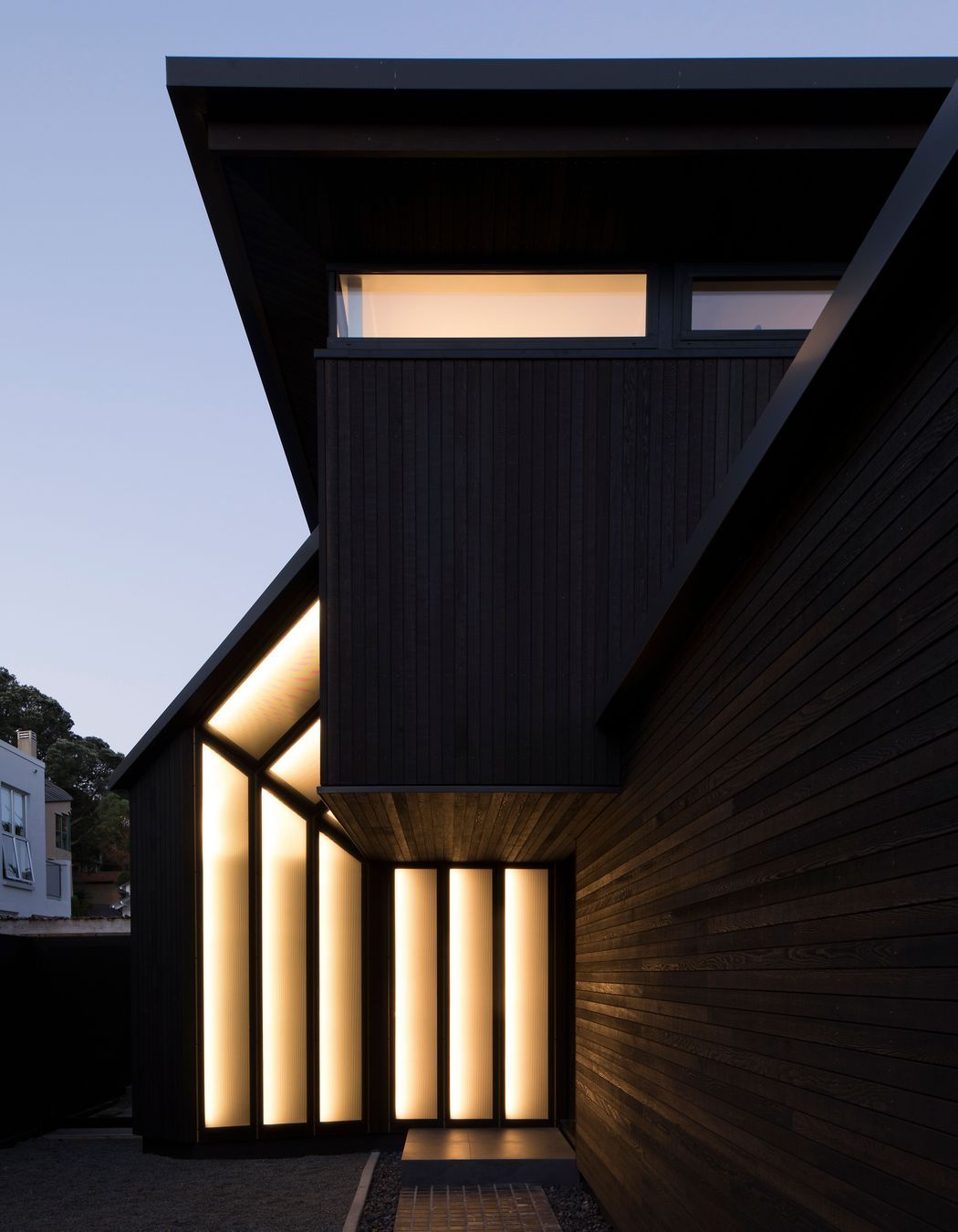
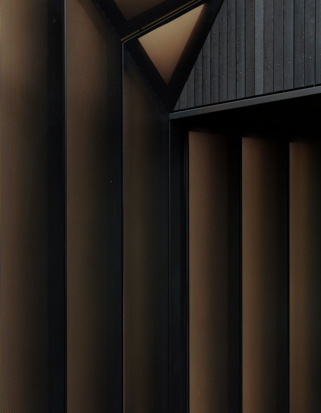
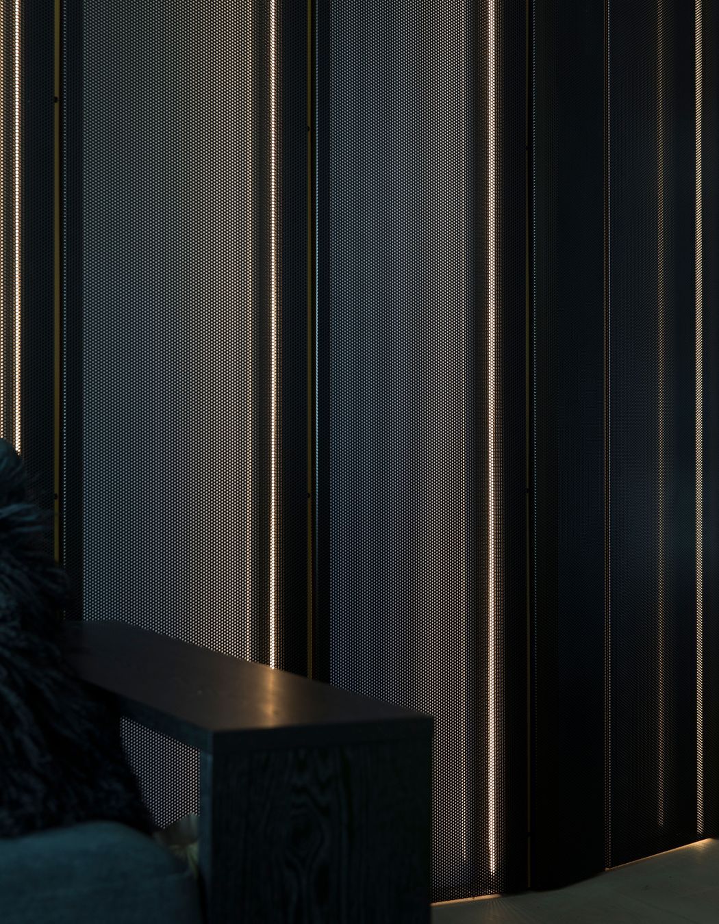
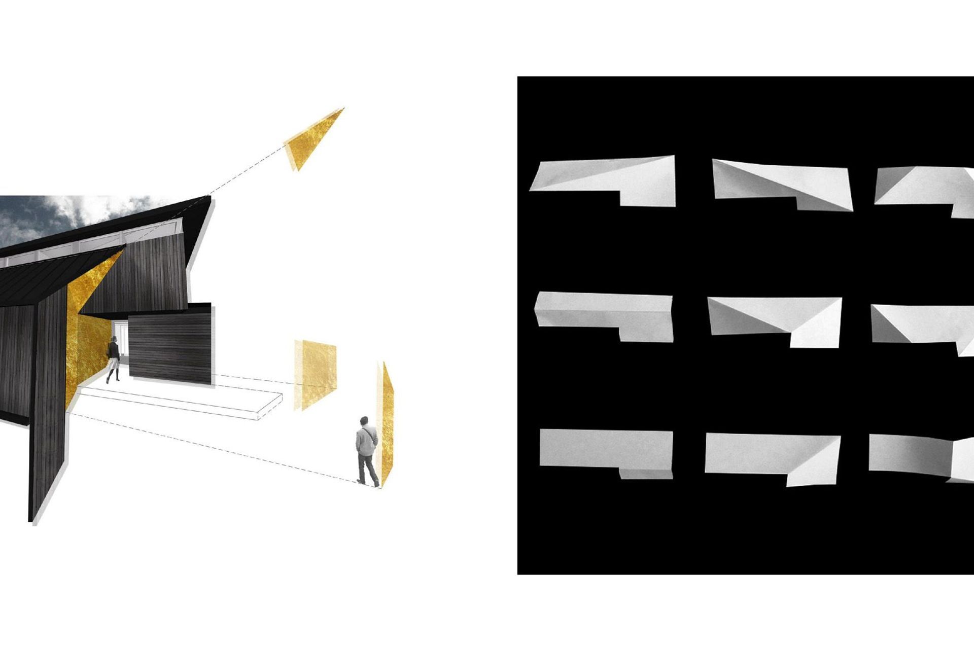
The entry area also needed to be reworked. “In one of our initial meetings, we presented a physical model showing the key design moves but we hadn’t completely resolved the entry, which led the owner to comment that it looked like a ‘fat bum’,” remarks Mike. “This prodded us to throw our energies into the idea of a double or French cuff made in fine dress shirting, with folded mesh forms that are backlit to give the house a refined prominence from the street.”
“You can’t actually see the front door from the street, so we wanted to indicate the front door and to make the garage door less dominant. We worked hard to focus less on the vehicular and more on the pedestrian, to explore where people are coming from and how they arrive at the house, and lighting helps to distinguish the entrance.”
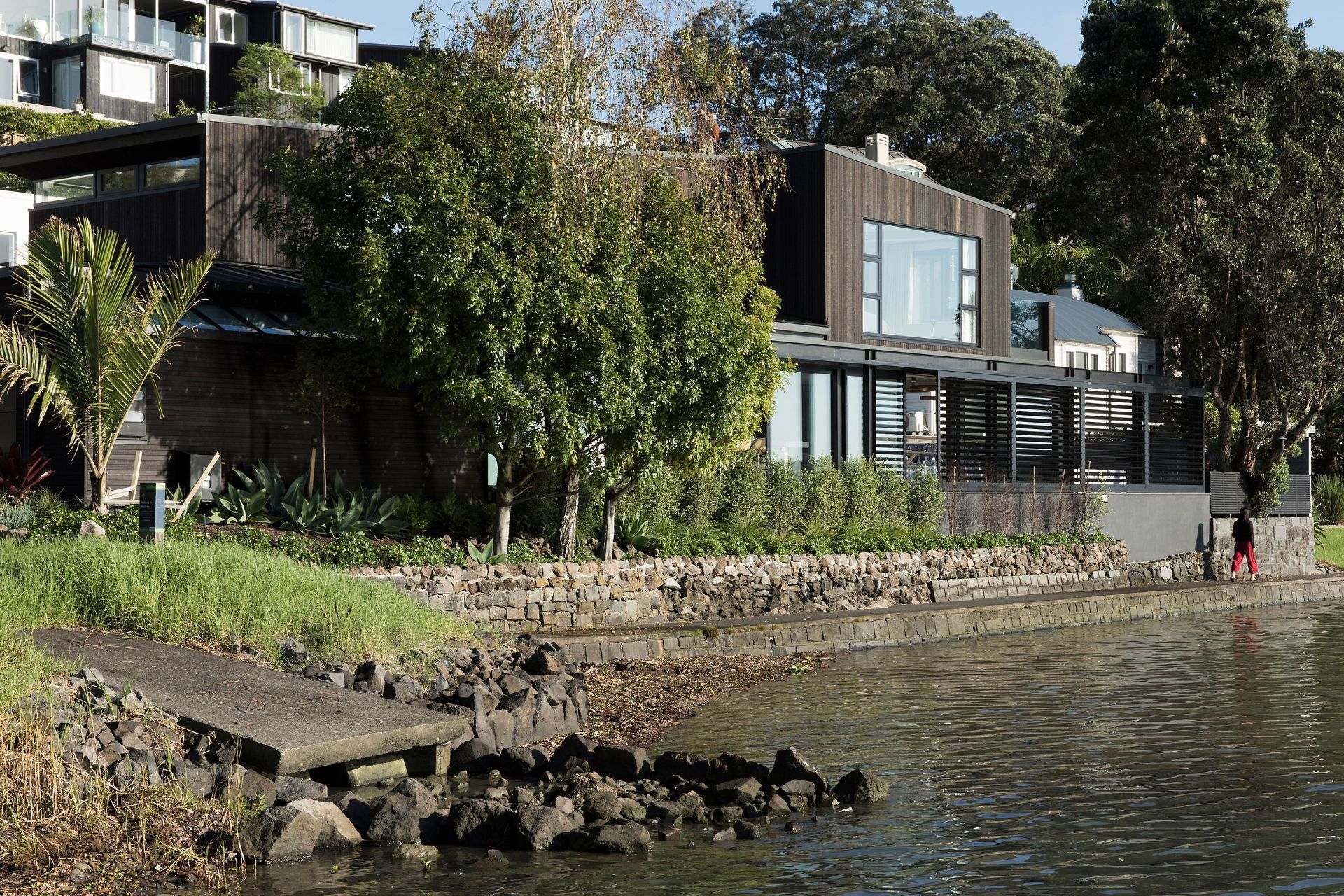
In context, the house can be seen from the street, but it can also be viewed from the bay and from a waterfront walkway that runs right beside the house. “Since the unveiling and removal of the shrinkwrap and scaffolding, we have visited the project and received a number of very positive comments from people walking by the house,” says Mike. “It was a truly lovely moment for us to see the owners
revel in the resulting sculptural presence of their new suit.”
Words by Justine Harvey.
Photography by David Straight.
