About
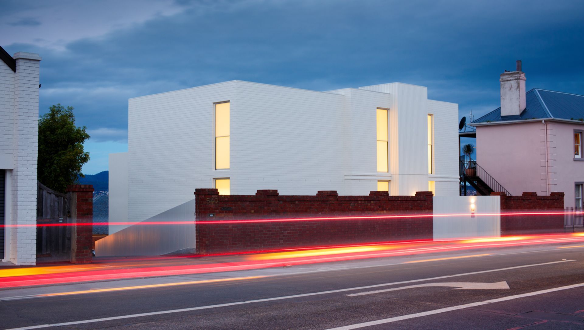
Lipscombe House.
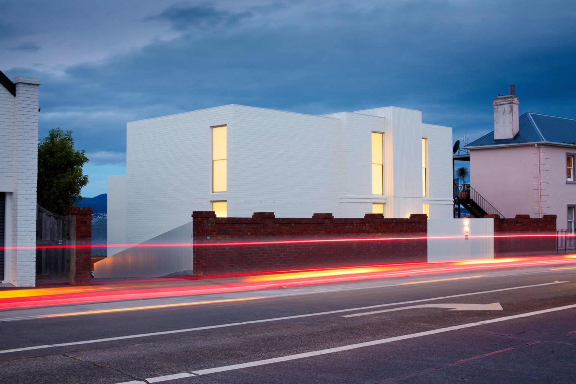
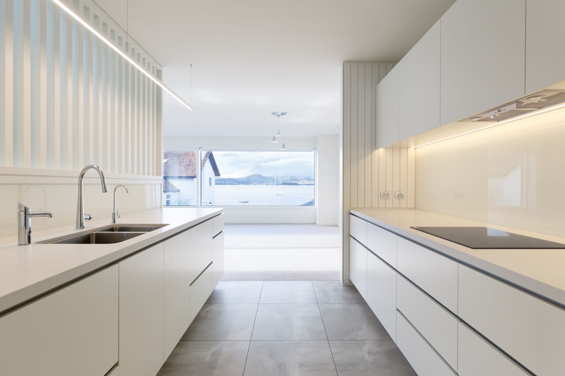
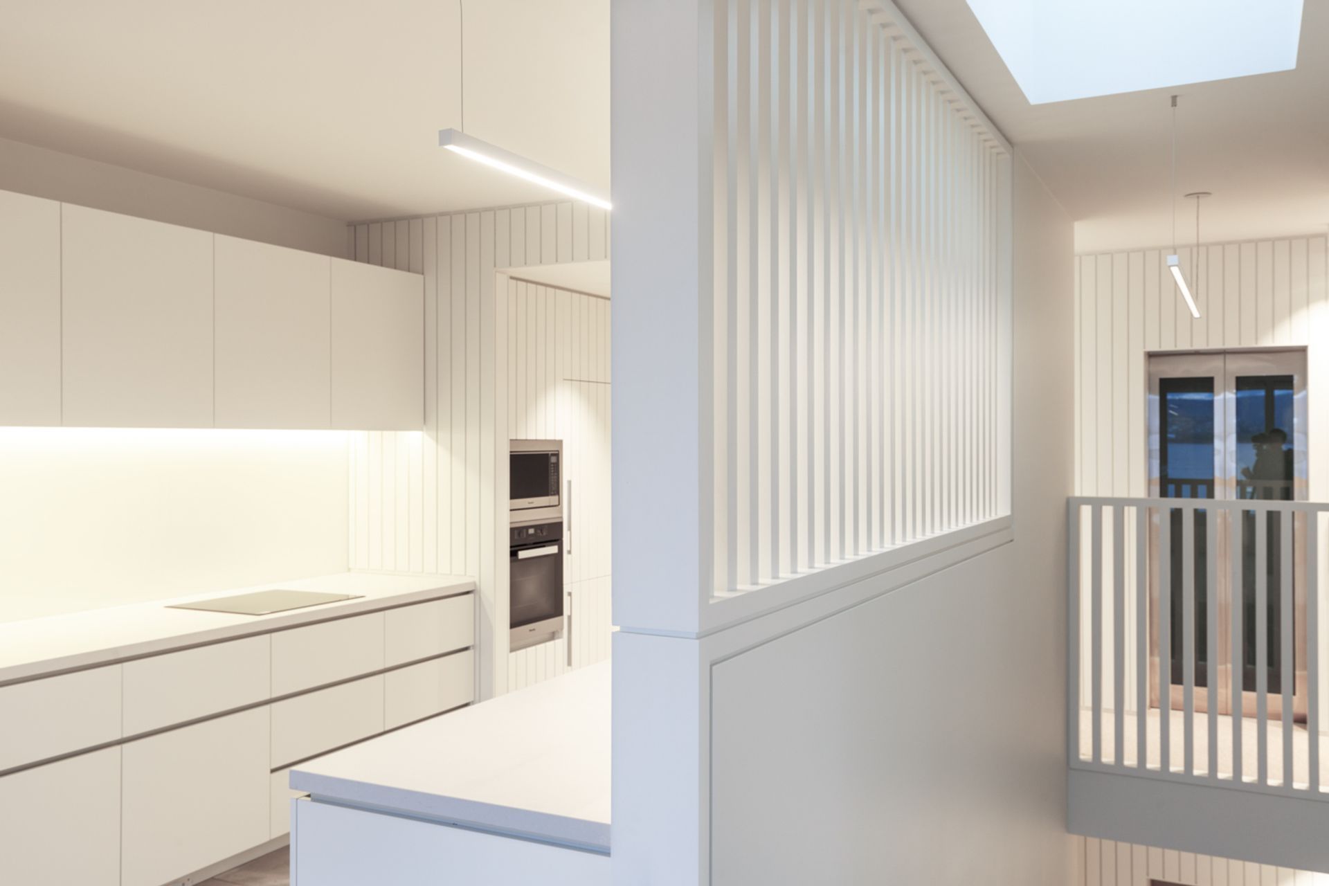
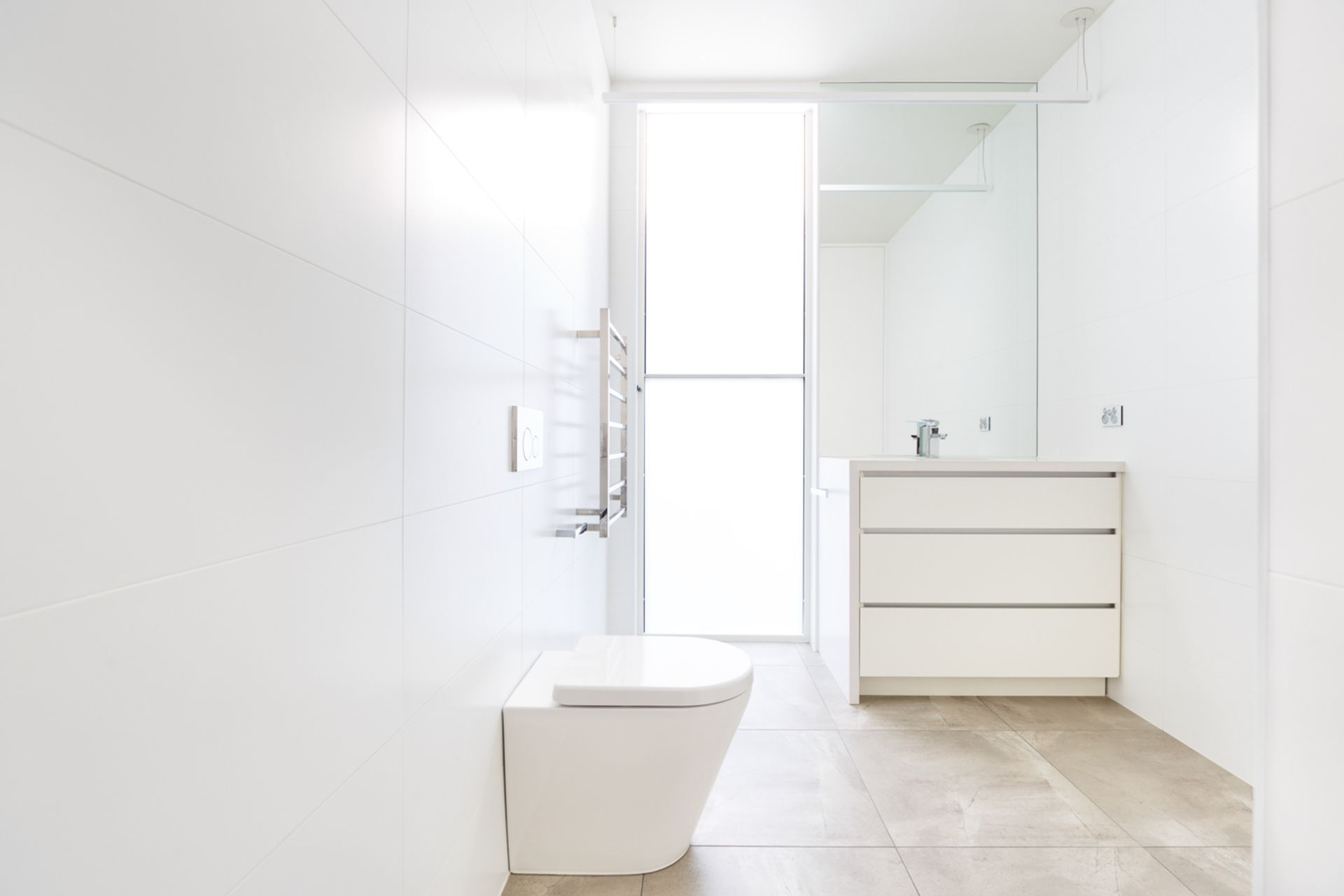
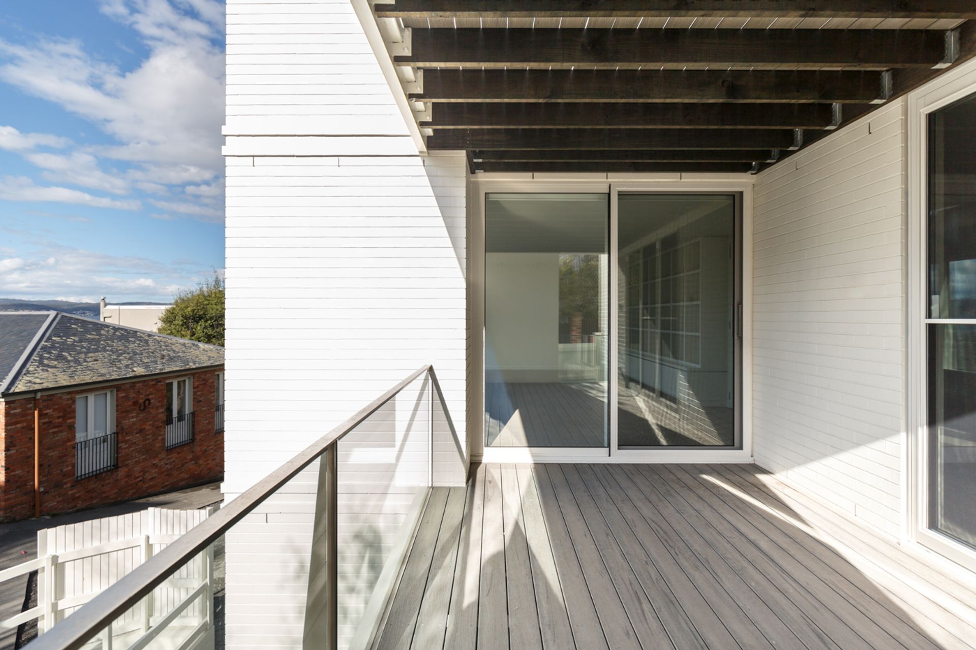
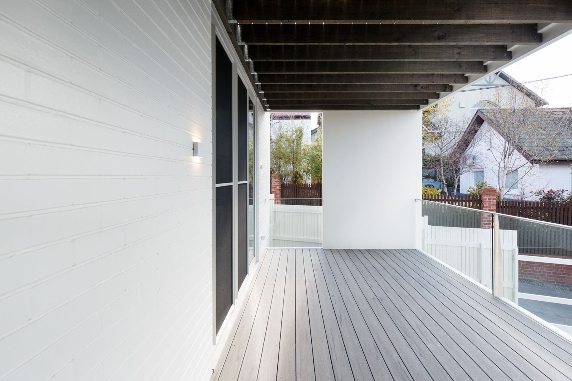
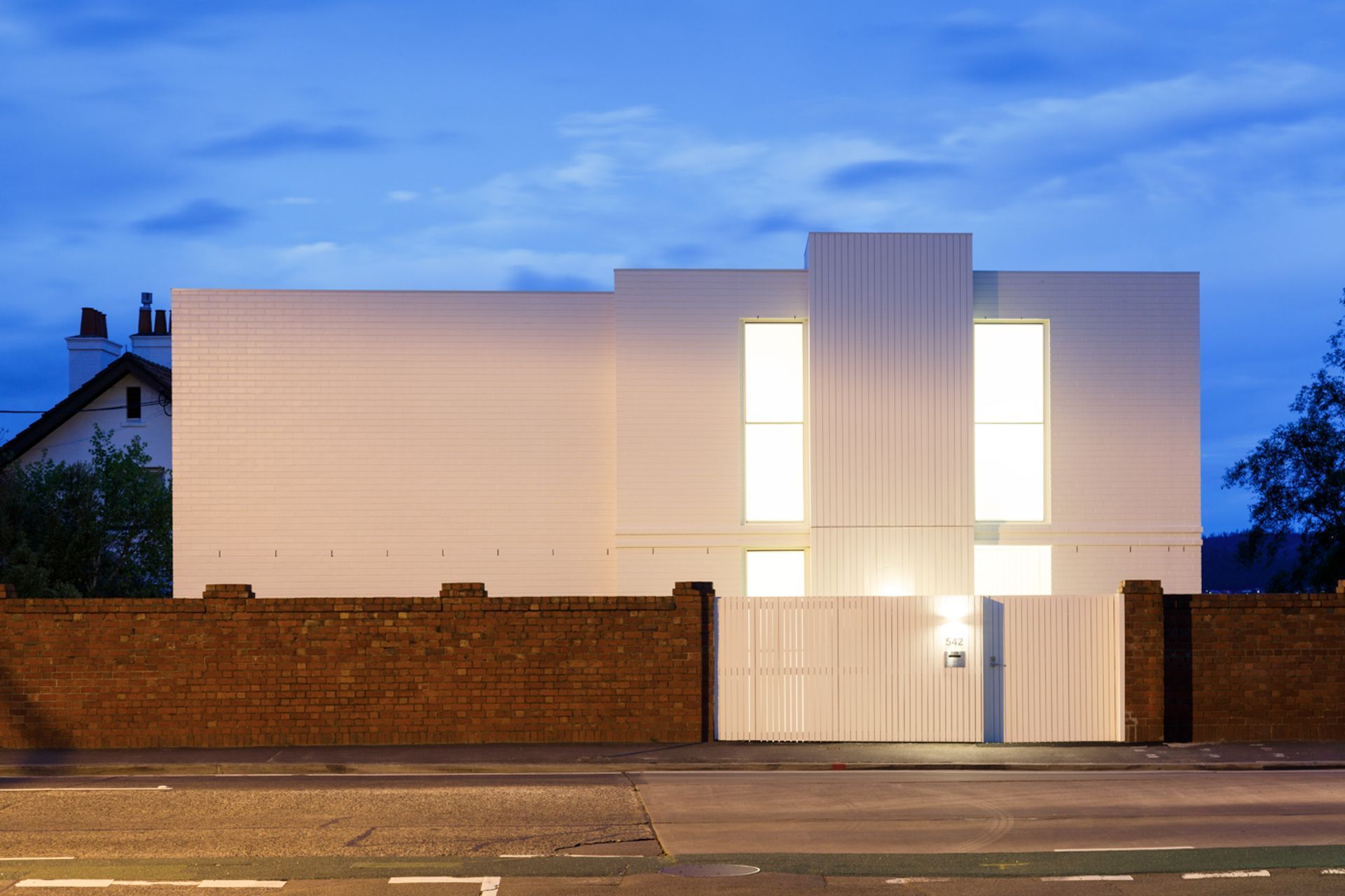
ArchiPro Project Summary - A contemporary three-level residence in Sandy Bay, designed for accessibility and independence, seamlessly integrating with traditional surroundings while featuring a striking external lift and elegant vertical timber cladding.
- Title:
- Lipscombe House
- Architect:
- Studio Ilk
- Category:
- Residential/
- New Builds
Project Gallery
Views and Engagement

Studio Ilk. Studio Ilk takes an inclusive and collaborative approach to design. We listen deeply to produce truly unique responses to each project, site and client. Adapting not only to the intricacies of each new site, but also seeking to understand the people behind the brief.We continually evolve the way we work, informed by people, place and the greater societal context in which we practice, always seeking to respect and foster local values and craftsmanship, so that the result is functional and enduring solutions that enrich daily life for our clients, whether residential or commercial.
Year Joined
2022
Established presence on ArchiPro.
Projects Listed
28
A portfolio of work to explore.
Studio Ilk.
Profile
Projects
Contact
Other People also viewed
Why ArchiPro?
No more endless searching -
Everything you need, all in one place.Real projects, real experts -
Work with vetted architects, designers, and suppliers.Designed for New Zealand -
Projects, products, and professionals that meet local standards.From inspiration to reality -
Find your style and connect with the experts behind it.Start your Project
Start you project with a free account to unlock features designed to help you simplify your building project.
Learn MoreBecome a Pro
Showcase your business on ArchiPro and join industry leading brands showcasing their products and expertise.
Learn More