Office Fit out – Commercial, three levels
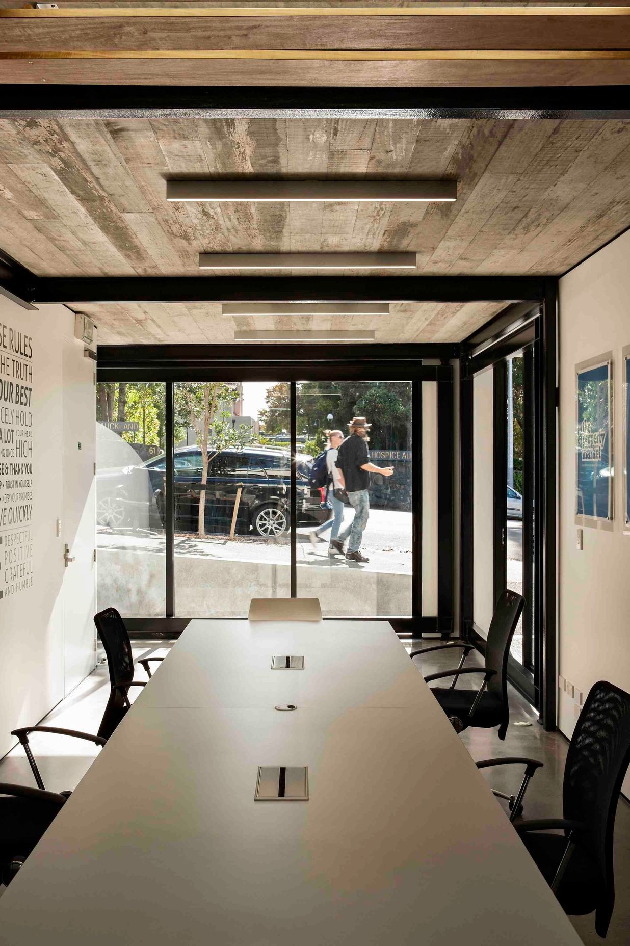
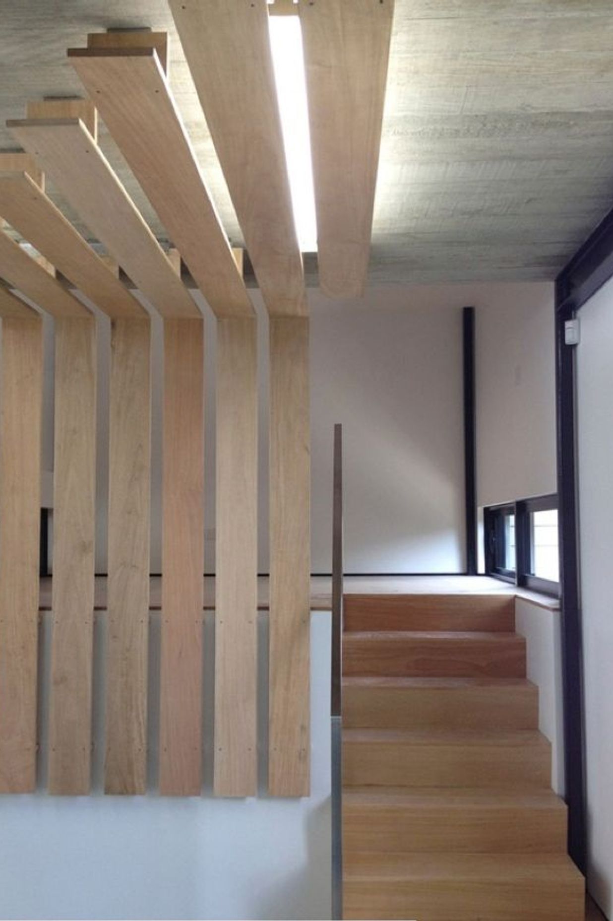
All the basics were there with the new build shell; however, the spaces needed definition and flexibility. The main restriction with defining the internal areas was the scale. The three floor plates were around 70m2 each with some interesting level changes due to the carriageway running through the building. We needed acoustic treatment, privacy for meetings, a staff kitchen, and a small snug for stay-overs if required (one of our staff members lives a good hour-and-a-half’s drive away… and likes beer).
The fundamental/underlying focus of the design was to generate a space that fostered creativity and productivity, promoted mental and physical health, encouraged teamwork and social well-being, and fostered a micro-community between (a) building levels, and (b) building occupants and the outside world. The luxuries came with the material selections… and the vinyl collection.
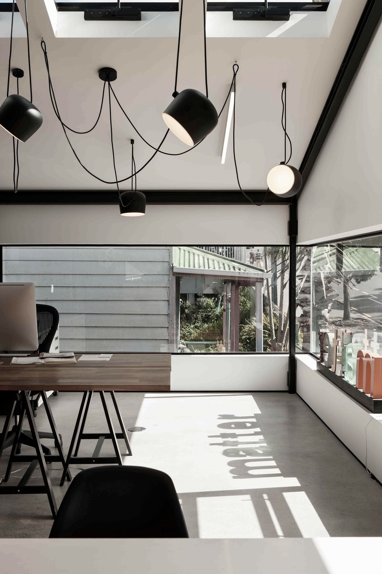
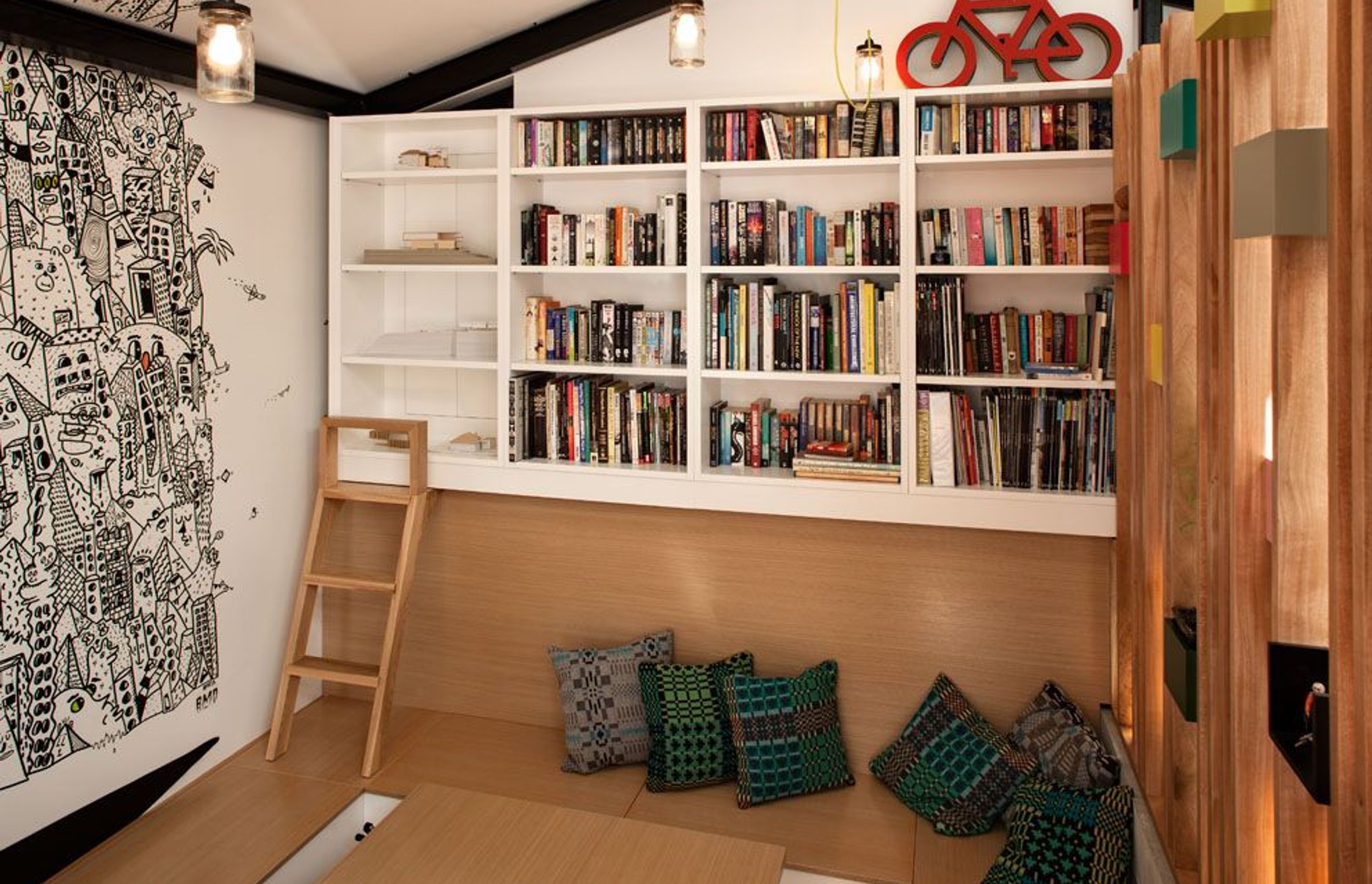
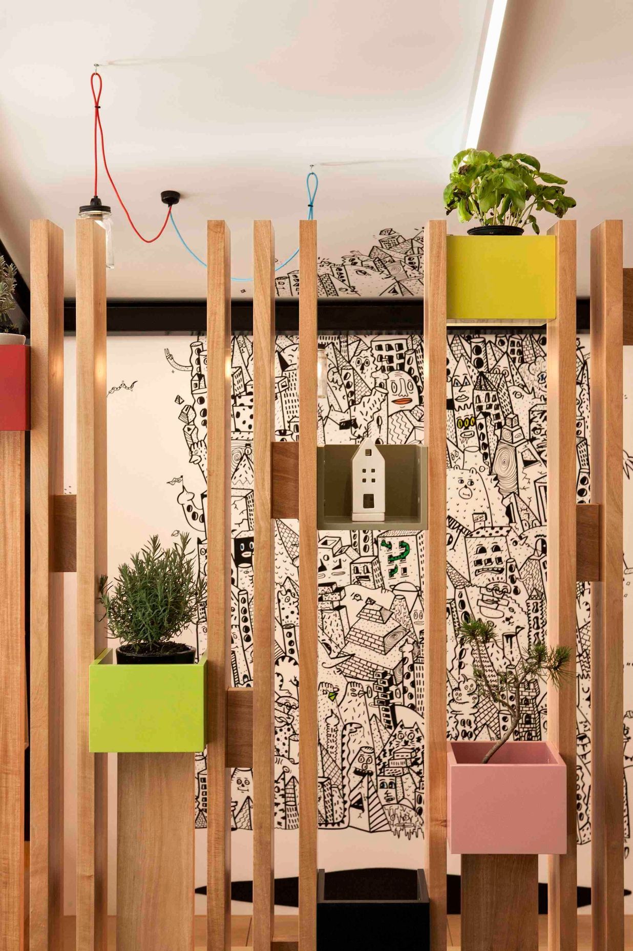
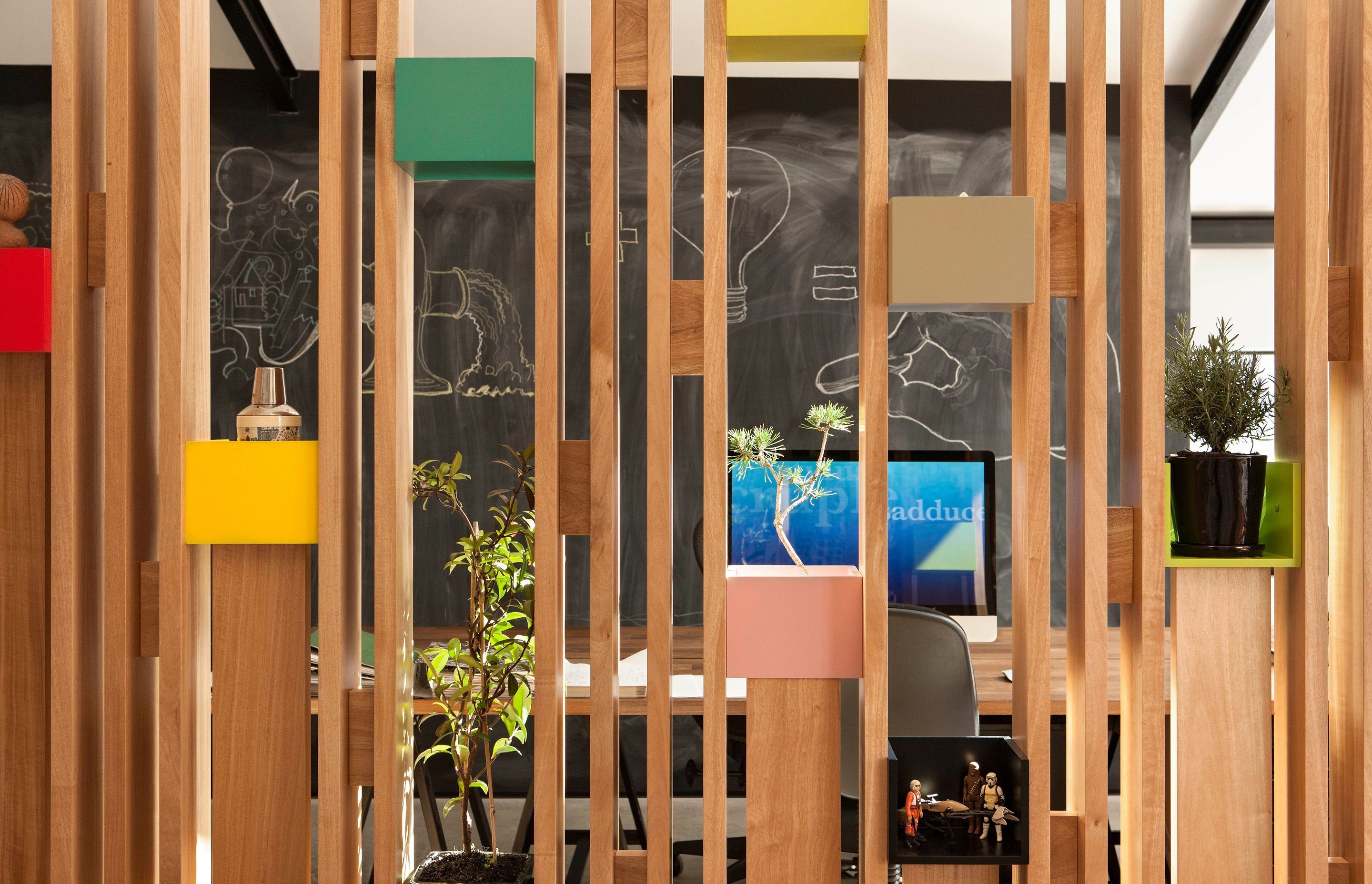
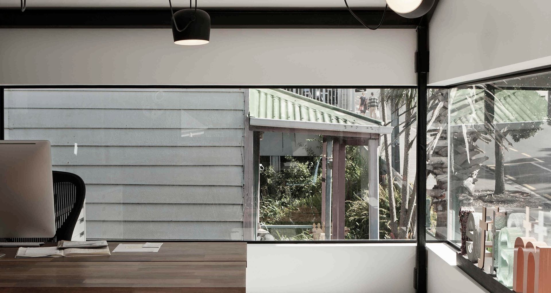
This is how we accomplished it: street art brings the outside in and generates conversation. Low windows invite pedestrians and cars to gaze into the building, generating interest and interactions between building occupants and the local community. Floor-to-ceiling blackboard walls tempt visitors and occupants to leave their marks, while facilitating brainstorming, planning, and clear communication of tasks and ideas. Snugs and cosy-pits allow for private meetings, and for ‘time out’ for workers to read, sleep and revitalise.
Juxtaposing the traffic ‘highway’ of College Hill, existing natural features were prioritised in joinery design, harnessing natural light, and drawing in tree foliage both to the rear and front of the building (including petitioning to Council for the plantation of a rata directly to the front of the building).
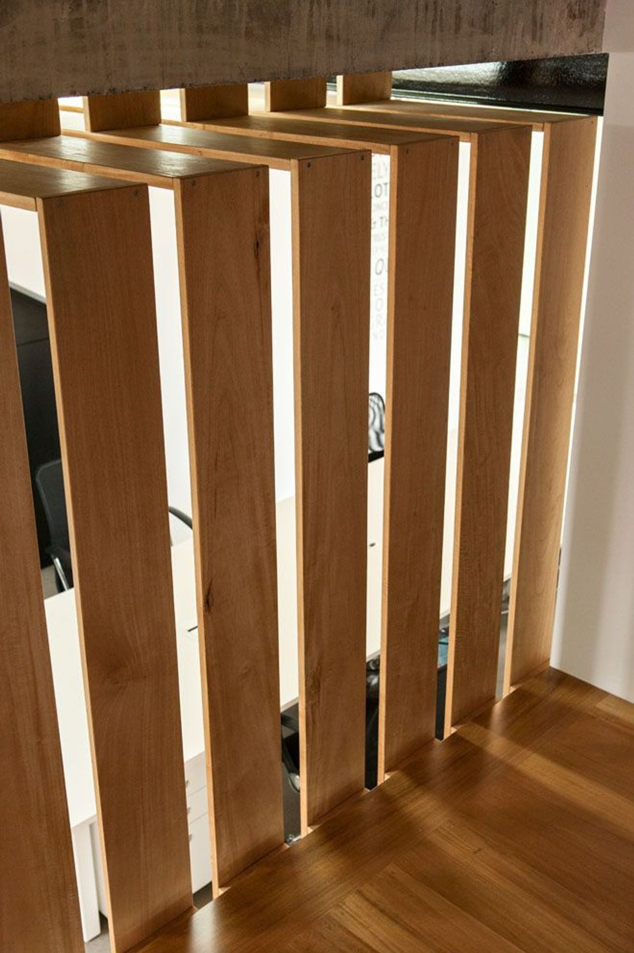
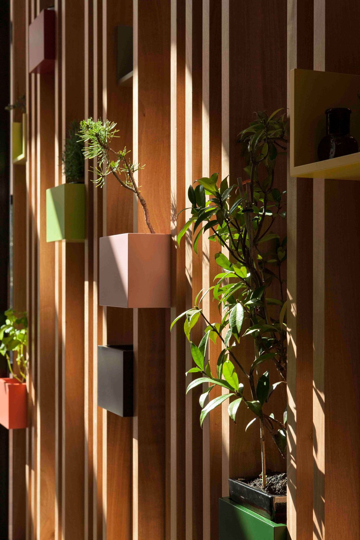
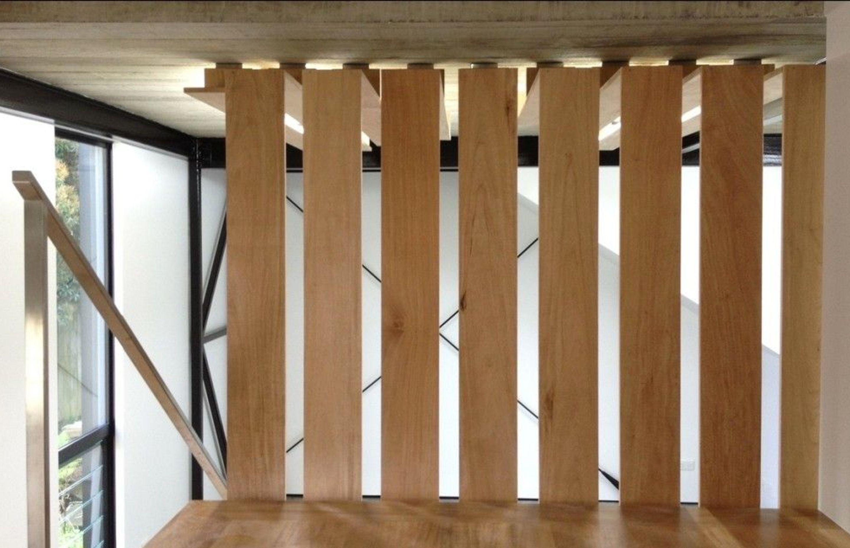
Drawing from latest health science research, we generated capacity for standing desks. Also, we generated a rosawa ‘artifact’ screen to provide an acoustic barrier and delineate between common workspace and private meeting/retreat areas; wooden ‘pockets’ of colour allow for occupants to personalise the space, using an energetic colour palette to balance the natural materials.
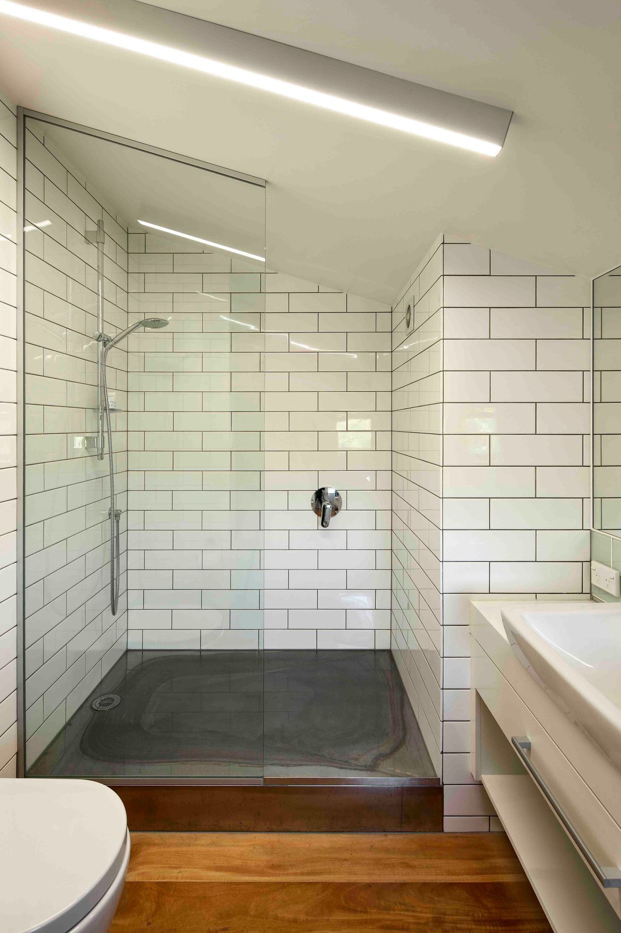
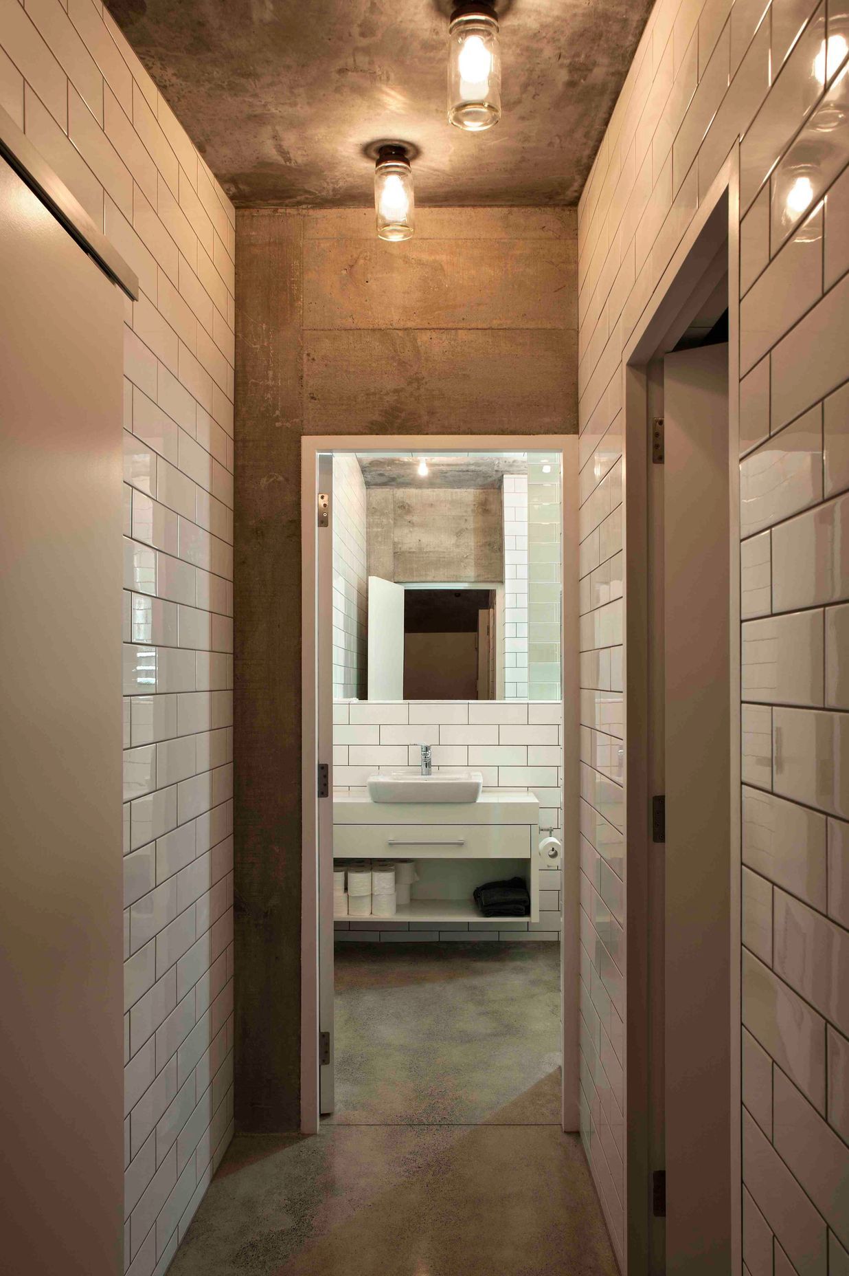
Generous shower facilities were specified to encourage occupants to actively transport themselves to and from work, or to exercise throughout the day. My favourite bit of the redesign is the conversation pit. It’s great to meet with clients in this space or chill out and share a couple of wines. Nonetheless, we use every aspect of the space, whether working or playing. Each level has great tenants and we all socialise and provide feedback on each other’s companies and cooking abilities.
No project details available for this project.
Request more information from this professional.


Matter is recognised for its work in architecture, urban planning, art, design and strategic thinking. We pride ourselves on our ethical, honest, and transparent approach to all projects.
We love what we do and have a profound commitment to our clients and finding innovative design solutions. We achieve these solutions through a working methodology of collaboration and disruption.
Integrity of ideas along with process and effective communication ensure that any investment made throughout the project is done so in a well planned and mutually agreed manner, making certain that our clients and all affected parties realise the most value from our product.
Start you project with a free account to unlock features designed to help you simplify your building project.
Learn MoreShowcase your business on ArchiPro and join industry leading brands showcasing their products and expertise.
Learn More