Orsini Fine Jewellery banner

The Italian name “Orsini” along with the client's history with, and love for, Italy was important to the design of their new adjoining Atelier space. It provided us with an authentic narrative that would allow for a timeless aesthetic. With tradition, history, quality and lasting beauty being key principles of Orsini jewellery, we were able to echo this throughout.

We chose to give the space it’s own personality that would compliment but not be ruled by the existing store interior. One that would not be dictated by trends but have its own personal aesthetic.

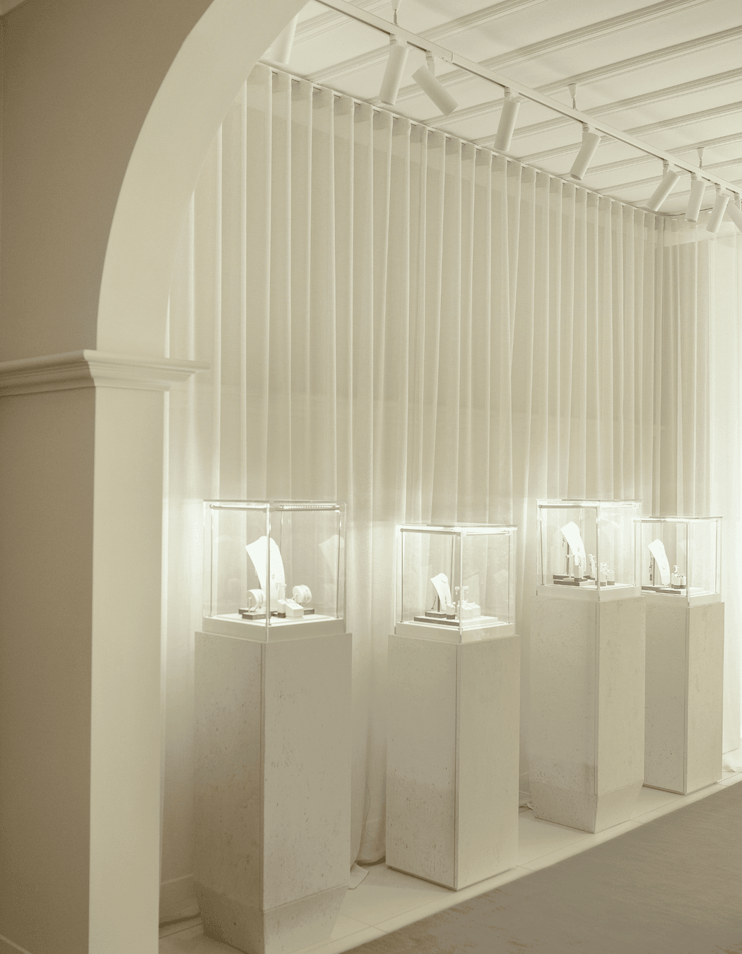
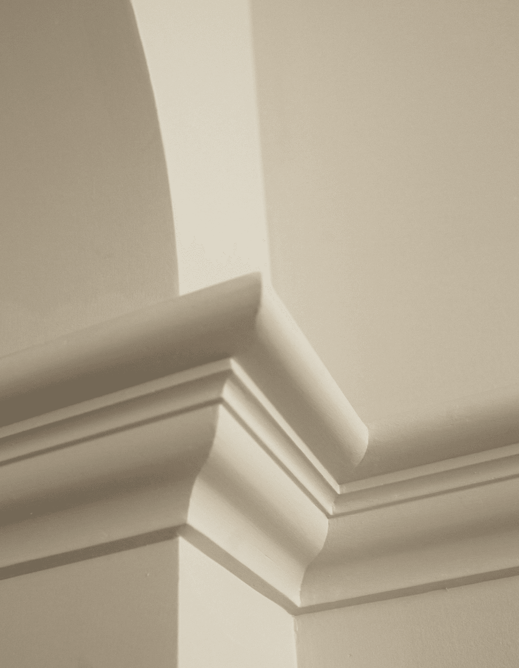
Generous dado rails, archways and white walls are reminiscent of Villa San Michele(1885) in Capri. The light palette and minimal decoration allows the space to become a gallery in which jewellery is showcased on plinths.

Arches within arches; the main entry to the space, smaller twin arches, the space dividing semi-arch, a wall mirror and the large arching dado play together creating forms that echo as you enter and move about the space. Each kept simple allows you to truly appreciate the forms.

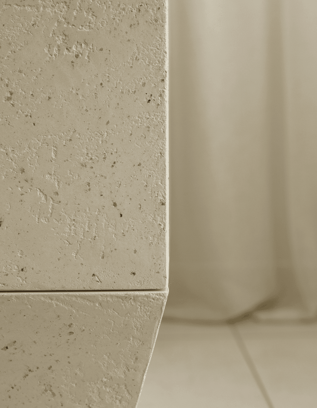
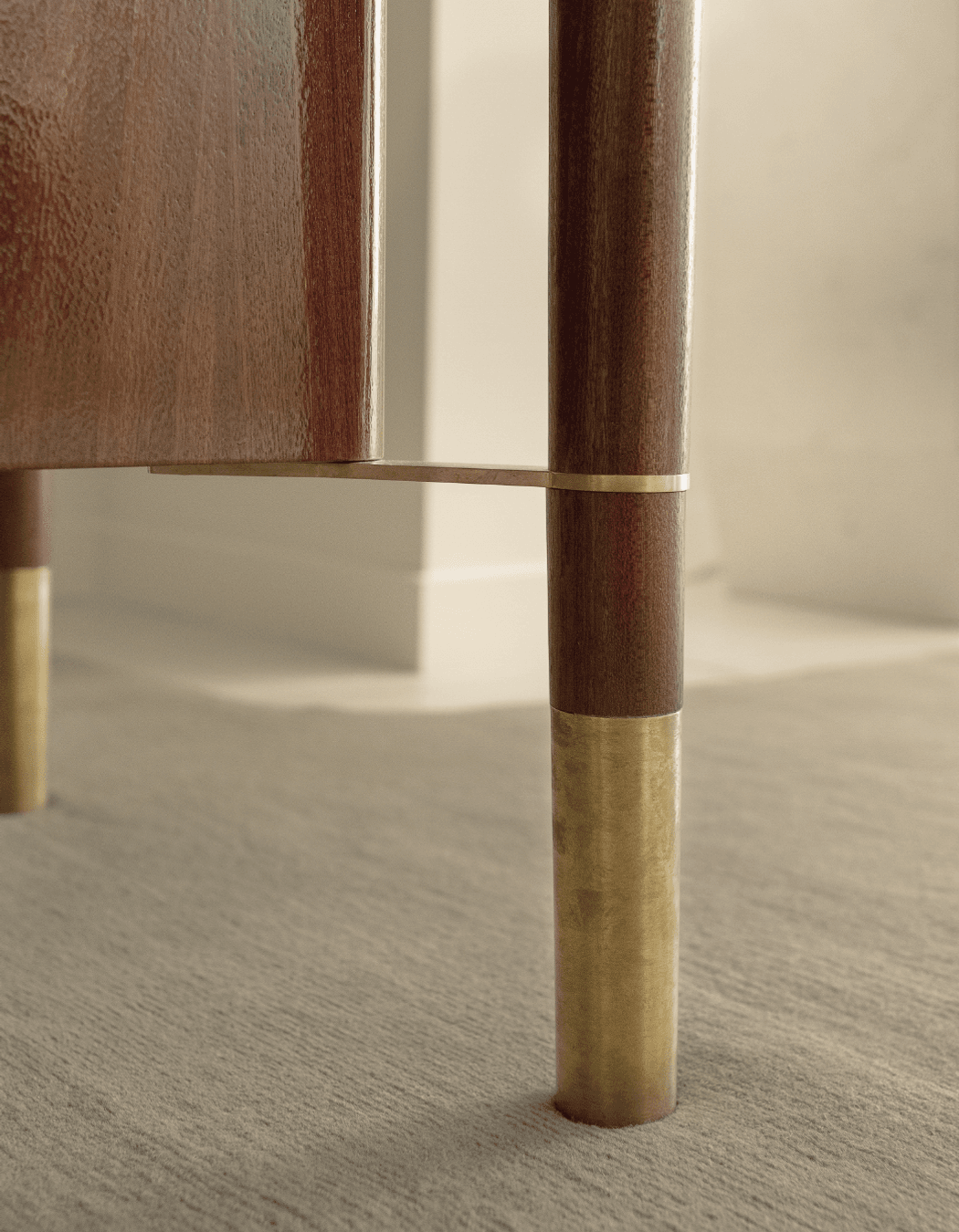
A nod to Capri’s coastal location the plastered plinths hint at limestone and the watery green floor rug references the beach shallows where water washes over pebbles. The ocean is another place of importance to Sarah with yachting being a favoured hobby. Rich Sapele timber was selected for the central plinth which floats on a mirrored base. Curves and a high gloss finish are a surprise in the otherwise paired back space with these elements subtly mimicking boat building craftsmanship.

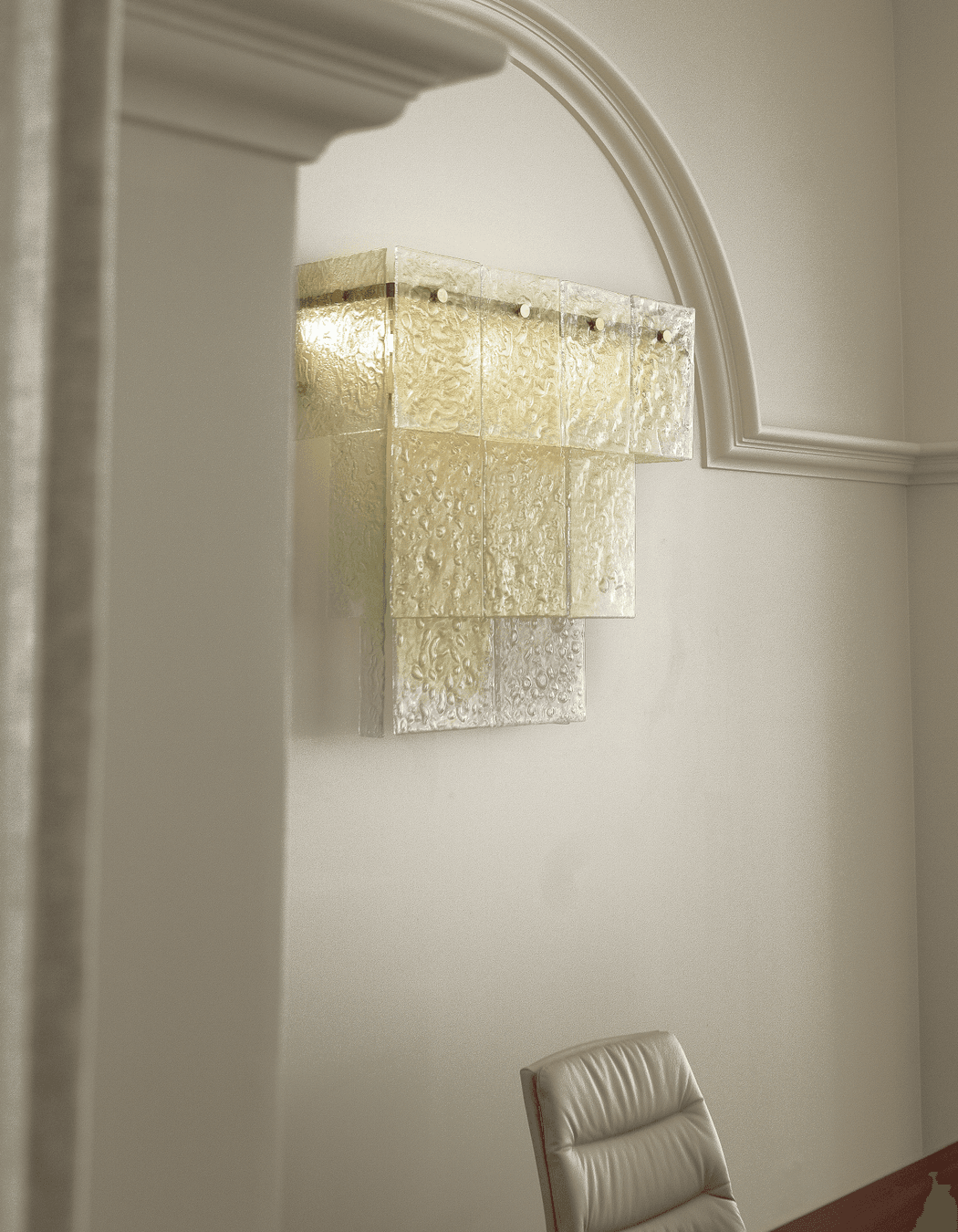
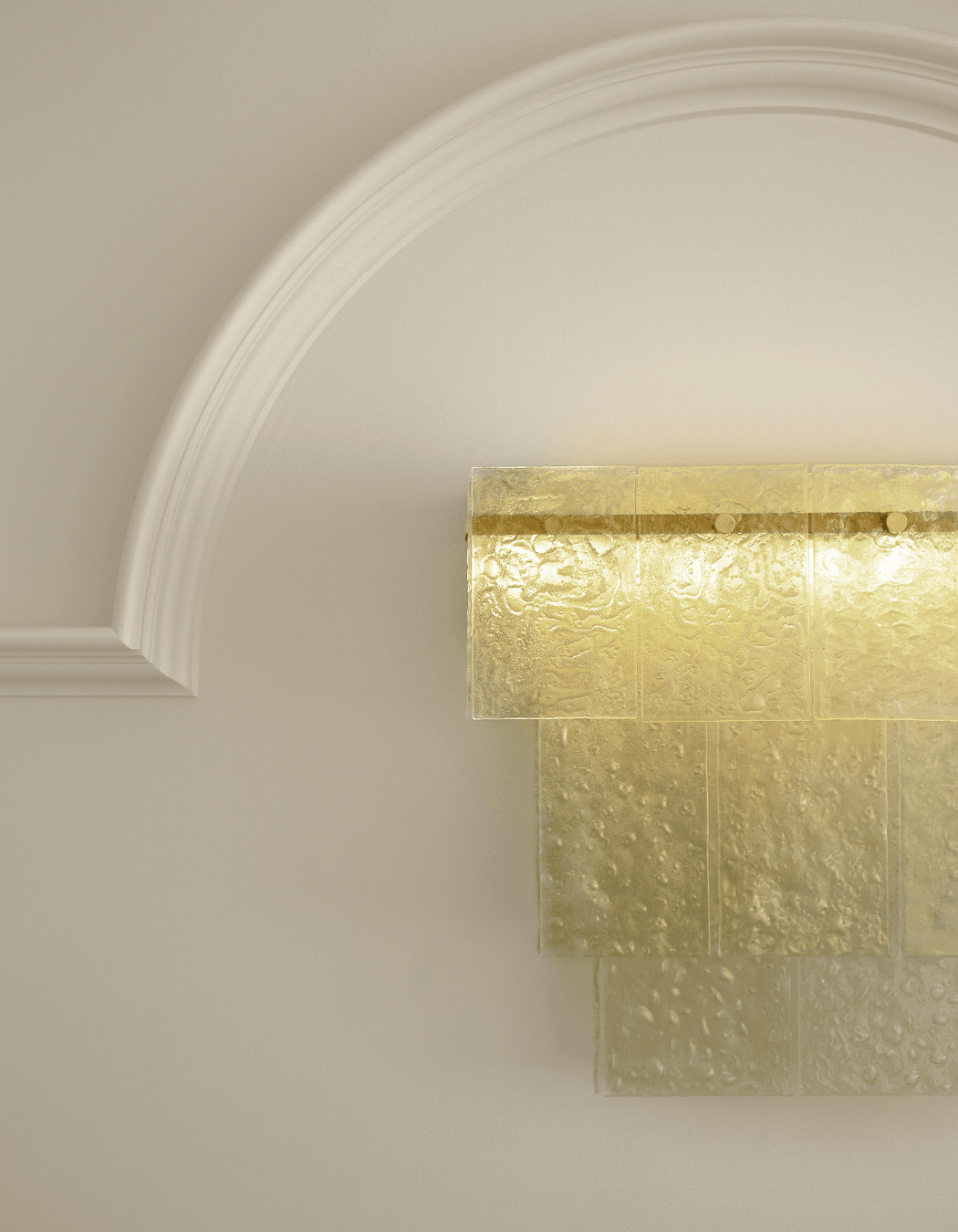
The consultation space needed to express the same craftsmanship as well as luxury and to be a key focal point within the space. Framed by an arching dado is a large bespoke wall light. What originally was to be a chandelier above the desk became a chandelier to the wall due to security limitations. A close collaborative process with Sarah lead this piece to become a layering of softly coloured green Murano-inspired glass panels. Each panel was poured into hand-made moulds. The piece is generous and glowing with brass details. Glass panels were produced by local Monmouth Glass.

In front of the desk is another bespoke design influenced by elegant Italian furniture design with Sapele timber in a high gloss, fine details, tapered legs and discreet power supply for desktop cabinet lighting. There is an illusion of ease in this very hard working piece.

The Veiled Vestal (1847) marble sculpture by Rafaelle Monti is a bust of a veiled female with a crown of roses. This piece spoke to us on few levels. It resonated with the history and lasting beauty of Italian design. The veiling was also a beautiful reference to bridal-wear and reflected a sense of intimacy in ceremony. We articulated this in the use of sheer curtains which allow the dado to be visible behind.

Sarah’s workroom sits on the other side of the twin arches. One glazed for privacy the other open for access. A Sheer curtain providing casual access. There was a considered decision to keep this space visible. To allow clients to see the artist at work. To show this is a store dedicated to quality and invested in their product. It gives a sense of approachability and bespoke. The space is monotone in it’s chalky whiteness and feature hand-made plaster wall covering.

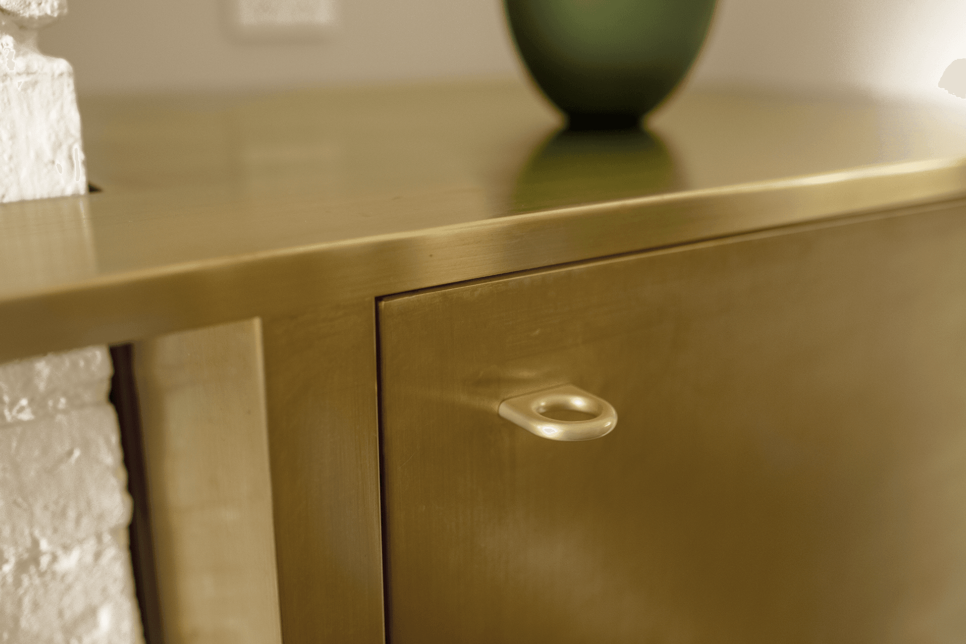
The existing fireplace is painted into the chalky white canvas of the space. Alongside it is a contemporary brass cabinet and shelf that sets itself within and around the fireplace. The brass cabinet needed to hold its own in this gallery but also not detract from other more important elements. Used as a sort of waiter’s station, the act of filling a champagne glass becomes a special occasion in itself.

A few details assist in the transition between the new space and the existing store. Brass and gold details throughout. Timber flooring from the old space steps down into the new and meets an elegantly bullnosed Statuario Oro marble step. A statement in itself.

Both spaces reflect Italian design but are opposites. The existing space is clean, squared with a modern minimalism. The new is softer, rounder with a nod to tradition and history. The differences are not in the extreme but are there in a way that still keeps them relevant to the other.

Orsini Fine Jewellery

About the
Professional

Kanat is an Auckland-based Interior Design studio specialising in bespoke Residential and Small Commercial interiors.

Good design creates a sense of ease, both in the process and the end result. It enhances the experience of space and makes it a joy to inhabit.

Aesthetics, atmosphere and practicalities are considered equally. The influence one has on the next produces a magic. That magic is felt through the memorable moments of simply inhabiting a beautifully designed space. It enhances our clients’ lives both functionally and aesthetically. And it flows from the things they hold close, that we are able to bring out and into the world with them.

We work closely with our clients to develop principles that will guide and inform their design, this process creates spaces that have intention and a true connection between client and design.

Our design experience spans apartment living, mid-high end residential, workspaces and retail interiors and offers design, procurement and project management capabilities.