About
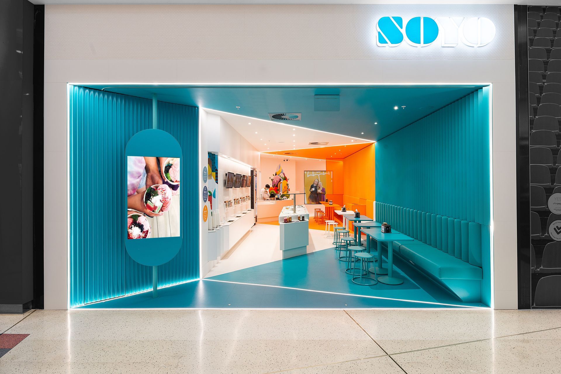
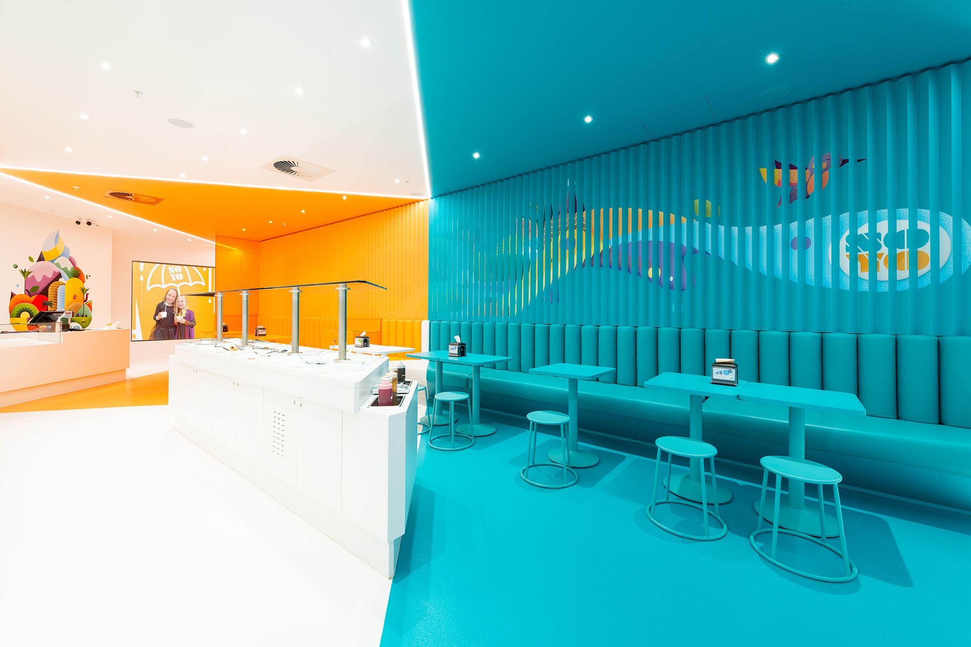
Soyo - Northlands.
ArchiPro Project Summary - Soyo - Northlands features a vibrant entryway with a bold three-color palette, innovative design elements, and a modern interior that enhances the brand's identity while creating an immersive experience for visitors.
- Title:
- Soyo - Northlands
- Architect:
- Hierarchy Group
- Category:
- Commercial/
- Hospitality
- Completed:
- 2021
- Photographers:
- Ashley Bing Photography
Project Gallery


Views and Engagement
Professionals used

Hierarchy Group. At Hierarchy, we specialise in objective-led design. This means that we work closely with you to understand your commercial objectives and develop creative solutions that fit your budget. Our in-house quantity surveyor and construction management team collaborate with our designers to optimise cost and time efficiencies, while also leveraging our established relationships with consultants and contractors to ensure that we set realistic expectations. Our goal is to create a beautiful end result that aligns with your vision and financial goals, achieving the dream: the ‘pretty picture’ you can afford.
Year Joined
2024
Established presence on ArchiPro.
Projects Listed
30
A portfolio of work to explore.
Hierarchy Group.
Profile
Projects
Contact
Project Portfolio
Other People also viewed
Why ArchiPro?
No more endless searching -
Everything you need, all in one place.Real projects, real experts -
Work with vetted architects, designers, and suppliers.Designed for New Zealand -
Projects, products, and professionals that meet local standards.From inspiration to reality -
Find your style and connect with the experts behind it.Start your Project
Start you project with a free account to unlock features designed to help you simplify your building project.
Learn MoreBecome a Pro
Showcase your business on ArchiPro and join industry leading brands showcasing their products and expertise.
Learn More


