The original brief from the client was straightforward to begin with. They had recently purchased the property and had planned to renovate the existing kitchen, laundry, and bathroom. The house was built in the 1930s. The intention was to maintain all the property's original features while creating a contemporary interpretation.
The home belongs to a family of four who wanted to create an open living space with a good connection between the kitchen and dining areas, suitable for entertaining guests. We designed the house with the client's lifestyle and needs in mind and allowed the client to have significant involvement in the process. The kitchen was tiny, and the laundry and toilet were located to the rear, meaning the kitchen had no view.
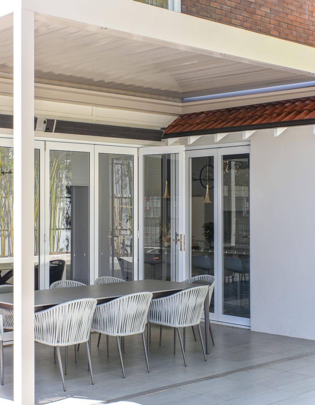
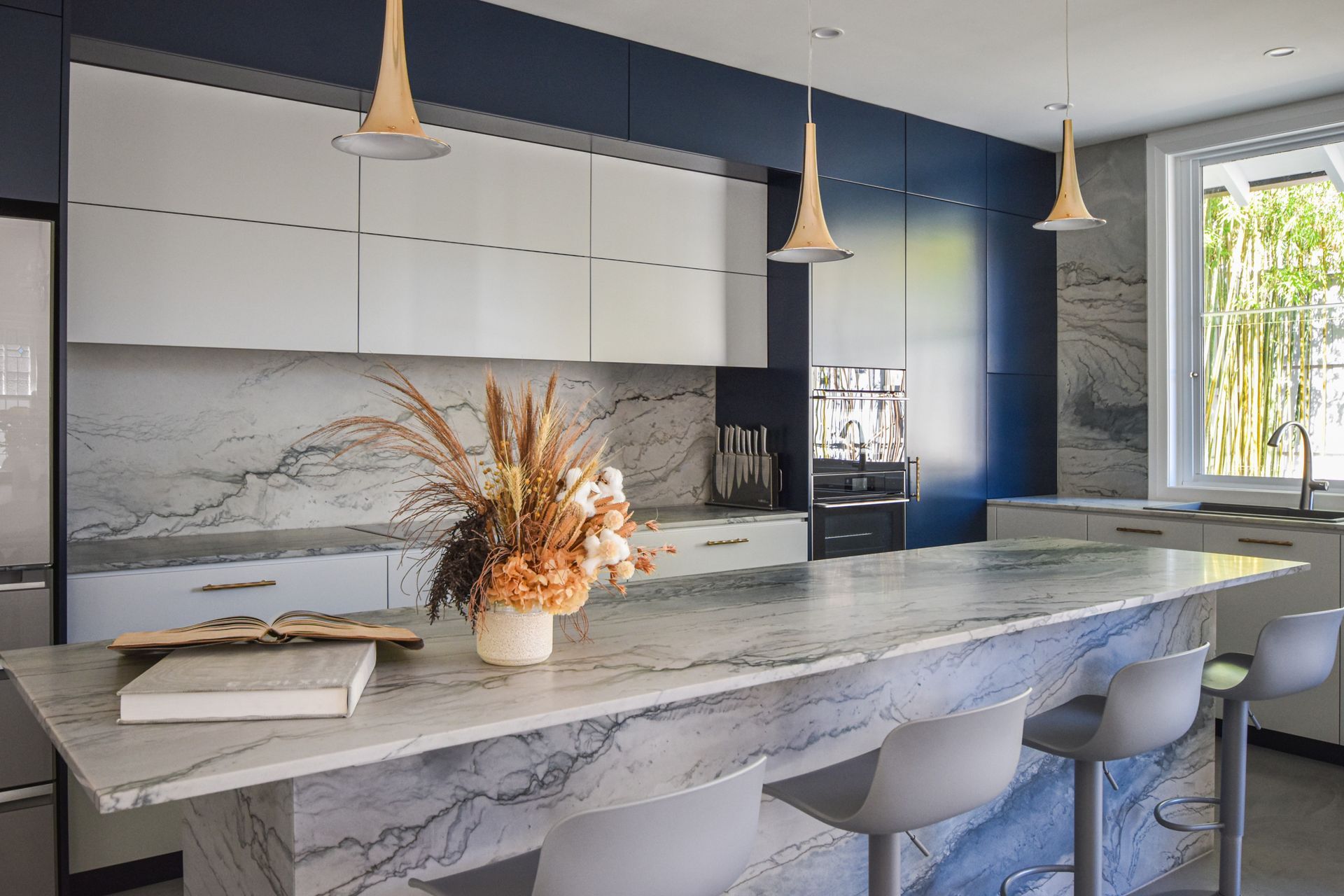
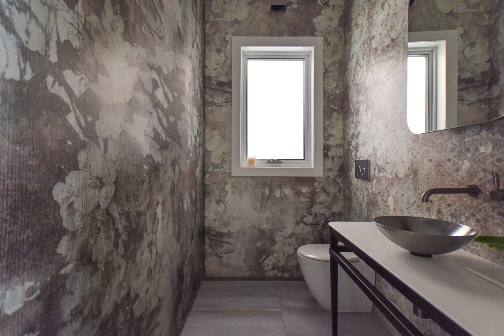
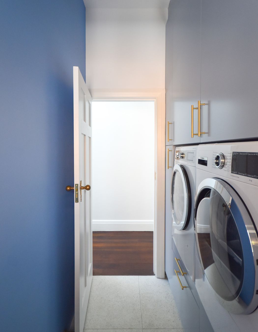
We wanted to create a space with more natural light from the rear, which meant demolishing the existing kitchen, laundry, and toilet. We created a simple, modern kitchen that was sympathetic to the original house. We demolished the existing garage, giving the property more space for a larger outdoor entertaining area. To achieve the client’s brief, we had to alter the original plans by creating a powder room on the ground floor and putting the laundry upstairs.
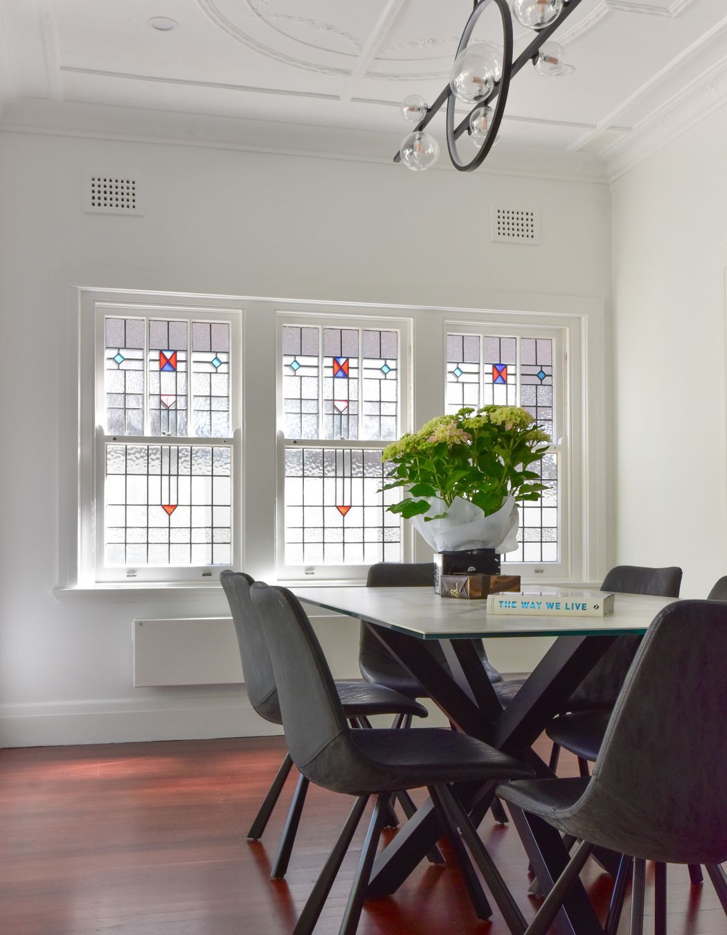
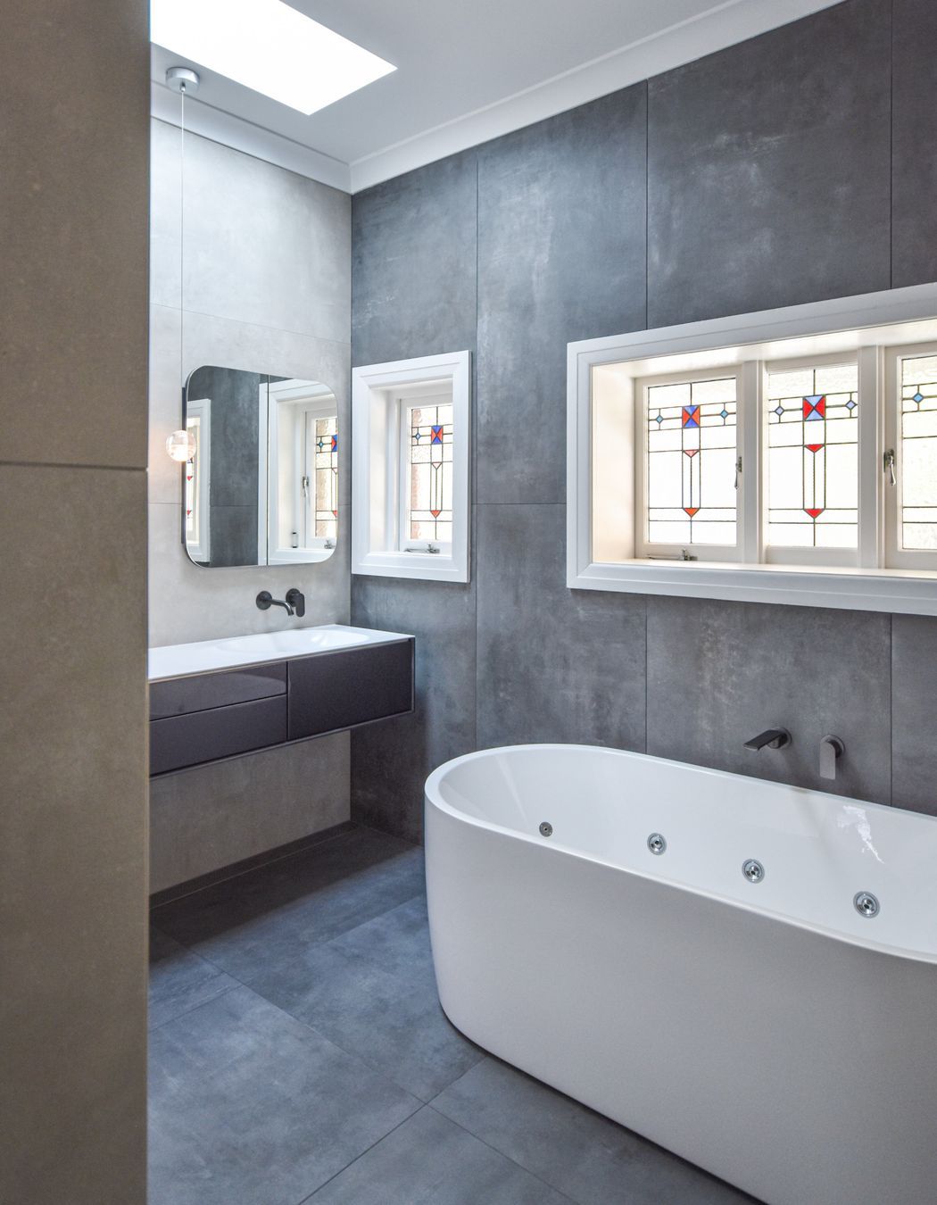
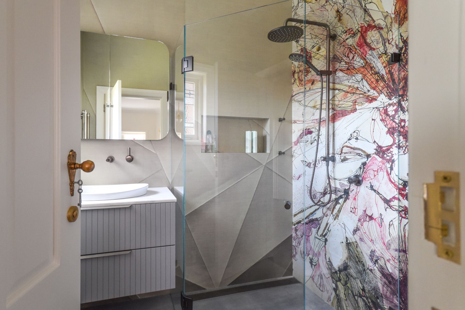
As the brief grew, the client decided to also renovate the existing bathroom and master ensuite for the first floor with a new contemporary design by maintaining the original stained glass windows. We retained the original features of the house.
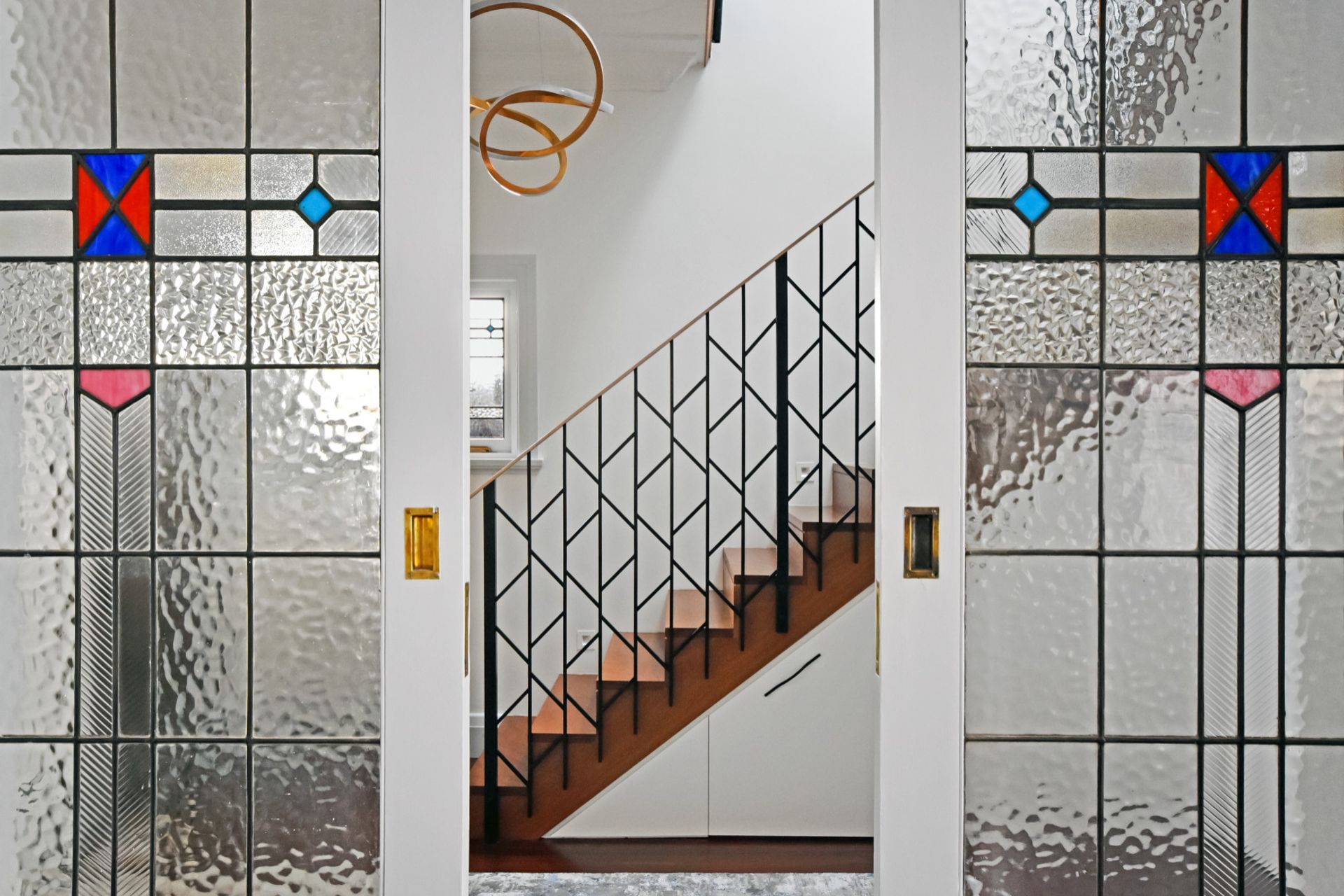
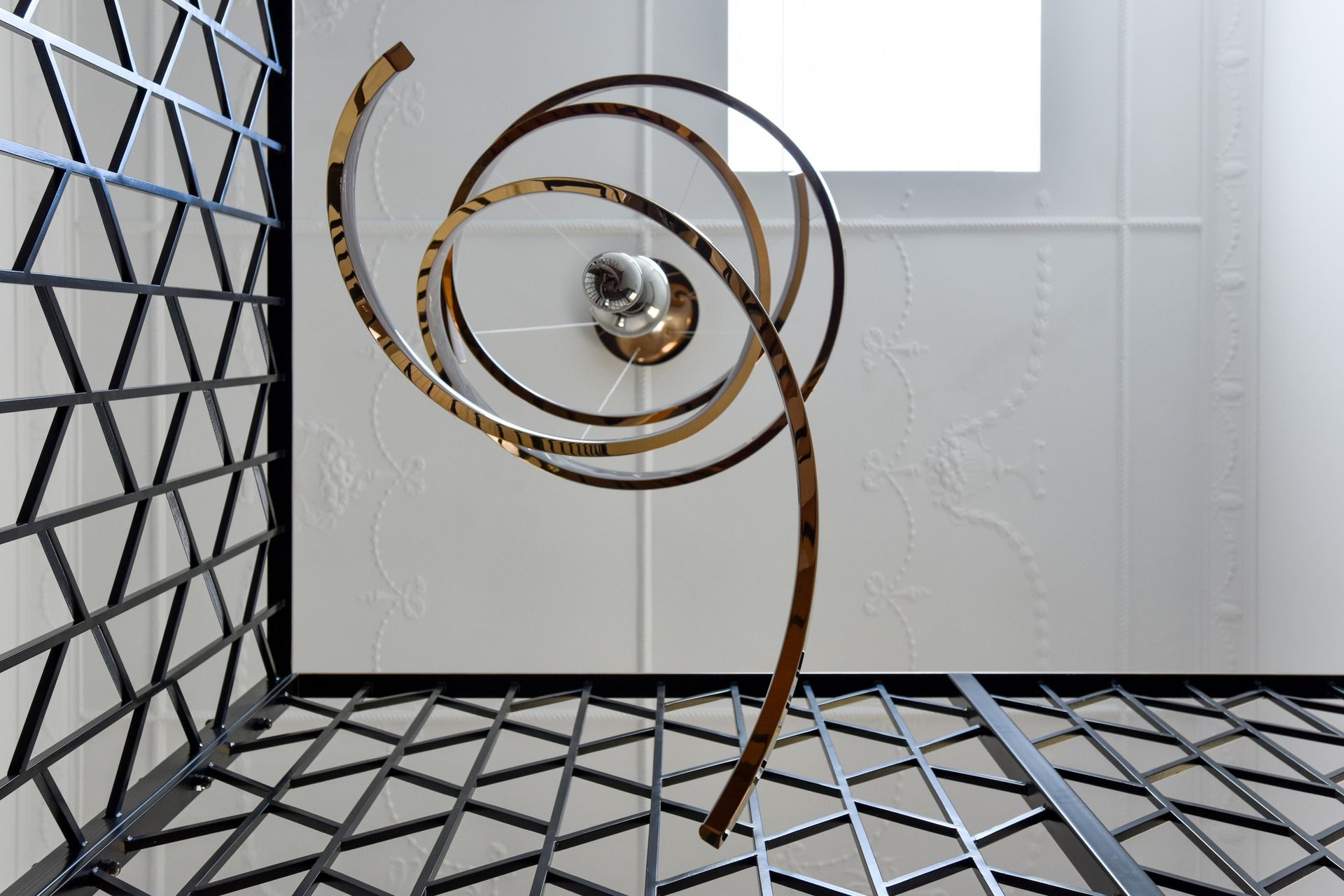
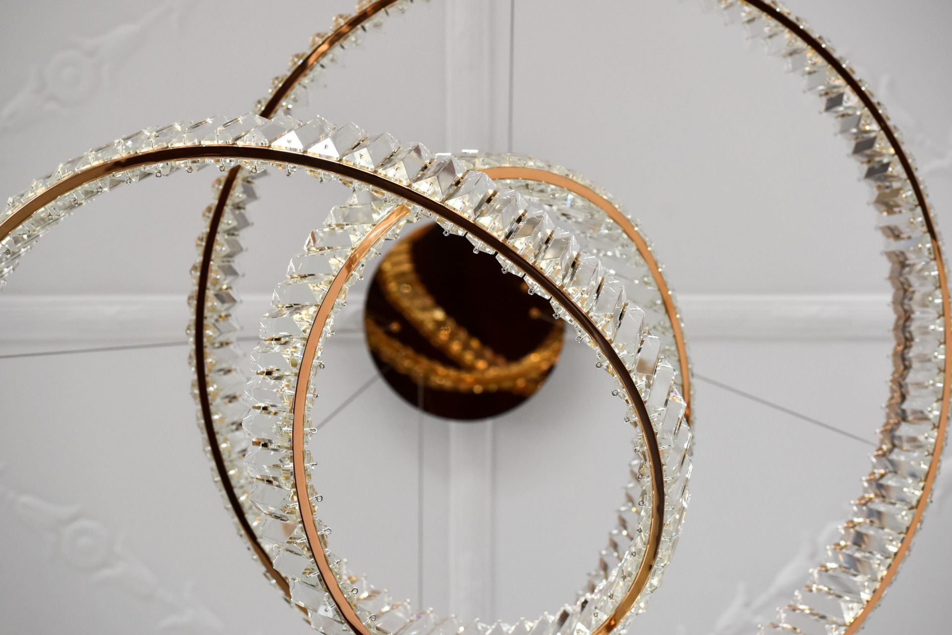
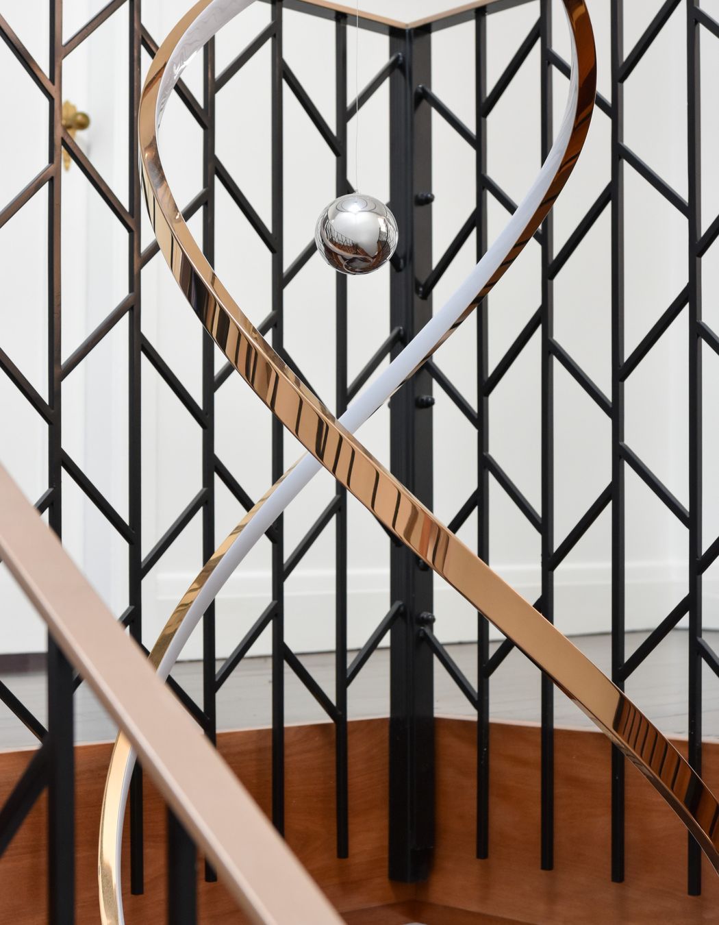
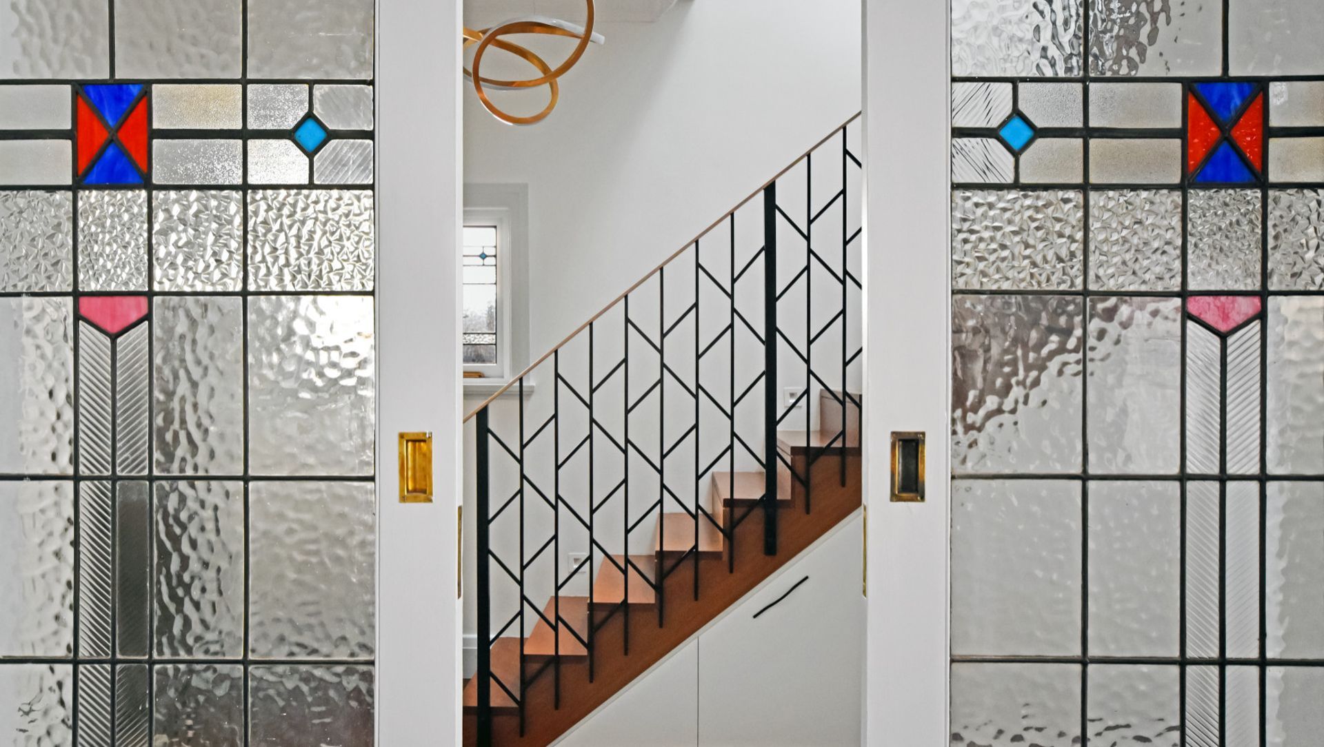
The existing staircase created an enclosed feeling at the front of the entrance of the house with poor natural lighting. The new staircase we designed was a response to create a warmer, grand entrance to the house. This became a prominent feature of the house with a skylight and pendant for dramatic lighting. Using natural and artificial light was central to the design process; positioning the statement pendant and skylight above the staircase created a bright entrance. The handrail on the staircase featured geometric shapes to remind the original art deco style in a more contemporary way. Being transparent in form allows more light to flow throuThe initial client brief presented a clear directive to renovate the kitchen, laundry, and bathroom of a 1930s house, while preserving the property's authentic characteristics and infusing a modern aesthetic. As a family of four, they sought to fashion an expansive living area with a seamless connection between the kitchen and dining sections, conducive to hosting guests and providing easy access to the rear outdoor space. Our design ethos revolved around the client's lifestyle requirements, and we actively solicited their input throughout the process.
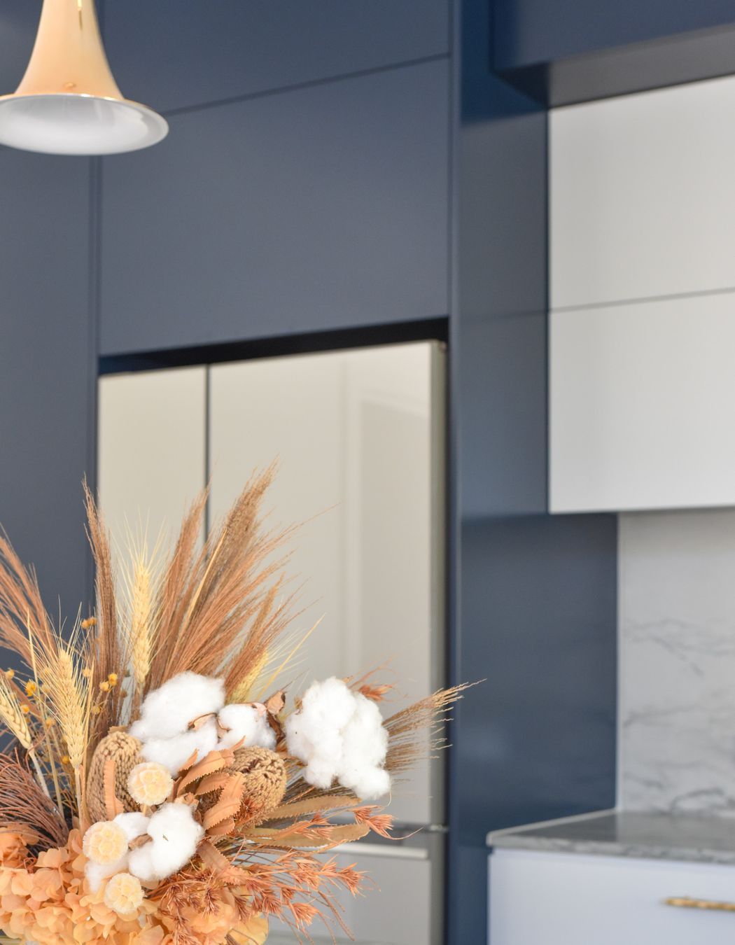
Given the existing small kitchen dimensions and the laundry and toilet's inconvenient placement at the rear of the property, the new kitchen's orientation and layout were optimized to maximize functionality and facilitate social interaction around a spacious island while also providing a view of the backyard. The installation of a large window above the sink ensured that natural light and ventilation were in abundance. The kitchen's aesthetic was carefully crafted to exude sophistication, with dark blue and grey cabinetry, an Olympia Quartzite Honed Block benchtop and waterproof splash back, and satin brass diamond-textured handles. The strategically placed pendants above the kitchen island serve a dual purpose: they highlight specific areas with a warm glow and add to the overall visual appeal as a decorative architectural element. To create a striking contrast with the original timber floor. A grey Pandomo levelling compound floor was added.
As the brief grew, the client decided to also renovate the existing bathroom and master ensuite for the first floor with a new contemporary design by maintaining the original stained glass windows. We retained the original features of the house.
The existing staircase created an enclosed feeling at the front of the entrance of the house with poor natural lighting. The new staircase we designed was a response to create a warmer, grand entrance to the house. This became a prominent feature of the house with a skylight and pendant for dramatic lighting. Using natural and artificial light was central to the design process; positioning the statement pendant and skylight above the staircase created a bright entrance. The handrail on the staircase featured geometric shapes to remind the original art deco style in a more contemporary way. Being transparent in form allows more light to flow through the space.
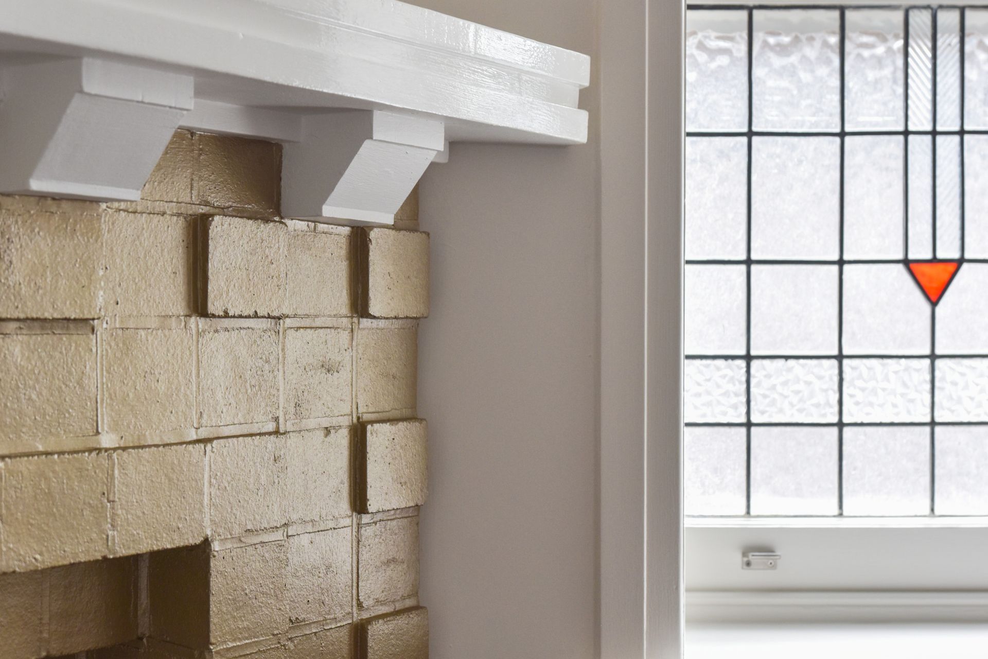
We used various unique materials throughout the property, including waterproof wallpaper in the wet areas, to create something out of the ordinary. Using reflective materials gave us different perceptions of other parts of the property with different views. For example, you can see the bamboo outside while standing in the kitchen. We kept the stained glass doors in the home to keep a balance between the traditional aspects and the new modern ones. We brightened the home using colours and retained the existing brick fireplace by modernising it.
The renovation of this 1930s property's kitchen was a careful balance between preserving the original character and creating a modern and functional space suitable for a family of four who loves to entertain. The elegant finishes and the contrasting modern Pandomo floor add a touch of sophistication and style to this beautiful kitchen, making it a standout feature of the home. Overall, we were thrilled to work with the client and bring their vision to life, creating a space that met their needs and expectations.
Photography: Lisa Loigh the space.
We used various unique materials throughout the property, including waterproof wallpaper in the wet areas, to create something out of the ordinary. Using reflective materials gave us different perceptions of other parts of the property with different views. For example, you can see the bamboo outside while standing in the kitchen. We kept the stained glass doors in the home to keep a balance between the traditional aspects and the new modern ones. We brightened the home using colours and retained the existing brick fireplace by modernising it.
