Project team
Revitalizing the University of Canterbury with innovative temporary and permanent signage solutions post-earthquake, enhancing campus navigation and brand identity while fostering a vibrant and welcoming environment.
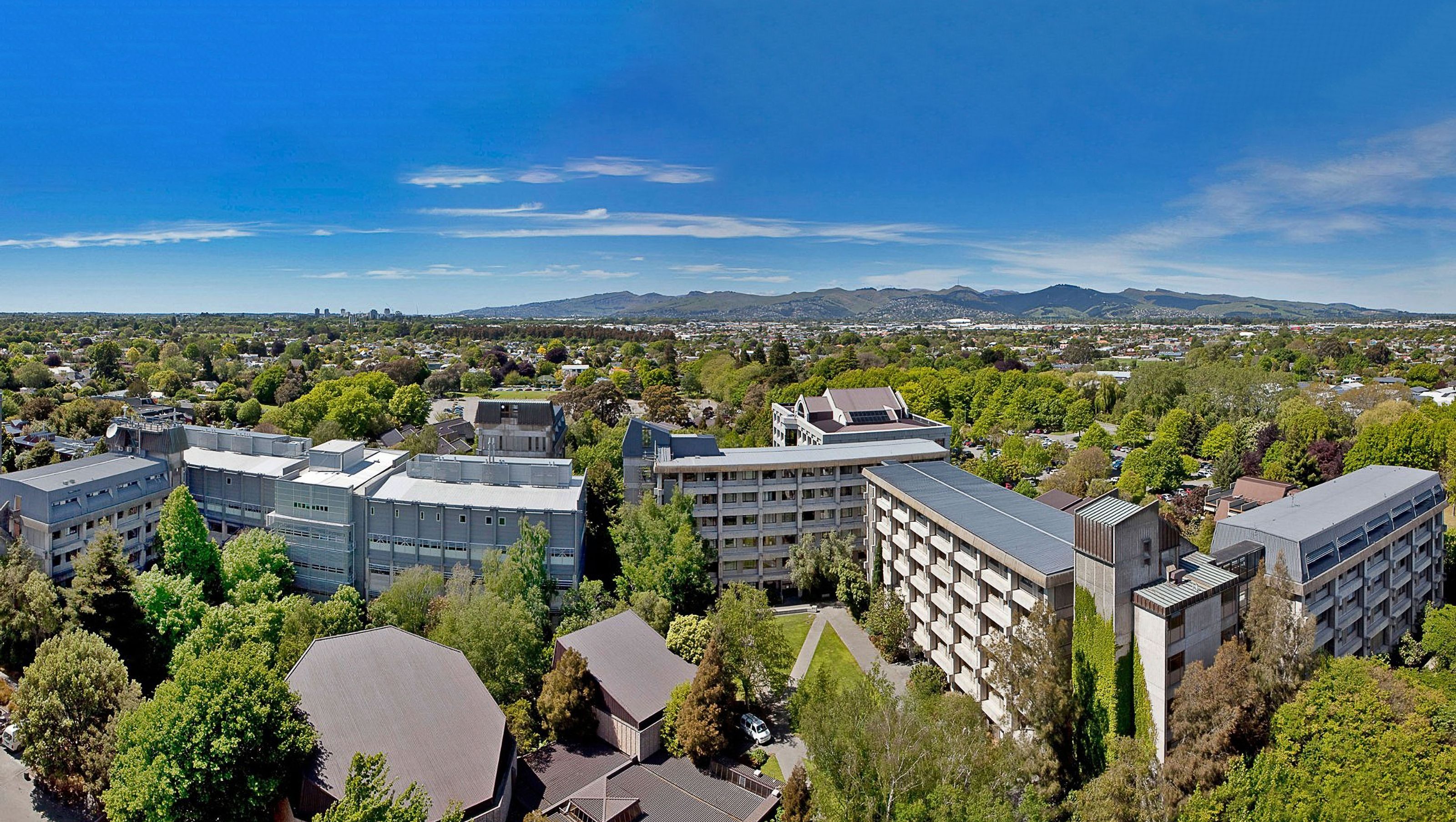
Following the 2011 earthquake in Christchurch, along with most of the city, the University of Canterbury undertook an extensive rebuilding program. Facilities were revitalised as a part of this rehabilitation process.
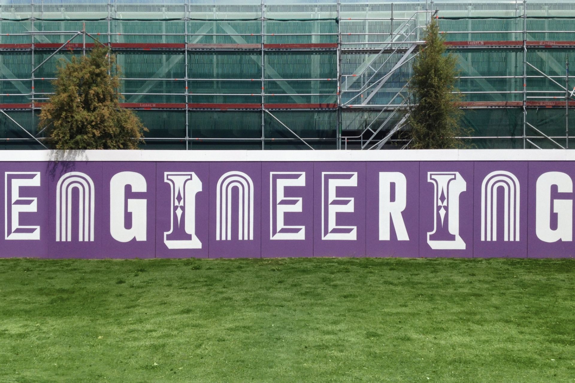
The university wanted to ensure the changing environment would be vibrant and welcoming for the temporary hoardings across the large and complex campus, making a true brand statement.
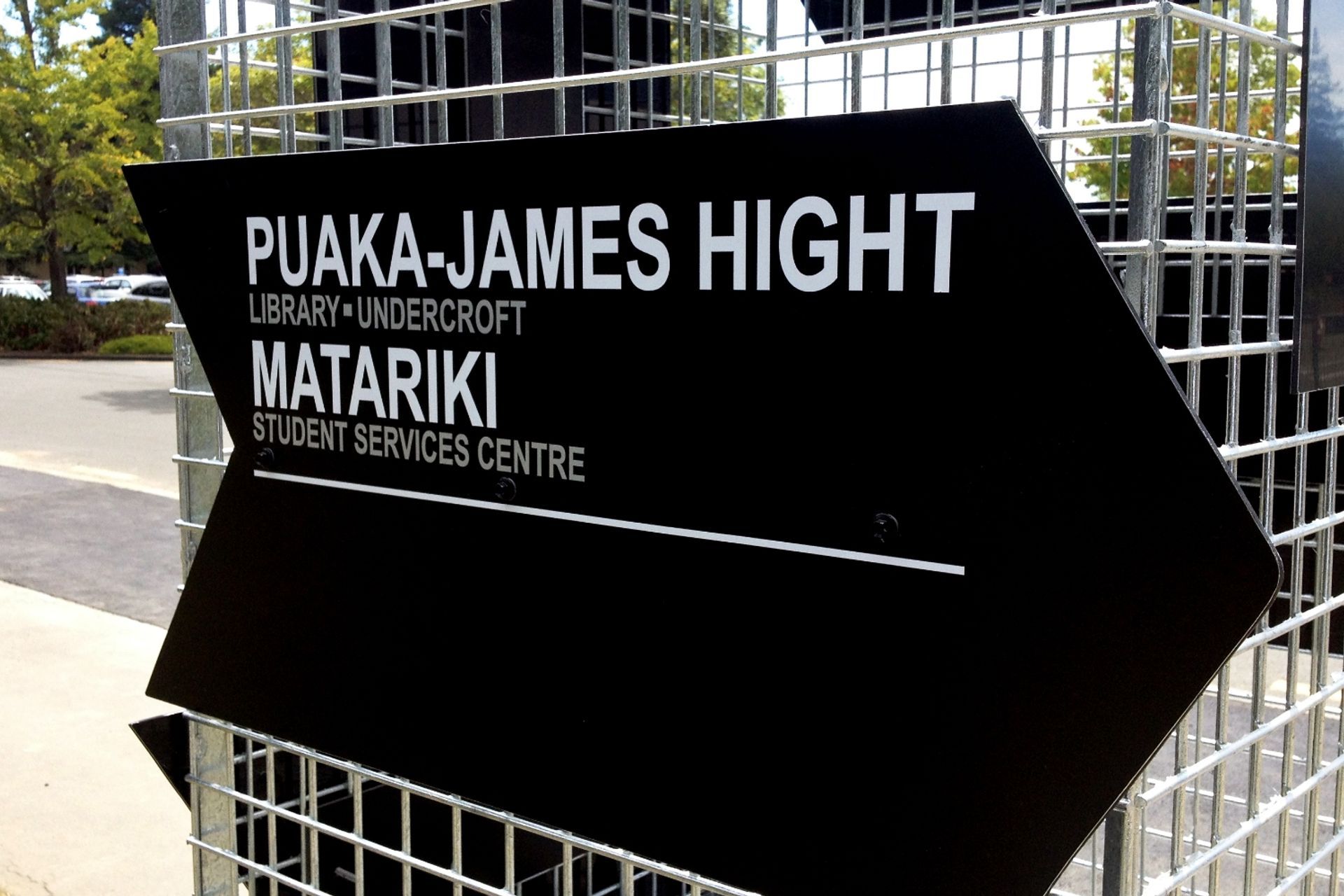
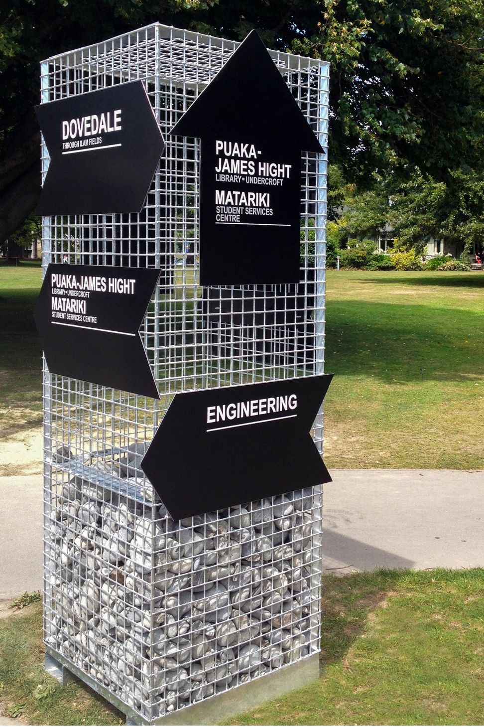
As well as realising the university’s vision, Diadem saw this project as an opportunity to provide long-term value for the temporary signage.
Diadem envisaged temporary construction that would evoke the brand’s energy and character, and provide information to students, staff and visitors. The structures could include details about the buildings, timelines of the build, and facility information.
The design concepts also needed to be clean and minimal to provide the most impact. It was also vital that the signs were adaptable to accommodate changes in the location.
Following detailed site audits and journey planning, Diadem delivered a creative solution that solved the design rationale. In addition, the scope identified and activated hoarded areas that felt awkward to navigate.
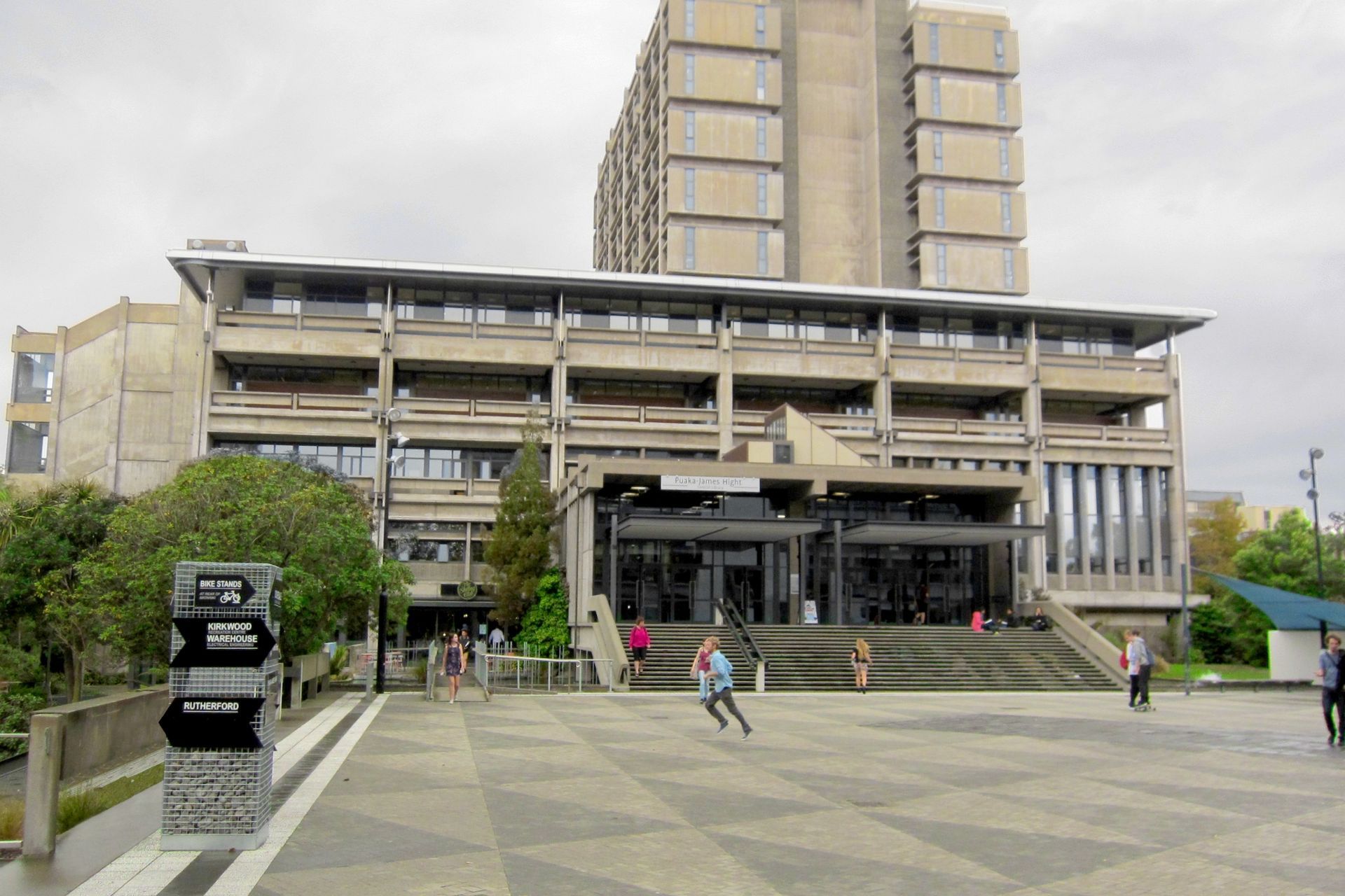
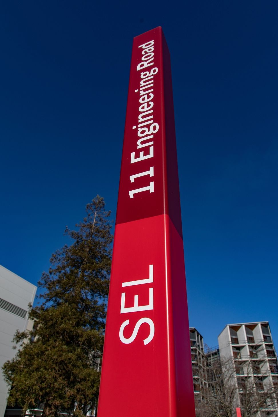
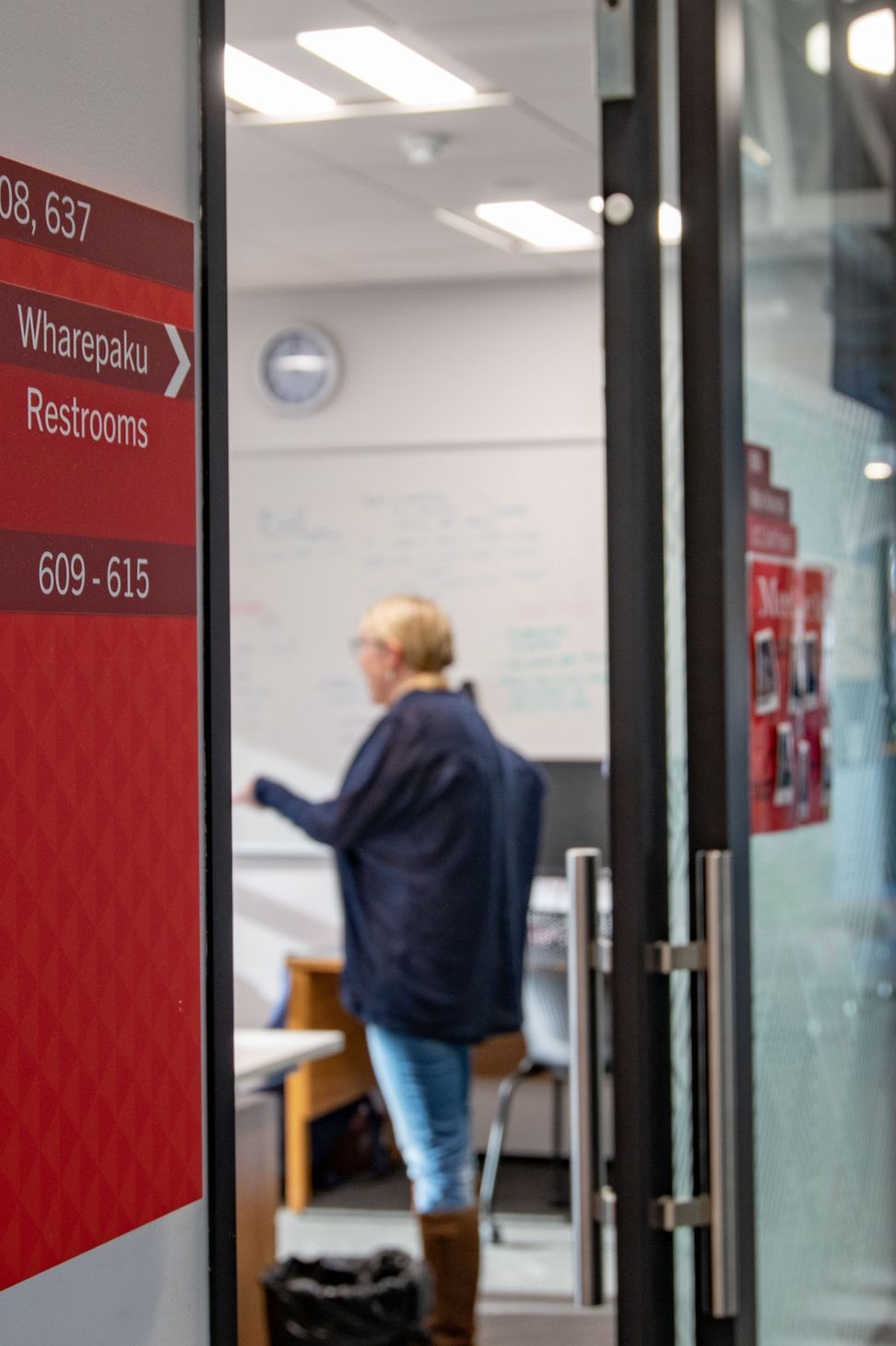
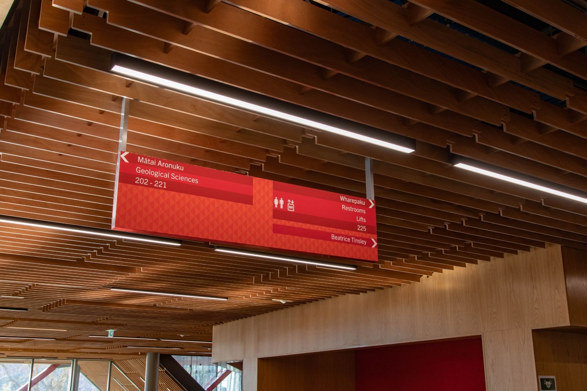
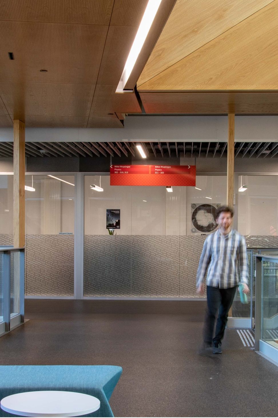
Following the temporary signage, Diadem was engaged to create permanent signage for the campus. This signage suite was distinguished by a number of features, including the use of Te Reo before English.
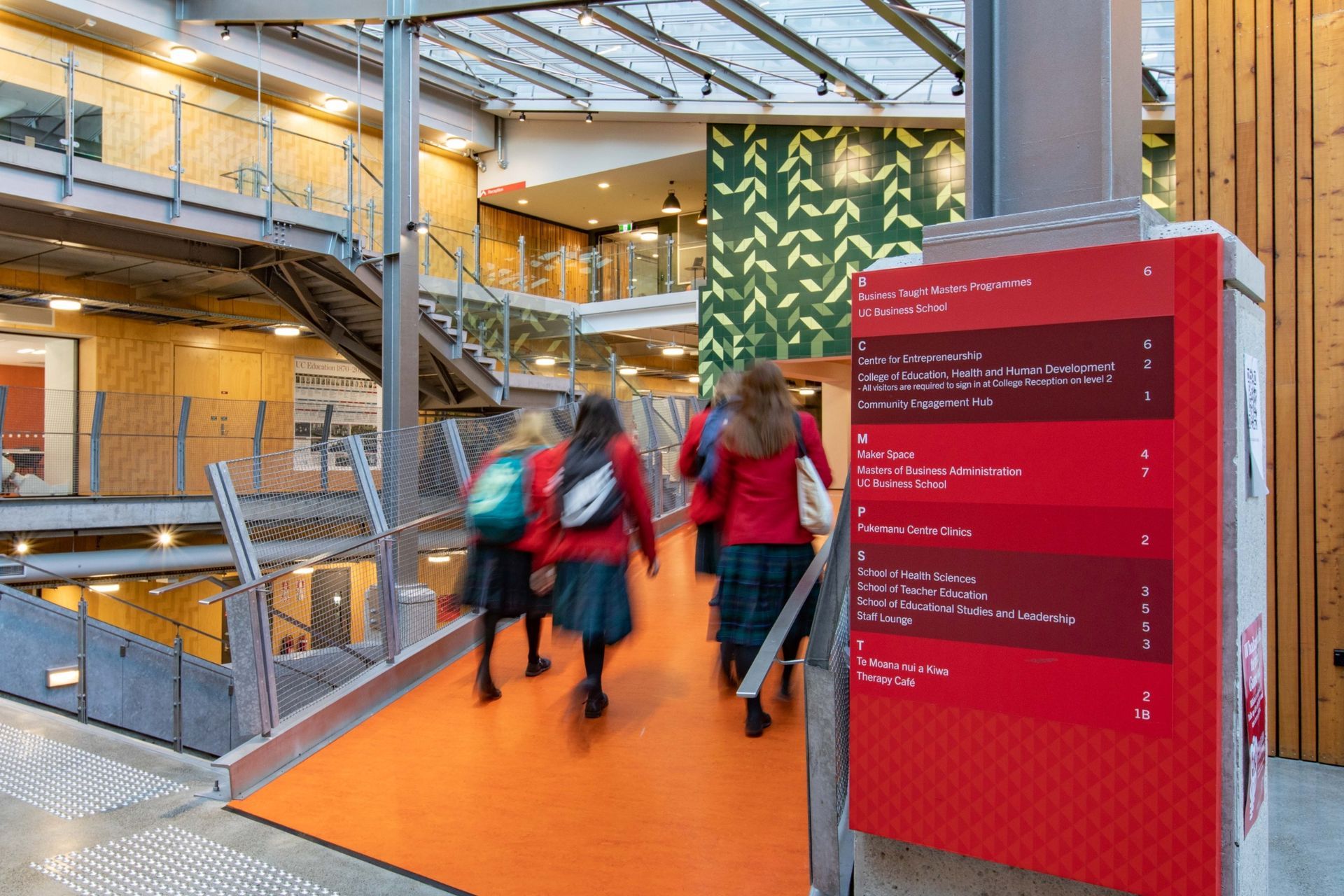
The suite’s purpose was to create a holistic and user-centric wayfinding experience. Diadem’s concept explored approaches to content and a visual language that added vibrancy to the campus, and expressed the University of Canterbury brand.
For example, the use of red from the UC guidelines provided a visual cue for wayfinding, with different tones organising the graphic information system, either differentiating the street address from the building names, or articulating the Te Reo from the English.

Like this Project?
Hire Diadem
Professional Reviews
Professionals used in
this project
The practices and trades credited on this project.

More projects from
Diadem
Other work by Diadem, across every category they build in.


Everything else in Higher Education and Research Facilities, from every practice on ArchiPro.


Next Project
Keep scrolling