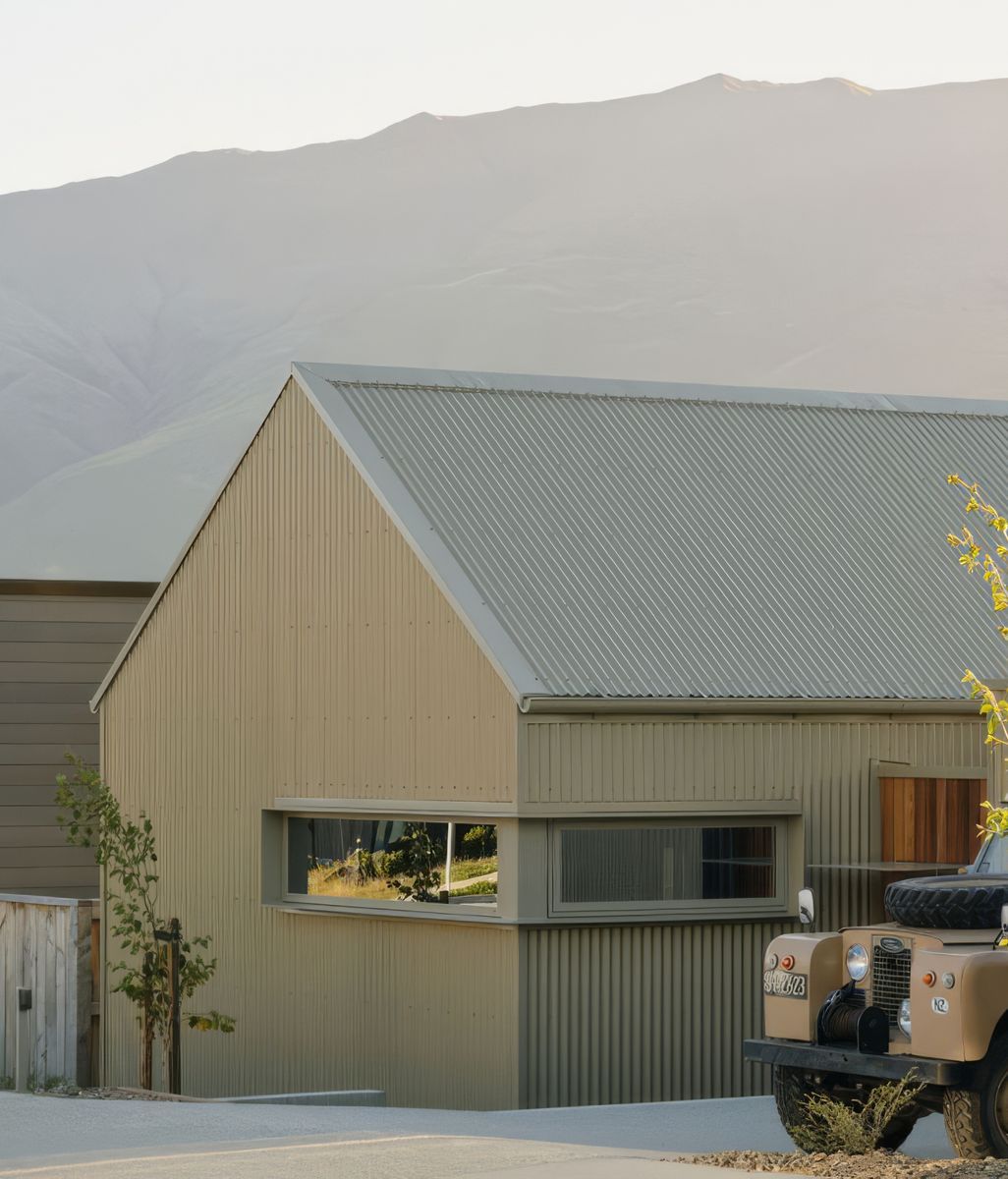
A New Way to See Colour in Context

featuring COLORSTEEL®

© COLORSTEEL®

COLORSTEEL® logo
  • 521.3K profile views
  • 277 saves

COLORSTEEL®’s redesigned website brings colour, profile and built examples closer together, reflecting a more visual approach to making exterior material decisions.

Visit Website

Featured Professionals

Written by

  • Alice Thompson

Choosing an exterior colour is rarely as simple as choosing a swatch. Scale, profile, finish, surrounding materials and even the quality of natural light can change how a colour reads once it becomes part of a building.

It is this gap between selection and reality that sits behind the newly launched COLORSTEEL® website. Rather than presenting its colour range as a standalone palette, the redesigned digital experience connects colour with profiles, finishes, completed projects and different housing types, giving homeowners more ways to understand a potential choice before moving towards specification.

Seeing colour beyond the swatch

At the centre of the new experience is a redesigned colour tool. Users can begin with an individual COLORSTEEL® colour, then explore how it relates to different profiles and finishes.

It makes an important distinction. Colour is one element of a steel surface, but profile determines its geometry and the way light and shadow move across it. A colour applied to corrugate can create a different visual effect from the same colour across the cleaner lines of a tray or trapezoidal profile.

Finish adds another variable. Classic, Low Gloss and Matte surfaces each respond differently to light, meaning the decision extends beyond hue alone.

The result is a more layered way of considering exterior materiality, where colour, surface and form can be explored together rather than as separate specifications.

Searching architecture by colour and profile

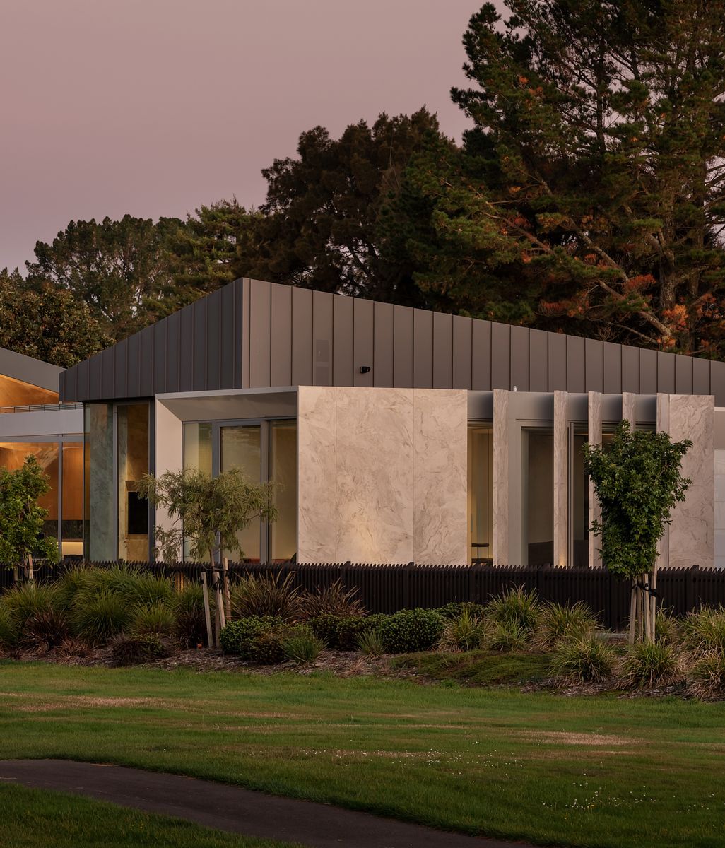
The new project portfolio takes that process into built context. Rather than browsing residential inspiration as an undifferentiated image library, projects can be filtered by colour, profile and finish, as well as applications including roofing and cladding.

This changes the role of precedent. Someone considering Lichen, for example, can look specifically at projects where the colour has been used at architectural scale. The same can be done for a tray profile, a Matte finish or a particular combination of these elements.

For homeowners, it provides a more tangible reference for conversations with an architect, designer or roofer. For design professionals, it creates a quicker way to compare how different specifications behave across building forms and environments.

Testing combinations on familiar homes

COLORSTEEL® has also carried its existing home visualiser into the redesigned experience. Here, colours, profiles, cladding and trim can be tested across familiar residential typologies, ranging from villas and traditional brick houses to alpine homes and compact contemporary forms.

The distinction between the visualiser and the project portfolio is useful. One provides a controlled environment for comparing combinations, while the other shows those decisions translated into completed architecture.

Digital colour remains a starting point rather than a substitute for physical selection. COLORSTEEL® itself recommends viewing physical samples in natural light before making a final decision, acknowledging the inevitable differences between screen rendering and the material itself.

A more direct route from inspiration to specification

While much of the redesigned experience is consumer-facing, the website also introduces a consolidated trade area for architects, designers, builders and roofing professionals. Brochures, specifications, technical documentation, certifications, sustainability information and product guidance are gathered within a dedicated resource space.

That separation is significant. The early stages of material selection are often visual and exploratory; later decisions require considerably more technical information. Bringing those stages into a clearer sequence creates a more continuous path from an initial colour idea to an informed specification.

For homeowners beginning that process, the new website offers several ways to explore before narrowing a decision. Start with the colour tool to compare colours, profiles and finishes, browse completed projects to see those choices at architectural scale, or use the home visualiser to test combinations across familiar New Zealand house types.

Credits

Discover More Readingin Materials & Craft