About
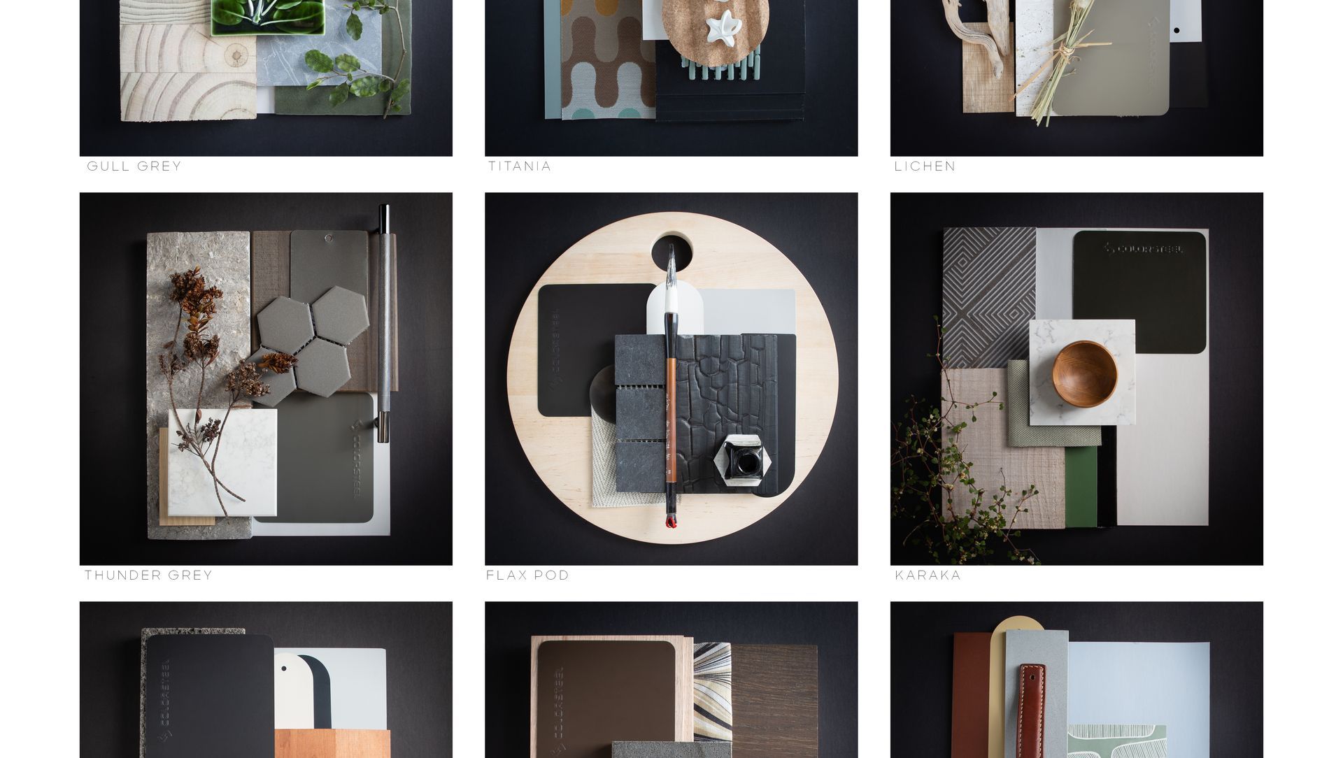
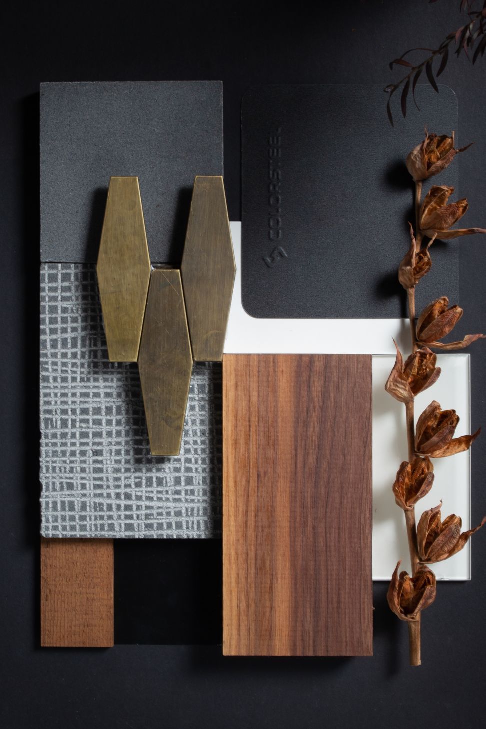
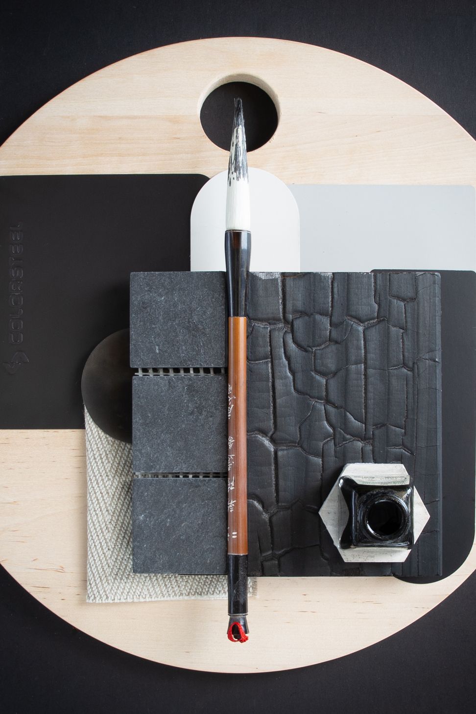
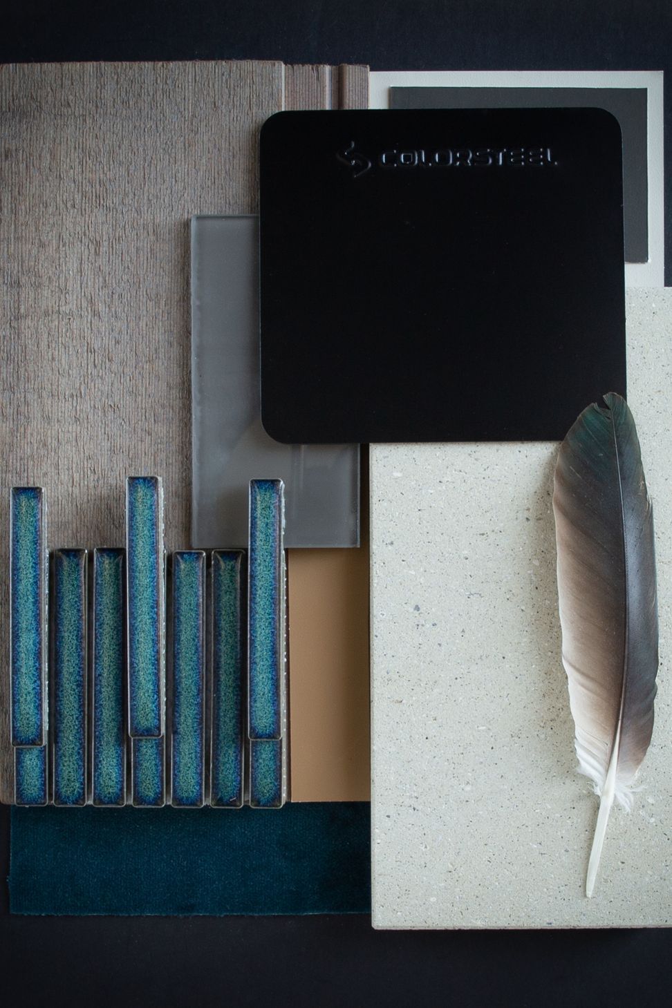
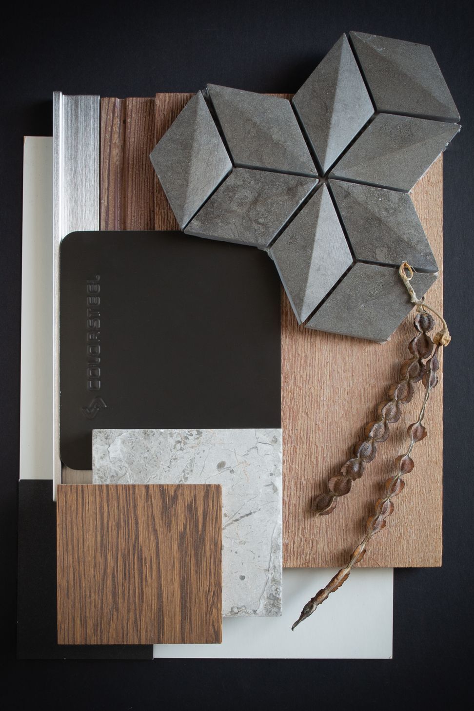
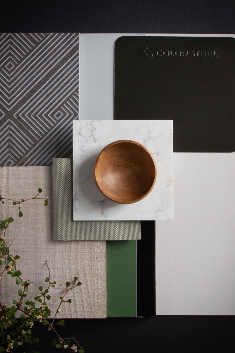
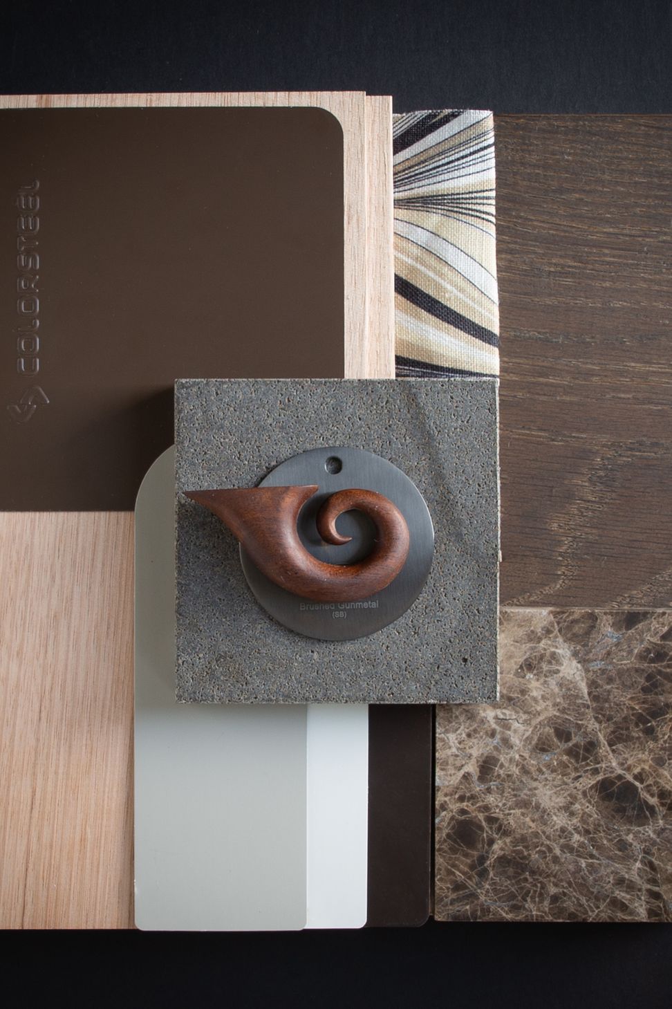
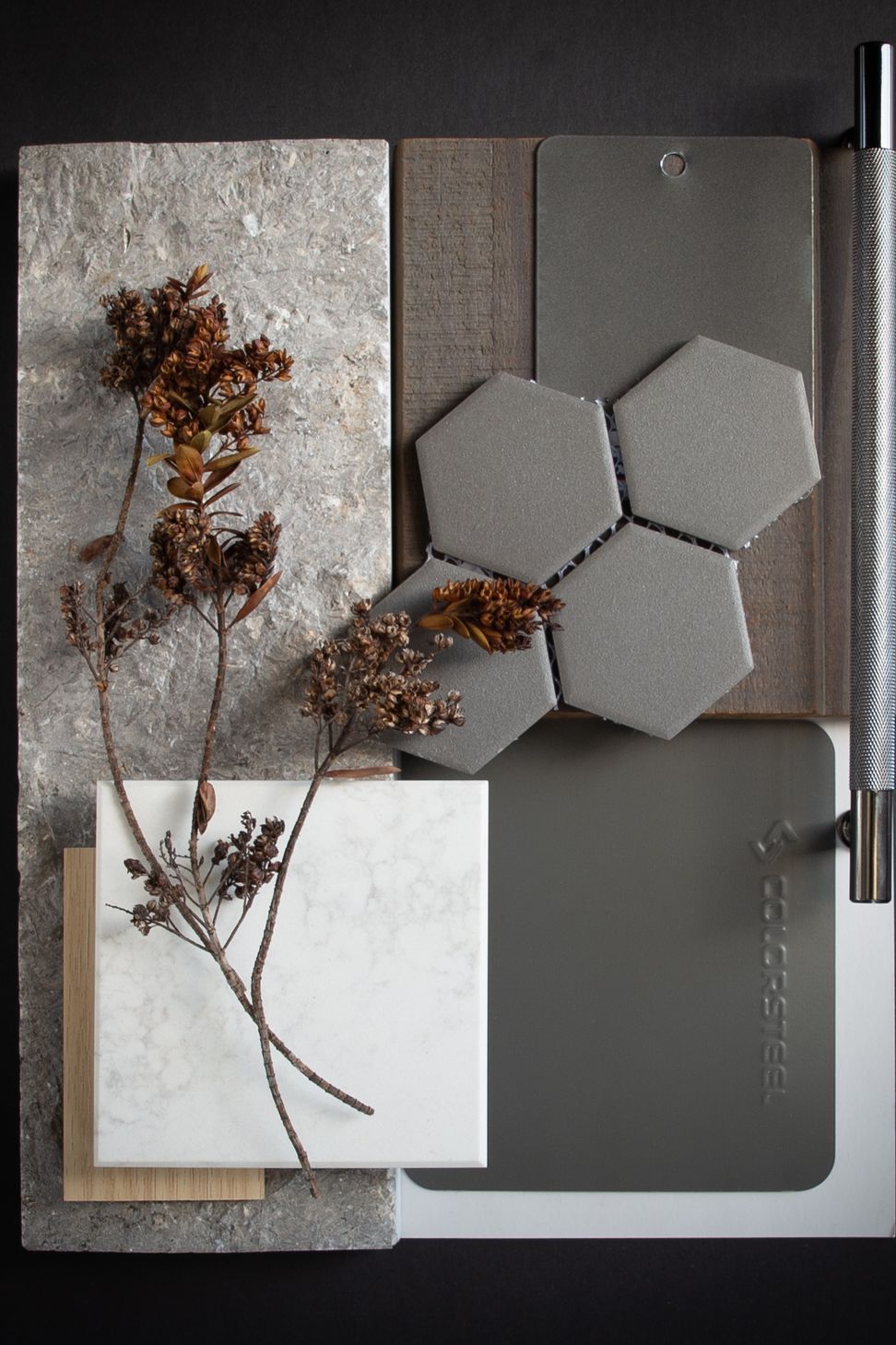
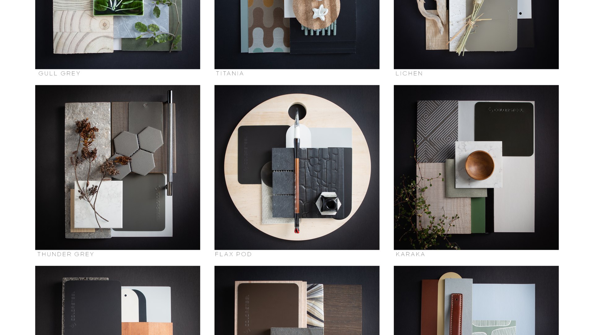
Colorsteel Moodboards.
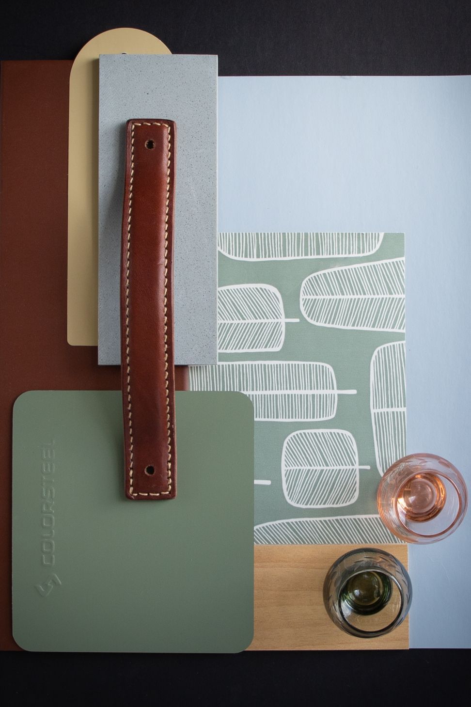
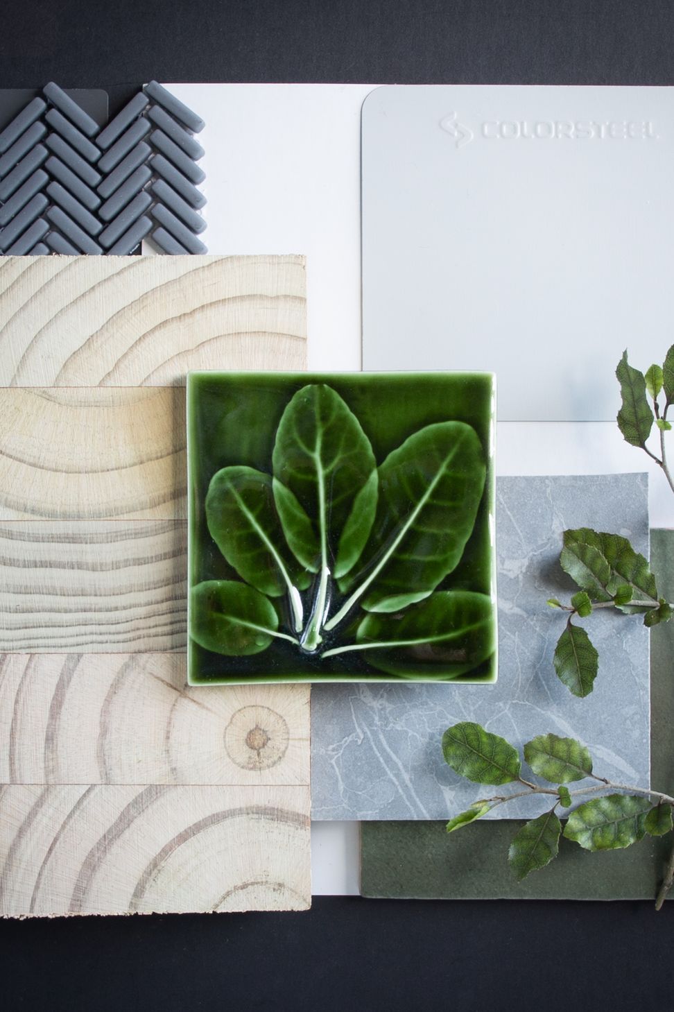
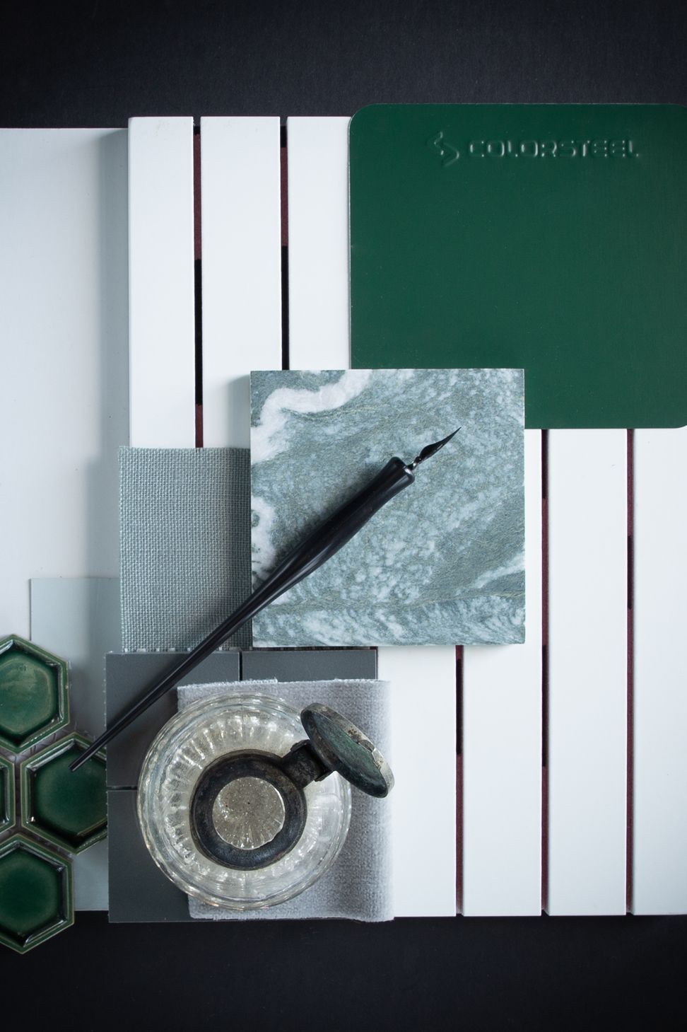
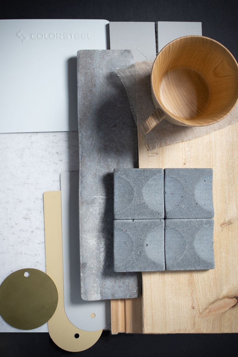
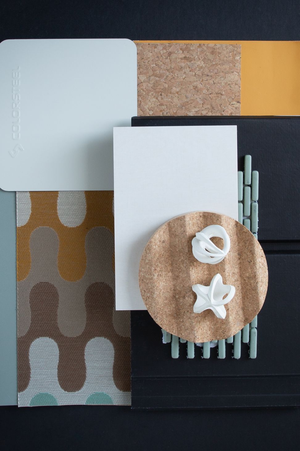
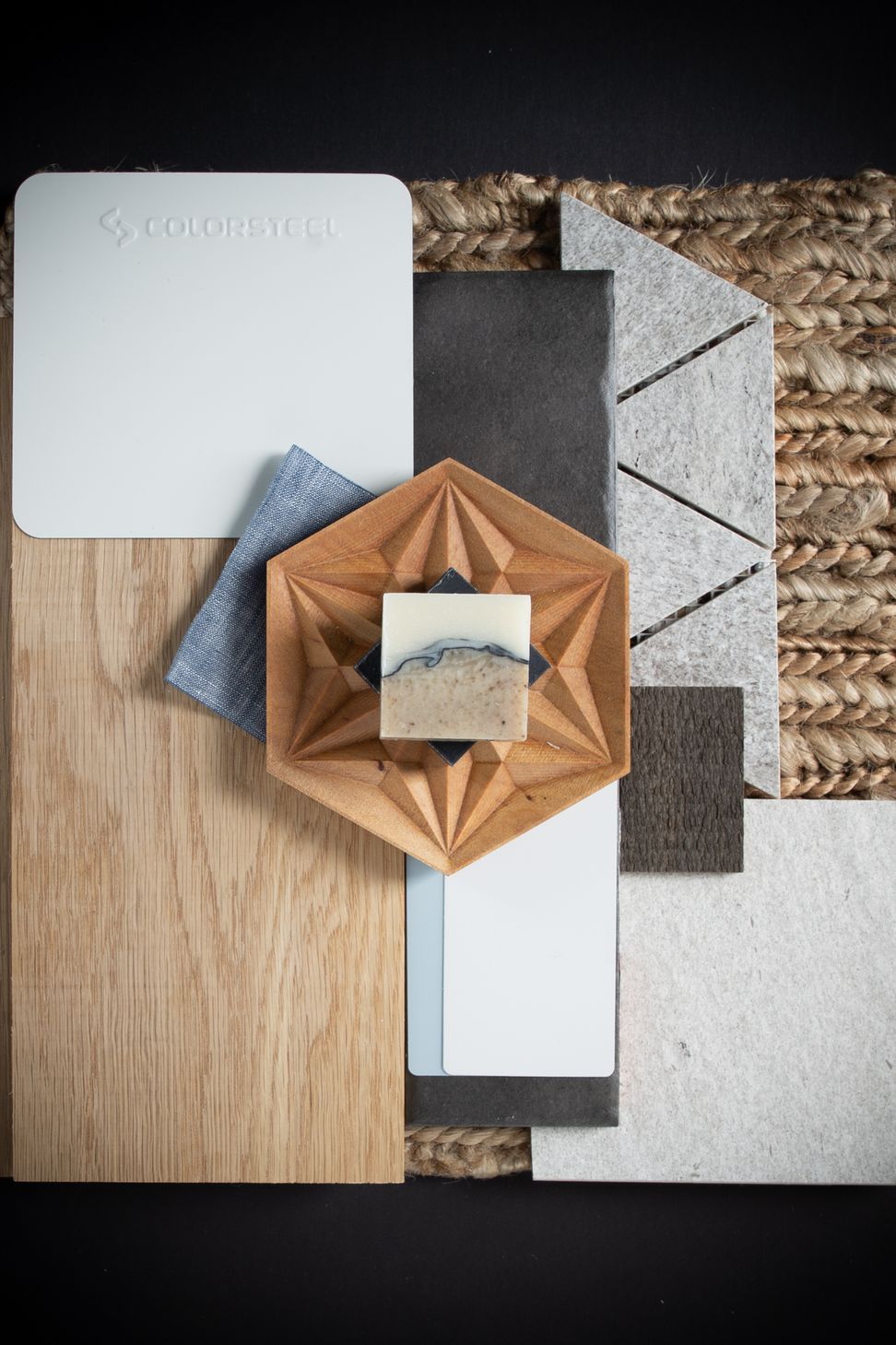
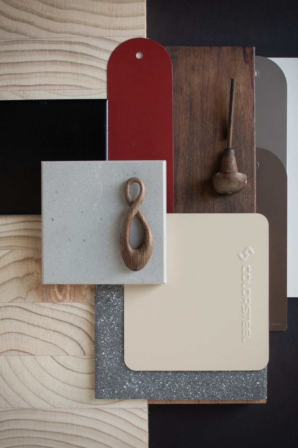
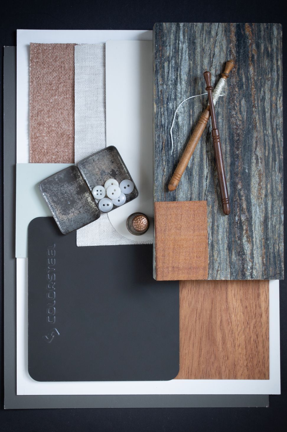
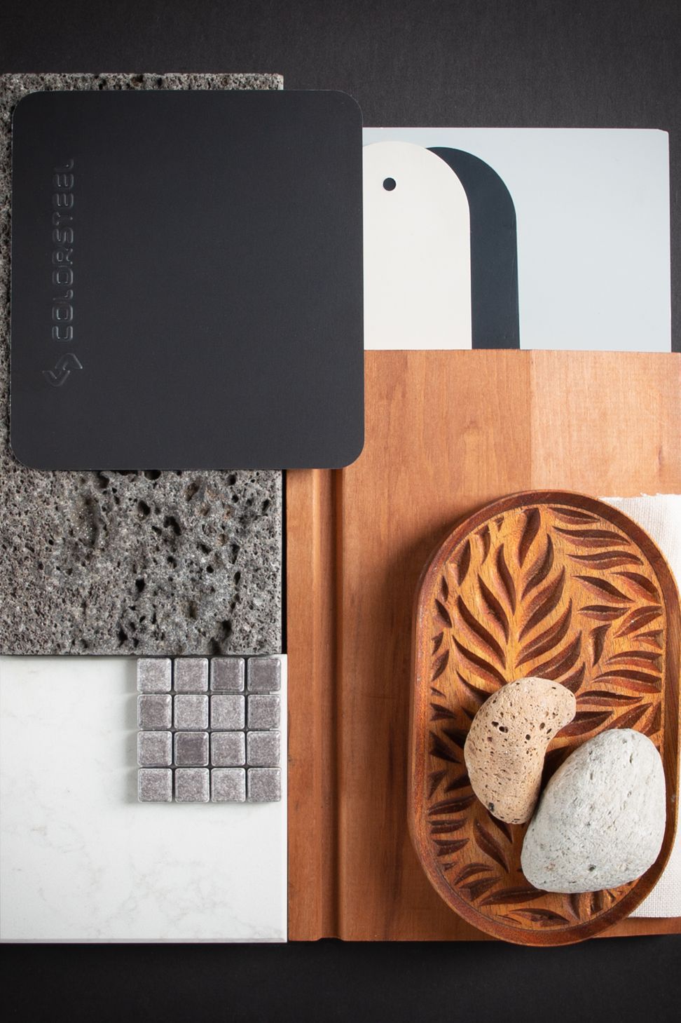
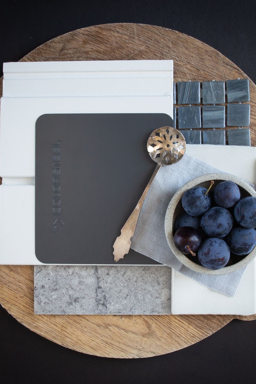
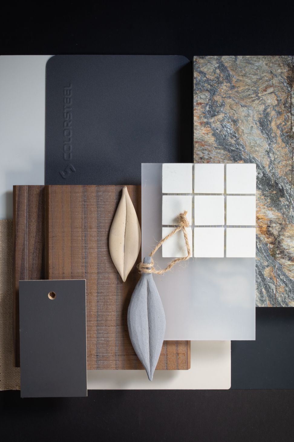
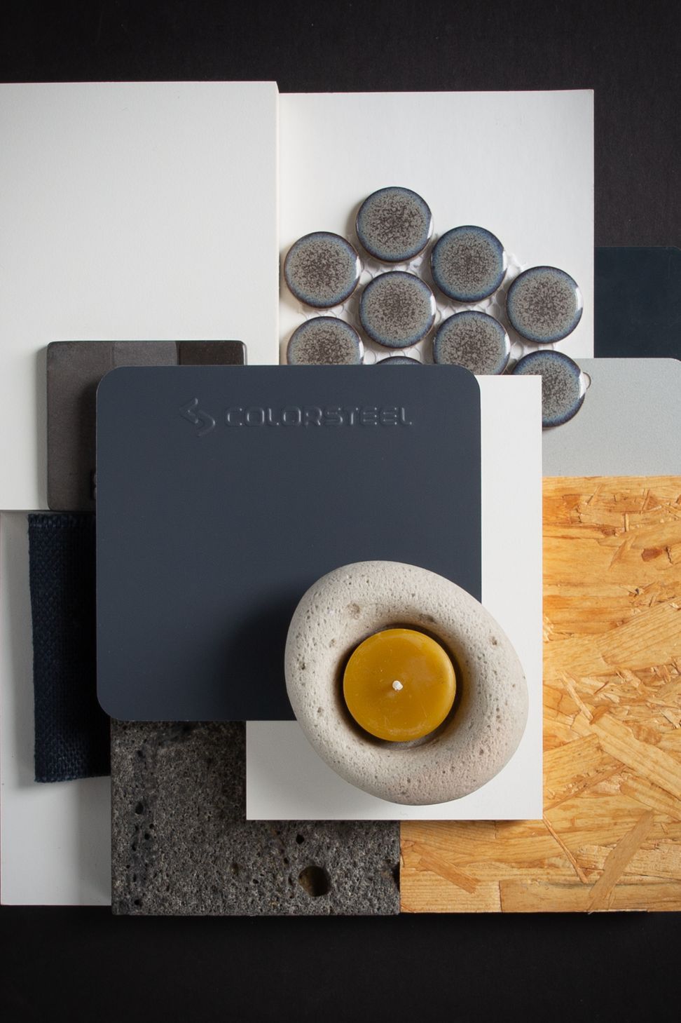
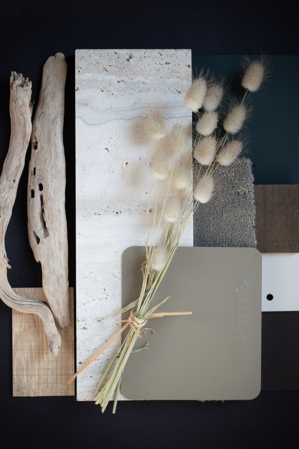
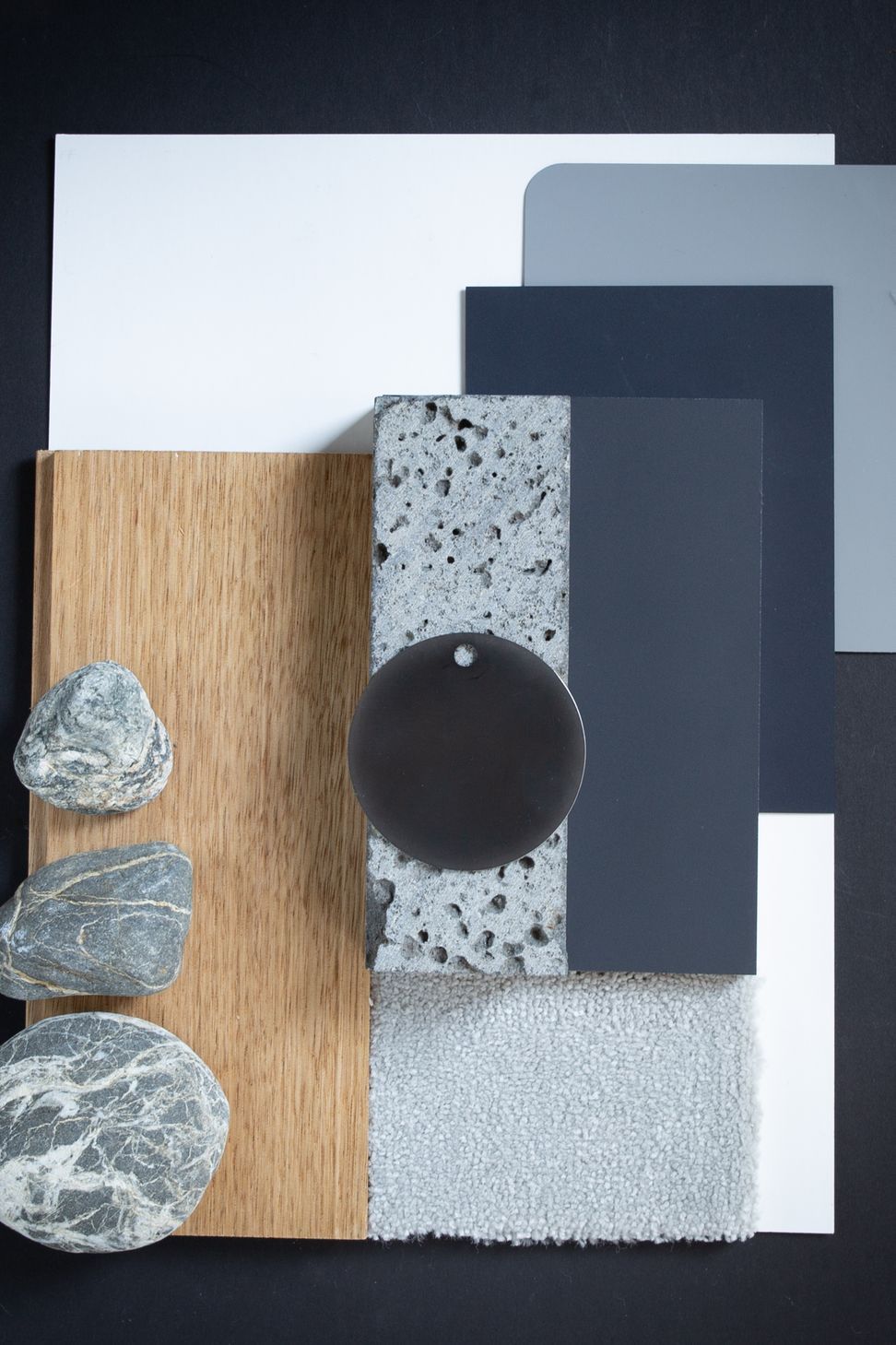
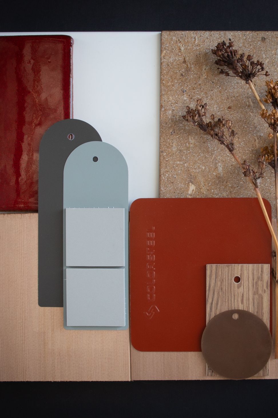
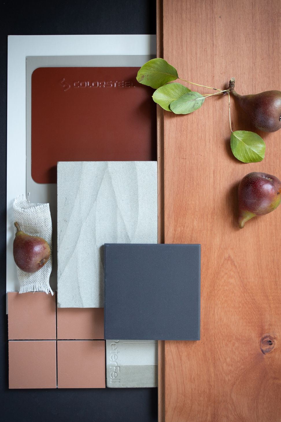
ArchiPro Project Summary - A creative collaboration with Colorsteel NZ to explore their color palette, crafting mood boards that harmonize internal and external finishes, reflecting the essence of New Zealand's landscapes and sustainable living.
- Title:
- Colorsteel Moodboards
- Architect:
- Day Architects
- Category:
- Residential/
- Renovations and Extensions
- Photographers:
- Day Architects
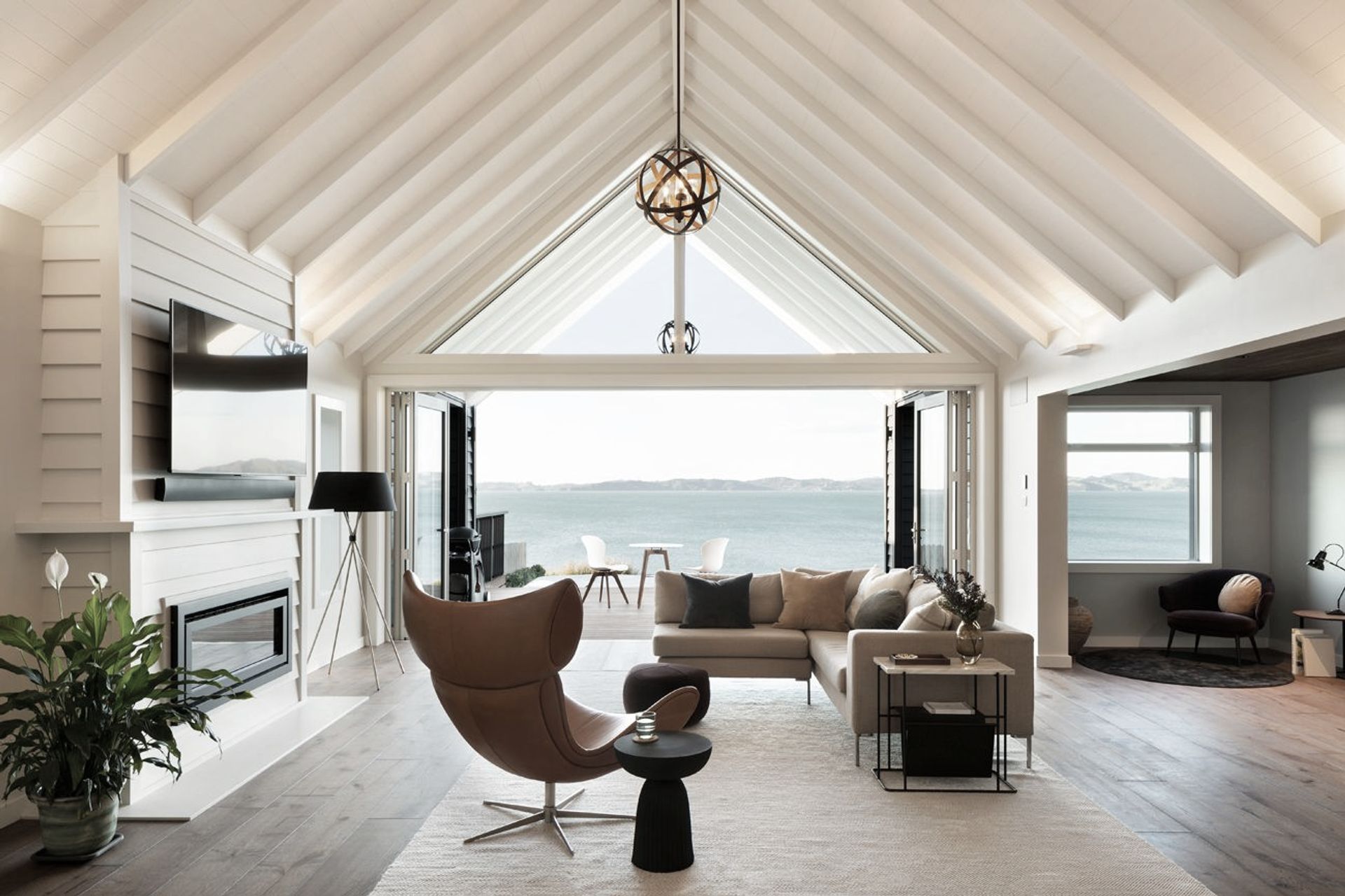
Project Gallery
Views and Engagement

Inspired by this project?Visit Day Architects
Products used


Professionals used


Day Architects. We create homes not houses. A home is where you feel most comfortable. Where you rest, live and laugh. Where you grow, celebrate and make memories. Our approach is to understand what home means to you and bring that space to life. At Day Architects, we design spaces for living. Architecture that connects you and your family to the community and environment around you. We do this with appreciation and understanding of your dreams, your lifestyle and your budget.
We believe great architecture should be accessible and designed for everyday life. Our strength lies in creating sustainable site-specific homes and bespoke renovations that frame your way of life and give families room to grow. We also design community projects, residential new builds, alterations, customised interiors, from both small to large commercial and residential projects.
We take client care seriously, and are there throughout your project to bring your dreams to reality. Working with us is a truly collaborative experience. Understanding our clients and their objectives is a very important part of the process and is fundamental to what we do. That’s why we place a high emphasis on listening, asking the right questions and enjoying quality discussion, to advance your goals and ultimately design architecture that truly fits your life.
NZIA Practice, NZGBC Member (NZ Green Building Council).
Year Joined
2016
Established presence on ArchiPro.
Projects Listed
9
A portfolio of work to explore.
Day Architects.
Profile
Projects
Contact
Project Portfolio


Other People also viewed


Why ArchiPro?
No more endless searching -
Everything you need, all in one place.Real projects, real experts -
Work with vetted architects, designers, and suppliers.Designed for New Zealand -
Projects, products, and professionals that meet local standards.From inspiration to reality -
Find your style and connect with the experts behind it.Start your Project
Start your project with a free account to unlock features designed to help you simplify your building project.
Learn MoreBecome a Pro
Showcase your business on ArchiPro and join industry leading brands showcasing their products and expertise.
Learn More