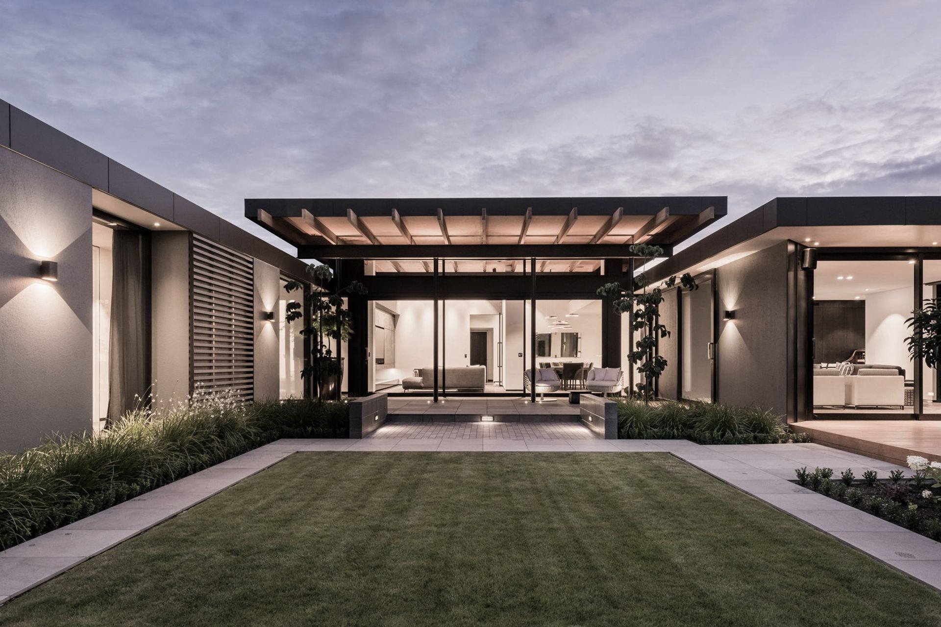
An architect’s own family home draws from 30 years’ experience working at one of Christchurch’s leading practices to create a spacious modern house that owes its folding roof form to a tricky site. Bound by close neighbours and backing onto a railway line, the house needed a clever design for privacy and to draw light in wherever it could.
As a director at Sheppard & Rout Architects, Tim Dagg has worked on major public projects throughout Christchurch – including several developments at Burwood Hospital, Christchurch Hospital’s Gastroenterology Unit, the refurbishment of the Public Trust Building and the Wilding Park Indoor Tennis Centre – but designing a home for his own family was a personal achievement and a labour of love.
“I’ve designed a lot of houses but this is the first one I’ve designed for us,” Tim says. “We purchased the property seven years ago and lived in an existing 1940s bungalow on the site for about five years, before we decided to demolish the old house and build a new home,” explains Tim. “The old house wasn’t going to work for us in the longer term as we needed more space, including a bigger kitchen for my wife, who has previously worked in the catering industry. However, we liked the site as it’s quite unique. It has established native trees that were planted by a previous owner who worked at the Christchurch Botanic Gardens, which means you can’t see the neighbours, and it can never be built up due to the orientation of a railway line on the north-western corner of the site and a school over the tracks.”
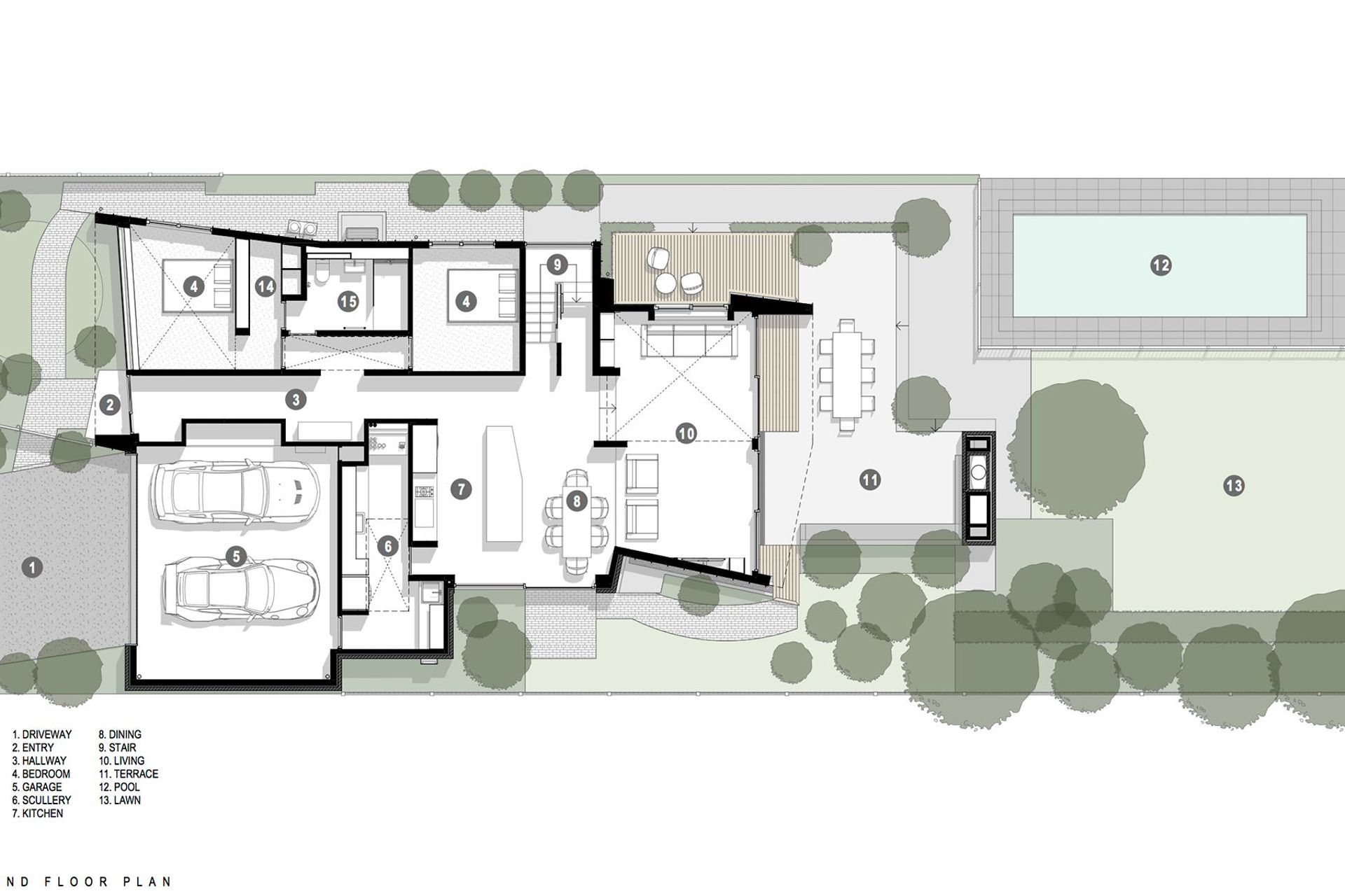
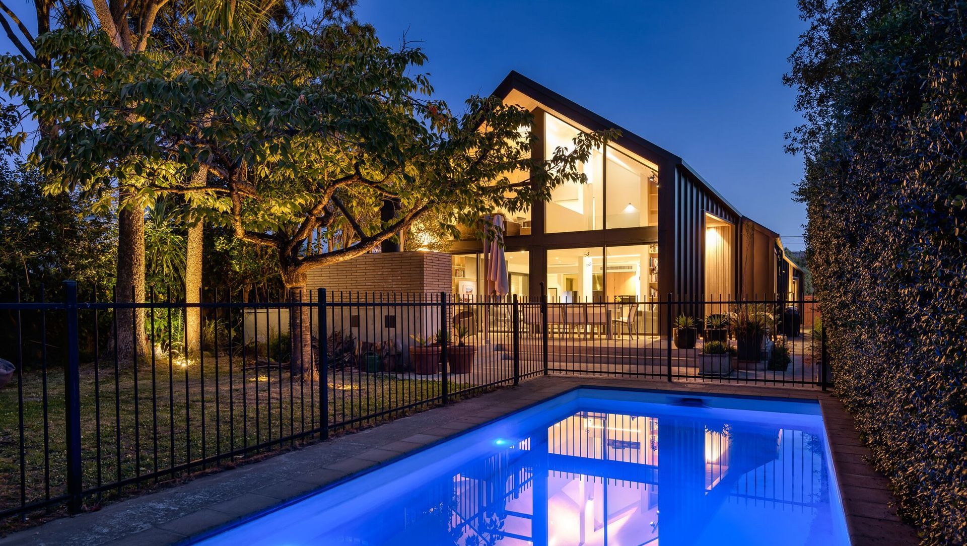
Tim worked on the drawings for about a year, outside of his day job, before he settled on a design. “We kept the existing swimming pool and terrace at the rear, so the starting point for the design was to make the most of the mature trees at the northern end of the site,” he says. “However, that meant at least one bedroom would face the street and a bedroom window facing the street is a pet hate of mine in terms of privacy. We elected to put our bedroom upstairs to make the most of the sunlight and the views of the trees; they include native lancewood (horoeka), kowhai and cabbage trees (tī kōuka).”
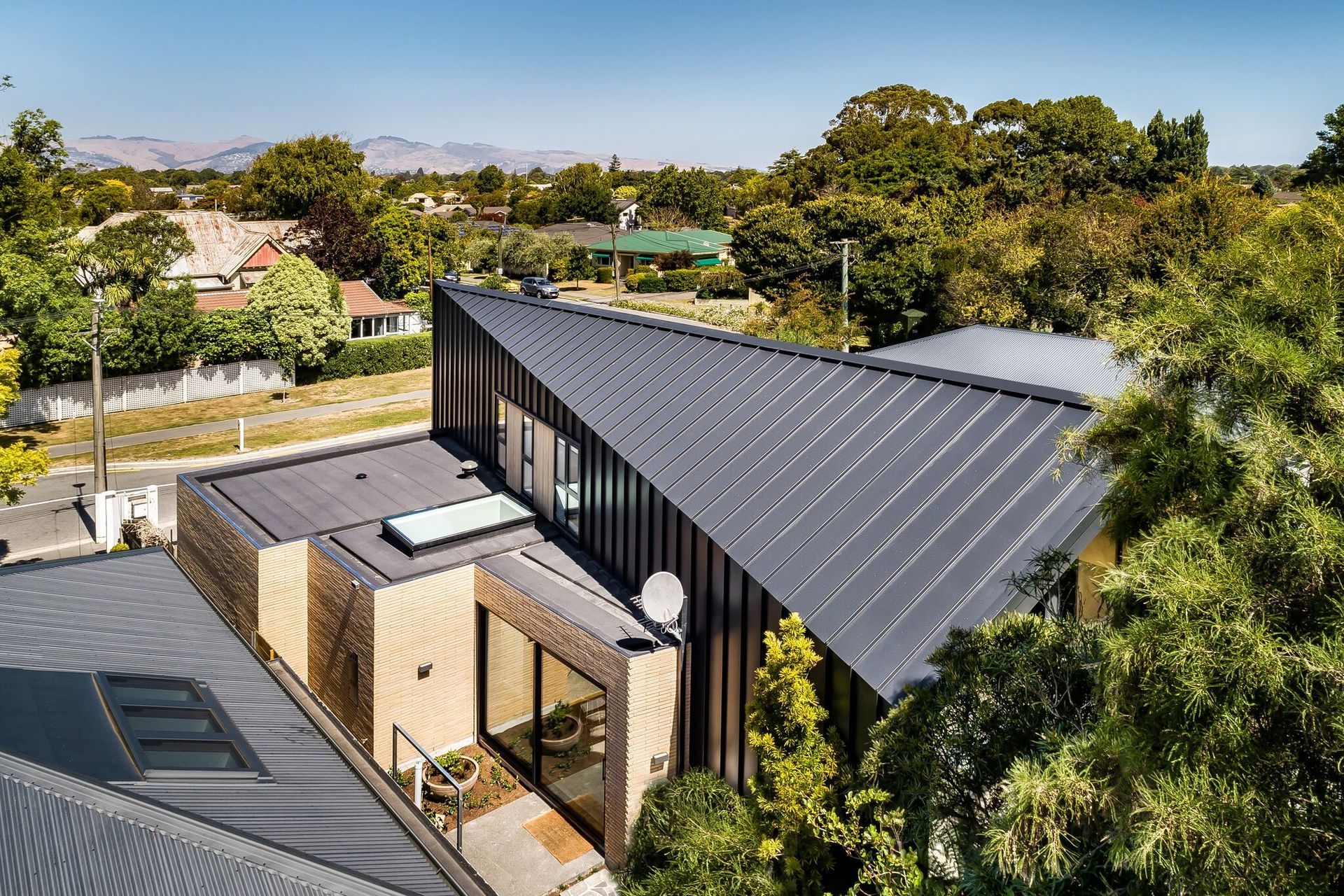
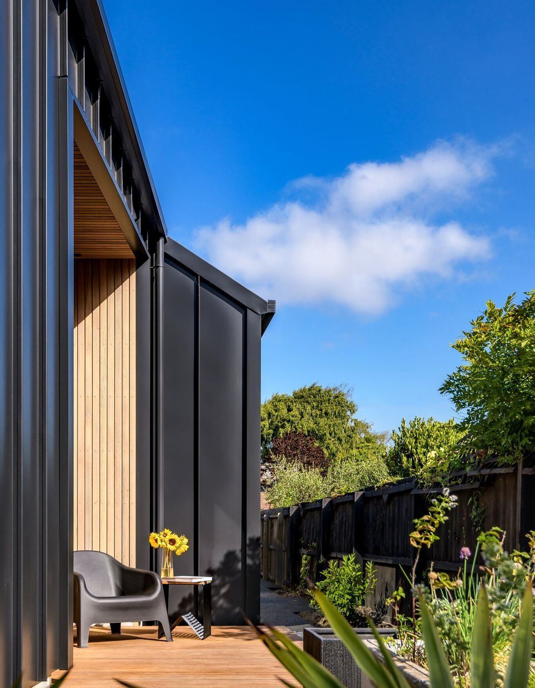
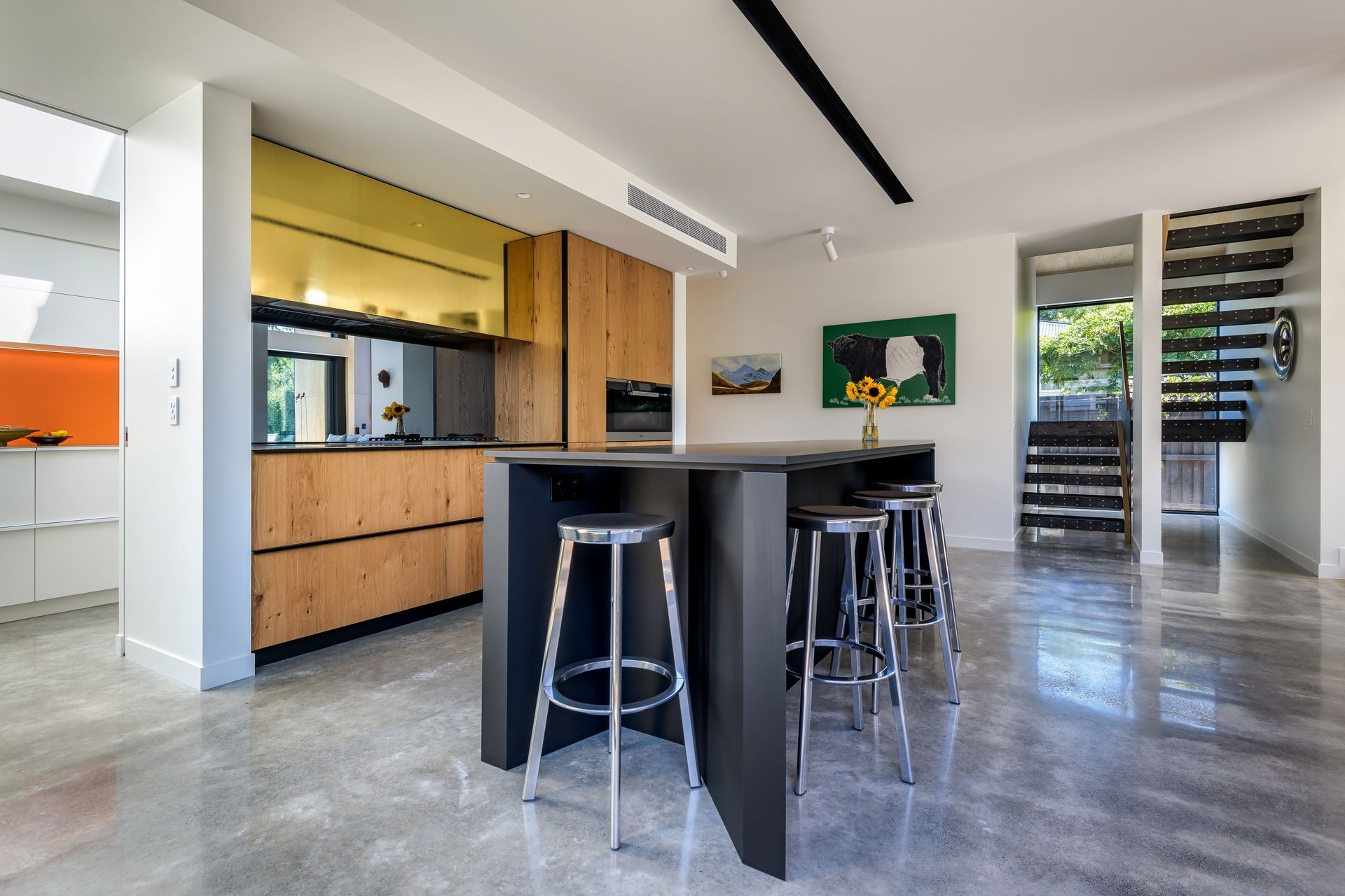
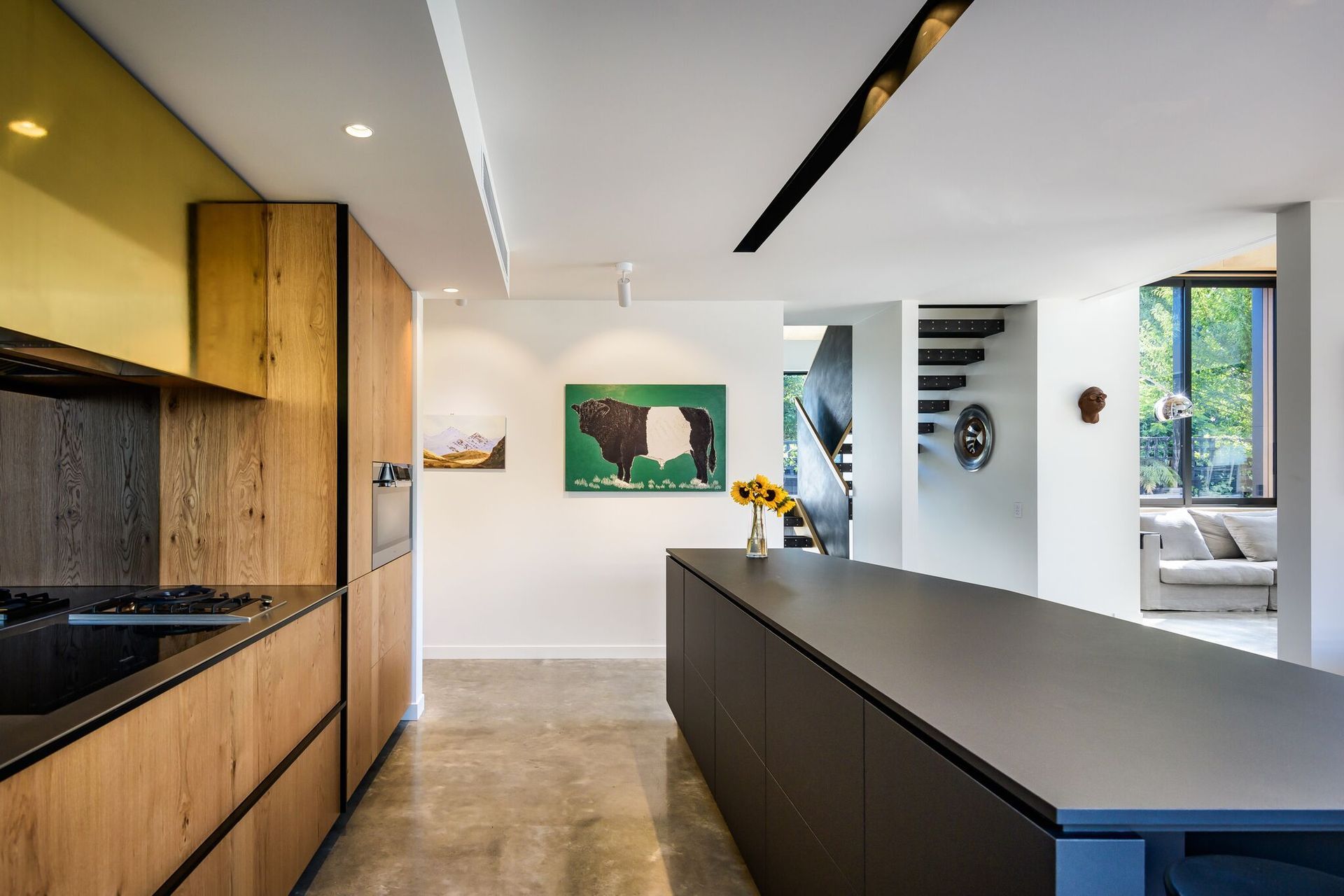
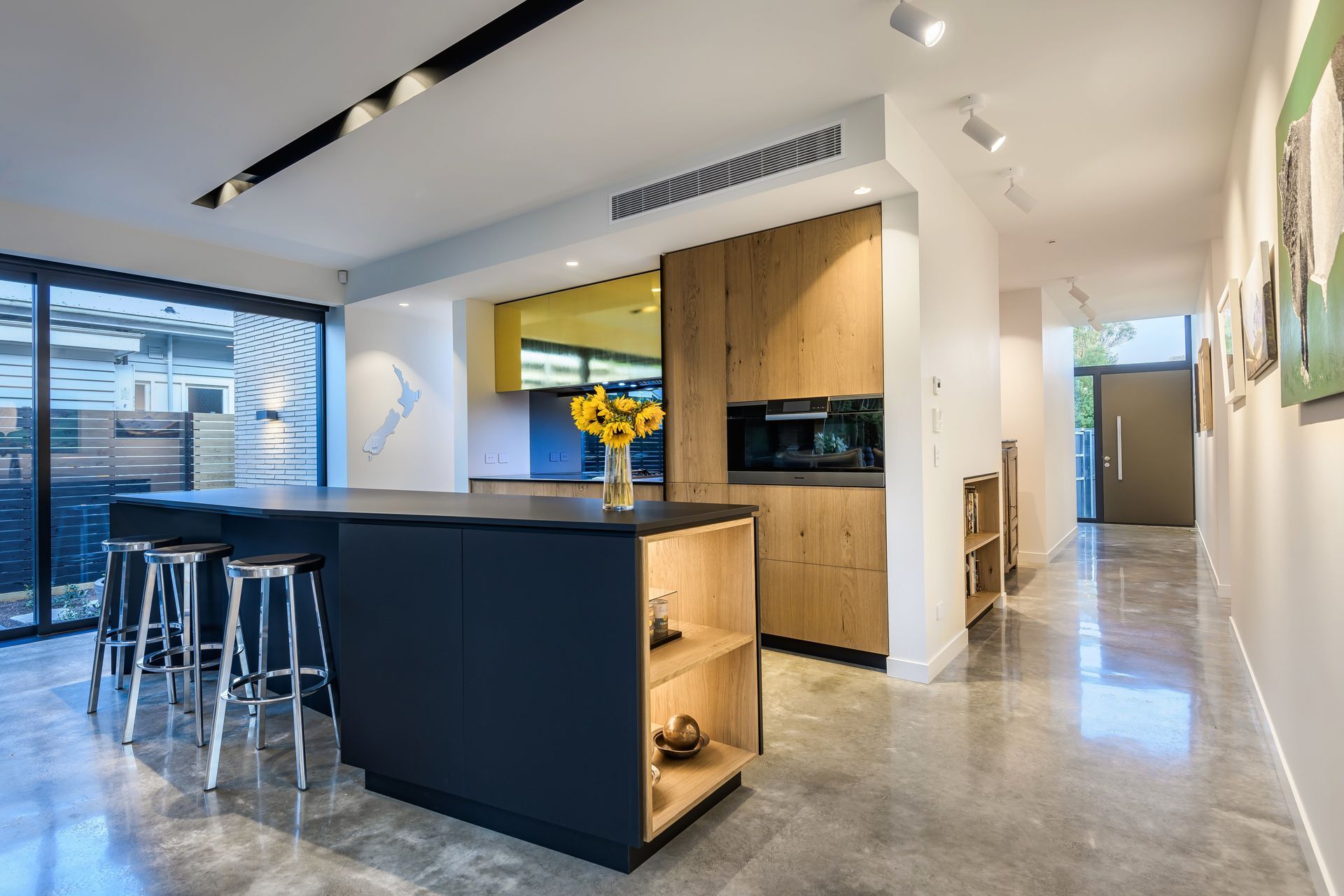
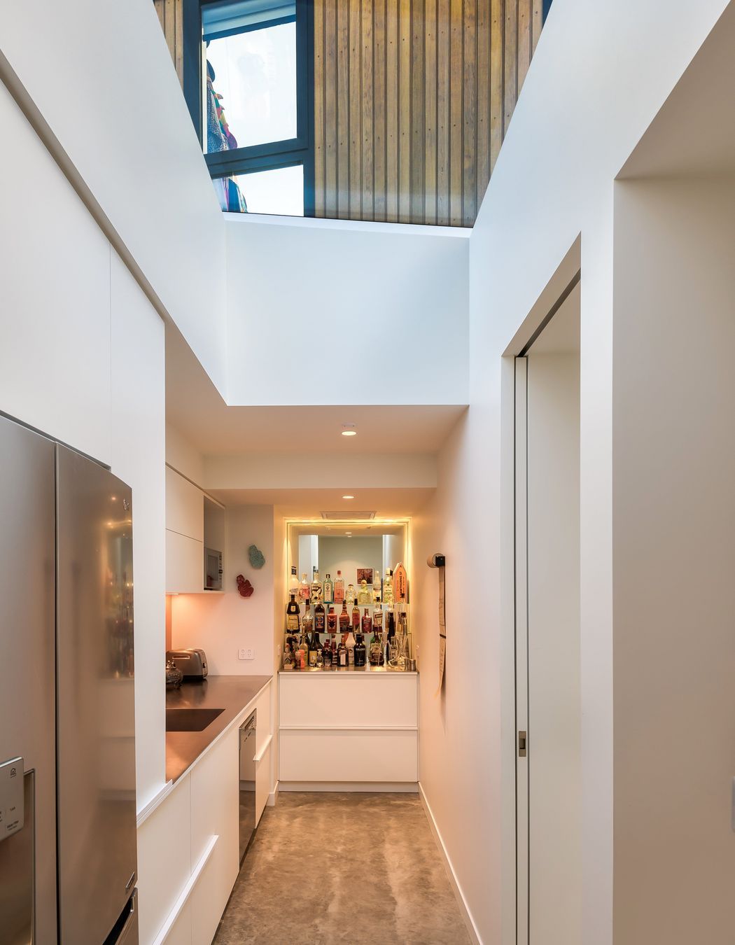
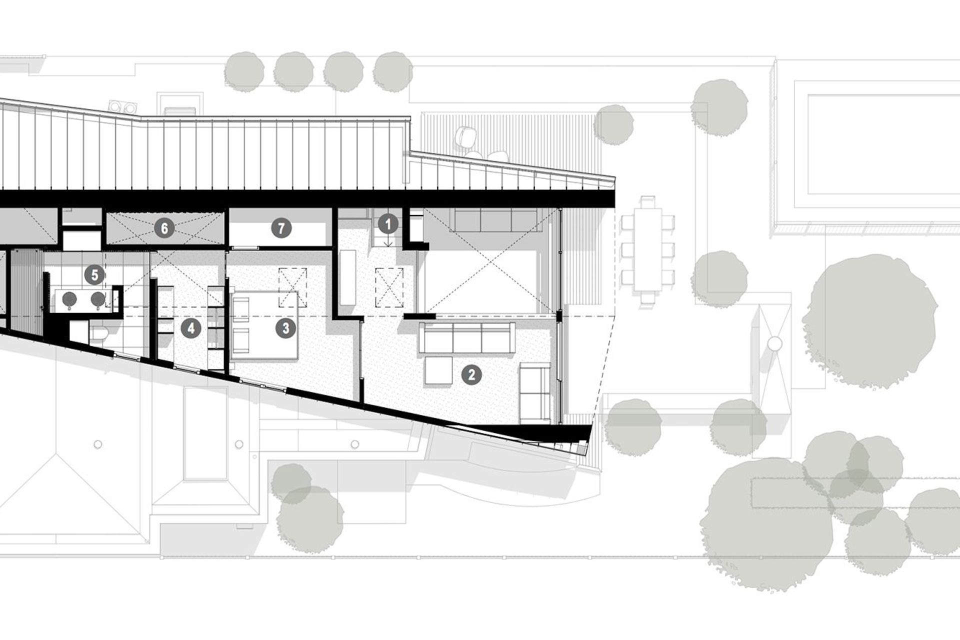
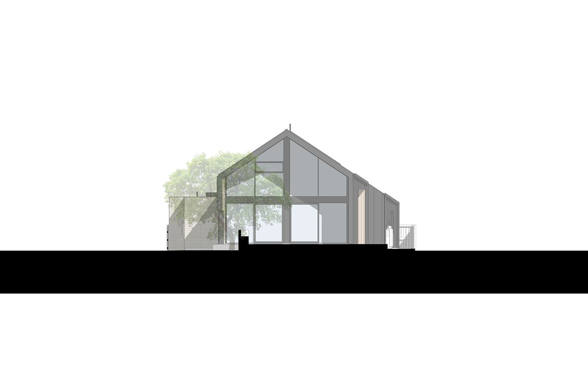
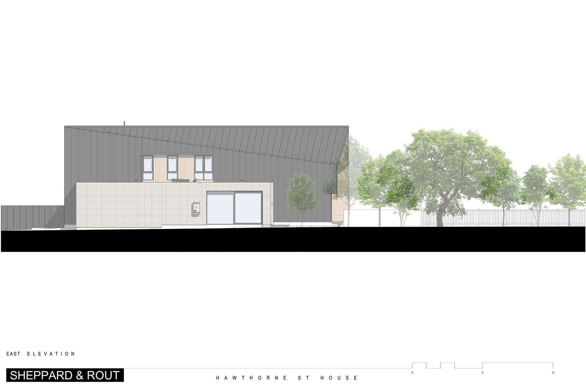
While developing the design, Tim kept returning to the idea of a folding roof plane that starts at the straight edge of a half gable facing the street, before folding and widening to become a full gable elevation at the rear of the house. The main two-storeyed form is clad in metal tray and contains the living areas and two bedrooms on the ground floor, and the master bedroom suite and another lounge on the upper floor. Jutting out from its eastern façade is a staggered, single-storey brick form that contains a two-car garage, part of the kitchen and a scullery.
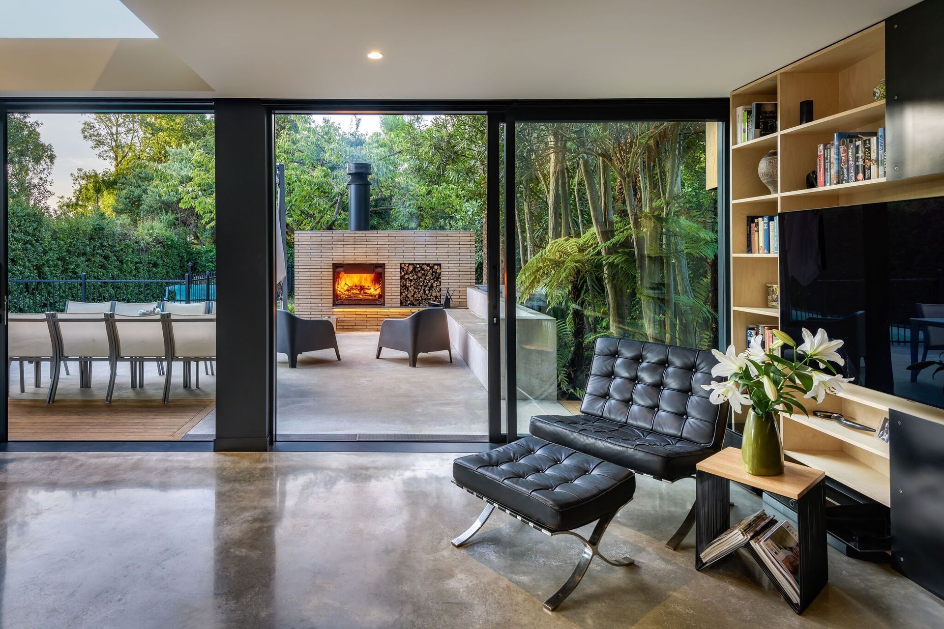
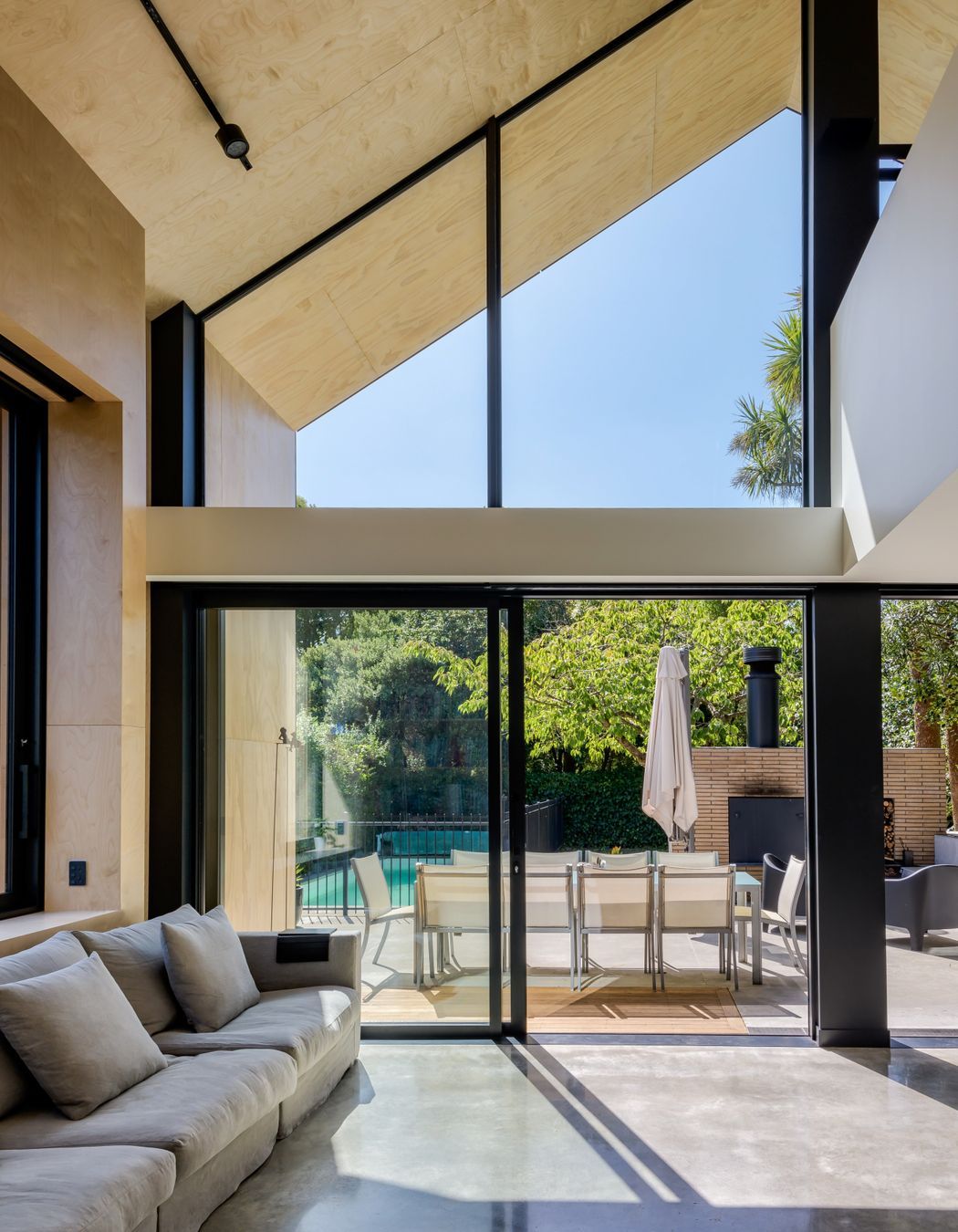
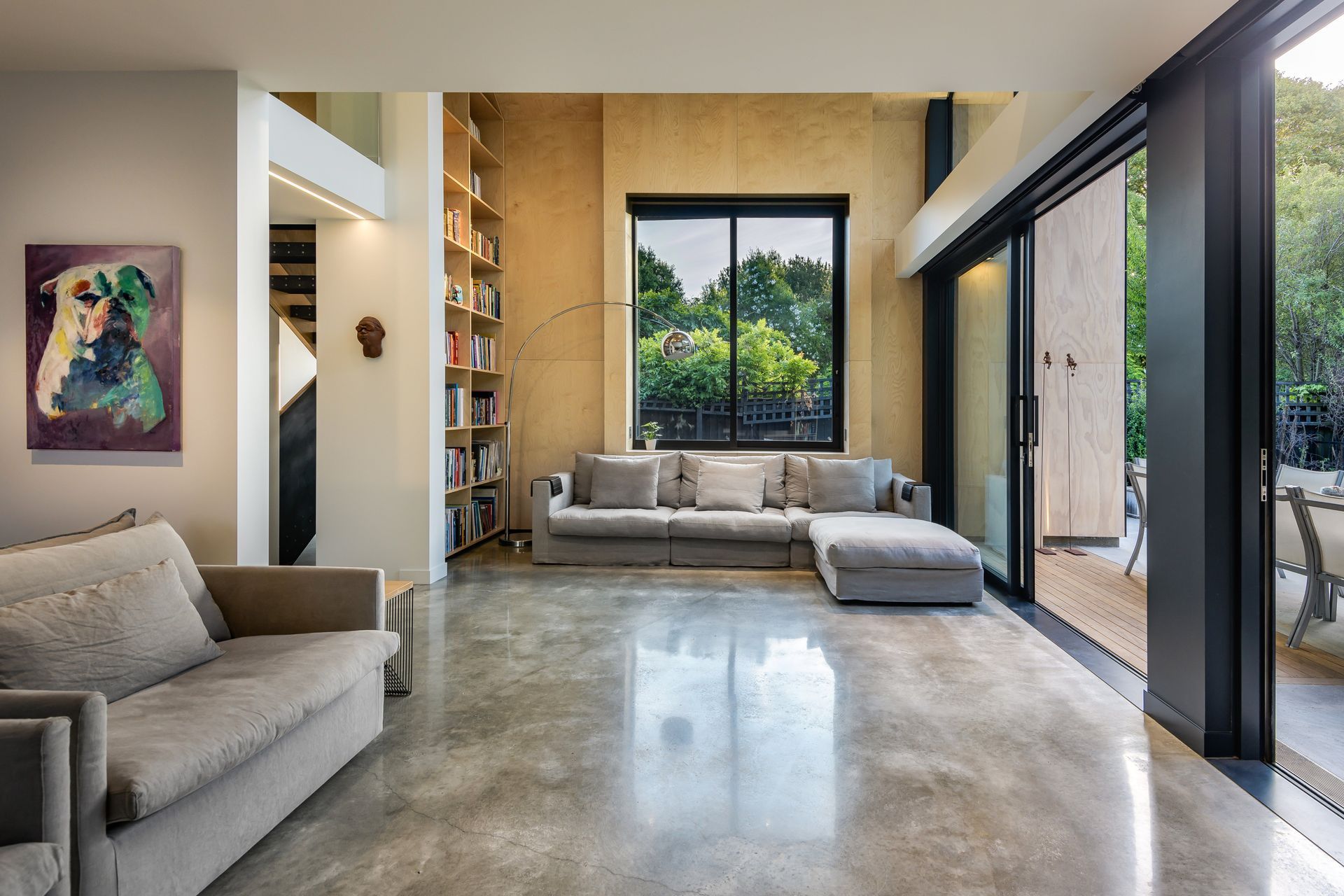
Upon entering the house, a hallway leads visitors to the double-height living room that opens up into the garden. Here, a stunning outdoor entertaining space has a built-in brick fireplace/pizza oven, two seating areas, a dining area and a swimming pool. “We have plenty of options for entertaining and relaxing, and the outdoor fire/pizza oven is used a lot in the evenings. When we have people over, they gravitate to the fire and start talking,” says Tim. “The upstairs’ mezzanine lounge is also currently being used as my home office and, during the winter, we are spending more time here in the evenings.”
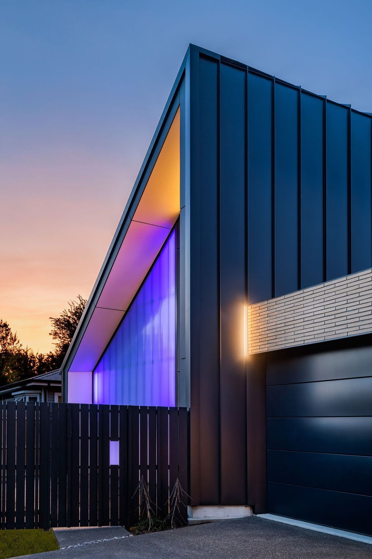
Tim has deliberately designed the southern façade to ‘add’ to the street with a polycarbonate wall that glows at night. “I didn’t want bedroom windows that face the street but the polycarbonate wall offers privacy and creates a glow that interacts with the street,” explains Tim. “We were going to just use polycarbonate but, since we’re 80m from a railway line, the acoustic engineer suggested inserting a plywood wall in behind to achieve the acoustic requirements so in the cavity between the lining and the plywood, we inserted colour-changing LED lights.”
“The LED lights have worked better than just normal lights as they interact with the street; one neighbour asked us to turn the lights pink for her birthday and, then, another neighbour asked for yellow; then, we switched them to red for Anzac Day,” he adds. “A lot of people walk by and comment about it, and it was a talking point during the neighbourhood lockdown drinks we had in our driveways. It’s certainly better than a blank façade because it encourages interaction in our community – I’ve spoken with people I might not have spoken with before and, I guess, people watched the house being built so they were interested to know more about it.”
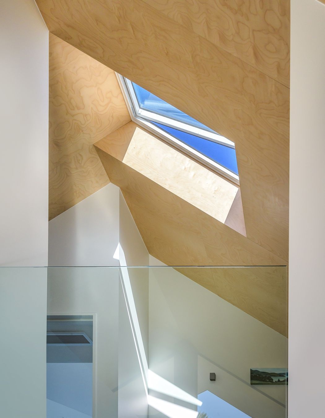
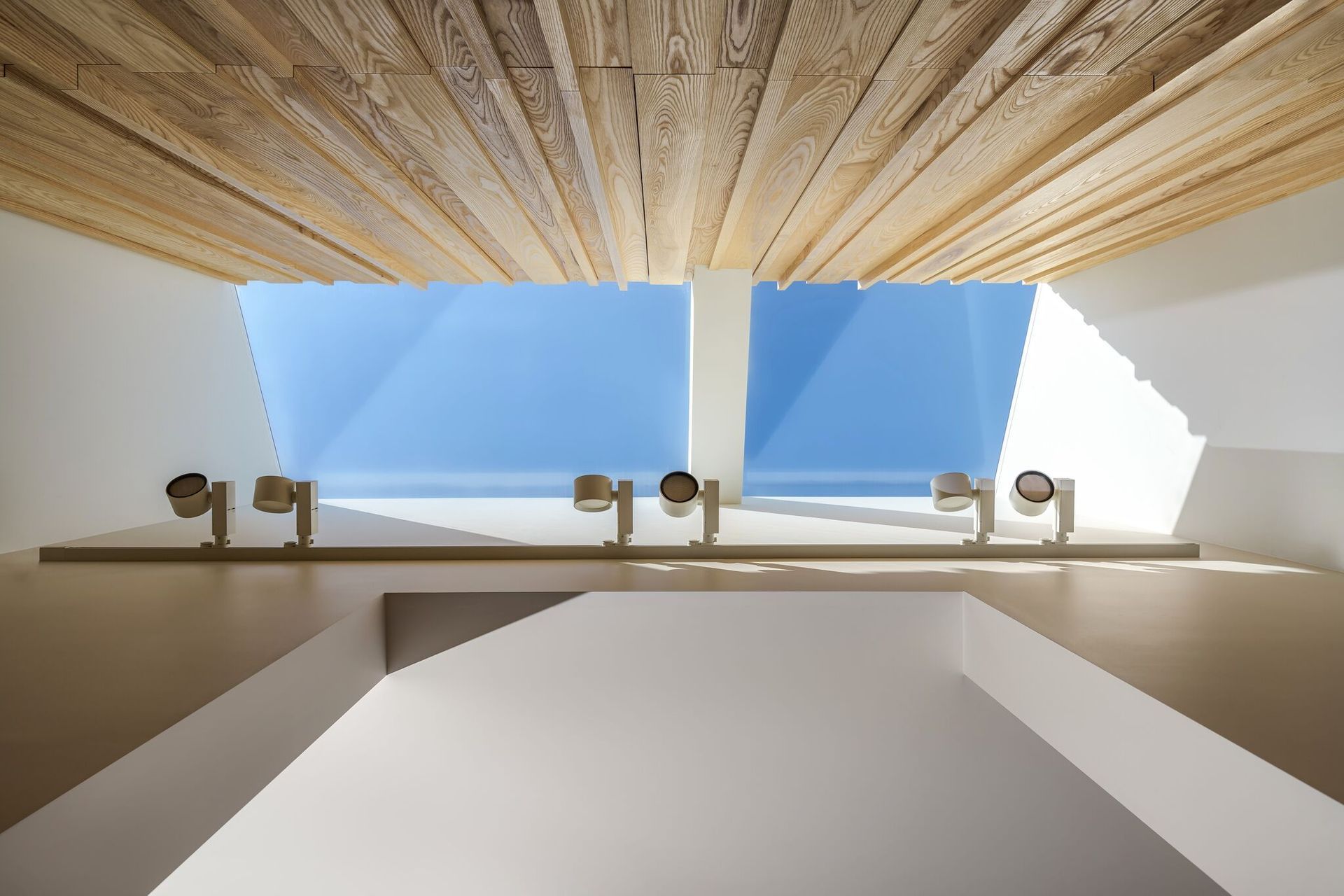
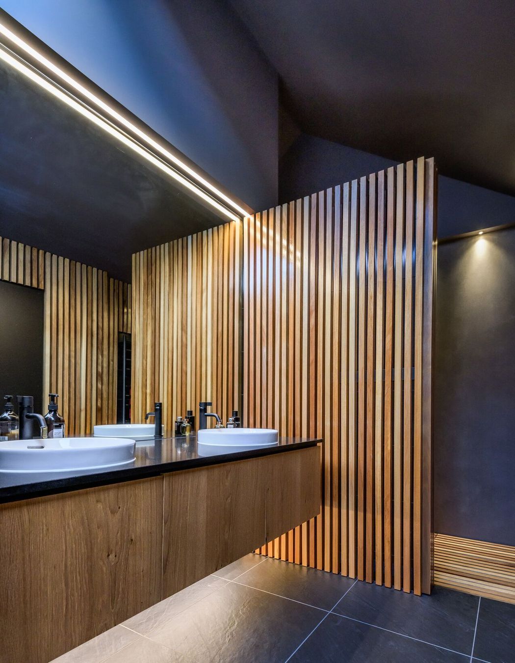
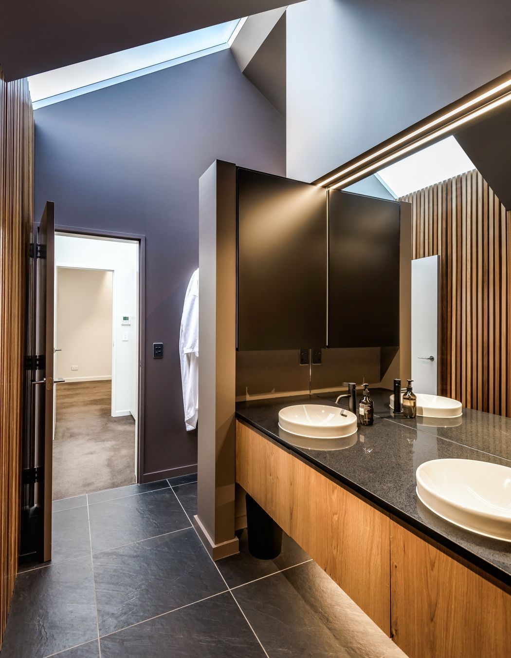
It was also important for Tim to create an energy-efficient, low-maintenance home to help future proof it. Roof overhangs are 1.5m wide to prevent the house from overheating in the summer. Windows were laid out to maximise cross ventilation and mitigate the big glass north-facing wall, while automated skylights draw light into the deep recesses of the home, including the dressing room and ensuite bathroom. To cope with the cooler Canterbury winters, extra-thick insulation, a polished concrete slab and double-glazed, thermally broken windows retain the internal heat, ensuring the house hardly needs heating.
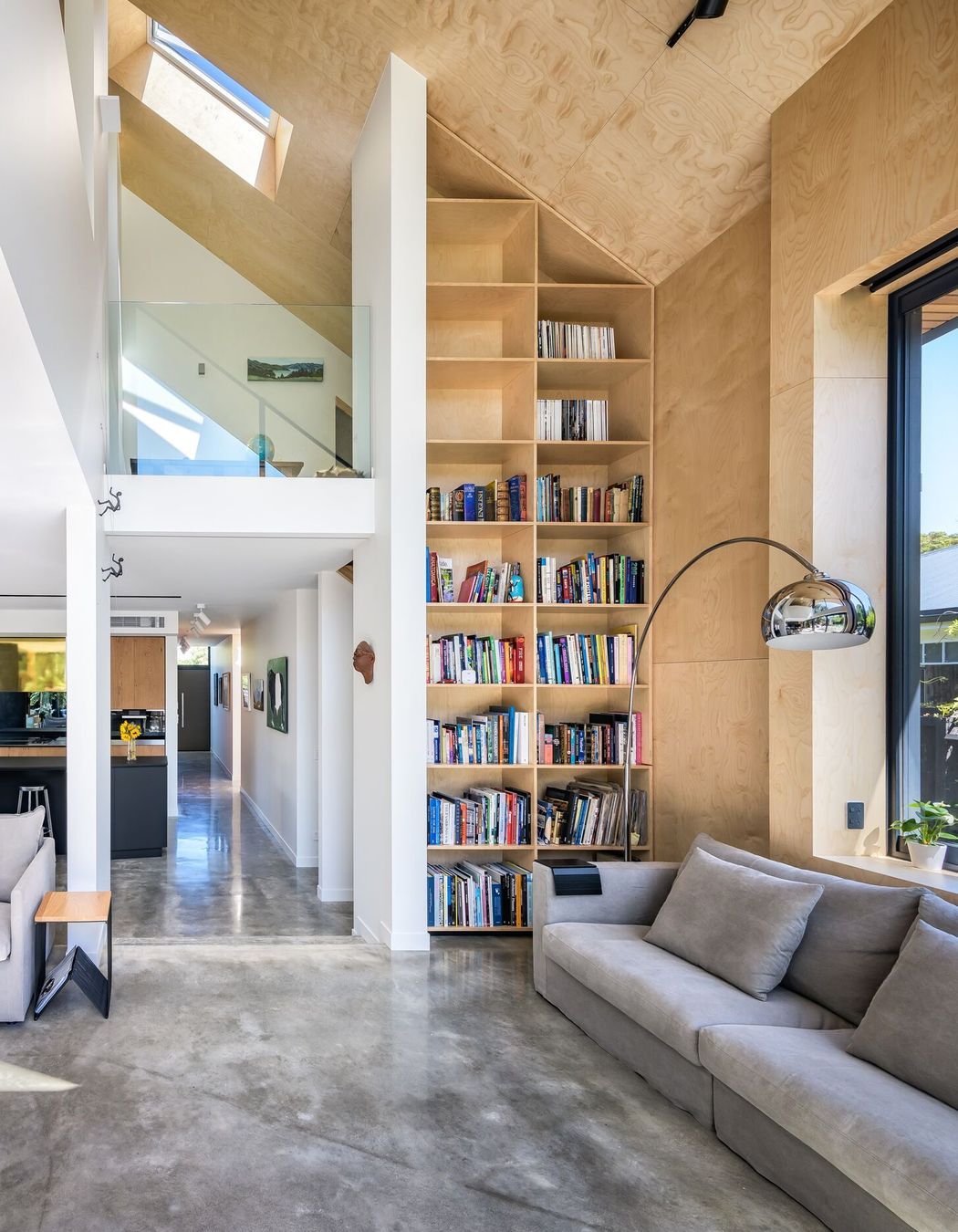
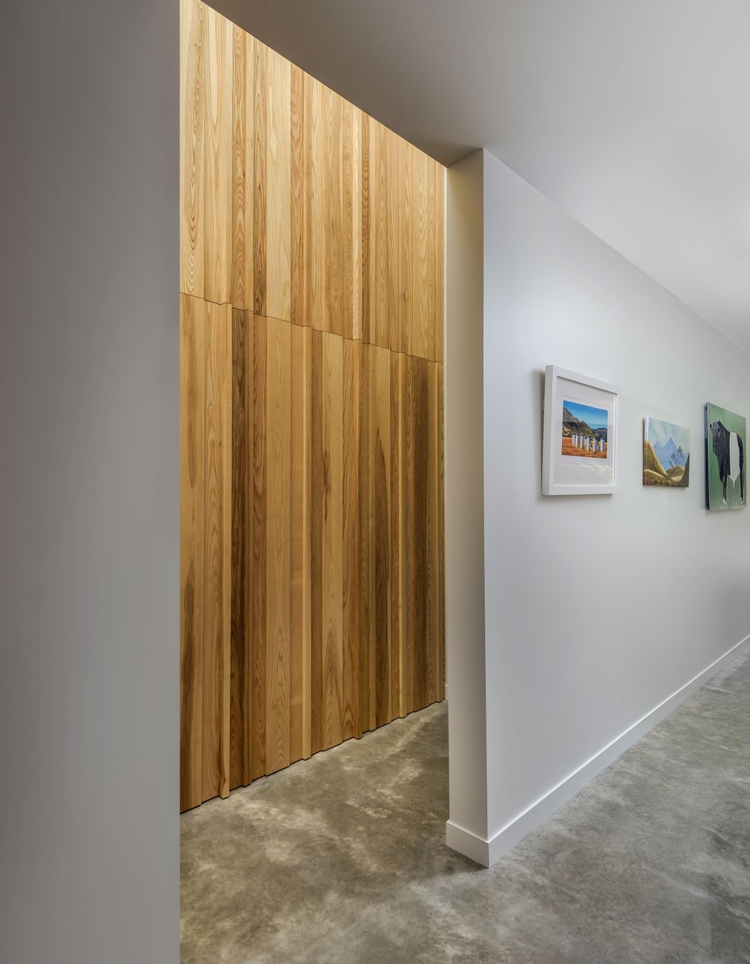
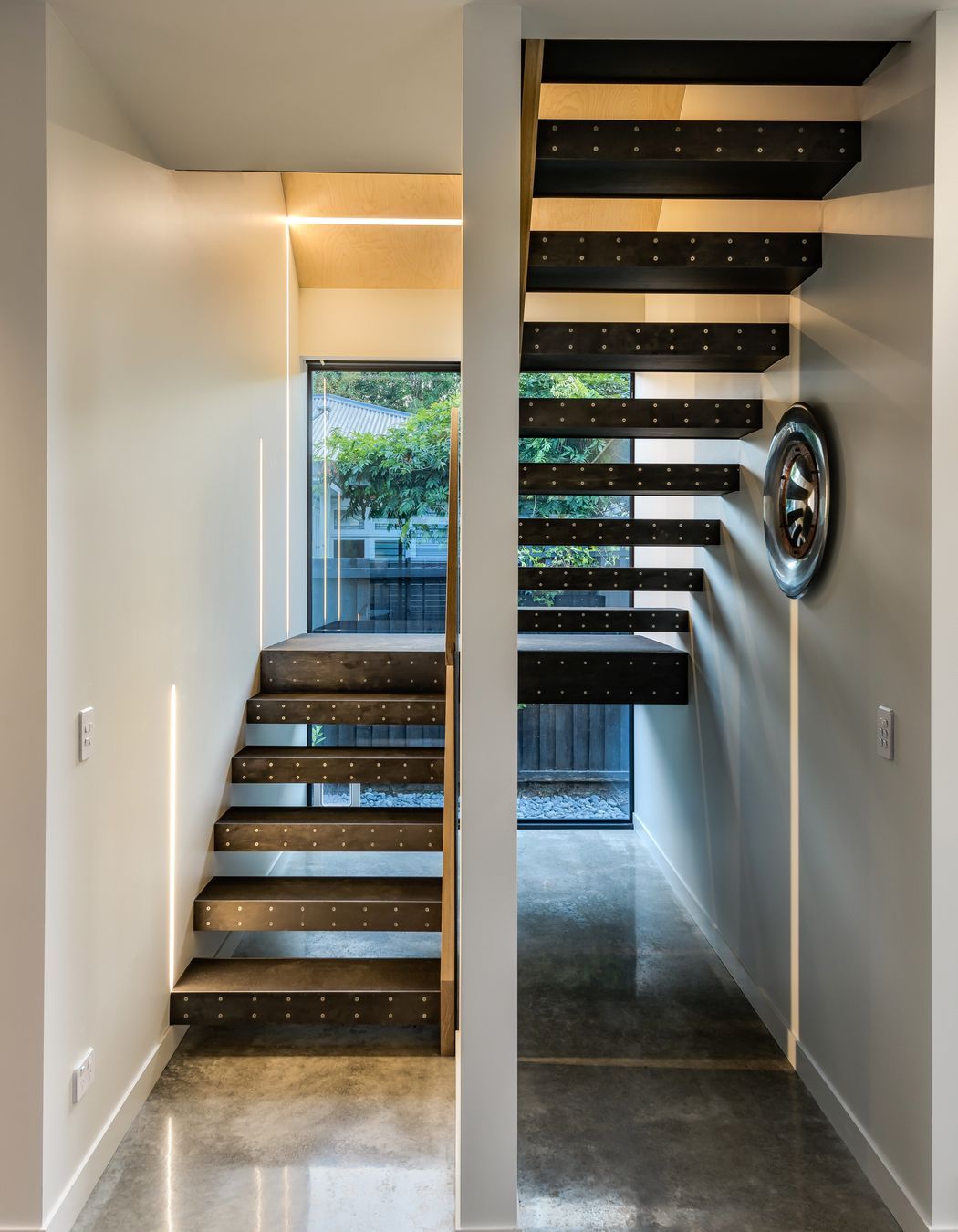
Maintenance-free materials include Canterbury clay bricks from Darfield, Colorsteel metal roofing and cladding, and minimal cedar to the soffits and decking, which can easily be re-stained every few years. Internally, white walls contrast timber accents, including double-height feature walls in birch plywood panels or randomly placed ash boards that add texture and depth, accentuated by light that washes down from skylights in the ceiling. In the hallway, an elegant staircase has an exposed natural steel balustrade in the middle, and timber treads with rubber on top and natural mild steel fronts.
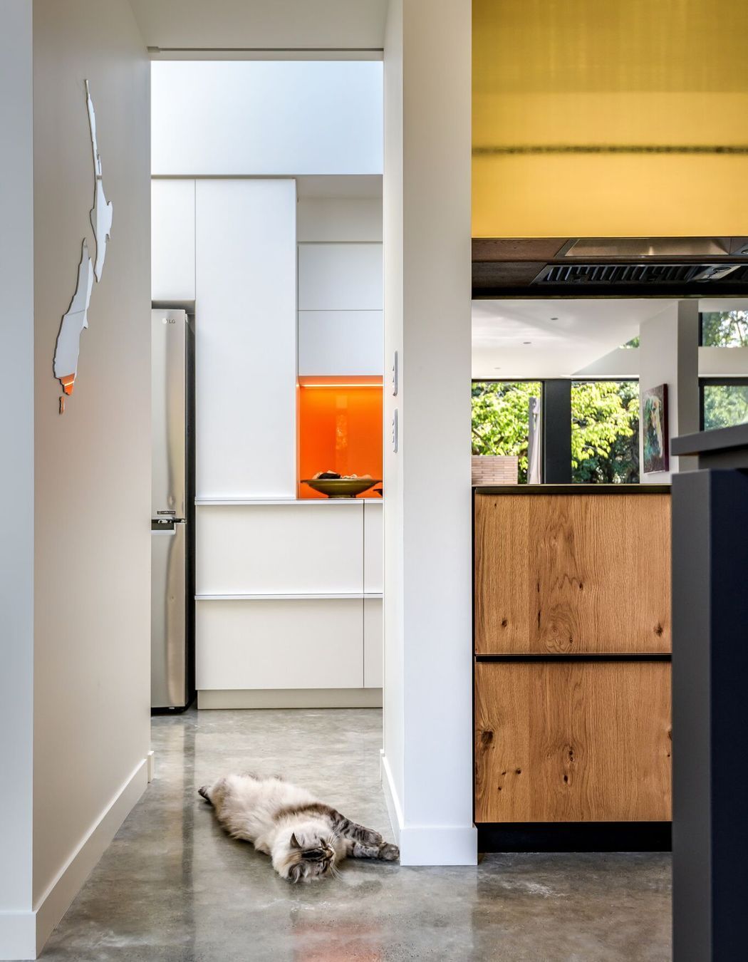
“While I designed this home myself, it does have some Sheppard & Rout flavour, especially in the materiality,” says Tim. “In our practice, we like to combine timber with concrete floors and steel panelling, and you can see that here.” There are also similarities in the way Tim has created a sense of expansion and compression throughout the home with a mixture of spaces and ceiling heights, such as the single-level kitchen and living area that opens up to a double-height space. This variety of adaptable, light-filled areas and warm, intimate spaces is part of the magic of this home. From the inside, it’s hard to believe that this is an urban home nestled snugly into its site.
Words by Justine Harvey.
Photography by Anthony Turnham.
