
About
Mr Pickles.
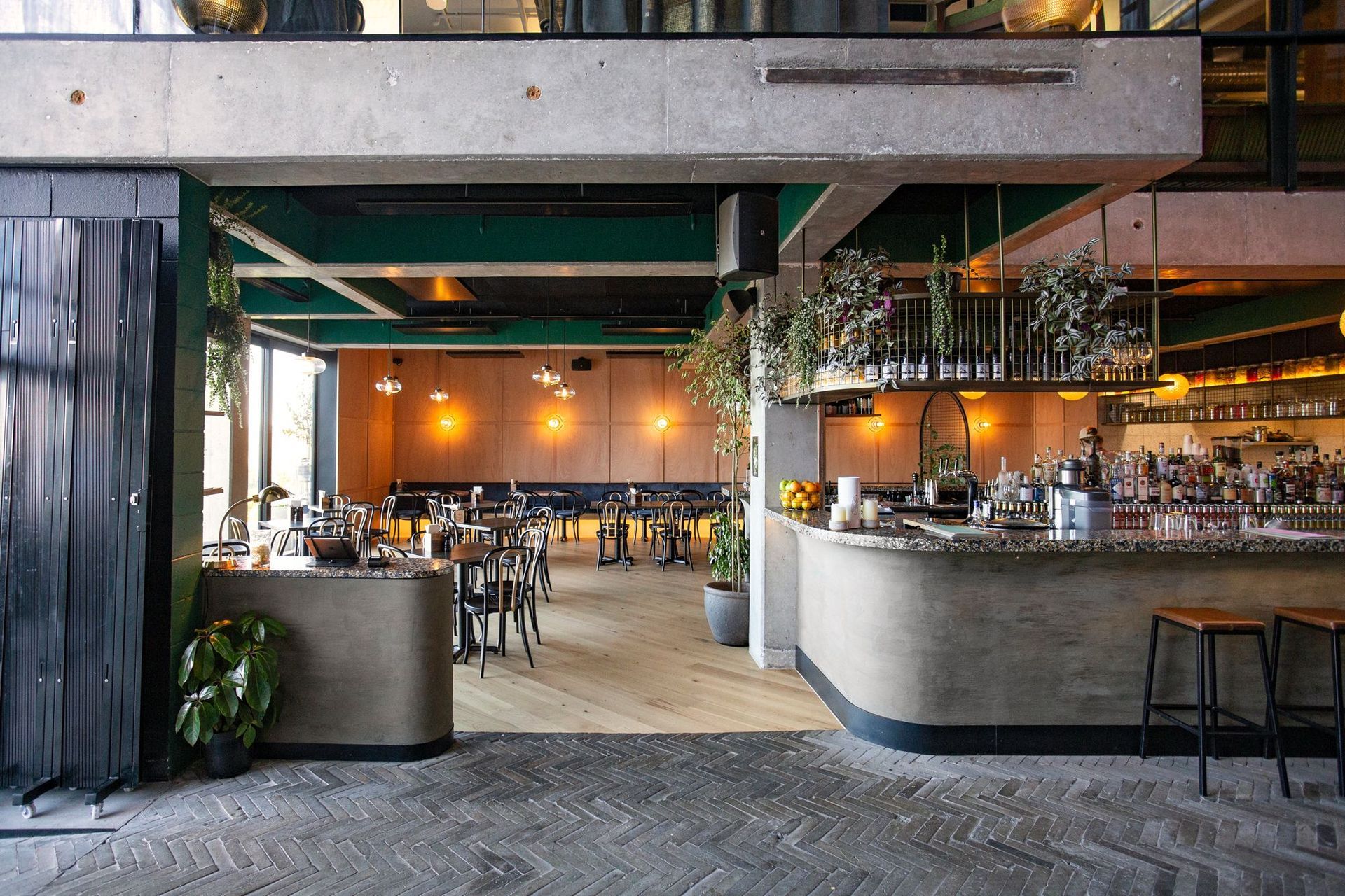
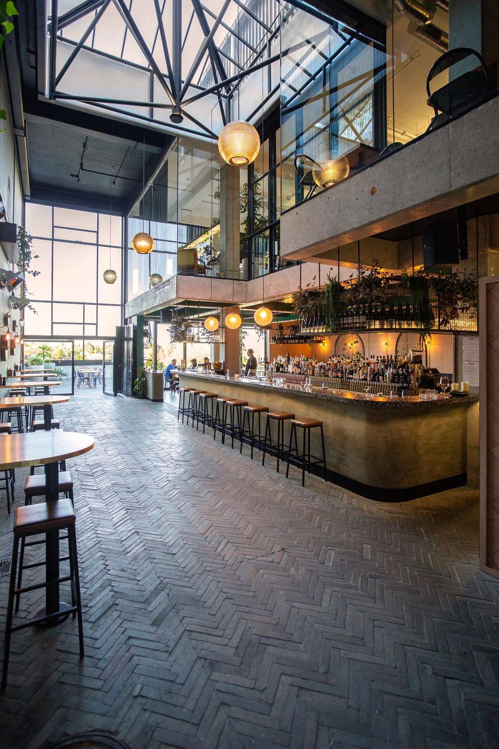
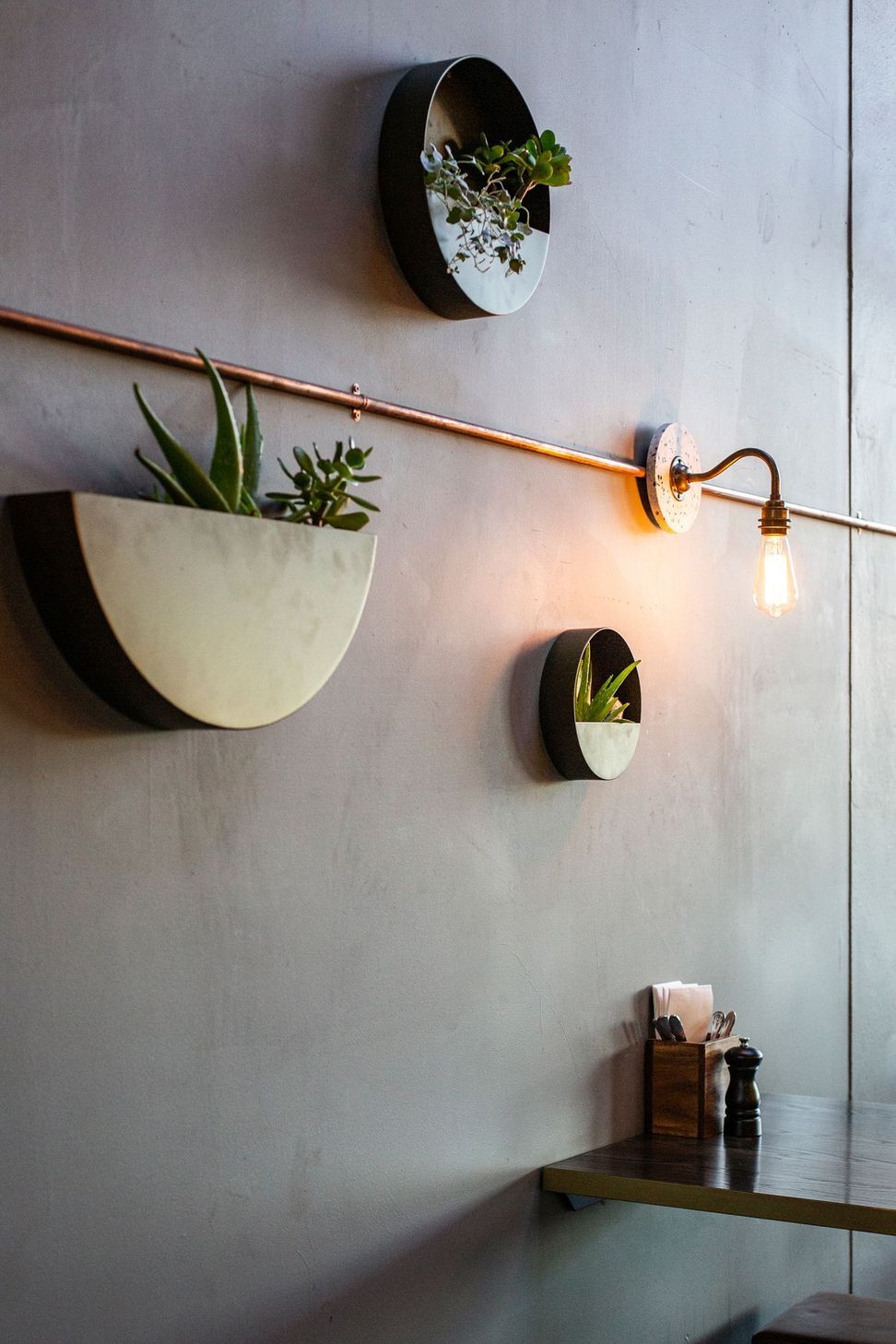
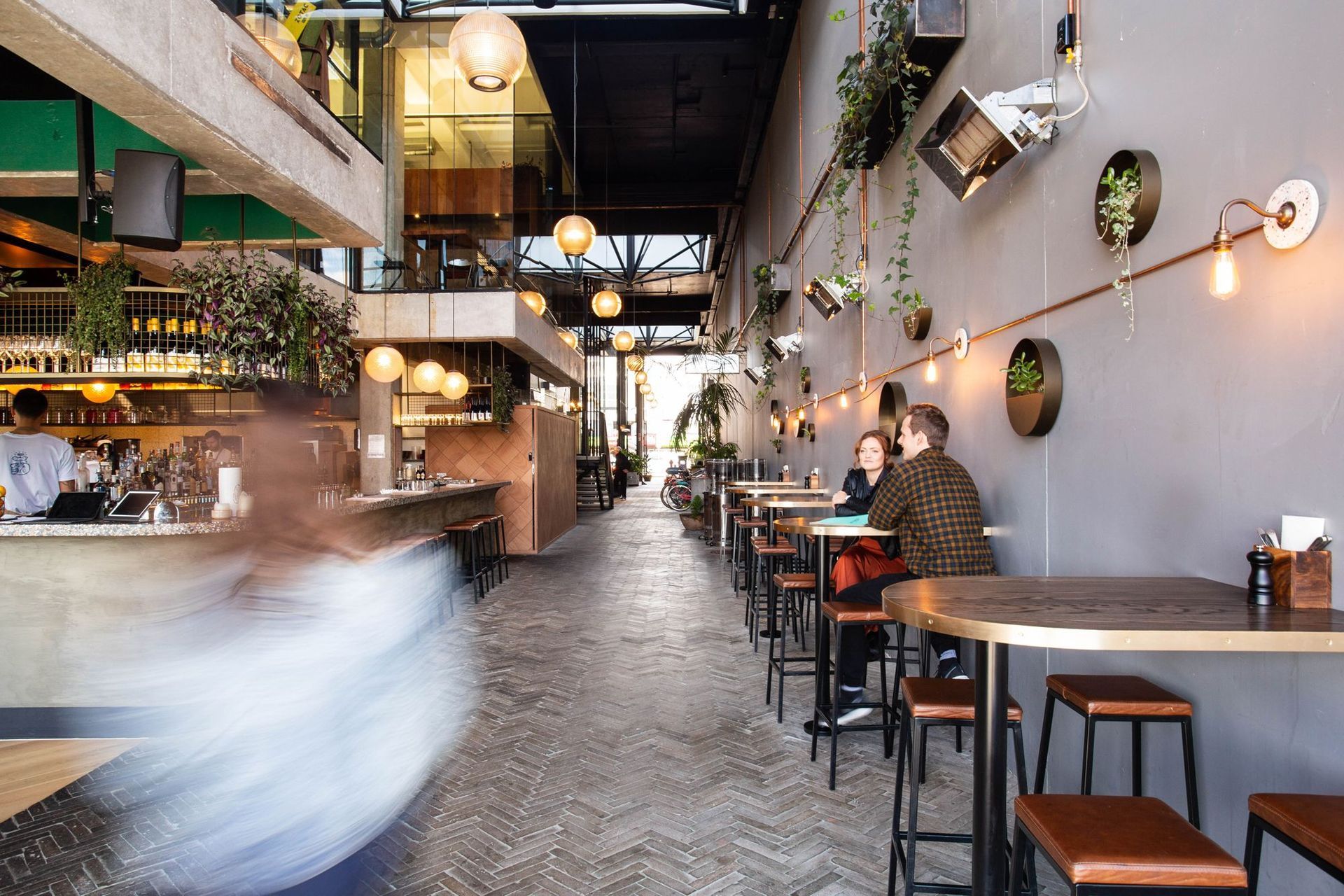
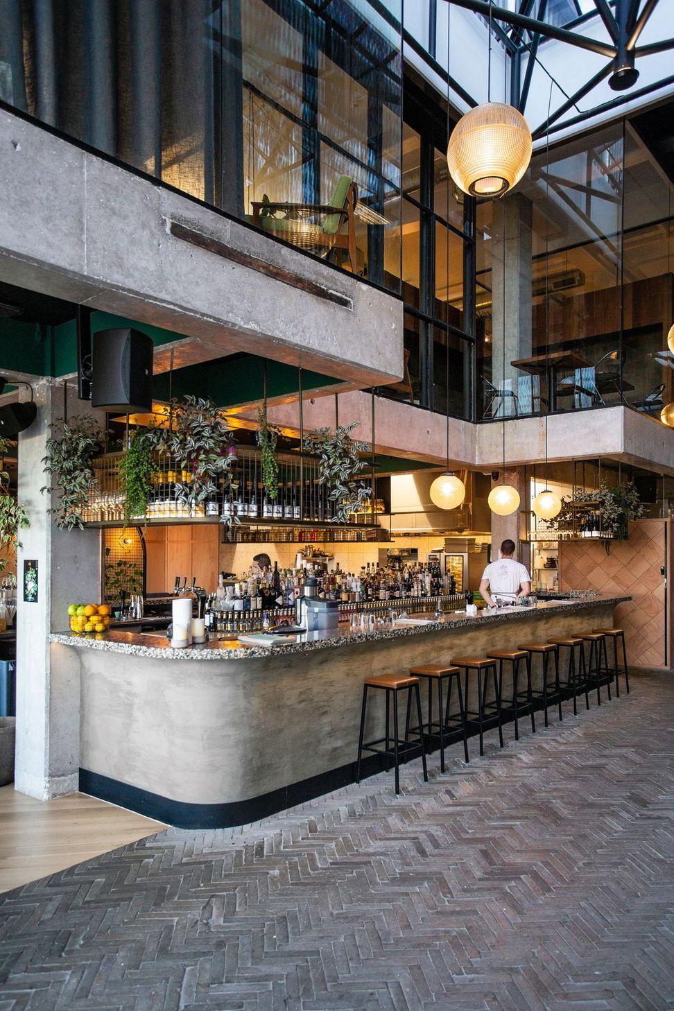
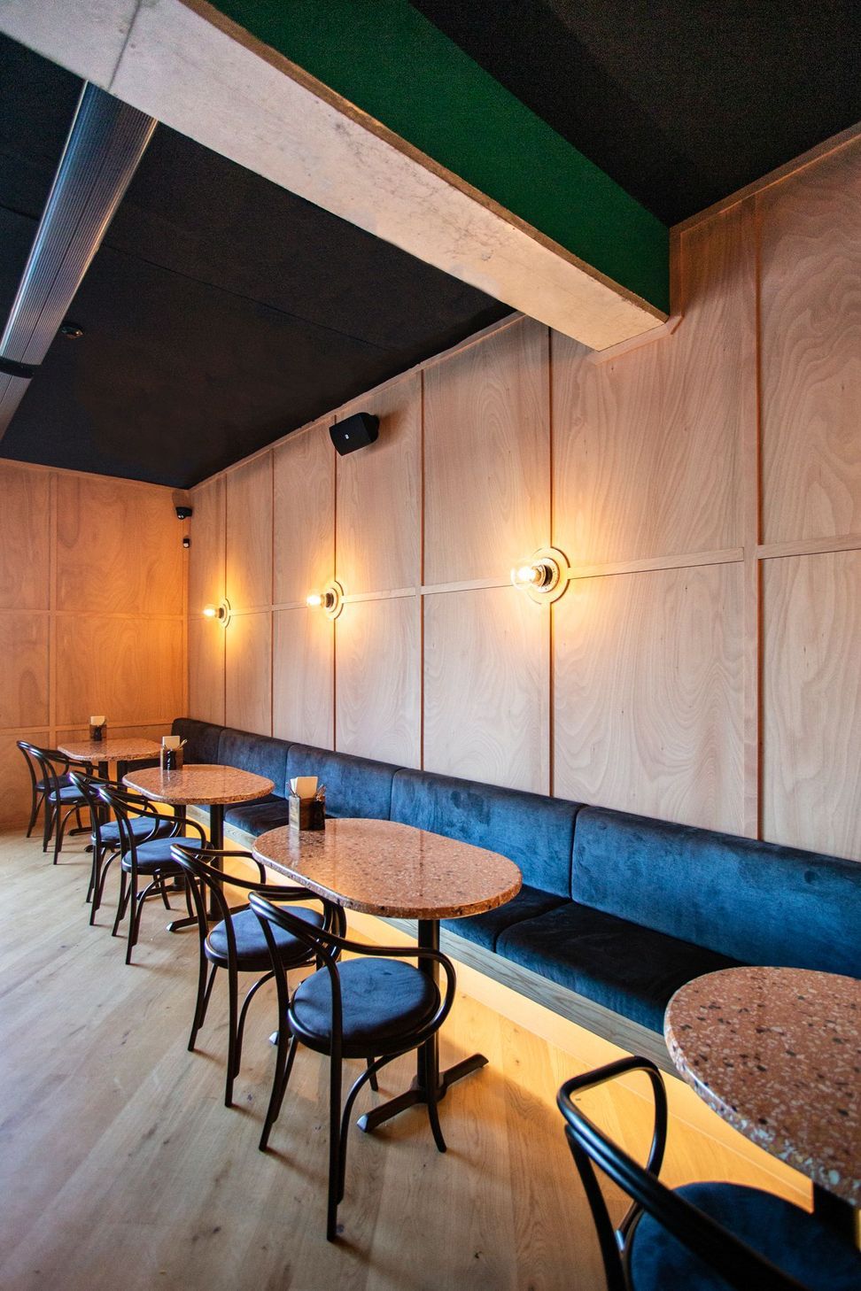
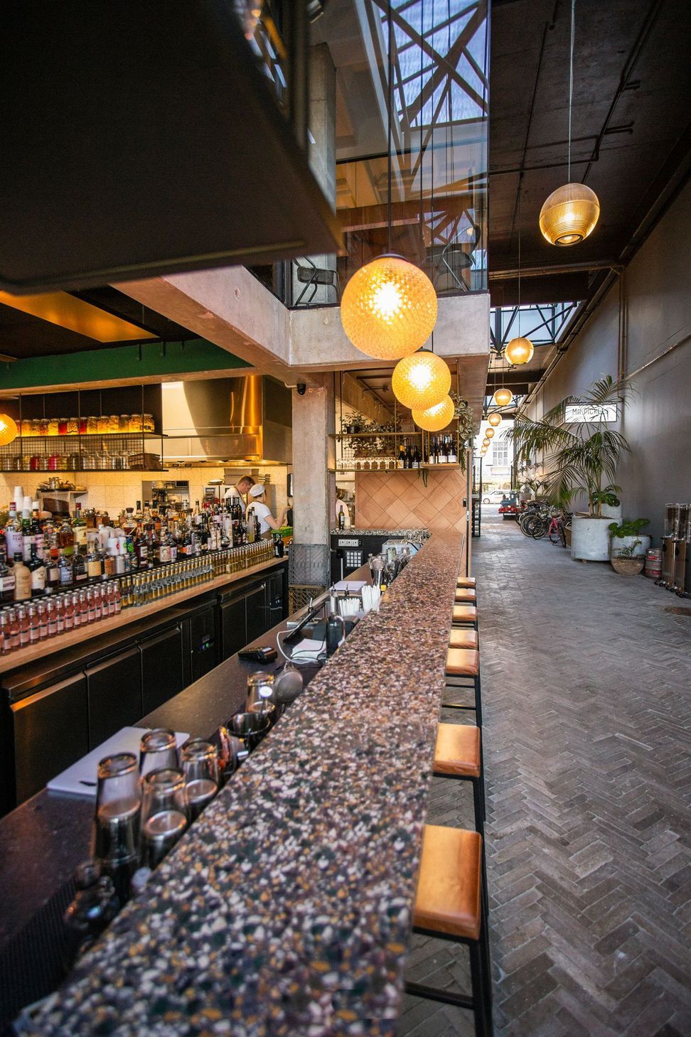
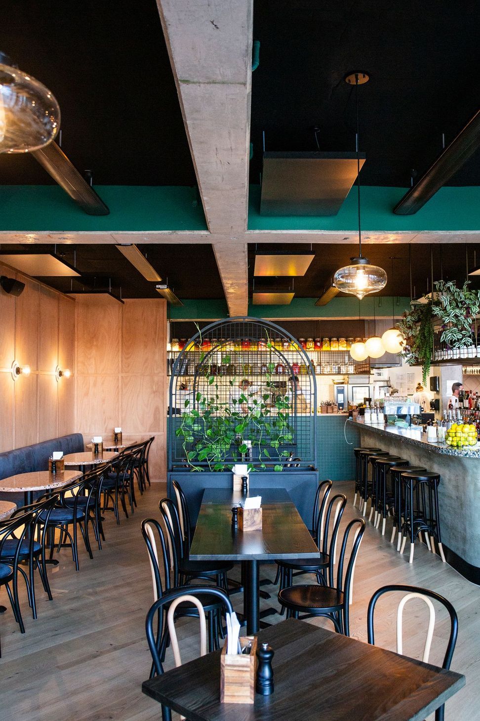
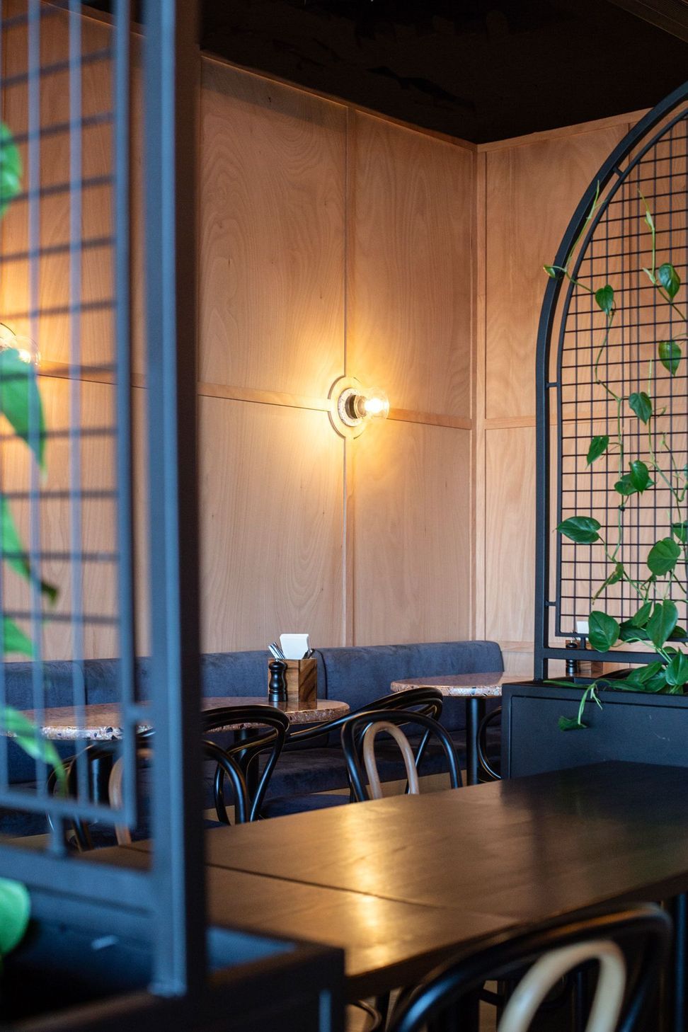
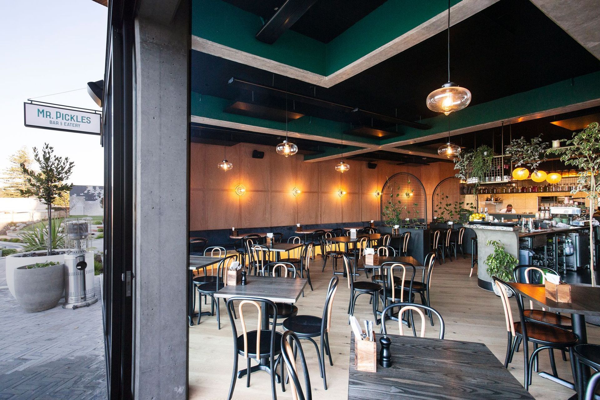
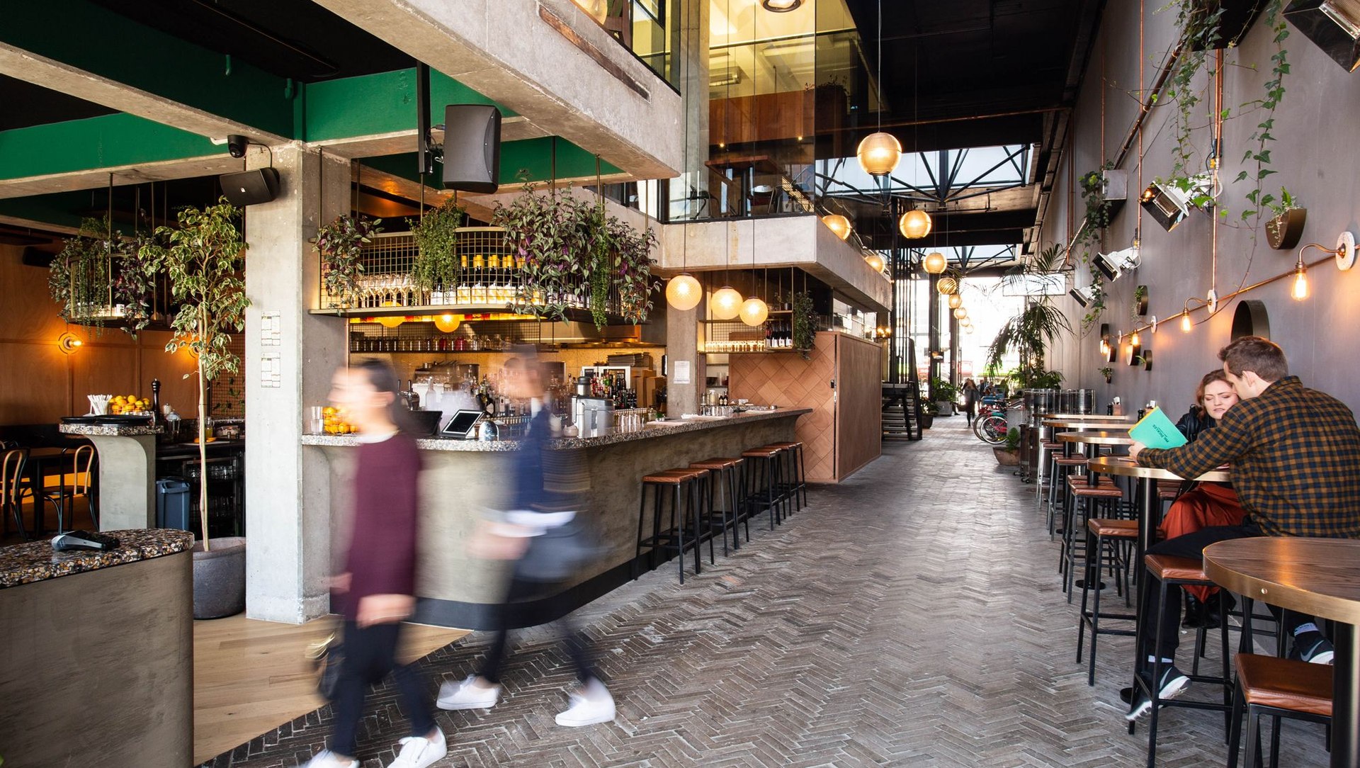
ArchiPro Project Summary - Mr Pickles is a casual bar and eatery located in The Riverbank Lane, Hamilton. Mr Pickles offers an experience of contrasts - light and fresh in the day, moody and refined at night.
- Title:
- Mr Pickles
- Interior Designer:
- Designwell
- Category:
- Commercial/Hospitality
- Completed:
- 2018
- Photographers:
- Jess Koretz
Project Gallery


Views and Engagement
Inspired by this project?Visit Designwell

Designwell. We design commercial interiors with a focus on workplace, hospitality & retail, health & wellbeing, public and education. We design beautiful spaces that work.
Our clients are workplace changers, hospitality innovators, city developers and inspiring entrepreneurs who recognise the value of good design.
Founded
2017
Established presence in the industry.
Projects Listed
35
A portfolio of work to explore.
Designwell.
Profile
Projects
Contact


