Retro Office.
ArchiPro Project Summary - A vibrant and sustainable retro office design for Simplicity Kiwi Saver, completed in 2023, featuring pre-loved furniture, playful elements, and a unique interior that embodies the company's ethos of creativity and community.
- Title:
- Retro Office
- Interior Designer:
- Donna White Interior Design
- Category:
- Commercial/
- Interiors
- Completed:
- 2023
- Price range:
- $0.25m - $0.5m
- Building style:
- Classic
- Client:
- Sam Stubbs - Simplicity Kiwi Saver
- Photographers:
- Jono Parker
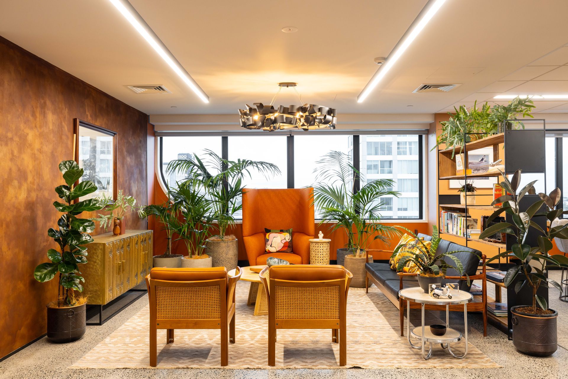
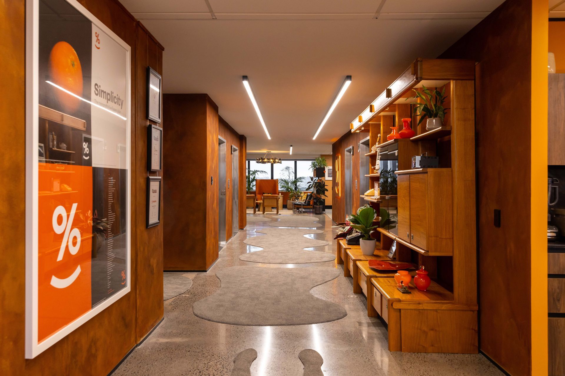
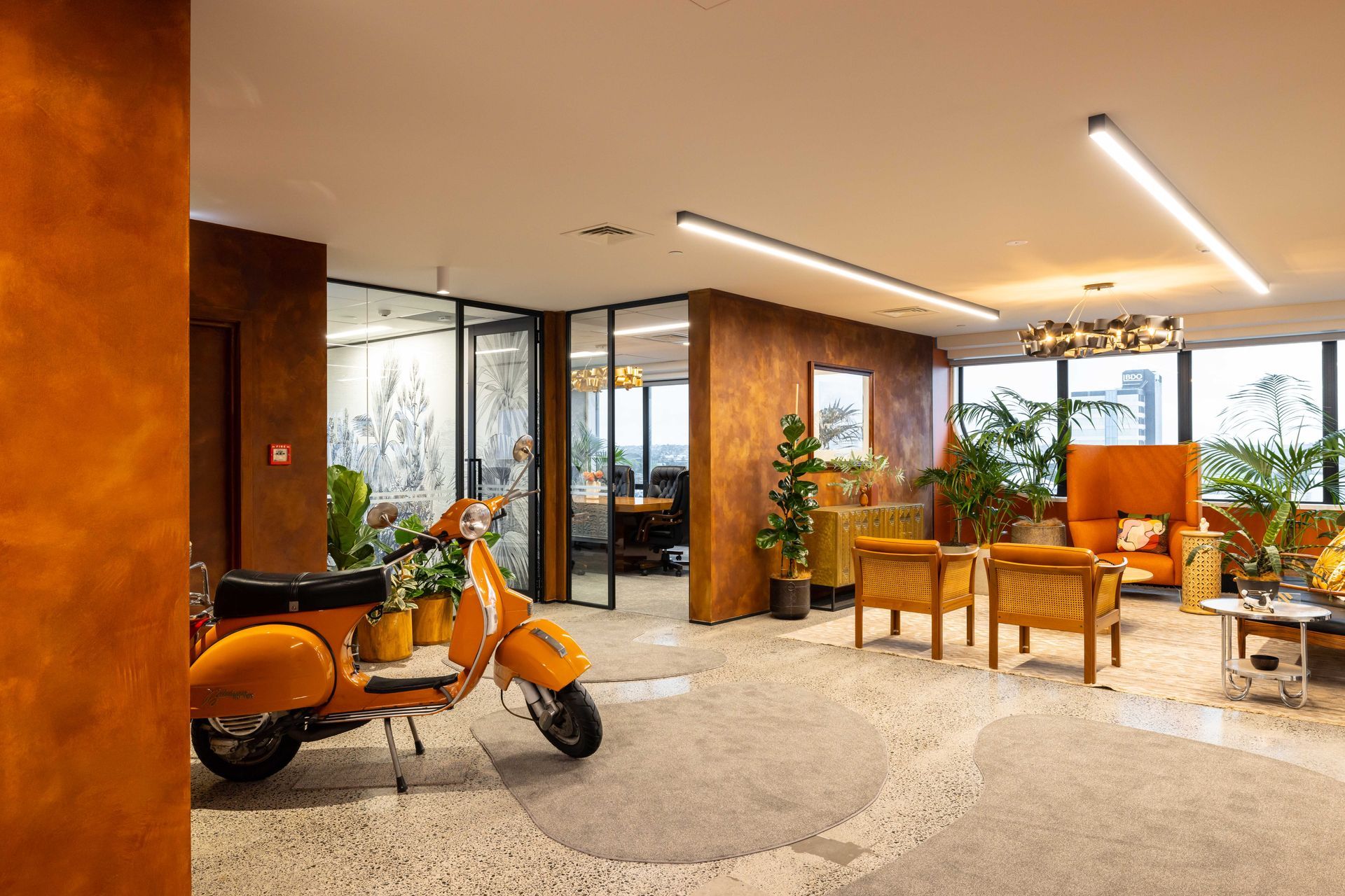
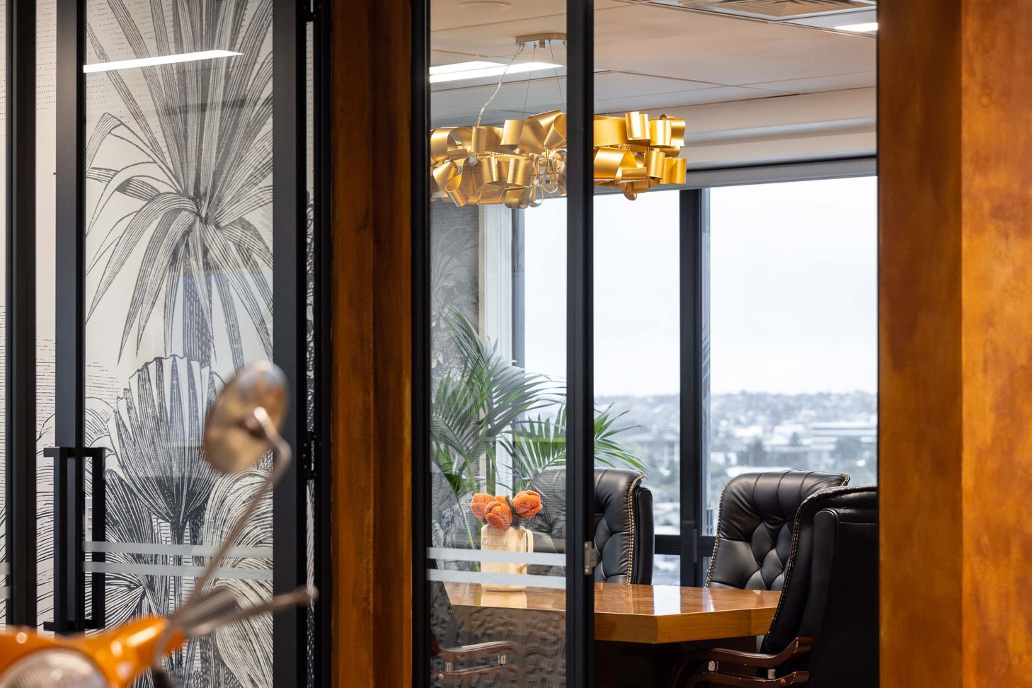
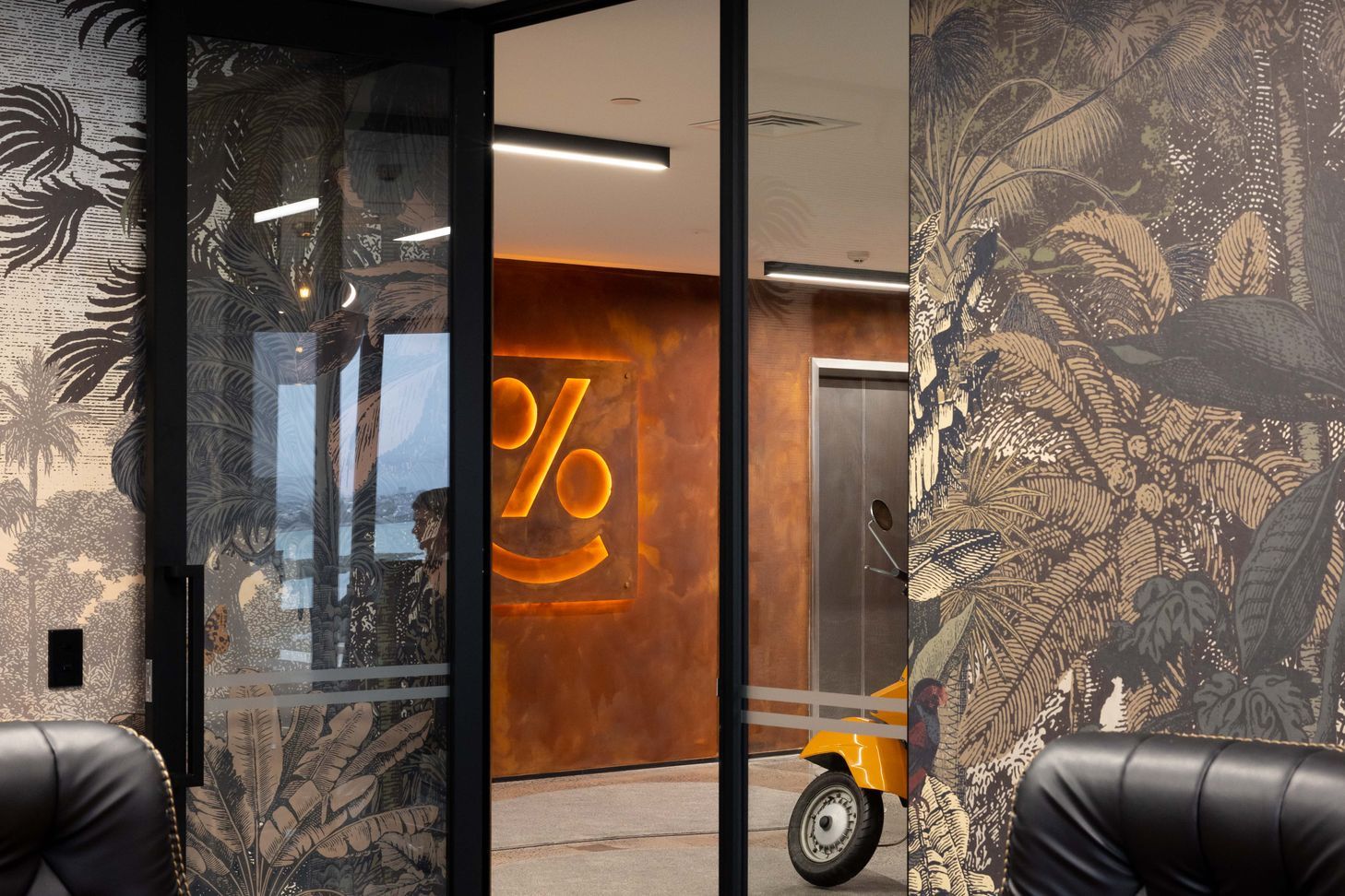
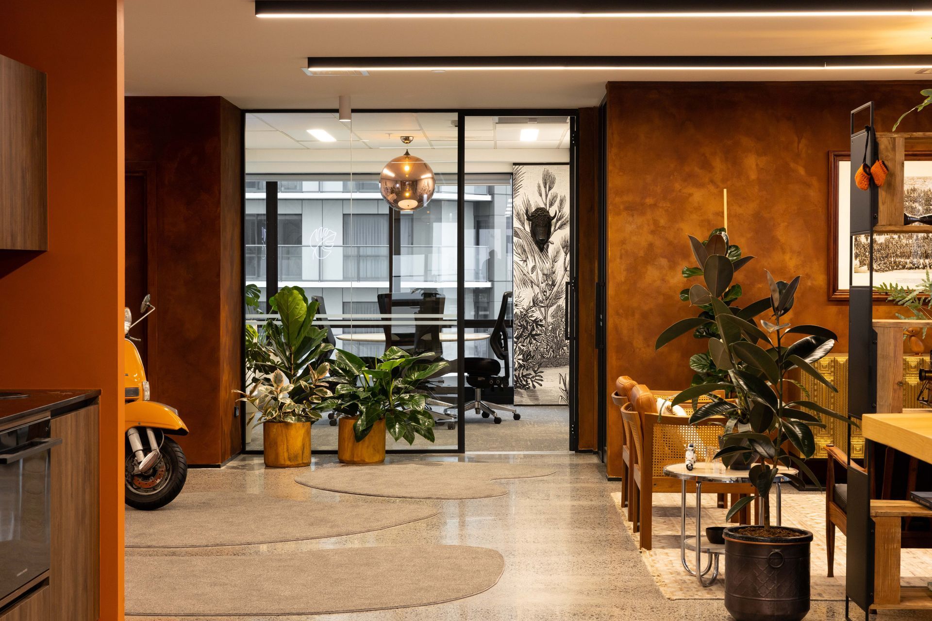
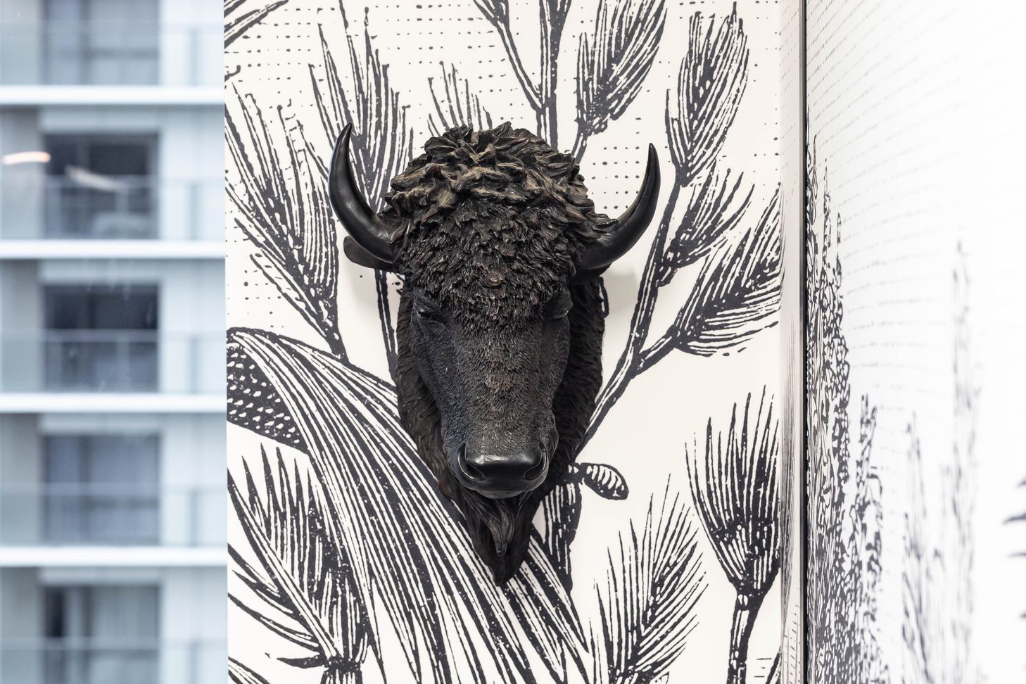
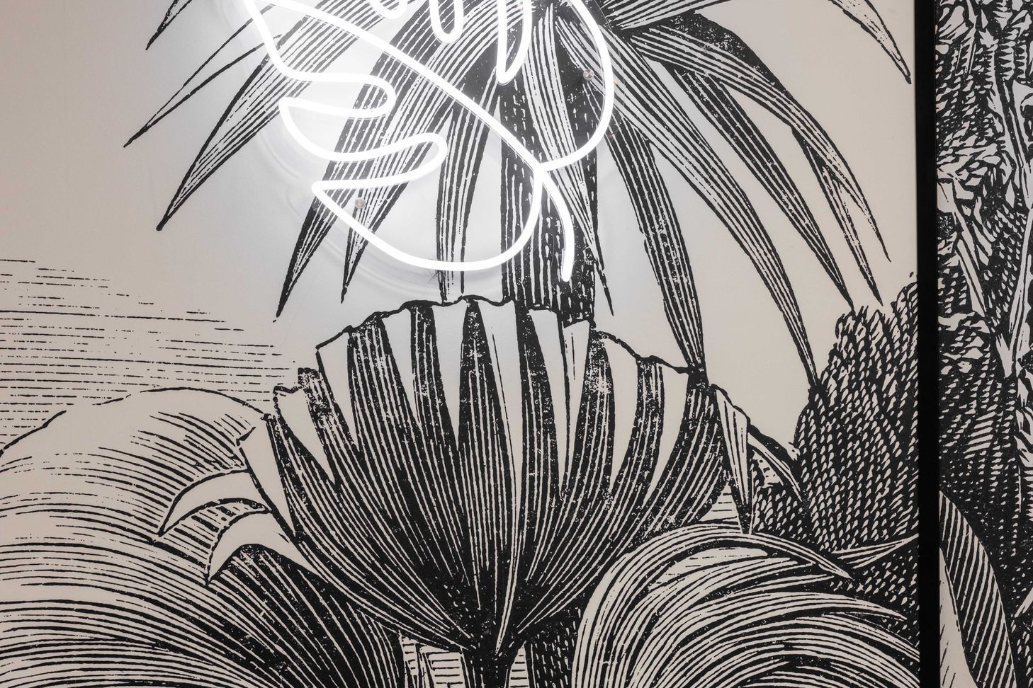
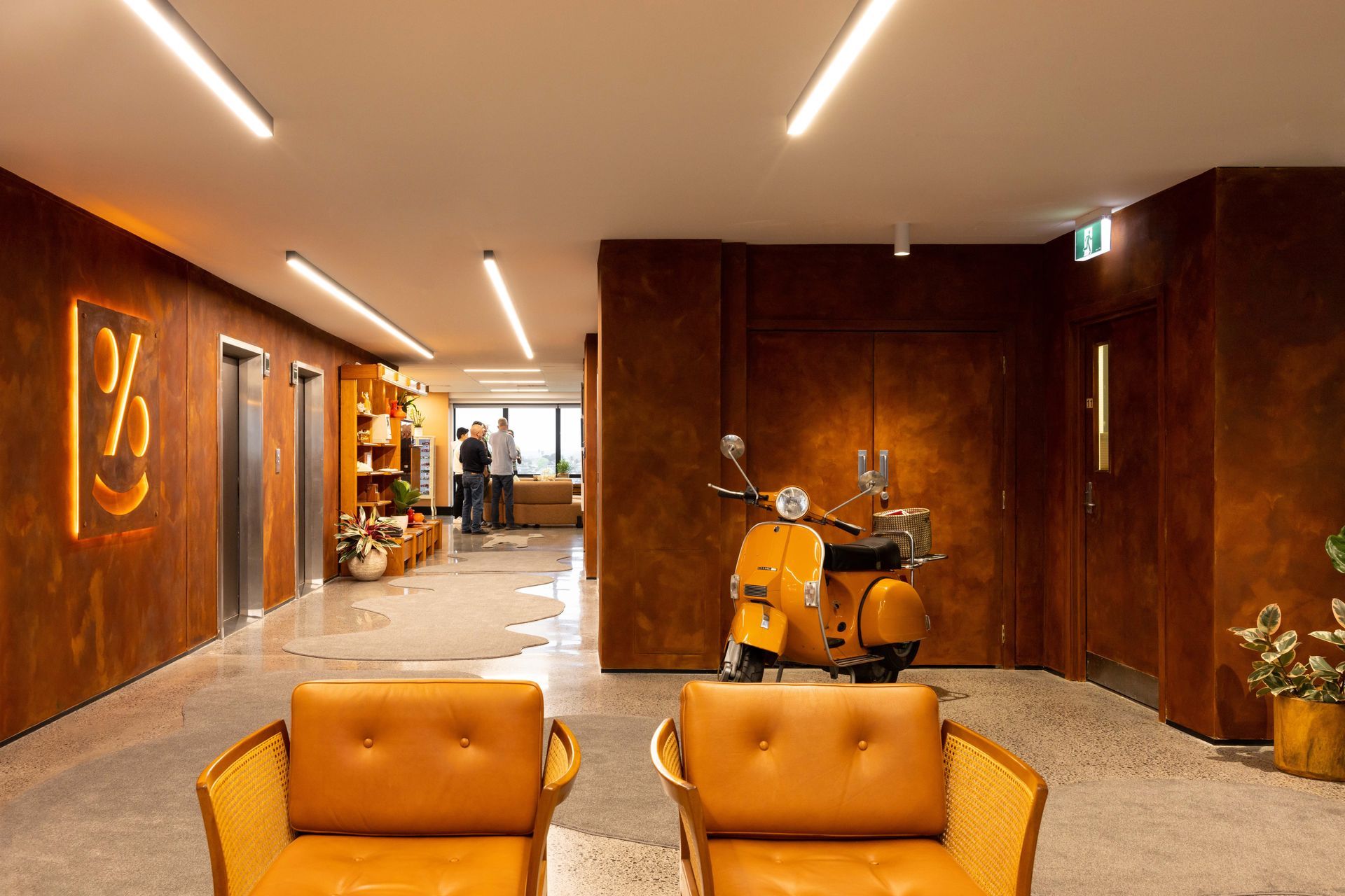

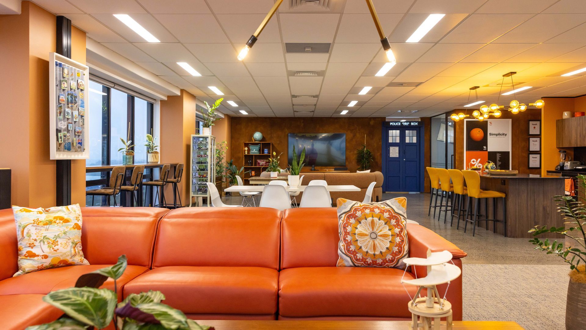
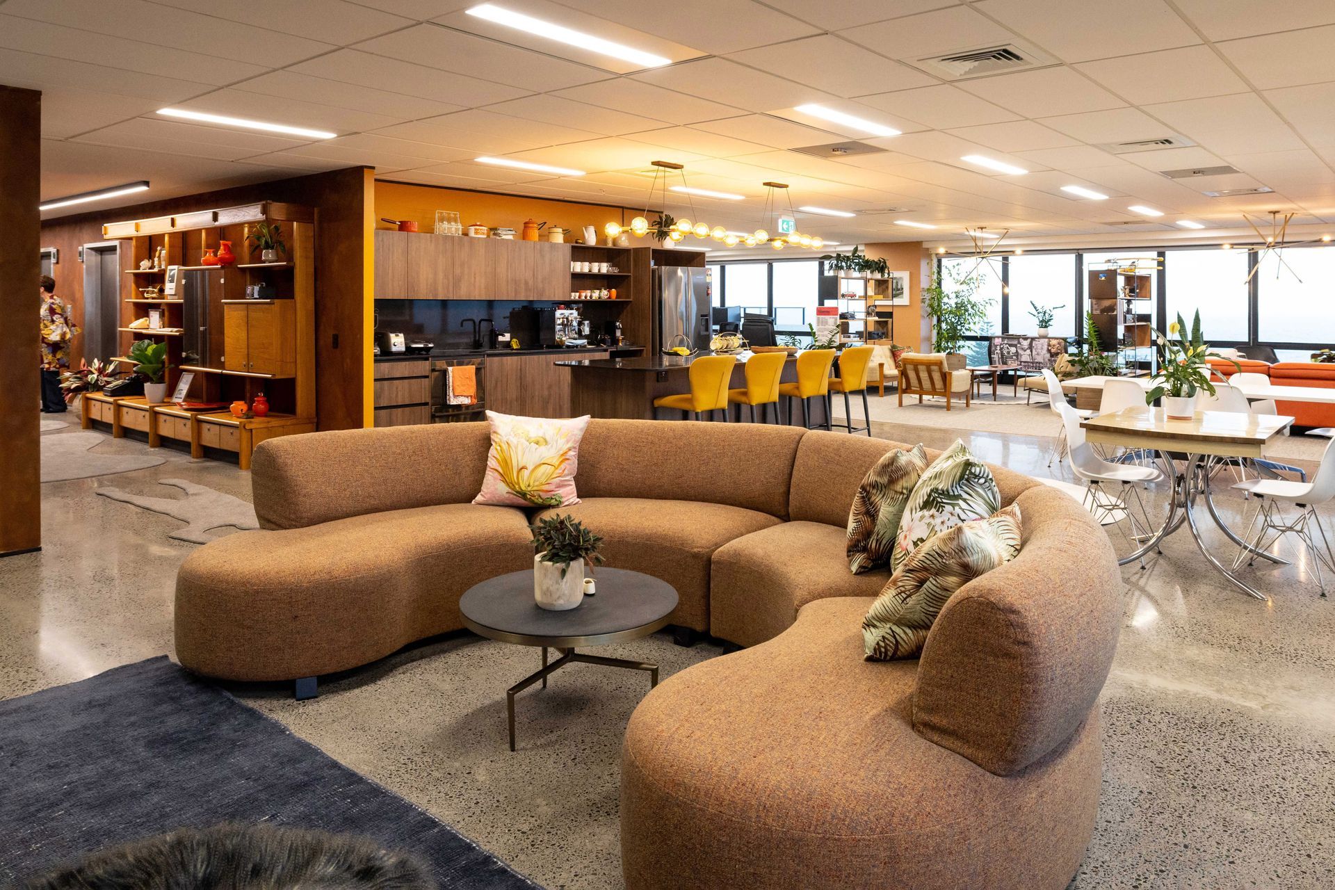
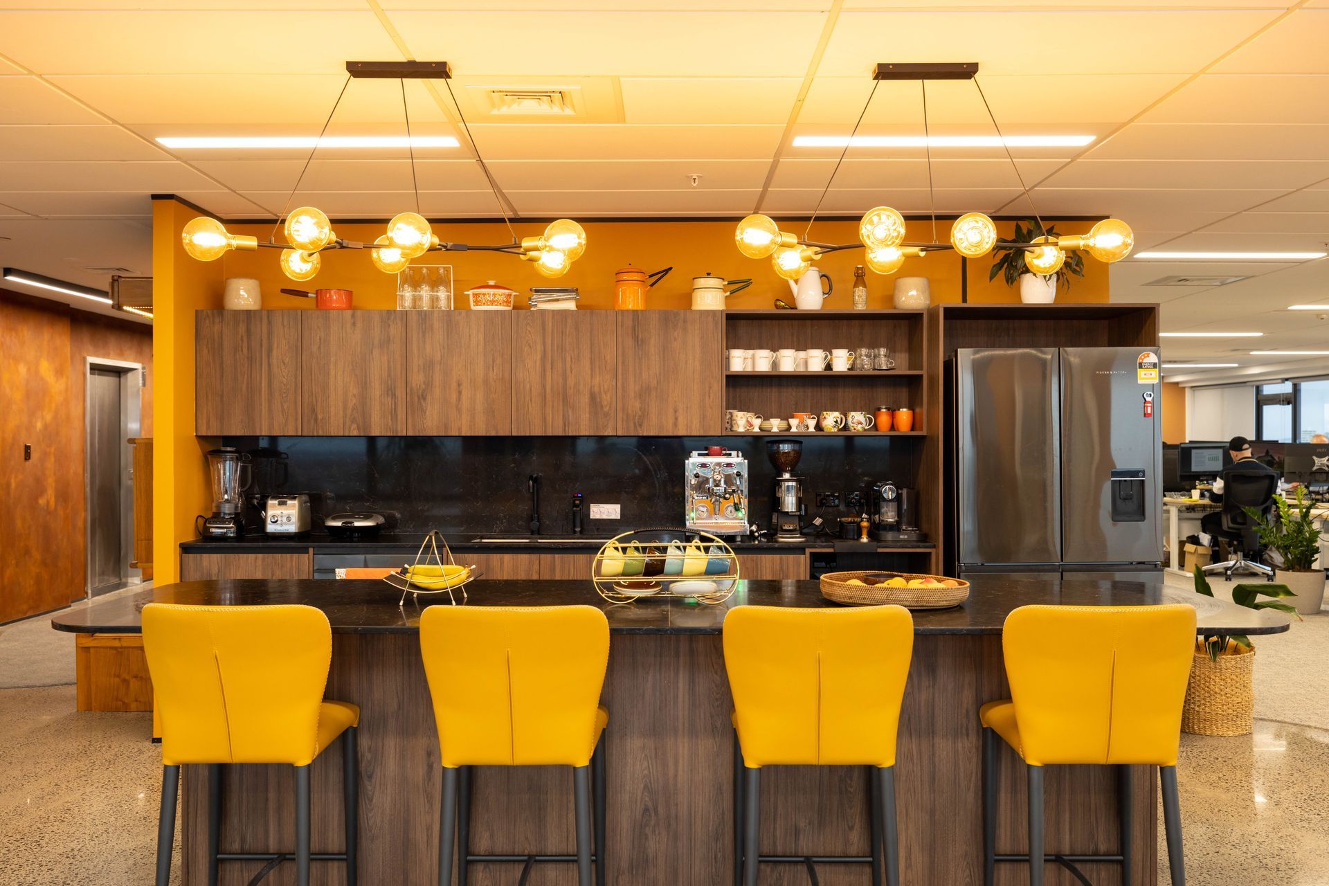
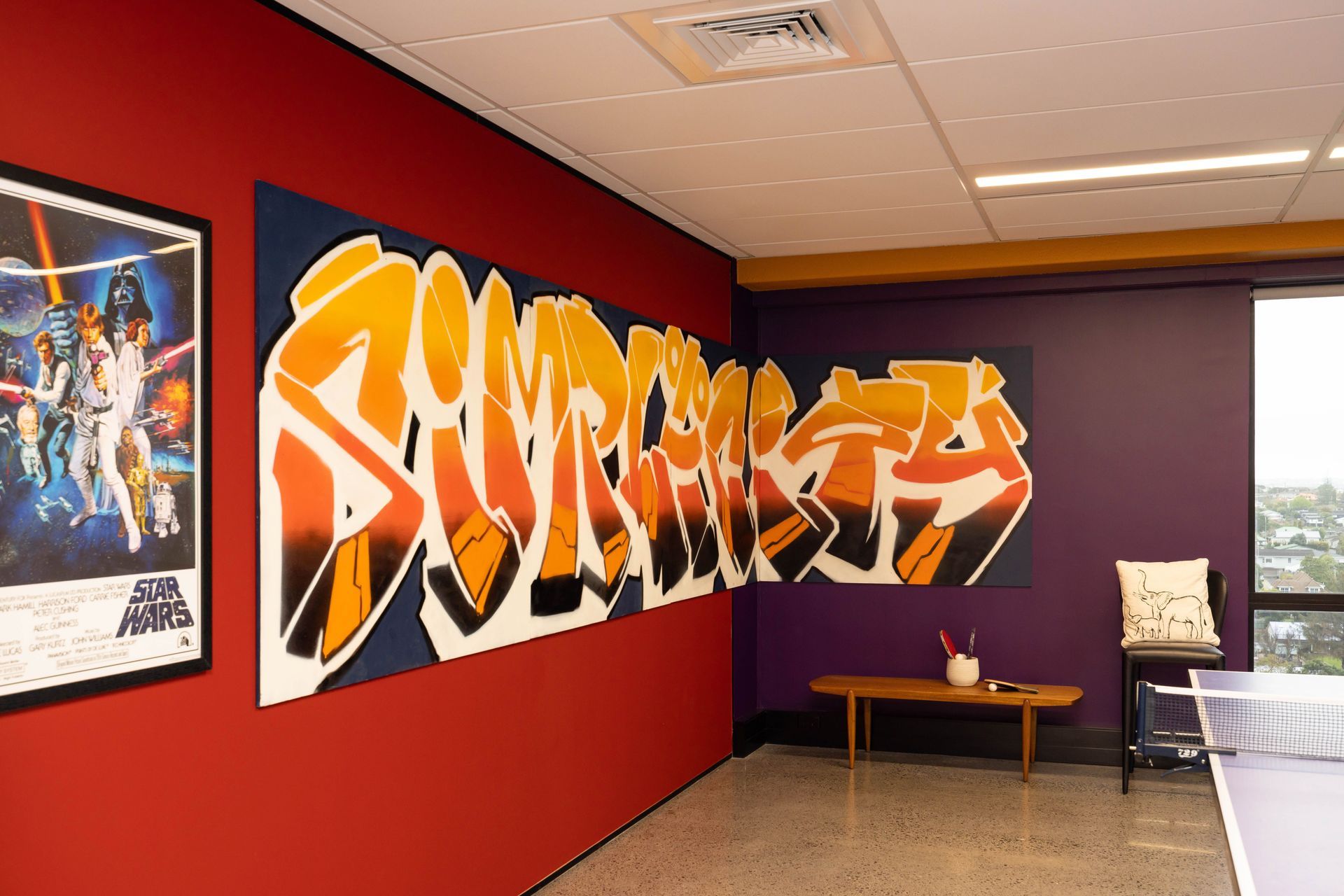
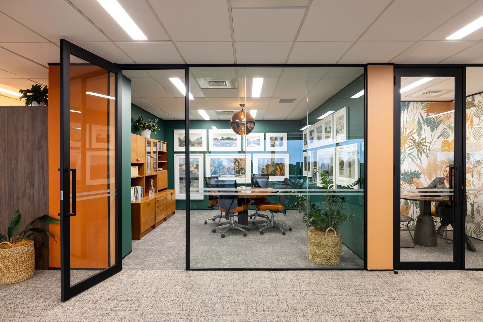
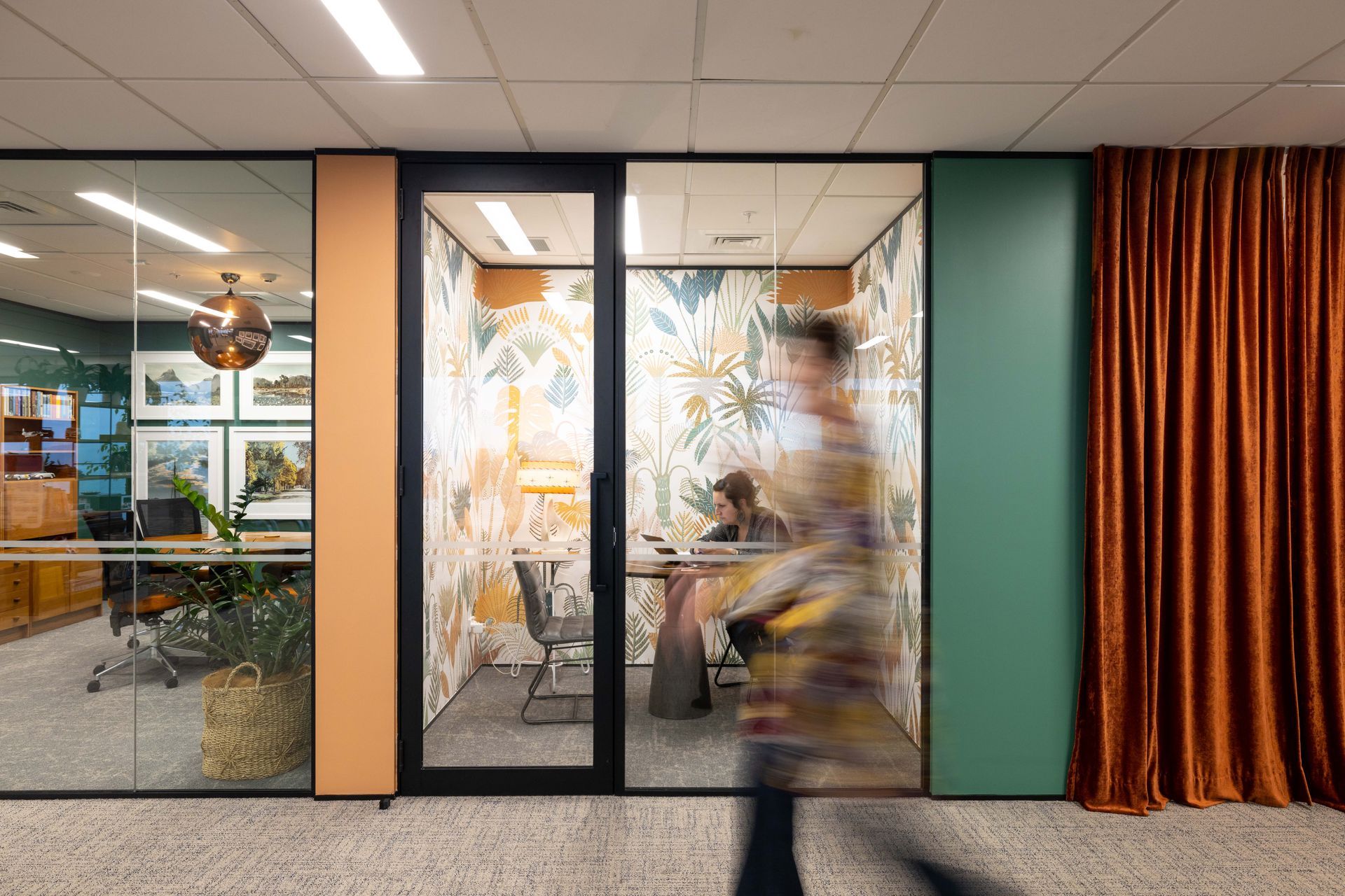
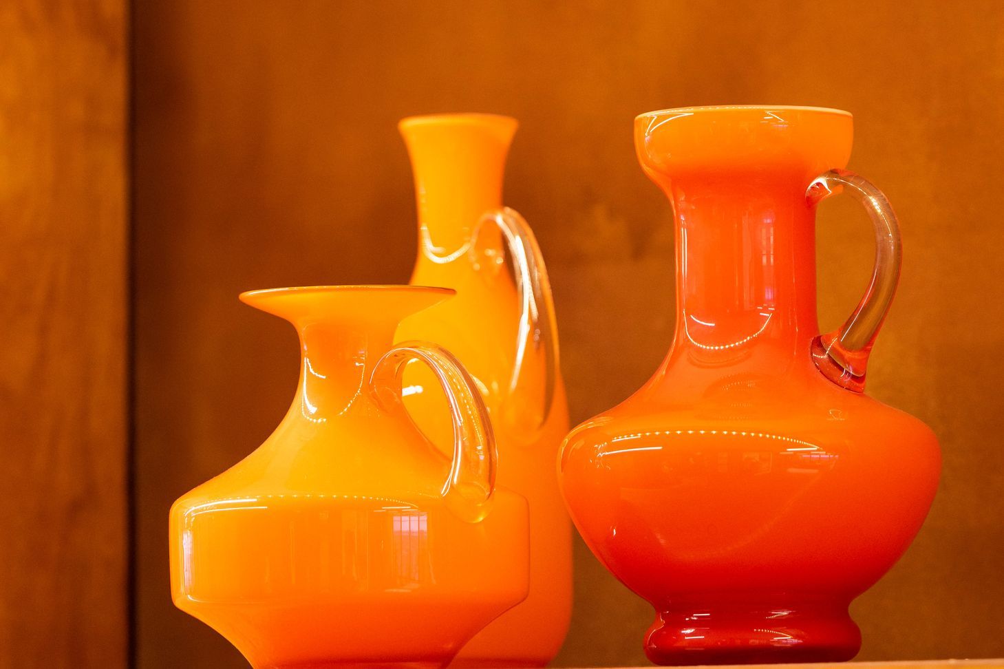
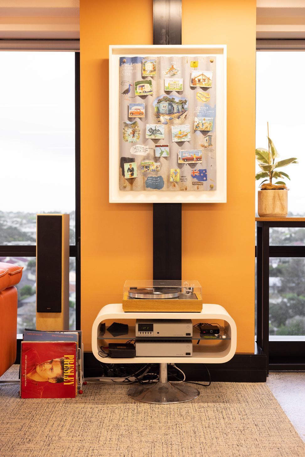
The company colour is orange, and so rather than painting the entry/reception in ordinary orange, we thought Porter’s rust-effect paint would meet the brief of ‘expect the unexpected’. Other colours either complement or contrast with orange. Most meeting rooms are wallpapered, and staff locker and meditation rooms are hidden behind brick-red velvet curtains. All the colours are rich and intense, and differ from the usual subdued office interior.
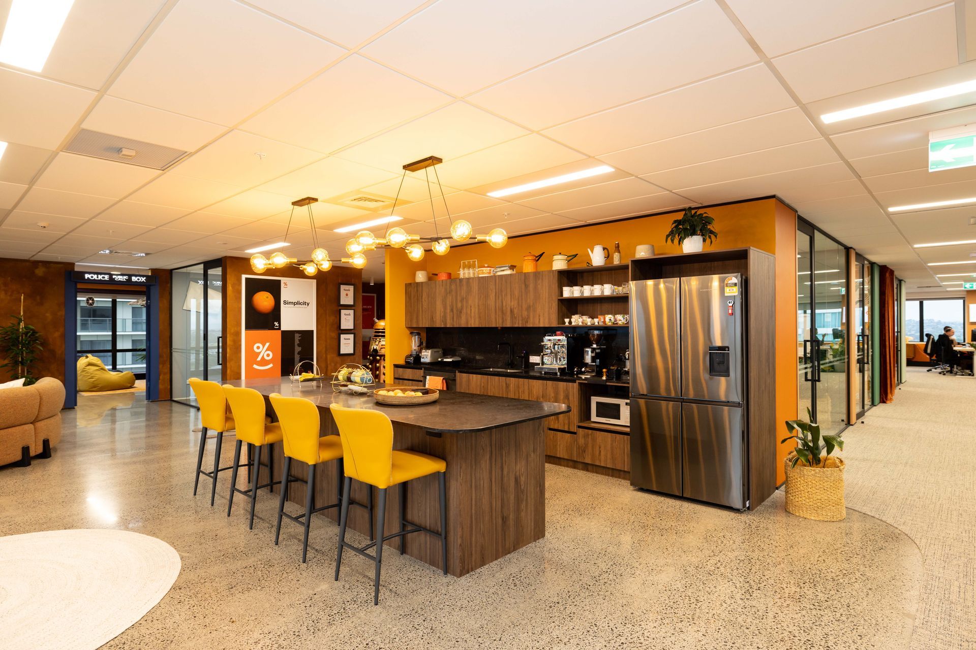
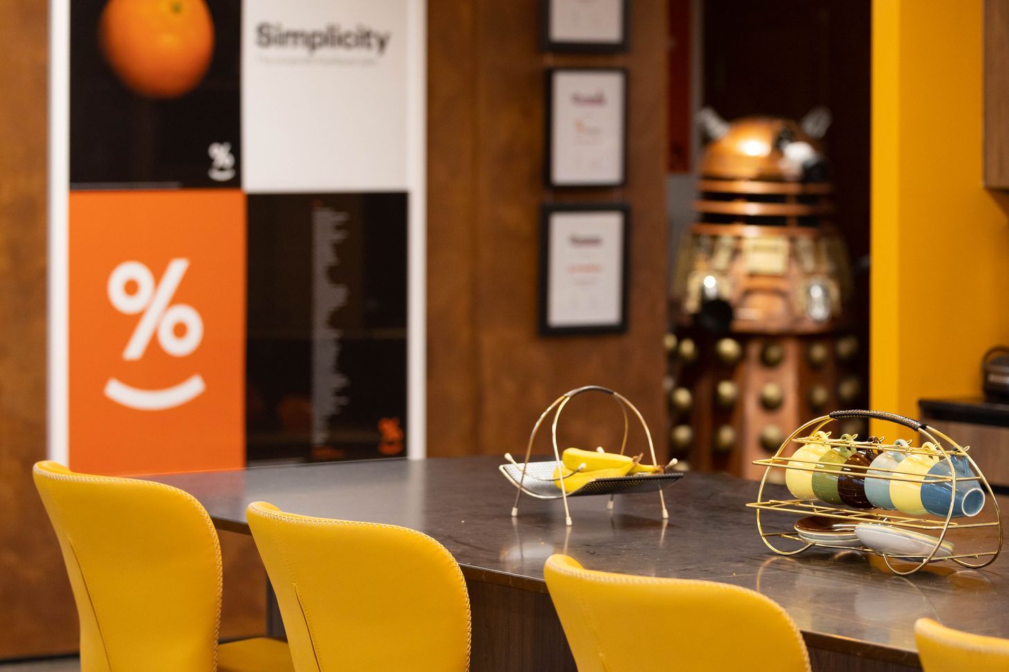
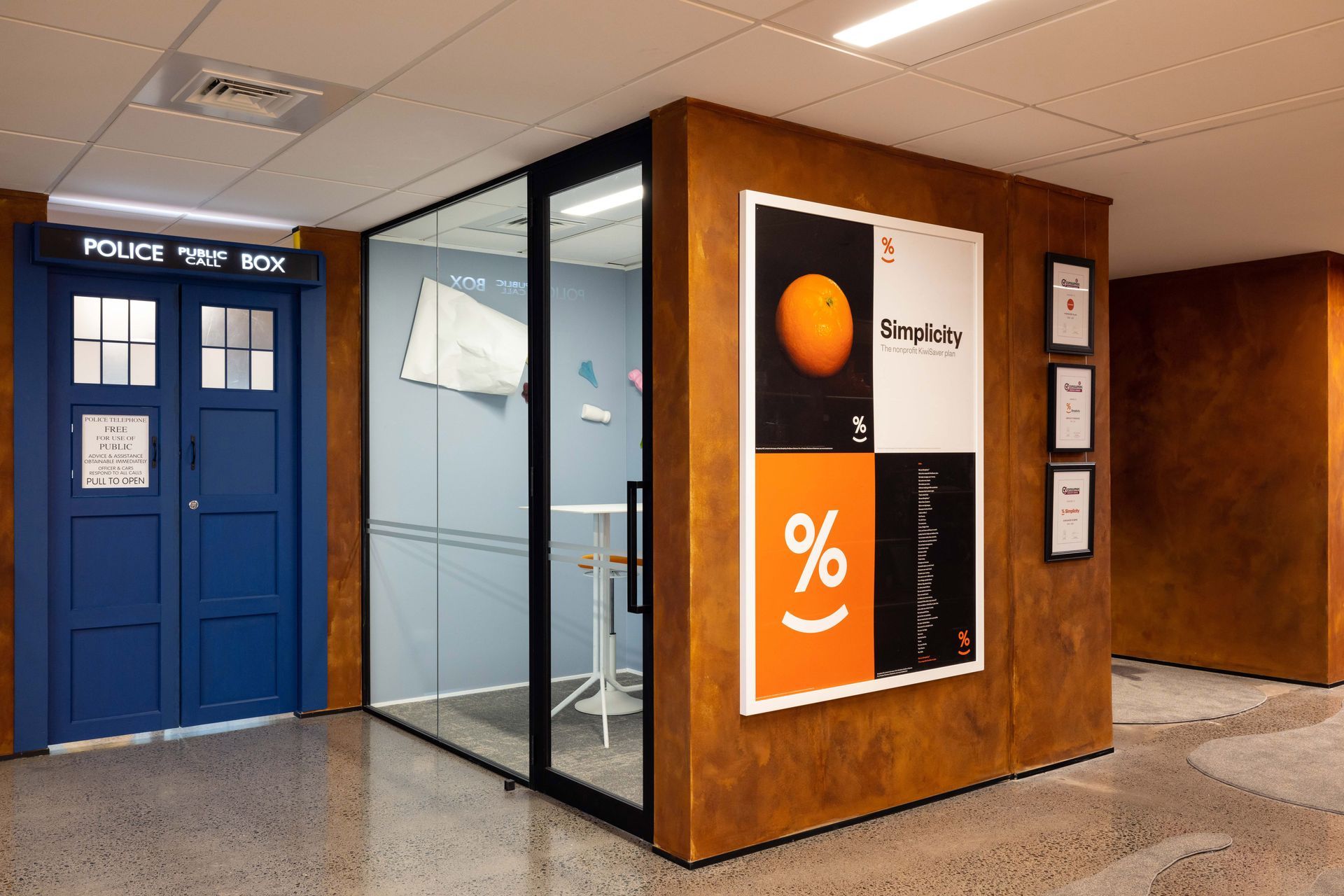
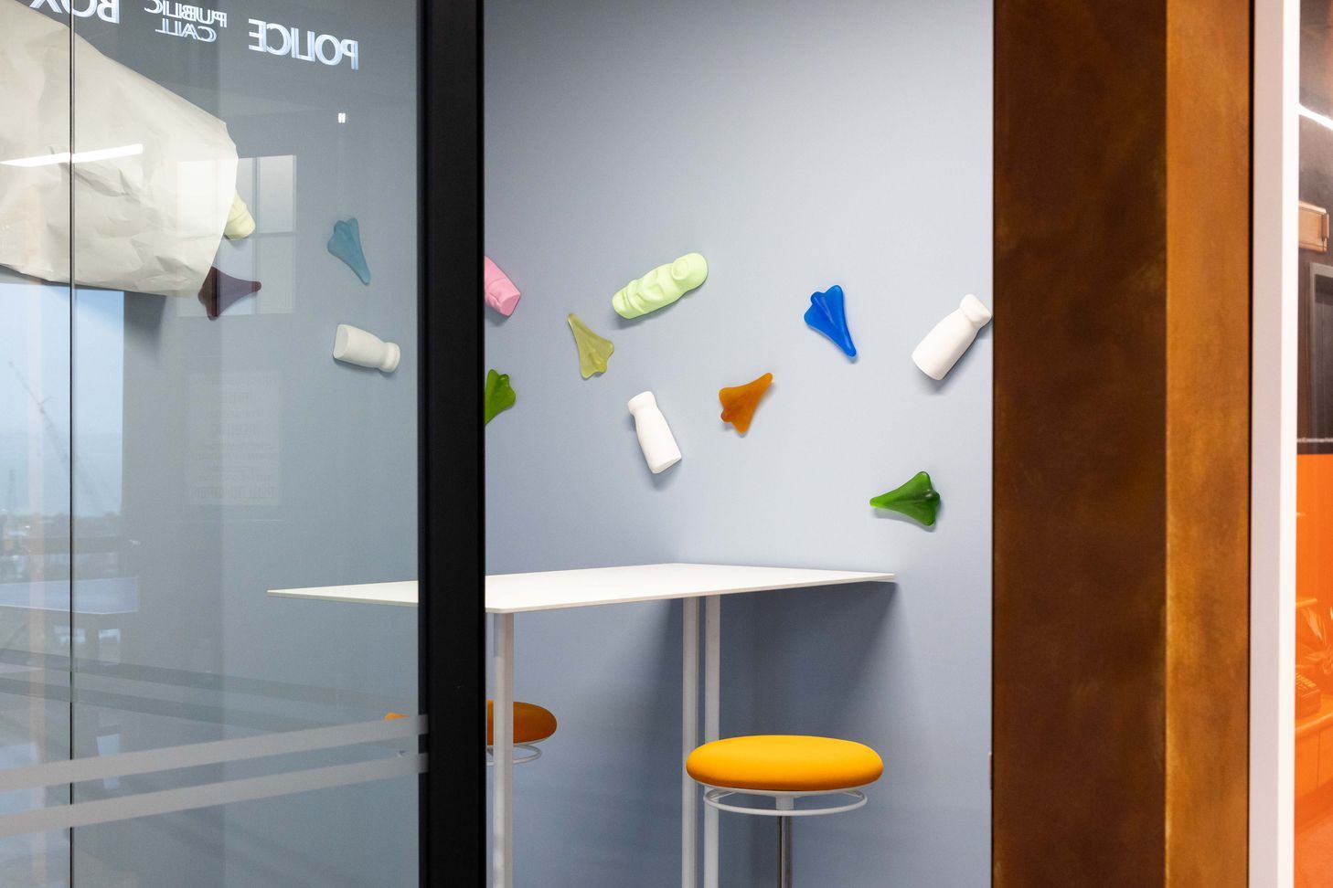

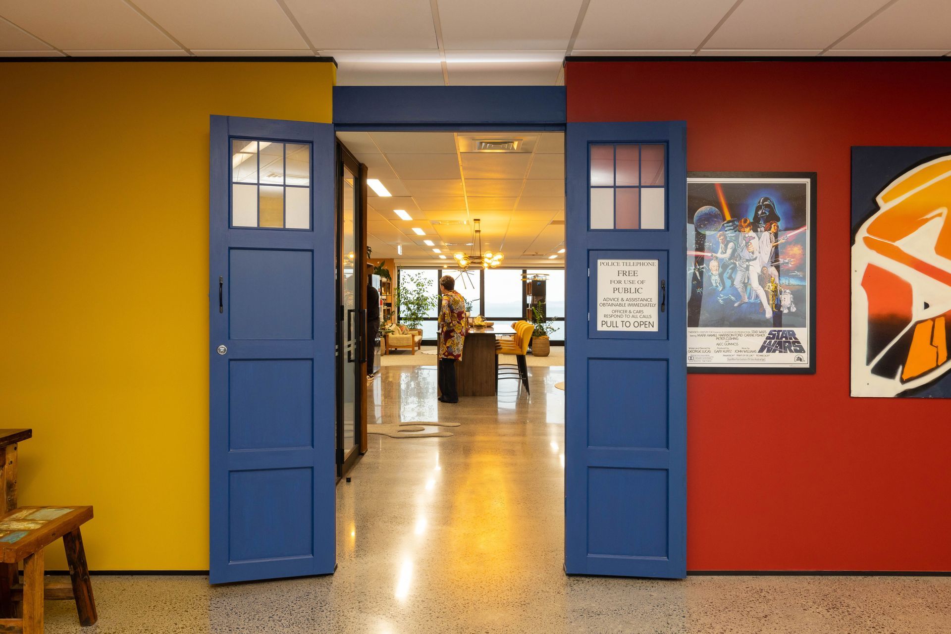
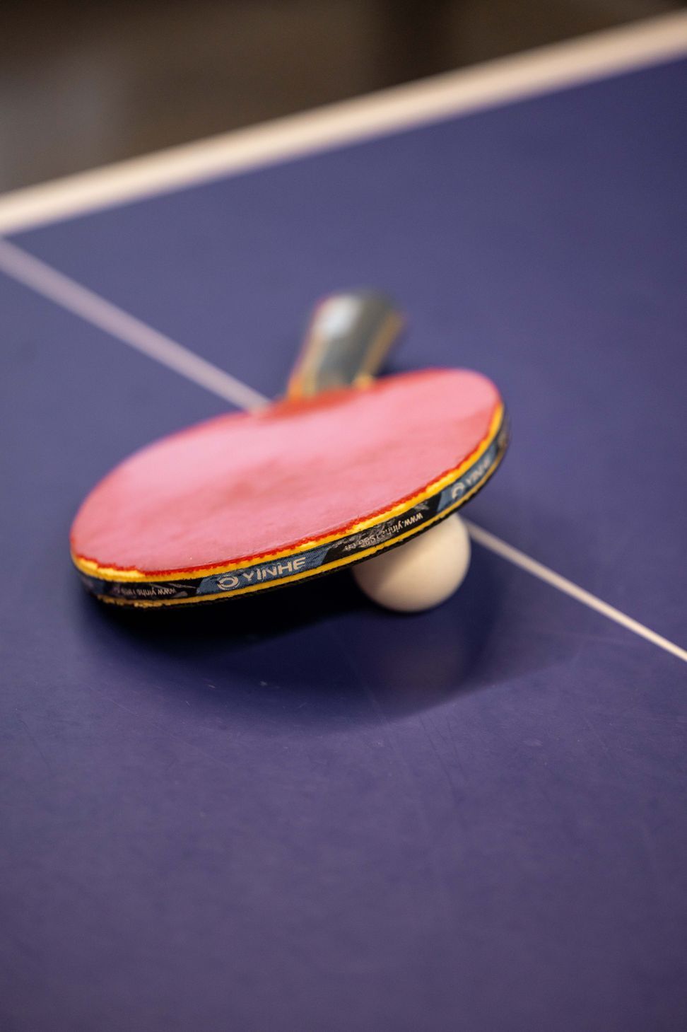
There is a ‘Playroom’ for table tennis (where much problem solving by staff is carried out), and where children of staff do their homework after school. In fact, the entry into the ‘Playroom’ is through a bespoke replica of Doctor Who’s Tardis. The Head of Human Resources is a custom-made Doctor Who Dalek, and sits in an alcove off the entry.


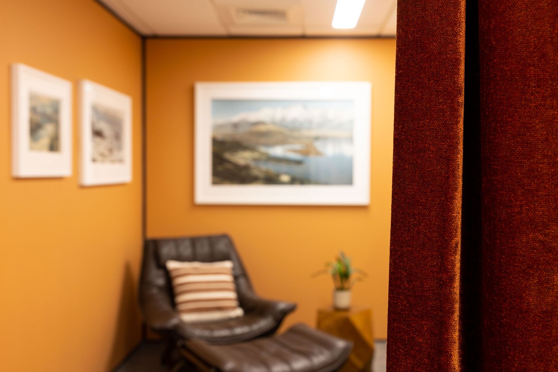
There is a prayer/meditation room), which is behind a velvet curtain to allow for privacy. The prayer mat is stored behing a column.
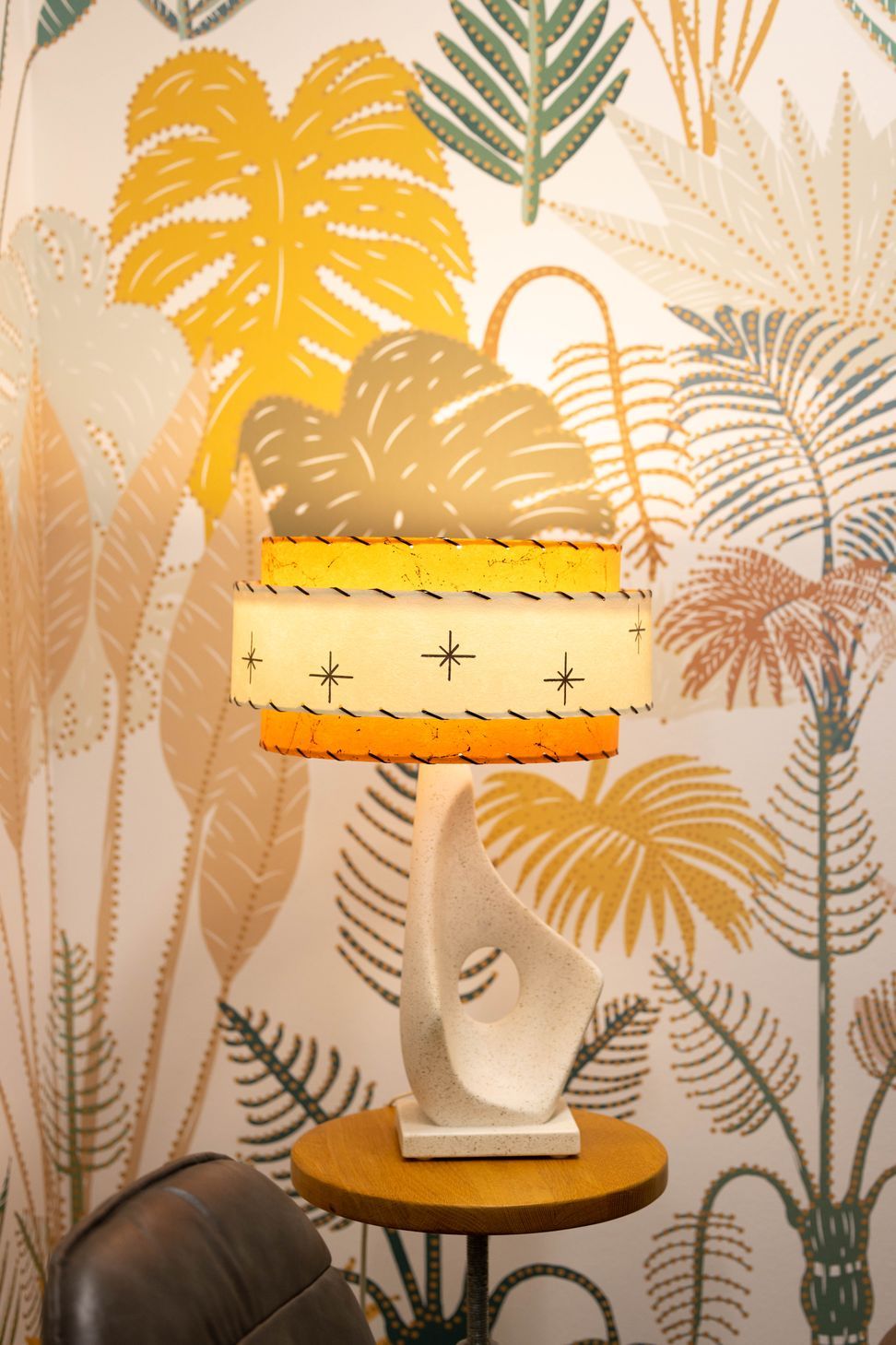

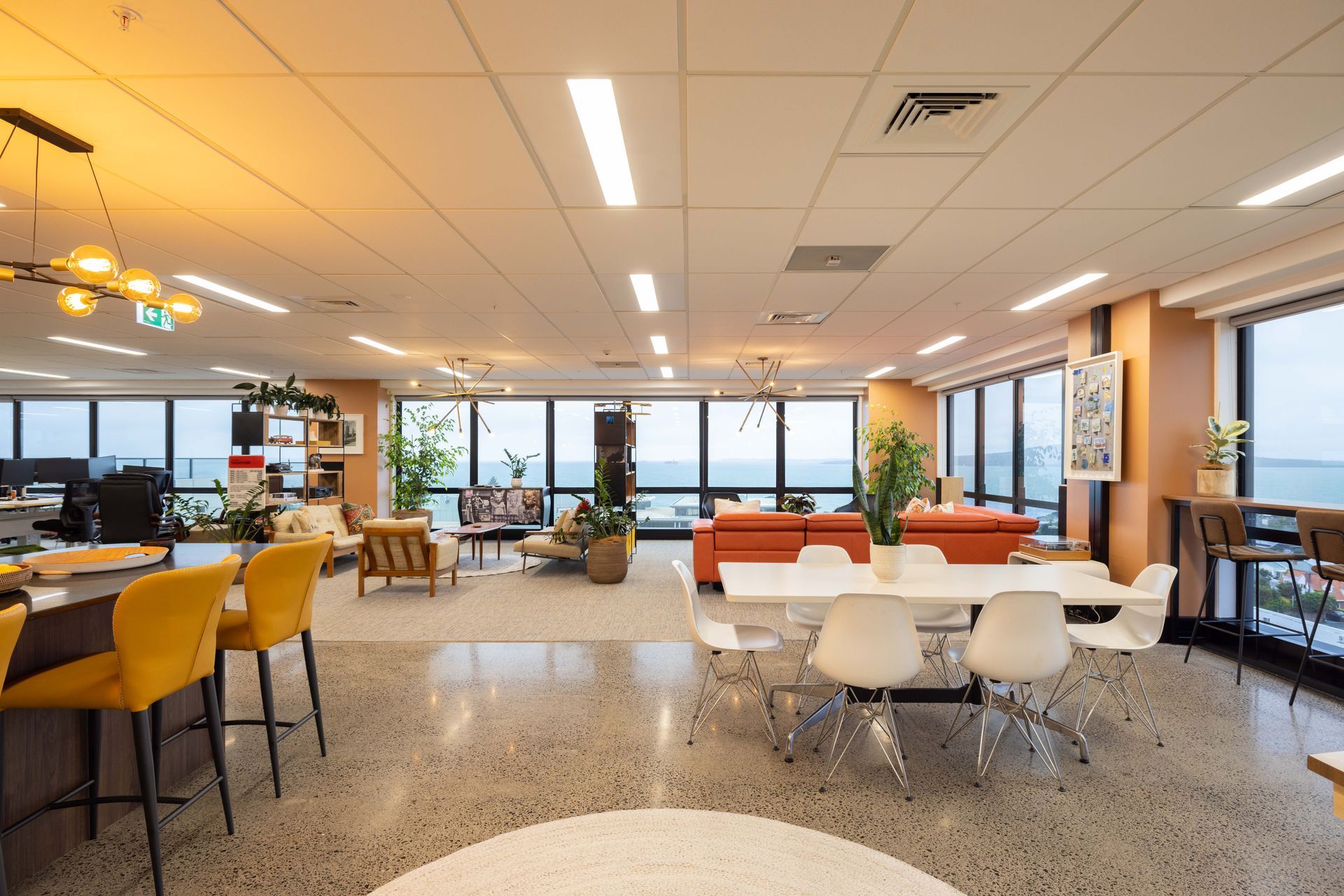
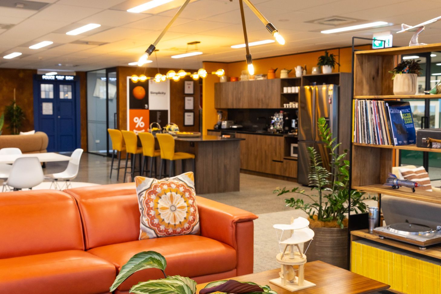
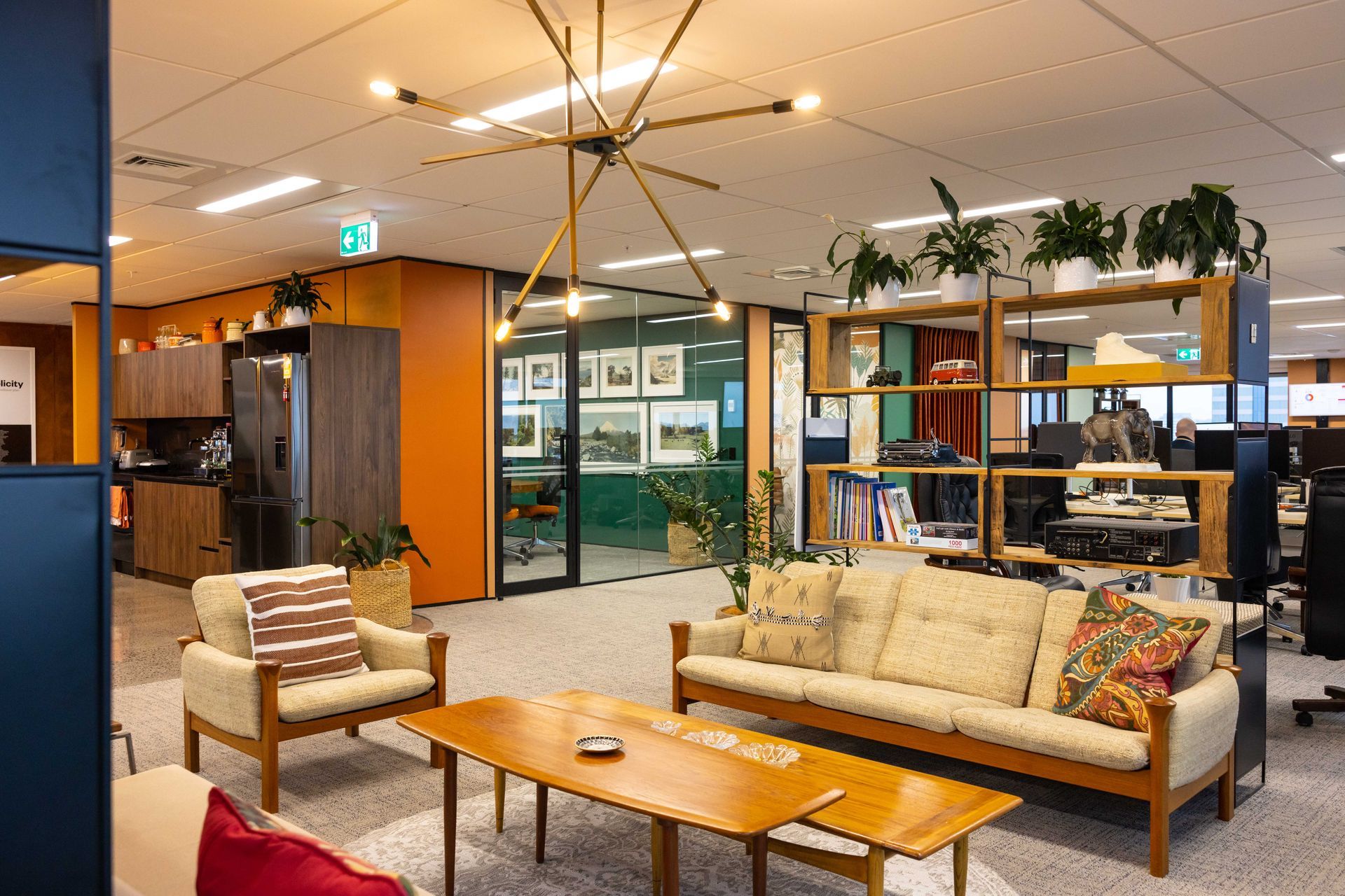
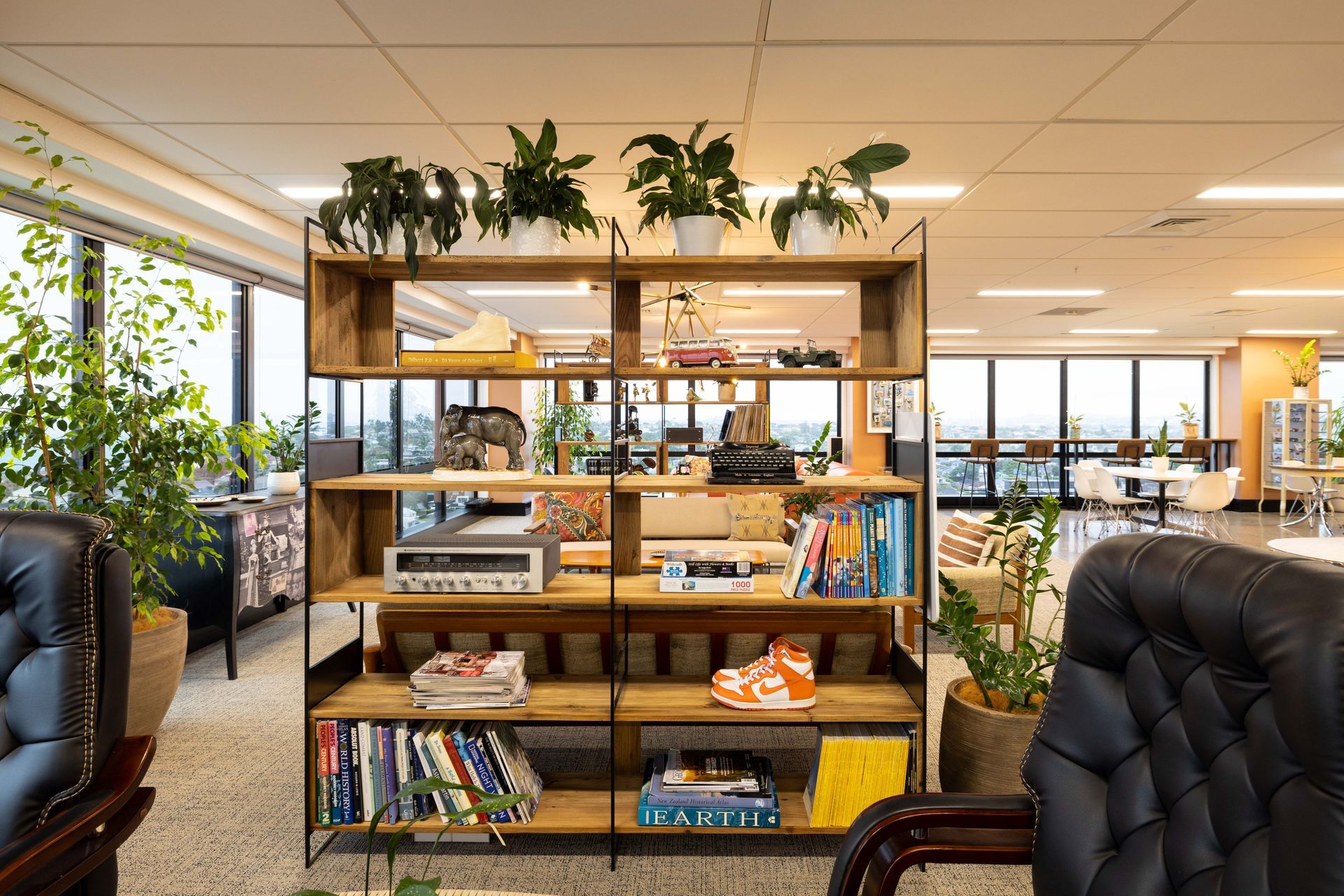
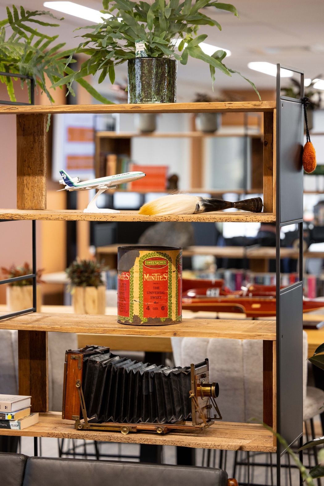
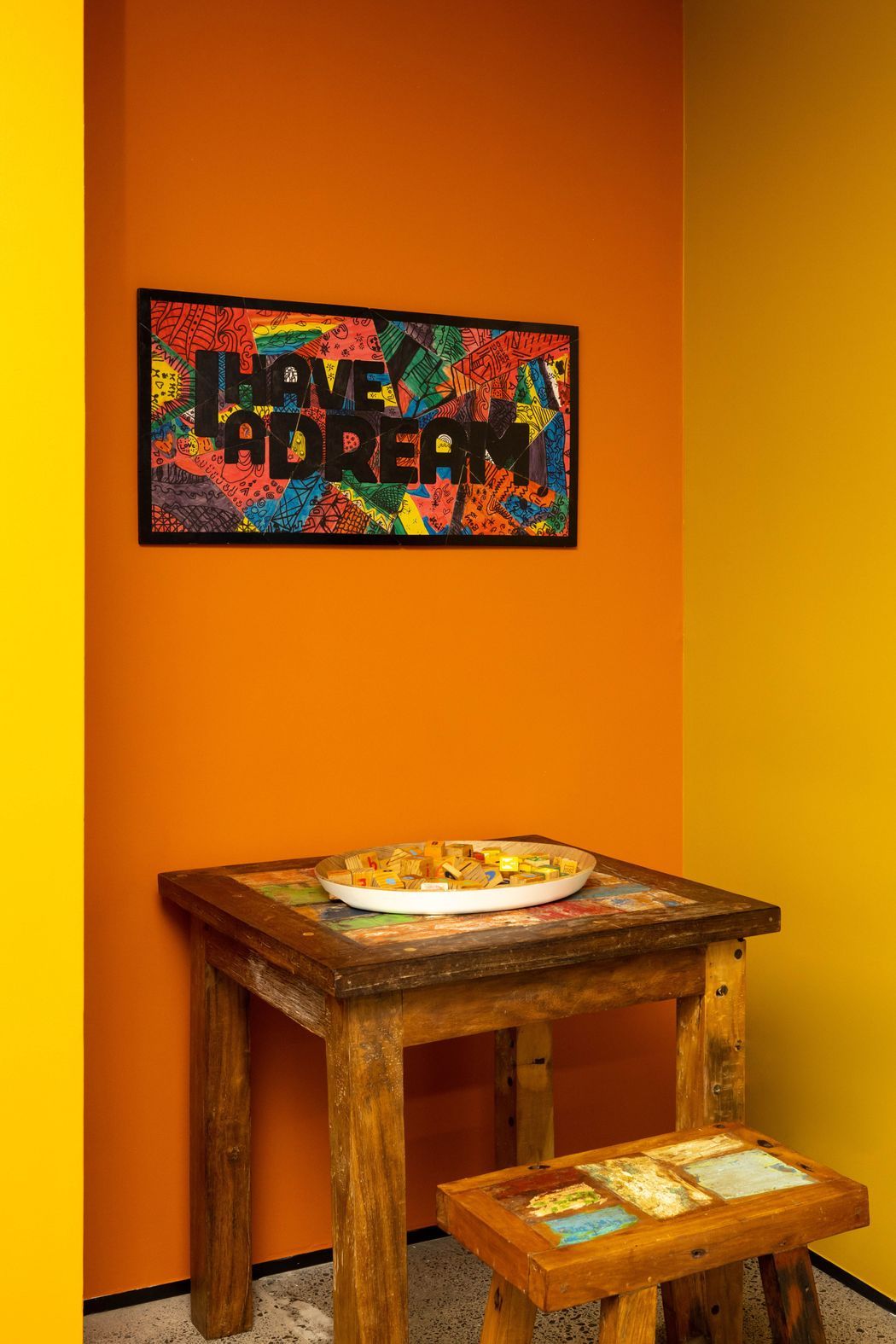
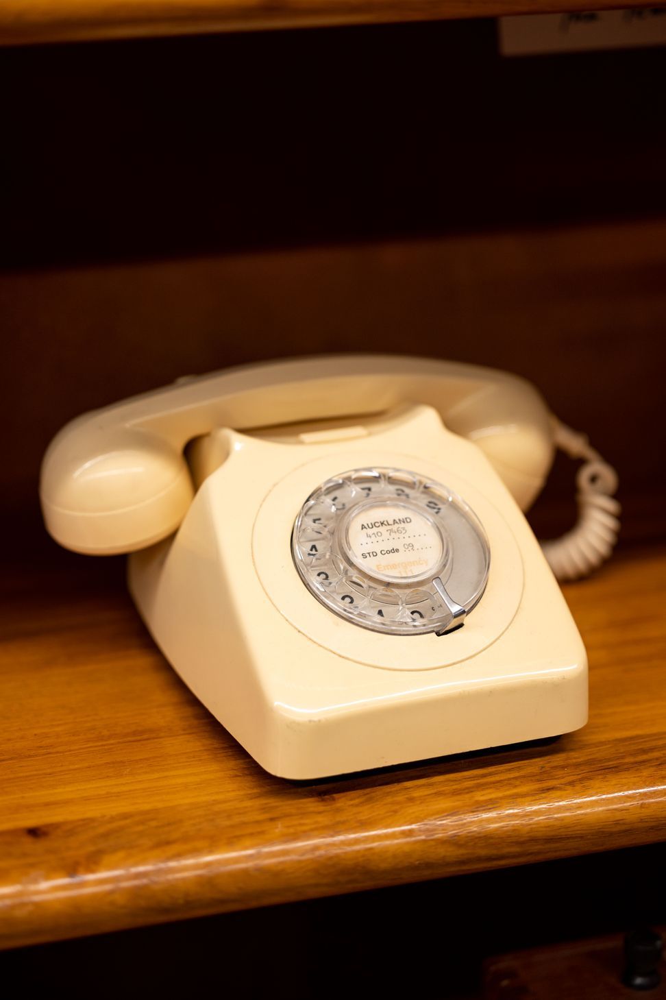
The client had a wonderful range of memorabilia from the 50’s, 60’s, 70’s, and so Retro style was embraced. Most of the furniture and accessories have been pre-loved, and so support sustainability, and reduction of landfill. For example, the 1980’s Board Room table and chairs are a Trade Me purchase. Recycling older furniture promoted a respect for well-made NZ furniture of the past, demonstrated not all we discard is destined for the scrapheap. A collection of NZ furniture and memorabilia has accessorised the entire office, and the company could in time, be recognised as the keeper of significant National collectables.

The staff tell us they love their work environment, and visitors say ‘wow’, because the interior design is so unexpected. Preloved, Trade Me, and collectable shop purchases for office interiors may be the way of commercial interior design as the world is becoming more aware of waste. Importantly, the client has told us the interior design of his office is the embodiment of the ‘Simplicity Difference’.


Year Joined
Projects Listed