About
Sandspit Bathroom.
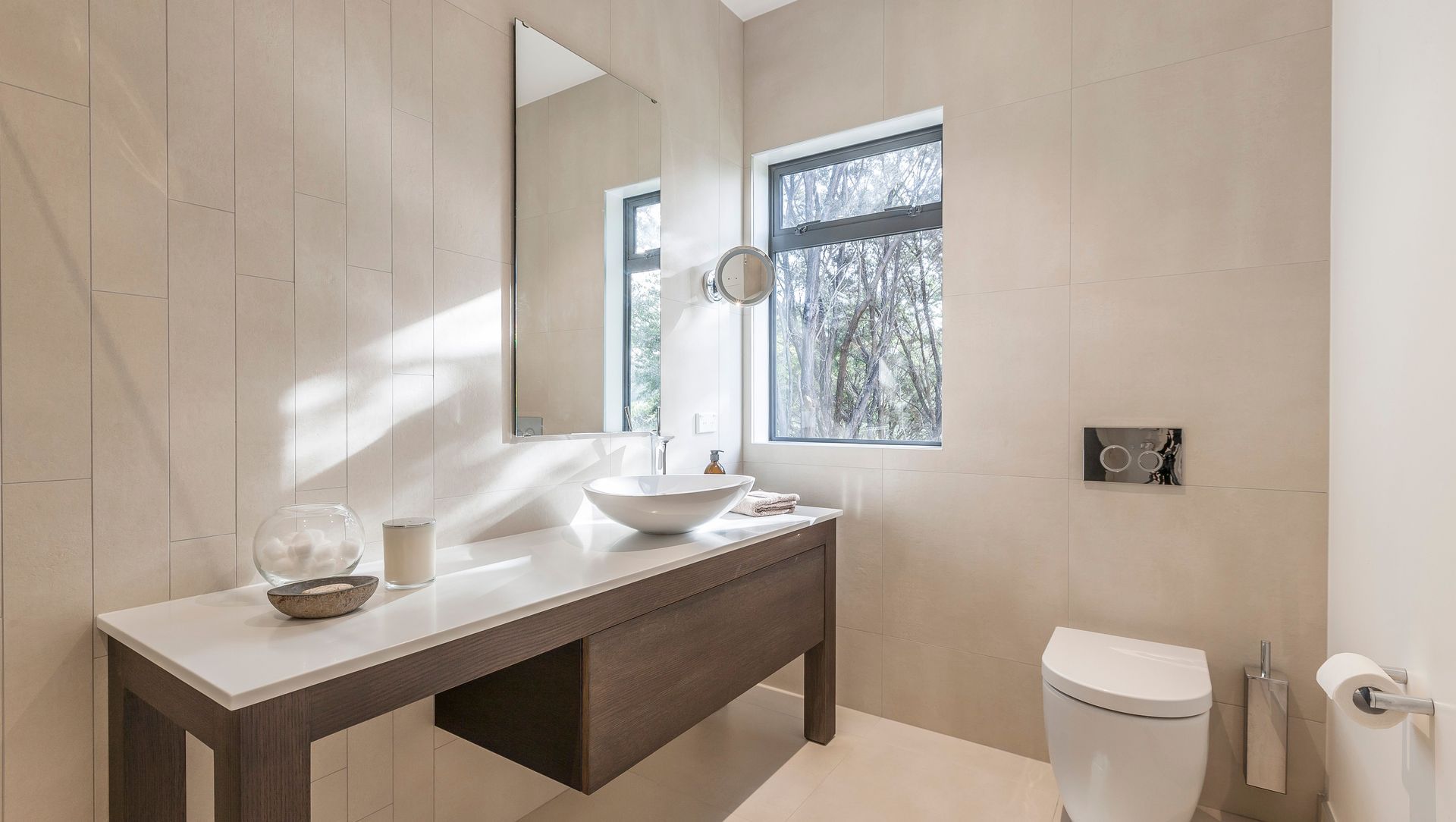
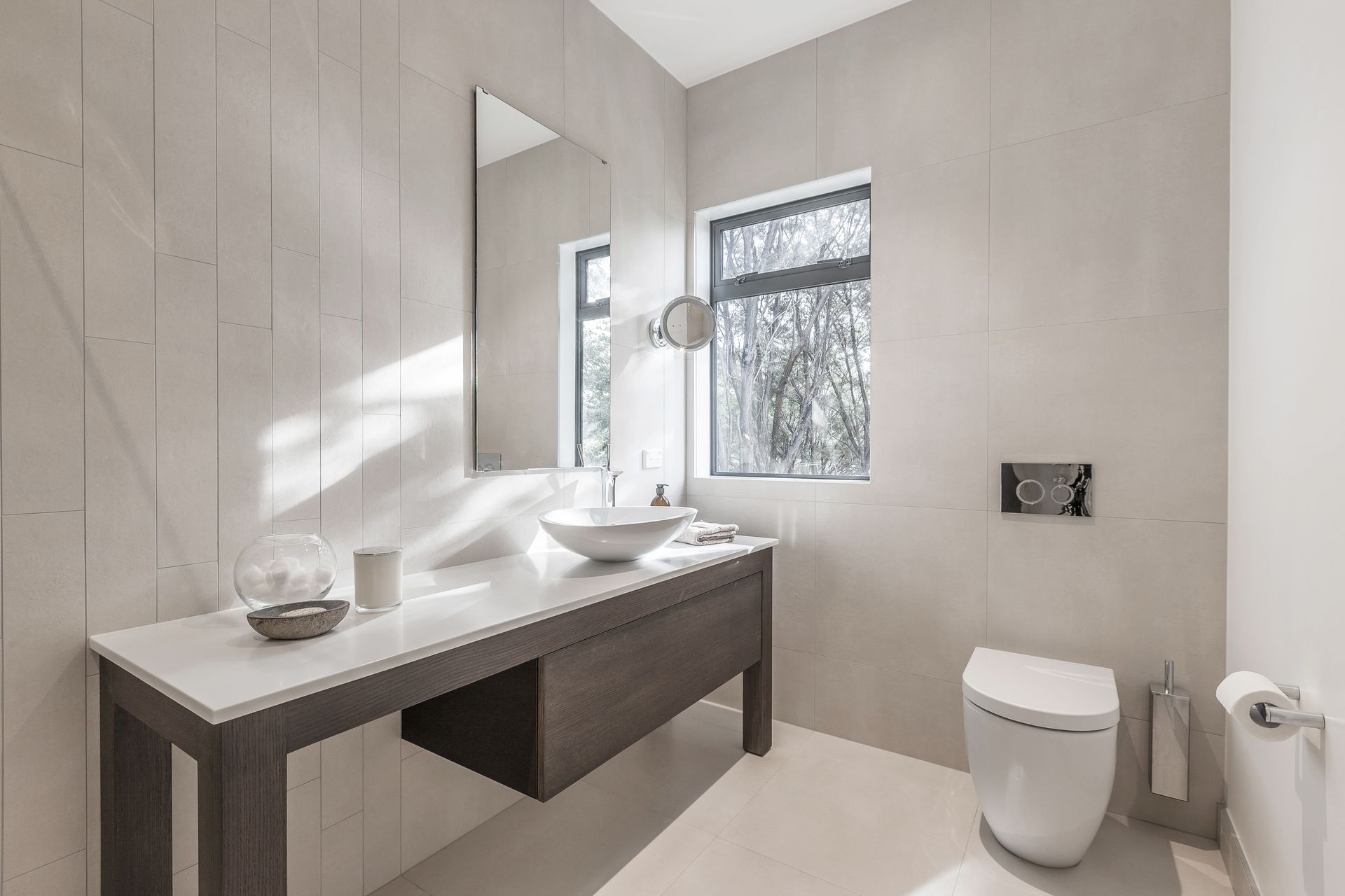
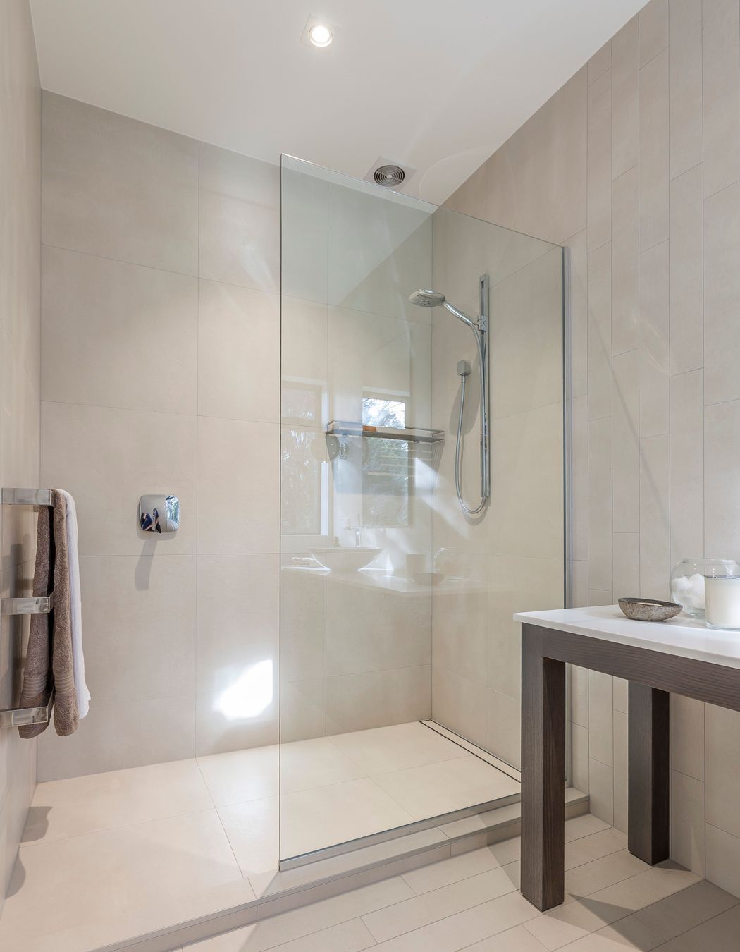
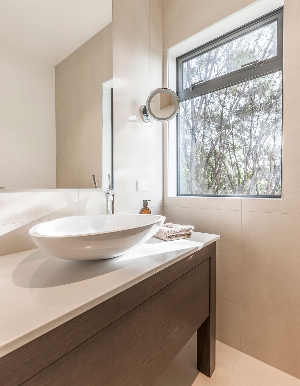
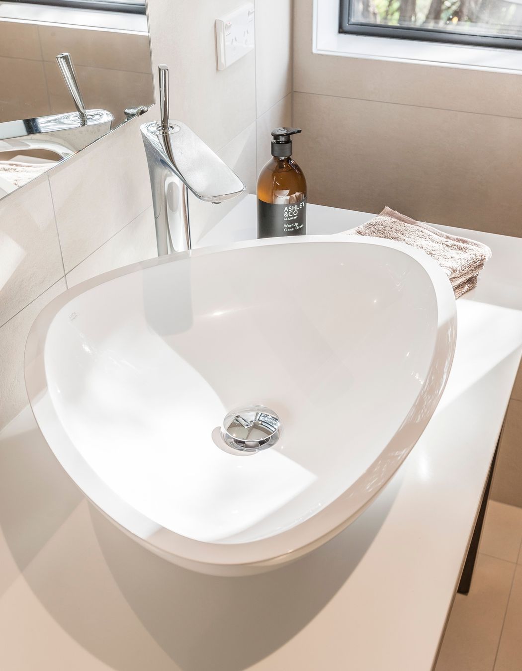
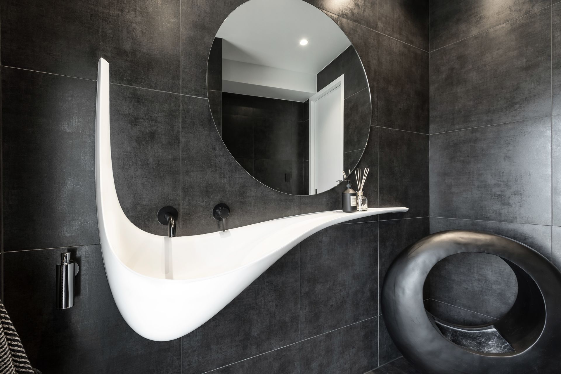
ArchiPro Project Summary - A master ensuite renovation that embodies elegance and simplicity, featuring a custom timber vanity, an asymmetrical design, and a spacious walk-in shower, all harmoniously integrated to enhance the sense of openness and style.
- Title:
- Sandspit Bathroom
- Interior Designer:
- Celia Visser Design
- Category:
- Residential/
- Interiors
Project Gallery

Views and Engagement
Products used
Professionals used

Celia Visser Design. Celia Visser lives and breathes design. Her passion for innovation and quality is matched only by her commitment to client satisfaction. Within the kitchen design industry, she is highly respected for her consistency and innovation – qualities that have won her multiple awards.When Celia first walks into a home, she quickly assesses its potential. She listens to her clients and takes on board their lifestyle, family circumstances and the ambience they want to create within their home. This is what guides her unique designs.Her goal is for her clients to come home to a place they can relax in, and at the same time is beautiful space that suits their individuality. She loves designing homes with soul and that X Factor.Celia is inquisitive – always seeking fresh creative stimulation. Her weekends are spent scouring magazines, shops and markets for inspiration and quirky ideas, and she travel often overseas. She is equally focused on the business side of her company, and strives for excellence in all areas.Celia has been in the design and construction industry for 25 years, and is currently a member of the Certified Designers Society, NKBA and DINZ.
Year Joined
2017
Established presence on ArchiPro.
Projects Listed
32
A portfolio of work to explore.
Celia Visser Design.
Profile
Projects
Contact
Project Portfolio
Other People also viewed
Why ArchiPro?
No more endless searching -
Everything you need, all in one place.Real projects, real experts -
Work with vetted architects, designers, and suppliers.Designed for New Zealand -
Projects, products, and professionals that meet local standards.From inspiration to reality -
Find your style and connect with the experts behind it.Start your Project
Start you project with a free account to unlock features designed to help you simplify your building project.
Learn MoreBecome a Pro
Showcase your business on ArchiPro and join industry leading brands showcasing their products and expertise.
Learn More