About
Burt Street.
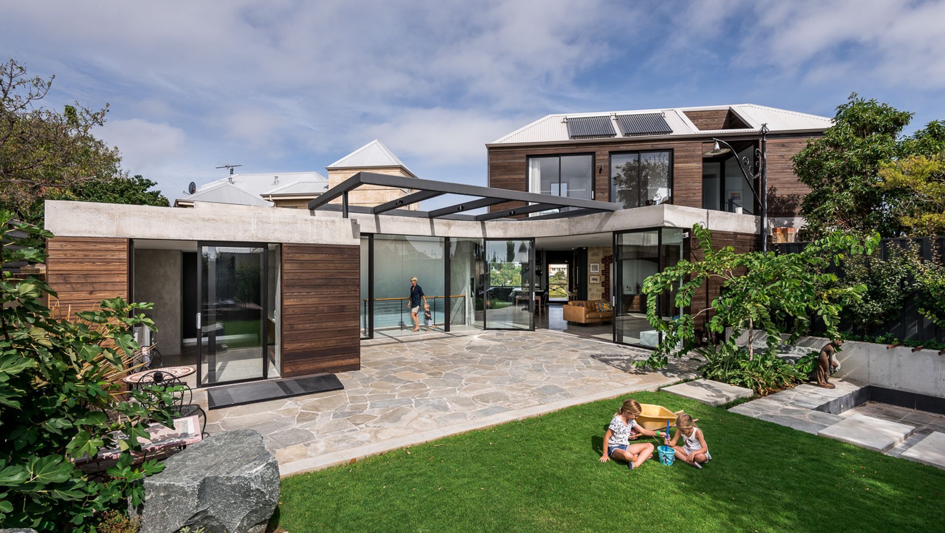
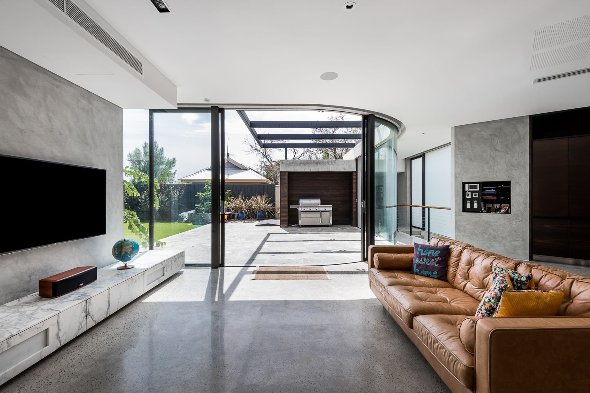
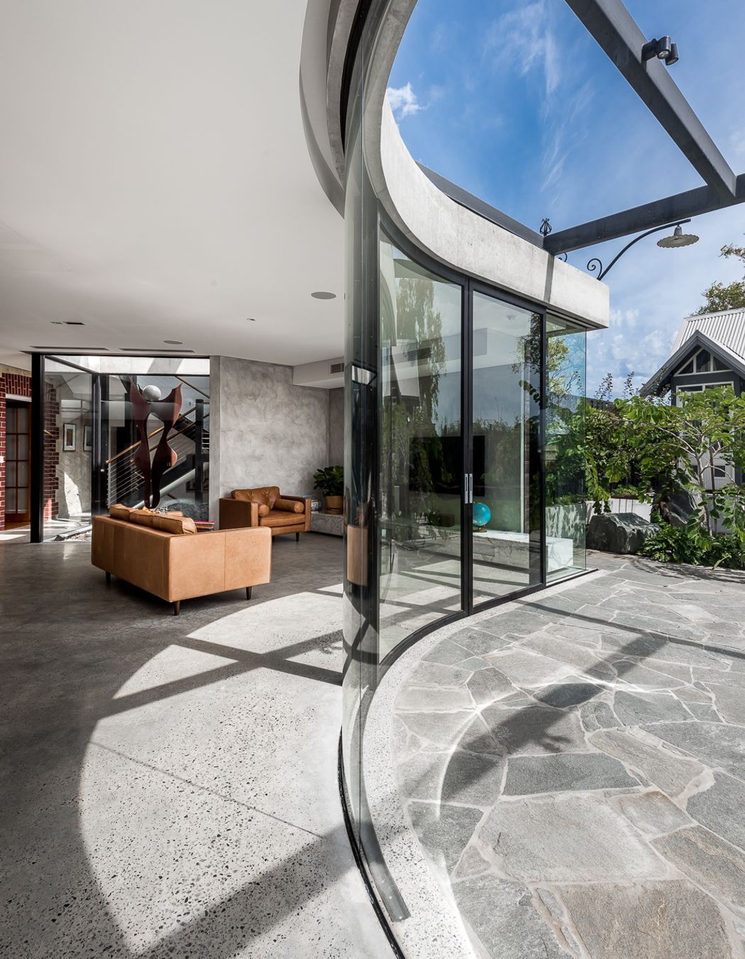
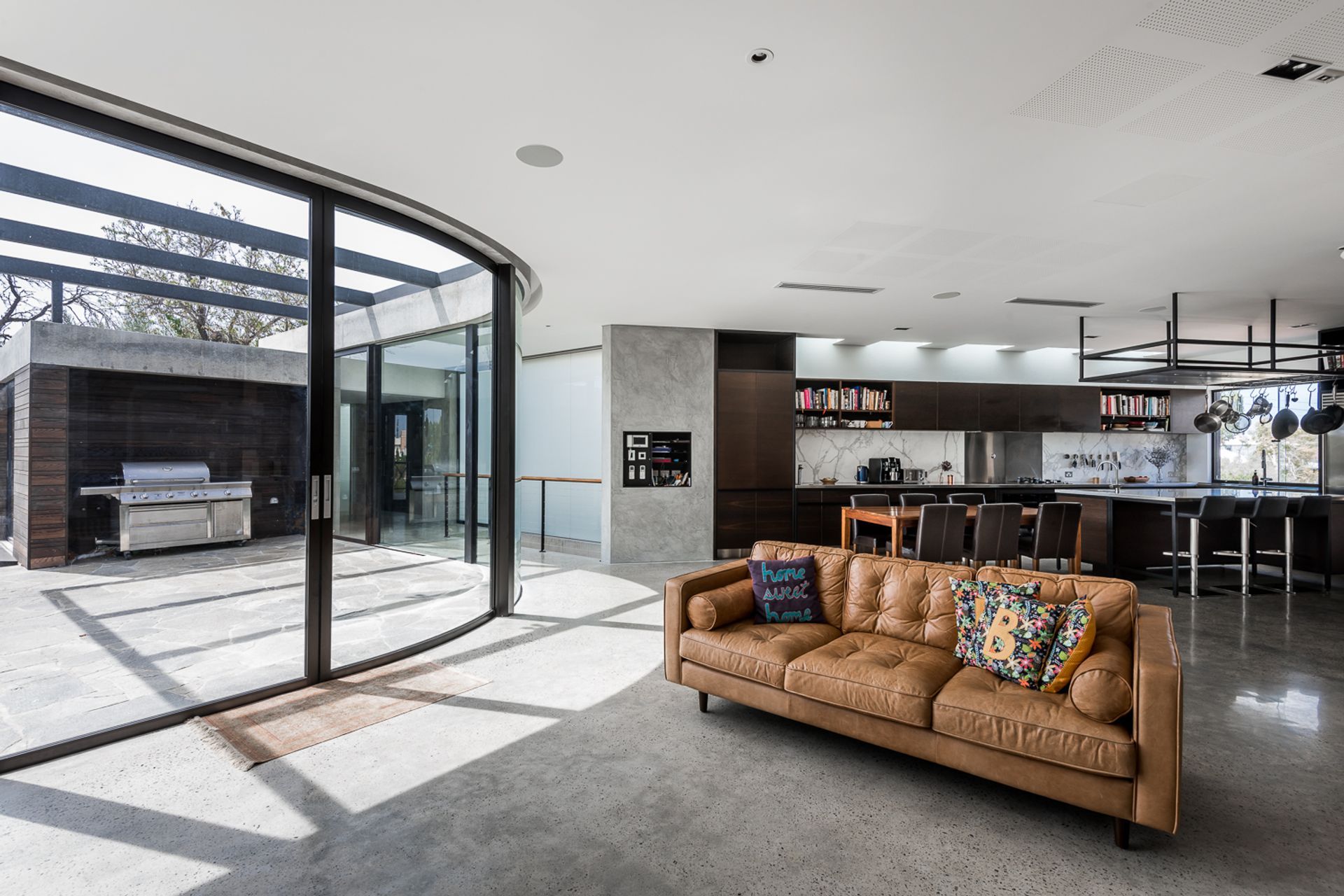
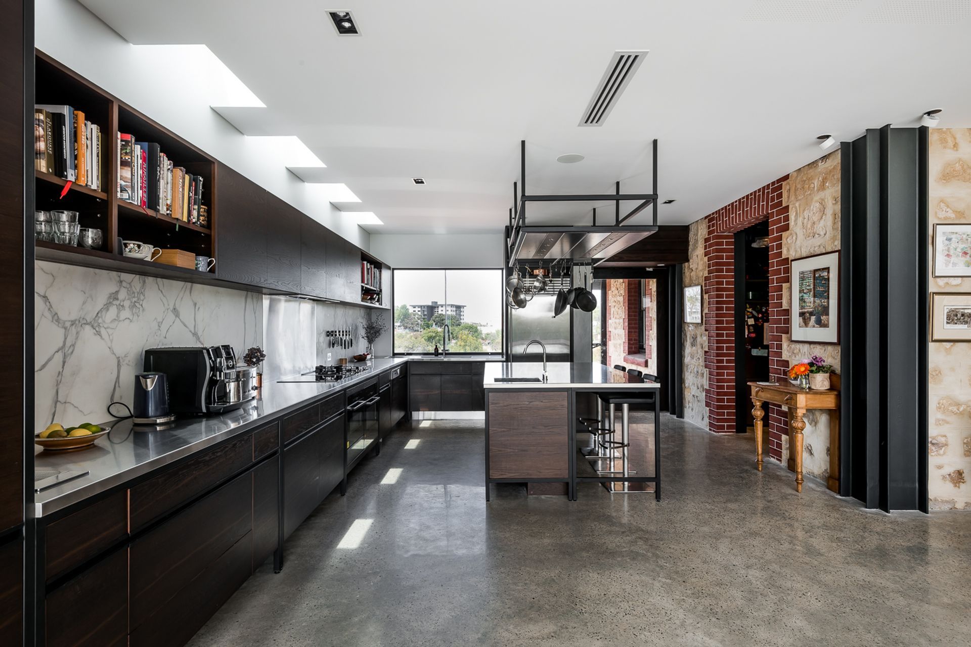
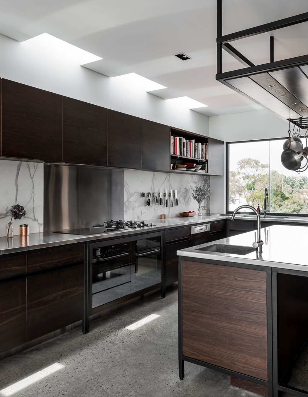
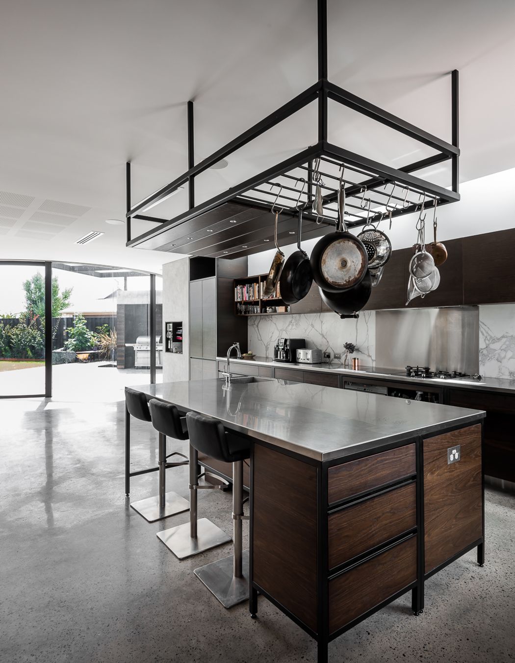
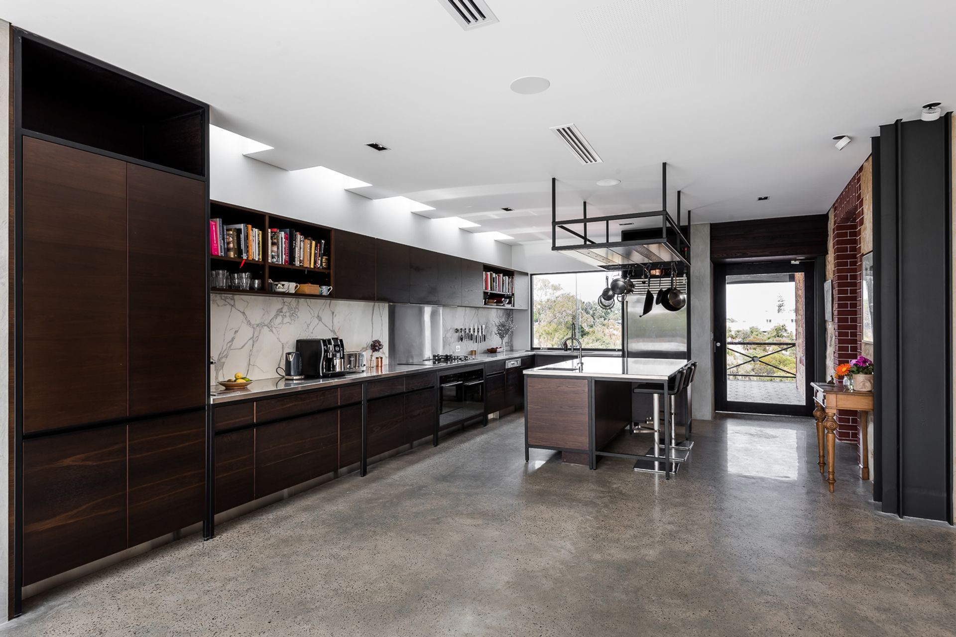
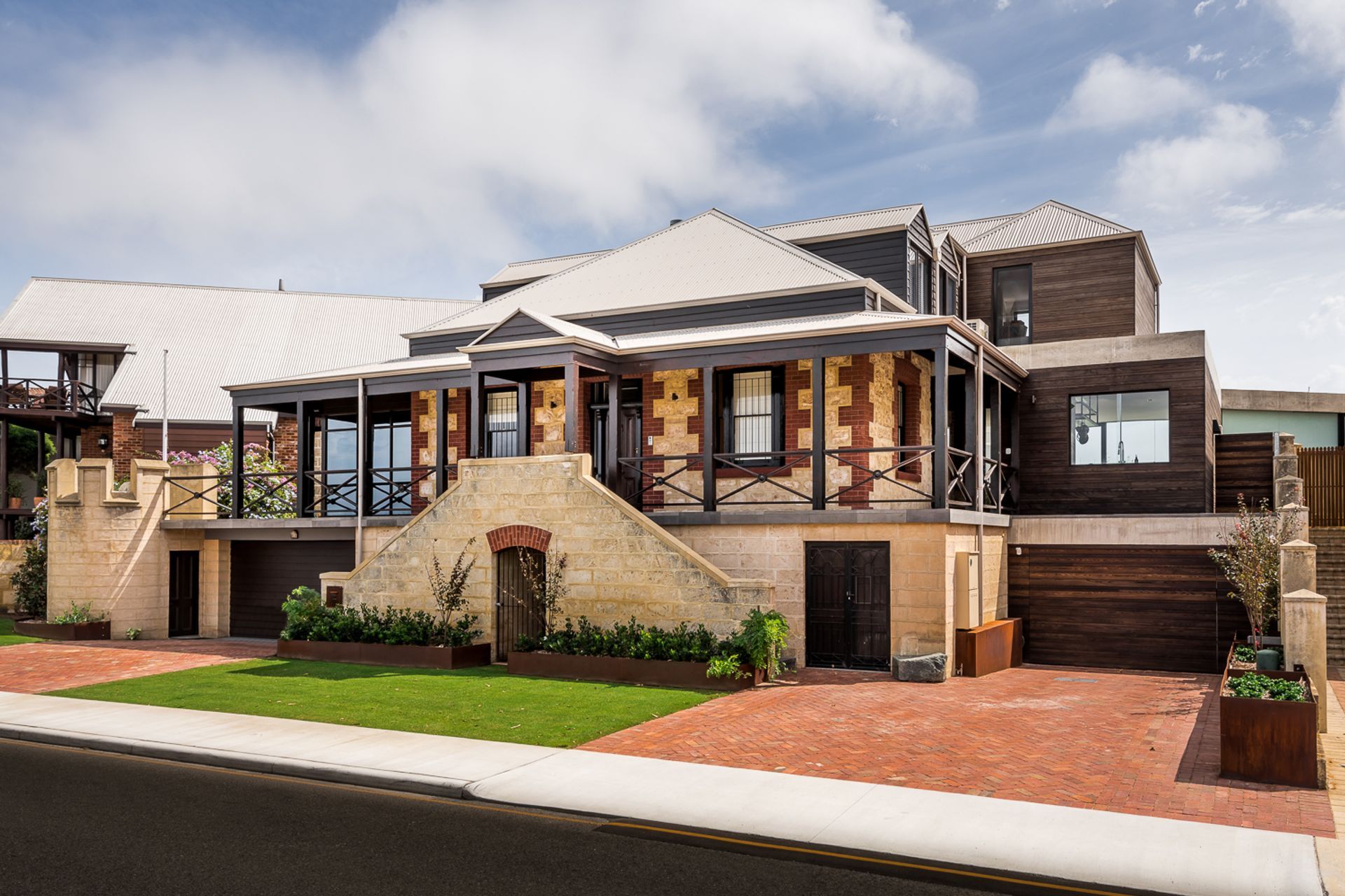
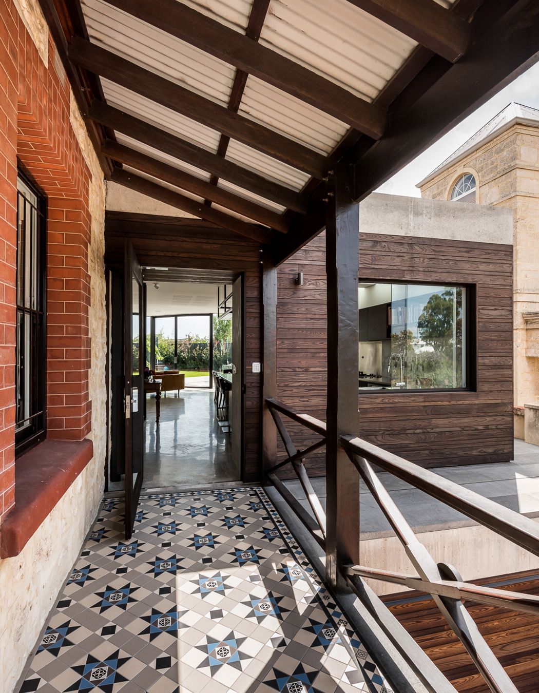
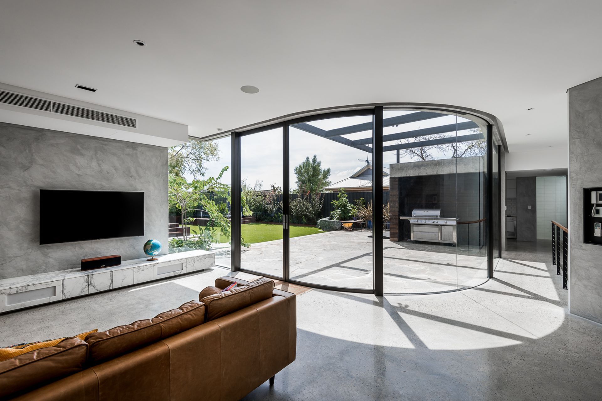
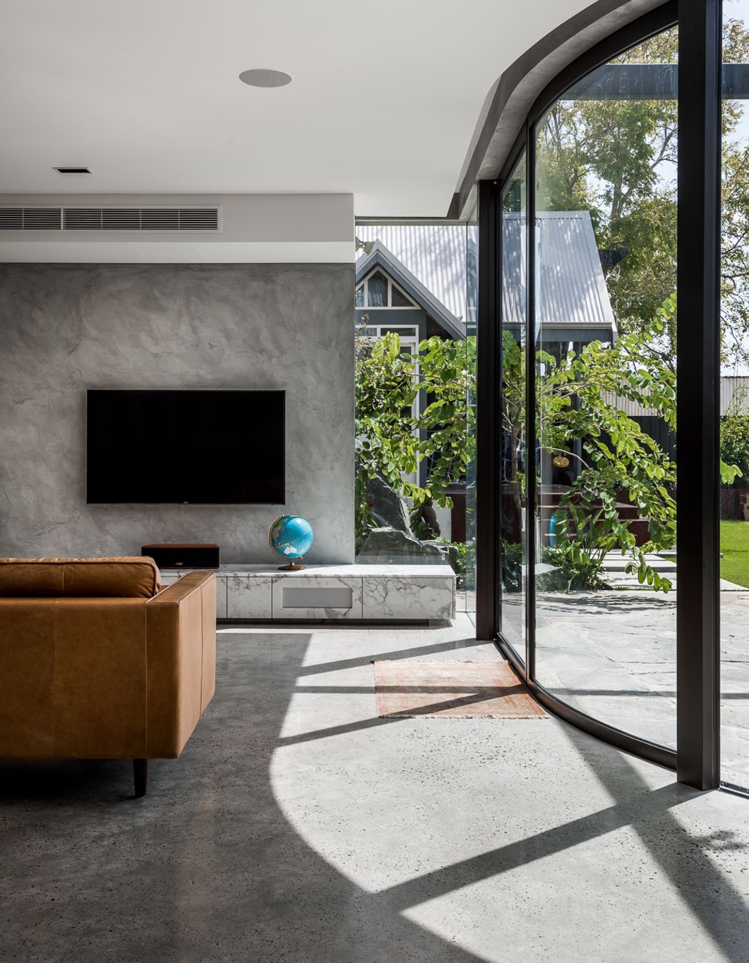
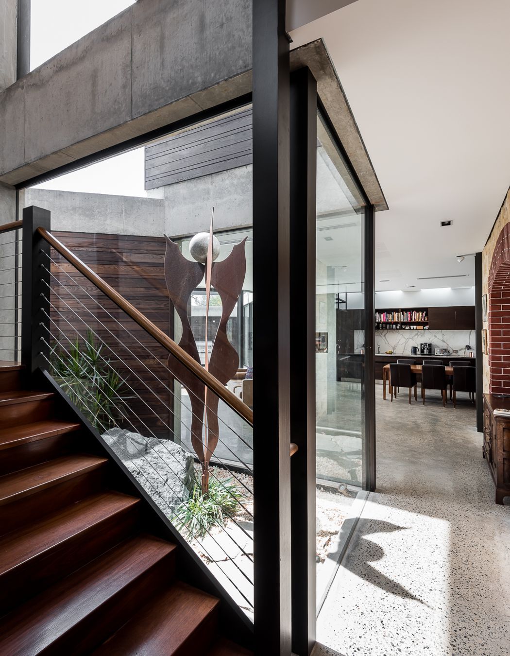
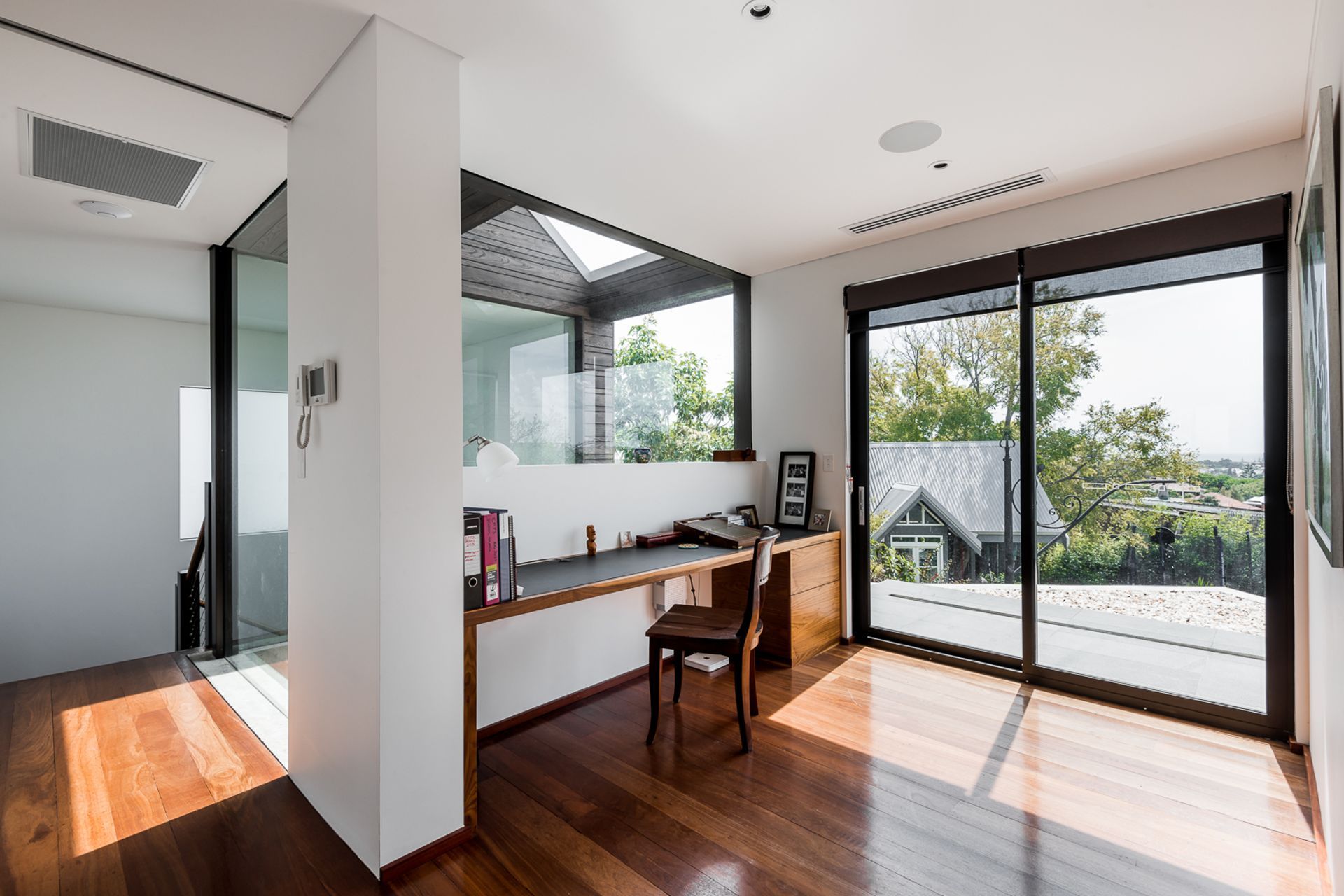
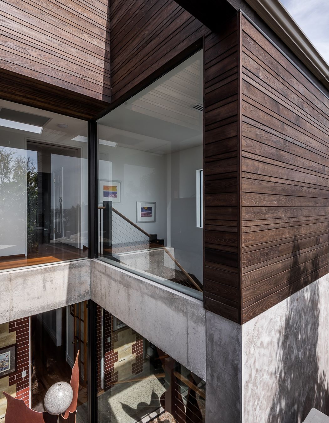
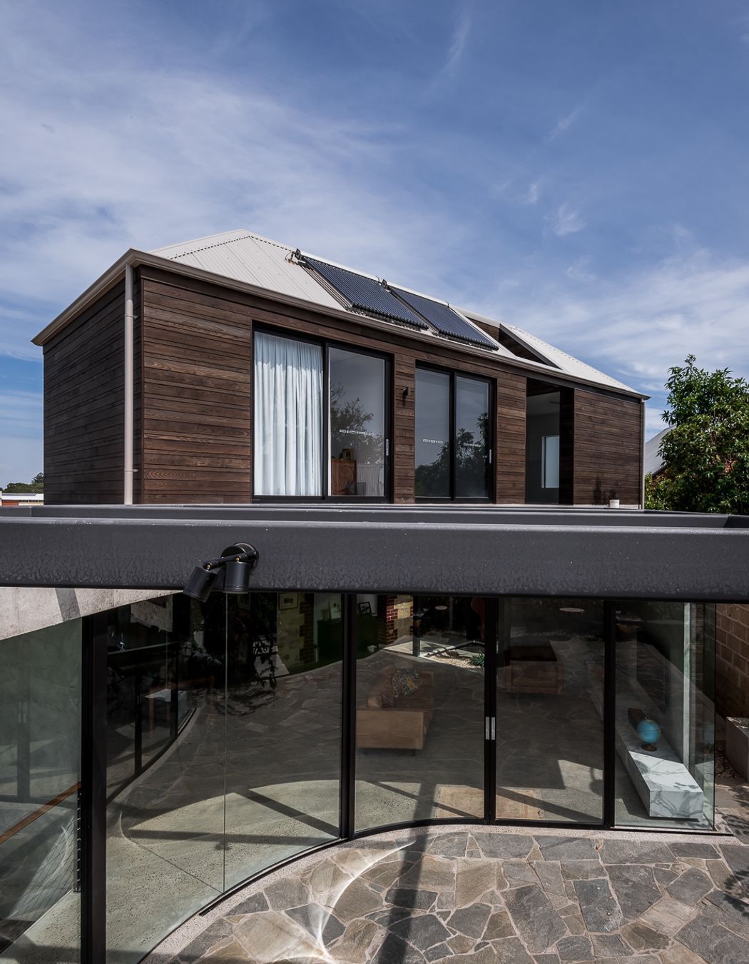
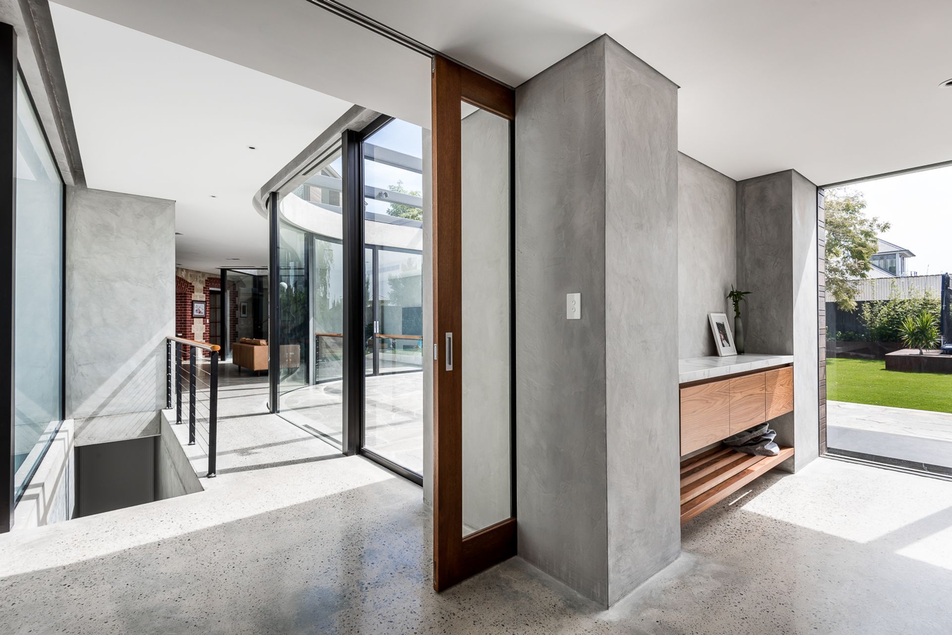
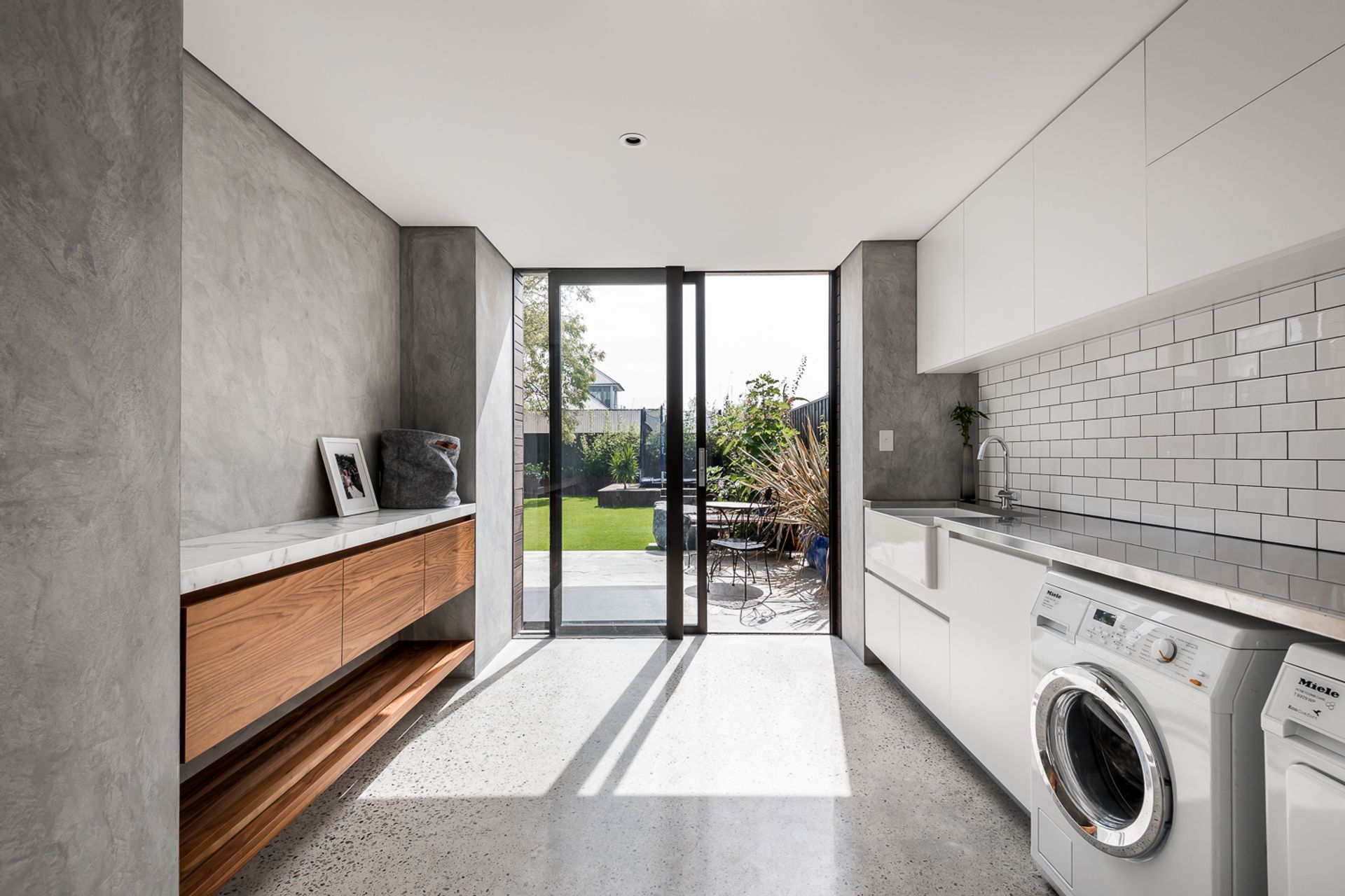
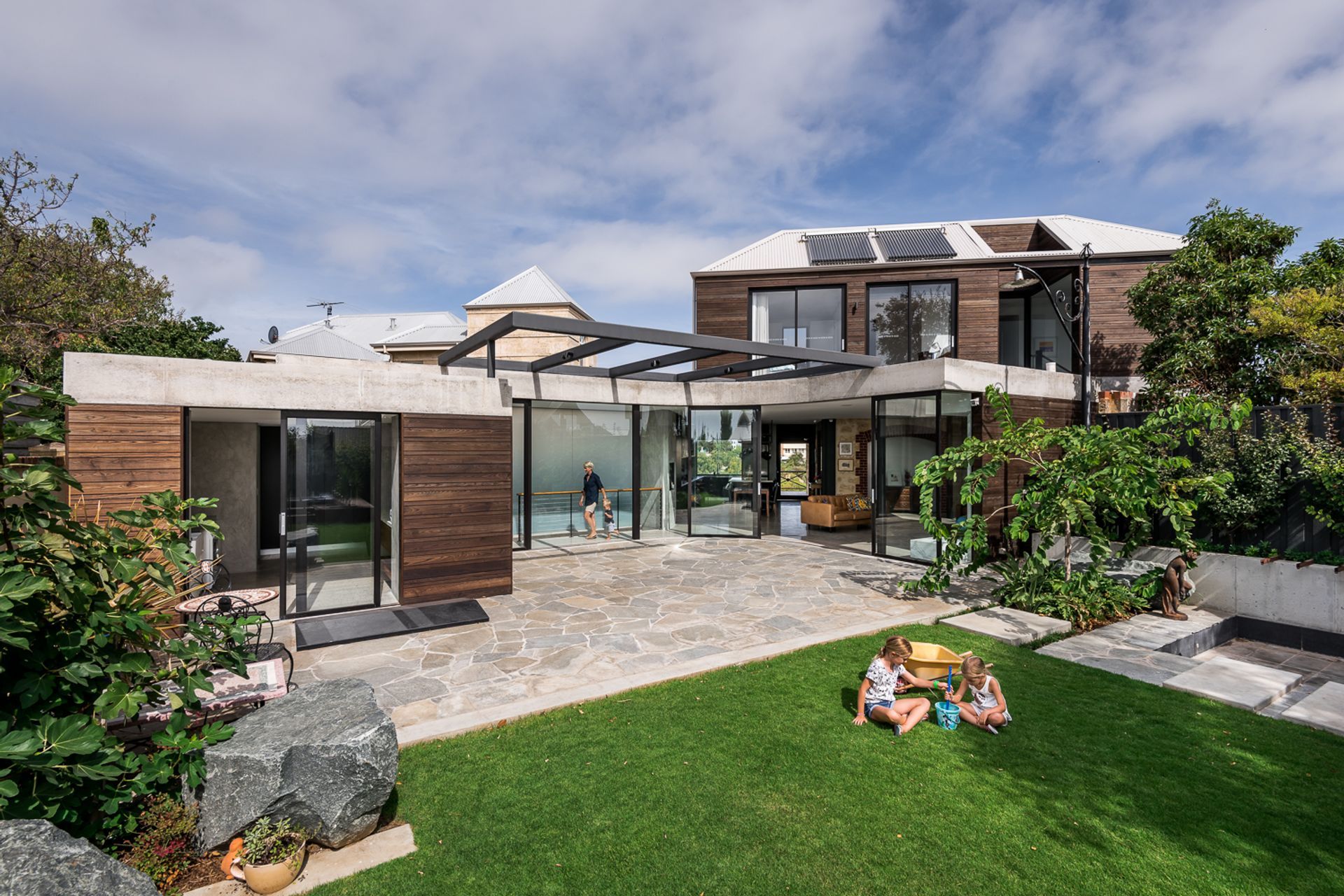
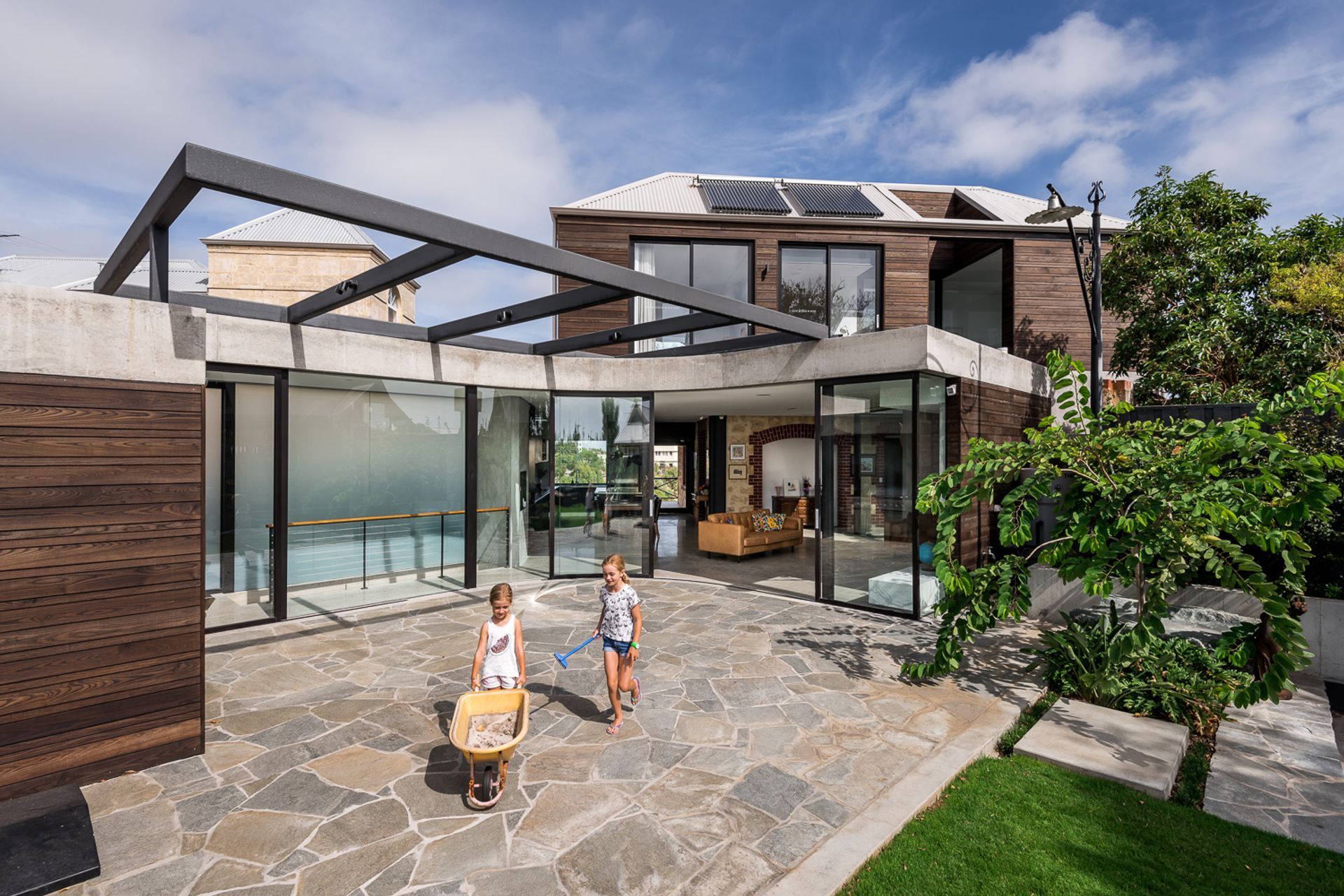
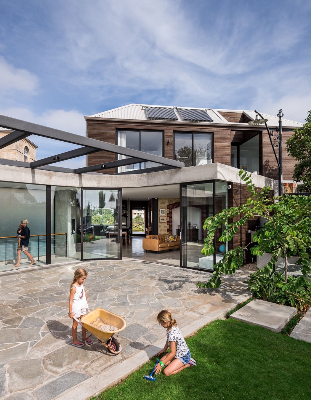
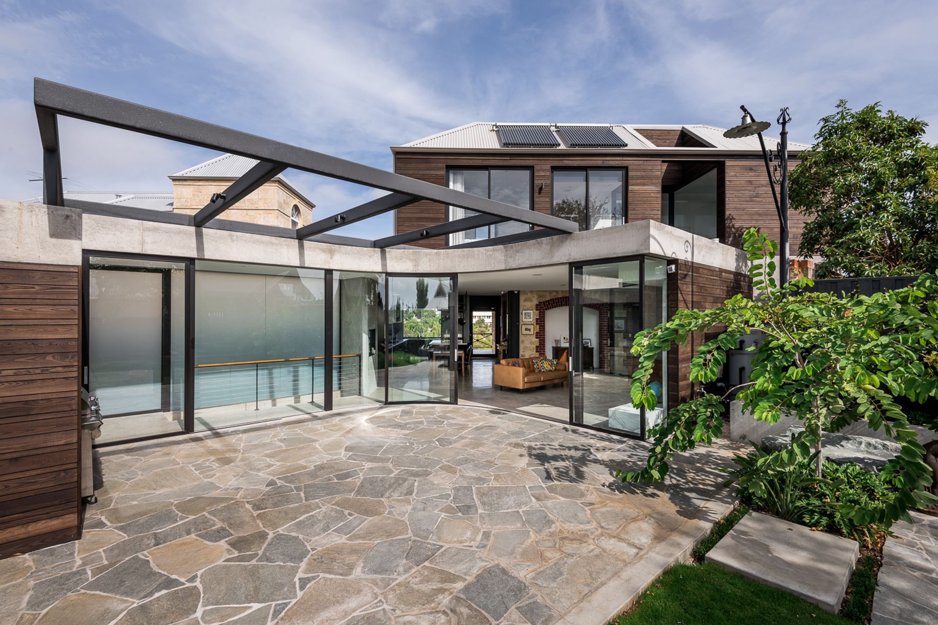
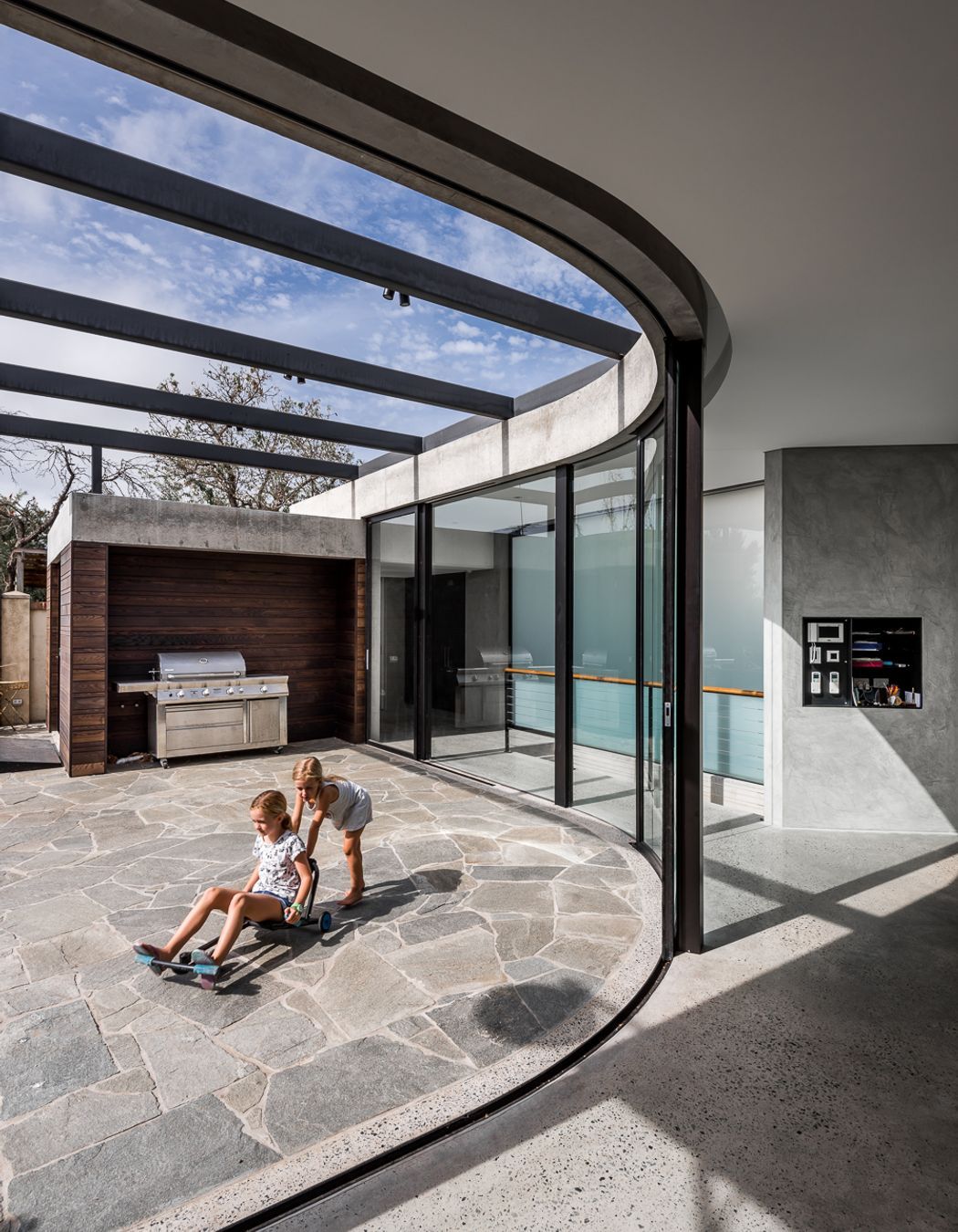
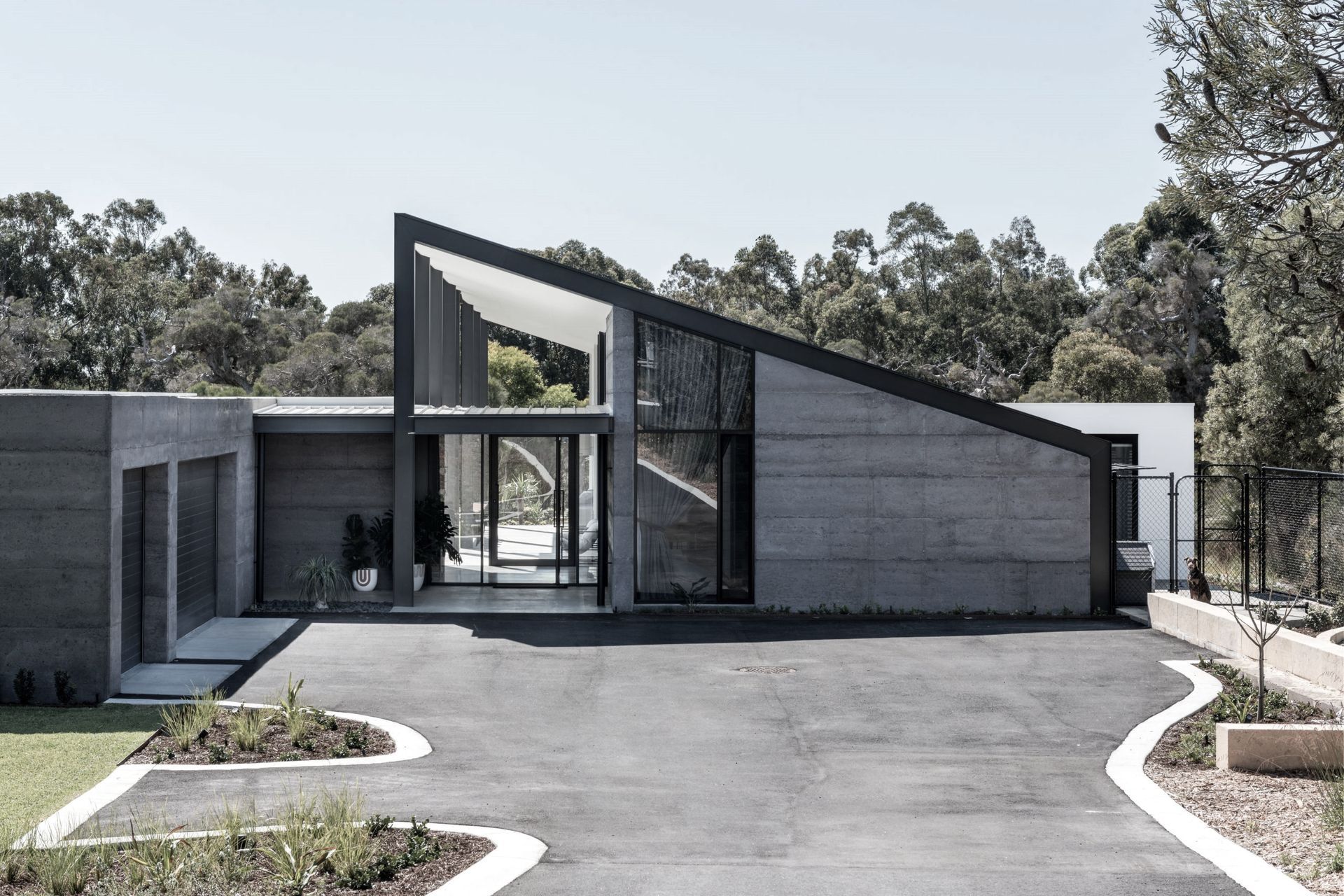
ArchiPro Project Summary - A transformative renovation and extension that enhances lifestyle through seamless indoor-outdoor living, featuring a central kitchen, curved glass sliding doors, and a harmonious blend of modern and warm materials.
- Title:
- Burt Street
- Architect:
- Keen Architecture
- Category:
- Residential/
- Renovations and Extensions
Project Gallery
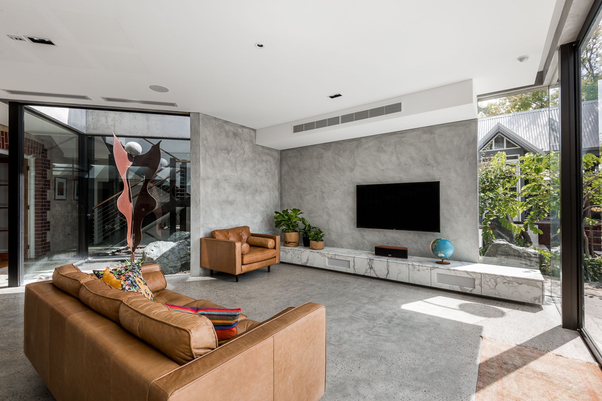
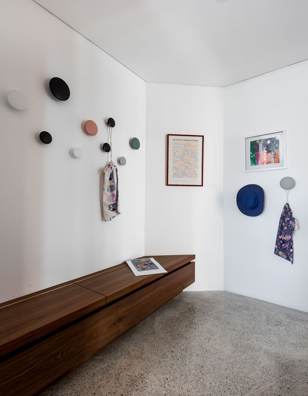
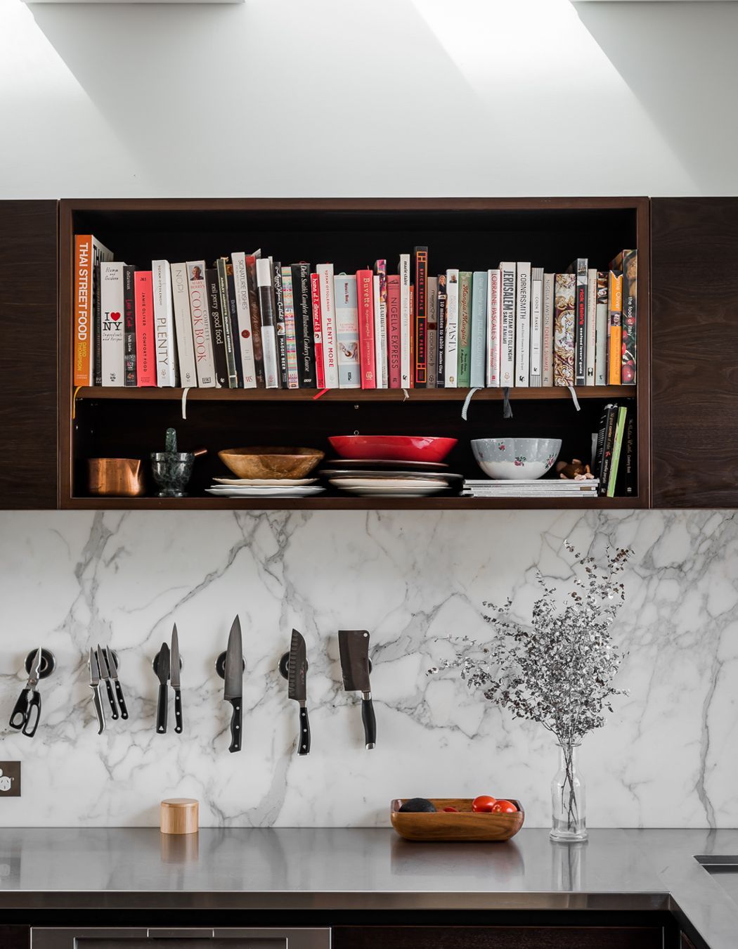
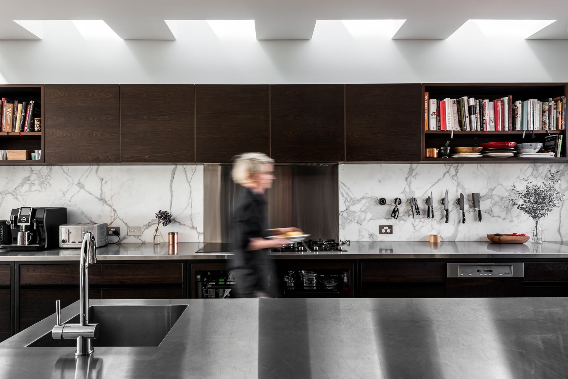
Views and Engagement
Professionals used

Keen Architecture. This is about you, simple.You have found us because you enjoy something a little different, a little bit special, and you value quality.We are here because of our passion for design, creative problem solving, and seeing people smile. Our approach matches our aesthetic; honest, authentic and a bit of fun.And it all starts with a conversation…
Year Joined
2022
Established presence on ArchiPro.
Projects Listed
9
A portfolio of work to explore.
Keen Architecture.
Profile
Projects
Contact
Other People also viewed
Why ArchiPro?
No more endless searching -
Everything you need, all in one place.Real projects, real experts -
Work with vetted architects, designers, and suppliers.Designed for New Zealand -
Projects, products, and professionals that meet local standards.From inspiration to reality -
Find your style and connect with the experts behind it.Start your Project
Start you project with a free account to unlock features designed to help you simplify your building project.
Learn MoreBecome a Pro
Showcase your business on ArchiPro and join industry leading brands showcasing their products and expertise.
Learn More