The renovation of a mid-century home in central Auckland demonstrates how seamlessly original character features can be combined with contemporary additions.
Renovating a home with an architectural legacy can be daunting, particularly when the architect of the central Auckland home is famed Christchurch architect Don Cowey. But when owner and architect Julian Guthrie (of Julian Guthrie Architecture) spotted the mid-century beauty, with its Titirangi-like view over a valley of native bush, he knew it had the potential to transform to accommodate his blended family of six.
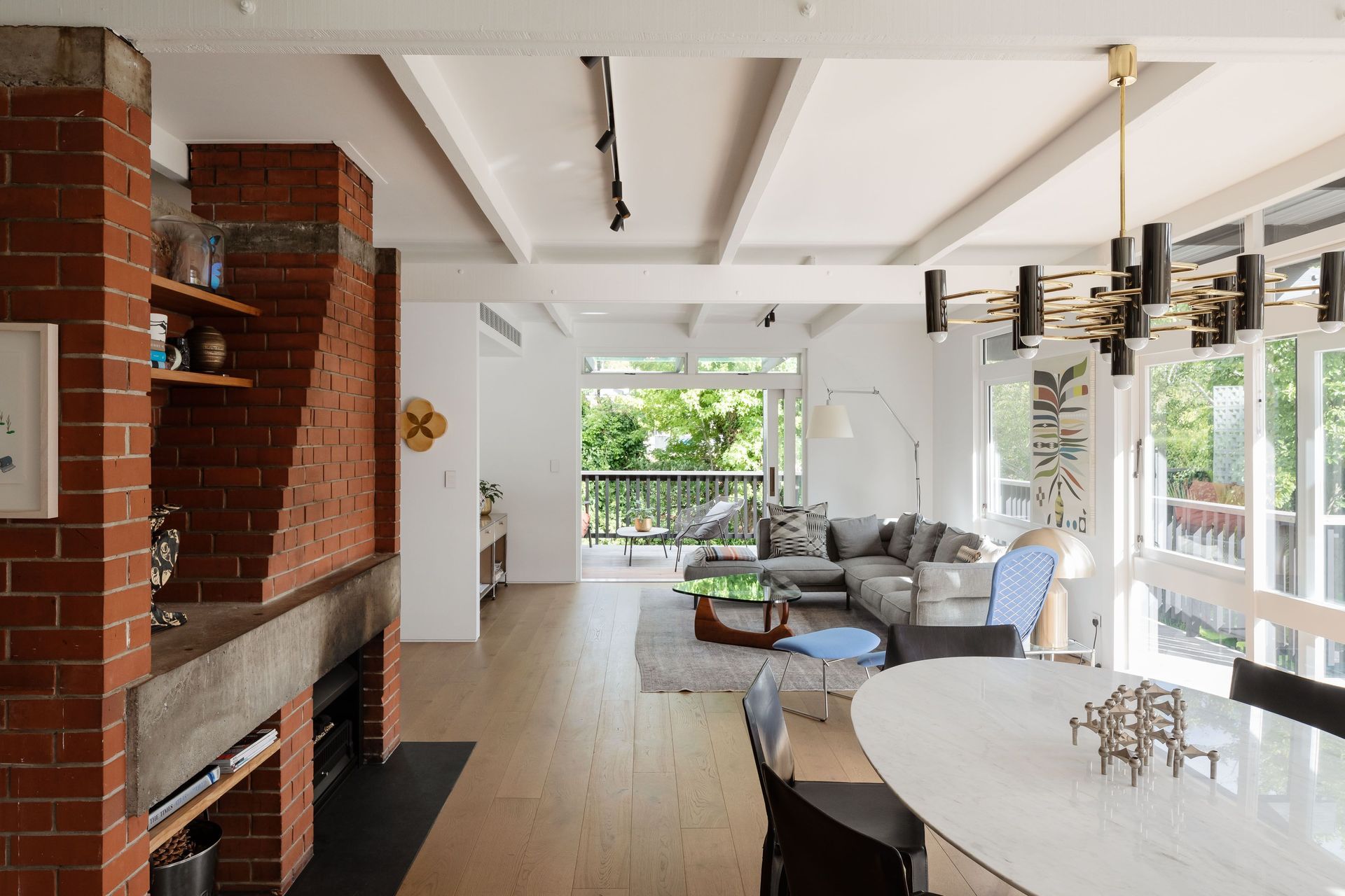
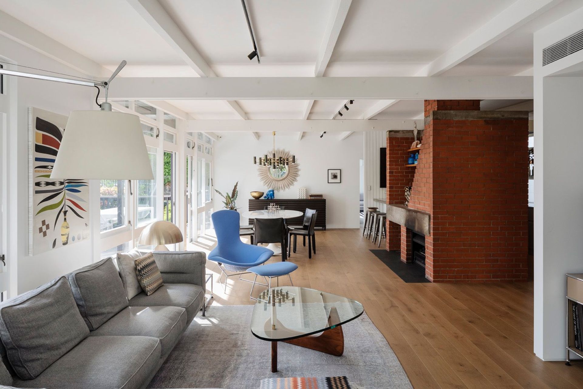
The bones of the home were classic mid-century modern: an orange brick fireplace, a simple flat pitched roof, original floor-to-ceiling wooden window joinery and exposed roof rafters in the interior.
At the time of its design, it would have been considered a reasonably substantial home: it had five bedrooms and two bathrooms, with a small central living space. Funnily enough, Julian’s renovation would almost double the floor area, yet retain the same number of bedrooms but in more contemporary, spacious sizes. In addition, it would enlarge the living room and add additional internal living spaces.
The renovation plan was not an unsubstantial undertaking, with the family living on site during the two-phase construction period.
“It was quite difficult: the house has a lot of concrete block walls that were supported mid-air while a bulldozer was driving underneath the house. This was while we were living in it—it was a challenging few months!”
But the benefit of digging out the remaining space under the house was a no-brainer and rebuilding from the ground up meant that the home was brought up to modern earthquake standards; and insulation was added to ensure it was also warm.
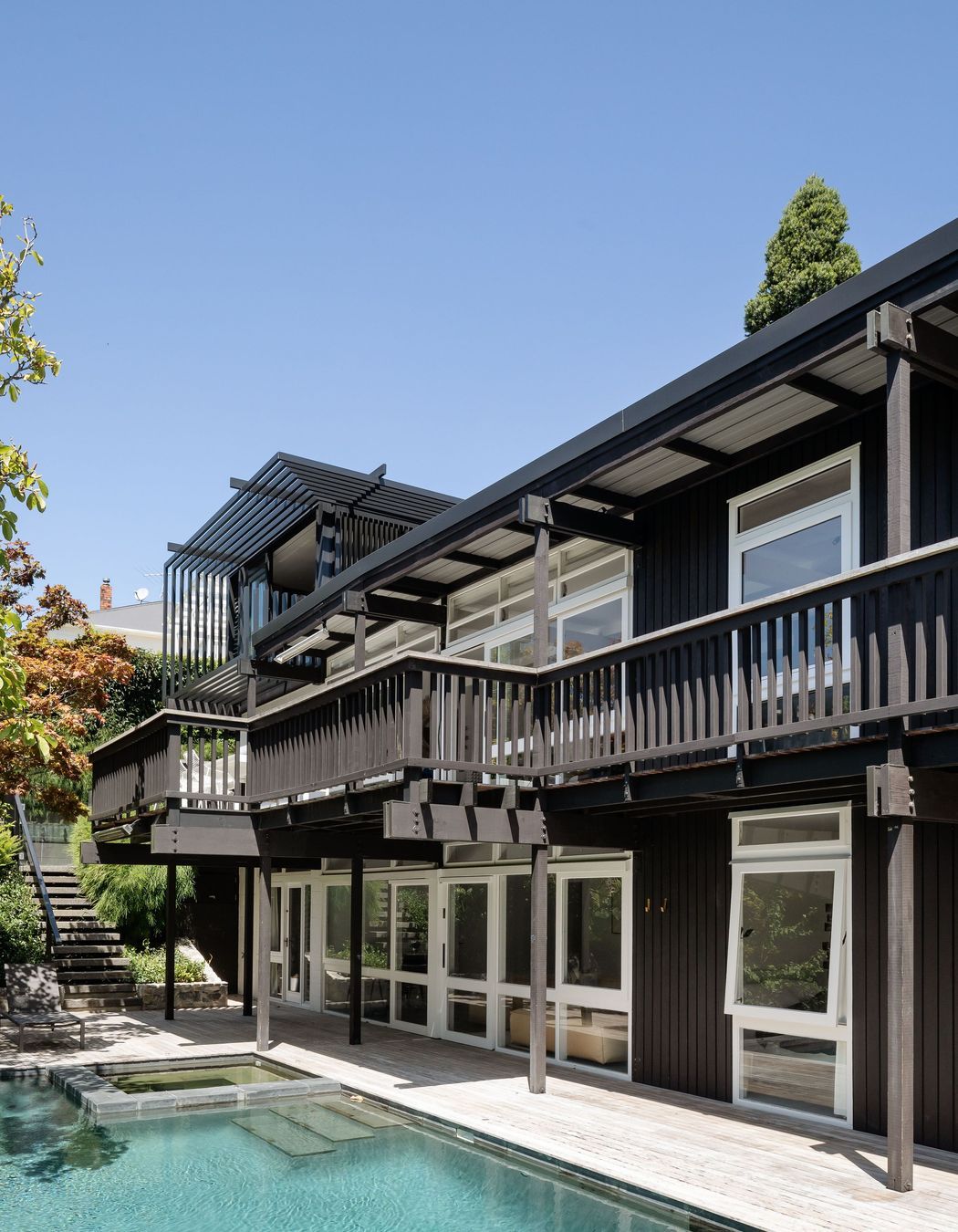
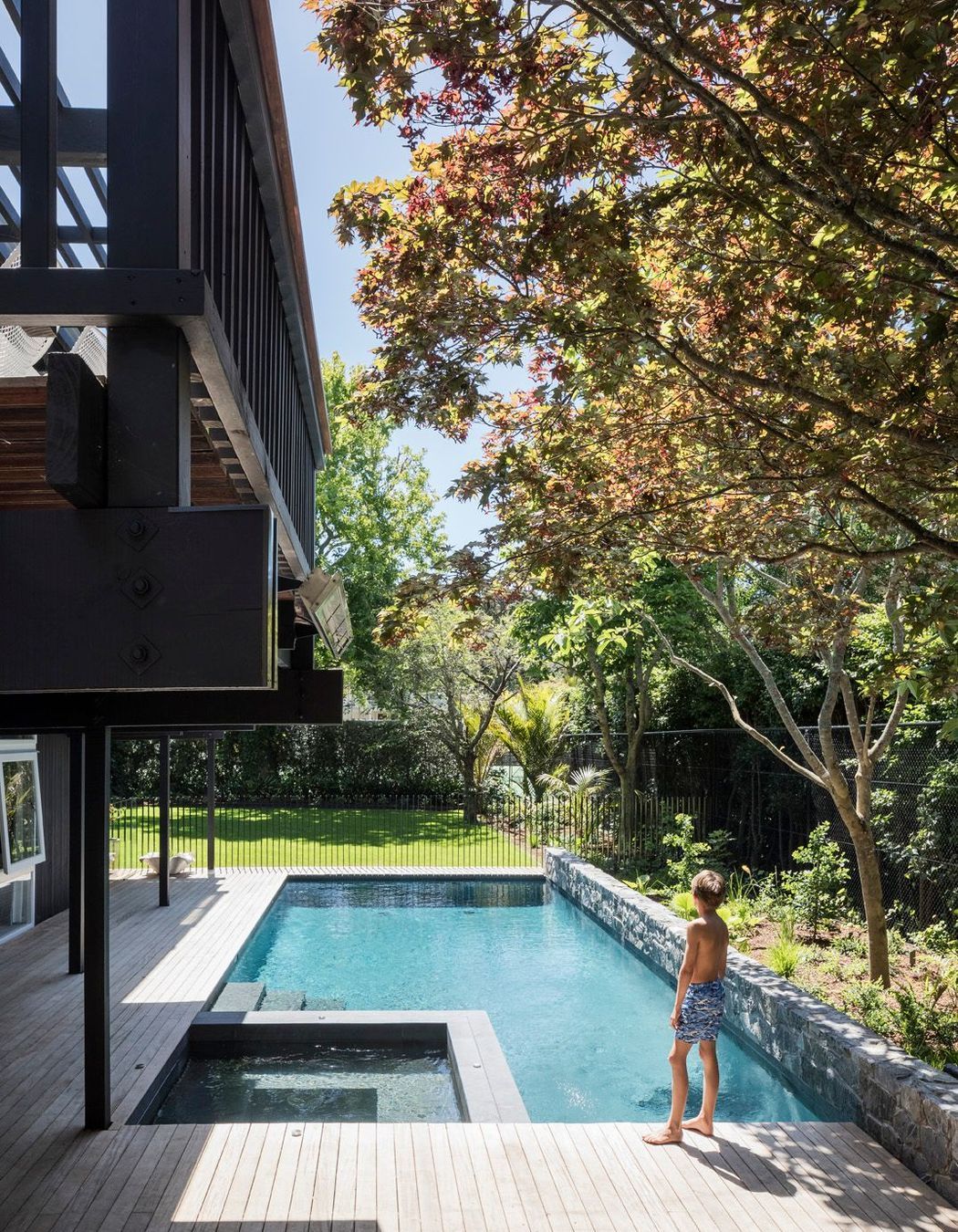
Once the basement was excavated, another bedroom and bathroom were added to the existing bedroom and rumpus room, while a pool was built in the backyard. The area was then landscaped with a feature raised wall against the garden in paving stone that matches the original basalt stone walls and paving on the property.
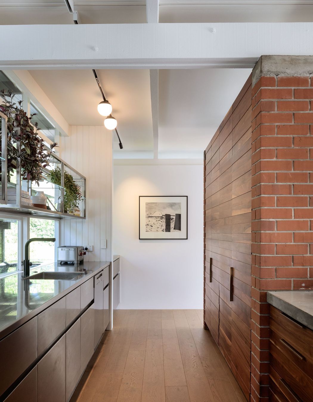
The second phase of construction brought with it new challenges. The layout of the main floor was modified, so that a bedroom on the southwest side became an entry foyer and two original bedrooms had a Jack-and-Jill playroom installed between them. A new bathroom was created and the kitchen completely renovated with stainless steel and solid walnut cabinetry.
The existing master bedroom (complete with original single wardrobe) became part of the small living area, providing much needed extra space and connecting the room to the western sun and balcony.
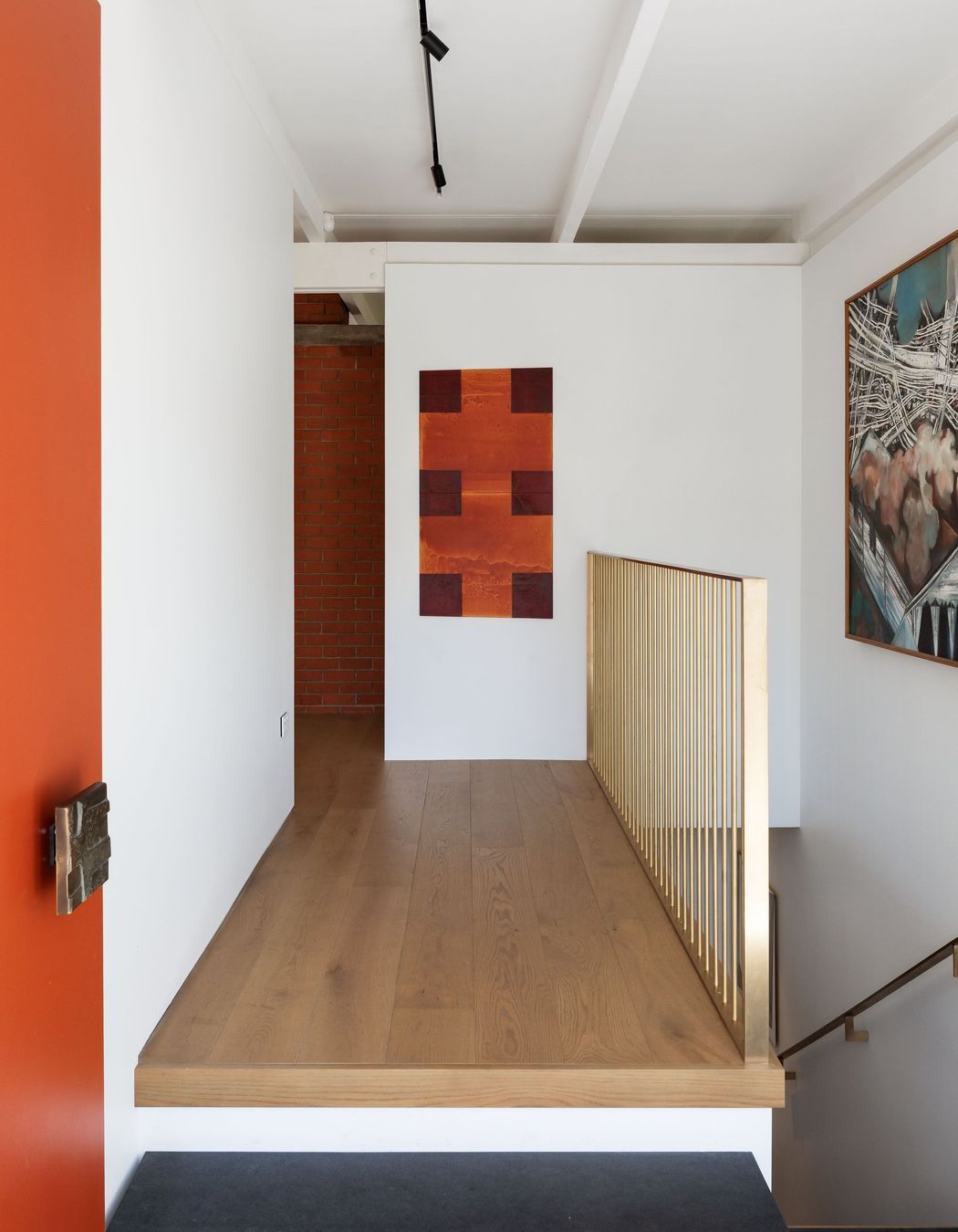
The original (and rather treacherous) spiral stair between the living room and rumpus was removed, which means sound and heat no longer travels between the floors; a new stair now leads down off the entry foyer, bringing light to the lower level.
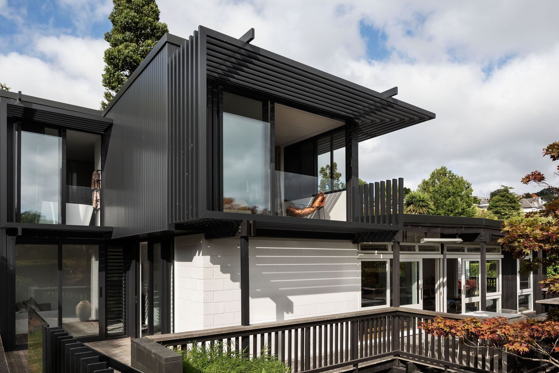
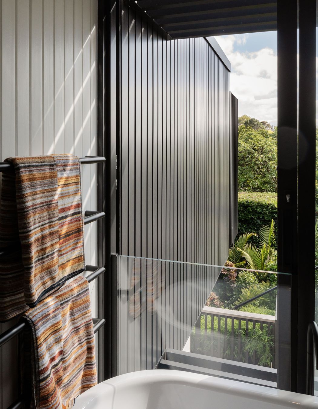
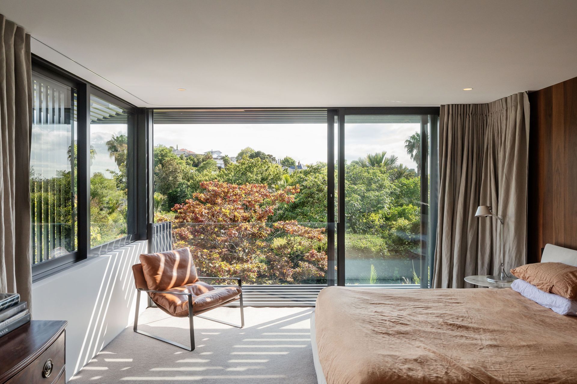
A third level was added above the eastern wing of the house, consisting of a spacious master bedroom, en suite and a much larger wardrobe.
But there was one feature that did not change during this second phase of the renovation: the original orange-brick fireplace.
“A lot of people were wondering why we wanted that old orange brick in our living room, but it’s such a defining mid-century feature and I’m glad we were able to retain that and work the plan around it.”
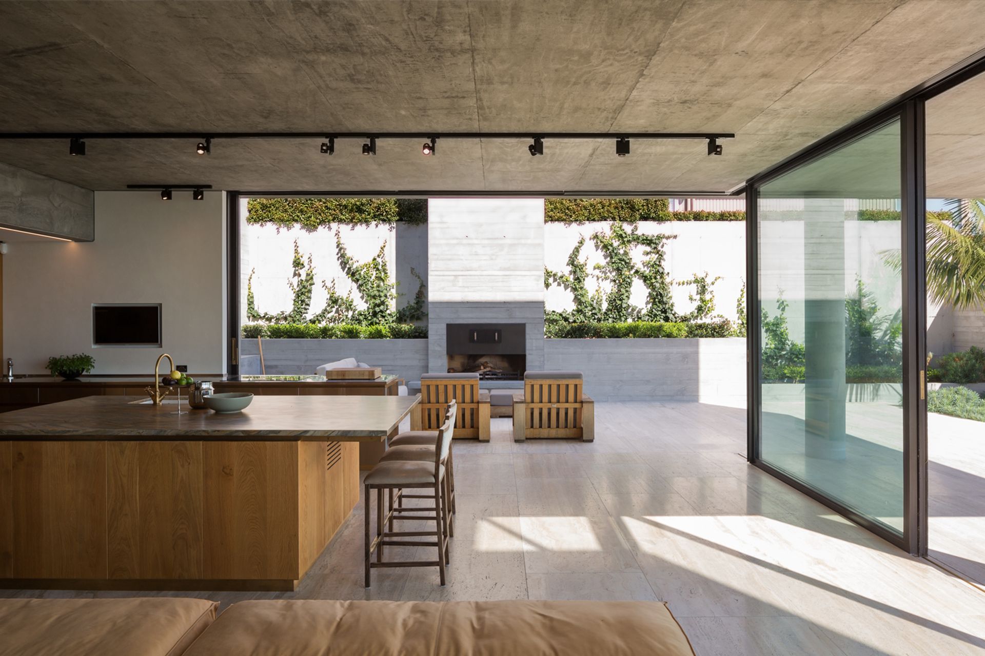
The fireplace is now central to the living and kitchen spaces on the main floor—opening to the lounge and with its chimney against the kitchen—providing a symmetry to the interior that it was previously lacking.
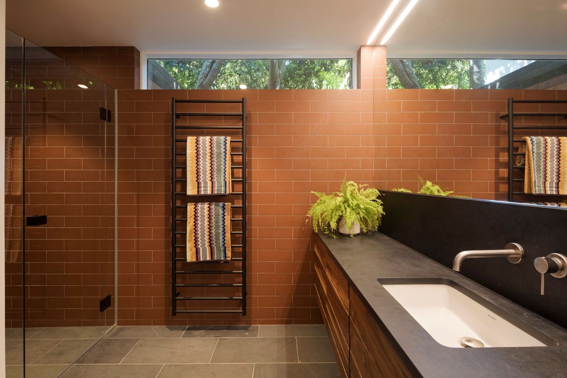
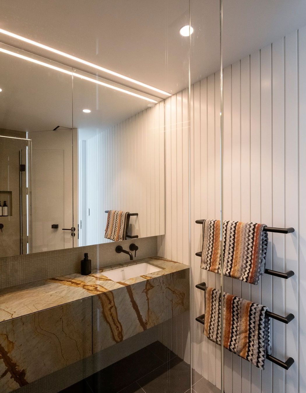
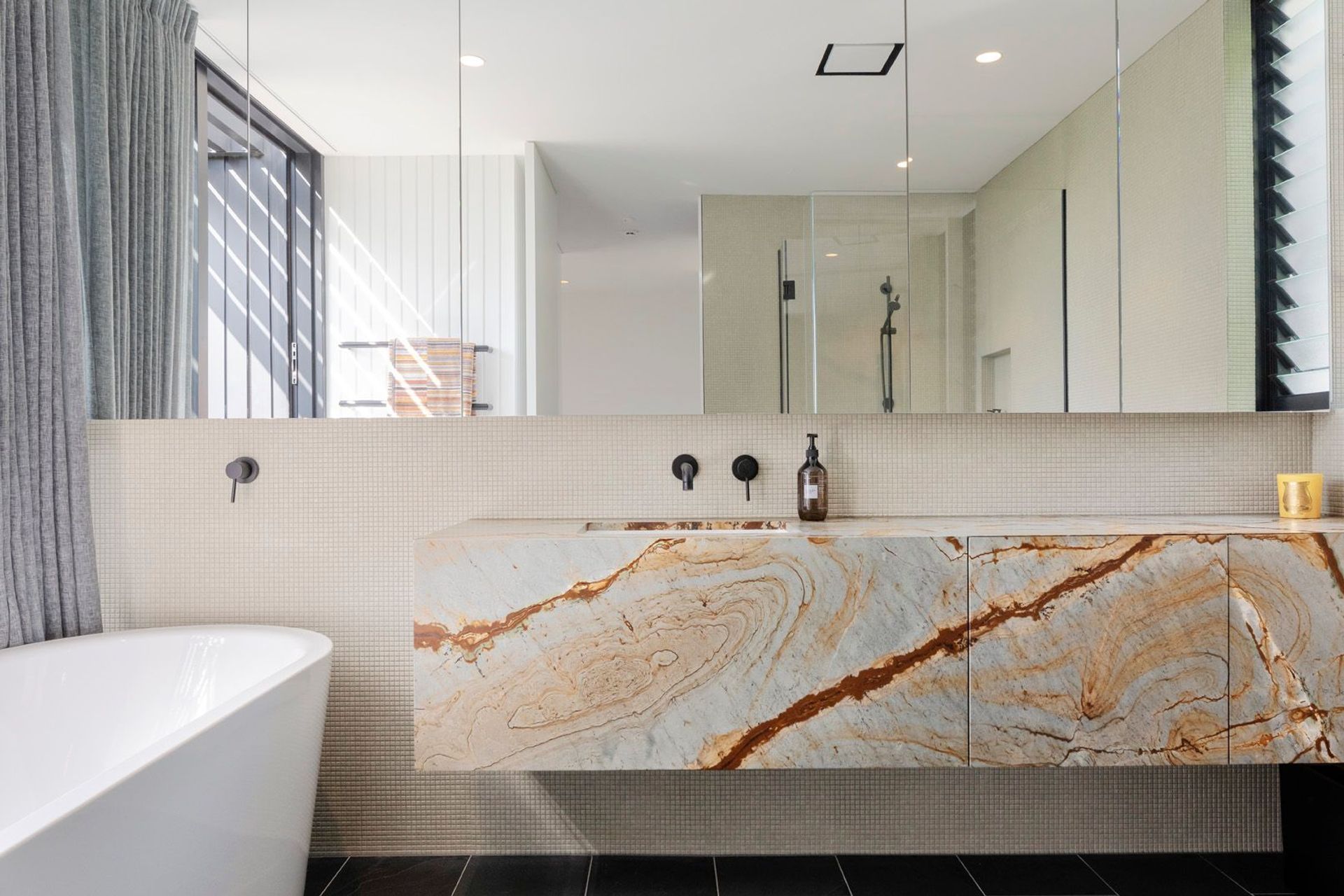
The kitchen design references the cement hearth of the fireplace with its concrete island and there are further links throughout the home (terracotta tiles in the downstairs bathroom and terracotta-veined stone in the master en suite) to the warm hue of the bricks.
Julian says when renovating an older home with a unique character, it’s helpful to pick up on the original palette and materials and tie these into the new design, rather than to replicate them.
“It’s about finding elements that you love about the character and celebrating those features, but also recognising that the new work doesn’t need to slavishly copy the old.”
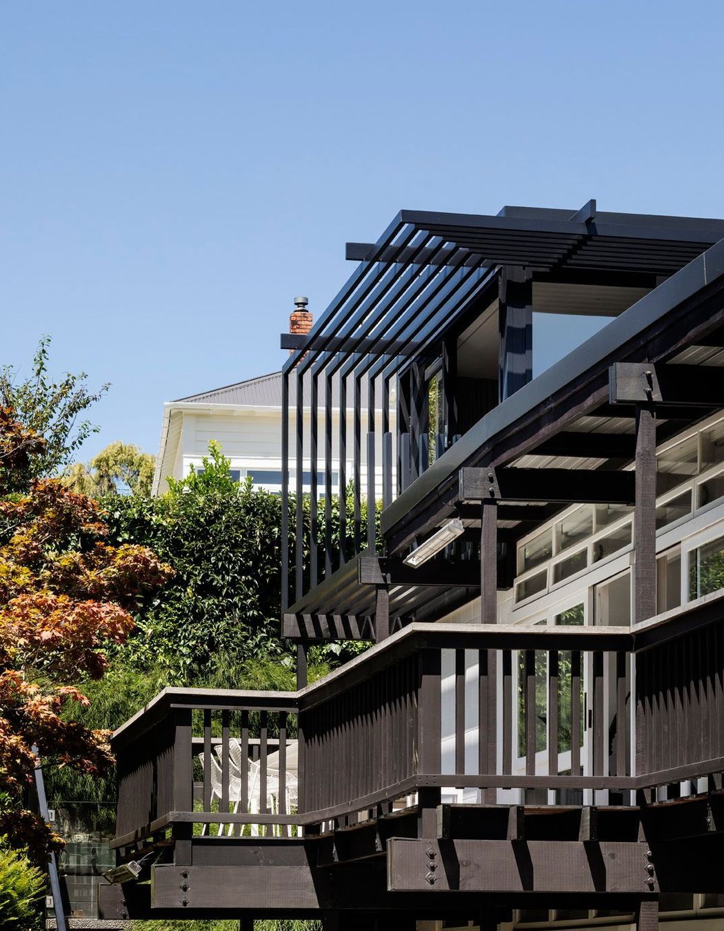
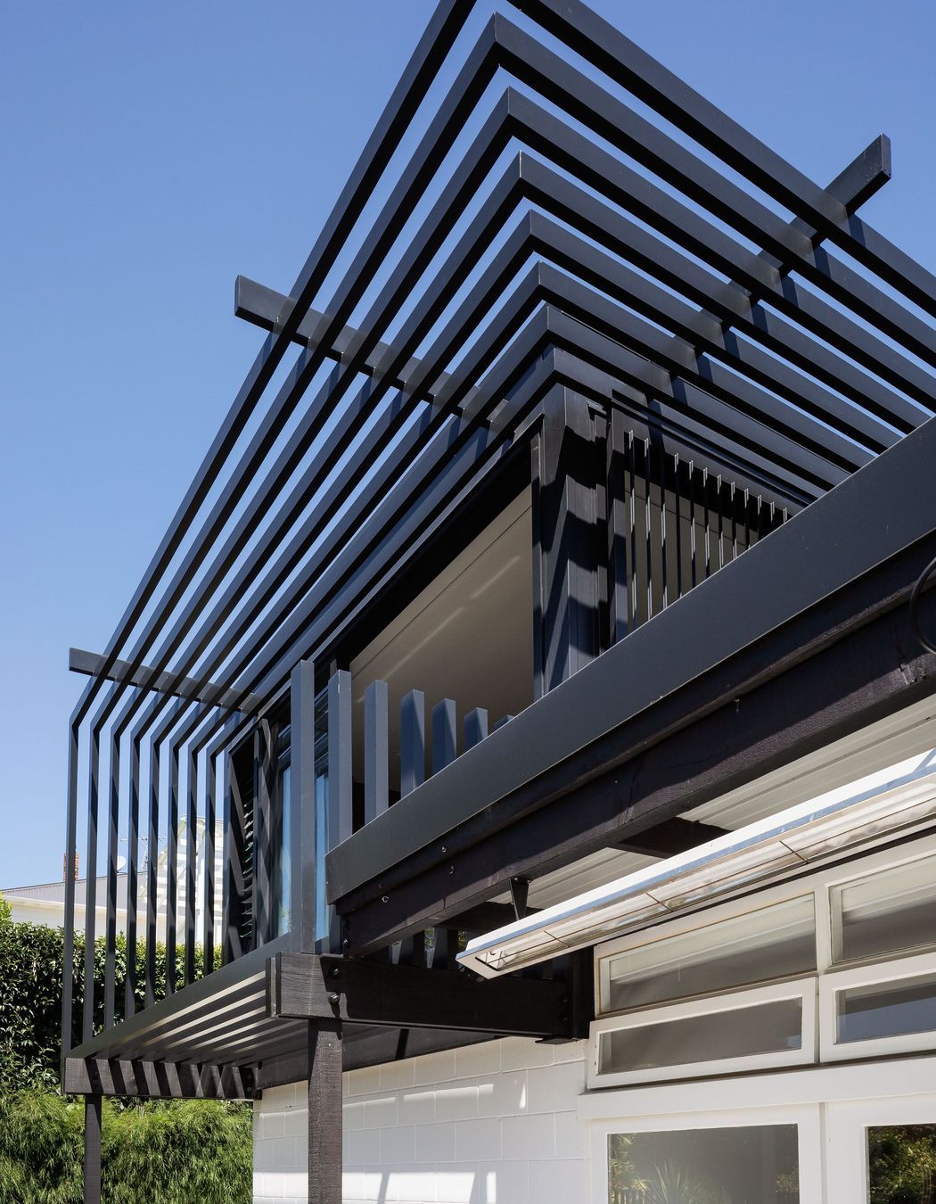
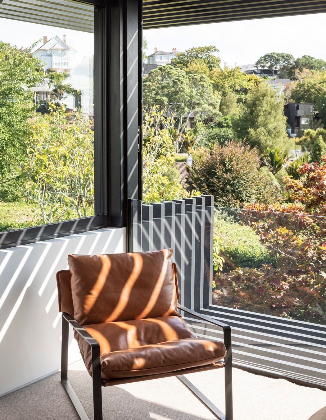
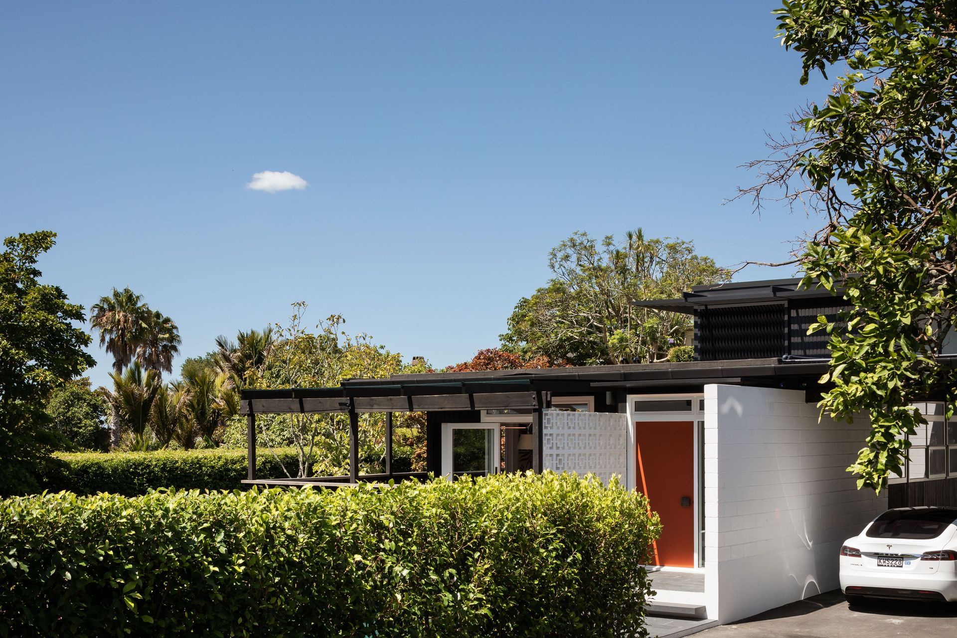
Naturally, the exterior materiality speaks to this philosophy: character features such as the full height timber joinery were retained, while new aluminium joinery on the addition co-exists with the original home through a singular colour palette.
“I think it gives it a nice monotone, contemporary aesthetic, which is still complimentary to the vertical black cedar and the timber windows of the original house.”
Slatted aluminium canopies reference the wide roof overhangs of the original design, but provide a lighter weight and more contemporary twist.
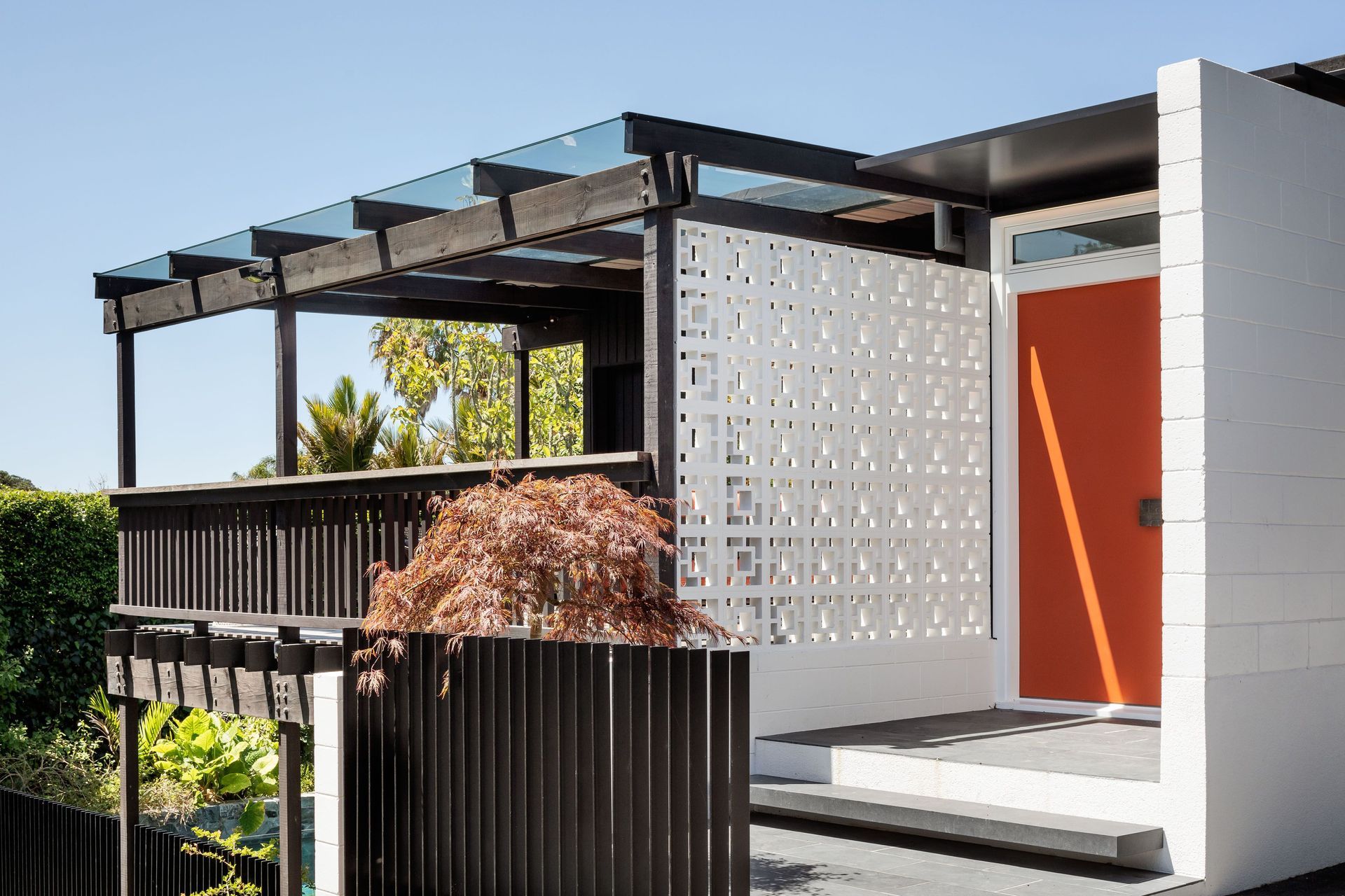
Black slate tiles, which are represented across the interior, integrate the external and internal colour palettes, while a wall of white breeze block at the entrance, both provides privacy for the upper deck and a statement mid-century welcome to the home.
A retro bronze front door handle sourced from London is just one of the many special touches that complete the integration of old and new.
The home is now light and bright and the layout is spacious, and for this reason Julian cannot imagine ever leaving.
“It works perfectly, we could never imagine moving away from it because it’s such an ideal scenario for ourselves when there’s just two of us here and for when there’re teenagers and all of their friends hanging out. It’s a fun, modern and really unique home.”
Words by Joanna Jeffries
Photography by Patrick Reynolds Photography
