Mother: A design mashup between modern & nostalgic
When CTRL Space began work on Mother, a new bakery and eatery in Grey Lynn, it was a continuation of a well-established partnership. Designer Sam Griffin and owner Hugo Baird had already worked together on two successful venues, Hotel Ponsonby and Lilian—the former known for its fresh take on the old British ‘boozer’—and the latter for its reimagining of a humble Italian dining room. That shared understanding and a synchronicity in their design thinking created freedom to try something bold and new.
“We knew we wanted to do something that was recognisably contemporary, in contrast to his other venues,” says Sam. “Lillian is almost like a step back in time, so this time we wanted to look forward.”
From the start, Mother was shaped by a spirit of curiosity and experimentation. Inspiration came from looking at what was happening in fashion-forward and culture-forward cities like Berlin, Los Angeles, Amsterdam and Sydney.
“It was about matching the high standard of design in those places,” Sam explains. “We wanted to do something that hadn’t been seen before in New Zealand, and we wanted to have some fun with it.”
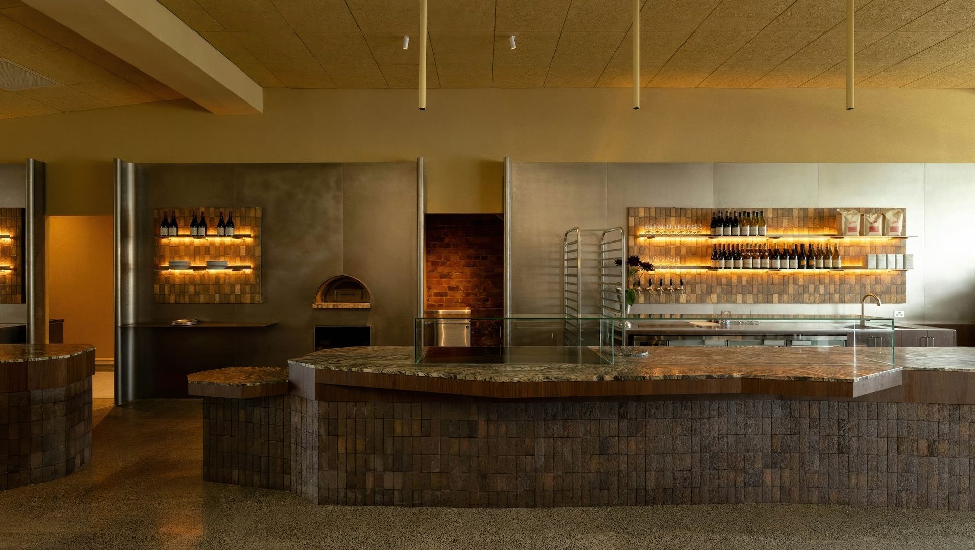
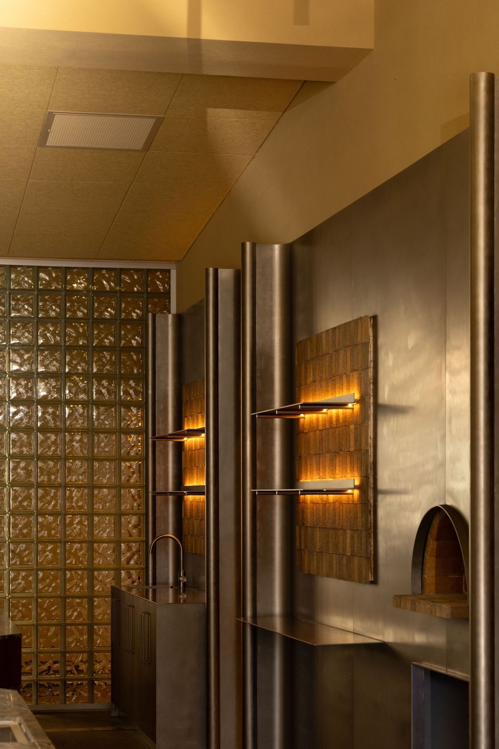
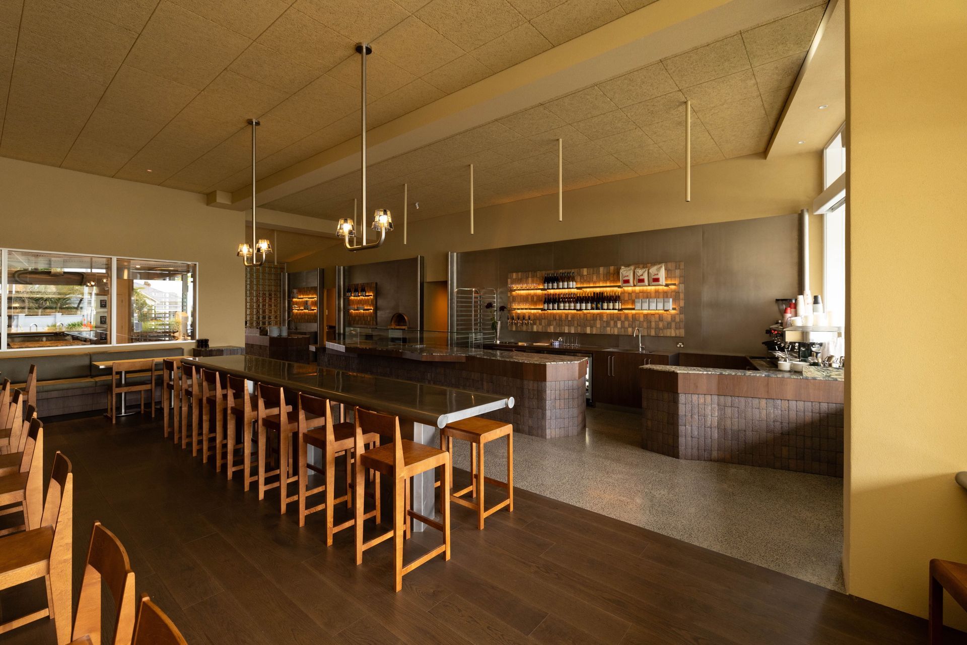
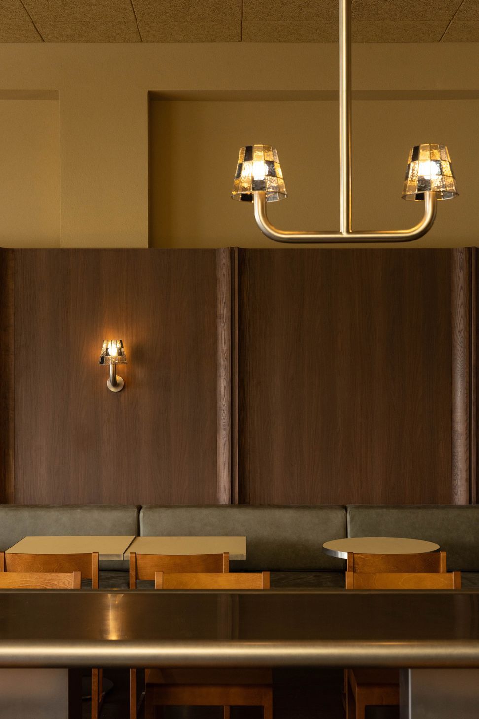
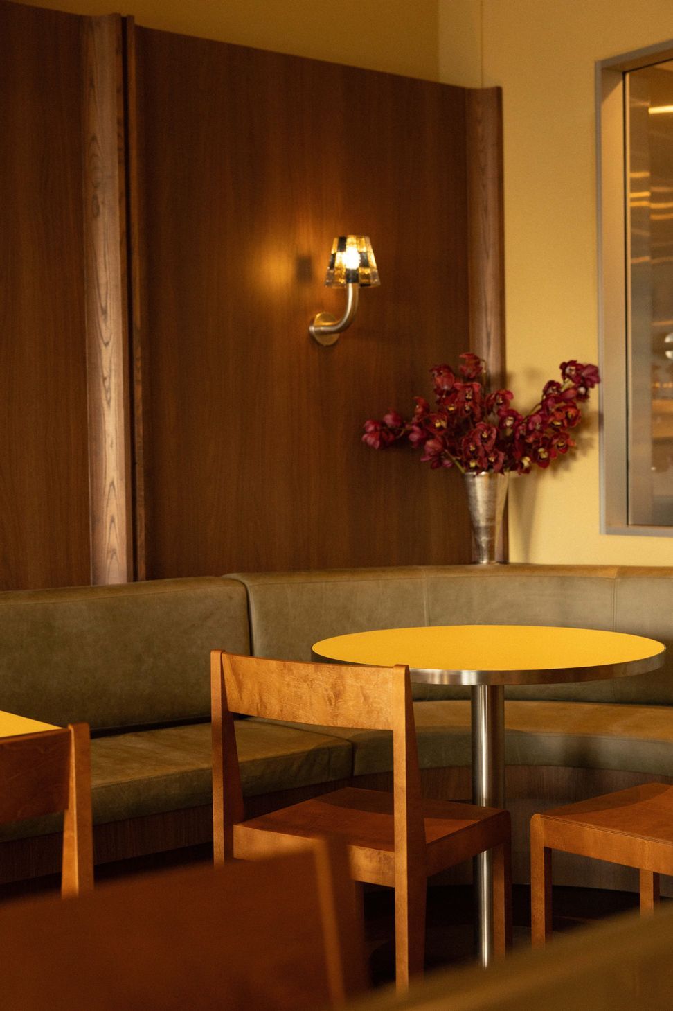
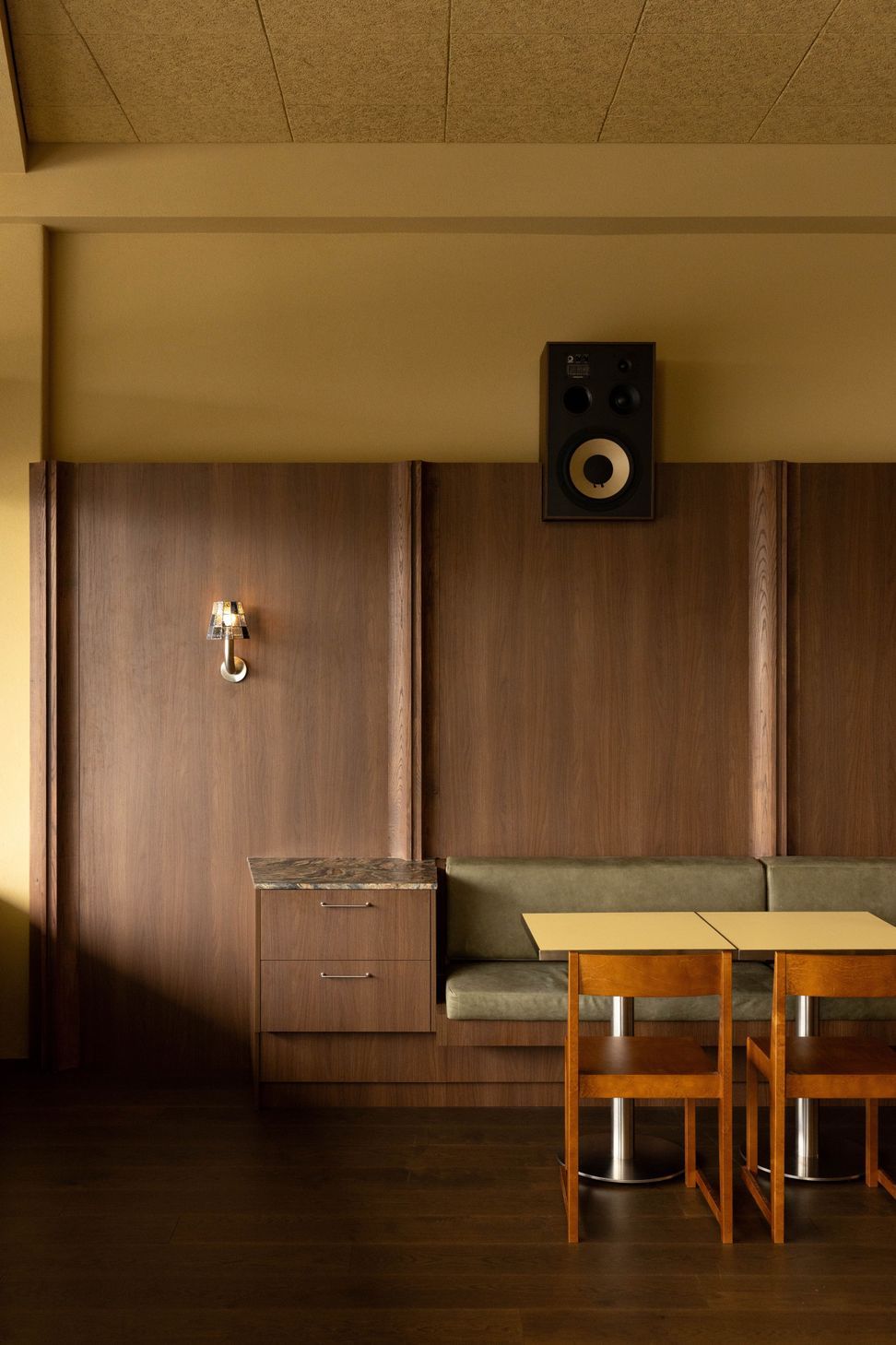
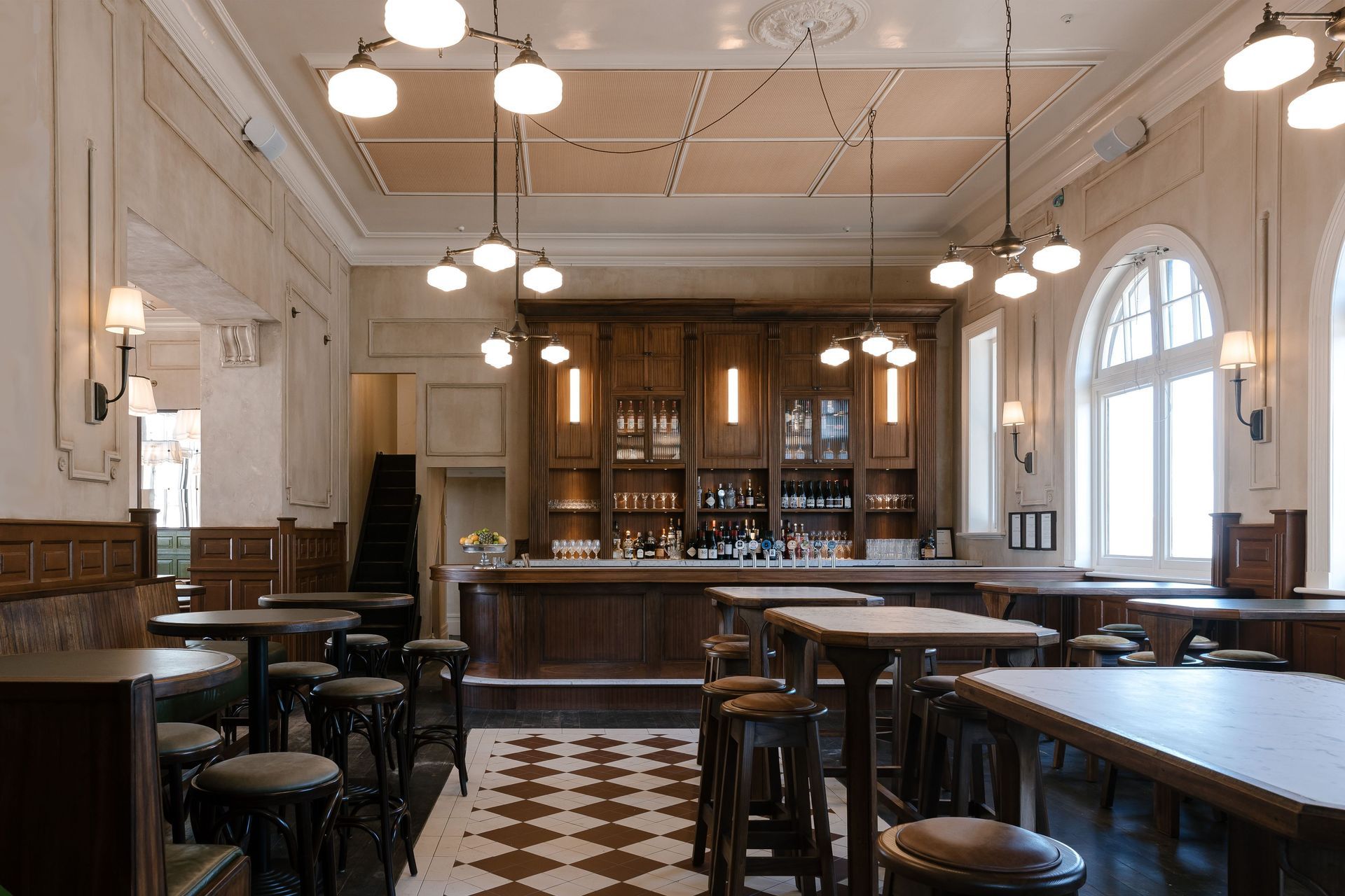
The resulting design draws from a mix of influences that feel both nostalgic and new. Sam describes it as a “modernist-nostalgic mashup,” pairing stark lights, stainless steel and almost brutalist sci-fi references with design elements from the 1960s through to the 1990s. The space feels playful, bringing together the raw and refined in a hi-lo mashup that is fresh and energetic.
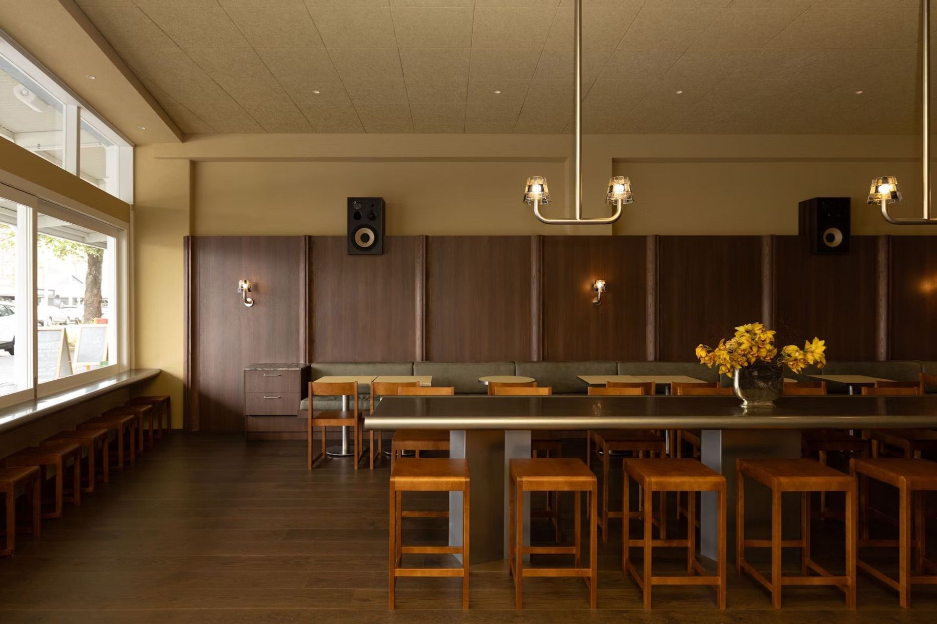
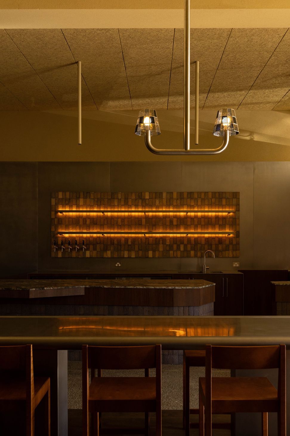
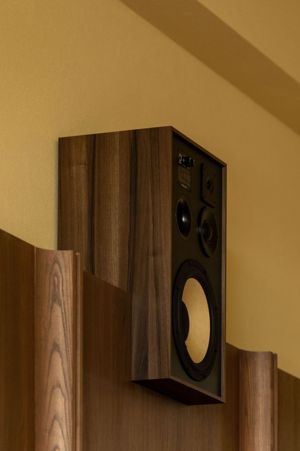
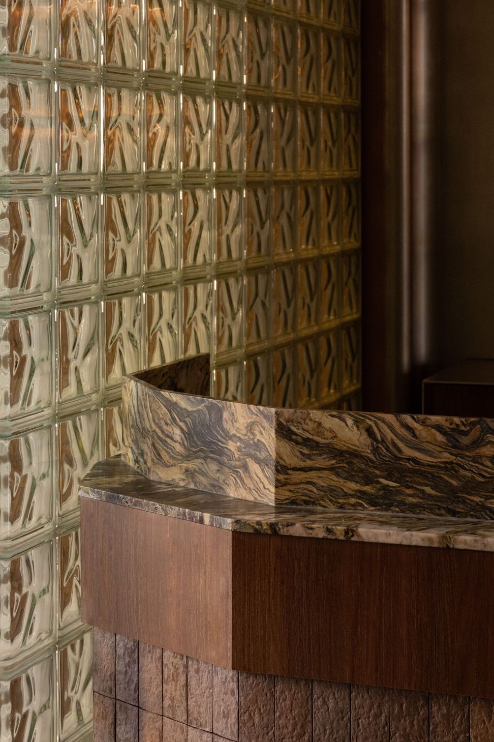
Nostalgic elements such as glass bricks, stained glass wall and pendant lights, and walnut timber veneers are paired with contemporary sculptural counters and bold colour choices. Butter-yellow stucco walls add warmth while challenging what might be expected, creating a subtle tension that invites customers’ attention and starts conversation.
To achieve the right balance between nostalgic and contemporary, juxtaposing interesting shapes with unexpected materials was key.
“Throughout the space, we’ve put aside the form language of the past, but adopted the materiality to create the palette,” shares Sam. “We’ve incorporated nostalgic elements like the stained glass, but done it in a really contemporary way.”
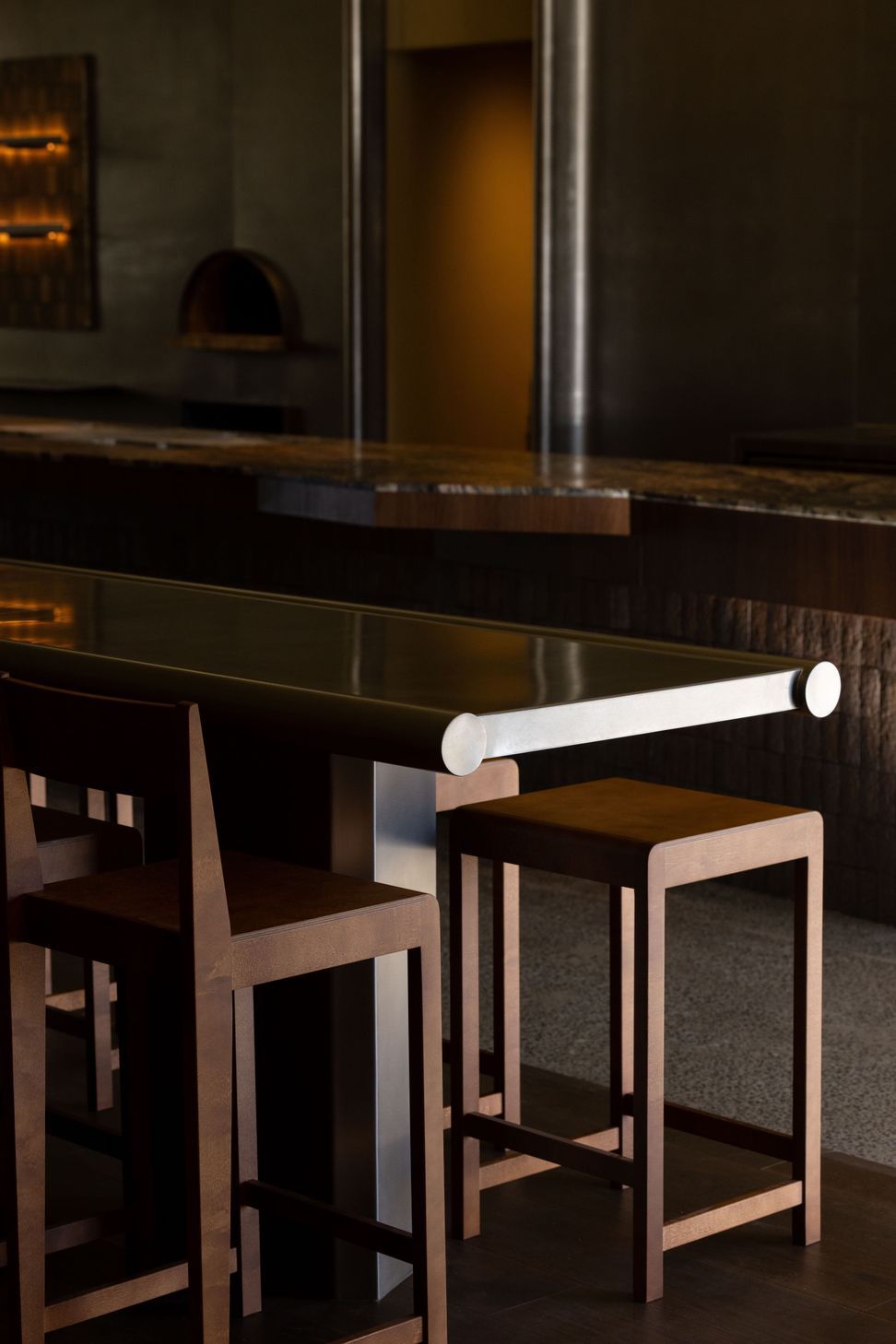
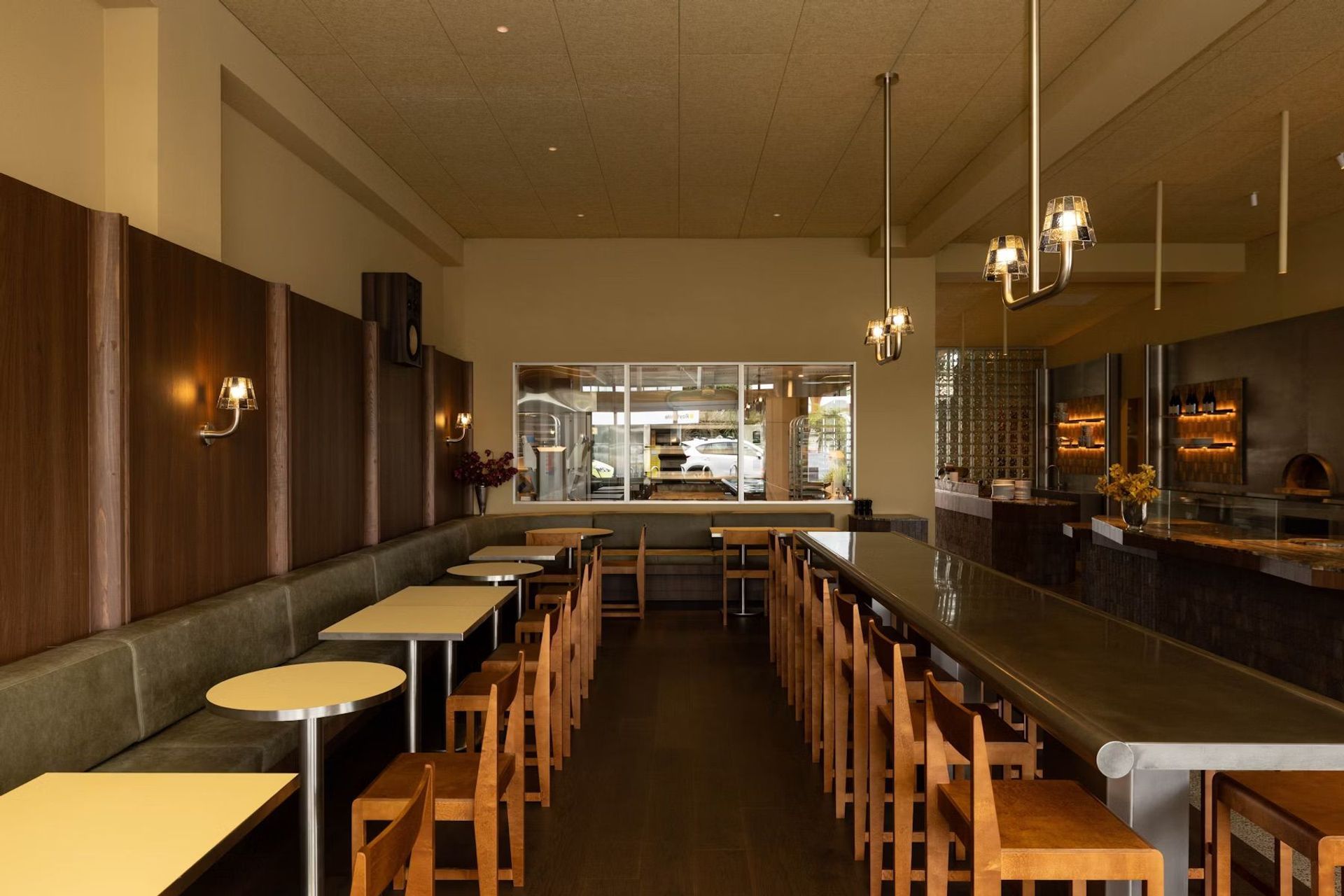
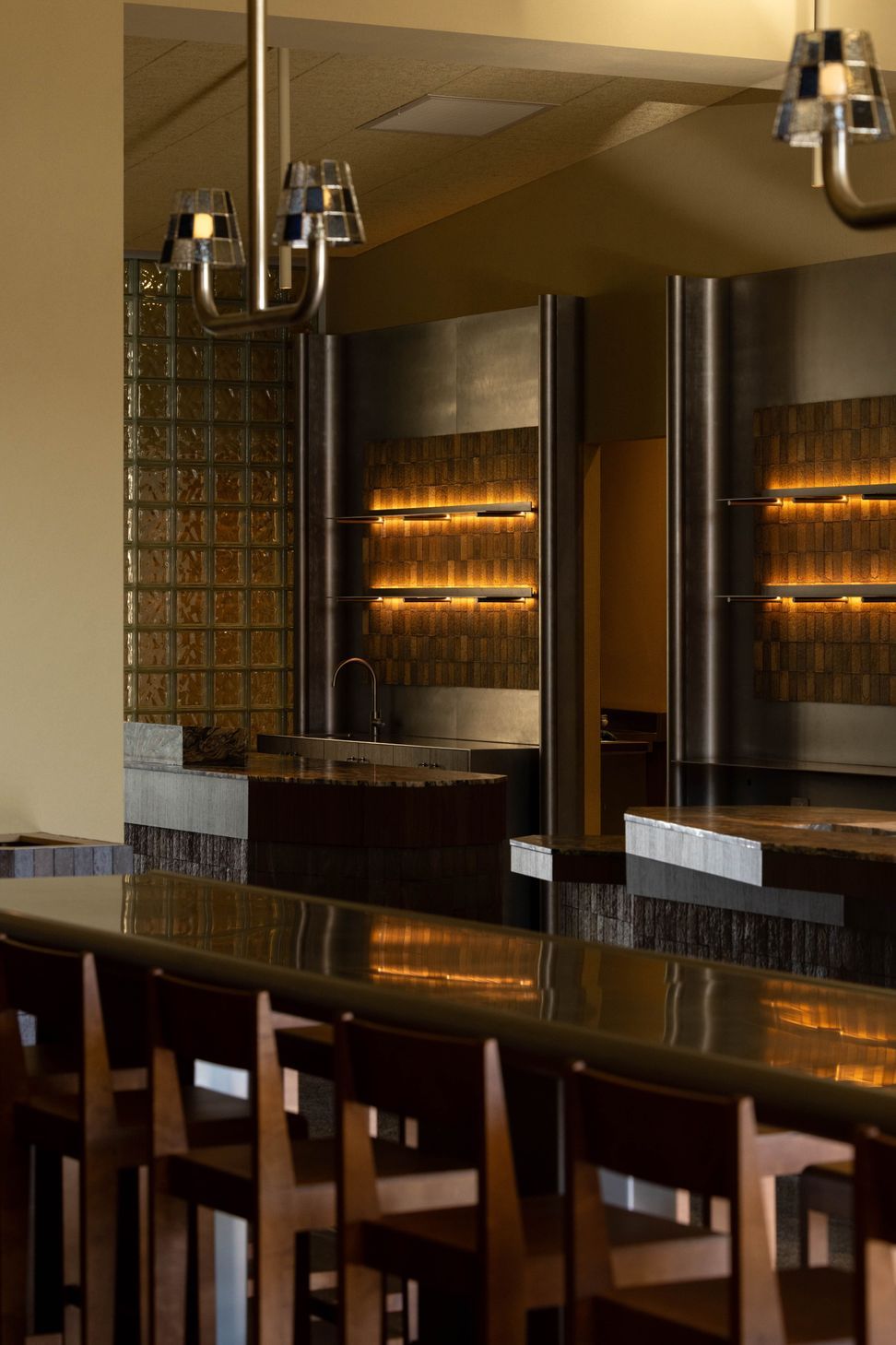
The sculptural counters are an excellent example of this playful approach. The inspiration for their faceted forms came from the imperfect beauty of baked goods. As Sam explains, “If you think of a croissant or a loaf of bread, its beauty is in its unrefinement and in its tactility; every bun comes out differently. That idea started a bit of a design language that you can see most clearly in the form of the counters.”
Beyond aesthetics, the counters are highly functional, with cooling plates embedded into the stone, and equipment and storage underneath. Their placement and shape also create a nice rhythm through the room. In the same theme, a central stainless-steel leaner adds another sculptural layer, doubling as both furniture and artwork.
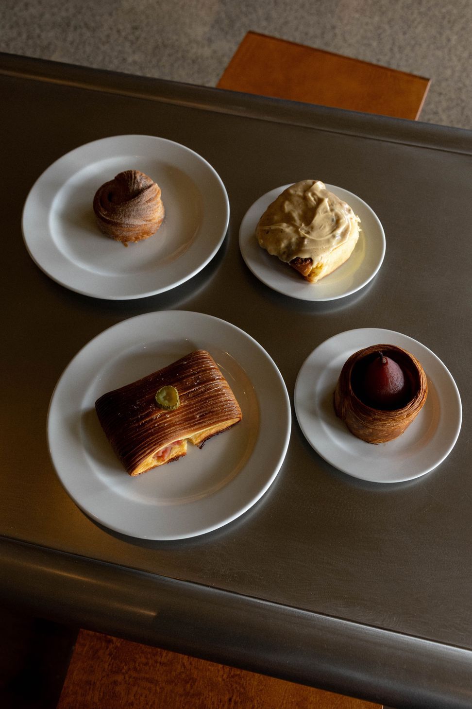
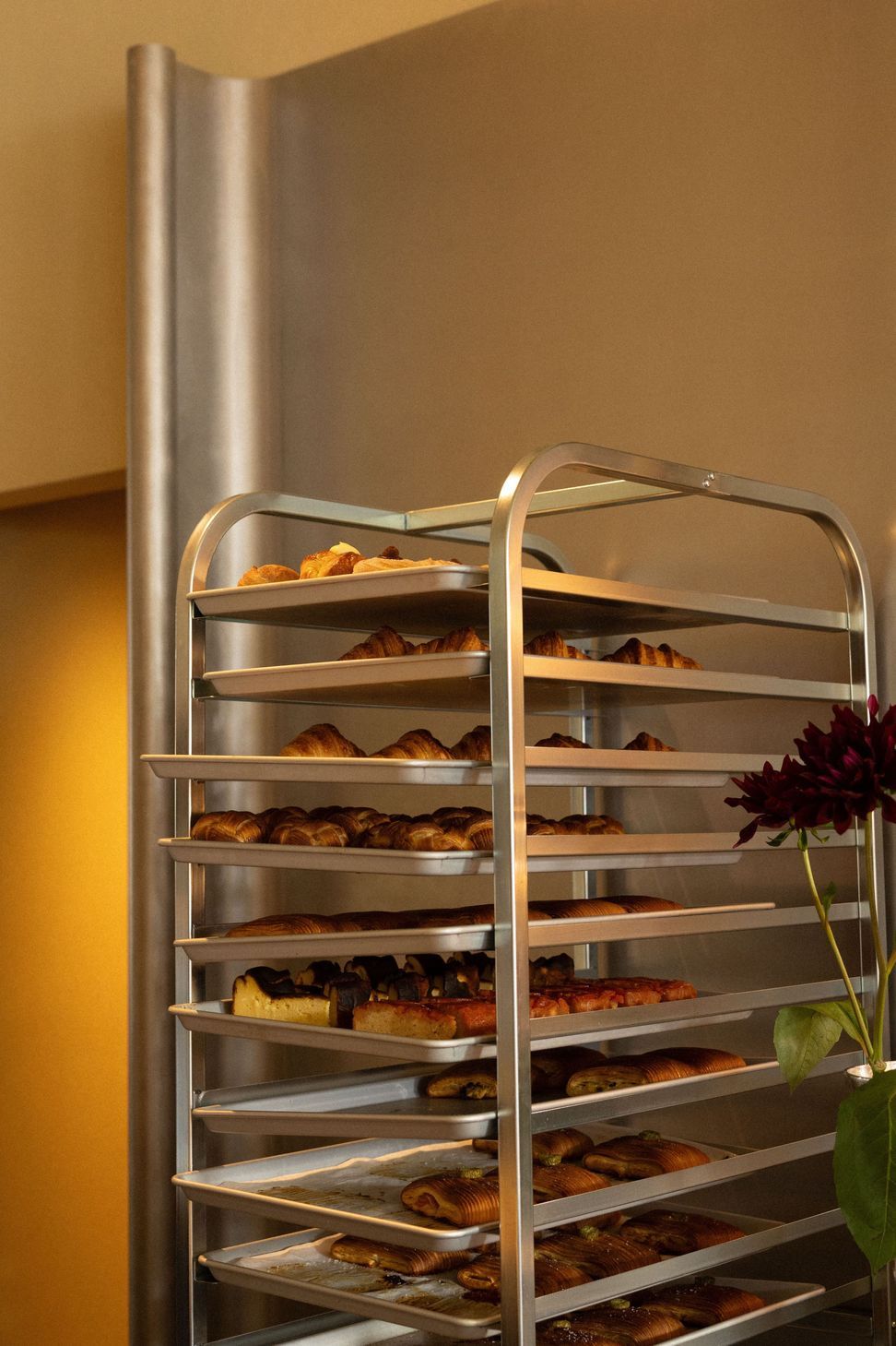
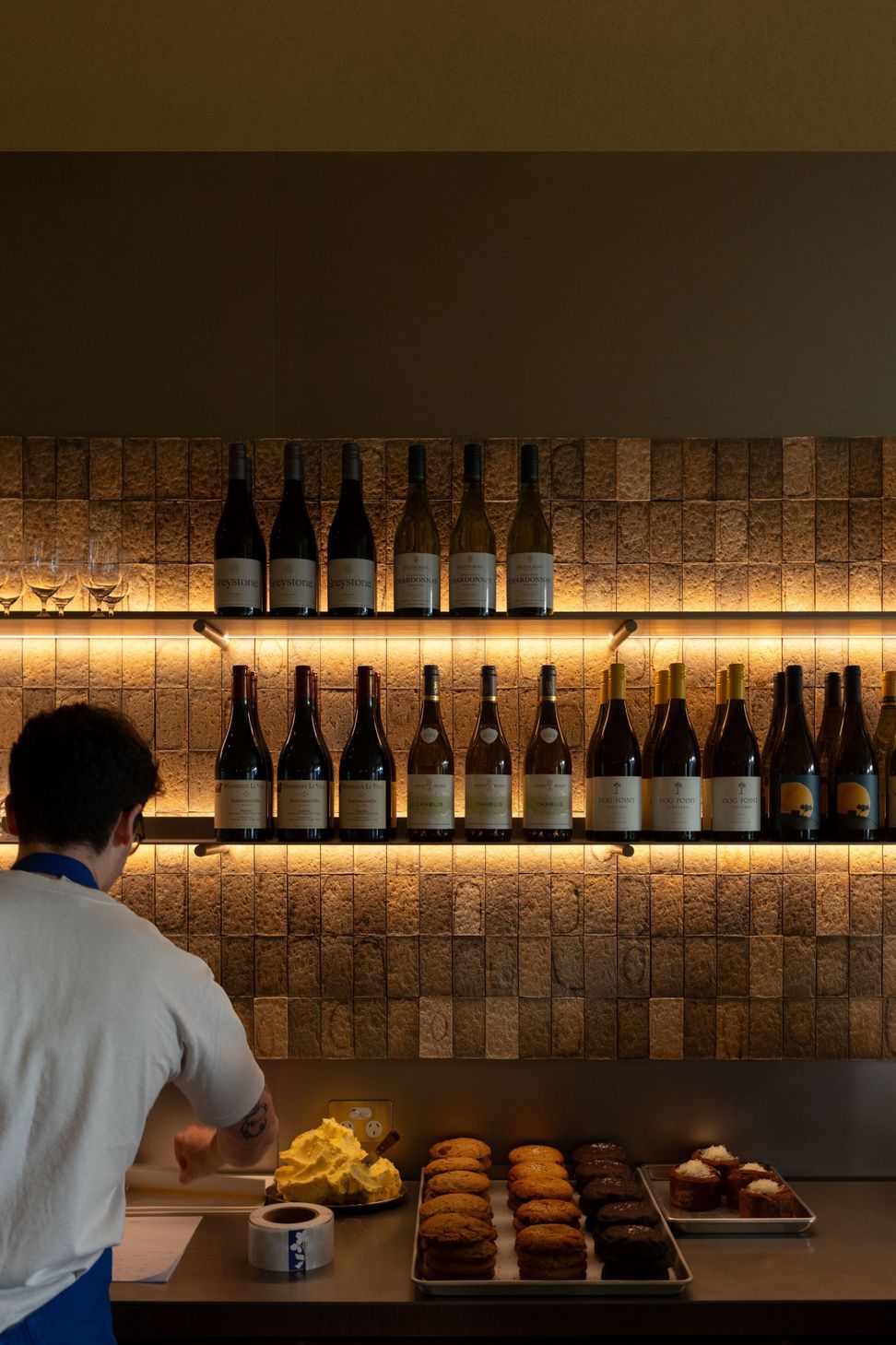
Celebrating the act of making food was also central to the design concept. As such, the glazed, working kitchen lets visitors see every step of production, giving them a chance to understand and appreciate the craft behind what they eat.
“A lot of people wouldn't have seen a focaccia pulled, dimpled and oiled before, so having that on display was absolutely central to the concept: to celebrate the making and the makers,” shares Sam.
The choreography of the space encourages customers to navigate the journey from the entry, where they’re greeted by an abundance of fresh food, through to seeing the food being prepared and served, then into a space for them to dwell and enjoy it.
It’s a clear and logical design that was able to remain intact from concept to completion due to the close collaboration between designer and client.
“There was so little compromise and we really got to see the idea come to life in its full strength,” says Sam. The result is a cohesive, confident interior where branding, layout, and service converge seamlessly.
And the proof of the design’s success is in the pudding: in the first week, overwhelming volumes of curious customers came in droves.
But beyond operational success, Mother has become a marker of the creative direction of hospitality interiors in New Zealand.
“I feel we’ve created something for the New Zealand market that is truly new and meaningful. It really reflects where we’re trying to go creatively: it’s that perfect pairing of functionality and creativity together, combined with new energy and authenticity.”
Words: Jo Seton
Mother is a bold reimagining of the modern bakery, rivalling design benchmarks on a global scale. Every detail from faceted stone counters to sculptural stainless steel has been meticulously crafted to balance operational precision with visual clarity. At once nostalgic and uncompromisingly contemporary, the space pairs soft tones and refined forms with the complexity of a working production kitchen where diners can witness the full journey from flour arriving at the back door to freshly baked goods served at the table.