About
Nexus Apartments.
ArchiPro Project Summary - Nexus Apartments: A luxury urban residence inspired by the romance of train travel, featuring uniquely shaped façades and thoughtfully designed interiors that foster connection and community.
- Title:
- Nexus Apartments
- Architect:
- Hachem
- Category:
- Residential/
- New Builds
- Photographers:
- Nicole Reed
Project Gallery

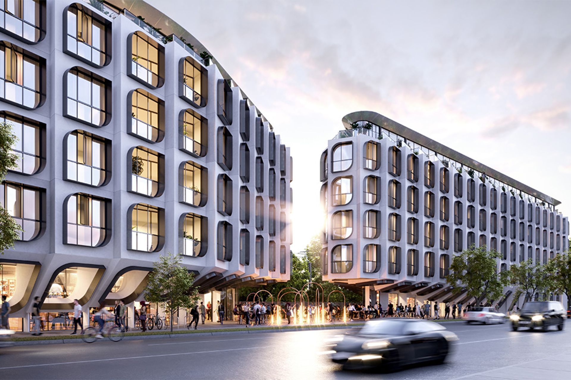

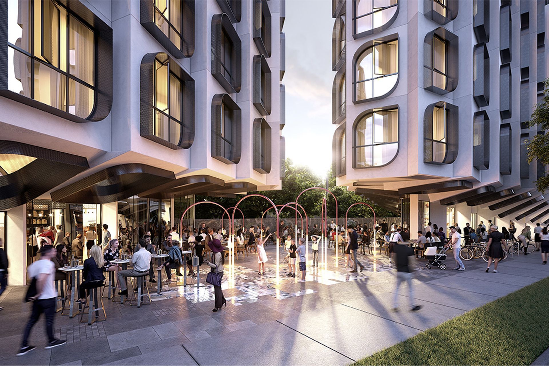
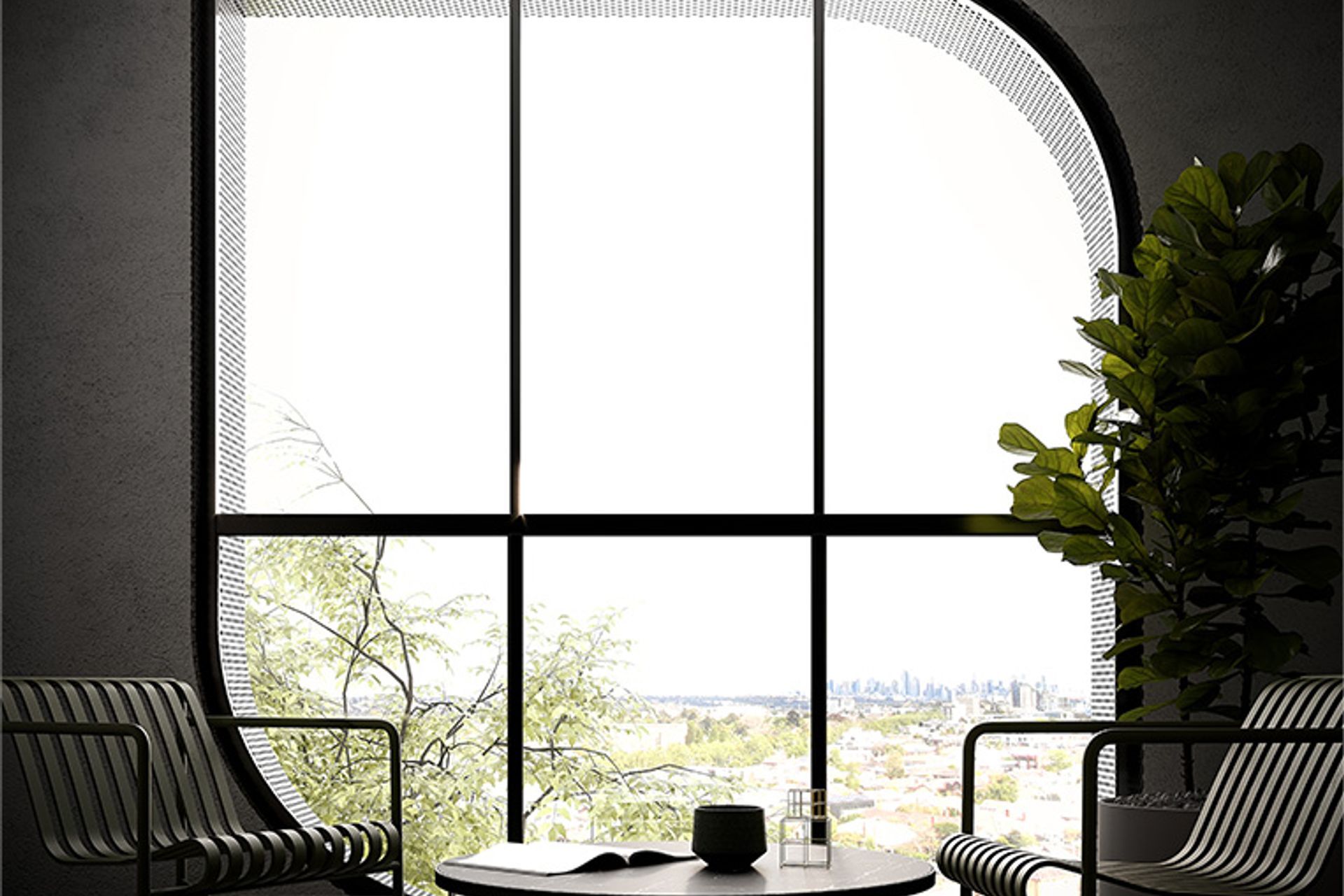

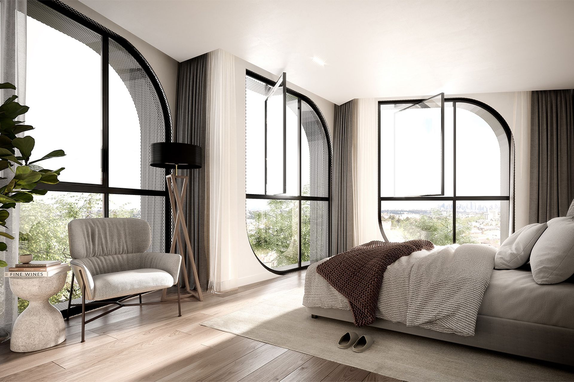
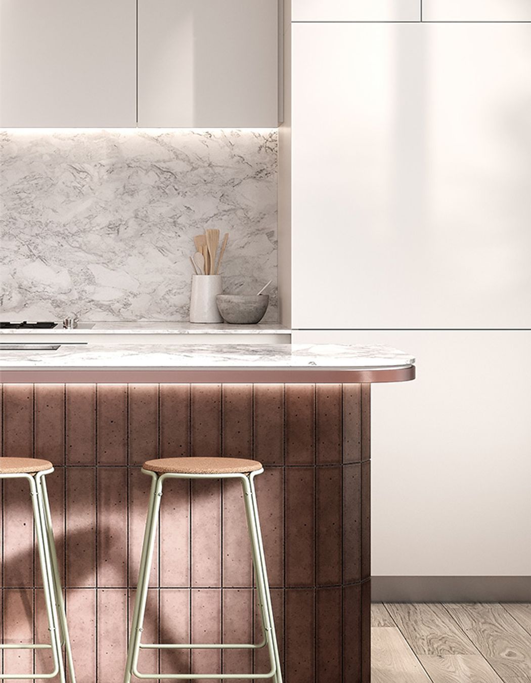
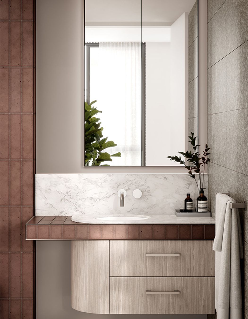
Views and Engagement
Professionals used

Hachem. We are interior designers – We design interiors that emphasise a human connection
We are architects – We produce architecture that stimulates a response
We are marketing gurus – We develop marketing material that brings brands to life
Year Joined
2022
Established presence on ArchiPro.
Projects Listed
21
A portfolio of work to explore.

Hachem.
Profile
Projects
Contact
Other People also viewed
Why ArchiPro?
No more endless searching -
Everything you need, all in one place.Real projects, real experts -
Work with vetted architects, designers, and suppliers.Designed for New Zealand -
Projects, products, and professionals that meet local standards.From inspiration to reality -
Find your style and connect with the experts behind it.Start your Project
Start you project with a free account to unlock features designed to help you simplify your building project.
Learn MoreBecome a Pro
Showcase your business on ArchiPro and join industry leading brands showcasing their products and expertise.
Learn More


