

Project team
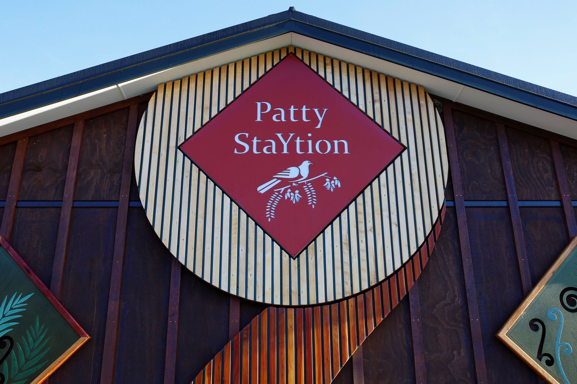
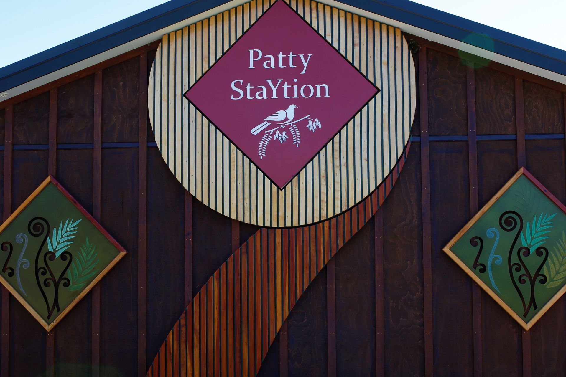
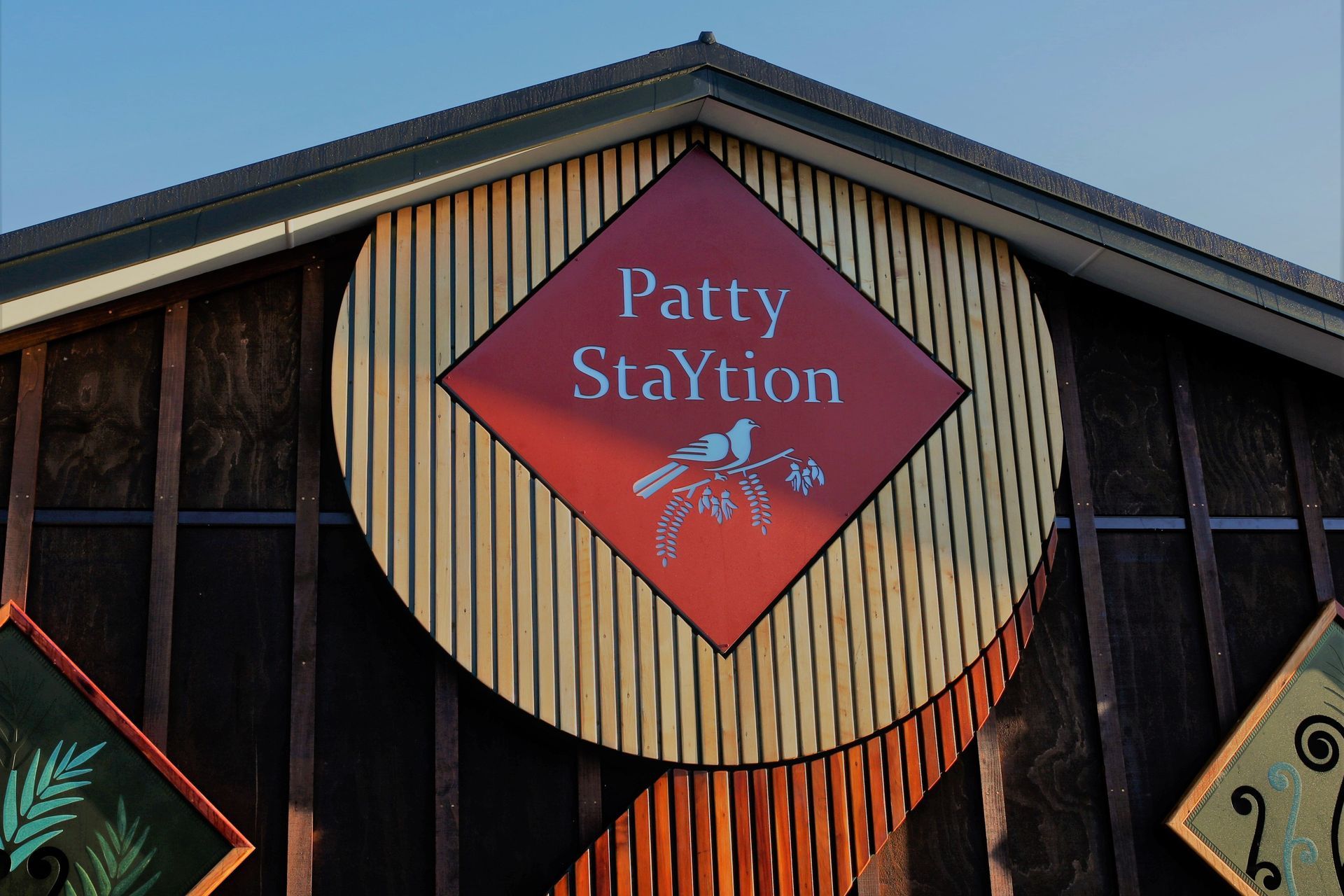
Award-winning sign design for Patty StaYtion, featuring a unique Koru motif and reclaimed NZ timber, blending nature with branding to create a striking visual identity that reflects the client's personality and commitment to sustainability.
GOLD Medal NZ Sign Award of Excellance
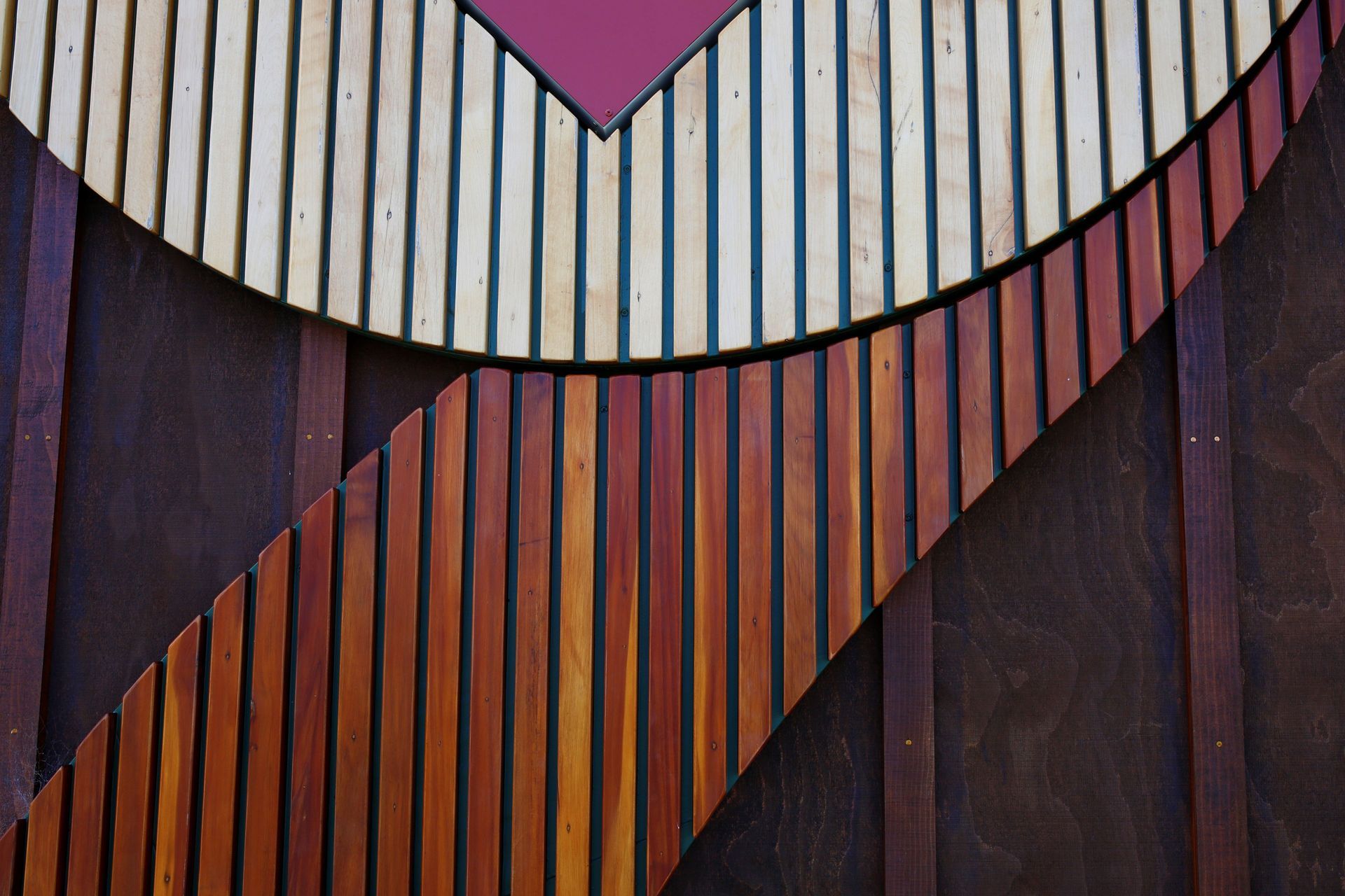
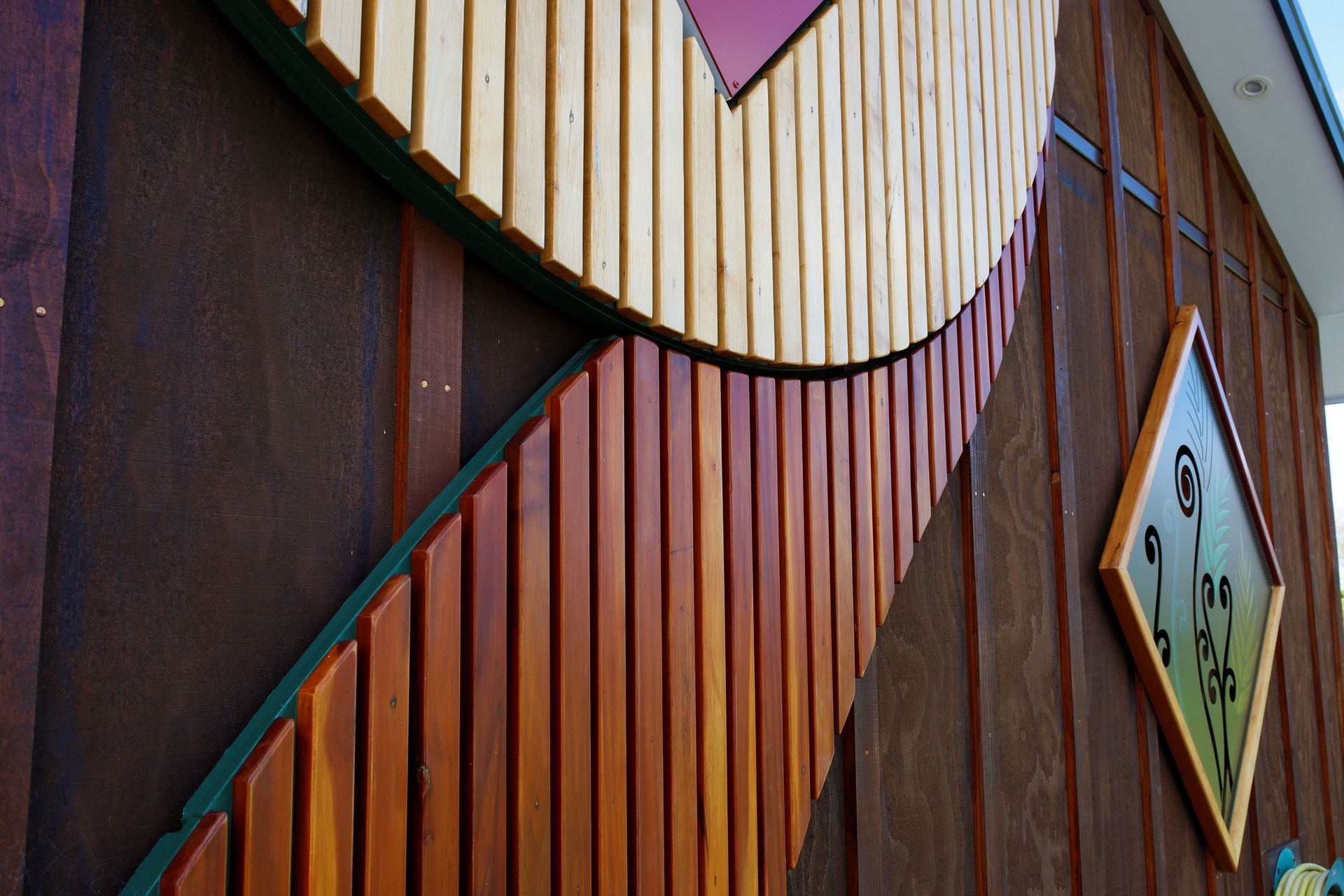
The Client approached me asking for a simple sign with the business name Patty StaYtion. The brief was to add kiwi nature into the sign, it was noted the Client liked the Kereru and the sign was to be installed onto the gable end of their building. The font was selected during the design process. Design options were developed for the shape of the sign, a circle, diamond, oval and the quote was submitted accordingly. The next meeting with the Client was to discuss the proposal and design ideas, whereby id designed and developed an additional idea of making a 3.9 m high Koru which stretches up the wall unfurling around the diamond shaped sign. After showing the Client the additional idea, and telling the story behind the sign, being the Koru which envelopes around the diamond sign, they fell in love with it. The structure is NZ treated radiata plywood, with recycled Native NZ timber battens which embrace a light box with the Clients brand name.
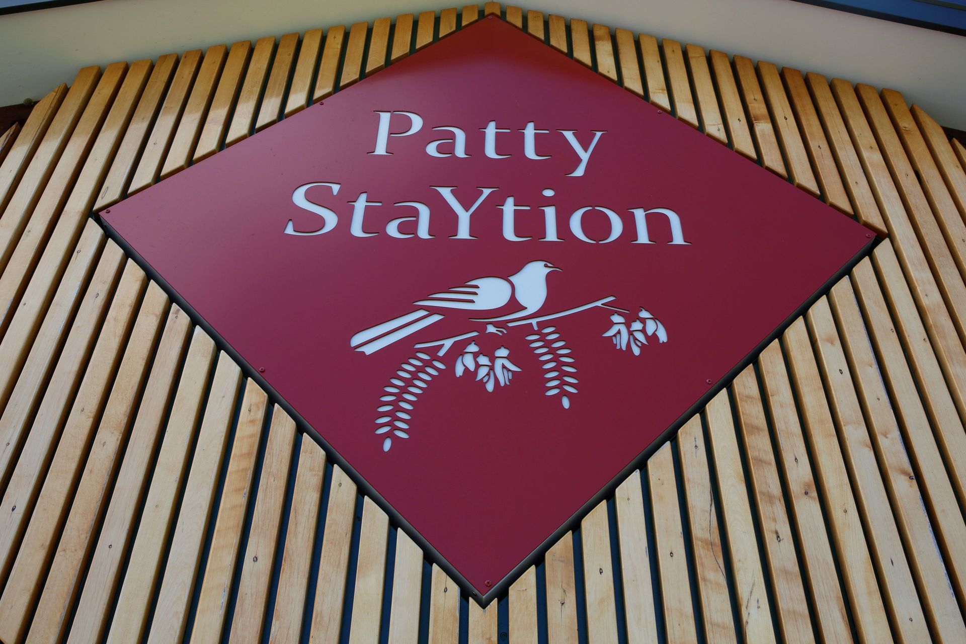
Each batten is screw fixed from behind the plywood backboard concealing any fixings. The Patty StaYtion sign is CNC cut from 3mm aluminium and then powdercoated in a complimentary colour to the background green and colours of the native timbers.
The diamond shape of the sign represents the Clients personalities, brilliant, luminous and strong. The Koru represents nature, growth and balance. The top section of the Koru is made using native NZ Tawa, the stem of the Koru is using native NZ Matai. The NZ timber is all reclaimed /recycled /repurposed timber aiming to minimise the impact on the environment.
The backboard which the battens are fixed to is painted a dark green to represent the dark greens we see within the NZ bush. Elements of NZs beautiful nature were incorporated into the sign, the Kereru sitting on the Kowhai branch is a much loved bird of the Client and the business name with the Kereru resting on the Kowhai branch has now become the Clients new branding.
The Tawa and Matai battens were cleaned up, machined to the right dimensions, and followed a very labour intensive inhouse process. Each batten was handled approximately 25 times, from being selected, machined to size, putty existing nail holes and fine timber cracks, belt sanded, orbital sanded, corners arised, all the layers and sanding of the coating, the placement, marking and cutting each length to shape and size. This project was a joy to design and build, and the finished product was next level, so it was entered into the NZ Sign and Display Awards and was very fortunate to win a gold medal.



Professional Reviews
Professionals used in
this project
The practices and trades credited on this project.

More projects from
CODE6NINE
Other work by CODE6NINE, across every category they build in.


More in
Bars and Night Clubs
Everything else in Bars and Night Clubs, from every practice on ArchiPro.


Next Project
Keep scrolling