About
Snapper Rock.
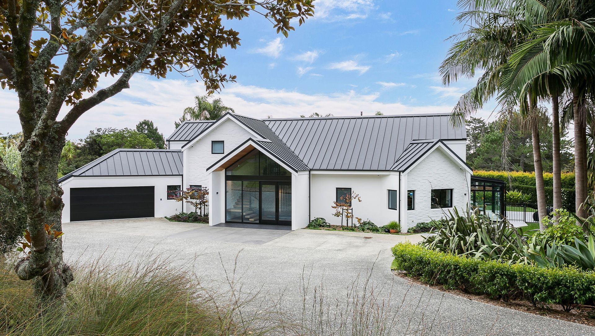
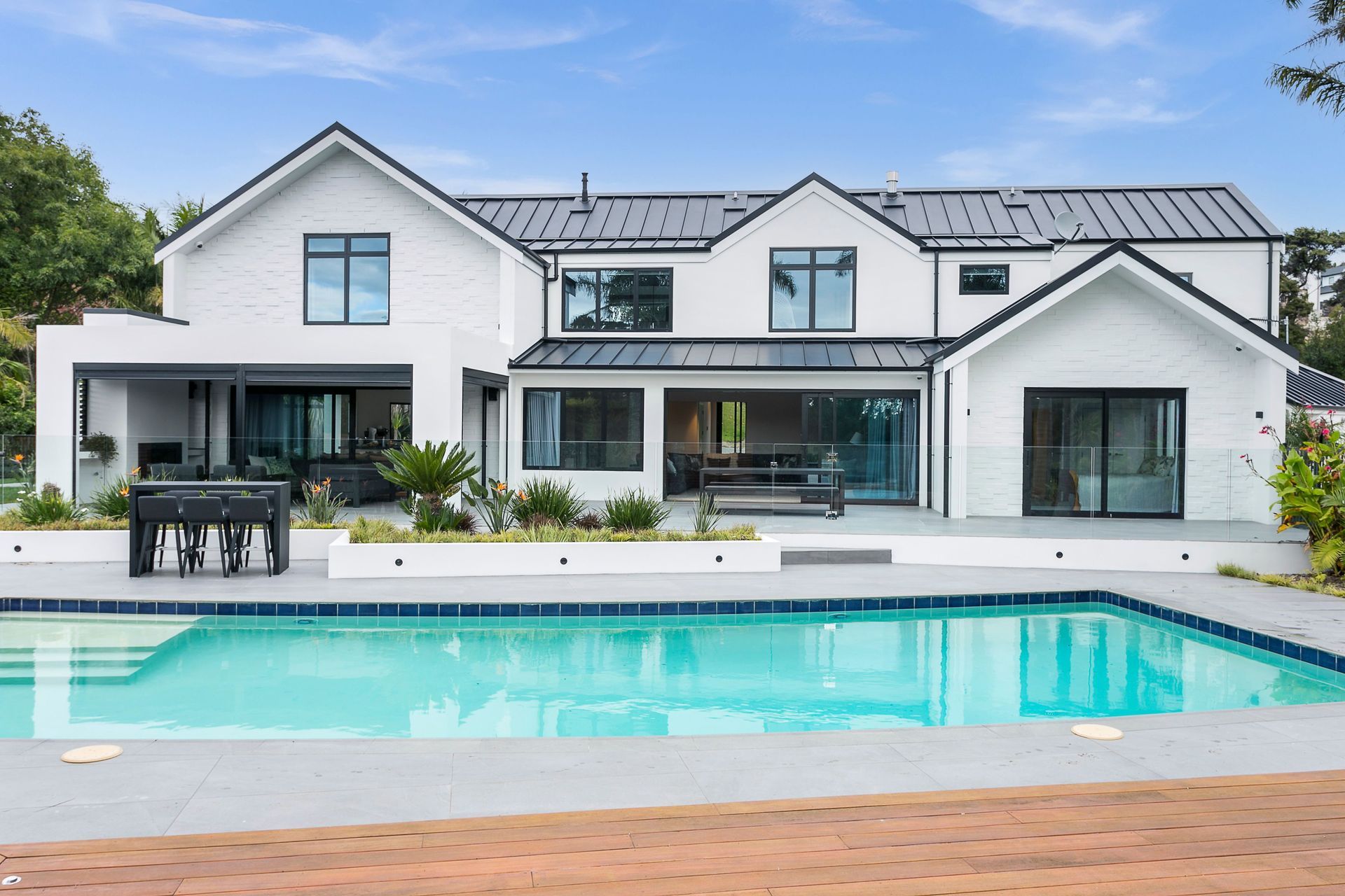
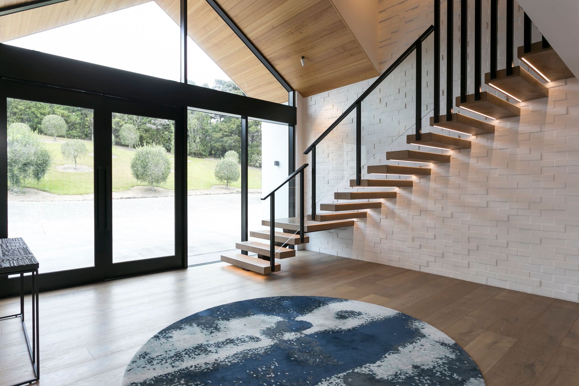
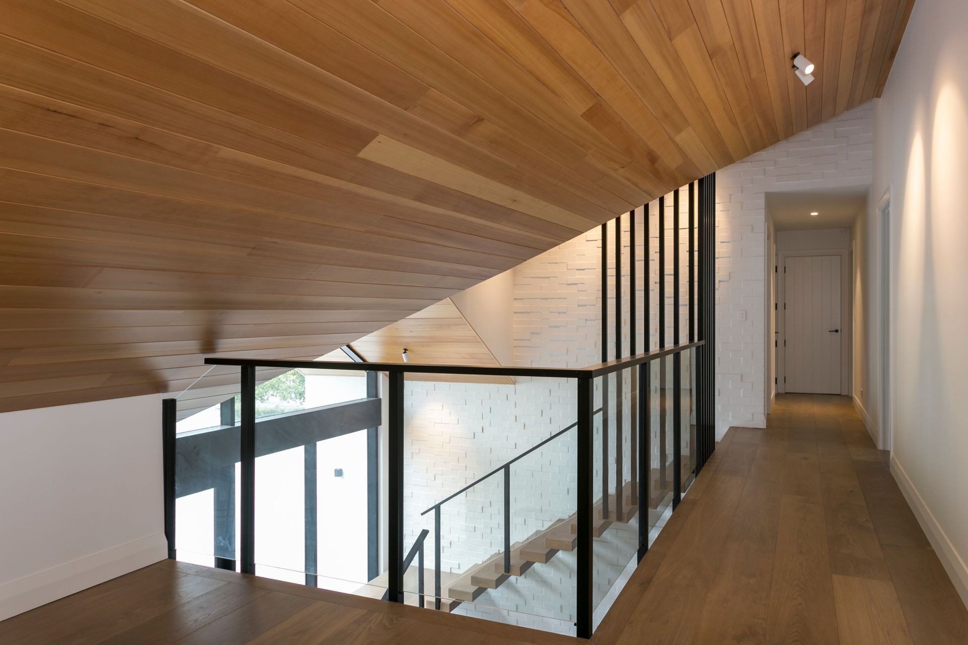
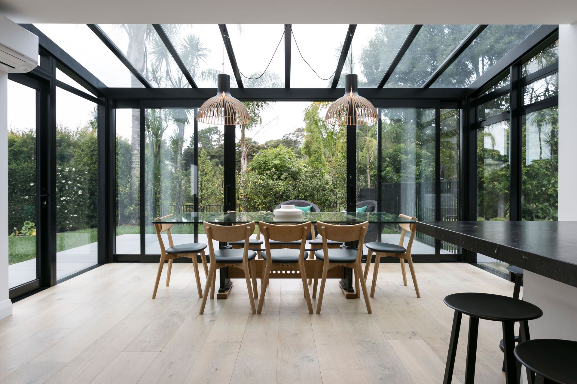
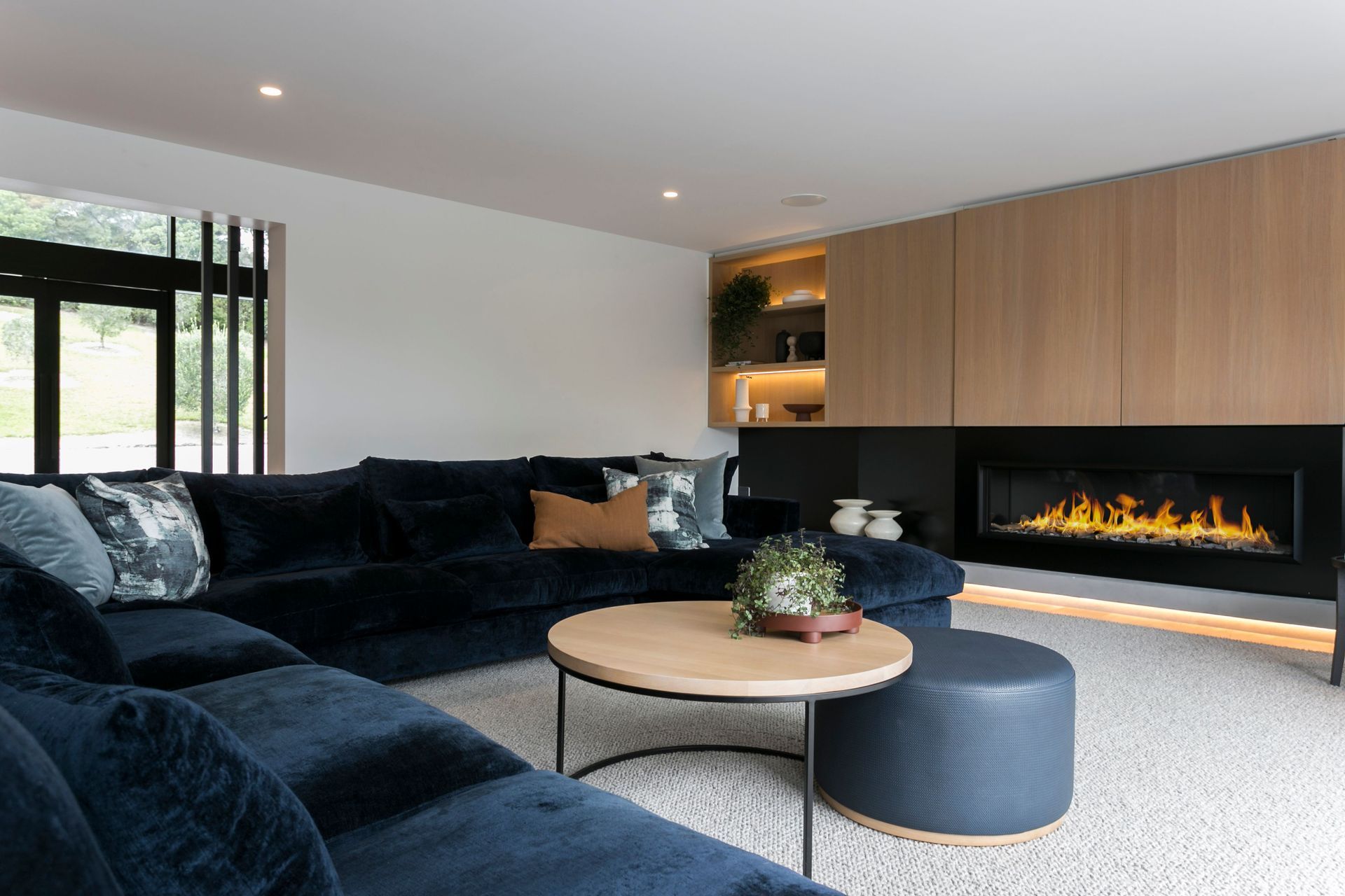
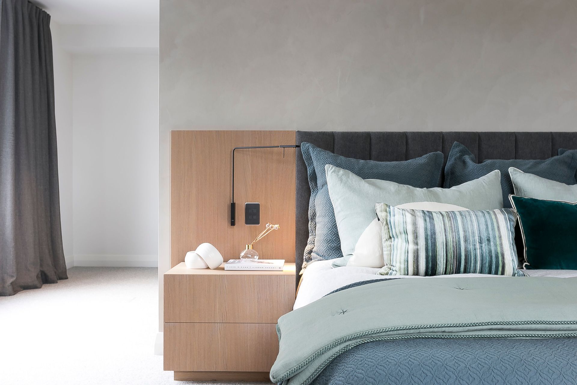
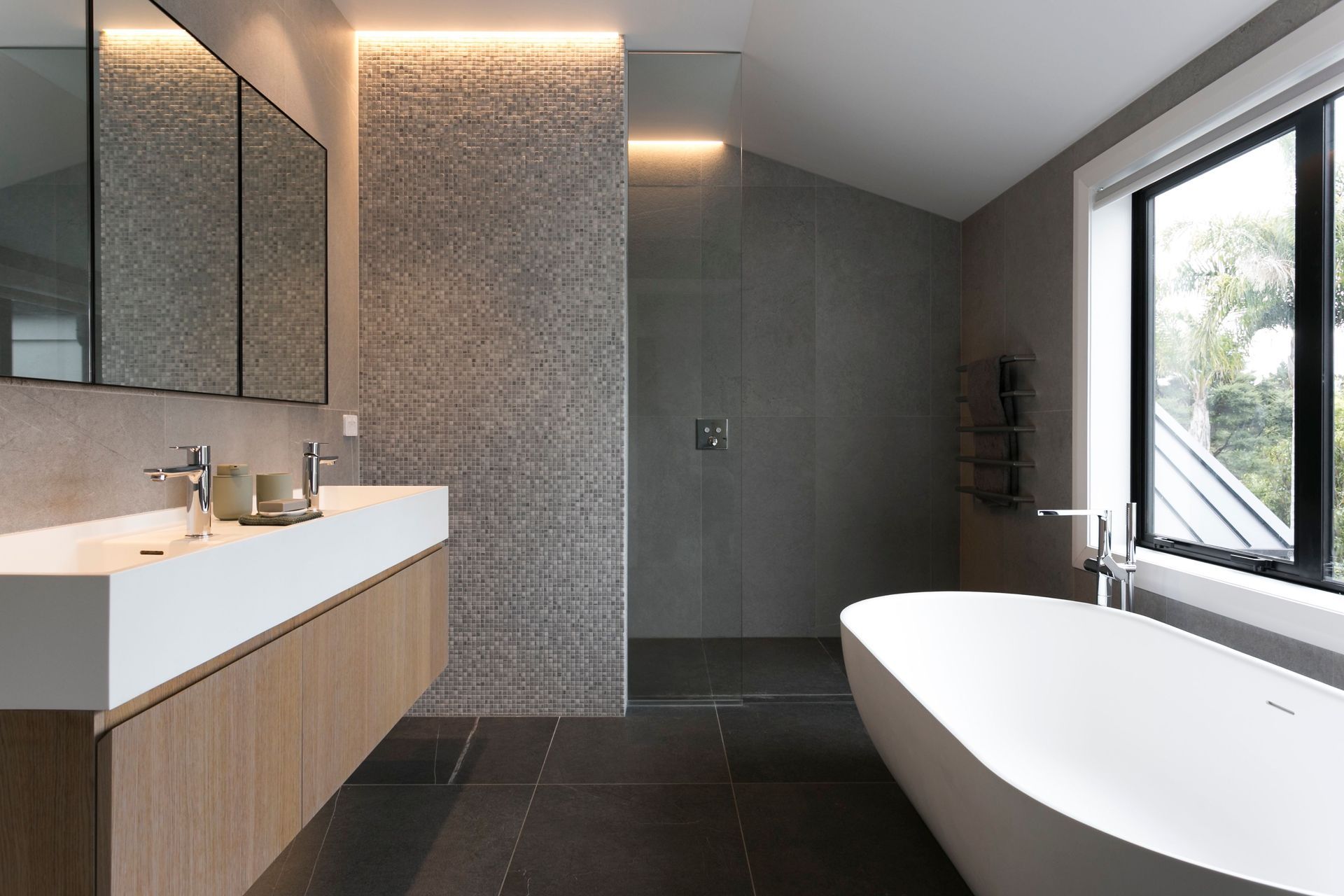
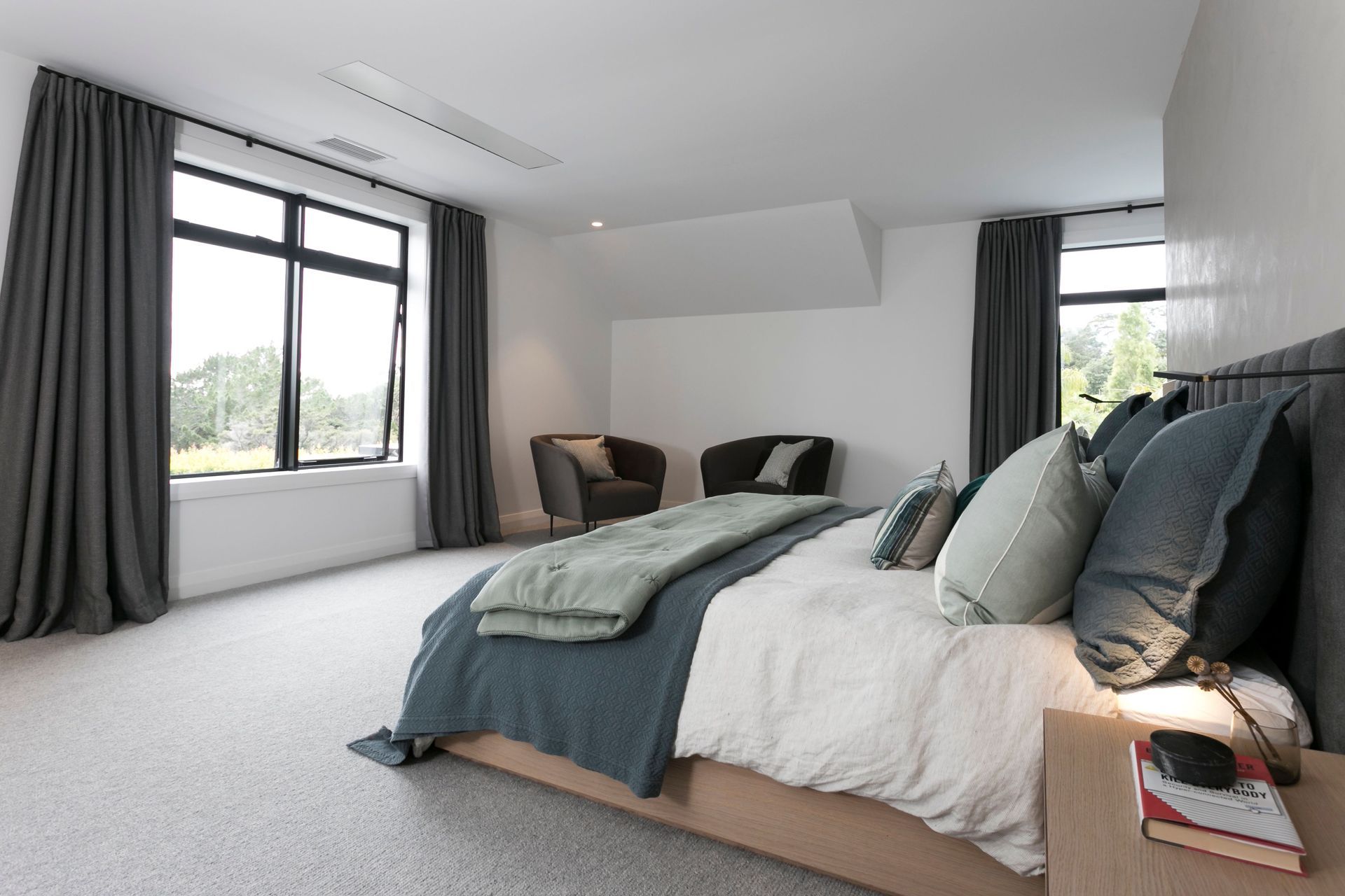
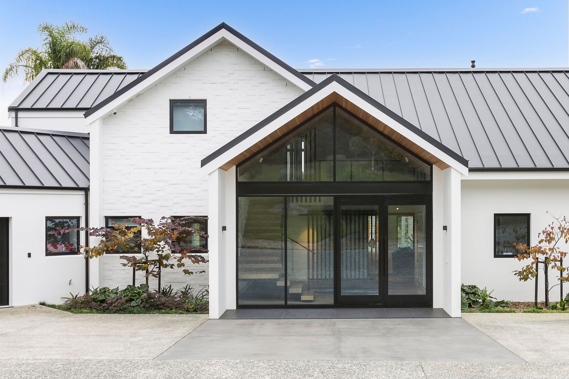
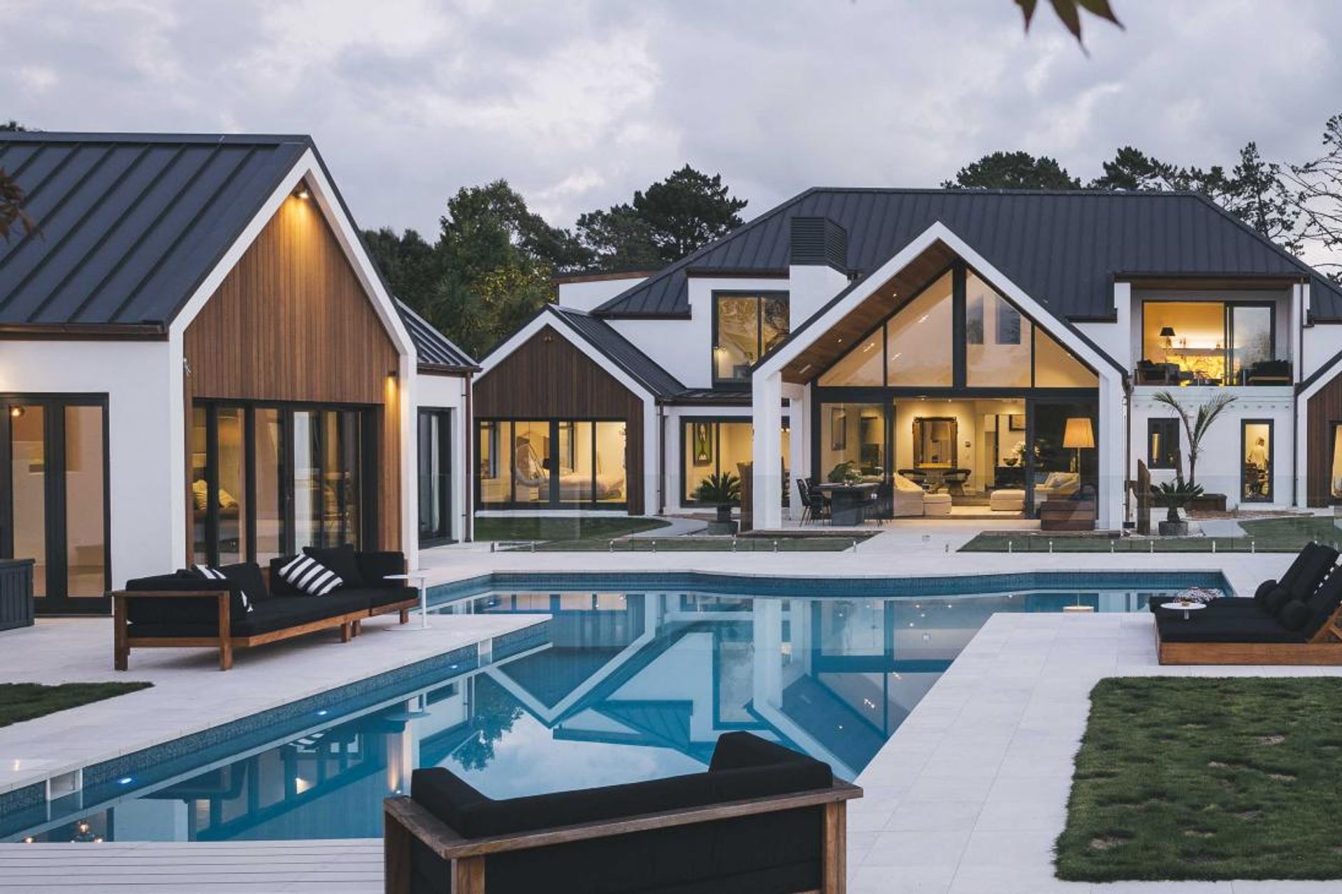
ArchiPro Project Summary - Extensive redesign of a post-modern home featuring a new second level, enhanced indoor/outdoor connections, and a striking monochromatic exterior, creating a modern family residence that harmonizes with its landscaped surroundings.
- Title:
- Snapper Rock
- Architect:
- Bindon Design Group
- Category:
- Residential/
- Renovations and Extensions
Project Gallery
Views and Engagement
Products used
Professionals used

Bindon Design Group. We are an architectural design company providing innovative architectural design solutions to meet your requirements. Our skilled Architects give you the freedom to dream and be inspired! Our office is based on the North Shore in Auckland with local and international design commissions including China and USA.
At Bindon Design Group we prepare and produce practical and unique code compliant outcomes that will connect your budget and your imagination. We have a talented team who can accurately produce three dimensional digital computer models of your design using the latest software and rendering techniques, and add in real world fabrications to communicate key features of the design and make your dreams a reality. With our partners we are able to offer, should it be required, a full range service including project feasibility, estimating, design, design-build, management and construction.
Year Joined
2016
Established presence on ArchiPro.
Projects Listed
6
A portfolio of work to explore.
Bindon Design Group.
Profile
Projects
Contact
Other People also viewed
Why ArchiPro?
No more endless searching -
Everything you need, all in one place.Real projects, real experts -
Work with vetted architects, designers, and suppliers.Designed for New Zealand -
Projects, products, and professionals that meet local standards.From inspiration to reality -
Find your style and connect with the experts behind it.Start your Project
Start you project with a free account to unlock features designed to help you simplify your building project.
Learn MoreBecome a Pro
Showcase your business on ArchiPro and join industry leading brands showcasing their products and expertise.
Learn More