Beyond tapware: Why finish continuity now extends across the bathroom

featuring Caroma

Caroma logo
  • 594.8K profile views
  • 112 saves

As bathroom palettes become more considered, even the smallest of fittings have a role to play. But what does it take to achieve consistency across the room?

Visit Website

Featured Professionals

Written by

  • Cassie McKenzie
Luke Di Michel, Industrial Design Manager at GWA Group for Caroma.

There comes a point in bathroom design where the bigger decisions meet the smaller ones. The layout has been set, the vanity has been selected, and tiles are being laid. Then come the shower fittings, towel rails, flush buttons and wastes. Each introduces another surface, another detail that contributes to the overall look and feel of the space. But anyone who has tried to bring these components together will know the challenge: matching the finishes can often seem impossible. 

For Luke Di Michel, Industrial Design Manager at GWA Group for Caroma, consistency across these details has become more than a ‘nice to have’.

“There’s a confidence to and a desire to bring a colour palette in and, particularly, to link the colour finishes with the interior design,” says Luke. “The tiles, the benchtop, the basin finish, the tapware are all a key part to supporting that. It means the focus on colour is not just a nice to have now; it’s a mandatory to have.” 

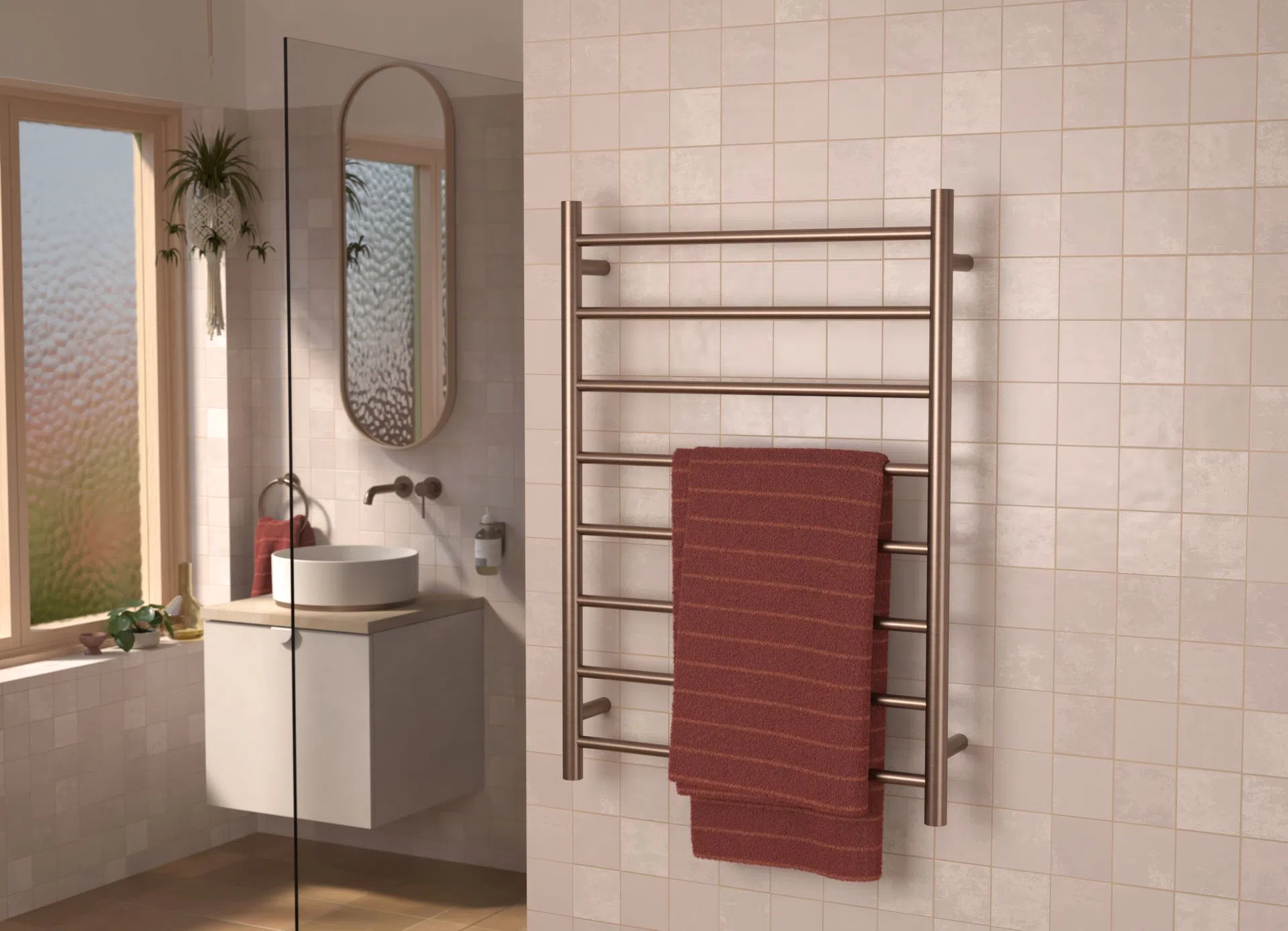
Inside Caroma’s Design & Innovation Centre, this idea is shaping the development of collections such as Liano II, with tapware basins, heated towel rails and accessories considered together so that their finishes, forms and proportions all belong to the same visual language.

More than colour

Designs have certainly moved beyond the familiar, ‘safe’ selection of chrome. Today’s bathrooms feel more connected to other spaces of the home with more considered design decisions, the use of colour and metallic finishes such as brushed bronze, brushed brass, brushed nickel and gunmetal. More than choosing a product purely based on practicality, selecting finishes and forms that feel cohesive and contribute to the entire space, no matter how small, has become the expectation. 

Colour is only the beginning, though. Carrying it consistently across the room means paying attention to how both texture and shape influence its appearance. Two products described as the same colour can look quite different beside one another, especially when specified from different brands. 

The name of the colour alone shouldn’t be what selection is based on.

“The forms of the products do play a really key role in how that finish is viewed and interpreted,” says Luke. 

For example, the way light interacts with the tubular designs and repeated circular forms of Liano II changes the tones of the surface when compared to other forms such as Caroma’s Urbane range, which features more linear and flat surfaces.

Revisiting Liano, a collection long specified by designers and architects across Australia and New Zealand, the focus became the ability to offer whole-room continuity, while adding a more contemporary feel through form. 

Thinner, more refined edges were introduced to the basins alongside details such as an integrated waste, and new colour finishes were added to what was already a tried, tested and well-respected collection.

Working with a master colour sample, 3D-printed prototypes for Liano II were also created so the team could experience what it would be like to use and feel each piece in hand, and how the different products would work together in completed spaces. Sharing these early prototypes with architects and customers, one of the key pieces of feedback was the desire for tactile finishes. The kind you want to reach out and touch. 

“Nothing beats actually being able to touch and feel or look at a product,” says Luke. “Tapware is quite a tactile product. You’re touching it, you’re opening and activating, touching handles all the time.”

This also brings a common frustration: visible fingerprints. With this in mind, developing non-fingerprinting matte finishes became an important part of the design process.

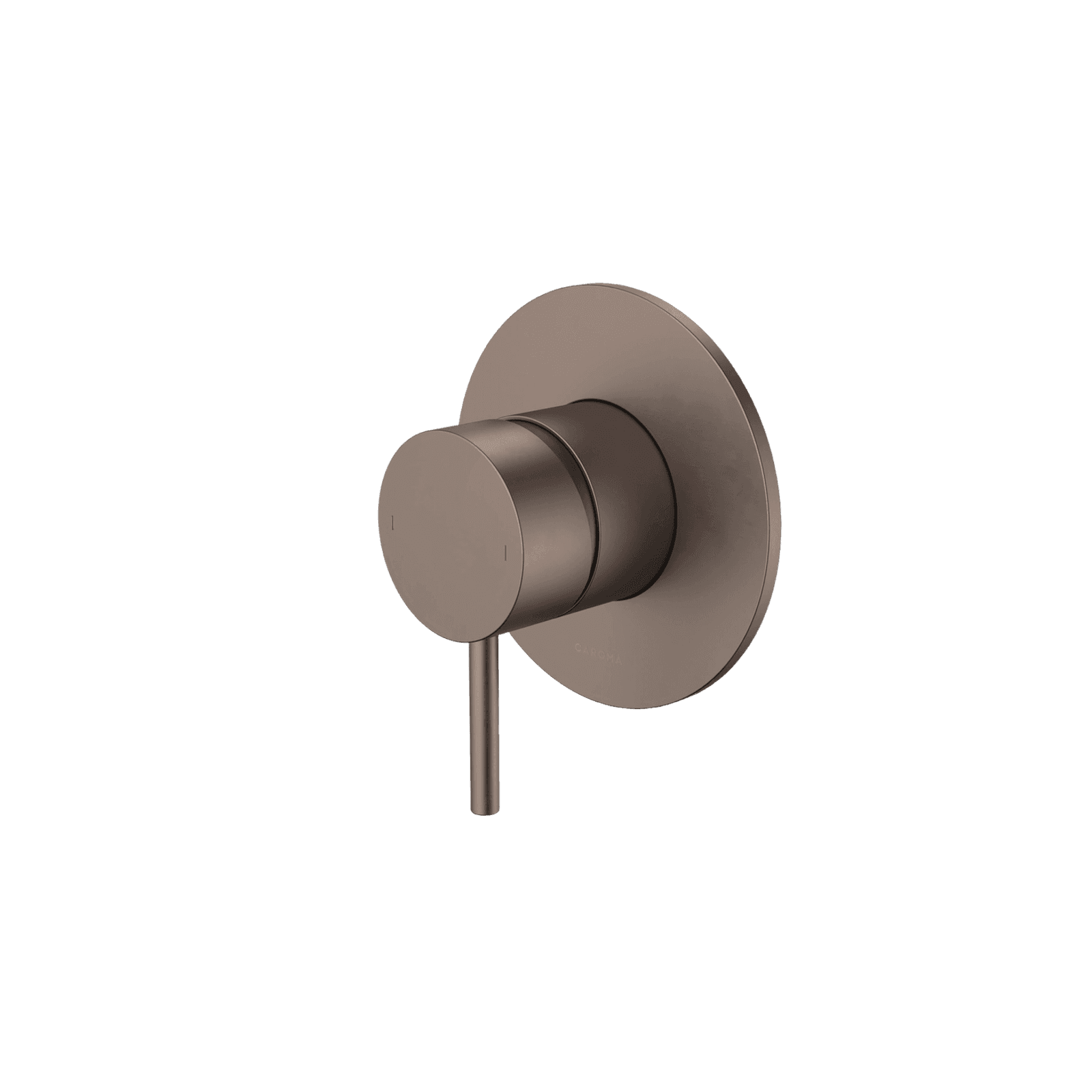
As the collection evolved, brushed bronze joined the existing palette of black, chrome, brushed nickel, gunmetal and brushed brass. Alongside the metallic finishes, the team was also exploring ceramic colours such as matte pink, matte green and speckled, and considering how the two types of finishes could work together.

Luke points to pairing brushed bronze tapware with a matte white ceramic basin, a combination that brings warmth to an otherwise simple palette. By adding a matching pop-up waste, a direct visual connection between the two products is created. It makes the design feel completely resolved, something not always possible. 

Dress rings offer another way of achieving this visual connection. Positioned beneath selected round basins, they visually lift the ceramic above the vanity while picking up the metallic tone of the tapware. 

For Luke, it’s these details that provide the greatest opportunity. The breadth of a coordinated collection such as Liano II gives architects and designers the freedom to choose finishes for larger pieces, knowing the smaller details can carry that palette through. A basin waste may seem inconsequential, but when considered alongside the rest of the space, it becomes part of what makes the design feel complete. 

Even the smallest functional details deserve to belong to the same visual language. Explore Caroma’s Liano II collection and start planning your next bathroom.

Like this Article?
Get in touch with Caroma

Themes

Credits